Logo Designing in Sialkot — From Rs 2,500
Your logo is the face of your business. It is the first thing people see on your shop sign, your Facebook page, your packaging, and your visiting card. A strong logo makes people remember you. A weak one makes them forget you in seconds. If you are starting a new business in Sialkot — or you feel your old logo no longer fits — this guide covers everything: why logos matter, the types of logos, what makes one good, our design process, pricing, and the mistakes to avoid.
Why Your Logo Matters More Than You Think
Think about the brands you know. You can spot their logos from far away, even without reading the name. That is not an accident. It is the result of a well-designed mark doing its job over years. Your logo works the same way for your business, whether you run a small shop in Sialkot or export sports goods to fifty countries.
First, a logo builds trust before a customer ever talks to you. When a buyer sees a clean, professional logo on a sports goods box, they assume the product inside is good too. When they see a blurry, copied logo, they hesitate. This happens in seconds, and most buyers never tell you why they walked away. They just do.
Second, a logo makes you memorable. Sialkot has thousands of manufacturers making similar products. Footballs, surgical instruments, leather gloves — the products often look alike. What makes a buyer remember YOUR company after visiting ten factories in one week? Your name and your mark. A distinct logo sticks in the mind when product photos blur together.
Third, a good logo saves you money over time. Once people know your mark, you do not need to explain who you are in every ad. Your logo does the talking. It works on your business cards, your shop board, your delivery boxes, and your social media pages — all without you paying extra. It is a one-time investment that keeps working for years.
Fourth, for manufacturers and exporters, a logo matters even more than for local shops. International buyers judge your whole company by it. They cannot visit your factory easily, so your logo, your company profile, and your catalogue are all they have. A professional logo tells them you are serious. It can be the difference between getting an email reply and being ignored.
Fifth, a logo brings consistency. Without one, every banner, every Facebook post, and every box looks different. Customers get confused. With a proper logo and brand colors, everything you produce looks like it comes from one professional company. That consistency builds recognition, and recognition builds sales.
Finally, think about the cost of a bad logo. A copied or ugly logo does not just fail to help — it actively hurts. It makes your business look cheap, careless, or untrustworthy. Fixing it later means reprinting everything: boxes, cards, boards, catalogues. Getting it right the first time is always cheaper.
The 7 Types of Logos (With Examples)
Not all logos work the same way. Designers group them into seven main types. Knowing these helps you choose the right style for your business — and helps you talk to your designer clearly.
1. Wordmark. This is your company name in a custom font style, with no symbol. Think of famous brands written in a special way. Wordmarks work best when your business name is short, catchy, and unique. If your name is long or common, a wordmark alone may not stand out.
2. Lettermark. This uses initials instead of the full name — two or three letters designed as a mark. Companies with long names often use these. A lettermark is compact and works well on small items like pen clips and mobile app icons. But it takes more marketing effort before people connect the letters to your company.
3. Pictorial mark. This is a symbol or icon that represents your business — an animal, an object, a shape. It is memorable and works across languages, which is great for exporters. The challenge is that a new pictorial mark means nothing until you build recognition around it.
4. Abstract mark. This is a geometric shape that does not picture anything real — circles, lines, and forms arranged in a unique way. Abstract marks are very flexible and look modern. Many tech and sports brands use them. They need skilled design to avoid looking random or meaningless.
5. Mascot logo. This uses an illustrated character as the face of the brand. Mascots feel friendly and work well for businesses targeting families or young customers — food brands, toy shops, sports academies. They are harder to keep looking professional in formal settings.
6. Emblem. This puts your name inside a badge, seal, or crest. Emblems feel traditional and trustworthy. They suit schools, clubs, and heritage brands. The downside is that detail gets lost at small sizes, so emblems need careful simplification.
7. Combination mark. This pairs a symbol with your company name — the most popular choice for small businesses. You get the best of both: the symbol becomes recognizable on its own over time, while the name tells new customers who you are from day one. Most of the logos we design for Sialkot businesses are combination marks, because they work everywhere from shop boards to export cartons.
There is no single best type. A surgical instruments exporter might suit a clean abstract mark. A children's sports brand might suit a mascot. During our design process, we recommend the type that fits your business, your customers, and where the logo will appear — from product packaging to social media profile pictures.
What Makes a Logo Actually Good
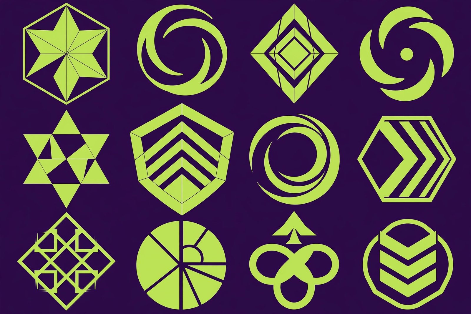
Good logos share five traits. Check any logo you admire against this list, and you will see the pattern.
Simple. The best marks in the world use basic shapes and clean lines. A simple logo is easy to remember and easy to reproduce — on a pen, a shirt, or a giant billboard. If your logo needs ten colors and fine detail to work, it will fail in real life. Simplicity also makes a logo load fast as a website icon and stay readable as a tiny social media avatar.
Unique. Your logo should not look like your competitor's. Many cheap designers copy designs from the internet, change one color, and call it original. That can get you into legal trouble, and it makes your brand look fake the moment someone notices. Always ask for an original design, and ask your designer to confirm it is not copied.
Versatile. Your logo will appear in many places: full color on your website, single color on a stamp, embroidered on a cap, engraved on a metal instrument, printed tiny on a care label. A good logo works in all of these. Test every logo in black and white before you approve it. If it only works in full color, send it back.
Timeless. Trends come and go. A logo built on this year's design fad will look old in two years, and rebranding is expensive. Aim for a mark that will still look right in ten years. Clean shapes and classic proportions age well. Gradient-heavy, ultra-thin, or gimmicky effects do not.
Relevant. The logo should fit your business. A playful, bouncy logo suits a toy shop, not a surgical instruments company. Colors, shapes, and fonts should match what you sell and who you sell to. Blue suggests trust and is common in medical and corporate brands. Green suggests nature and health. Red suggests energy and urgency. Your designer should explain the color and shape choices, not just present a pretty picture.
Our Logo Design Process, Step by Step
At Advert Solutions, we do not just open software and start drawing. We follow a clear process that gets you a logo you will actually like — and one that works in the real world.
Step 1 — Discovery. We learn about your business. What do you sell? Who are your customers? What feeling should your brand give? A sports brand and a food brand need very different logos. We also ask where the logo will be used most — shop boards, export boxes, social media, uniforms — because that shapes the design.
Step 2 — Research. We study your competitors in Sialkot and in your industry. The goal is a logo that stands apart from them, not next to them. If every surgical company uses a blue cross, we find a different way to say medical and trustworthy. We also check that our concepts do not accidentally copy any existing well-known mark.
Step 3 — Sketching and concepts. We sketch many directions, then develop the strongest ones into polished digital concepts. You receive multiple original logo ideas — not one take-it-or-leave-it design. Each concept comes with a short explanation of the thinking behind it: why this shape, why these colors, why this style.
Step 4 — Your feedback. You review the concepts and tell us what you like and what feels wrong. Be honest and specific — "I like the second one's shape but want stronger colors" is far more useful than "make it nicer." We revise the chosen direction based on your comments.
Step 5 — Refinement. We polish the chosen logo: perfect the spacing, balance the shapes, test it at different sizes, and check it in single color. Small details make the difference between an amateur mark and a professional one. We also test it on realistic previews through our mockup designing service, so you can see it on boxes, shirts, and cards before anything is printed.
Step 6 — Final delivery. Once you approve, you receive your logo in all the formats you need: vector source files for printers, high-resolution files for print, and web-optimized versions for your website and social media. You also get a simple usage guide — your brand colors and fonts — so everything you make in the future stays consistent.
What to Check Before You Hire a Logo Designer
Choosing the right designer matters as much as the design itself. Here is a checklist to use before you pay anyone.
Look at their portfolio. A real designer shows real past work. Look for variety — can they design in different styles, or does everything look the same? Look for logos in your industry. And look closely: do the logos look original, or do they look like copied templates?
Ask about originality. Ask directly: will my logo be 100% original? A professional designer will say yes and explain their process. Be careful with very cheap offers that deliver in two hours — those are often copied or template-based.
Confirm the files you will get. You need vector source files (AI, EPS, or SVG), not just a JPG. Without vector files, no printer can use your logo properly, and you will be stuck if you ever need it resized. Also confirm you get versions for print, web, and social media.
Check the revision policy. How many revision rounds are included? What happens if you do not like any concept? A fair designer includes at least one or two revision rounds and explains the process upfront.
Confirm ownership. Once you pay in full, the logo should be 100% yours. Get this in writing or at least in a clear message. You should be free to trademark it, modify it later, and use it anywhere.
Judge their communication. Do they ask about your business, or just ask for the company name? A designer who asks questions will design better than one who does not. Clear communication before the project predicts smooth work during it.
Logo Design Pricing in Sialkot — From Rs 2,500
Our logo design packages start from Rs 2,500. That base package gets you original logo concepts, revision rounds, and final files in all common formats — vector source files, print-ready versions, and web versions. For most small businesses and startups, this is everything needed.
What affects the price? The number of concepts you want to see, the complexity of the design (a detailed mascot costs more than a clean wordmark), and extras like a full brand guideline document or a complete stationery set. If you need your logo applied across many items — cards, letterheads, packaging — we can bundle it into a brand package at a better rate than ordering each piece separately.
We always tell you the full price before we start. No hidden charges, no surprise fees at the end. You approve a fixed quote, and that is what you pay.
Think about value, not just price. A logo is a one-time cost that works for you for years — on every product, every ad, every box. Paying a little more for an original, professional logo is far cheaper than rebranding later because the cheap one looked copied or unprofessional. One lost export order costs more than any logo design package.
7 Common Logo Mistakes to Avoid
1. Copying a famous brand. Making your logo look like a big brand does not borrow their success — it makes you look fake and can bring legal trouble. Build your own identity.
2. Too much detail. Tiny lines, small text, and complex scenes disappear at small sizes. If your logo cannot be recognized at the size of a postage stamp, simplify it.
3. Following trends blindly. That trendy style everyone uses this year will date your brand fast. Choose clean, classic design that will still look right in a decade.
4. DIY with free tools. Free logo makers give thousands of businesses the same templates. Your "unique" logo might already belong to a bakery in another country. For a real business, invest in original design.
5. Ignoring single-color use. If your logo needs five colors to be recognized, it will fail on stamps, engravings, embroidery, and single-color print. Always check the one-color version.
6. Choosing based on personal taste only. You might love purple, but if your customers are conservative industrial buyers, it may send the wrong signal. Design for your customer, not just yourself.
7. Skipping the vector files. Accepting only a JPG means every future use — printers, sign makers, embroiderers — will ask for the real files, and you will not have them. Always get vector source files.
Logo Design for Different Industries in Sialkot
Different industries need different logo styles. What works for a sports brand will not work for a surgical instruments company. Here is how we approach the main industries in Sialkot.
Sports goods manufacturers. Sports logos need energy and movement. Bold shapes, dynamic angles, and strong colors work well. The logo must also survive embroidery on apparel, printing on balls, and stamping on equipment. We keep sports marks simple and bold so they stay readable on a fast-moving product.
Surgical and dental instruments. Medical buyers want precision and trust. Clean lines, blue and teal colors, and minimal shapes suit this industry. The logo must look professional on tiny engravings — instruments are small, so fine detail is the enemy. We design marks that stay clear even at 5 millimeters.
Leather goods and gloves. Leather brands benefit from heritage-style marks — emblems, classic typography, earthy colors. These suggest craftsmanship and quality. For fashion-forward leather brands, we go modern and minimal instead. The key is matching the mark to the price point: premium products need premium-looking logos.
Retail shops and local businesses. Shop logos need to work big — on signboards seen from across the street. Bold lettering, high contrast, and simple shapes win here. We also make sure the design works in the single colors that sign makers use.
Food and restaurants. Food logos should feel appetizing and welcoming. Warm colors like red, orange, and yellow stimulate appetite. Mascots and playful typography work for casual food brands, while fine dining needs elegant, restrained marks.
Startups and tech. New businesses usually want modern, minimal logos — abstract marks or clean wordmarks that look good on apps and websites. We design these with digital use as the priority: app icons, social avatars, and website headers.
How to Brief Your Designer: A Simple Template
A good brief gets you a good logo. You do not need to write pages — just answer these questions clearly before the project starts.
1. What is your business name, and what do you sell? State it plainly. Include the exact spelling of the name as it should appear.
2. Who are your customers? Describe them simply: local shopkeepers, international buyers, young athletes, hospital purchasing managers. The designer needs to know who the logo must appeal to.
3. Who are your competitors? Name three or four. This helps the designer make you look different from them, not similar.
4. What feeling should the logo give? Pick three words: for example, "strong, trustworthy, modern" or "friendly, fresh, affordable." These guide every design choice.
5. Where will the logo be used most? List the top uses: shop board, export cartons, Instagram, uniforms, product engraving. A logo used mainly on tiny instruments is designed differently from one used mainly on billboards.
6. Any colors or styles you like or dislike? Share examples of logos you admire — and ones you hate. This saves rounds of revision.
7. What is your deadline? Be honest about launch dates so the designer can plan properly.
Send this brief to your designer, and the first concepts will be far closer to what you want. At Advert Solutions, we collect this information in a short discovery call, so you do not have to write it all yourself.
Logo File Formats Explained in Simple Words
When your logo is done, you will receive several files. Here is what each one is for, in plain language.
AI / EPS (vector source files). These are the master files. They can be scaled to any size — from a pen to a building — without losing quality. Printers, sign makers, and embroiderers need these. Always keep them safe; they are the most important files you receive.
SVG. A vector format for websites. It stays sharp on all screen sizes and loads fast. Your web developer will want this for your site header.
PDF (print). A high-resolution file for professional printing — catalogues, brochures, and packaging. Printers accept this universally.
PNG (transparent background). For digital use — presentations, social media posts, website images. The transparent background means the logo sits cleanly on any color.
JPG. For everyday use — email signatures, Word documents, quick sharing. It has a white background and is the most widely compatible format.
You will also get color variations: full color, single black, and single white (reversed) versions. The white version is for dark backgrounds — your website footer, dark packaging, or video intros.
Building on Your Logo: The Full Brand Identity
A logo is the foundation, not the whole house. Once your mark is finalized, these are the pieces that turn it into a complete brand identity.
Business cards and letterheads. Your everyday business documents should carry the logo consistently. A matching set of cards, letterheads, and envelopes makes every communication look professional. See our business card design guide for details.
Packaging. For manufacturers, this is where the logo earns its keep. Boxes, labels, and pouches printed with your mark turn every shipment into advertising. Our packaging design guide explains the process.
Catalogues and profiles. Your product catalogue and company profile should open with your logo and use your brand colors throughout. Consistent branding across these documents makes your company look established and reliable.
Social media branding. Profile pictures, cover photos, and post templates in your brand style. When someone visits your Facebook page, they should instantly recognize it as yours.
Signage. Shop boards, factory signs, and vehicle branding. Your logo needs a version designed for large-format use — bolder and simpler than the detailed version.
Ordering these as a bundle with your logo saves money and guarantees consistency. Everything is designed together, by one team, in one style.
How Long a Good Logo Lasts — and When to Redesign
A well-designed logo should serve you for 7 to 10 years, often longer. The world's most famous marks have lasted decades with only small refinements. But there are times when a redesign makes sense.
Redesign when your business changes. If you started as a small shop and are now an exporter, your old logo may not match your new scale. If you added product lines the old mark does not represent, it is time for a rethink.
Redesign when the logo looks dated. Design trends from fifteen years ago — heavy gradients, bevels, clip-art styles — make a business look stuck in the past. A modern refresh signals that your company is current.
Redesign when it does not work technically. If your logo cannot be embroidered, cannot shrink to an app icon, or looks bad in one color, those are practical reasons to redesign, not just cosmetic ones.
Do not redesign just because you are bored. Familiarity is a logo's strength. If customers recognize your mark, changing it throws away years of recognition. When in doubt, choose a refresh — small improvements to the existing mark — over a full redesign.
The Psychology of Logo Colors
Colors speak before words do. People react to color in milliseconds, and those reactions shape how they feel about your brand. Choosing logo colors is not just about taste — it is about strategy.
Blue signals trust, professionalism, and calm. It is the most popular logo color in the world for a reason. Banks, medical companies, and tech firms use it heavily. For Sialkot's surgical instruments exporters, blue is a natural fit — it says precise and reliable.
Red signals energy, urgency, and passion. Food brands, sports brands, and sale-driven retail use red because it grabs attention and stimulates action. But too much red can feel aggressive, so it is often balanced with neutral colors.
Green signals nature, health, and growth. It suits organic products, health brands, and companies that want to feel fresh and eco-friendly. Dark green adds a premium, established feel — common in financial and heritage brands.
Black signals luxury, power, and sophistication. Premium brands use black heavily, often paired with gold or silver. But an all-black logo can feel cold for friendly, family-oriented businesses.
Orange and yellow signal friendliness, optimism, and youth. They work for casual food brands, children's products, and startups that want to feel approachable. They are harder to use in formal or luxury contexts.
Purple signals creativity and premium quality. It is less common, which helps a brand stand out — but it must fit the industry. A creative agency in purple makes sense; a heavy machinery maker in purple raises eyebrows.
For exporters, remember that colors mean different things in different cultures. White means purity in the West but mourning in parts of Asia. Red means luck in China but danger in other contexts. If you export to specific countries, mention them to your designer so color choices travel well.
Finally, limit your palette. The strongest logos use one or two main colors plus neutrals. More than three colors makes a logo hard to reproduce and hard to remember.
Logo Design vs. Brand Identity: What Is the Difference?
People often use "logo" and "brand" as if they mean the same thing. They do not. Understanding the difference helps you order the right service.
A logo is a single mark — the symbol and/or styled name that identifies your business. It is one deliverable: the files we discussed above.
A brand identity is the complete visual system built around the logo: the color palette, the fonts, the business cards, the letterhead, the packaging style, the social media look, the signage. It is the logo plus everything the logo appears on, designed to work together.
A brand is even bigger — it is what people think and feel about your business. The identity shapes it, but so do your product quality, your customer service, and your reputation. No designer can create that part for you; it is earned over years.
When you order a logo, you get the mark. When you order a brand identity, you get the mark plus the system. For a new business, we usually recommend starting with the logo plus the essentials — cards and social media branding — then adding packaging, catalogues, and signage as you grow. This spreads the cost while keeping everything consistent from the start.
How to Launch Your New Logo
Getting the logo designed is only half the job. Rolling it out properly makes sure you get full value from it. Here is a simple launch checklist.
Update your digital presence first. Change your profile pictures on Facebook, Instagram, WhatsApp Business, and LinkedIn. Update your website header. These are free and instant, so do them on day one.
Update your documents. Business cards, letterheads, invoices, and email signatures should carry the new mark. Order fresh prints rather than sticking old stock — mixing old and new branding confuses customers.
Update your physical branding. Shop boards, factory signs, and vehicle graphics come next. These cost more, so plan them in order of visibility: the customer-facing signboard first, the factory gate second.
Tell your customers. Announce the new logo on social media with a short post explaining the change. For exporters, send a brief email to existing buyers so they recognize your new mark on future shipments and do not think it is a different supplier.
Protect it. As mentioned in the FAQ, consider trademark registration once the logo is final. The sooner you register, the sooner you are protected.
A planned rollout takes a week or two and makes your rebrand look professional instead of messy. We can help you plan the rollout order when we deliver your files.
Think about everywhere your logo will appear before you finalize it. It will go on your shop sign, your Facebook page, your product packaging, your invoices, and maybe your delivery van. A good logo works in all these places without losing its shape or meaning. When we design a logo at Advert Solutions, we test it at tiny sizes and large sizes so you never face a surprise later.
Frequently Asked Questions
How long does it take to design a logo?
Most logos take 3 to 5 working days. This includes the first concepts and one or two rounds of revisions. The timeline depends on how quickly you give feedback — fast replies mean fast delivery. If you have a launch deadline, tell us upfront. Rush delivery is possible in many cases for a small extra charge.
Will I get the source files of my logo?
Yes. You receive the full vector source files plus ready-to-use versions: high-resolution files for print, web-optimized versions for your website, and social media sizes for profile pictures and covers. You own your logo completely once the final payment is made, and you can use it anywhere without restrictions.
How many logo concepts will I see?
It depends on the package you choose, but you always see more than one concept. Each concept is a genuinely different direction, not small variations of the same idea. You pick the direction you like, and we refine it with your feedback until it is right.
Can you redesign my existing logo?
Yes, logo redesign is one of our most common jobs. There are two approaches: a refresh, which modernizes your current logo while keeping what customers recognize, or a full redesign, which starts fresh. We recommend a refresh if your current logo has years of recognition behind it, and a redesign if it is holding your brand back.
What if I do not like the first designs?
That is what revisions are for. Tell us specifically what feels wrong — the style, the colors, the shape — and we adjust. Our process is built around your feedback. In the rare case that no concept feels right, we discuss what is missing and create a new direction. The goal is a final logo you are happy to put on everything, from product packaging to your shop sign.
Can you design a logo for my export business specifically?
Yes. For exporters, we design with international buyers in mind: clean marks that work across cultures, colors with the right associations in target markets, and versions that reproduce well on cartons, labels, and embroidery. We also make sure the design works at the small sizes used on product tags and care labels.
Do you also design the rest of my branding?
Yes. After the logo, we can design your complete brand identity: business cards, letterheads, packaging, catalogues, social media branding, and shop boards — all in one consistent style. Bundling these together saves you money compared to ordering each separately, and it keeps your brand consistent from day one.
Will my logo work on social media profile pictures?
Yes. We specifically test and provide a version of your logo optimized for round and square profile pictures. Many logos fail as tiny avatars because they have too much detail or wide layouts. We make sure yours stays recognizable even at small sizes, and we deliver the correctly sized files for Facebook, Instagram, WhatsApp Business, and LinkedIn.
How do I protect my logo from being copied?
Once your logo is finalized, you can register it as a trademark with the Intellectual Property Organization of Pakistan. A registered trademark gives you legal rights against copiers. We deliver all the files and documentation you need for the application, and we can guide you on the basic process. Registration is especially important for exporters and growing brands.
Get Your Logo Designed in Sialkot
A good logo is one of the smartest investments a new business can make. It builds trust, makes you memorable, and works for you on every product and ad for years. Whether you are launching a startup, rebranding a factory, or preparing your export brand for international buyers, start with a logo designed properly. Your competitors are already investing in their image, and a professional mark keeps you ahead of them.
Visit our logo designing service page to see what we offer, or get in touch directly. Call us at +92 371 4200173 or visit our contact page — tell us about your business, and we will design the face of your brand from Rs 2,500.
We do this for businesses.
Get a free consultation — we'll map the fastest path for you.