SEO · Exports
Why SEO Is Important for Exporters: The Complete 2026 Guide
Google is where foreign buyers shortlist Sialkot suppliers. Here's why SEO is your most powerful export asset.
Read article →const growth = scale()We make brands impossible to ignore.
One team for everything digital — websites that convert, local SEO that ranks, Meta Ads that sell, scroll-stopping design, and social media that builds your brand.
⚡ Trusted for Exporters, Manufacturers, Retail & Local brands in Sialkot & worldwide
Finding digital marketing services in Sialkot that actually understand your business is harder than it sounds. Big-city agencies charge big-city prices and treat you like a number. Freelancers disappear halfway through the campaign. We built Advert Solutions to be the middle ground: a proper digital marketing team, right here in Sialkot, that picks up the phone and explains every campaign in plain words.
Our digital marketing services cover everything a growing business needs. Exporters who want foreign buyers to find them on Google. Local shops, restaurants and clinics that want more calls from Google Maps and social media. Brands that need ads that bring real sales — not just likes. From SEO and Google Ads to Meta Ads and social media marketing, every campaign is built around one thing: more customers for your business.
Our approach is simple. First we listen. Then we look at what you already have — your website, your Google listing, your social pages and any ads running — and tell you honestly what is working and what is not. Our free audit does exactly that. Only after that do we suggest a marketing plan, and you approve every step before we start. If you want SEO services in Sialkot that bring real inquiries, or Meta and Google Ads in Sialkot that turn clicks into customers, that is what we do every day.
*Sample figures – real numbers coming soon.
Pick a category to see what’s inside — every sub-service links straight to its own page.
Custom websites engineered to convert — fast, mobile-first, and built to rank on Google from day one.
Every page built around calls, enquiries and sales — never just pretty pixels.
Technical SEO baked into every build, so you start ranking from launch day.
Optimised code and images for sub-2-second loads on any connection.
Your domain, your hosting, full control. No hostage situations.
Rank #1 on Google and Google Maps — the channel that keeps bringing customers long after launch.
We target the exact English terms foreign buyers search — not vanity traffic.
Google Maps dominance locally, international SEO for export markets.
White-hat methods that survive every Google update. No penalties, ever.
Monthly reports in words you understand — rankings, traffic, leads.
From logos to export catalogues — design that makes your business look world-class.
Logos, colours and typography that stay consistent everywhere.
Print-quality assets tuned for catalogues, packaging and web.
Commercial timelines that never keep your orders waiting.
Feedback rounds are built into every package until you're happy.
Paid campaigns that pay for themselves — Meta, Google and LinkedIn ads, managed end to end.
Every rupee tracked against revenue — no vanity metrics.
Ad creatives designed by our in-house team, not outsourced.
Losers get cut, winners get scale — every single week.
Ads run in your accounts. Walk away anytime, keep everything.
Consistent, on-brand content for Instagram, Facebook and LinkedIn — planned, designed and posted for you.
A month of posts, reels and stories planned in advance.
Every post designed by our creative team, always on-brand.
Comments and enquiries managed professionally, daily.
Monthly strategy reviews that keep your results climbing.
Your path to direct foreign buyers — SEO, export websites, catalogues and campaigns built as one system.
Rank for the terms US, UK and Gulf buyers actually search.
Website, catalogue and profiles that prove you are legit.
Direct buyer pipelines instead of platform dependency.
Websites, design and ads coordinated under one strategy.
Most of our clients fall into three groups, and each one needs something different.
Sialkot is famous for sports goods, surgical instruments and leather products — and most of our exporter clients come from exactly these industries. They usually have the same problem: great products, but no direct line to foreign buyers. They depend on middlemen or marketplace listings where they compete on price alone. We build them export websites that rank on Google for buyer keywords, design catalogues and company profiles that impress foreign buyers, and run export marketing in Sialkot campaigns that bring inquiries straight to their inbox.
Restaurants, retail shops, clinics, real estate dealers and service providers in Sialkot need to be found by people nearby. For them we focus on Google Business Profile setup, local SEO and social media that keeps them visible in the city. Small budgets, clear results, no complicated talk.
Starting from zero? We handle the full launch: logo and branding, a professional website, and social media pages set up the right way from day one. One team, one plan, everything matching.
Websites, logos, catalogues, social media, banners & letterheads — real projects we’ve delivered for exporters and brands. Click any card to preview.
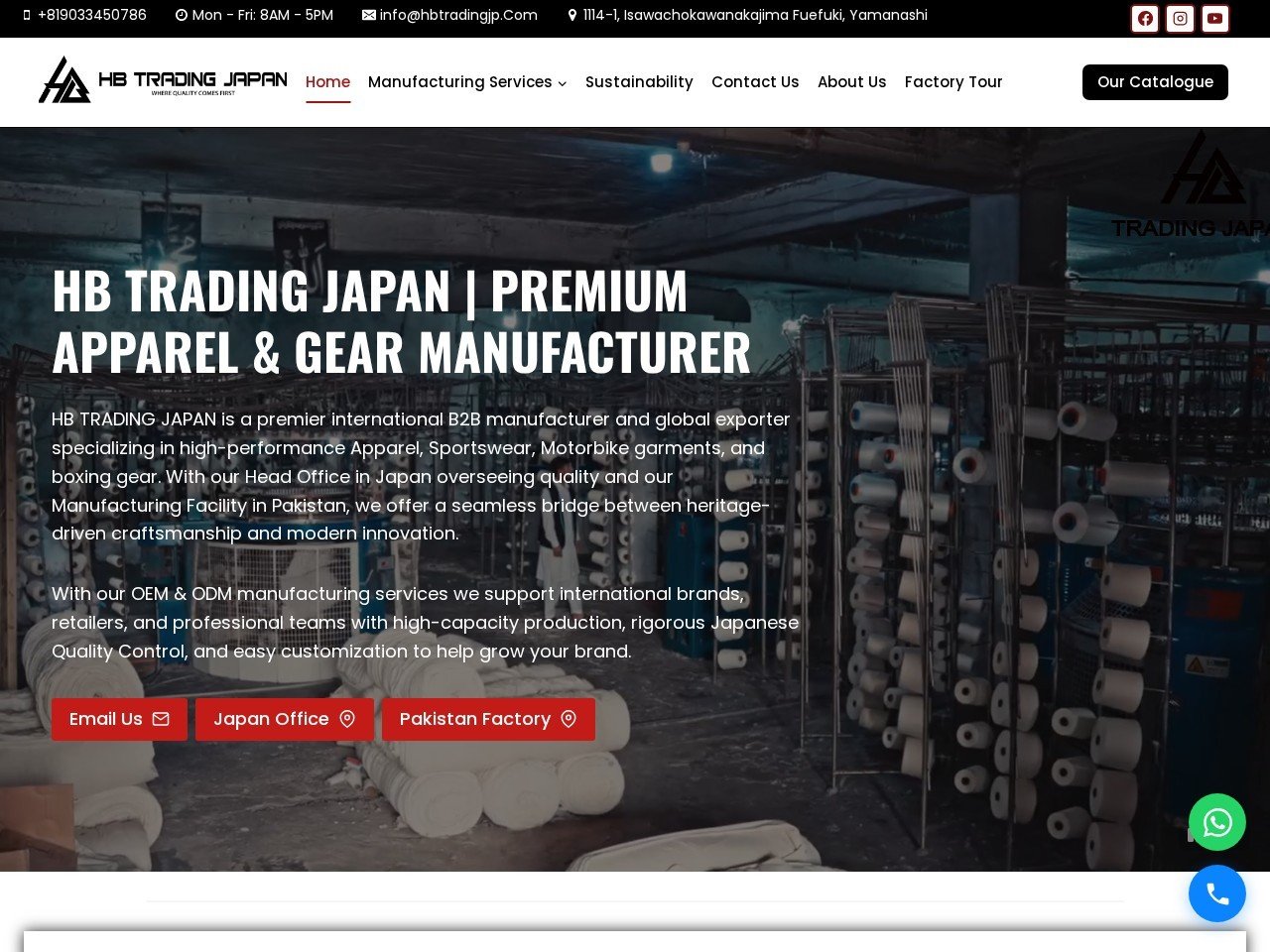 Website
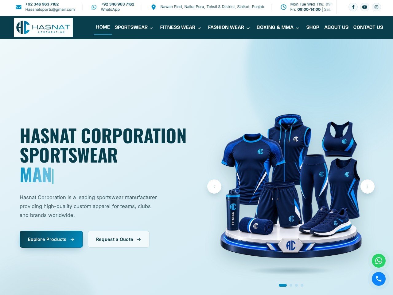 Website
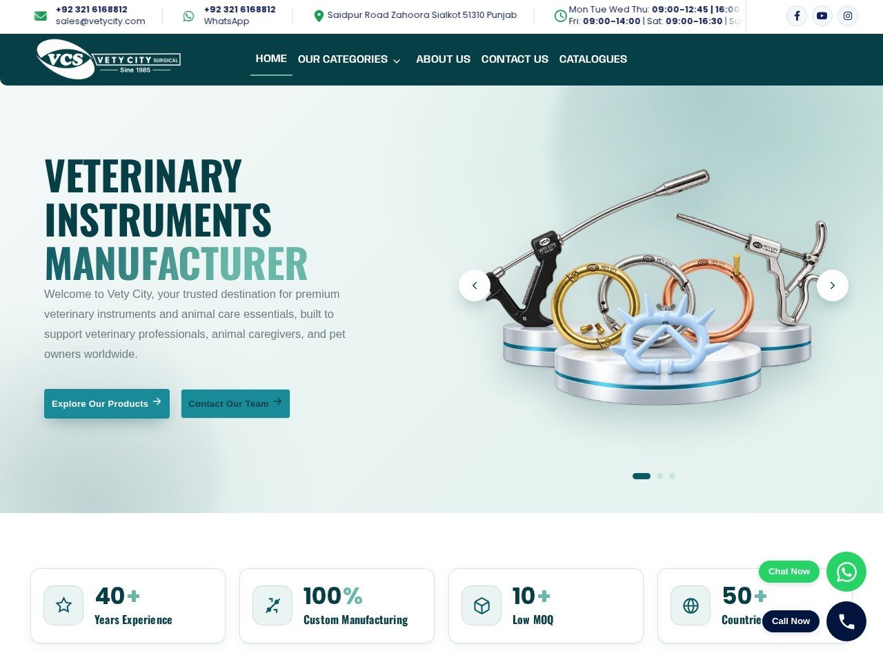 Website
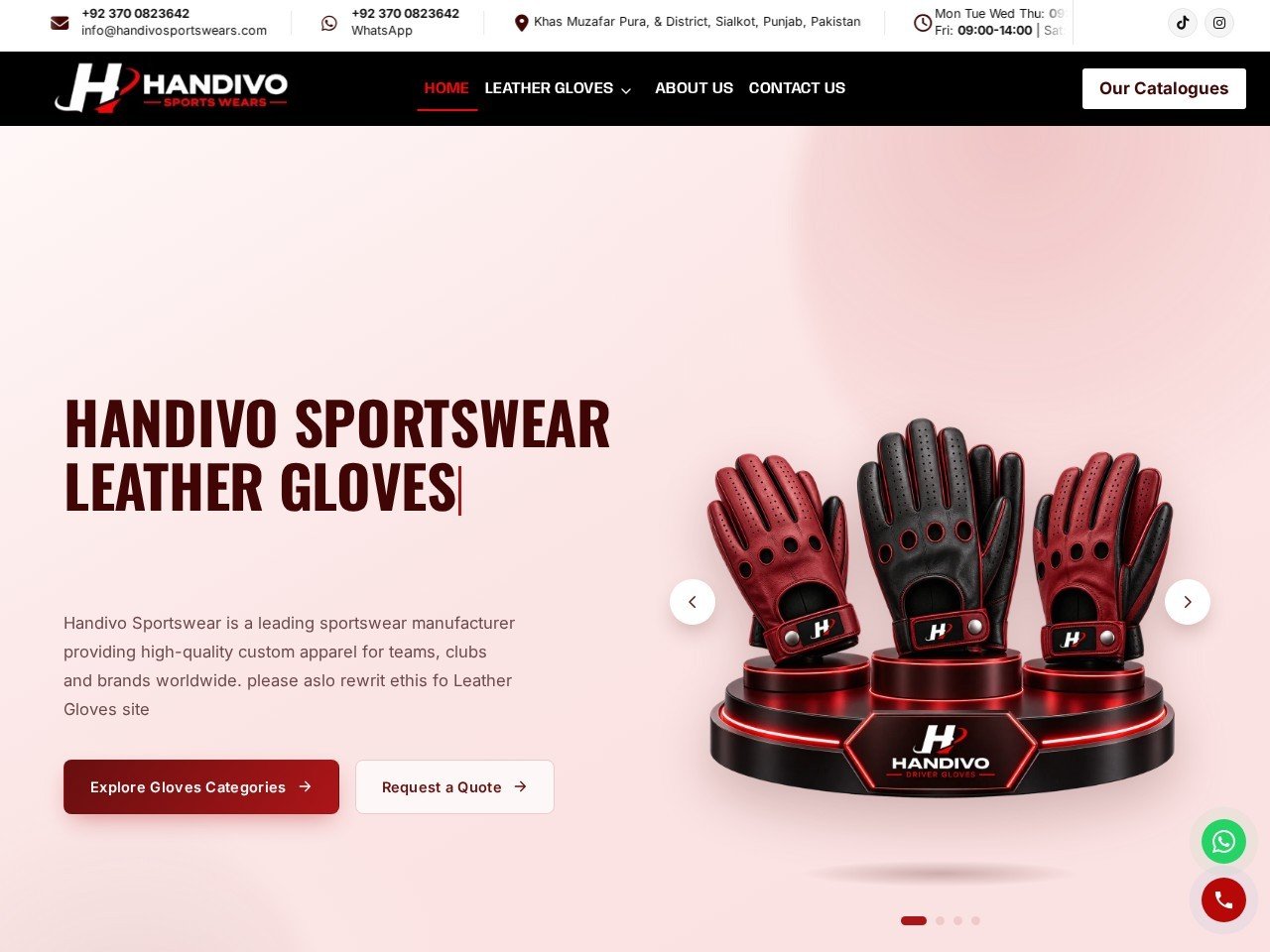 Website
 Website
 Website
 Website
 Website
 Logo
 Logo
 Logo
 Logo
 Logo
 Logo
 Logo
 Logo
 Logo
 LogoSample
 LogoSample
 LogoSample
 Catalogue
Fresco Industries · 17 pages
View Catalogue → Catalogue
Fresco Industries · 13 pages
View Catalogue →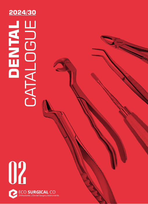 Catalogue
Eco Surgical Co · 232 pages
View Catalogue → Catalogue
Janletic Sports · 36 pages
View Catalogue →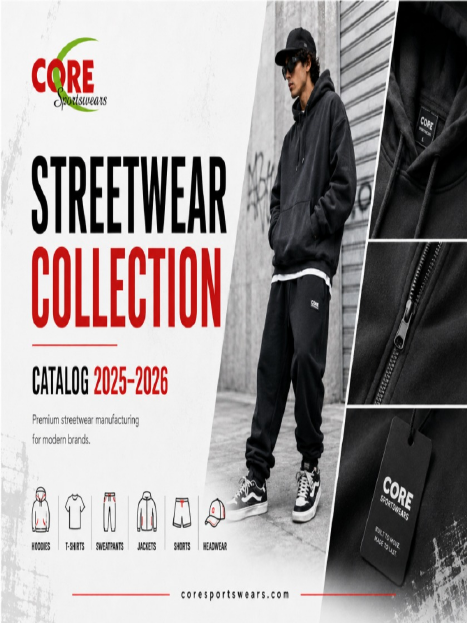 Catalogue
Core Sportswears · 62 pages
View Catalogue →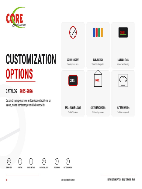 Catalogue
Core Sportswears · 14 pages
View Catalogue →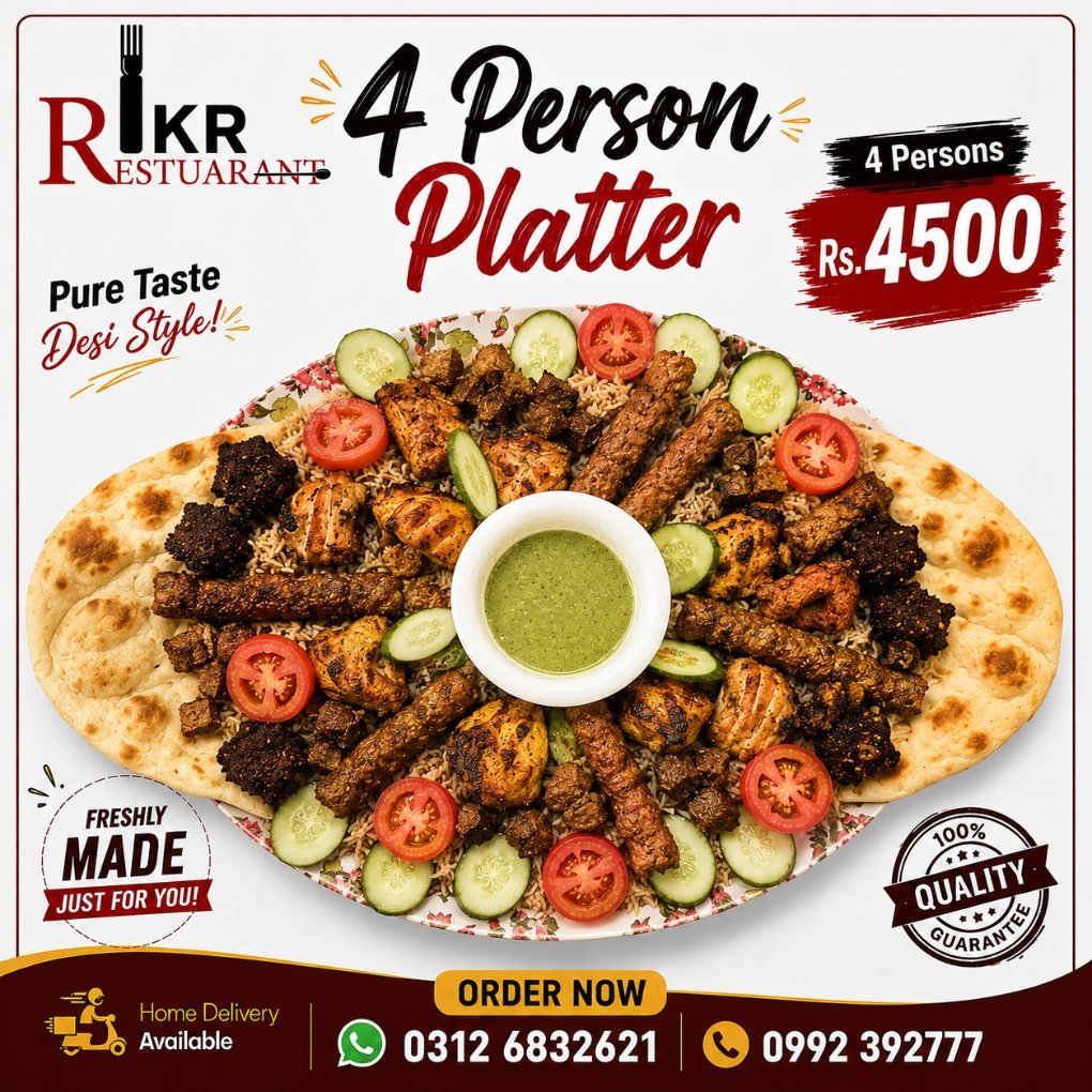 Social Media
IKR Restaurant (Inam Khan Restaurant) · Social Post
Social Media Management →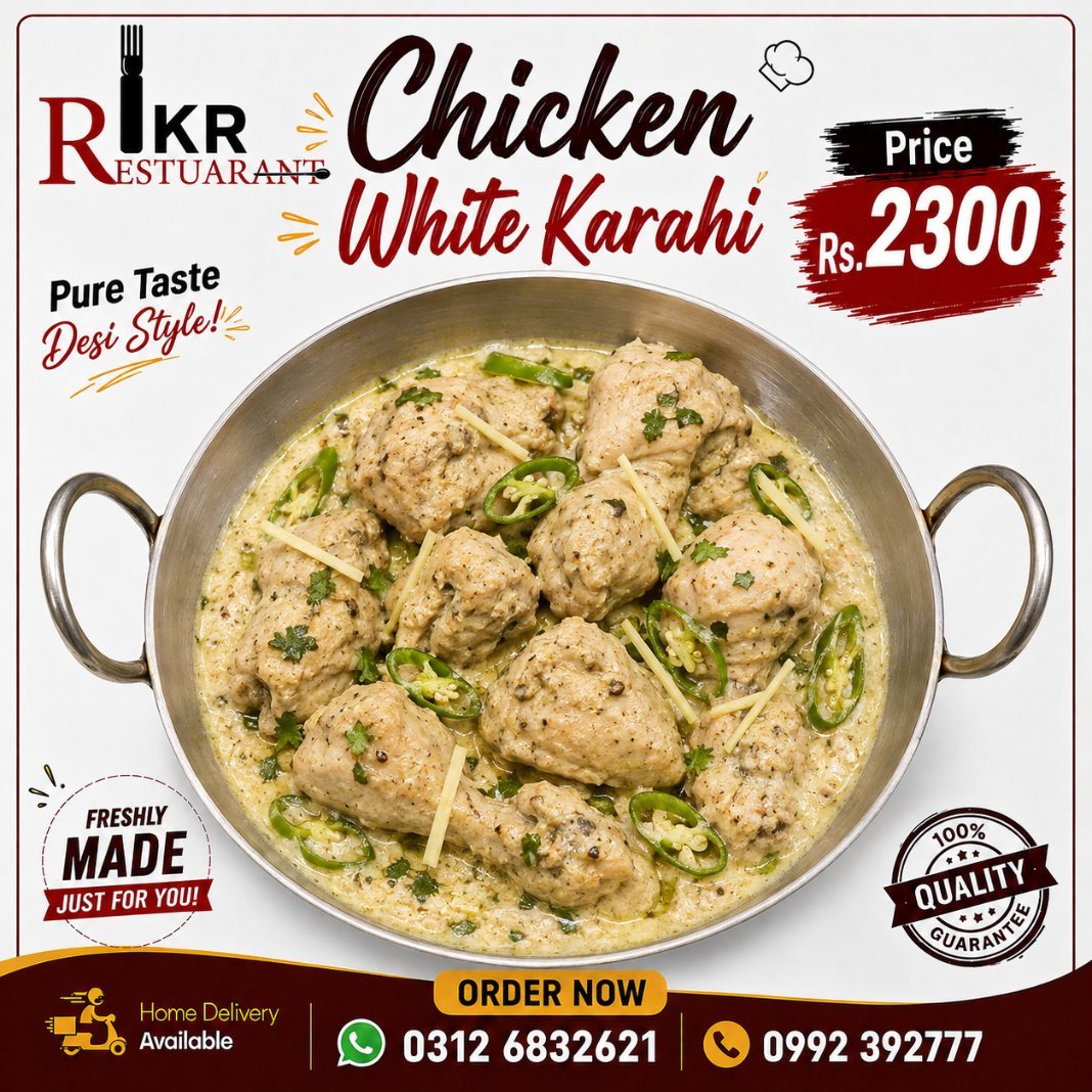 Social Media
IKR Restaurant (Inam Khan Restaurant) · Social Post
Social Media Management →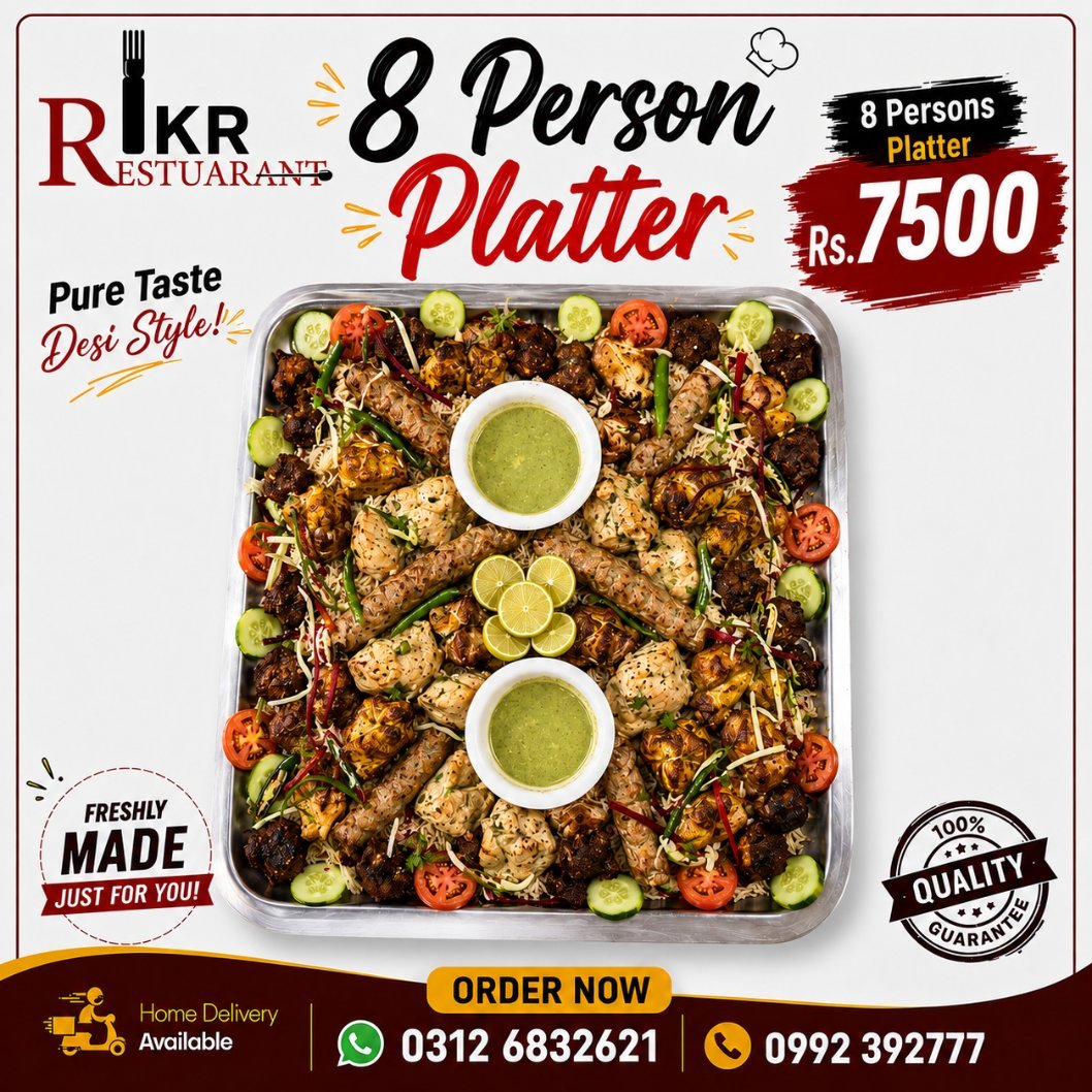 Social Media
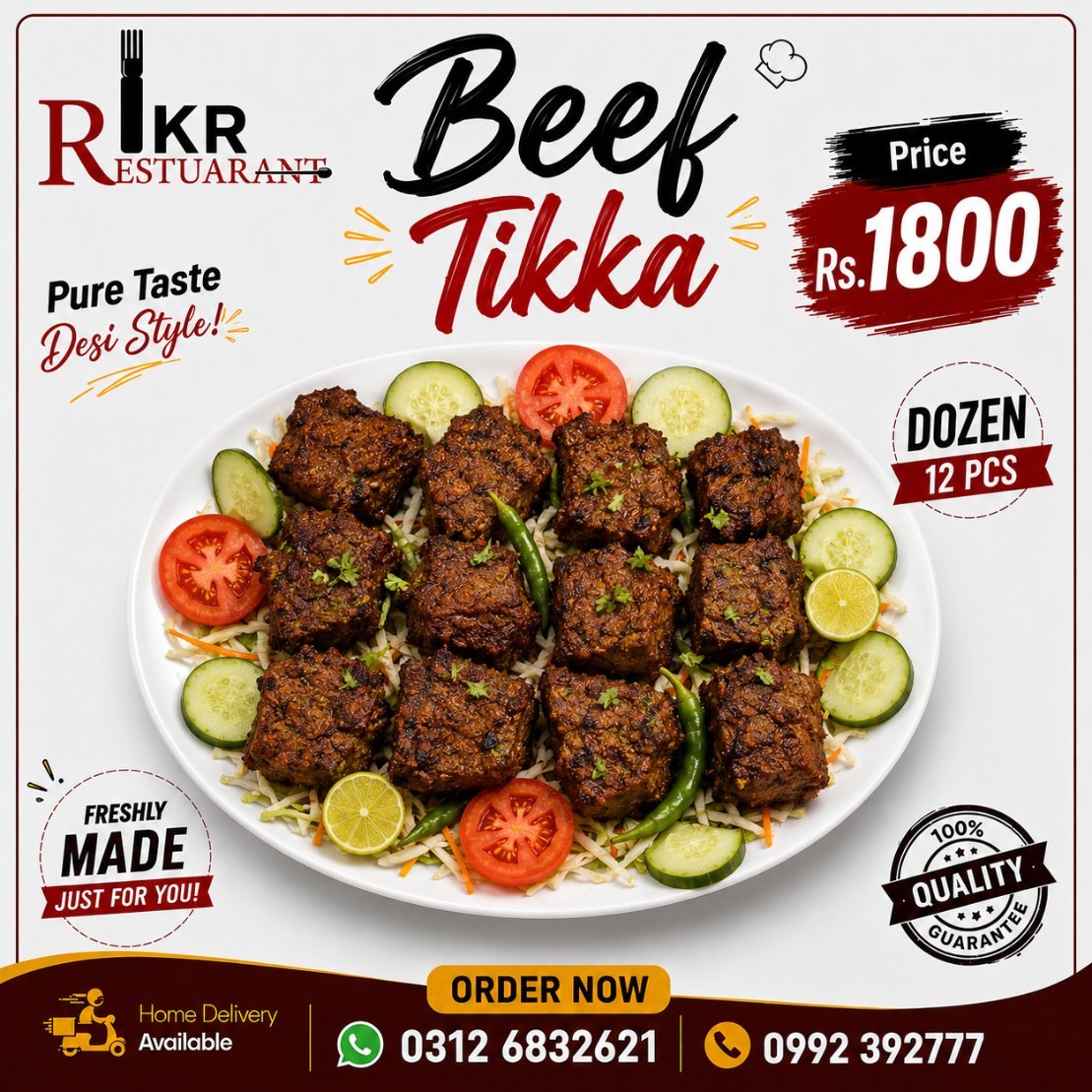
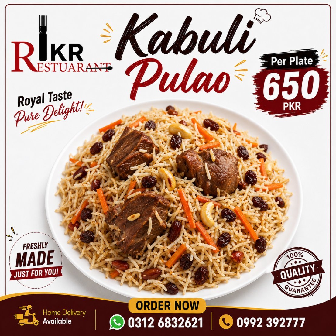
IKR Restaurant (Inam Khan Restaurant) · Social Post
Social Media Management →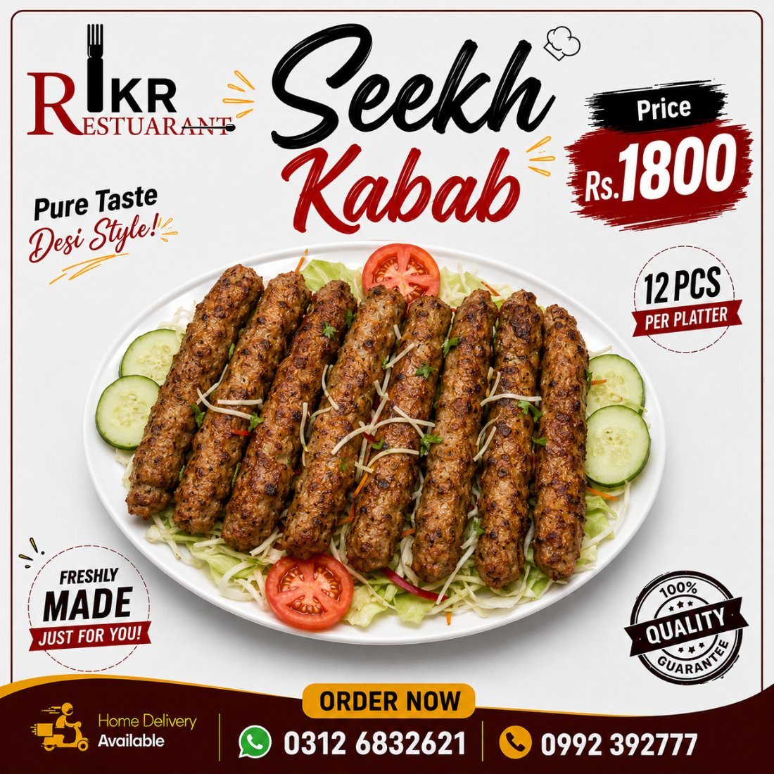 Social Media
 Social Media
 Social Media
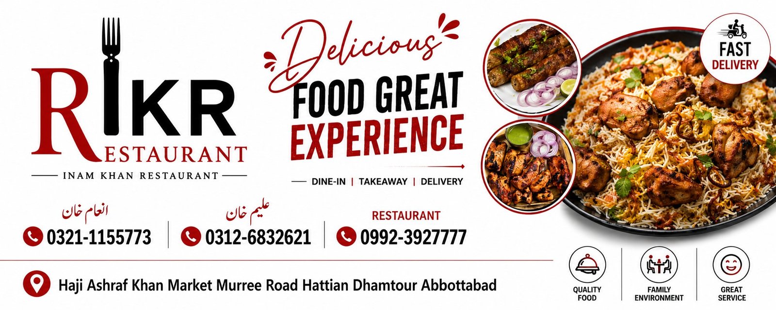 Banner
Outdoor Flex Banner — Abbottabad
Graphic Designing →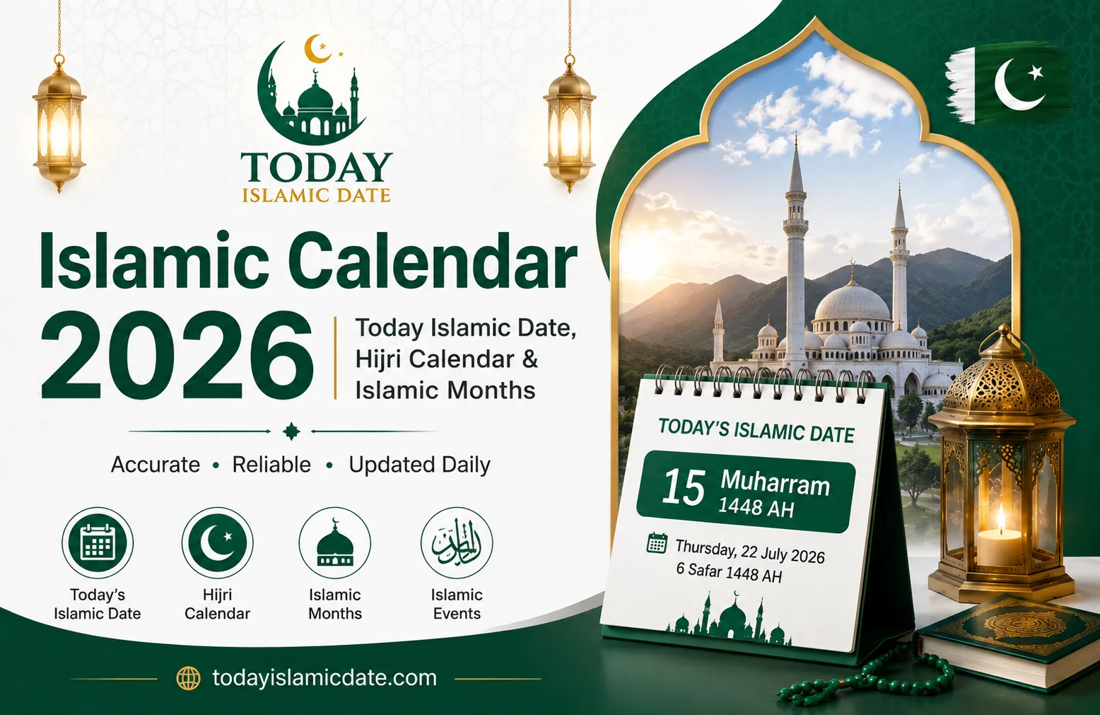 Social Media
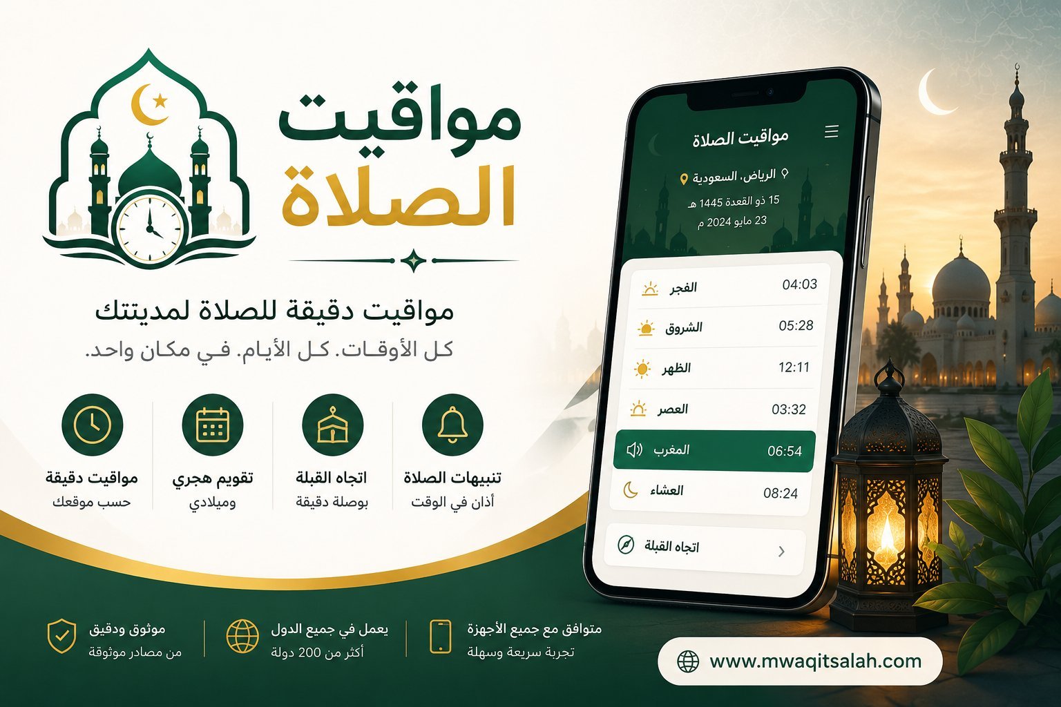 Social Media
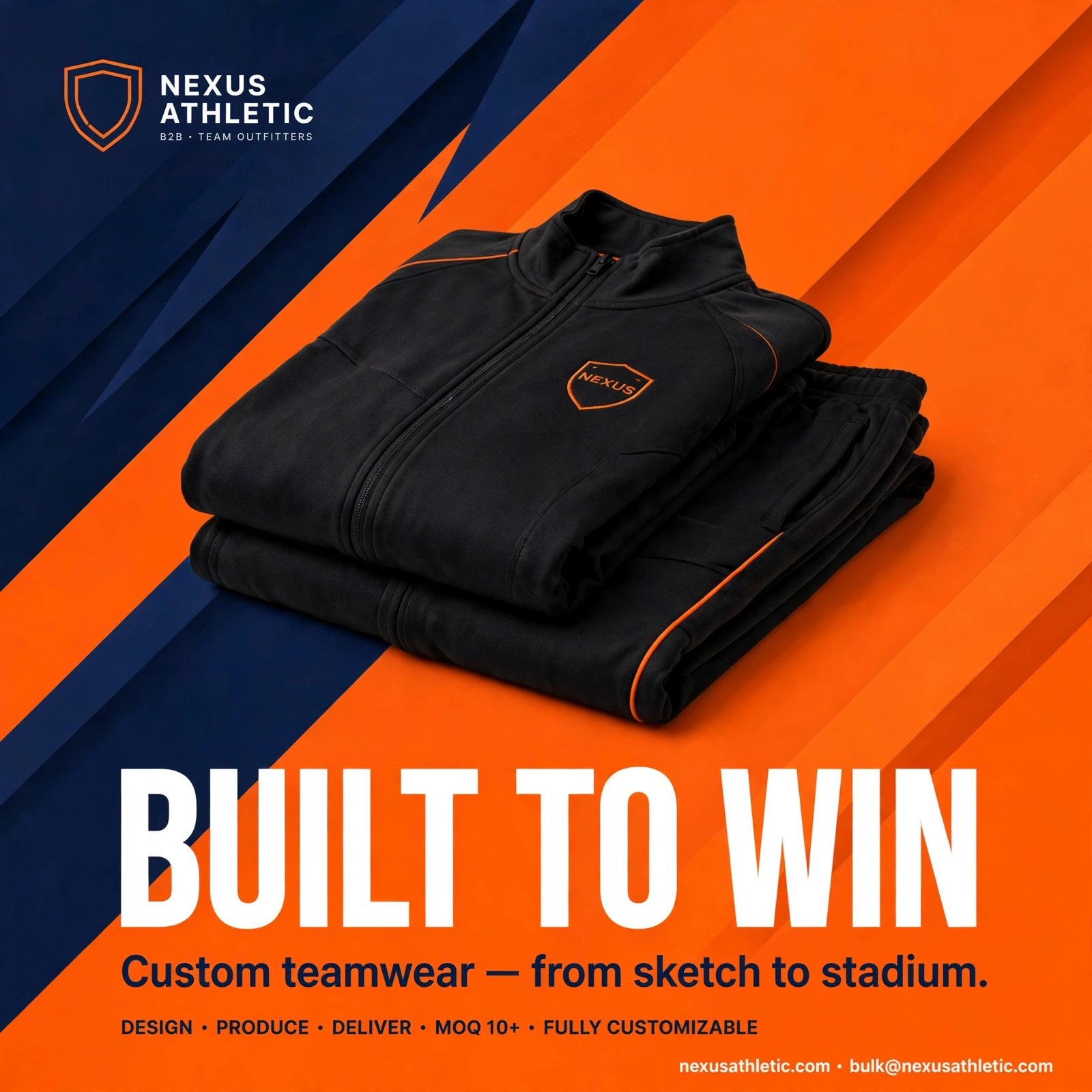 Social MediaSample Work
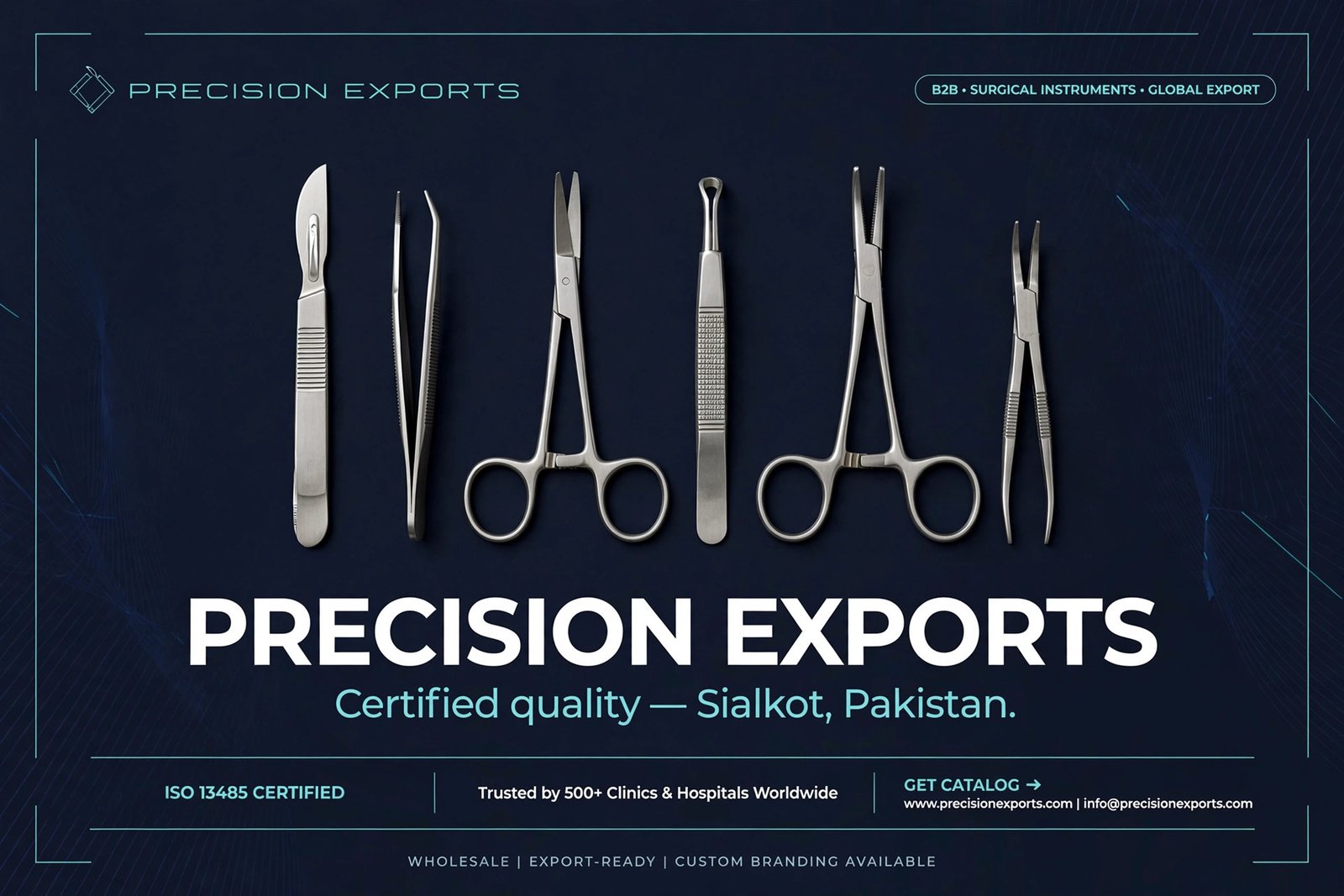 Social MediaSample Work
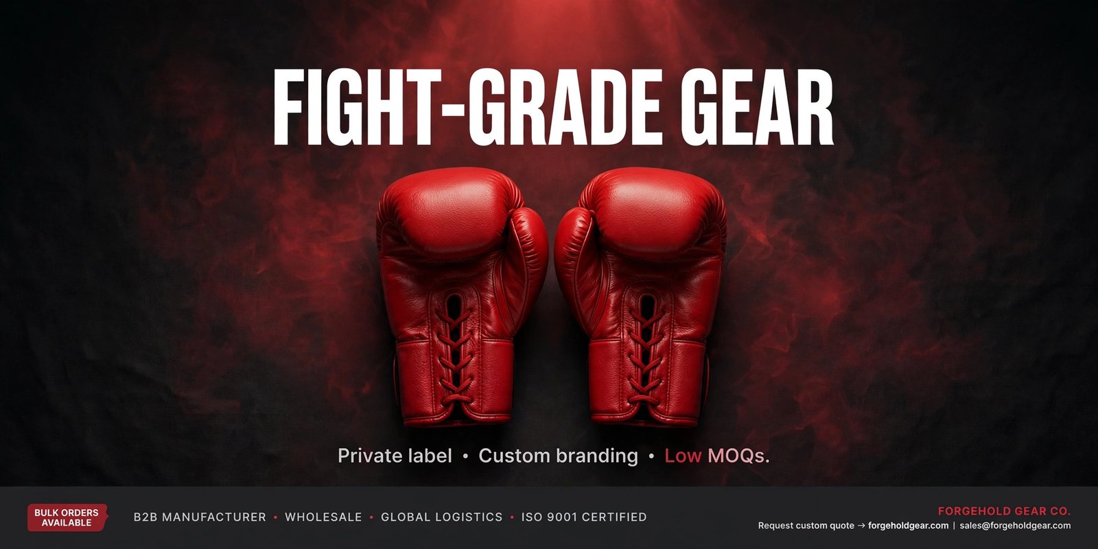 Social MediaSample Work
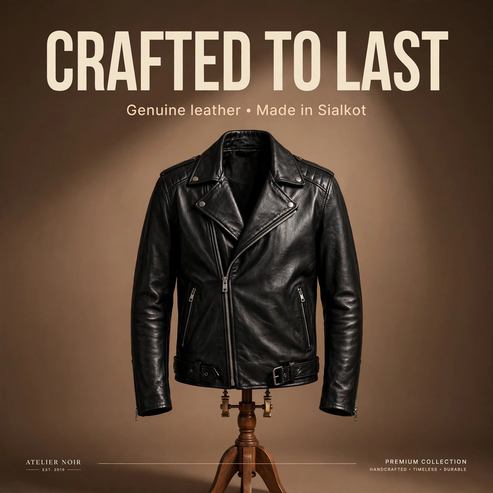 Social MediaSample WorkBanner
Outdoor Flex Banner — Abbottabad
Graphic Designing →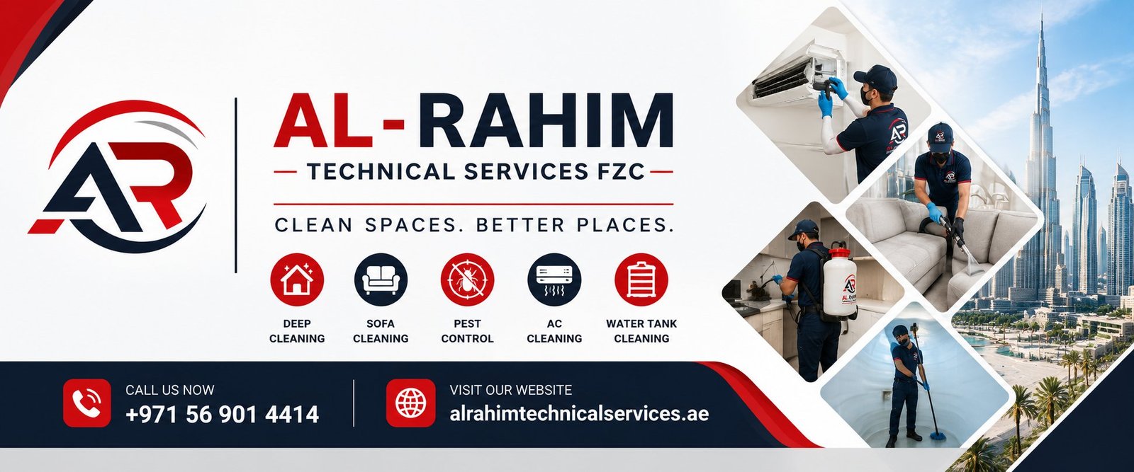 Banner
 Letterhead
Website previews are temporary thumbnails. Items marked "Sample" are design mockups — everything else is real client work.
Tell us about your business — we’ll design something that wins customers.
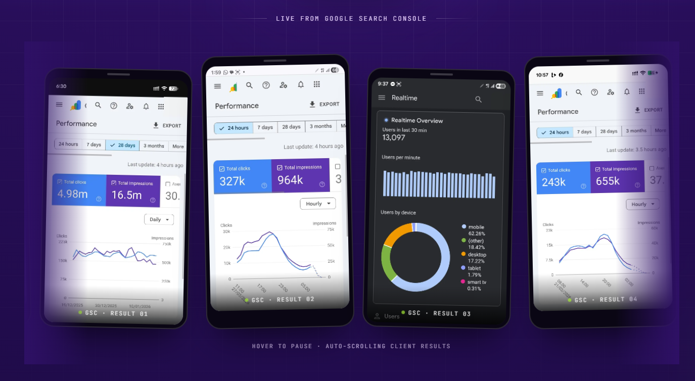
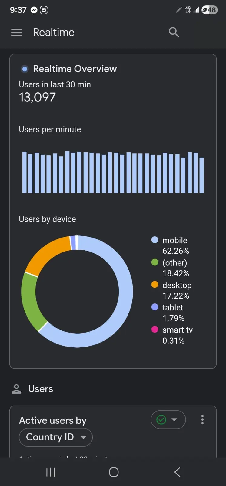
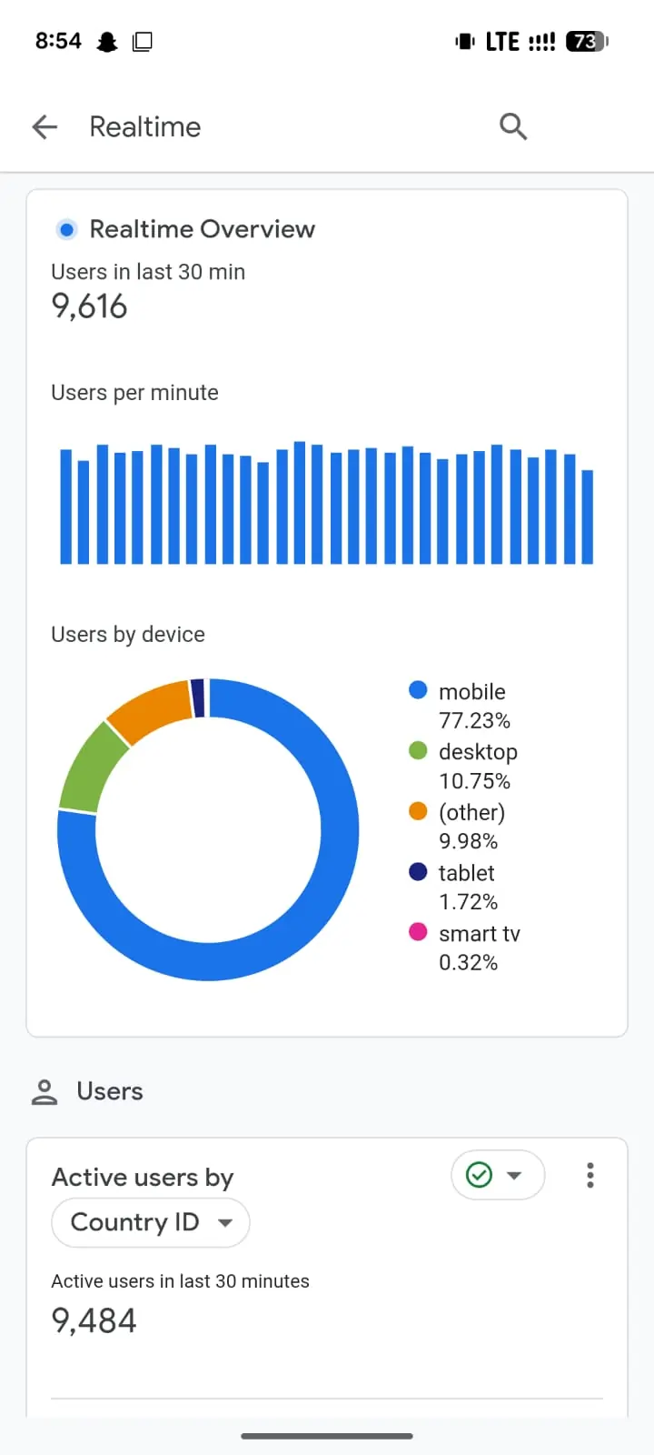
Sample results illustrating the outcomes our SEO work targets — traffic, rankings & leads.
Google Analytics Realtime — live screen recording of actual client traffic
International SEO for an exporter's website
SAMPLE RESULT
Local SEO for a Sialkot service business
SAMPLE RESULT
Google Maps SEO for a restaurant
SAMPLE RESULT
Website + SEO for a manufacturer
SAMPLE RESULT
Transparent starting prices on our most booked services — confirmed with an exact quote after a free consultation.
Business Website
Monthly social media management
Professional export catalogue
Prices are starting from — the exact quote depends on scope and is confirmed free of charge before any work begins. See all 20 service packages on the pricing page.
Sample testimonials in the style of feedback our clients share.
"Our Google Maps ranking changed everything. Takeaway orders doubled within three months of working with them."
"They run our Instagram and Meta Ads. Every rupee is tracked, and the reports are in plain language I actually understand."
"Our old website was embarrassing. The new one looks world-class and foreign buyers mention it on calls."
"Bookings come straight from Google now. Best decision we made for the business this year."
"Catalogue, logo, company profile — one team handled all of it. Professional from the first meeting."
"Meta Ads finally profitable. They test constantly and never waste budget on what doesn't work."
A clear, proven process — click each step to see what happens.
We dig into your website, ads, competitors and goals — so every recommendation is based on facts, not guesses.
01A plan built around your business and budget — no templates, no copy-paste packages.
02Website fixes, campaigns and content go live. You approve everything before it ships.
03Weekly improvements driven by real data. What works gets more budget; what doesn't gets cut.
04Transparent monthly reports and clear next steps — you always know what's happening and why.
05We don't just build websites — we grow your business, attract buyers, and turn clicks into customers.
Real specialists, not generalists — people who design, rank, advertise and write every single day. That daily practice shows in every website, campaign and brand we ship.
We measure campaigns in leads, sales and inquiries — not vanity likes. If it doesn't move your business, it doesn't count.
Clients stay with us because we communicate clearly, deliver on time and report honestly. Trust is earned month after month — never bought.
Only ethical SEO practices that Google rewards — no spam, no PBNs, no shortcuts. Strategies designed to compound safely over time.
No copy-paste packages. Every plan is built around your business, your market and your budget — factory, retailer or restaurant.
Monthly reports you actually understand — what we did, what it earned you, and what's next. You always know where every rupee went.
Many business owners tell us they avoided agencies because they feared two things: hidden charges and confusing reports. So we removed both. Every price on this site is a clear starting point, and your exact quote is confirmed in writing before any work begins. You will never see a surprise bill from us.
Here is how a typical project goes. You contact us by phone, WhatsApp or the form below. Within 24 hours we reply and set up a free consultation. We study your current online presence and share an honest audit — what is fine, what needs fixing, and what it will cost. You approve the plan. Then we get to work, and you get regular updates in simple language: what we did, what changed, what is next.
Everything we build belongs to you. Your website, your ad accounts, your social pages, your data. If we ever part ways, you keep it all — no lock-in, no hostage situations. That is how a marketing company in Sialkot should treat its clients, and it is why our clients stay with us and send their friends. From social media management in Sialkot to full export campaigns, the process stays the same: honest, clear and built around your goals. Want practical advice first? Read our local SEO tips for Sialkot businesses and see how we think.
Free audit, honest advice, zero pressure. Tell us where you are — we'll map where you can go.
Advert Solutions is a full-service marketing agency in Sialkot — and if you're looking for the best marketing agency in Sialkot, talk to us before you sign anywhere else. We're a digital marketing agency Sialkot businesses trust for websites, SEO services in Sialkot, export marketing, Meta & Google Ads, social media management and design that grows revenue — not just looks.
From surgical exporters chasing US buyers to retailers winning Google Maps, our online marketing in Sialkot strategies serve both engines of Sialkot's economy. One team, every channel, honest reporting — that's why businesses choose this marketing company in Sialkot as their growth partner.
Export websites, SEO and marketing — answered straight.
Yes. Foreign buyers Google suppliers before placing orders — usually in English, with buyer keywords like 'surgical instruments manufacturer Pakistan'. When your website ranks for those terms, inquiries come directly to you — no platform fees, no competition for the same listing. That's why exporters call SEO their highest-ROI channel.
Alibaba puts you beside thousands of identical listings where buyers punish you on price. Your own website is the one place you control the story: your factory, certifications, catalogue and reviews. Serious buyers Google your company name before ordering — and what they find decides the deal. Read more in our Alibaba vs. your own website breakdown.
Most of our services start from Rs 9,999 as one-off projects, with monthly marketing packages from Rs 24,999/mo. Every figure on our pricing page is 'starting from' — your exact quote is confirmed free after we understand your scope. No hidden charges, ever.
Google Maps and local wins often show in 30–90 days. Competitive English buyer keywords take 3–6 months of consistent work. Anyone promising overnight #1 rankings is either lying or using tricks that will get you penalized — we'd rather give you the honest timeline up front.
100%. Everything is set up in your accounts, under your ownership — your website, your ad accounts, your analytics. If we ever part ways, it all stays with you. It's your business; we're the team that grows it.
Yes — most of our clients are small and local businesses. Plans are tailored to your budget, and we focus spend where it returns the most. A free consultation will tell you honestly what's worth doing first.
No honest agency can guarantee rankings — and anyone who does is selling you a story. What we guarantee: a proven process, ethical work, and transparent monthly reporting. Our strategies consistently grow traffic, leads and sales for the businesses we work with.
Yes. Most of our work is online, so location does not limit us. We have clients in other Pakistani cities and abroad. But being based in Sialkot means local clients can also meet us face to face at our office on Khadim Ali Road.
Yes. We create posts in English, Urdu, or a mix of both — whatever your customers respond to best. For exporters we keep it professional English; for local Sialkot audiences we can use the language your customers actually speak.
Both. Logos, websites, catalogues and company profiles are one-time projects with a fixed quote. SEO, social media management and ad campaigns run as monthly packages because they need ongoing work. You choose what fits your budget — check our pricing page for the starting figures.
Always. No jargon, no ten-page reports full of charts you did not ask for. We tell you what we did, what it means for your business, and what happens next — in words anyone can understand.
Practical guides on exporting, marketing & growing online.
Google is where foreign buyers shortlist Sialkot suppliers. Here's why SEO is your most powerful export asset.
Read article →Alibaba puts you in a price war with thousands of factories. Here's the smarter path to direct foreign buyers.
Read article →Factories compete on price — brands command premiums. How Sialkot exporters build brands buyers pay more for.
Read article →Our office in Sialkot — walk in for a free consultation & chai.
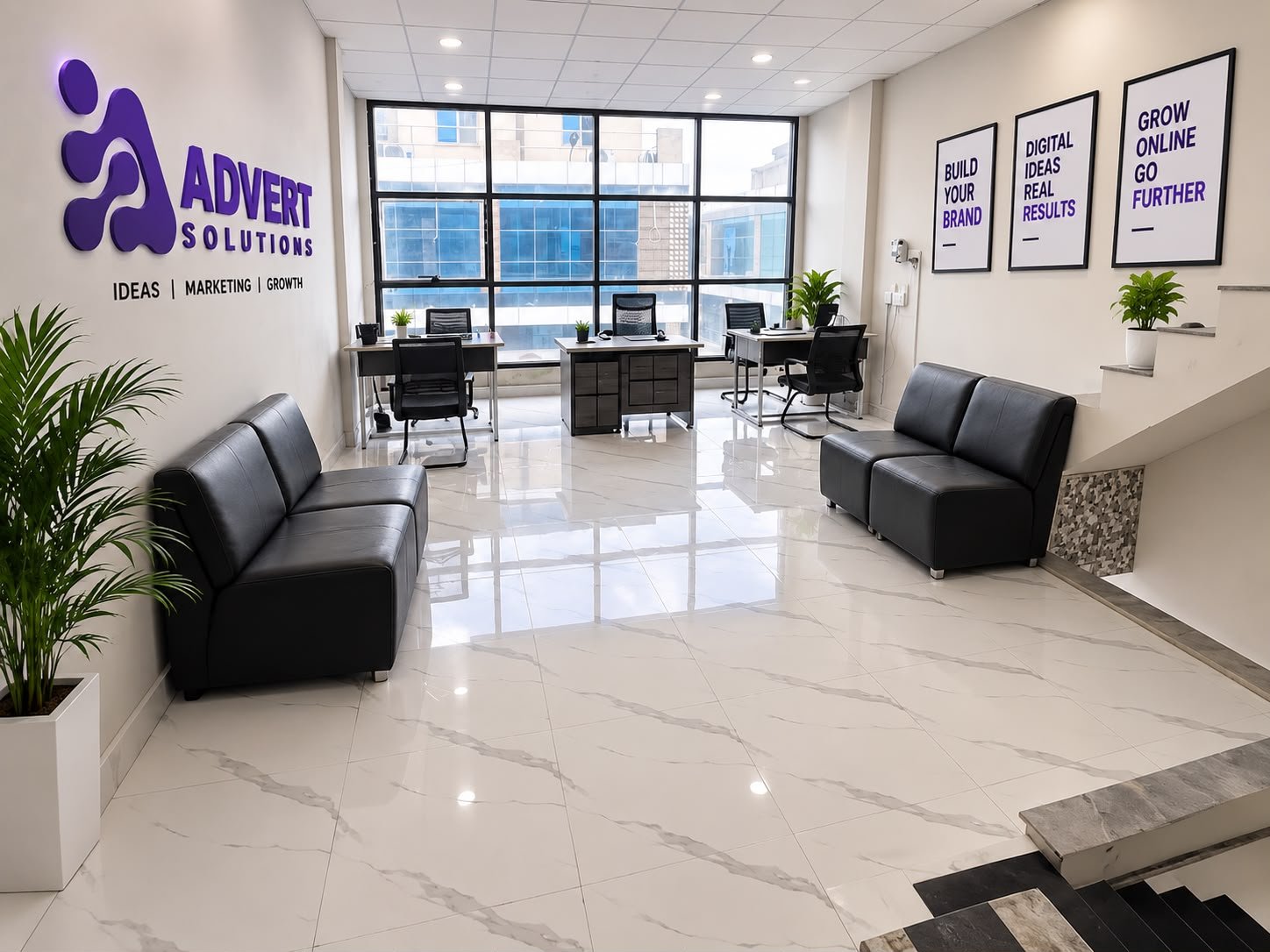
Khadim Ali Road, Kotli Behram, Sialkot, Pakistan
📞 +92 371 4200173
Advert Solutions is a full-service digital marketing agency in Sialkot, Pakistan. We help businesses, manufacturers, exporters, and brands grow online through website development, SEO, digital marketing, and creative design. Our goal is to help businesses reach more customers, build a strong online presence, and achieve long-term success.
Advert Solutions started with a simple observation: Sialkot has world-class products but most local businesses are invisible online. Exporters with decades of experience still wait for buyers to find them through middlemen. Shops with loyal customers cannot be found on Google Maps. We started this digital marketing agency in Sialkot to fix exactly that.
We are based right here in Sialkot, Pakistan — not in Lahore, not in Karachi, and not overseas. That matters. We understand the sports goods exporter who needs German buyers, the surgical manufacturer who needs American distributors, and the restaurant owner who just wants more footfall on a Friday evening. We speak your language, we work in your timezone, and you can walk into our office and talk to us face to face.
We are a small, focused team. When you work with us, you talk directly to the people doing the work — no account managers passing messages, no juniors learning on your budget. Every project gets the same care whether it is a startup's first logo or a full export marketing campaign. That is the whole idea behind our marketing agency in Sialkot: honest work, clear communication, and results you can actually see. Our SEO services in Sialkot have helped businesses get found by the exact customers they were missing.
Advert Solutions is a digital marketing and IT agency based in Sialkot, Pakistan. We work with local businesses, manufacturers, exporters, and growing brands to help them succeed online. Our services include website development, e-commerce solutions, search engine optimization (SEO), Google Ads, social media marketing, graphic design, branding, and custom software development. We focus on understanding each client's needs and providing simple, effective solutions that help their business grow. From building a professional website to improving online visibility, we are here to support our clients at every step.
To become a trusted digital marketing and IT agency in Pakistan, helping businesses of all sizes grow online. We aim to make digital solutions simple and accessible while helping our clients build successful brands in the global market.
Our mission is to provide high-quality website development, SEO, digital marketing, and creative design services. We focus on understanding our clients' needs, delivering practical solutions, and building long-term relationships through honest work and reliable support.
Our goal is to help businesses attract more customers, increase online visibility, and grow their revenue. We want to give every client the right digital tools and strategies to compete in today's online market.
We believe every business deserves a strong online presence. That's why we provide services that meet different business needs, from small local companies to large manufacturers and exporters.
Website development, SEO, advertising, branding, and more under one roof.
We understand your business goals before starting any project.
We create professional websites and designs that represent your brand.
We build websites with search engines and user experience in mind.
We provide ongoing support to help your business grow.
We offer services designed to meet different business needs and budgets.
Three rules guide everything we do.
If your website only needs small fixes, we will tell you — we will not sell you a full rebuild. If paid ads are wrong for your budget right now, we will say so and suggest what to do instead. Our free audit is genuinely free advice, not a sales trap. We would rather earn your trust with the truth than earn a quick payment with a story.
Your website, your ad accounts, your social media pages, your analytics — everything is set up under your ownership, from day one. If we ever part ways, you keep it all. Many agencies hold client assets hostage to keep them paying. We think that is wrong, and we built our whole process the opposite way.
We explain our work in words anyone can understand. You will know what we did this month, why we did it, and what it means for your business. No jargon-filled reports, no hiding behind technical terms. From website development in Sialkot to monthly marketing retainers, you always know where your money goes. And if you ever want to check what things cost before calling us, our pricing page shows every starting figure openly.
At Advert Solutions, we offer a range of digital services to help businesses build, manage, and grow their online presence.
We create modern, responsive, and user-friendly websites that help businesses present their services and reach more customers.
View Service →We help businesses improve their Google rankings, attract organic traffic, and reach customers searching for their services.
View Service →We help businesses reach their target audience through online advertising and social media campaigns.
View Service →We create logos, catalogues, social media posts, and other creative designs that help businesses build a consistent brand identity.
View Service →We build online stores that make it easy for businesses to display products, manage orders, and sell online.
We develop business software to help companies manage their daily work, improve efficiency, and save time.
The team behind Advert Solutions' growth.




Behind every successful project is a dedicated team. Our team includes creative designers, web developers, SEO specialists, and digital marketing professionals who work together to deliver quality solutions. We share ideas, solve problems, and focus on helping our clients achieve their business goals.
Hiring an agency from another city — or another country — looks cheaper on paper until the problems start. They do not answer during your working hours. They have never heard of your industry. They cannot meet you, see your factory, or understand your customers. And when something goes wrong, you are one email in a long queue.
Working with a digital marketing agency in Sialkot changes all of that. We can visit your office or factory, photograph your real products, and meet your team. We already know how Sialkot's export industries work — the trade fairs, the buying seasons, the way foreign buyers search. That local knowledge goes straight into your website copy, your ad targeting, and your SEO strategy.
It also means accountability. We live in the same city as our clients. Our reputation is built one local business at a time, and we protect it fiercely. When your neighbour asks who built your website, we want you to point at us with pride. If you are an exporter still wondering whether online marketing is worth it, read our guide on why every Sialkot exporter needs a website — then come talk to us and we will show you what is possible for your business.
Ready to take your business online? Let Advert Solutions help you build a strong digital presence with the right solutions for your business.
A distributor in Texas needs a new private-label glove supplier. A club chain in Australia wants custom team kits. Their journey starts the same way: Google, supplier shortlists, website comparisons, then inquiries to two or three finalists. If your sports goods company isn't visible and convincing at each step, you lose before the conversation starts.
SEO targeting terms like 'custom boxing gloves manufacturer', 'sublimated team uniforms supplier' and 'private label sportswear Pakistan' brings distributors to you on autopilot. These keywords have clear commercial intent — the searcher wants a supplier, not information. Each first-page ranking is a 24/7 salesperson.
B2B buyers are busy. Your website needs quote forms tailored to wholesale (quantities, customization options, target prices), WhatsApp chat for instant questions, and downloadable catalogues. Every extra step loses buyers — audit your inquiry flow ruthlessly.
Build lists of distributors, retail chains and brands in your target markets, then reach them with LinkedIn Ads and direct outreach. Share content that proves capability: factory videos, quality processes, new product launches. B2B buyers buy from companies that look active and invested.
Your digital catalogue is your traveling salesman. Professional catalogue design with customization options clearly presented (sublimation, embroidery, fabrics, MOQs) lets a buyer evaluate you without a call. Pair it with mockup design showing their branding on your products — nothing accelerates a decision like seeing their logo on your jersey.
Track inquiries per channel, cost per qualified lead and inquiry-to-order rate. Double down on what produces real RFQs, not vanity traffic. B2B lead generation is a system — build it once, refine it monthly, and it compounds.
Here's the painful truth: most Sialkot exporters lose deals not for lack of leads, but for lack of follow-up. A distributor inquires on Monday; the reply comes Thursday; by then they've shortlisted two responsive competitors. In B2B, speed is a competitive weapon — the first professional response often wins.
Build a system: instant auto-acknowledgment, personal reply within 4 business hours, WhatsApp as a backup channel, and a simple CRM (even a spreadsheet) tracking every inquiry's stage. Add a nurture sequence for quotes that go quiet — a short 'checking in, anything you need on specs or pricing?' email after 7 and 21 days revives a surprising number of dead conversations.
A single international trade fair costs flights, hotels, booth fees and a week of your team's time — for three days of foot traffic. Digital lead generation costs less annually and works every day. This isn't an argument against fairs (relationships matter); it's an argument about portfolio balance.
The smartest Sialkot exporters use digital to multiply fair ROI: run LinkedIn outreach to buyers before the fair ('we'll be at Hall 4, booth 12'), capture every booth visitor into an email sequence, and retarget fair contacts with ads afterward. Digital turns a three-day event into a three-month pipeline.
Online B2B buyers compare faster than fair visitors — your pricing structure must be clear. Publish MOQs plainly (hiding them just creates friction), offer tiered volume pricing that rewards bigger orders, and be transparent about what's included (packaging, labeling, shipping terms).
For private-label inquiries, speed of quotation matters enormously. Prepare template quotes for your top 20 products so your team can respond within hours, not days. The exporter who quotes first with professional documentation sets the anchor price — everyone else is compared against it.
Every quarter you delay, competitors compound their advantage in search rankings and buyer relationships. The exporters who started systematic digital lead generation two years ago now have pipelines that run without them — while everyone else still chases the same fair contacts. Pick one channel, execute it well for 90 days, then add the next. Momentum beats perfection.
SEO for compounding inbound plus LinkedIn for proactive outreach. Together they cover buyers who search and buyers you target directly.
Professional presentation: better website, better catalogue, faster response. Most competitors underinvest in all three — it's an easy gap to exploit.
Many manufacturers add D2C as a second revenue stream. It requires e-commerce and marketing investment, but the margins justify it for strong brands.
Within 4 business hours ideally. B2B buyers shortlist fast — the first professional, complete response has a major advantage.
Get a free consultation — we'll map the fastest path for you.
Most Sialkot exporters think branding is for consumer labels — the big names on shop shelves. "We sell B2B," they say. "Buyers care about price and quality, not logos." Half right. Buyers do care about price and quality — but they decide who delivers both based on signals, and every one of those signals is brand. A strong exporter brand commands higher prices, opens better doors, and builds a pipeline that keeps growing. Here is how it works.
Put yourself in a German distributor's office, choosing a supplier you've never met and will pay $50,000 on trust. You can't inspect the factory; you can inspect the logo, the website, the catalogue, the email signature, the packaging photos. Irrelevant? Not at all — buyers use these as evidence of professionalism: care about your own name implies care about their orders.
Weak branding doesn't tell buyers your products are bad. It tells them you might be. Strong branding does the opposite — it lowers perceived risk, which is the real currency of B2B.
Many exporters are quietly comfortable: no brand of their own, they manufacture for others' labels. It can pay the bills, but it's fragile — lose one private-label client and the revenue hole is enormous. Worse, you accumulate zero equity: no buyer ever asks for you by name.
Building an exporter brand while serving private label isn't contradiction but insurance. It means direct enquiries arrive alongside contract work, you can eventually sell direct in some markets, and your negotiating power with big clients rises. A brand is leverage.
Strip away the art-school talk and brand does four jobs for an exporter. One, legitimacy: a professional identity marks you as an established operation, not a faceless trader. Two, consistency: consistent look and tone across website, catalogue and emails signals process-driven production. Three, premium position: premium presentation justifies non-premium pricing anxiety. Four, memorability: buyers choose between dozens of near-identical factories; the one with the name, the story, the feel is the one they remember.
These are not vanity benefits. They are competitive weapons.
Exporter brands are built from five assets, in this order of impact: first, an identity system (a proper logo, colors, typography that reads as industrial-grade, not cheap and cheerful). Second, a company profile that buyers actually read — factory story, certifications, capacity, contact — in a designed PDF they can forward to their boss. Third, a catalogue with photography that makes products look premium. Fourth, a website that carries the same authority online. Fifth, packaging and shipping materials that keep the promise when the order arrives.
Notice the pattern: every buyer touchpoint carrying the same confident identity. That coherence is the brand.
Two factories make identical surgical sets. One has a dusty logo, a brochure last updated in 2015, and a Gmail address. The other has a crisp identity, professional catalogue, fast website and branded responses. The second one wins at 10–20% higher prices — not because product is better, but because the buyer's risk is lower and the perceived value is higher.
This premium compounds. Over hundreds of orders, that margin is the difference between scraping by and investing in machinery, staff and further marketing — which builds the brand further. Strong brands literally buy themselves.
Building an exporter brand doesn't take years. Weeks 1–2: identity audit and logo/brand refresh if needed. Weeks 3–5: company profile and core sales collateral designed. Weeks 6–9: catalogue design with proper product photography direction. Weeks 9–12: website refresh carrying the identity online.
Nobody does this casually in-house — it requires creative direction plus export-industry understanding. Agencies that serve exporters (like ours) do it constantly and get it right the first time.
Watch for the classics: an inconsistent logo across assets (different colors, different fonts), stock photos of random European factories instead of your own floor, Gmail/Yahoo addresses instead of a domain email, and "catalogues" that are hastily merged photos with clip-art backgrounds. Each one whispers the same message: we don't invest in ourselves.
Flip each: consistent identity, real photography, domain emails, professionally designed sales material. None of this requires a fortune — just an exporter thinking of brand as infrastructure, not decoration.
Remember: buyers can't smell your leather or flex your instruments before buying. All they see is brand. Make it believe them.
Yes — buyers choose suppliers by perceived risk, and professional branding lowers it. Two factories with the same product: the branded one usually wins at 10–20% higher prices.
A consistent identity (logo, colors, typography), a readable company profile, a professional catalogue, a strong website, and branded packaging — every buyer touchpoint carrying the same authority.
About 90 days for identity refresh, company profile, catalogue and website alignment — doable while production continues.
Yes, as insurance and leverage: a brand brings direct enquiries alongside contract work, strengthens negotiation with big clients, and lets you sell direct in chosen markets.
Get a free consultation — we'll map the fastest path for you.
Before a foreign buyer visits your factory, they read your catalogue and company profile. These documents answer their real questions: Is this supplier professional? Can they handle my volume? Are they certified? Do they understand my market? Great design doesn't just look nice — it systematically builds the confidence to place an order.
Organize products the way buyers think (by sport, instrument type, or application — not your internal codes). Use consistent, well-lit product photography with clean backgrounds. Show specifications clearly: materials, sizes, colors, packaging, MOQs. Include customization options prominently — that's your edge. End with clear contact details and a call to action, not a dead last page.
Tell your story as capability: founding and milestones, factory infrastructure with real photos, machinery and capacity numbers, workforce strength, certifications (ISO, CE, SEDEX), export markets served, and quality processes. Buyers are evaluating risk — every page should reduce it. Keep it tight: 10–16 pages that get read beat 40 that don't.
The biggest: inconsistent product photos (different backgrounds, lighting, quality) which scream amateur. Next: walls of unformatted text nobody reads — use infographics for timelines and capacity. And the classic: contact details buried or outdated. Audit yours today.
You need both. Print for exhibitions, factory visits and buyer meetings — where physical quality impresses. Digital PDFs for email and WhatsApp — which is how most first contacts happen. Design once, deliver both: our catalogue and company profile services in Sialkot produce print-ready and screen-optimized versions from the same design.
In catalogue design, photography quality matters more than layout creativity. Invest in consistent product photography: same background, same lighting, same angles across every product. For instruments, macro shots showing finish quality; for apparel, ghost-mannequin or flat-lay shots showing true shape and color.
Factory photography deserves equal care — buyers scrutinize production photos for cleanliness, organization and modern equipment. A professional half-day shoot of your facility pays for itself many times over in buyer confidence. Phone snapshots in poor lighting actively undermine the premium story your text is telling.
Buyers don't read catalogues cover to cover — they search. Include a clear index, consistent product coding, and specification tables they can scan in seconds. Group by buyer logic (sport, instrument specialty, application), and put your best-sellers and highest-margin lines where eyes land first.
For digital PDFs, add clickable navigation: linked index entries, bookmarks for each section, and hyperlinked contact details. A 60-page PDF without navigation is a chore; with it, it's a tool buyers keep open on their desktops. Small details — page numbers on every spread, your logo and contact on every section divider — make catalogues feel professional.
Think of your company profile as answering the buyer's risk checklist in order: Who are you (history, ownership)? What can you make (capabilities, machinery, capacity figures)? How do you ensure quality (processes, certifications, inspection)? Who already trusts you (markets served, client types)? How do we start (contact, inquiry process)?
Use real numbers wherever possible — '120 skilled workers', '15,000 units monthly capacity', 'exporting to 22 countries' — because specifics are believable and vagueness is suspicious. End with a clear next step, not a dead page: 'Request our complete product catalogue' with QR codes linking to your digital assets.
A well-designed PDF catalogue with clickable navigation, embedded videos and hyperlinked contacts outperforms print in day-to-day selling — it reaches buyers instantly via WhatsApp and email, costs nothing to distribute, and can be updated without reprinting. Design print and digital from the same master files: one investment, two formats, zero inconsistency.
The most damaging mistake is inconsistent product photography — mixed backgrounds, varying sizes and poor lighting make even quality products look amateur. Second: burying contact details — buyers who can't find your WhatsApp or email in seconds move on. Third: no digital version — in 2026, a print-only catalogue might as well not exist for first-contact situations. Fourth: outdated information — old prices, discontinued items and dead phone numbers destroy trust instantly. Audit your current catalogue against this list before your next buyer interaction; fixing these four issues alone transforms how your company is perceived.
At least annually, plus updates when adding significant products. An outdated catalogue (old prices, discontinued items) actively loses orders.
Core design yes, with adaptable sections. Some exporters add language-specific inserts for key markets like Germany or the Gulf.
Both — they serve different moments. The catalogue travels to buyers; the website captures buyers who search. Together they're your complete first impression.
For catalogues, yes — consistent clean backgrounds let buyers compare products and signal professionalism. Lifestyle shots belong in marketing, not spec catalogues.
Get a free consultation — we'll map the fastest path for you.
There is something poetic about a product stitched on a Sialkot worktable ending up in a Berlin apartment — ordered online, paid in dollars, shipped in days. That is the Etsy promise, and Sialkot's handmade strengths make it a natural fit. But Etsy success is not automatic: it rewards makers who treat it like a real shop, not a side listing. Here is the complete picture for Sialkot makers.
Etsy buyers are not price-hunters — they want handmade, authentic, storied products. A factory-made football won't fit, but handcrafted footballs, leather gloves, boxing accessories, wallets, surgical-instrument-inspired beauty tools, and musical instruments absolutely do. Sialkot's centuries of craft give you something Amazon sellers can't fake: a genuine production story.
That story — real makers, real workshops — is the single strongest asset you bring. Etsy shoppers pay premiums for exactly this.
Winners from Sialkot-style workshops include quality leather goods (wallets, tote bags, journals), fitness gear (boxing gloves, hand wraps, lifting straps), sports accessories, and musical instruments. Beauty tools made on surgical-precision machinery — tweezers, nail implements — are another strong lane when marketed honestly as beauty/grooming products.
Common thread: focused, giftable, and niche. The stores that sell "everything" struggle; the ones dominating a tight niche — say, leather journals or leather knife rolls — compound reviews and rankings fast.
Etsy takes a small listing fee per item plus a percentage of every sale, and if you opt into Etsy's offsite advertising (compulsory for bigger stores) another percentage applies. Factor in payment-processing and currency conversion, and sellers can pay 12–18%+ of revenue to the platform. None of this is a dealbreaker at US/EU price points — but model it before listing so your margins survive.
Rules also matter: products must genuinely be handmade (your own production qualifies), designs must be original, and honesty about materials and origin is required. Sialkot makers usually clear these bars comfortably, since you really do manufacture.
The biggest practical hurdle: Etsy Payments isn't available in Pakistan, which affects how quickly and smoothly you can withdraw. This is the point most Sialkot sellers stumble on, and the honest answer is research: policies change, and cross-border payment options like multi-currency business accounts and global payment services (Payoneer-style platforms) are the routes most Pakistani digital sellers use across marketplaces.
Set up your money flow before you ship your first order. A working store with frozen funds helps nobody. Keep records clean — buyers and tax documentation both appreciate clarity.
Etsy is a search engine. Titles must front-load the terms buyers actually search ("leather boxing gloves handmade vintage gift for him"), tags must mirror buyer phrases, and your shop title and about section feed search too. Copy competitors' best practices — then outwrite them.
Reviews compound: the first 20 sales matter enormously. Price early listings to move, over-deliver, and politely request reviews in your packing slips. Rankings on Etsy follow buyer trust signals, and nothing builds trust like dozens of 5-star reviews with buyer photos.
On Etsy, photography is your storefront. Shoot products on neutral backgrounds first, then in lifestyle settings — a leather bag on an actual traveller, gloves in a gym. Sialkot makers often under-invest here; the difference between dark mobile snaps and decent product shots is frequently the difference between 2 and 20 sales a month.
Your 'About' section is your brand moment: tell your real workshop story. Skilled craft, family workshops, Made in Sialkot pride — this authenticity is the niche Amazons of the world cannot copy.
International shipping is the operational crux. Pakistan Post's EMS and international parcels work for lighter goods and keep costs viable. Private couriers offer tracking and speed for higher-value items. Successful sellers publish honest delivery windows (buyers tolerate 10–14 days when told upfront; they don't tolerate surprises), provide tracking, and wrap genuinely well.
Price shipping into listings with buffer for easy customs documentation. Experience shows: buyers accept honest timelines; they never accept "lost" packages.
One, selling everything instead of a niche. Two, failing to register payments before launch. Three, ignoring Etsy SEO and relying on hope. Four, phone photos that undersell handmade quality. Five — the costliest — trying to compete on price with Chinese bulk sellers instead of commanding the handmade premium that Etsy buyers actually want to pay.
Avoid these five and you are instantly ahead of most newcomers to the platform.
The smart play: Etsy as a launchpad, your own brand as the endgame. Use your Etsy traffic to validate products and build capital — then extend into your own store and brand: your own website, your catalogue, your packaging, and your customer list.
Converting marketplace buyers into brand followers takes work (include your story and follow-up in every package), and it's the route from "selling on a platform" to "owning a business." If you want that upgrade built properly, our export marketing packages cover exactly this journey — website, logo, catalogue, packaging mockups and a direct-buyers pipeline beyond Etsy.
Yes — Sialkot makers sell leather goods, sports accessories and crafts globally on Etsy. The main hurdle is payments: Etsy Payments is not available in Pakistan, so research compliant payment routes and set them up before shipping.
Etsy charges a listing fee plus a percentage of each sale, plus optional advertising fees. Sellers should model 12–18%+ of revenue in total platform costs; US/EU price points usually absorb this with margin to spare.
Focused, giftable niches: leather goods, boxing gloves and wraps, sports accessories, beauty tools, and musical instruments. Focused niche shops dramatically outperform "everything" stores.
Use Etsy as a launchpad, then own your brand: your website, catalogue, packaging and customer list. Platforms take cuts and change rules; your brand keeps the margins.
Get a free consultation — we'll map the fastest path for you.
Your Google Business Profile (formerly Google My Business) is the listing that appears on Google Maps and in local search results — with your hours, phone, reviews, photos and directions. For 'near me' searches, it's often the entire decision: customers compare profiles and call the winner without ever visiting a website. And it's completely free.
Claim your business at google.com/business. Enter your exact business name (no keyword stuffing — Google penalizes it), select precise categories (primary + secondaries), add your complete Sialkot address, phone numbers, website, and hours including holidays. Verify via the postcard, phone or video method Google offers. Unverified profiles barely rank.
Add 10+ high-quality photos (storefront, interior, products, team) — profiles with photos get dramatically more calls. Write a keyword-rich business description. List all services with descriptions. Add attributes (women-led, wheelchair accessible, etc.). Post weekly updates: offers, new products, events. Enable messaging and respond fast. Each of these is a ranking and conversion lever your competitors ignore.
Reviews drive both rankings and customer choice. Build a system: after every happy transaction, send a WhatsApp message with your direct review link. Make it frictionless — every extra step halves response. Respond to all reviews within 24 hours, including negative ones, professionally and specifically. Never buy fake reviews — Google detects and penalizes them, and the damage is hard to reverse.
Wrong map pin location (customers can't find you), inconsistent phone numbers across listings, choosing the wrong category, ignoring the Q&A section (answer it yourself before strangers do), and setting up duplicate profiles. Audit yours against this list today.
Once optimized, your profile becomes a mini-website: bookings, product catalogues, and service menus can live right on Google. Pair it with local SEO — citations, location pages, local content — and you own your neighborhood's search results. Our SEO services in Sialkot include full Google Business Profile optimization and review strategy as standard.
Your profile has a public Q&A where anyone can ask — and anyone can answer. Unmonitored, strangers answer for you (sometimes wrongly). Seed it yourself with the 6–8 questions customers always ask — prices, timings, parking, delivery areas — and answer them thoroughly. Each Q&A is indexed content that ranks and converts researchers into callers.
Profiles with quality photos get dramatically more calls and direction requests. Upload storefront shots (so customers recognize you), interior, products, team at work. Refresh seasonally — Eid displays, new arrivals. Never upload just a logo: customers want to see the real place before visiting, and the decision happens in seconds.
Your free GBP insights show profile views, calls, direction requests and website clicks. Watch the monthly trend, not daily noise — climbing from position 8 to position 3 over a few months of consistent work is the system working. Pair with 'how did you hear about us?' at the counter to connect effort to revenue.
Your Business Profile handles 'near me' discovery brilliantly, but serious customers still click through to your website before calling — to see services, prices and credibility. A thin or missing website leaks the very customers your profile attracted. The profile brings them to your door; the website invites them in. Our website development service in Sialkot builds sites designed to convert exactly this Google-driven traffic.
A negative review, handled well, can actually win customers — it shows you're responsive and human. Respond within 24 hours, acknowledge the specific issue without being defensive, explain what you'll fix, and invite the conversation offline with a phone number. Never argue publicly, never offer bribes for removal, and never ignore it — silence reads as guilt. Future customers read your responses more carefully than the complaints; every reply is a public demonstration of your customer service. Over time, a profile with a few gracefully-handled negatives converts better than a suspiciously perfect one.
Yes — 100% free, no catch. Google monetizes ads around it, but the profile itself costs nothing.
Postcard: 1–2 weeks in Pakistan. Phone/video verification: often same-day when available.
Yes — each branch gets its own profile under one business account, each optimized for its area.
Yes — review quantity, recency and your responses are confirmed local ranking factors, and they directly influence which business customers choose.
Get a free consultation — we'll map the fastest path for you.
Website prices in Sialkot range from a few thousand rupees (a freelancer's template job) to several hundred thousand (a custom agency build). The huge range confuses buyers — so let's break down what you actually get at each level, and what a serious business should budget.
Five factors: design quality (template vs custom), page count and content, functionality (booking systems, catalogues, e-commerce), copywriting and SEO setup, and who builds it (freelancer vs agency). A 5-page brochure site and a 500-product e-commerce store are different projects with different prices — anyone quoting without asking questions is guessing.
Starter business website (5–10 pages, professional design): affordable four-to-five figure PKR investment. Business site with catalogue or booking: mid-range. Full e-commerce store: higher, driven by product count and payment/shipping integration. Custom web applications: quoted per project. These are investments, not costs — a site generating even a few extra customers monthly pays for itself quickly.
Ask about: domain and hosting renewals (annual), SSL, maintenance and updates, content changes (charged per change?), and who owns the files. The cheapest quote often becomes the most expensive when every small change is billed — or when you discover you don't own your own site.
Budget for the website plus year-one essentials: decent hosting, an SSL certificate, basic SEO setup, and a maintenance plan. Cutting these corners is like buying a car and skipping oil changes. Our website development service in Sialkot quotes transparently — one price covering design, build, SEO-ready setup and handover training, with no surprise bills.
Watch for these: no written scope (what exactly is included?), 'unlimited revisions' with no timeline (means no process), no mention of mobile responsiveness (non-negotiable in 2026), and prices that seem too good — they mean templates, outsourced work, or corners you'll discover later.
Also ask who writes the content. Many cheap builds expect you to supply all text and images — which delays projects for months. A proper agency helps with copywriting and image sourcing, because they know that's where projects stall.
To get comparable quotes, brief every developer identically: number of pages, examples of sites you like, must-have features (contact forms, WhatsApp chat, product catalogue, online payments), who provides content, and your deadline. Vague briefs produce vague quotes — the detailed brief gets you the honest price.
Ask each candidate: Can I see 3 live sites you built? Who owns the domain and files? What's included in year one? How do I request changes after launch? The quality of answers tells you as much as the portfolio.
A restaurant website that drives 20 extra monthly orders, a clinic site that fills 15 appointment slots, an exporter site that lands one new buyer — each pays for itself many times over. Calculate backwards from one new customer: if a customer is worth Rs. 5,000 to you and the site brings 10 monthly, that's Rs. 600,000 in annual value from a five-figure investment.
The businesses that regret website spending are those who bought the cheapest option and got a digital brochure nobody visits. Invest properly once — in design, copy, SEO setup and speed — and the site becomes an asset that compounds.
A cheap site that loads slowly, ranks nowhere and converts nobody isn't a bargain — it's an expense. Factor in the rebuild you'll need within a year, the customers lost to a poor first impression, and the SEO starting from zero twice. The true cost of a website is build price plus opportunity cost; the cheapest quote almost always has the highest total.
Because 'a website' means wildly different things — a template installed in a day vs a custom-designed, SEO-ready site built over weeks. Compare what's included, not just the number.
For a placeholder, maybe. For a business asset that brings customers — almost never. Weak sites cost more in lost business than they save in build cost.
We structure payments in milestones (advance, design approval, launch) so you never pay for work you haven't seen. Ask us for details.
Typically 2–4 weeks for a business site, 4–8 for e-commerce — assuming content is ready. Delays almost always come from content, not coding.
Get a free consultation — we'll map the fastest path for you.
This is the single highest-ROI local SEO action. Claim your profile, choose the right categories, add your exact address (Khadim Ali Road, Sialkot — consistency matters), phone, hours, services and high-quality photos. Businesses with complete profiles dramatically outperform incomplete ones in Maps rankings. Post updates regularly — Google rewards active profiles.
Reviews are a top Maps ranking factor and the first thing customers read. Ask happy customers systematically (a WhatsApp follow-up with your review link works wonders). Respond to every review — positive and negative — professionally. A thoughtful response to a bad review often impresses readers more than the review itself.
NAP = Name, Address, Phone. It must be identical across your website, Google profile, Facebook, and every directory listing. Inconsistent addresses ('Khadim Ali Rd' vs 'Khadim Ali Road') confuse Google and dilute your rankings. Audit and fix every listing.
If you serve Sialkot plus nearby areas (Daska, Sambrial, Wazirabad), create dedicated content mentioning these areas naturally. A page about your service 'in Sialkot' with genuine local detail (areas served, local landmarks, local phone numbers) outranks generic pages every time.
Get listed in Pakistani business directories, earn mentions from local websites, and create content about Sialkot topics your customers care about. Sponsor a local event and get the backlink. Google trusts businesses that are visibly part of their community — because customers do too.
Local SEO isn't one trick — it's the compound effect of getting the fundamentals right and staying consistent. Most Sialkot competitors neglect even the basics, so executing these five puts you ahead of the pack fast. For businesses that want it done professionally, our SEO services in Sialkot handle the full system: profile, reviews strategy, citations, content and reporting.
Your Google Business Profile has a Q&A section where anyone can ask — and anyone can answer. Unmonitored, competitors or misinformed strangers answer for you. Monitored and answered by you, it's free FAQ real estate that reduces hesitant callers' doubts.
Seed it yourself: post the 5–8 questions customers always ask (prices, timings, parking, delivery areas) and answer them thoroughly. Each Q&A is indexed content that helps you rank and converts researchers into callers.
Profiles with 10+ quality photos get dramatically more calls and direction requests than photo-less ones. Upload storefront shots (so customers recognize you), interior, products, team at work, and happy-customer moments. Refresh seasonally — Eid displays, new stock arrivals, renovated interiors.
Avoid the common mistake of uploading only a logo. Customers want to see the real place before visiting. A restaurant with appetizing food photos versus one with a single blurry exterior shot isn't a contest — it's a decision made in seconds.
Measure what matters: profile views, calls, direction requests and website clicks (all free in your GBP insights), plus your ranking position for key terms like '[your service] Sialkot'. Check monthly, not daily — local rankings fluctuate normally.
The trend is what counts. A profile climbing from position 8 to position 3 over three months of consistent work is the system working. Pair these metrics with actual business results — 'how did you hear about us?' at the counter — to connect SEO effort to revenue.
If you've executed these five fundamentals and want to go further — competitive keywords, multiple branches, reputation management at scale — professional help multiplies results. Our SEO services in Sialkot take businesses from invisible to dominant in their local market, with monthly reporting that ties every rupee to calls, directions and customers.
If you serve customers across Sialkot — or in nearby cities — create dedicated location pages on your website for each area you target. A page optimized for 'plumber in Daska' or 'boutique in Pasrur' captures searches your single homepage never could. Each page needs genuinely local content: area-specific services, local landmarks, testimonials from that area — not copy-pasted text with the city name swapped, which Google penalizes. Done right, location pages quietly multiply your local search footprint and bring customers from areas competitors ignore.
Google Business Profile optimizations: often 2–6 weeks. Competitive map pack rankings: 2–4 months of consistent work.
Yes — completely free. It's the most underused free marketing tool in Sialkot.
Yes — review quantity, velocity and responses are confirmed local ranking factors, and they directly influence customer decisions.
The basics, yes — claim your profile, add photos, ask for reviews. For competitive keywords and sustained growth, professional help pays for itself.
Get a free consultation — we'll map the fastest path for you.
The globe-with-arrows, the swoosh-man, the generic gear — buyers have seen them a thousand times. A stock-icon logo tells customers you didn't invest in your own identity. Why should they believe you'll invest in them?
Great logos are simple: Apple, Nike, McDonald's. If your logo can't be sketched from memory in 10 seconds, it's too complicated. Detail gets lost at small sizes — favicons, social avatars, embroidery — where logos live most.
Gradients, ultra-thin lines, 3D effects — every era's trend looks dated five years later. A logo should last a decade or more. Timeless beats trendy for the mark itself; save trends for campaigns.
Colors carry meaning and vary by culture. A luxury brand in neon, or a children's brand in corporate navy, creates instant dissonance. Professional logo design considers color psychology for your actual audience — Sialkot local, Pakistani national, or international.
If your 'logo' only exists as a small JPG, you're stuck: it pixelates on banners, can't be embroidered, and every designer you hire starts over. Always demand vector source files (AI/EPS) — they're the master copy of your brand.
Test every logo at 32 pixels. If it's mush, it fails where it matters most: browser tabs, WhatsApp profile pictures, Instagram avatars. Strong logos work from billboard to favicon.
Founder-designed logos carry emotional attachment but often lack the objectivity branding needs. The cost of a professional logo is trivial compared to rebranding later — new signage, packaging, websites — after the weak mark has already cost you credibility.
A professional logo process: discovery (your market, competitors, positioning), multiple original concepts, refinement rounds, and complete file delivery including vectors. Our logo designing service in Sialkot follows exactly this process — and for exporters, we design marks that work as well in Düsseldorf as in Sialkot.
Domestic customers may know your reputation; foreign buyers judge the logo before anything else. On a trade fair banner, a catalogue cover or a website header, your mark is the first signal of professionalism. Buyers subconsciously equate brand polish with manufacturing discipline — a sharp logo suggests sharp quality control.
There's also a practical dimension: your logo gets embroidered on apparel, etched on instruments, printed on packaging and stamped on cartons. A mark designed with these applications in mind (simple shapes, limited colors, works in single color) saves constant production headaches. Design for the factory floor, not just the letterhead.
A logo is one asset; a brand identity is the system — colors, fonts, patterns, packaging style, social templates. Small businesses can start with just a strong logo; growing businesses need the system so every touchpoint feels like the same company.
The cost of skipping identity: every designer, printer and agency you hire invents their own version of your brand, and within two years you have five shades of blue and three fonts across your materials. A simple brand guideline document (even 5 pages) prevents this drift permanently.
Good briefs produce good logos. Provide: what you sell and to whom, 3 competitors' logos (and what you think of them), 3 brands you admire (any industry), where the logo will appear (signage, packaging, embroidery, app icon), and any must-avoids. Then give the designer creative room — micromanaging the process produces worse results.
Judge concepts on criteria, not taste: Is it distinctive? Memorable? Appropriate for the market? Works at small sizes? Works in one color? Your personal favorite that fails these tests is the wrong choice.
If your current logo commits several of these mistakes, don't panic — evolution beats revolution. A skilled designer can modernize your mark while preserving the recognition you've built, updating typography, simplifying shapes and fixing scalability without alienating existing customers. The worst option is doing nothing while the brand quietly drags down every marketing effort.
Far less than a rebrand later. Professional logo design is one of the cheapest high-impact investments a business makes — request a quote and compare it to one lost customer.
Yes — we evolve dated marks while preserving the recognition you've built. Evolution, not revolution, unless a full rebrand is warranted.
1–2 weeks for a logo; 3–4 for a complete brand identity with guidelines.
Completely — vector sources, all formats, full ownership transferred to you. It's your brand, not ours.
Get a free consultation — we'll map the fastest path for you.
Meta Ads (Facebook + Instagram) show your message to people based on who they are — interests, demographics, behaviors. Google Ads show it to people based on what they just searched. That's the whole game: Meta creates demand by interrupting with something appealing; Google captures demand that already exists. Neither is universally better — they do different jobs.
Visual products (fashion, food, beauty), new businesses nobody searches for yet, promotions and events, brand building, and retargeting website visitors. A Sialkot boutique's Eid collection will always perform better on Instagram than Google — nobody searches for a collection they've never seen. Meta is also typically cheaper per impression, making it ideal for awareness and demand creation.
High-intent searches: 'plumber in Sialkot', 'best dentist near me', 'surgical instruments manufacturer'. The searcher has already decided they need something — you just need to be the option they click. For services and B2B, Google often delivers the highest-quality leads because intent is explicit. Exporters targeting international buyers should absolutely be on Google.
Meta clicks are generally cheaper in Pakistan, but cheaper clicks don't mean cheaper customers — measure cost per actual lead or sale, not per click. Google clicks cost more (especially competitive or English-language keywords), but convert at higher rates. The honest answer: test both with modest budgets, measure properly, then allocate by return.
Most Sialkot businesses do best with both: Google captures the customers searching today; Meta builds the audience that searches tomorrow — plus retargets everyone who visited your site but didn't convert. Add proper conversion tracking (non-negotiable) and review performance monthly. Our Meta Ads and Google Ads services in Sialkot are designed to run as one coordinated system, not two silos.
New to paid ads? Start with a 60/40 split favoring the platform that matches your business type — Meta for visual/consumer, Google for intent/services — then reallocate monthly based on cost per lead or sale. Never split so thin that neither platform gets enough data to optimize; ad algorithms need volume to learn.
As a rule of thumb, give any new campaign at least 2–3 weeks before judging it — the learning phase is real. But set kill criteria upfront: if cost per lead stays 2x your target after proper optimization, pause and diagnose rather than hoping. Discipline beats optimism in ad spend.
On Meta, creative is the targeting — great creative to broad audiences beats mediocre creative to narrow ones. Invest in thumb-stopping visuals: real photos and videos outperform stock, and user-generated-style content outperforms polished corporate ads. Test multiple hooks in the first 3 seconds of video.
On Google, your 'creative' is the search ad copy and landing page. Match the ad to the search intent precisely ('emergency plumber Sialkot' should land on a page about emergency plumbing, not your homepage), and make calling or WhatsApp-ing you effortless on mobile. Most clicks come from phones — if your landing page isn't mobile-perfect, you're burning budget.
None of the above matters without proper tracking. Install the Meta Pixel and Google conversion tracking correctly, define what counts as a conversion (purchase, lead form, WhatsApp click, call), and verify data is flowing before scaling spend. Businesses that 'feel' ads are working but can't prove it inevitably waste money somewhere.
Review a simple weekly dashboard: spend, leads/sales, cost per result, by campaign. Monthly, go deeper — which audiences, which creatives, which keywords. This discipline is the difference between advertising as an expense and advertising as an investment.
Still unsure? Run a disciplined 90-day test: allocate a fixed monthly budget, launch on the platform matching your business type, track cost per lead weekly, and review at day 90. One quarter of real data beats a year of debating. Then scale the winner and add the second platform for retargeting. Our ads team in Sialkot runs exactly this test framework for local businesses.
Yes — start where your customers are most reachable. Visual consumer businesses: Meta first. Intent-driven services/B2B: Google first. Expand once one channel is profitable.
Modest test budgets work — enough for statistically meaningful data (typically a few weeks). We'll recommend exact figures in a free audit.
It multiplies results. Ads buy traffic; your website converts it. Sending paid traffic to a weak site is the most common way businesses waste ad spend.
Proper conversion tracking tied to real revenue — not clicks or impressions. We'll set this up so every rupee is accountable.
Get a free consultation — we'll map the fastest path for you.
A familiar sight in Sialkot: an exporter's website proudly lists boxing gloves, surgical cutlery, leather belts, footballs and dog leashes — all from one nav bar. It feels like strategy ("we never lose an order") but it reads as risk ("they can't be expert at all of this"). In 2026, the exporters winning serious orders are the focused ones. Here is the case for the micro niche — and how to find yours.
The everything-site logic is understandable: more products, more chances to be found. But buyers don't buy from "general suppliers" when stakes are real — they buy from specialists. A buyer needing orthopedic surgical instruments wants the surgical specialist, not the company whose homepage can't decide between boxing and cutlery.
Selling everything also dilutes your marketing budget, your SEO authority and your team's expertise in every direction. A focused competitor with one tenth of your range routinely wins the exact orders you'd like — because focus looks like mastery.
Google rewards topical authority: sites dedicated to one subject rank higher for that subject than sites covering everything lightly. An exporter site about nothing-but-padel equipment page after page (rackets, bags, accessories, replacement grips) accumulates relevance signals a general sports site with two padel pages can't match.
For Sialkot's industries — surgical, sports, leather, instruments — this is pure advantage. Your entire product line can map to one authority area, and our SEO strategies for exporters are built around exactly this architecture: niche-first, everything else in support.
Buyers pay premiums to specialists and haggle with generalists — in every industry on earth. The exporter known for "the best leather knife rolls in Pakistan" commands prices the "we make everything" supplier never sees. Niche dominance is the shortest path from price competition to value pricing.
Focus also sharpens production: specializing equipment, training and QA on a narrow line raises quality, which raises reviews, referrals and repeat orders — the virtuous circle of specialists.
Trust is largely "have you done this exact thing many times?" A beauty-implements buyer needs to believe you know tweezers cold — surface finishes, spring tension, packaging regulations. A specialist site bristling with detail (materials guides, MOQ pages, compliance info, factory process photos) answers that instantly; a generalist site asking "what else do you need?" cannot.
Your website and catalogue both get better when focused: richer per-product detail, coherent photography, and content that positions you as the go-to — not the maybe.
Some real micro-niche shapes Sialkot exporters are winning with: a surgical maker specializing in beauty/dental-adjacent instruments; a sports maker dominant in padel racket components; a leather exporter known for motorcycle and boxing glove components only; a glove maker focused on workwear/safety gloves for the UK; a football maker doing private-label B2B for brands only (no retail). Each is narrow enough to own and deep enough to run production at scale.
The pattern: not an industry (surgical) but a buyer-defined problem within it. That is what "micro niche" means — ownership of a specific order type.
Find a product line where all three are yes. One: is there real search demand from buyers (do distributors search for it in English, on Google, on LinkedIn)? Two: is there margin — can you sell it at prices that don't require underpaying your own factory? Three: do you have (or can you build) some real edge — product knowledge, tooling, a certification trail, photography that proves expertise?
The best niche often isn't your biggest current line; it's the one where you could plausibly be the most knowledgeable specialist in Sialkot. That line gets the homepage hero. Everything else gets tucked into secondary pages.
You don't necessarily delete anything — you reframe. Step one: choose the flagship niche and rebuild the homepage, about and contact pages around it. Step two: deep product pages for the niche (guides, MOQs, customization, process photos). Step three: pull peripheral products into a clean secondary category or a quieter page fold. Step four: produce niche content steadily (two useful articles a month beats twenty random ones).
Clients worry the niche sells smaller. It sells larger — because specialist positioning wins the mid-to-large buyers that general listings never convince. Our export marketing work routinely starts with exactly this focus move before anything else.
Run this on your current site: after five minutes, could a stranger state what you specialize in? If the honest answer is "everything," buyers scored the same. The focused competitor who can answer in one sentence — "custom padel equipment for distributors" — wins the order more often than the generalist with 400 pages.
Specialization isn't limitation; it's clarity. And in export markets where buyers compare suppliers from memory before shortlists, clarity converts.
Rarely for serious orders: real buyers want specialists. A focused competitor routinely wins the exact orders a generalist site loses — because focus reads as expertise.
Google rewards topical authority: sites dedicated to one subject rank higher for it than sites covering everything lightly. We build exporter SEO around this niche-first architecture.
Yes — buyers pay premiums to specialists and haggle with generalists everywhere. Niche dominance is the shortest path from price competition to value pricing.
The 3-question test: real English search demand from buyers, sustainable margin at fair wages, and a genuine edge you can prove — then make it the homepage hero.
Get a free consultation — we'll map the fastest path for you.
Ask fifty Sialkot exporters where their orders come from and a surprising number give one answer: "Alibaba." And credit where it's due — Alibaba has introduced genuine Sialkot factories to genuine foreign buyers. The problem isn't the platform. The problem is depending on it for everything. A single point of failure in your enquiry pipeline is a risk no exporter should accept. Here is why — and what the healthy balance looks like.
Alibaba works well enough that exporters quietly stop marketing altogether. Why build your brand when the enquiries keep coming? Because when — not if — the stream slows, you have nothing else: no brand buyers remember, no website that ranks, no customer list you own, no reputation beyond a star rating on someone else's site.
The business becomes a listing, not a company. And listings are replaceable.
On Alibaba, the buyer sees you side-by-side with dozens of factories offering "the same" product. Your description, images and review count may be better — but the dominant signal is price, and someone can always quote lower. Sialkot factories with real quality and fair wages can't win a bottom-dollar auction against shops willing to cut every corner.
Worse, the buyer you win purely on price has zero loyalty. Next order, they auction you again. Nobody gets rich from orders won on price alone.
Here is the sentence to sit with: on a platform, they are the platform's buyers, not yours. You can't market to them properly, can't build a relationship beyond the order chat, and can't take them with you. Almost every veteran exporter eventually asks how to turn platform enquiries into direct relationships — because that is the only ownership that compounds.
Buyers who found you via Google or your own website have no other option lined up on the same screen. They research you. The conversation starts with your factory, your quality, your terms.
Accounts get restricted, flagged, or downgraded for reasons that are often unclear and hard to appeal. Visibility can fall because the algorithm changed its mind, because fees increased, because a new category rule appeared — and you cannot do anything except pay more or wait. That is fine for one channel among five. It is terrifying as your only channel.
The question isn't "has Alibaba worked this year?" — it's "what happens to us if next month it stops?" Every exporter should have a practiced answer.
Open competition listing products identical to yours is standard on marketplaces. Some are real factories; some offer inferior copies at lower prices; some don't exist at all. Either way, your enquiry pool gets fragmented, buyers get confused or burned, and legitimate manufacturers fight for air among dozens of lookalikes.
Your own channels are the one place where competition evaporates: buyers on your website only see you. That exclusivity is worth more than most exporters realize.
Alibaba favours sellers with history, ratings and volume — the factories that are already big. Small and mid-size Sialkot manufacturers must compete with established giants from day one, paying the same membership costs for a fraction of the visibility. The very exporters who need new channels most get the least from the marketplace model.
This is exactly reversed with channels like Google SEO: there, quality of website and content wins, and small factories routinely outrank much bigger competitors in specific buyer niches.
None of this says "leave Alibaba." It says: don't let it be everything. A resilient 2026 export pipeline looks like: your own Google presence generating direct enquiries; Alibaba or other marketplaces for volume; LinkedIn and email outreach for targeted prospecting; trade fairs for relationship building; and referrals from satisfied buyers across all of it.
Each channel answers for maybe 20–40% of enquiries. No single failure breaks you — and direct channels almost always carry the best margins.
Nobody suggests breaking marketplace rules. The legitimate route: make your own house so good that buyers want to find it. A professional export website, a beautiful catalogue, real factory photography, buyer-focused content answering their questions — and then a gentle invite in every order shipment and follow-up email to visit your site and join your updates.
Buyers respect suppliers with substance. Many platforms also permit putting company profile links where appropriate — check policies as you go. Over 12–24 months, a steady exporter can typically shift a healthy share of repeat business to direct channels, freeing margin from commissions and gaining customer ownership.
The takeaway is simple: keep Alibaba, but build the business as if it might disappear tomorrow. The exporters who do this sleep better — and price higher.
No — treat it as one channel among several. The risk is dependence, not the platform. A resilient enquiry pipeline keeps Alibaba for volume while direct channels grow.
Buyers compare dozens of suppliers side-by-side, so price dominates the decision — and price-won buyers have no loyalty. Direct enquiries through your own website carry no such race-to-the-bottom pressure.
No. On a marketplace you largely rent the relationship: you cannot market to buyers properly or reliably bring them back. Direct enquiries through your own channels build an asset you own.
In this order: a professional export website, buyer-keyword SEO, a readable catalogue, and simple email/LinkedIn follow-up. Our export marketing packages build this whole system.
Get a free consultation — we'll map the fastest path for you.
Sialkot produces the majority of the world's surgical instruments, yet most manufacturers capture only a fraction of the digital demand. Buyers in the USA, Germany, Japan and the Gulf search daily for suppliers — and the manufacturers with strong online presence collect a disproportionate share of inquiries. The gap between the best-marketed and the average Sialkot surgical company is enormous, which means the opportunity is enormous too.
Your website must lead with the product catalogue — organized by specialty (orthopedic, dental, veterinary, electrosurgical), with specifications, materials and packaging options. Buyers should find any instrument in seconds. Certification pages (ISO 13485, CE marking, FDA) deserve prominent placement: they're trust shortcuts that shorten the evaluation process dramatically.
Your PDF catalogue is your most-forwarded asset — it travels through email and WhatsApp to people you'll never meet. Invest in professional catalogue design with consistent product photography, clear specifications and your branding on every page. A sharp catalogue gets forwarded; an amateur one gets deleted.
Target the English terms buyers actually search: 'surgical instruments manufacturer', 'dental instruments supplier Pakistan', 'orthopedic instruments exporter'. These are lower-competition than consumer keywords, and each ranking can produce inquiries for years. International SEO is a compounding asset — the earlier you start, the bigger the moat.
Procurement managers and distributors live on LinkedIn. A professional company page plus targeted LinkedIn Ads can put your factory in front of decision-makers by title, industry and country — precision no trade fair can match. Share factory updates, certifications and product launches regularly.
The winning formula: website + catalogue + SEO + LinkedIn, all telling one consistent story of quality and reliability. Start with the website and catalogue (your foundation), add SEO for compounding inbound, and layer LinkedIn for proactive outreach. Our team builds all four for Sialkot's surgical cluster — it's literally what we're set up to do.
Put yourself in a German procurement manager's chair. She has twelve Sialkot tabs open. In the first five minutes she forms judgments that are brutally hard to reverse: Does this site look like a real manufacturer or a trading agent? Are certifications visible or buried? Can I find the product I need, or is the catalogue a mess? Is there a clear way to request a quote?
Most Sialkot surgical sites fail this test — slow loading, tiny product photos, no certifications above the fold, contact forms that look broken. Passing it doesn't require a huge budget; it requires understanding what the buyer is looking for and putting it front and center. Every element of our surgical website design service is built around this five-minute evaluation.
Beyond the catalogue, specific content types dramatically lift inquiry rates. A 'quality process' page with photos of your inspection stages answers the buyer's biggest fear — inconsistent quality. An OEM/private-label page speaks directly to brands looking for manufacturing partners. Case-style pages ('supplying dental kits to 40+ clinics in the Gulf') provide the social proof buyers crave.
Video multiplies everything: a 90-second factory tour embedded on your homepage does more for credibility than ten pages of text. Buyers forward videos internally to decision-makers — your factory tour literally presents your case in meetings you'll never attend.
The most expensive mistake: no inquiry system. Sites with just an email address in the footer convert a fraction of sites with prominent quote forms, WhatsApp chat and downloadable catalogues. Second: English copy written as an afterthought — grammar errors in a surgical context read as quality risk. Third: ignoring mobile — many buyers browse suppliers on phones between meetings.
Fourth: treating the website as finished after launch. Google rewards fresh content; buyers notice dead news sections. A site with a 2021 'latest news' post signals a company that stopped caring. Plan for ongoing updates from day one.
SEO compounds over 4–8 months; LinkedIn outreach can produce conversations in weeks. The catalogue and website start converting the traffic you already get immediately.
Yes — prioritize by margin and fit. The USA and Germany offer volume; the Gulf offers proximity and growth. Your keyword and ad targeting should reflect your priority markets.
English is the baseline. German and French versions of key pages meaningfully lift conversion with European buyers.
Yes — it's one of the highest-ROI investments. Consistent, well-lit instrument photos across your catalogue and website signal manufacturing discipline to buyers.
Get a free consultation — we'll map the fastest path for you.
Your buyers check your social profiles before ordering — it's due diligence now. An active feed signals a healthy, modern, invested company; a dead one raises questions. For Sialkit's surgical, sports and leather manufacturers, social media is buyer reassurance and brand building in one.
Buyers love seeing how things are made. Short videos of production lines, quality checks, stitching, polishing — 'how it's made' content consistently outperforms polished ads. It proves capability better than any claim.
Feature one product weekly: close-ups, specifications, use cases, customization options. Over a year, that's 50 products documented — a video catalogue that sells while you sleep.
ISO renewals, new machinery, export milestones, exhibition participation — post them all. Each is a trust signal that compounds in a buyer's mind.
Skilled workers, training programs, team events. Buyers prefer suppliers who treat people well — it predicts reliability. Human content also earns the highest engagement.
With permission: '5000 custom gloves shipped to Texas.' Real orders, real destinations — nothing proves export capability like evidence of exports.
Explain your craft: leather grades, steel types, stitching methods. Educational posts position you as the expert supplier — and get shared, expanding your reach to new buyers.
Raw material to finished product — the most satisfying content format on the internet, and manufacturers have an endless supply of it.
The secret is batching: one factory visit per month produces weeks of content. Film processes, photograph products, interview staff — then schedule it out. Our social media management service in Sialkot does exactly this for manufacturers: monthly content days, professional editing, and consistent posting across Facebook, Instagram, TikTok and LinkedIn.
LinkedIn: post factory milestones, certifications, export news and industry insights. This is where buyers evaluate you — keep it professional and consistent, 2–3 posts weekly. Long-form posts about manufacturing expertise perform surprisingly well.
Instagram & TikTok: process videos, before/after transformations, product spotlights. Short, visual, satisfying — the algorithm rewards watch time, and factory content naturally earns it. Show the craft; people love watching skilled work.
Facebook: community presence, job postings, local engagement, customer stories. Still the platform where Sialkot's business community actually hangs out — don't neglect it for B2B credibility locally.
Organize everything into 4–5 pillars: (1) Process & Craftsmanship, (2) Products & Capabilities, (3) People & Culture, (4) Trust Signals (certifications, milestones, exports), (5) Education & Industry. Rotate through them and you never face the 'what do we post?' panic.
Each pillar serves a purpose: process content proves capability, product content drives inquiries, people content builds likability, trust signals reduce buyer risk, education positions expertise. A feed balanced across all five tells the complete story of a manufacturer worth buying from.
For manufacturers, follower count is a vanity metric. Track: profile visits from target countries, website clicks, inquiry mentions ('saw your factory video'), and content saves/shares (signals of buyer interest). A video with 2,000 views from procurement professionals beats 100,000 views from teenagers.
Monthly, review which content drove actual business conversations and make more of it. Quarterly, audit whether your feed would impress a buyer doing due diligence — because that's its real job.
Don't overthink the launch. Week 1: film a factory tour and post it everywhere. Week 2: photograph your 10 best products properly. Week 3: share your story — founding, milestones, team. Week 4: post a customer testimonial or export milestone. One month of consistent posting transforms a dead feed into a living one — and buyers notice the difference immediately.
Your best content asset is your workforce — the craftsmen whose hands make your products. With permission, feature them: short interviews about their craft, years of experience, pride in their work. This humanizes your brand in a way no product shot can, and it does something equally valuable internally — employees featured in content feel valued and share it with their networks, multiplying your reach organically. Buyers, especially Western ones, increasingly care about who makes their products; showing skilled, respected workers is both ethical marketing and a genuine competitive advantage for Sialkot manufacturers.
LinkedIn for B2B buyers, Instagram/TikTok for brand and workforce content, Facebook for local presence. We'll recommend the right mix.
That's the point of management services: one content day a month, and we handle filming, editing, captions and posting.
Directly sometimes, indirectly always — buyers who discover you via Google or LinkedIn check your socials before inquiring. Dead feeds lose deals you never hear about.
It helps enormously — founder-led content builds trust fastest. But it's optional; process and product content works without faces too.
Get a free consultation — we'll map the fastest path for you.
Walk through Ugoki or Daska Road on any working day and you can't miss the exports story: surgical sets being polished, footballs being stitched, leather gloves being cut. Sialkot makes world-class products. But in 2026, how the world buys them has changed — and most exporters' marketing hasn't caught up.
The old game was agents, trade fairs and rolodexes of contacts. The new game starts with a Google search in a Dallas office or a Munich procurement department. If you are not ranking when a foreign buyer searches for what you make, you are not shortlisted — that simple. Here is why SEO is the single most important marketing investment an exporter can make, and how to start properly.
Before any buyer books a trip to Sialkot, they do hours of online research. They compare suppliers, check websites, download catalogues, and quietly eliminate ninety percent of options without ever sending a single email. A strong Google presence is now the first filter in every sourcing decision.
This is especially true for new private-label brands and small distributors — the segments with the most growth potential. They don't have legacy supplier relationships; they have Google. Ranking for what you make is literally how they find you.
Buyers are risk-averse. Their biggest fear is simple: is this supplier real, capable and reliable? A website that ranks well, loads fast, and shows real factory photos, certifications and contact details answers that question instantly. Ranking on Google feels like a recommendation — the buyer assumes the top results are established players.
That perception is priceless. Two identical factories — one invisible online, one ranking on page one with a professional export website — will close very different volumes of business.
A trade fair costs a fortune and ends the day you fly home. An agent takes a cut of every order forever. Ads stop working the instant you pause the budget. But a blog post that ranks for a buyer keyword, a category page that sits in Google for years — those generate enquiries while you sleep, month after month, with no per-click charge.
That compounding effect is why SEO is the highest-ROI channel for exporters. You build authority once and harvest enquiries for years. Every month of consistent work raises your baseline: more keywords, more traffic, more quotes going out.
Nothing against marketplaces — they are a useful channel. But exporters who rely entirely on platforms like Alibaba face brutal price wars, opaque rules and zero customer ownership. When you change your mind or the platform changes its terms, your pipeline vanishes.
Organic search is your pipeline. Google can't ban you for a rule change, and competitors can't outbid you in an auction for the buyer's attention in the same way. Diversifying into SEO is insurance for your order book.
A good trade fair costs USD 10,000–30,000 with travel, stall build and samples — for three days of exposure. An SEO-optimized website costs far less and works 365 days a year, answering the same buyer questions your sales team handles: MOQs, customization, lead times, certifications, shipping.
Exporters who think of their site as a always-open trade booth — with multiple landing pages for different products and buyer needs — win the enquiry game decisively.
Export SEO is not local SEO copied over. It has five pillars: buyer keyword research (the English terms real buyers type, e.g. 'private label boxing gloves manufacturer'), a website structure built around product categories and buyer intents, content that answers pre-purchase questions (MOQ guides, certification explainers), authority building through quality backlinks and press, and technical excellence (speed, mobile, security).
Most Sialkot competitors have weak sites and zero authority — which is good news: the bar is low, and consistent effort moves you up quickly.
Expect traffic movement in 2–3 months, and a steady enquiry flow from international keywords in 4–8 months. SEO is a compounding asset, not an ad campaign — but because so few exporters do it well, patient businesses often find that a year of work buys them a lead pipeline worth many times the investment for years to come.
The exporters who started in 2024 are already enjoying this. The ones starting today are still early — most of Sialkot's 20,000+ units ignore SEO entirely.
If we were starting an exporter on SEO today, the order would be: first, a fast, professional export website with product pages for your main lines; second, buyer-intent keyword research; third, technical SEO and speed fixes; fourth, steady content targeting buyer questions; fifth, authority building. Every layer feeds the next.
Below in the Quick Answers we tackle the questions exporters ask us most. And if you want the whole system built by people who understand Sialkot exports, our SEO services and export marketing packages are designed exactly for this.
Yes. Foreign buyers shortlist Sialkot suppliers on Google before ever contacting one. Ranking for buyer-intent keywords like "private label boxing gloves manufacturer" puts your factory in that shortlist.
Traffic movement in 2–3 months; a steady enquiry flow from international keywords in 4–8 months. Few Sialkot exporters do SEO well, so patient businesses often outrank fast.
A trade fair costs heavily for three days of exposure; an SEO-optimized website generates enquiries 365 days a year and compounds. The best exporters now do both.
Only if buyers can find it. Most exporter websites are invisible on Google. Technical SEO, keyword targeting, content and authority building are what make a website generate enquiries.
Get a free consultation — we'll map the fastest path for you.
Ten years ago, international buyers found Sialkot suppliers at trade fairs in Düsseldorf, Chicago and Dubai. Today, the first contact happens on Google. A procurement manager in Germany types 'surgical instruments manufacturer Pakistan' at 9 AM, opens five websites, and emails two of them by lunch. If your website is outdated — or doesn't exist — you're not even in the comparison.
This isn't a prediction. It's how B2B buying works now: studies consistently show that the majority of B2B buyers complete most of their supplier research digitally before ever contacting a company. Your website is your showroom, your catalogue and your first impression, all in one.
Having any website isn't enough. Buyers evaluate specific signals: a complete, organized product catalogue with specifications; visible certifications (ISO 13485, CE, FDA); factory and quality-control imagery that proves manufacturing capability; clear contact channels with fast response; and professional English copy. A site missing these reads as a risk — and buyers don't take risks on suppliers they've never met.
Consider two Sialkot surgical manufacturers with equal quality. One has a modern site ranking on Google with a full catalogue and instant WhatsApp inquiry. The other relies on old contacts and has a five-year-old site. Over a year, the first collects inquiries weekly from buyers they'd never have met. The second slowly loses share as old relationships retire. The website isn't an expense — it's the difference between growing and shrinking.
At minimum: a structured product catalogue with search and filters, certification displays, factory capability pages, a B2B inquiry system (quote forms + WhatsApp), and SEO targeting buyer keywords in English. Multi-language readiness (German, French, Arabic) is a strong plus as you expand into new markets.
You don't need everything on day one. Start with a professional corporate site and core catalogue, then expand. The important thing is to start — every month without a proper website is a month of buyers choosing competitors. Our surgical website design service in Sialkot is built specifically for this: catalogues, certifications and inquiry systems that international buyers expect.
Walk through Sialkot's industrial areas and you'll see the divide clearly: some factories have invested in sharp websites, active LinkedIn pages and professional catalogues — and they're the ones growing. Others still rely on the same buyer relationships from 2010, and they're quietly shrinking as those contacts retire or switch suppliers.
The uncomfortable truth is that digital presence has become a filter, not a bonus. Buyers don't compare your website against perfection — they compare it against the three other Sialkot suppliers on their shortlist. Being the weakest link online means losing orders you never knew existed, to competitors whose only real advantage was showing up better on screen.
A professional exporter website is a fraction of the cost of one international trade fair trip — no flights, no hotels, no booth fees — yet it works 365 days a year in every time zone. A single new buyer relationship can be worth hundreds of thousands of dollars in annual orders. Viewed that way, the website isn't a cost center; it's the cheapest salesperson you'll ever hire.
The mistake is comparing website cost against zero. The real comparison is against the orders you're currently losing to competitors with better online presence. Most Sialkot exporters who invest properly see the site pay for itself with the first new buyer it helps land.
'Our buyers come from referrals.' Referrals still check your website before calling — a weak site kills referred leads too. 'We're too small.' Small exporters benefit most, because the website levels the playing field against bigger names. 'We'll do it later.' Every quarter of delay is a quarter where competitors compound their lead in search rankings — SEO rewards early movers.
The exporters winning in 2026 aren't necessarily the biggest or cheapest. They're the most visible and the most credible online. That race is still winnable for any Sialkot manufacturer willing to start now.
Yes — arguably more than large ones. Big exporters have reputation; small ones need the website to establish credibility with buyers who've never heard of them.
Absolutely — with proper SEO targeting English buyer keywords like 'surgical instruments manufacturer Pakistan', your site reaches procurement teams worldwide.
Portals help, but they put you alongside hundreds of competitors with identical listings. Your own website is the one place you control the story — and serious buyers always check it.
Far less than one trade fair trip — and it works year-round. Request a free quote and we'll scope it to your catalogue size and goals.
Get a free consultation — we'll map the fastest path for you.
Practical, no-fluff guides on exporting, marketing & winning online — written for Sialkot.
This is the digital marketing blog Sialkot businesses can actually use. No theory, no jargon, no recycled tips from American websites that do not apply here. Every article is written by our team, for the businesses we work with every day — exporters, manufacturers, shops, restaurants, and startups in Sialkot and across Pakistan.
You will find two kinds of guides here. The first kind is for exporters: how to get foreign buyers through SEO, why depending only on Alibaba is risky, how to build a brand that wins premium buyers, and how catalogues and company profiles should look when a German or American buyer opens them. If you sell sports goods, surgical instruments, leather products or anything else to the world, start with our export marketing guides in Sialkot — they explain in simple words what actually brings inquiries.
The second kind is for local businesses: SEO tips for Sialkot businesses, Google Business Profile setup, Meta ads versus Google ads, social media content ideas, and honest answers about what websites cost. We also publish practical design guides — from logo designing in Sialkot to packaging and catalogue design — because good design is part of good marketing. New articles go up regularly, and each one ends with clear next steps you can take yourself. And if you would rather have experts handle it, our SEO services in Sialkot put these same strategies to work for your business directly.
 Graphic Design
Creative ad designs in Sialkot from Rs 500. Advert Solutions designs scroll-stopping creatives for Google Ads, Facebook and Instagram campaigns that…
Read article → Graphic Design
Professional annual report designs in Sialkot with clear layouts, charts and visuals that present your company performance beautifully. Free quote today.
Read article → Web Development
Need B2B website development in Sialkot? We build B2B websites for manufacturers and exporters with catalogues, inquiry forms and trust signals that…
Read article → Graphic Design
Need promotional banners in Sialkot? Advert Solutions designs shop banners, event backdrops, billboards and web banners for print and online advertising.
Read article → Graphic Design
Creative brochure design in Sialkot for businesses, manufacturers and exporters. Bi-fold, tri-fold and multi-page brochures that sell. Get a free quote…
Read article → Graphic Design
Modern business card design in Sialkot for companies, entrepreneurs and professionals. Premium cards that make a lasting first impression. Get a free…
Read article → Web Development
Need business website design in Sialkot? We design professional, mobile-friendly websites that showcase your services, build trust and bring more…
Read article → Graphic Design
Professional catalogue design in Sialkot for manufacturers, exporters and wholesalers. Digital and print catalogues from Rs 250 per page. Get a free quote.
Read article → Graphic Design
Professional company profile design in Sialkot. We present your business, products, services and capabilities in a profile that wins clients. From Rs…
Read article → Web Development
Need custom website development in Sialkot? We build tailored websites with modern designs, useful features and responsive layouts. Get a free quote today.
Read article → Graphic Design
High-quality ecommerce product image designs in Sialkot for online stores and marketplaces. Images that showcase your products clearly. Free quote today.
Read article → Web Development
Need ecommerce website development in Sialkot? We build mobile-friendly online stores with carts, product pages, secure checkout and easy order management.
Read article → Graphic Design
Advert Solutions designs eye-catching flyers in Sialkot - print-ready and digital flyers for shops, brands and events. See types, pricing and our process.
Read article → Graphic Design
Professional infographic design in Sialkot by Advert Solutions - turn complex information into clear visuals for marketing, presentations and social media.
Read article → Graphic Design
Beautiful custom invitation card designs in Sialkot for weddings, corporate events and parties. Cards that match your event — get a free quote from us…
Read article → Graphic Design
Professional product label designs in Sialkot by Advert Solutions - labels that show product info with consistent brand identity for manufacturers and…
Read article → Graphic Design
Get a unique, memorable logo in Sialkot. Advert Solutions designs logos for startups, small businesses, manufacturers and brands. Prices start from Rs…
Read article → Graphic Design
Professional magazine design in Sialkot with organized layouts, attractive visuals and consistent branding for businesses and publishers. Free quote today.
Read article → Graphic Design
Realistic mockup design in Sialkot. See your logo, packaging and branding on real products before you print. Professional mockups for every business need.
Read article → Graphic Design
Product packaging design in Sialkot for manufacturers. Boxes, labels and pouches that protect your product and sell it on the shelf. Get a free quote.
Read article → Graphic Design
Realistic packaging mockup designs in Sialkot for manufacturers and brands. Preview your boxes, bags and labels before printing — get a free quote today.
Read article → Graphic Design
Eye-catching poster designs in Sialkot by Advert Solutions - posters for businesses, schools, events, promotions and announcements, for print and digital.
Read article → Graphic Design
Professional presentation designs in Sialkot for sales pitches, company intros and business meetings. Clean slides that impress — get a free quote today.
Read article → Graphic Design
Attractive, easy-to-read restaurant menu designs in Sialkot. Menus, cafe boards and takeaway flyers that match your brand — get a free quote from us today.
Read article → Graphic Design
Custom T-shirt designs in Sialkot by Advert Solutions - for clothing brands, sports teams, uniforms and fashion collections, ready for every print method.
Read article → Web Development
Need website maintenance in Sialkot? We keep your site updated, secure and running smoothly with updates, backups, bug fixes and speed checks. Get a…
Read article → Web Development
Need website redesign services in Sialkot? We modernize outdated websites with responsive designs, better user experience and faster loading. Free quote.
Read article → Web Development
Need WordPress development in Sialkot? We build responsive, SEO-friendly WordPress websites for local businesses, manufacturers and exporters. Get a…
Read article →Foreign buyers now shortlist suppliers entirely online. If your factory isn't impressive on screen, it never gets a visit.
Read article →A playbook for surgical exporters: the exact online assets that turn foreign browsers into RFQs.
Read article →Distributors and brands are searching for suppliers right now. Here's how sports goods exporters capture them.
Read article →Your catalogue is your first sales meeting. Here's how to make it win.
Read article →One creates demand, the other captures it. Here's how Sialkot businesses should use both.
Read article →Rank higher on Google Maps and 'near me' searches with these five proven local SEO moves.
Read article →Honest pricing breakdown: what Sialkot businesses actually pay for websites, and what's worth it.
Read article →Your logo is judged in 3 seconds. Avoid these seven mistakes.
Read article →Foreign buyers Google suppliers before buying. The highest-ROI export channel — decoded.
Read article →Etsy fits Sialkot's handmade strengths. What sells, the honest challenges, and the path to your own brand.
Read article →Price wars, no buyer ownership, one account you don't control. The case for a second pipeline.
Read article →How strong brands win premium foreign buyers — and what builds one in 90 days.
Read article →One website selling everything wins nothing. Specialists rank higher, price higher, win more.
Read article →Manufacturers think social media isn't for them. These content ideas prove otherwise.
Read article →It's free, it takes an hour to set up, and it brings customers daily. Here's the full playbook.
Read article →Reading about marketing is a good start — acting on it is what grows a business. Pick the guide that matches your biggest problem right now: no website, no Google visibility, weak social media, or a brand that does not impress buyers. Work through its steps, and you will already be ahead of most competitors in Sialkot.
And when you are ready for help, we are one message away. Every article on this blog reflects how we actually work with clients — the same audits, the same honest advice, the same focus on results. Get a free consultation, and we will look at your business and tell you exactly which three things to fix first. You can also browse our digital marketing packages in Sialkot to see starting prices before you call. No pressure, no sales talk — just a clear plan for your business.
Websites that pack a punch for boxing brands.
Sialkot is a global hub for boxing equipment — gloves, hand wraps, headgear and apparel ship from here to gyms and brands worldwide. Your website should hit as hard as your products do. We design boxing websites with bold, athletic aesthetics that showcase your gear and convert visitors into wholesale and retail buyers.
Sialkot is a global hub for boxing equipment — gloves, hand wraps, headgear and apparel ship from here to gyms and brands worldwide. Your website should hit as hard as your products do. We design boxing websites with bold, athletic aesthetics that showcase your gear and convert visitors into wholesale and retail buyers.
Whether you're a manufacturer seeking B2B contracts or launching your own boxing brand, we build sites with product showcases, size guides, and ordering systems designed for the fight-sports market.
Based in Sialkot, we deliver this service to local businesses, exporters and brands across Pakistan — with reporting you can actually understand.
Boxing gear from Sialkot competes with global brands — but too many manufacturers present themselves with outdated websites that undersell their quality. International distributors and gym chains judge craftsmanship through a screen first. A sharp boxing website with professional product photography layouts, clear wholesale terms and easy inquiry channels positions your factory as a premium supplier, not a budget option.
Boxing equipment buyers are different from typical online shoppers. A gym owner ordering 200 pairs of gloves cares about different things than a fight fan buying one pair. Our boxing website design in Sialkot serves both — because most Sialkot boxing businesses sell to both.
Distributors, gym chains and fight promotions want to see your production range, customization options (colors, logos, materials) and minimum order quantities before they talk to you. We build dedicated wholesale sections with private-label showcases and easy bulk-inquiry forms. A distributor in the USA should be able to understand your full offering in five minutes — and send you an RFQ in one click.
Launching your own boxing label? Your website is your brand's home. We design bold, athletic sites with brand-story pages, fighter-style product photography layouts, and size guides that cut down returns. Limited drops, pre-orders and discount flows are built in, so you can launch like the big brands do.
Boxing gloves, headgear and wraps all come in sizes — and wrong sizes mean returns and angry customers. We build clear, visual size and fit guides into your product pages, so buyers choose correctly the first time. It is a small feature that makes a big difference in reviews and repeat orders.
For the wider playbook, read our B2B lead generation strategies for sports goods exporters.
Launching the brand too? Our social media management in Sialkot team keeps your pages active while the website brings in orders.
Starting a new label? Our logo designing in Sialkot service creates the mark your gloves, wraps and apparel will carry.
Here's exactly what you get with our boxing website design.
High-energy visuals, action photography layouts and typography that fits the boxing world.
Gloves, apparel and gear displayed with variants, sizes and detailed specifications.
Sell direct with carts, secure checkout and payment options for retail customers.
Private-label and bulk order pages for gyms, distributors and brands.
Reduce returns and support tickets with clear sizing information buyers trust.
Rank for terms buyers actually search, from 'custom boxing gloves manufacturer' to brand terms.
Our 5-step boxing website process — click each step to see what happens.
We learn your gear, athletes and buyers — then map the pages that sell them best.
01High-energy designs in your brand style — product showcases, sizing and spec sheets done right.
02Fast, mobile-first build with product variants, spec details and SEO baked in.
03Tested on phones, tablets and desktops — product pages, forms and speed, double-checked.
04Go-live handled safely with training included — plus support for new gear launches.
05A few of the sites we've designed and built — click any card for a full-page preview.
WebsiteWebsiteWebsiteWebsiteBoxing brands compete on look and feel — our website development pairs bold design with serious online marketing Sialkot foundations. As a digital marketing agency Sialkot gyms and brands use, we make sure your site ranks for buyer keywords and converts visitors into customers.
Sialkot makes boxing gear for the world, and we are a Sialkot agency that understands both sides of this business: the factory floor and the fight fan. That is why our boxing websites look like they belong in the industry — not like generic templates with a logo pasted on.
This is part of our wider website development in Sialkot service for manufacturers, exporters and local brands.
Transparent packages, honest work. All plans get the full in-house team.
Starter website
Business website
Exporter / E-commerce website
Every website package is mobile-first, SEO-ready, and includes WhatsApp & call buttons. Final price depends on content volume & features — get an exact quote free.
Yes — full e-commerce with product variants (sizes, colors), secure checkout and payment integration, ready for local and international orders.
Absolutely. We combine website design with logo design and mockup design so your brand launches looking established from day one.
Yes — dedicated B2B sections with bulk pricing forms, MOQ details and private-label information for distributors.
Every site is mobile-first. Fight fans and buyers browse overwhelmingly on phones.
Brand and brochure-style sites: 2–4 weeks. Full e-commerce stores: 4–8 weeks depending on product count.
Yes — our social media management service is popular with sports brands for Instagram and TikTok growth.
Yes — by a wide margin. Alibaba puts you beside hundreds of identical listings where buyers compare on price alone. Your own website is the one place you control the story: your factory, certifications, catalogue and inquiry channels. Serious buyers Google your company before placing orders — and serious Sialkot exporters answer with a professional website.
That's exactly what we build for. Every website we develop is SEO-ready — fast, mobile-first, clean structure — and we target English buyer keywords (like 'surgical instruments manufacturer Pakistan') so procurement teams abroad actually find you. Pair it with our SEO services in Sialkot for the fastest ranking growth.
Yes. We can build a dual system: a normal online store for retail customers, plus a separate wholesale section with login-only pricing, minimum order quantities and bulk inquiry forms. This keeps your retail pricing clean while giving distributors the tools they need.
Yes — a brand without a website looks temporary. Even a simple 5-page site with your story, products and contact details makes retailers and gyms take you seriously. Our Basic package is designed exactly for startups: professional, affordable, and easy to expand as you grow.
Absolutely. We build product galleries that show every colorway, customization option and private-label example. Buyers can see exactly what their branded gloves will look like — which is often what closes the deal.
We guide your photography direction: angles, backgrounds and lighting that make boxing gear look premium online. Great product photos are half the battle in fight-sports e-commerce, and we make sure your site gets them.
Foreign buyers now shortlist suppliers entirely online. If your factory isn't impressive on screen, it never gets a visit.
Read article →A playbook for surgical exporters: the exact online assets that turn foreign browsers into RFQs.
Read article →Distributors and brands are searching for suppliers right now. Here's how sports goods exporters capture them.
Read article →Free consultation, honest pricing, and a plan built for Sialkot businesses. No pressure — just answers.
Brochures people actually read.
A great brochure does in 30 seconds what a sales call does in 30 minutes. We design brochures in Sialkot — bi-fold, tri-fold and multi-page — that present your products and services with clarity and style.
A great brochure does in 30 seconds what a sales call does in 30 minutes. We design brochures in Sialkot — bi-fold, tri-fold and multi-page — that present your products and services with clarity and style.
For exhibitions, showroom displays, direct mail and sales kits: brochures that prospects keep instead of binning.
Based in Sialkot, we deliver this service to local businesses, exporters and brands across Pakistan — with reporting you can actually understand.
Digital is dominant, but Sialkot's business culture still runs on handshakes, exhibitions and factory visits — where a physical brochure matters. At surgical and sports exhibitions, buyers collect dozens of brochures; the well-designed ones survive the trip home. And digitally, a sharp PDF brochure attached to a quote email lifts response rates. We design for both worlds.
The short answer: most Sialkot businesses need both, and we design both. But they do different jobs, so it helps to understand the difference before you order.
A print brochure is physical. You hand it to a buyer at a trade show, leave it at a client's office, or include it in a shipment sample box. In Sialkot's trade culture, this still matters. A well-printed brochure on good paper feels serious in a way a phone screen cannot. Buyers keep it on their desk. It reminds them of you.
A digital brochure is a PDF built for screens. You send it on WhatsApp, attach it to emails, and link it from your website. It costs nothing to send, reaches buyers in seconds, and works great for follow-ups after that first meeting. Every digital brochure we design is also optimized for mobile, because most buyers will open it on their phone.
Smart businesses use the pair together. The print brochure wins attention at the meeting. The digital version keeps the conversation going after. When you order brochure designing in Sialkot from us, you get print-ready files in the correct sizes and bleed settings for your printer, plus a digital version ready to share online.
Need the full product range in one document instead? See our catalogue designing in Sialkot service.
Want the complete picture first? Read our brochure designing in Sialkot — full guide.
Here's exactly what you get with our brochure designing.
Bi-fold, tri-fold, z-fold and multi-page booklets — whatever fits your message.
Headlines, benefits and calls-to-action structured to persuade.
CMYK, bleed and crop marks — files your printer will love.
Screen-optimized PDFs for email, WhatsApp and website downloads.
Your products showcased at their absolute best.
Designed to match your logo, website and other materials.
Brochures are not only for exporters. Almost every business in Sialkot that sells to other businesses can use one.
If you already have a catalogue for your full product range, a brochure is the shorter, sharper version — your best products and your strongest selling points on a few pages. Many of our clients order both: the catalogue for serious buyers and the brochure for quick introductions. Call +92 371 4200173 and we will help you decide which one your business needs first.
Pair your brochure with our company profile design in Sialkot service and your sales documents tell one consistent story.
We explain the buyer psychology behind this in how catalogues and company profiles impress foreign buyers.
Ready when you are — see all design packages and pricing.
Our 5-step brochure design process — click each step to see what happens.
You tell us the size, fold, content and audience — we plan the structure around your story.
01Real first layouts — genuine creative directions to react to, not one take-it-or-leave-it draft.
02We refine together through structured revision rounds until every panel feels right.
03Every detail polished — alignment, typography and print-safe margins and bleeds.
04All final files in your hands — print-ready PDF plus digital and editable sources. You own everything, 100%.
05Brochures, flexes and stationery we've produced — click any item to see it big.
CatalogueFresco Industries · 17 pages
View Catalogue →CatalogueFresco Industries · 13 pages
View Catalogue →CatalogueJanletic Sports · 36 pages
View Catalogue →BannerBannerOutdoor Flex Banner — Abbottabad
Graphic Designing →LetterheadEvery brochure we design starts with strategy: who reads it, and what should they do next? That's the difference a marketing agency in Sialkot brings versus a print shop. Whether for trade fairs or retail counters, our online marketing Sialkot experience shapes brochures that sell.
Transparent packages, honest work. All plans get the full in-house team.
Single flyer
Bi-fold brochure
Tri-fold + extras
Per-project pricing — delivered print-ready with a digital PDF.
A catalogue lists your full product range in detail. A brochure is shorter and focused on selling — your best products, your key services, and why the customer should choose you. Think of the brochure as the introduction and the catalogue as the full story.
It depends on how you will use it. Bi-fold and tri-fold brochures are popular for handouts and trade shows. Multi-page booklets work better for detailed product or service brochures. Tell us where the brochure will be used and we will recommend the right format — we design all formats.
Yes. Send us your logo, colors, and any existing material, and we will keep everything consistent. If you do not have a brand identity yet, we can design one for you first so your brochure, catalogue, and website all look like one company.
Either way works. You can send us your text and we will arrange and polish it. Or we can write sales-focused copy for you from a short briefing about your business. Good brochure copy is short and clear — buyers skim, so every word must earn its place.
Tri-fold for service overviews, bi-fold for product highlights, multi-page for ranges. We'll recommend based on your content — free consultation included.
We deliver print-ready files and can coordinate with reliable Sialkot printers for the finished job.
1–3 weeks depending on pages and content readiness.
We structure and polish your text; full copywriting available if you need it from scratch.
Every brochure includes a screen-optimized PDF perfect for email, WhatsApp and your website.
Yes — layouts adaptable for English, Urdu, Arabic and other languages.
Absolutely. Foreign buyers judge your credibility in seconds — a sharp logo, professional catalogue and company profile tell them you're a serious supplier. Blurry phone photos and outdated layouts tell them you're a risk. We design branding materials that impress buyers from the US, UK and Europe.
Yes. We use professional English copy, international layout conventions and print-ready production — materials designed in Sialkot that look at home anywhere in the world.
Foreign buyers now shortlist suppliers entirely online. If your factory isn't impressive on screen, it never gets a visit.
Read article →A playbook for surgical exporters: the exact online assets that turn foreign browsers into RFQs.
Read article →Distributors and brands are searching for suppliers right now. Here's how sports goods exporters capture them.
Read article →Free consultation, honest pricing, and a plan built for Sialkot businesses. No pressure — just answers.
Catalogues that sell before you speak.
In Sialkot's export industries, your catalogue is your first sales meeting. Buyers flip through it deciding whether you're worth an email. We design product catalogues for surgical, sports goods, leather and textile exporters that present your range with the clarity and polish international buyers expect.
In Sialkot's export industries, your catalogue is your first sales meeting. Buyers flip through it deciding whether you're worth an email. We design product catalogues for surgical, sports goods, leather and textile exporters that present your range with the clarity and polish international buyers expect.
Print-ready and digital versions, organized categories, consistent product photography layouts and specifications presented cleanly — catalogues engineered to generate inquiries.
Based in Sialkot, we deliver this service to local businesses, exporters and brands across Pakistan — with reporting you can actually understand.
Ask any Sialkot exporter: the catalogue email goes out before the factory visit ever happens. German and American buyers compare dozens of supplier catalogues — the professional ones get replies, the amateur ones get deleted. A well-designed catalogue with clear specifications, MOQs and beautiful product presentation can single-handedly lift your inquiry rate. It's among the highest-ROI investments an exporter can make.
When a buyer in Europe asks for your products, what do you send? If the answer is a few photos on WhatsApp, you are losing orders. Serious buyers expect a proper catalogue — every product, clear photos, sizes, colors, and your company branding on every page. A catalogue says you are an organized, established business. Random photos say you are a small workshop.
A digital catalogue goes further. It is a PDF your buyer can open on any phone or laptop, forward to their team, and keep on file. It works while you sleep. When a new buyer finds your website at midnight in another time zone, your catalogue is there selling for you.
We design catalogues for Sialkot exporters in sports goods, surgical instruments, leather wear, and apparel — like the Leather Wears Catalogue, Martial Arts Catalogue, Eco Dental Catalogue 2024, and the Janletic Sports and Core Sportswears catalogues you see in our portfolio. We know how to lay out hundreds of products so buyers can browse easily, and we design for both print and digital use.
Our catalogue design is priced at Rs 250 per page, so you know exactly what a project will cost. You can also ask us about flipbook catalogues — an interactive online version of your catalogue that buyers can flip through page by page, right in their browser.
Our company profile design in Sialkot service builds the matching company document buyers ask for alongside the catalogue.
For shorter handouts and trade-show leave-behinds, see our brochure designing in Sialkot service.
We break this down further in how catalogues and company profiles impress foreign buyers.
A catalogue works even harder inside a full campaign — see our export marketing services in Sialkot.
Here's exactly what you get with our catalogue designing.
Logical categories, consistent grids and specifications buyers can scan quickly.
High-resolution print files and interactive PDFs for email and WhatsApp sharing.
Guidelines and layouts that make your product photos look consistent and premium.
Designs adaptable for English, German, Arabic and other buyer languages.
Your logo, colors and story woven through every page — not a generic template.
Add products next season without redesigning from scratch.
Buyers do not read your catalogue like a book. They scan it. In the first ten seconds they decide whether you look professional enough to contact. Here is what they check.
This is why catalogue designing in Sialkot needs a designer who understands export trade, not just layout software. We arrange your products the way buyers actually shop, and we can write or polish the English copy so nothing looks unprofessional.
Want more detail before you order? Read our catalogue designing in Sialkot — full guide.
Our 5-step catalogue design process — click each step to see what happens.
You tell us the page count, products and story — we plan the sections and flow around them.
01Real first layouts — genuine creative directions to react to, not one take-it-or-leave-it draft.
02We refine together through structured revision rounds until every page feels right.
03Every detail polished — alignment, typography and print-safe margins and bleeds.
04All final files in your hands — print-ready PDF plus digital and editable sources. You own everything, 100%.
05Click any catalogue to browse it page by page in our flipbook preview.
CatalogueFresco Industries · 17 pages
View Catalogue →CatalogueFresco Industries · 13 pages
View Catalogue →CatalogueEco Surgical Co · 232 pages
View Catalogue →CatalogueJanletic Sports · 36 pages
View Catalogue →CatalogueCore Sportswears · 62 pages
View Catalogue →CatalogueCore Sportswears · 14 pages
View Catalogue →Your catalogue closes deals when you're not in the room. As an export-focused marketing agency in Sialkot, we design catalogues for foreign buyers: clean layouts, sharp specs, professional English. Pair catalogue design with the SEO services Sialkot exporters use most — and your products get found and chosen.
Transparent packages, honest work. All plans get the full in-house team.
Up to 10 pages · Rs 2,500 total
Up to 25 pages · Rs 6,250 total
40+ pages · Rs 10,000+ total
Rs 250 per page — you pay for exactly the pages you need. Print-ready + digital files included in all tiers.
A flipbook is your catalogue turned into an interactive online document. Buyers open a link and flip through the pages like a real book, on any device. It is perfect for sharing on WhatsApp or linking from your website, and it looks far more impressive than a plain PDF attachment.
Yes, because we build catalogues with update-friendly files. When you add new products or change prices, we can update just those pages instead of redesigning everything. Many of our exporter clients refresh their catalogue once or twice a year.
Yes. Our multi-language layouts are built for exporters selling to specific markets. Tell us which language you need, provide the translated text (or we can help arrange translation), and we will design the layout to fit it properly.
Most serious exporters have both. The catalogue shows your products; the company profile shows your company — factory, team, certifications, and history. Buyers often ask for both before placing an order. We design matching sets so the two documents look like one brand.
Both. Print for exhibitions and factory visits; digital PDF for email and WhatsApp — which is how most inquiries start today. We deliver both.
From 20 to 2,000+. Large catalogues get structured navigation so buyers find products fast.
Yes — we'll optimize layouts around them, and advise where re-shoots would pay off.
Typically 2–4 weeks depending on product count and content readiness.
We polish and structure your specifications; full copywriting is available as an add-on.
Absolutely — we design catalogues to match your brand identity and website for a consistent buyer experience.
Absolutely. Foreign buyers judge your credibility in seconds — a sharp logo, professional catalogue and company profile tell them you're a serious supplier. Blurry phone photos and outdated layouts tell them you're a risk. We design branding materials that impress buyers from the US, UK and Europe.
Yes. We use professional English copy, international layout conventions and print-ready production — materials designed in Sialkot that look at home anywhere in the world.
Foreign buyers now shortlist suppliers entirely online. If your factory isn't impressive on screen, it never gets a visit.
Read article →A playbook for surgical exporters: the exact online assets that turn foreign browsers into RFQs.
Read article →Distributors and brands are searching for suppliers right now. Here's how sports goods exporters capture them.
Read article →Free consultation, honest pricing, and a plan built for Sialkot businesses. No pressure — just answers.
Your company, presented to win.
When a buyer, investor or partner asks 'tell me about your company,' your profile answers. We design company profiles for Sialkot businesses that tell your story with authority — history, capabilities, certifications, infrastructure and vision, presented beautifully.
When a buyer, investor or partner asks 'tell me about your company,' your profile answers. We design company profiles for Sialkot businesses that tell your story with authority — history, capabilities, certifications, infrastructure and vision, presented beautifully.
Exporters use them to win buyer confidence; service companies use them for tenders and partnerships. Either way, a professional profile makes you look established and serious.
Based in Sialkot, we deliver this service to local businesses, exporters and brands across Pakistan — with reporting you can actually understand.
In Sialkot's B2B world, deals start with due diligence. Before a buyer places an order or a partner signs on, they want to understand your company: how long you've operated, what you can produce, who certifies you. A professional company profile answers all of it in one polished document — and it keeps selling when you're not in the room. For tenders and corporate clients, it's often mandatory.
A company profile is your business introduction to a buyer who has never met you. It answers the questions every foreign buyer asks before placing an order: Who are you? What can you make? How big is your operation? Can I trust you with my order?
A strong exporter company profile usually includes these sections. An introduction to your company and its history. Your factory details — size, machinery, and monthly production capacity. Your product range with good photos. Your team and management. Your certifications and compliance documents. Your export markets and major clients (with permission). And clear contact details on every section.
What separates a winning profile from a weak one is proof. Buyers want numbers, not claims. "Large factory" means nothing. "25,000 square feet facility with 180 workers and 50,000 units monthly capacity" means everything. We turn your facts into clean infographics and charts that buyers can understand at a glance, even if English is not their first language.
We also provide English copywriting support, because many Sialkot profiles lose buyers with unclear or broken English. Your profile should read like it came from a professional international company — because that is what you are competing with. Our company profile design in Sialkot is built for this exact audience: the foreign buyer deciding whether to trust you.
Our catalogue designing in Sialkot team designs the matching product document, so both pieces look like one brand.
For the complete breakdown, read our company profile designing in Sialkot — full guide.
We explain the buyer side of this in how catalogues and company profiles impress foreign buyers.
Here's exactly what you get with our company profile design.
We structure your history, strengths and vision into a compelling narrative.
Factory, machinery, workforce and capacity presented to impress decision-makers.
ISO, CE and compliance credentials displayed for maximum trust.
Premium print files and screen-optimized PDFs for email and presentations.
Timelines, capacity charts and process visuals that explain at a glance.
We help craft and polish the text — you provide the facts, we make them shine.
Anyone with design software can make a pretty document. But a company profile is a sales tool, and we build it like one. We are a marketing agency, not just a design shop. Our designers work with marketers who understand what convinces a B2B buyer — proof, clarity, and professionalism on every page.
We have designed profiles and catalogues for Sialkot exporters across industries, including the Al-Rahim Trading FZC profile and catalogues for leather wear, martial arts, and sportswear brands you see in our portfolio. We know what a German surgical buyer and an American sportswear buyer each expect to see, and we design accordingly.
You get strategic storytelling — your company history and strengths arranged to build trust page by page. You get custom infographics that turn boring facts into visuals buyers remember. You get certification pages designed properly, so your ISO and compliance documents look official, not scanned. And you get both print and digital delivery, so the same profile works at a trade show and in a WhatsApp message.
Based at Khadim Ali Road, Kotli Behram, we are easy to reach for Sialkot businesses. Call +92 371 4200173 and tell us about your company. We will plan a profile that fits your industry and your buyers.
As a full graphic designing in Sialkot team, we keep every document — profile, catalogue, website — in one consistent style.
Shorter sales documents are covered by our brochure designing in Sialkot service.
Your printed profile should match your online one — here is why Sialkot exporters need a website.
Our 5-step company profile design process — click each step to see what happens.
You tell us your milestones, services and audience — we shape the story around them.
01Real first layouts — genuine creative directions to react to, not one take-it-or-leave-it draft.
02We refine together through structured revision rounds until every page feels right.
03Every detail polished — alignment, typography and print-safe margins and bleeds.
04All final files in your hands — print-ready PDF plus digital and editable sources. You own everything, 100%.
05Stationery and catalogues we've designed for export businesses.
LetterheadCatalogueFresco Industries · 17 pages
View Catalogue →CatalogueFresco Industries · 13 pages
View Catalogue →CatalogueJanletic Sports · 36 pages
View Catalogue →BannerBannerOutdoor Flex Banner — Abbottabad
Graphic Designing →Company profiles are sales tools, not paperwork. Our marketing company in Sialkot designs profiles that help exporters win deals — capabilities, certifications and trust signals in one sharp document. It's why exporters call us the best marketing agency in Sialkot for B2B collateral.
Transparent packages, honest work. All plans get the full in-house team.
Compact profile
Exporter profile
Premium company profile
Per-project pricing — delivered print-ready with a digital PDF.
Most exporter profiles run 8 to 16 pages. Enough to cover your company, factory, products, and certifications — short enough that a busy buyer actually reads it. We will recommend the right length for your business during the briefing. Quality matters more than page count.
Not necessarily. We can design around it with infographics, icons, and clean layouts. But real factory photos build the most trust, so we will also guide you on what photos to take with your phone — you do not need a professional photographer for good results.
Yes. We keep editable source files, so adding new products, new certifications, or new machinery is quick and affordable. Many exporters refresh their profile once a year, and we make that process simple.
Yes, they should look like they come from one company — same logo, colors, fonts, and design style. We design matching sets of profiles and catalogues so your whole brand presentation is consistent. Buyers notice this, and it builds confidence.
Introduction, history/milestones, products or services, infrastructure, certifications, team, clients/exports and contact — structured for your audience.
Typically 8–20 pages. Enough to be thorough, tight enough to actually get read.
Yes — we interview you, organize the facts and write professional copy. You just approve it.
Both — print for meetings and exhibitions, digital PDF for email. We deliver both formats.
2–4 weeks including content development, design and revisions.
Completely — designed in your brand identity to sit alongside your website and catalogue.
Absolutely. Foreign buyers judge your credibility in seconds — a sharp logo, professional catalogue and company profile tell them you're a serious supplier. Blurry phone photos and outdated layouts tell them you're a risk. We design branding materials that impress buyers from the US, UK and Europe.
Yes. We use professional English copy, international layout conventions and print-ready production — materials designed in Sialkot that look at home anywhere in the world.
Foreign buyers now shortlist suppliers entirely online. If your factory isn't impressive on screen, it never gets a visit.
Read article →A playbook for surgical exporters: the exact online assets that turn foreign browsers into RFQs.
Read article →Distributors and brands are searching for suppliers right now. Here's how sports goods exporters capture them.
Read article →Free consultation, honest pricing, and a plan built for Sialkot businesses. No pressure — just answers.
Call, WhatsApp, or send the form — we reply within 24 hours.
Getting in touch with our marketing agency in Sialkot is easy, and you will hear back fast. Call or WhatsApp us directly on +92 371 4200173 — this is the quickest way, especially if you have an urgent question or want to discuss a project in detail. We are real people, and we actually pick up.
Prefer writing? Fill in the contact form below. Tell us a little about your business and what you need — a website, SEO, social media, ads, or design work. The more detail you share, the better our first reply will be. We read every message ourselves and reply within 24 hours, usually much sooner.
Not sure what you need yet? That is completely fine. Many of our clients first contacted us with just a rough idea — "we need more customers" or "our website is old." Our free consultation sorts that out. We will ask the right questions, look at your current online presence, and tell you honestly what would help. If you are exploring SEO agency contact options in Sialkot, start with a simple message and let us take it from there.
Fill this in and send it straight to our team — we reply within 24 hours with pricing & a plan.
Your request has been received — we’ll contact you soon.
No black holes here. This is exactly what follows your message, step by step.
We reply within 24 hours. A real team member answers — not a bot, not an auto-reply. We confirm we received your message and ask any follow-up questions we need.
You get a free consultation. We discuss your goals on a call or WhatsApp chat: what you sell, who your customers are, and what you want to achieve. This costs nothing and comes with zero pressure.
We audit your current presence. If you have a website or social pages, we review them and tell you honestly what is working and what is holding you back — free.
You receive a clear written quote. No vague estimates. You get exact pricing, what is included, and how long it will take. Our digital marketing packages in Sialkot all start from published prices, so there are no surprises.
You decide. Take your time. We follow up once, politely — and if you are not ready, that is fine. The free advice is yours to keep either way.
Wondering about budgets before you write to us? Our guide on how much a website costs in Sialkot gives you realistic figures so you can plan ahead.
Some conversations are better face to face — and we welcome that. Our office is on Khadim Ali Road, Kotli Behram, Sialkot, Pakistan. If you are in the city, drop by and meet the team who will actually work on your project. Seeing us in person is also the fastest way to judge whether we are the right fit for your business.
A quick call or WhatsApp message on +92 371 4200173 before visiting helps us make sure the right person is free to sit with you. Bring your questions, your current website address if you have one, and any examples of work you like. We will talk through your goals over a cup of chai and give you honest direction — whether that means website development in Sialkot with us, or simply free advice you can take and use on your own. Either way, you will leave with a clearer picture of what your business needs next.
Direct foreign buyers. More enquiries. Zero middlemen.
Stop depending on agents, marketplaces and trade fairs for every order. Our export marketing system puts your Sialkot factory in front of US, UK, EU and Gulf buyers who are already searching — and turns your website into your best salesperson.
Most Sialkot exporters run on patchwork: one agent here, Alibaba there, a trade fair once in a while. Export marketing is the opposite — a system where your website, catalogue, SEO and campaigns all work together to bring direct foreign buyers into your inbox.
The small problems are the ones we fix: inconsistent enquiries, buyers ghosting after quotes, middlemen eating margins, a website that looks nothing like the real factory, catalogues buyers never open. Each is fixable — and fixing them compounds.
Based in Sialkot, we build this for surgical, sports, leather and instrument exporters — in the English buyer language your markets actually use, with reporting you can understand.
Sialkot's economy is powered by surgical instruments, sports goods, leather and musical instruments — industries where the buyer is thousands of miles away and shortlisting happens on Google, not at your gate. Our export marketing system is built around that reality: English buyer-keyword SEO for US, UK, EU and Gulf markets; buyer-ready websites that pass the trust check; catalogues and company profiles buyers actually read; and campaigns that keep your factory in front of the right people. No middlemen in the way of your margins.
Alibaba gives you orders, but it also gives you price wars, platform fees, and buyers who do not belong to you. Export marketing builds a second pipeline that you own: your website, your Google rankings, your buyer lists, your brand. When a buyer in the US searches "private label sportswear supplier" and finds your website, that enquiry lands in your inbox — not through a middleman, not through a platform that sells your competitor's listing next to yours.
The system has four parts. First, a buyer-ready website with product categories, certifications, factory photos, and one-click quote paths — because buyers judge your factory by your website. Second, export SEO so you rank for the English keywords buyers type in your target markets. Third, direct outreach: LinkedIn campaigns, email marketing, and follow-ups that put your catalogue in front of decision-makers. Fourth, brand assets — catalogues, company profiles, and packaging that make buyers take you seriously.
This is slower than an Alibaba listing and stronger than one. Direct buyers negotiate less, order more, and come back. If you are tired of agents eating your margin, call +92 371 4200173 — we will show you what your own buyer pipeline could look like.
We have written about why relying only on Alibaba is risky in detail — it is worth ten minutes of your time.
We go deeper on the brand side in branding for exporters.
That is exactly what our website development for exporters in Sialkot team builds first.
That chain usually includes professional catalogue designing in Sialkot — the document buyers keep after the first call.
Here's exactly what you get with our seos.
Rank for the English search terms buyers in the US, UK, EU and Gulf actually type — not generic keywords nobody buys from.
Fast export websites built to win enquiries: product categories, factory trust signals and one-click quote paths.
Professional catalogues and company profiles that buyers open, forward to their boss and act on.
Logos, packaging and visual identity that position you as an established supplier — and justify premium pricing.
Google and Meta campaigns that put your products in front of international distributors and private-label brands.
Plain-language reports: rankings, traffic and enquiries by market. You'll always know what you're paying for.
Our 5-step export marketing process — click each step to see what happens.
We study your target markets — buyer keywords, competitor presence and where buyers actually search.
01Your offer framed for foreign buyers — certifications, capacity and credibility front and centre.
02An export-grade website, catalogue and company profile that win trust on the first visit.
03SEO, Google Ads and LinkedIn outreach working together to bring real buyer inquiries.
04Follow-up systems so no inquiry goes cold — then we scale the channels that deliver orders.
05Websites and catalogues we've built for exporters like you.
WebsiteWebsiteWebsiteWebsiteCatalogueFresco Industries · 17 pages
View Catalogue →CatalogueJanletic Sports · 36 pages
View Catalogue →SEO is our home ground. This marketing agency in Sialkot offers complete SEO services Sialkot businesses and exporters swear by — technical audits, local SEO, Google Maps, content and white-hat link building. As the best marketing agency in Sialkot, we measure ourselves on one thing: rankings that turn into revenue.
Transparent packages, honest work. All plans get the full in-house team.
Exporter starter
Buyer pipeline
Global reach
Monthly retainers built for Sialkot exporters — cancel any month with 30 days' notice.
Export marketing is not one thing — it is six services working together. B2B marketing is the strategy layer: positioning your factory for foreign buyers, framing your certifications and capacity so procurement managers shortlist you. Lead generation is the engine: SEO, Google Ads, and LinkedIn campaigns that bring real buyer enquiries every month.
Email marketing keeps buyers warm: new product launches, capacity updates, and seasonal offers sent to your buyer list so old contacts turn into new orders. Outreaching is direct and personal: we research buyer companies, find the right decision-makers, and start conversations on LinkedIn and email — the way factories actually win private-label clients. LinkedIn marketing runs your company page and targeted campaigns where procurement managers live. Instagram marketing shows the human side: factory floors, product shoots, and brand stories that make your company feel real.
Our packages run Rs 35,000/month for the exporter starter, Rs 70,000/month for a full buyer pipeline, and Rs 120,000/month for global reach with international SEO, a full content engine, and ads for buyer markets. Every plan includes a monthly buyer-lead report in plain language — rankings, traffic, and enquiries by market — so you always know what you are paying for.
For a worked example, read our B2B lead generation strategies for sports goods exporters.
It starts with credible documents — our company profile design in Sialkot service is usually step one.
That is exactly who the Rs 35,000/month starter plan is for: exporter SEO basics, one managed social platform, a company profile refresh, and a monthly buyer-lead report. Small factories win by focusing — one product line, one market, one clear message. We will help you pick the niche worth attacking first.
SEO is one channel. Export marketing is the whole machine: website, catalogue, branding, SEO, ads, LinkedIn, email, and outreach working together. A buyer might find you on Google, check your Instagram, download your catalogue, then reply to your LinkedIn message. If any link in that chain is weak, you lose the enquiry. We fix the small problems — ghosting after quotes, catalogues buyers never open, websites that look nothing like the real factory — because each one costs you orders.
We cannot promise a specific buyer will order — no honest agency can. What we do is put you in front of them: rankings for buyer keywords, ads in buyer markets, LinkedIn campaigns targeting procurement titles, and outreach to real companies. The enquiries come; closing them is your sales team's job, and a buyer-ready website makes that job much easier.
Then we build one first. Export marketing without a website is like a trade fair booth with no products — buyers have nowhere to go. Our website development team builds export-grade websites with product categories, factory trust signals, and quote paths designed to convert foreign visitors into enquiries.
Small Sialkot factories gain the most from it. Big players already get referrals and trade-fair business; a focused export website, buyer-keyword SEO and a professional catalogue level the playing field for the cost of a few samples.
Website and catalogue upgrades can bring enquiries within weeks of launch. SEO-driven pipelines build steadily — expect real traction from international keywords in 4–8 months.
Alibaba is one channel you don't own. Export SEO builds a direct enquiry pipeline no platform can change, compete with or take away — read why relying only on Alibaba is risky.
Our export SEO targets the English keywords those buyers actually search, backed by websites and catalogues that pass their trust check. Enquiries, not empty traffic, is what we measure.
Yes — professional catalogues, company profiles, logos and packaging are part of how we prepare exporters. Most exporters arrive with outdated material; we rebuild it buyer-ready.
Then that's the right starting point. A fast, buyer-focused export website is the foundation our SEO and campaigns build on — and it works as your always-open trade-fair booth.
Enquiries: how many, from where, about what. Monthly plain-language reports show rankings, traffic and quote requests by market — so you know exactly what every rupee bought.
It depends on scope — packages for websites, design and management are on our pricing page. Every engagement starts with a free consultation and an exact quote before any work begins.
Foreign buyers Google suppliers before buying. The highest-ROI export channel — decoded.
Read article →Price wars, no buyer ownership, one account. The case for a second pipeline.
Read article →How a credible brand makes buyers pay more — and shortlist faster.
Read article →One website selling everything wins nothing. Focus is the strategy.
Read article →Free consultation, honest pricing, and a plan built for Sialkot exporters. No pressure — just answers.
Facebook Ads, managed like a science.
Facebook remains Pakistan's largest social platform — and its ad system is the most sophisticated targeting tool available to local businesses. Our Facebook Ads service in Sialkot builds campaigns around your goals: leads, sales, store visits or brand awareness.
Facebook remains Pakistan's largest social platform — and its ad system is the most sophisticated targeting tool available to local businesses. Our Facebook Ads service in Sialkot builds campaigns around your goals: leads, sales, store visits or brand awareness.
We handle everything: audience research, creative design, campaign structure, testing and scaling. You see the results in clear reports — and in your revenue.
Based in Sialkot, we deliver this service to local businesses, exporters and brands across Pakistan — with reporting you can actually understand.
Nearly every smartphone user in Sialkot is on Facebook — it's where local purchase decisions get influenced daily. Restaurants fill tables with location-targeted offers, retailers clear stock with flash sales, and service businesses generate steady leads. The platform's detailed targeting (down to neighborhoods and interests) makes it uniquely powerful for Sialkot businesses — if campaigns are built correctly. Boosted posts waste money; structured campaigns print it.
Facebook has the widest reach of any ad platform in Pakistan. Almost every adult in Sialkot with a smartphone has Facebook, and the targeting is precise: age, gender, interests, behaviors, and location down to specific areas of the city. For a restaurant, boutique, clinic, or academy, that means your ad reaches exactly the people who can walk through your door — not random strangers.
Facebook also gives you the best lead tools for local businesses. Lead ads collect names and phone numbers without making people leave Facebook. Click-to-WhatsApp ads send customers straight into a chat with your team — and in Sialkot, most sales conversations happen on WhatsApp anyway. For online sellers, retargeting recovers the visitors who browsed your products but did not buy.
The mistake most businesses make is boosting posts and hoping. Real Facebook Ads need proper campaign structure: testing, prospecting, and retargeting working together, with lookalike audiences that find new customers resembling your best existing ones. That is what our Facebook Ads management does — we replace the boost button with a system, and we report every rupee.
Both run under one roof — see our Meta Ads management in Sialkot for the full system.
Our Instagram Ads management in Sialkot covers the Instagram side in detail.
Ads work better on an active page — our social media management in Sialkot keeps yours alive between campaigns.
Pair it with Google Ads for customers who search with intent and you cover both demand creation and demand capture.
Not sure which channel deserves your first rupee? Read Meta Ads vs Google Ads: what works for Sialkot businesses.
Here's exactly what you get with our facebook ads.
We map your ideal customers by demographics, interests and behaviors before spending a rupee.
Properly structured campaigns: testing, prospecting and retargeting working together.
Scroll-stopping images and videos designed in-house for your offers.
Recover abandoned carts and re-engage website visitors automatically.
Find new customers who resemble your best existing ones.
Winners get more budget systematically — without breaking performance.
Our 5-step Facebook ads process — click each step to see what happens.
We dig into your Facebook ad account and landing pages to find wasted spend and missed opportunities.
01Audiences, offers and budgets mapped to your cost-per-result goals — no guesswork.
02Scroll-stopping ad creatives — copy, images and video built to convert.
03Campaigns go live, then we optimize relentlessly — scaling what converts, cutting what doesn't.
04Clear monthly reporting, then we scale the winning campaigns. You keep 100% ownership of your ad accounts.
05A taste of the ad creatives and banners we design in-house.
Social MediaSample WorkSocial MediaSample WorkSocial MediaSample WorkSocial MediaSample WorkBannerBannerOutdoor Flex Banner — Abbottabad
Graphic Designing →Facebook Ads work when the funnel works. As a digital marketing agency Sialkot businesses trust, we build the landing pages, creatives and targeting together — and report every rupee. The best marketing agency in Sialkot doesn't hide behind jargon: just trackable results.
Transparent packages, honest work. All plans get the full in-house team.
Getting started
Growth campaigns
Full-funnel scale
Management fee only — ad spend is separate, paid by you directly to Google/Meta. Pause anytime with 30 days' notice.
Our Facebook Ads packages are Rs 20,000/month for getting started, Rs 35,000/month for growth campaigns, and Rs 60,000/month for full-funnel scale. These are management fees — your ad spend is always separate and paid directly to Meta. You keep full control of your page and ad account, and you see every rupee of spend yourself.
The Basic plan manages one campaign with three designed creatives, audience setup, tracking, weekly check-ins, and a monthly report. The Standard plan runs up to three campaigns with eight A/B-tested creatives, retargeting included, bi-weekly optimization, and a monthly strategy call. The Premium plan scales everything: six or more campaigns, full-funnel strategy, dynamic retargeting, landing page suggestions, and weekly reports with priority support.
We start every engagement with an ads audit — your account and landing pages, checked for wasted spend and missed opportunities. Most accounts we see in Sialkot are leaking money on bad targeting or weak creatives. The audit shows you where before you commit to anything. Call +92 371 4200173 and we will run it for free.
It depends on your offer, your market, and your budget — anyone who promises fixed numbers is guessing. What we can promise is a proper system: researched audiences, tested creatives, retargeting, and honest weekly reporting. Most local businesses see their cost per lead drop in the first 6–8 weeks as testing finds the winning combinations. Then we scale what works.
Yes — down to neighborhoods. We can target the whole city, specific areas around your shop, or nearby towns like Daska and Pasrur. For delivery businesses we draw radius targeting around your location so you never pay for clicks from people who cannot reach you. Location targeting is one of the first things we check in your free audit.
They run on the same ad system — Meta Ads Manager — so the real question is where your customers spend time. Younger, style-driven buyers live on Instagram; broader local audiences live on Facebook. Most Sialkot businesses do best with both, managed as one funnel: we test placements, see where your customers convert cheapest, and shift budget there. Our Instagram Ads page explains the Instagram side in detail.
Always. The ad account is yours, the page is yours, and the spend goes from your payment method to Meta directly. We get manager access to run the campaigns — we never hold your assets hostage. If you ever leave, everything stays with you.
No — boosting is Facebook's simplest (and least efficient) option. Proper Ads Manager campaigns with structured testing consistently outperform boosts by multiples.
Start with a test budget; we'll recommend based on your goals and market. Spend goes to Facebook directly.
Lead generation and e-commerce typically see traction in 1–3 weeks. We'll set honest expectations for your industry in the free audit.
Yes — headlines, primary text and calls-to-action in the language your customers respond to (English, Urdu or Roman Urdu).
Yes — down to specific neighborhoods and radius targeting around your business.
Completely. We work within your accounts with agreed permissions — you can see everything, anytime.
Both, but through different channels. LinkedIn Ads and Google Ads reach B2B decision-makers and buyers actively searching for suppliers; Meta Ads build demand with retail customers. Many Sialkot exporters win distributor inquiries by combining LinkedIn Ads with a sharp website.
They do different jobs: ads bring leads this week, SEO compounds free traffic for years. Together they cover the full customer journey — and our monthly reports show exactly what each channel earns you.
Foreign buyers now shortlist suppliers entirely online. If your factory isn't impressive on screen, it never gets a visit.
Read article →A playbook for surgical exporters: the exact online assets that turn foreign browsers into RFQs.
Read article →Distributors and brands are searching for suppliers right now. Here's how sports goods exporters capture them.
Read article →Free consultation, honest pricing, and a plan built for Sialkot businesses. No pressure — just answers.
Elegant websites for fashion brands.
Fashion is visual — your website must be a runway, not a spreadsheet. We design fashion wear websites with editorial layouts, stunning lookbooks and smooth e-commerce that reflect the quality of your garments.
Fashion is visual — your website must be a runway, not a spreadsheet. We design fashion wear websites with editorial layouts, stunning lookbooks and smooth e-commerce that reflect the quality of your garments.
Whether you're a Sialkot manufacturer launching a private label, a boutique going online, or a fashion exporter targeting foreign buyers, we build sites where design quality matches product quality.
Based in Sialkot, we deliver this service to local businesses, exporters and brands across Pakistan — with reporting you can actually understand.
Sialkot produces garments worn worldwide, yet many local fashion businesses present themselves with sites that don't match their product quality. In fashion, perception is everything — buyers and customers judge fabric quality through photography, layout and brand presentation. Our fashion websites close that gap, giving Sialkot labels and manufacturers the premium digital presence their products deserve.
In fashion, perception is the product. A buyer decides whether your garments are premium before reading a single word — based on photography, layout and typography. Here is what our fashion wear website design in Sialkot gets right in those first critical seconds.
Fashion websites should feel like magazines, not spreadsheets. We design editorial layouts — full-bleed campaign imagery, elegant typography, breathing room around products — that make your garments look expensive. This matters whether you sell to boutiques, run an online store, or pitch private-label clients: premium presentation justifies premium pricing.
Collections need context. Our lookbook and campaign pages present each collection as a story — styled shoots, fabric close-ups, behind-the-scenes shots — the way international fashion labels do it. A strong lookbook does double duty: it impresses retail buyers and gives your social media months of content.
Many Sialkot fashion manufacturers want private-label and wholesale clients, not just retail sales. We build dedicated wholesale sections with line sheets, minimum order details and easy inquiry forms — so a brand owner in London or Dubai can evaluate you as a manufacturing partner in one visit, without a single email exchange first.
This is the same principle behind how strong brands win premium foreign buyers.
Our guide to ecommerce website development in Sialkot explains the store setup behind boutiques like these.
Here's exactly what you get with our fashion wear website design.
Magazine-style layouts, generous whitespace and typography that feels premium.
Seasonal collections presented as immersive visual stories.
Variants, size guides, wishlists and smooth checkout for fashion retail.
Craftsmanship, fabric stories and heritage — the details fashion buyers care about.
Private-label and bulk manufacturing pages for B2B fashion buyers.
Rank for brand, product and manufacturer terms in your target markets.
Our 5-step fashion wear website process — click each step to see what happens.
We learn your labels, collections and customers — then map the pages that present them best.
01Clean, stylish designs in your brand style — lookbooks, collections and product detail pages.
02Fast, mobile-first build with collections, variants and SEO baked in.
03Tested on phones, tablets and desktops — shop pages, forms and speed, double-checked.
04Go-live handled safely with training included — plus support for every new collection.
05A few of the sites we've designed and built — click any card for a full-page preview.
WebsiteWebsiteWebsiteWebsiteElegant design means nothing if nobody sees it. As a full-service marketing agency in Sialkot, we build fashion websites with SEO baked in from day one — targeting the search terms your customers actually type. The best marketing agency in Sialkot for fashion brands that want to be found.
Fashion is the hardest kind of website to get right — it has to be beautiful and it has to sell. As a full marketing agency, we do both: design that belongs on a runway and marketing that brings buyers through the door.
Every fashion build sits inside our wider website development in Sialkot service.
Launch campaigns run through our Instagram ads in Sialkot service, planned with the website launch.
Transparent packages, honest work. All plans get the full in-house team.
Starter website
Business website
Exporter / E-commerce website
Every website package is mobile-first, SEO-ready, and includes WhatsApp & call buttons. Final price depends on content volume & features — get an exact quote free.
Yes — complete e-commerce with collections, variants, size guides, discounts and order management.
Yes — dedicated B2B sections showcase your manufacturing capabilities, MOQs and past work for fashion brands seeking production partners.
We provide art direction guidelines and layout designs optimized for fashion photography, so your shoots look their best online.
Boutique sites: 3–5 weeks. Larger catalogue/manufacturer sites: 4–8 weeks.
Yes — our website management service handles updates, new collections and seasonal changes.
Our Meta and Instagram Ads services are built for fashion — visual products perform exceptionally well there.
Yes — by a wide margin. Alibaba puts you beside hundreds of identical listings where buyers compare on price alone. Your own website is the one place you control the story: your factory, certifications, catalogue and inquiry channels. Serious buyers Google your company before placing orders — and serious Sialkot exporters answer with a professional website.
That's exactly what we build for. Every website we develop is SEO-ready — fast, mobile-first, clean structure — and we target English buyer keywords (like 'surgical instruments manufacturer Pakistan') so procurement teams abroad actually find you. Pair it with our SEO services in Sialkot for the fastest ranking growth.
Yes. We build complete online boutiques with product pages, size options, cart and checkout, plus local payment methods and cash-on-delivery flows that Pakistani shoppers expect. For international sales we can integrate card payments too.
Your website becomes your 24/7 sales rep for private-label clients. Brand owners searching for manufacturers judge you on presentation: clean design, professional lookbooks, clear capability pages and easy inquiry forms. A manufacturer with a fashion-grade website wins clients that a factory with no website never meets.
We direct your shoots: lighting, backgrounds, styling and shot lists that make garments look premium online. In fashion e-commerce, photography is half the sale — we make sure your site gets it right from the start.
Easily. We build lookbook and collection systems you can update yourself with our training videos — add a new season, swap campaign images, publish new products. Or hand it to our maintenance team and focus on designing clothes.
Foreign buyers now shortlist suppliers entirely online. If your factory isn't impressive on screen, it never gets a visit.
Read article →A playbook for surgical exporters: the exact online assets that turn foreign browsers into RFQs.
Read article →Distributors and brands are searching for suppliers right now. Here's how sports goods exporters capture them.
Read article →Free consultation, honest pricing, and a plan built for Sialkot businesses. No pressure — just answers.
Be there when customers search.
Google Ads captures demand at the exact moment of intent — when someone searches 'best restaurant in Sialkot' or 'surgical instruments manufacturer,' they're ready to act. Our Google Ads service puts Sialkot businesses at the top of those searches.
Google Ads captures demand at the exact moment of intent — when someone searches 'best restaurant in Sialkot' or 'surgical instruments manufacturer,' they're ready to act. Our Google Ads service puts Sialkot businesses at the top of those searches.
Search, Shopping, Display and YouTube campaigns — structured, tracked and optimized for return, not just clicks.
Based in Sialkot, we deliver this service to local businesses, exporters and brands across Pakistan — with reporting you can actually understand.
Meta Ads create demand; Google Ads capture it. When a Sialkot customer searches for a service, the top results win the call — often within minutes. For exporters, Google Ads target international buyers searching for suppliers right now. Combined with SEO (which takes months), Google Ads deliver page-one visibility from day one. It's the fastest way to turn searches into sales.
Google Ads and social ads catch customers at different moments. On Google, the customer comes to you — they search "best restaurant in Sialkot" or "surgical instruments manufacturer" because they already want to buy. That is high intent, and it converts. On Facebook and Instagram, you interrupt someone's scrolling and convince them they want your product. That is demand creation, and it needs stronger creative.
As a rule: if people search for what you sell, Google Ads should be in your plan. Local services, clinics, academies, and exporters all get searched — buyers type exact product terms when they are ready to shortlist suppliers. If nobody searches for your product yet (a brand-new concept), social ads create the demand first, and Google captures it later.
Most Sialkot businesses do best with both. Google Ads capture the ready buyers today; Meta Ads build the audience that searches for you tomorrow. And everything compounds with SEO — the organic rankings that keep bringing free clicks after the ad budget stops. During your free audit we will tell you honestly which channel deserves your first rupee.
That long-term side is our SEO services in Sialkot — the rankings that keep clicks free.
Most of our clients run this alongside our Meta Ads management in Sialkot.
We compare the two channels honestly in Meta Ads vs Google Ads: what works for Sialkot businesses.
If the audit shows your site needs work first, our website development in Sialkot team fixes it before a single ad runs.
Exporters often pair search with LinkedIn Ads for B2B buyer outreach to reach decision-makers directly.
Here's exactly what you get with our google ads.
Your business at the top of Google for the keywords that bring customers.
We target high-intent terms and filter out the searches that waste money.
Product listings with images and prices directly in Google results for e-commerce.
We block irrelevant searches so your budget goes only to real prospects.
Calls, forms and sales tracked precisely — you see exactly what ads earn.
Your ads point to pages built to convert, not your homepage by default.
Our 5-step Google ads process — click each step to see what happens.
We dig into your Google Ads account and landing pages to find wasted spend and missed opportunities.
01Audiences, offers and budgets mapped to your cost-per-result goals — no guesswork.
02Scroll-stopping ad creatives — copy, images and video built to convert.
03Campaigns go live, then we optimize relentlessly — scaling what converts, cutting what doesn't.
04Clear monthly reporting, then we scale the winning campaigns. You keep 100% ownership of your ad accounts.
05A taste of the creatives and banners we design in-house.
Social MediaSample WorkSocial MediaSample WorkBannerSocial MediaSample WorkSocial MediaSample WorkBannerOutdoor Flex Banner — Abbottabad
Graphic Designing →Search ads only make sense with killer landing pages — which is exactly what our digital marketing agency Sialkot team builds. From keyword research to ad copy to conversion tracking, this marketing agency in Sialkot manages the full loop that turns clicks into customers.
Transparent packages, honest work. All plans get the full in-house team.
Getting started
Growth campaigns
Full-funnel scale
Management fee only — ad spend is separate, paid by you directly to Google/Meta. Pause anytime with 30 days' notice.
Our Google Ads packages are Rs 20,000/month for getting started, Rs 35,000/month for growth campaigns, and Rs 60,000/month for full-funnel scale. These are management fees — your ad spend is always separate and paid directly to Google. You own the ad account, and you see every rupee of spend in your own dashboard. We never touch your ad money.
The Basic plan manages one campaign with keyword research, ad copy, audience setup, conversion tracking, weekly check-ins, and a monthly report. The Standard plan runs up to three campaigns — search, shopping, or display — with A/B-tested ads, negative keyword management, retargeting, bi-weekly optimization, and a monthly strategy call. The Premium plan is the full loop: six or more campaigns, dynamic retargeting, landing page guidance, and weekly reports with priority support.
Two things decide whether Google Ads make money: which searches you pay for, and where the click lands. We manage both. Negative keywords block the irrelevant searches that waste budgets, conversion tracking shows exactly which ads earn, and landing page guidance fixes the leaks that kill good campaigns. It starts with a free ads audit — call +92 371 4200173 and we will show you where your current spend is going.
That is the number one fear, and it is fair — most unmanaged accounts do waste money. We prevent it three ways: keyword research that targets high-intent terms and excludes the rest, negative keyword lists that block irrelevant searches (job seekers, freebie hunters, wrong locations), and weekly optimization that cuts what does not convert. You see every click and every rupee in your own account. Nothing is hidden.
Yes — honestly, yes. Google Ads send traffic; your website converts it. A slow, confusing, or untrustworthy site turns paid clicks into expensive bounces. Our Premium plan includes landing page guidance, and we will tell you straight in the audit if your site needs fixing first. We will not send ads to a bad website — that is the fastest way to burn money.
Neither is better in the abstract — they do different jobs. Search ads win when customers know what they want. Social ads win when you need to create desire with visuals. Exporters usually need both: Google for buyers searching supplier terms, LinkedIn or Meta for reaching decision-makers directly. Read our comparison guide and then ask us — we will map the right mix for your budget.
Google Ads buy you the top of the page today; SEO earns it over months. Ads are fast and stop when you stop paying. SEO is slow and keeps working. Smart businesses run both: ads for immediate enquiries, SEO to lower long-term costs, planned together so the two channels reinforce each other.
You control the budget — Sialkot local campaigns can start modestly; competitive or international keywords cost more per click. Spend goes to Google directly.
Campaigns can go live within days and generate calls/leads immediately — unlike SEO which builds over months.
Different jobs: Google captures existing demand, social creates it. Most businesses do best with both. We'll advise honestly in the free audit.
We aggressively manage negative keywords, match types and geo-targeting to filter junk traffic — this is where amateur management burns money.
It helps enormously — ads send traffic, your site converts it. We can fix or rebuild your site too.
Yes — everything in your Google Ads account, fully transparent and yours.
Both, but through different channels. LinkedIn Ads and Google Ads reach B2B decision-makers and buyers actively searching for suppliers; Meta Ads build demand with retail customers. Many Sialkot exporters win distributor inquiries by combining LinkedIn Ads with a sharp website.
They do different jobs: ads bring leads this week, SEO compounds free traffic for years. Together they cover the full customer journey — and our monthly reports show exactly what each channel earns you.
Foreign buyers now shortlist suppliers entirely online. If your factory isn't impressive on screen, it never gets a visit.
Read article →A playbook for surgical exporters: the exact online assets that turn foreign browsers into RFQs.
Read article →Distributors and brands are searching for suppliers right now. Here's how sports goods exporters capture them.
Read article →Free consultation, honest pricing, and a plan built for Sialkot businesses. No pressure — just answers.
Designs that stop the scroll.
Good design isn't decoration — it's a sales tool. At Advert Solutions, our graphic designers in Sialkot create visuals that make businesses look credible, memorable and premium: from logos and brand identities to social media creatives and advertising designs.
Good design isn't decoration — it's a sales tool. At Advert Solutions, our graphic designers in Sialkot create visuals that make businesses look credible, memorable and premium: from logos and brand identities to social media creatives and advertising designs.
Whether you need a complete brand identity or a steady stream of social media posts, you get a dedicated design team that understands marketing — not just pretty pictures, but designs engineered to get clicks, calls and customers.
Based in Sialkot, we deliver this service to local businesses, exporters and brands across Pakistan — with reporting you can actually understand.
Sialkot businesses compete globally — surgical exporters pitch to German buyers, sports brands sell in the USA. In every case, design quality signals business quality. A pixelated logo or dated flyer silently tells buyers to look elsewhere. Our designers combine international design standards with an understanding of local industries, so your visuals impress both the Sialkot market and foreign clients.
Good design is not decoration. It is how your business looks to the buyer before you ever get a meeting. A weak logo, a dull social post, or a messy catalogue tells the customer you are small. Strong design tells them you are serious. That is what we do for businesses in Sialkot.
We are not a freelance designer working alone at night. We are a full team of designers at a marketing agency on Khadim Ali Road, Kotli Behram. Designers here sit next to the marketing team. So every logo, post, and ad creative we make is built to sell, not just to look nice.
Most of our work is for Sialkot exporters and manufacturers — sports goods, surgical instruments, leather wear, and clothing brands. We know what a foreign buyer expects to see. Clean layouts. Clear English. Professional product shots arranged the right way. That local understanding is what makes our graphic designing in Sialkot different from a random online designer who has never visited a Sialkot factory.
You get an unlimited revisions approach, which means we keep working until you are happy. You get fast turnaround, because we know exporters work on tight buyer deadlines. And you get one team for everything — your logo, your social media creatives, your ad creatives, and your marketing material — so your whole brand looks consistent everywhere.
It usually starts with the mark itself — see our logo designing in Sialkot service.
Want to see designs on real products before production? That is our mockup designing in Sialkot service.
Exporters can go deeper with our branding guide for exporters.
Here's exactly what you get with our graphic designing.
Memorable logos with complete identity systems — colors, fonts and usage guidelines.
Scroll-stopping posts, stories and reel covers designed for engagement.
High-converting designs for Meta, Google and print ads — tested for performance.
Flyers, banners, packaging concepts and everything your promotions need.
We refine until you're genuinely happy — design is collaborative.
Agency-speed delivery without the agency bloat. Rush jobs handled when it matters.
If you run a factory or export business in Sialkot, you need graphic design more than you think. Your buyers are in Europe, America, and the Middle East. They judge your company by what they see on screen. Your website, your catalogue, your Instagram — this is your factory visit before they ever come to Sialkot.
Our design packages start at Rs 15,000 per project for the Basic package, Rs 30,000 for Standard, and Rs 55,000 for Premium. Call us at +92 371 4200173 and tell us what you need. We will suggest the right package and start with a clear brief, so there are no surprises.
Product documents are a specialty — see our catalogue designing in Sialkot service.
Print handouts are covered by our brochure designing in Sialkot service.
Buyer-facing documents start with our company profile design in Sialkot service.
Our 5-step graphic design process — click each step to see what happens.
You tell us the style, message and audience — references welcome, drawings strictly optional.
01Real first concepts — genuine creative directions to react to, not one take-it-or-leave-it draft.
02We refine together through structured revision rounds until every detail feels right.
03Every detail polished — colours, alignment and typography, with print checks where needed.
04All final files in your hands — print-ready, digital and editable sources. You own everything, 100%.
05Banners, stationery and social creatives — click any item to see it big.
BannerBannerOutdoor Flex Banner — Abbottabad
Graphic Designing →LetterheadSocial MediaSample WorkSocial MediaSample WorkSocial MediaSample WorkPosters, packaging and ad creatives should match one strategy. Our marketing company in Sialkot handles your graphic design alongside your online marketing Sialkot campaigns — so every visual matches your brand and sells. That's the advantage of a true digital marketing agency Sialkot businesses grow with.
Transparent packages, honest work. All plans get the full in-house team.
Starter design pack
Business design pack
Brand design system
Per-project pricing — delivered in print-ready + digital formats.
Yes. We are based in Sialkot, but most of our design clients are exporters dealing with buyers abroad. Everything is shared online for review, so distance is not a problem. If you are in Sialkot, you are also welcome to visit our office at Khadim Ali Road, Kotli Behram.
Yes, redesign is a big part of our work. Many Sialkot businesses come to us with an old logo or an outdated catalogue. We refresh the design while keeping what customers already recognize, so you do not lose your brand value.
It means we do not stop at two or three changes. We revise the design until you approve it. Fair use applies — we work with you step by step through concepts and revisions — but you will never be told "no more changes" on a design you are paying for.
We prepare print-ready files in the correct sizes and formats for your printer. We can also guide you to reliable printing options in Sialkot if you need it. Digital versions for WhatsApp, email, and social media are always included.
Logos, brand identities, social media creatives, ad designs, catalogues, brochures, company profiles, mockups, packaging concepts and print material — end to end.
Typically 1–2 weeks including concepts and revisions. Full brand identities take 3–4 weeks.
Yes — you receive all final files in print and digital formats, plus editable source files. Everything is yours.
Yes — many clients retain us for ongoing social media creatives, ad designs and marketing material at a fixed monthly plan.
We revise based on your feedback until it clicks. Clear communication upfront means this rarely happens.
We design print-ready files and can coordinate with trusted Sialkot printers for visiting cards, banners and packaging.
Absolutely. Foreign buyers judge your credibility in seconds — a sharp logo, professional catalogue and company profile tell them you're a serious supplier. Blurry phone photos and outdated layouts tell them you're a risk. We design branding materials that impress buyers from the US, UK and Europe.
Yes. We use professional English copy, international layout conventions and print-ready production — materials designed in Sialkot that look at home anywhere in the world.
Foreign buyers now shortlist suppliers entirely online. If your factory isn't impressive on screen, it never gets a visit.
Read article →A playbook for surgical exporters: the exact online assets that turn foreign browsers into RFQs.
Read article →Distributors and brands are searching for suppliers right now. Here's how sports goods exporters capture them.
Read article →Free consultation, honest pricing, and a plan built for Sialkot businesses. No pressure — just answers.
Where visual brands win.
Instagram is where Pakistan's consumers discover fashion, food, lifestyle and brands. Our Instagram Ads service in Sialkot creates thumb-stopping campaigns — reels, stories and feed ads — designed for how people actually use the platform.
Instagram is where Pakistan's consumers discover fashion, food, lifestyle and brands. Our Instagram Ads service in Sialkot creates thumb-stopping campaigns — reels, stories and feed ads — designed for how people actually use the platform.
Fashion labels, boutiques, restaurants, salons and e-commerce stores: if your product looks good, Instagram Ads can be your best salesperson.
Based in Sialkot, we deliver this service to local businesses, exporters and brands across Pakistan — with reporting you can actually understand.
Boutiques, salons, cafes and fashion labels in Sialkot live on Instagram — customers discover, evaluate and decide there before ever visiting. Instagram Ads amplify this: a well-targeted reel can put your Eid collection or new menu in front of tens of thousands of local users in days. For exporters, Instagram builds the brand story foreign buyers check before ordering. Visual businesses can't afford to be invisible here.
Instagram is a visual platform, so visual businesses win. Fashion boutiques, clothing brands, sportswear manufacturers, and leather goods sellers do best — people buy what they can see, and Instagram shows it beautifully. Restaurants and cafes win too: one good food reel can fill tables for a week. Salons, cosmetics, and lifestyle brands fit naturally because their customers already live on Instagram.
Reels are the strongest placement right now. Short vertical videos get far more reach than static images, which is why we build reels-first creatives: product showcases, behind-the-scenes clips, styling videos, and customer-style content that does not scream "ad". Native-feeling content gets watched; obvious ads get skipped. We also use Story ads with polls and swipe-ups, and shopping integration — product tags and catalogues that turn discovery into checkout.
If your product photographs well and your buyers are under 40, Instagram Ads should be in your plan. For exporters, Instagram also builds the brand image foreign buyers check before they order. Visual proof is trust, and trust closes deals.
Both platforms are planned together under our Meta Ads management in Sialkot.
The Facebook side is covered by our Facebook Ads management in Sialkot.
The visuals come from our in-house graphic designing in Sialkot team — the same people who design your posts and packaging.
For factories selling abroad, this plugs into our full export marketing for Sialkot exporters service.
Here's exactly what you get with our instagram ads.
Vertical video creatives built for Instagram's highest-engagement placements.
Native-feeling content that doesn't scream 'ad' — so people don't skip it.
Product tags and catalogues that turn discovery into checkout.
Interests, behaviors, lookalikes and retargeting tuned for Instagram users.
We test hooks, formats and offers relentlessly — only winners scale.
Clear reports on spend, reach, clicks and revenue attributed to Instagram.
Our 5-step Instagram ads process — click each step to see what happens.
We dig into your Instagram ad account and landing pages to find wasted spend and missed opportunities.
01Audiences, offers and budgets mapped to your cost-per-result goals — no guesswork.
02Scroll-stopping ad creatives — copy, images and video built to convert.
03Campaigns go live, then we optimize relentlessly — scaling what converts, cutting what doesn't.
04Clear monthly reporting, then we scale the winning campaigns. You keep 100% ownership of your ad accounts.
05A taste of the ad creatives and banners we design in-house.
Social MediaIKR Restaurant (Inam Khan Restaurant) · Social Post
Social Media Management →Social MediaIKR Restaurant (Inam Khan Restaurant) · Social Post
Social Media Management →Social MediaSample WorkSocial MediaSample WorkSocial MediaSample WorkSocial MediaSample WorkInstagram is a scroll-feed — creative quality decides your cost per lead. Our marketing company in Sialkot shoots and designs the reels and creatives in-house, then runs them with precise targeting. That full-stack approach is what makes a marketing agency in Sialkot worth hiring.
Transparent packages, honest work. All plans get the full in-house team.
Getting started
Growth campaigns
Full-funnel scale
Management fee only — ad spend is separate, paid by you directly to Google/Meta. Pause anytime with 30 days' notice.
Our Instagram Ads packages are Rs 20,000/month for getting started, Rs 35,000/month for growth campaigns, and Rs 60,000/month for full-funnel scale. These are management fees — your ad spend is always separate and paid directly to Meta. You own the ad account and see every rupee of spend in your own dashboard.
The Basic plan manages one campaign with three designed creatives, audience setup, tracking, weekly check-ins, and a monthly report. The Standard plan runs up to three campaigns with eight A/B-tested creatives, retargeting included, bi-weekly optimization, and a monthly strategy call. The Premium plan is full scale: six or more campaigns, full-funnel strategy, dynamic retargeting, landing page suggestions, and weekly reports with priority support.
Creative quality decides your cost per lead on Instagram more than anything else. Our team shoots and designs the reels and creatives in-house — we do not hand you a template and wish you luck. Every engagement starts with a free ads audit of your account and landing pages, so you see the wasted spend before you commit. Call +92 371 4200173 to start.
Instagram Ads run inside Meta's ad system, so the mechanics are the same. The difference is the audience and the creative. Instagram users are younger and more style-driven, and the creative has to be native — reels, stories, influencer-style content — not corporate banners. When you hire us for Instagram Ads, the strategy, targeting, and creative are all built for how Instagram actually behaves, not just copied from Facebook.
Our management starts at Rs 20,000/month, and we recommend at least Rs 30,000–50,000/month in ad spend on top so Meta's system has enough data to learn. Spend too little and the algorithm never finds your buyers. During your free audit we will recommend a starting budget based on your industry and goal — the spend always goes to Meta directly, never through us.
Yes, when the funnel is complete. Shopping integration with product tags and catalogues turns discovery into checkout, and retargeting brings back the people who viewed products but did not buy. But the website has to convert — slow pages and confusing checkouts kill even great ads. That is why our Premium plan includes landing page suggestions: we fix the leaks, not just the ads.
Ads and account management are separate services, but they multiply each other. People check your profile before they click your ad — an active, well-designed page makes the ad believable and the click cheaper. Our social media management team can run your page while we run your ads, planned together as one strategy.
Fashion, beauty, food, lifestyle, fitness and e-commerce — anything visual. B2B can work for brand building too.
Yes — reels and story ads designed and edited in-house, in the style that performs on Instagram.
Instagram Ads run through the same Meta system but need platform-native creative and placement strategy. We manage both as one coordinated system.
Yes — with proper pixel tracking, catalogue integration and retargeting, Instagram becomes a measurable sales channel.
Test budgets are modest; we'll recommend based on your goals. Ad spend goes directly to Meta.
Yes — pair ads with our social media management service for organic + paid working together.
Both, but through different channels. LinkedIn Ads and Google Ads reach B2B decision-makers and buyers actively searching for suppliers; Meta Ads build demand with retail customers. Many Sialkot exporters win distributor inquiries by combining LinkedIn Ads with a sharp website.
They do different jobs: ads bring leads this week, SEO compounds free traffic for years. Together they cover the full customer journey — and our monthly reports show exactly what each channel earns you.
Foreign buyers now shortlist suppliers entirely online. If your factory isn't impressive on screen, it never gets a visit.
Read article →A playbook for surgical exporters: the exact online assets that turn foreign browsers into RFQs.
Read article →Distributors and brands are searching for suppliers right now. Here's how sports goods exporters capture them.
Read article →Free consultation, honest pricing, and a plan built for Sialkot businesses. No pressure — just answers.
B2B advertising for serious businesses.
Selling to businesses? LinkedIn puts your message in front of decision-makers by job title, company and industry — precision no other platform offers. Our LinkedIn Ads service in Sialkot is built for exporters, manufacturers and B2B service companies.
Selling to businesses? LinkedIn puts your message in front of decision-makers by job title, company and industry — precision no other platform offers. Our LinkedIn Ads service in Sialkot is built for exporters, manufacturers and B2B service companies.
Higher cost-per-click than Meta, but unmatched for B2B: one new buyer or distributor can return the entire year's ad spend.
Based in Sialkot, we deliver this service to local businesses, exporters and brands across Pakistan — with reporting you can actually understand.
Sialkot's surgical, sports and leather exporters sell to procurement managers, brand owners and distributors — exactly who LinkedIn reaches. While competitors fight over the same trade fairs, LinkedIn Ads let you put your factory, certifications and product range in front of targeted buyers in Germany, the USA and the Gulf, year-round. For B2B, it's the most underused channel in Sialkot — which means less competition for you.
Facebook finds consumers. LinkedIn finds decision-makers. On LinkedIn you can target buyers by job title, seniority, company size, and industry — procurement managers, sourcing directors, and distributors in the US, UK, EU, and Gulf. No other platform lets a Sialkot factory put its catalogue directly in front of the person who signs purchase orders.
The tools are built for long B2B sales cycles. Lead gen forms capture buyer details without making them leave LinkedIn, so busy managers actually fill them in. Sponsored content keeps your factory visible while buyers compare suppliers. InMail sequences start real conversations with named decision-makers. And account-based targeting lets you upload your dream-client list and advertise to exactly those companies — ideal for exporters who know which brands they want.
Yes, LinkedIn clicks cost more than Facebook clicks. But one export order can be worth thousands of Facebook leads. When your goal is ten serious buyers instead of ten thousand casual clicks, LinkedIn is the cheapest expensive channel there is. We run it tied to your website and catalogue — a complete export marketing machine, not just ads.
The ads run best as one part of our full export marketing for Sialkot exporters machine.
For a detailed playbook, read our B2B lead generation strategies for sports goods exporters.
See how Sialkot surgical exporters win international buyers online for a real industry example of this approach.
We usually pair LinkedIn with Google Ads for high-intent buyer searches, so buyers find you whichever way they search.
On a tight budget, Meta Ads for visual product campaigns can run in parallel for visual reach.
Here's exactly what you get with our linkedin ads.
Reach buyers by job title, seniority, company size and industry — worldwide.
Lead gen forms, sponsored content and InMail sequences designed for long sales cycles.
Polished ad designs and copy that speak the language of procurement and management.
Native forms that capture buyer details without leaving LinkedIn.
Target specific companies and buyer lists — ideal for exporters with dream-client lists.
Cost-per-lead and pipeline reporting that proves B2B value.
Our 5-step LinkedIn ads process — click each step to see what happens.
We dig into your LinkedIn ad account and landing pages to find wasted spend and missed opportunities.
01Audiences, offers and budgets mapped to your cost-per-result goals — no guesswork.
02Scroll-stopping ad creatives — copy, images and video built to convert.
03Campaigns go live, then we optimize relentlessly — scaling what converts, cutting what doesn't.
04Clear monthly reporting, then we scale the winning campaigns. You keep 100% ownership of your ad accounts.
05A taste of the B2B creatives and banners we design in-house.
Social MediaSample WorkSocial MediaSample WorkBannerSocial MediaSample WorkSocial MediaSample WorkBannerOutdoor Flex Banner — Abbottabad
Graphic Designing →LinkedIn is where Sialkot exporters meet procurement managers and distributors. As the best marketing agency in Sialkot for B2B, we run LinkedIn campaigns tied to your website and catalogue — a complete export marketing machine, not just ads.
Transparent packages, honest work. All plans get the full in-house team.
Getting started
Growth campaigns
Full-funnel scale
Management fee only — ad spend is separate, paid by you directly to Google/Meta. Pause anytime with 30 days' notice.
Our LinkedIn Ads packages are Rs 20,000/month for getting started, Rs 35,000/month for growth campaigns, and Rs 60,000/month for full-funnel scale. These are management fees — your ad spend is always separate and paid directly to LinkedIn. You own the ad account and see every rupee of spend yourself.
The Basic plan manages one campaign with three professionally designed creatives, decision-maker audience setup, tracking, weekly check-ins, and a monthly report. The Standard plan runs up to three campaigns with eight A/B-tested creatives, lead gen forms, retargeting, bi-weekly optimization, and a monthly strategy call. The Premium plan is built for serious exporters: six or more campaigns, account-based targeting on your dream-client lists, InMail sequences, landing page suggestions, and weekly reports with priority support.
Because LinkedIn rewards relevance, the creative has to speak procurement language — certifications, capacity, compliance, private-label capability — not consumer slogans. Our team writes and designs for that audience. Every engagement starts with a free ads audit: we review your account, your targeting, and your landing pages, then show you what to fix. Call +92 371 4200173 to start.
B2B moves slower than retail. Expect 3–4 weeks of testing while we find the right job titles, company sizes, and messages for your market. Qualified leads typically start arriving in the second month, and the pipeline compounds as retargeting and InMail sequences warm up your audience. LinkedIn is not for quick sales — it is for building a buyer pipeline that pays for years.
Yes — country, region, and even city targeting, combined with job title and industry filters. We can run separate campaigns for the US, UK, EU, and Gulf with different messages for each market. For exporters this matters: a German procurement manager and a Dubai distributor respond to different offers, and we build the campaigns accordingly.
If you sell to businesses, yes — even small factories. You do not need a huge budget; you need precise targeting. Reaching 500 procurement managers who buy your exact product beats reaching 50,000 random people. Start with the Basic plan, one product line, and one target market. If the leads convert, scale. We will tell you honestly in the audit whether your product fits LinkedIn.
Ads and page management are separate, but they work best together. Buyers check your company page after seeing your ad — a page with recent factory updates, product posts, and real engagement makes you look established. Our export marketing team can run your LinkedIn presence while we run your campaigns, so the page and the ads tell the same story.
Cost-per-click is higher than Meta, but B2B lead quality is far superior. For exporters, a single converted buyer justifies the spend many times over.
Exporters, manufacturers, B2B services, recruiters and anyone selling to companies rather than consumers.
Sponsored content, native lead-gen forms and targeted messaging campaigns — all driving to your sales team or website.
Yes — by country, region, industry, company size and job title. Ideal for export market targeting.
B2B sales cycles are longer — expect qualified leads in weeks, closed deals over months. We optimize for lead quality, not just volume.
We can — a strong LinkedIn company presence multiplies ad performance. Ask about our social media management.
Both, but through different channels. LinkedIn Ads and Google Ads reach B2B decision-makers and buyers actively searching for suppliers; Meta Ads build demand with retail customers. Many Sialkot exporters win distributor inquiries by combining LinkedIn Ads with a sharp website.
They do different jobs: ads bring leads this week, SEO compounds free traffic for years. Together they cover the full customer journey — and our monthly reports show exactly what each channel earns you.
Foreign buyers now shortlist suppliers entirely online. If your factory isn't impressive on screen, it never gets a visit.
Read article →A playbook for surgical exporters: the exact online assets that turn foreign browsers into RFQs.
Read article →Distributors and brands are searching for suppliers right now. Here's how sports goods exporters capture them.
Read article →Free consultation, honest pricing, and a plan built for Sialkot businesses. No pressure — just answers.
Logos worth remembering.
Your logo appears everywhere — your website, packaging, uniforms, social media. It should look like you mean business. We design logos in Sialkot that are distinctive, professional and built to last: not clip-art, not trends that age in a year.
Your logo appears everywhere — your website, packaging, uniforms, social media. It should look like you mean business. We design logos in Sialkot that are distinctive, professional and built to last: not clip-art, not trends that age in a year.
Every logo project includes multiple concepts, refinement rounds and a complete file package — plus optional full brand identity with colors, typography and guidelines.
Based in Sialkot, we deliver this service to local businesses, exporters and brands across Pakistan — with reporting you can actually understand.
Too many Sialkot businesses — even successful exporters — run on logos made in an afternoon years ago. Then they wonder why foreign buyers take competitors more seriously. A professional logo is the foundation of every other marketing asset: website, catalogue, packaging, social media. Get it right once, and everything you build on top looks more credible.
A good logo is simple. You should be able to recognize it at the size of a shirt label and at the size of a factory signboard. If it only looks good big, it is not a good logo. Most logos we redesign in Sialkot fail this test — too many small details, too many colors, text you cannot read on a mobile screen.
For exporters, the logo has one extra job. It must look trustworthy to a buyer in Germany or the USA who has never visited Sialkot. That buyer will see your logo on your website, your catalogue, your email signature, and your packaging. If it looks unprofessional, they will assume your factory is unprofessional too. Fair or not, that is how it works.
A strong exporter logo follows a few rules. It works in one color, so it can be printed on boxes and stitched on garments. It does not depend on tiny text. It avoids clip-art style icons that look like every other factory's logo. And it fits the industry — a surgical instruments brand should feel precise, a sportswear brand should feel energetic.
When you order logo designing in Sialkot from us, we start with a creative brief about your business and your buyers. Then we design multiple original concepts — never copied from the internet — and show you mockup previews on real products so you can see how the logo looks in the real world before you approve it.
Those previews come from our mockup designing in Sialkot service, so you see the logo in the real world first.
Avoid the common traps — read logo design mistakes that hurt your brand before you brief any designer.
Selling abroad? Our branding tips for exporters show how the logo fits the bigger picture.
Here's exactly what you get with our logo designing.
Distinct creative directions to choose from — never templates or stock icons.
Colors, typography and usage guidelines for a complete, consistent brand.
Infinitely scalable files for everything from favicons to factory signage.
See your logo on business cards, packaging and signage before finalizing.
We refine the chosen concept until it's exactly right.
Designs created original to minimize conflicts; guidance on registration steps.
Many business owners in Sialkot only receive a JPG of their logo. That is a problem. A JPG cannot be enlarged for a signboard, cannot be printed on packaging cleanly, and cannot be edited. When we finish your logo, you get the full set of professional files.
You also get color codes and font names, so any designer or printer in the future can match your brand exactly. Our logo packages start at Rs 8,000 for Basic, Rs 15,000 for Standard, and Rs 30,000 for Premium, which adds full brand identity options. Every package includes the complete file set — your logo is truly yours.
New to this? Our logo designing in Sialkot guide walks through the whole process.
Our 5-step logo design process — click each step to see what happens.
You tell us your story, values and style — references welcome, drawings strictly optional.
01Real logo concepts — distinct creative directions to react to, not one take-it-or-leave-it mark.
02We refine together through structured revision rounds until the mark feels unmistakably yours.
03Every detail polished — spacing, scalability and a complete file package in every format.
04All source and export files in your hands — vector, print, web and social versions. You own everything, 100%.
05A few of the brands we've shaped — click any logo to see it big.
LogoLogoLogoLogoLogoLogoLogoLogoA logo from the cheapest quote and a logo from a marketing agency in Sialkot are two different things. Ours come strategy-first: built to work across packaging, websites and ads, and designed so the rest of your online marketing Sialkot activity builds one consistent brand.
Transparent packages, honest work. All plans get the full in-house team.
Simple wordmark logo
Custom brand logo
Logo + mini identity
Full ownership transferred on payment — your logo is 100% yours.
Yes. This is very common. We keep the parts of your logo that customers recognize and modernize the rest — cleaner shapes, better fonts, a more professional finish. Your brand stays familiar but looks up to date.
Yes. Once the project is complete and paid, the logo and all source files are 100% yours. You can use them anywhere — packaging, website, advertising — with no limits and no extra fees.
It depends on your package. Every package starts with multiple original concepts, and we revise your favorite until you approve it. Our revision rounds mean you are not stuck with the first draft.
Yes. The Premium package includes brand identity options — business cards, letterheads, and brand guidelines with your colors and fonts. We can also carry your new logo into a full company profile, catalogue, or packaging mockup so the whole brand matches.
Professional logo packages are surprisingly affordable — far less than the business a weak brand costs you. Request a free quote for exact pricing.
1–2 weeks for a logo; 3–4 weeks for a full brand identity with guidelines.
Yes — every concept is designed from scratch for your business. We never reuse templates or stock marks.
AI/EPS vector, PDF, PNG with transparency, JPG, plus favicon and social profile versions. All source files included.
Yes — we modernize dated logos while keeping the recognition your customers already have.
Yes — complete identity systems including colors, fonts, stationery and brand guidelines.
Absolutely. Foreign buyers judge your credibility in seconds — a sharp logo, professional catalogue and company profile tell them you're a serious supplier. Blurry phone photos and outdated layouts tell them you're a risk. We design branding materials that impress buyers from the US, UK and Europe.
Yes. We use professional English copy, international layout conventions and print-ready production — materials designed in Sialkot that look at home anywhere in the world.
Foreign buyers now shortlist suppliers entirely online. If your factory isn't impressive on screen, it never gets a visit.
Read article →A playbook for surgical exporters: the exact online assets that turn foreign browsers into RFQs.
Read article →Distributors and brands are searching for suppliers right now. Here's how sports goods exporters capture them.
Read article →Free consultation, honest pricing, and a plan built for Sialkot businesses. No pressure — just answers.
Ads that pay for themselves.
Meta Ads (Facebook + Instagram) remain the highest-ROI advertising channel for most Sialkot businesses — when run properly. We plan, launch and optimize Meta campaigns that target the right people, with creatives designed in-house to convert.
Meta Ads (Facebook + Instagram) remain the highest-ROI advertising channel for most Sialkot businesses — when run properly. We plan, launch and optimize Meta campaigns that target the right people, with creatives designed in-house to convert.
From e-commerce stores scaling sales to local services filling their calendars, our ROAS-focused management means every rupee is tracked, tested and pushed toward what works.
Based in Sialkot, we deliver this service to local businesses, exporters and brands across Pakistan — with reporting you can actually understand.
Pakistan has tens of millions of active Facebook and Instagram users — including your customers. For Sialkot's retailers, restaurants, boutiques and service businesses, Meta's targeting can reach exactly the right neighborhoods, ages and interests at a fraction of traditional advertising cost. For exporters and B2B, Meta excels at brand building and retargeting website visitors. The key is professional management: most wasted ad spend comes from poor targeting and weak creatives — the two things we obsess over.
Boosting a post is the most expensive way to advertise on Facebook and Instagram. It gives you almost no targeting control, no proper testing, and no funnel. Real Meta Ads run through Ads Manager, where we control everything: who sees the ad (interests, behaviors, lookalikes, custom audiences from your customer data), where it shows (Feed, Reels, Stories), and what happens after the click (retargeting the people who almost bought).
The structure matters. We run full-funnel campaigns: prospecting ads to find new customers, retargeting ads to bring back website visitors and abandoned carts, and retention ads to keep old customers buying. Each stage gets its own creatives and its own budget. Then we A/B test constantly — different hooks, images, videos, offers — and move the budget to the winners only.
Most Sialkot businesses we audit are either boosting posts or running one messy campaign. Both burn money. Our job is to replace guesswork with a system: strategy, in-house creatives, precision targeting, pixel tracking, and transparent reporting. That is what Meta Ads management actually means.
Placement by placement, our Facebook Ads management in Sialkot covers the Facebook side of the system.
The Instagram side runs through our Instagram Ads management in Sialkot — reels-first, native creative.
We pair it with Google Ads for high-intent searches when buyers are actively searching.
The organic side matters too — our social media management in Sialkot keeps the pages behind your ads active and believable.
Choosing between channels? Read Meta Ads vs Google Ads: what works for Sialkot businesses before you split the budget.
Here's exactly what you get with our meta ads.
Full-funnel planning: prospecting, retargeting and retention — not random boosting.
Ad images and videos designed by our team, tested in multiple variants.
Interests, behaviors, lookalikes and custom audiences built from your data.
Proper tracking so every sale and lead is attributed correctly.
Continuous creative and audience testing — budgets flow to winners only.
Weekly/monthly reports in plain language: spend, revenue, ROAS. No jargon.
Our 5-step Meta ads process — click each step to see what happens.
We dig into your Meta ad account and landing pages to find wasted spend and missed opportunities.
01Audiences, offers and budgets mapped to your cost-per-result goals — no guesswork.
02Scroll-stopping ad creatives — copy, images and video built to convert.
03Campaigns go live, then we optimize relentlessly — scaling what converts, cutting what doesn't.
04Clear monthly reporting, then we scale the winning campaigns. You keep 100% ownership of your ad accounts.
05A taste of the ad creatives and banners we design in-house.
Social MediaSample WorkSocial MediaSample WorkSocial MediaSample WorkBannerOutdoor Flex Banner — Abbottabad
Graphic Designing →BannerSocial MediaSample WorkWinning Meta Ads need strategy, creative and landing pages — all under one roof. That's why businesses trust this marketing agency in Sialkot: our designers, copywriters and ads managers work as one team. More ROI, less chaos than juggling freelancers.
Transparent packages, honest work. All plans get the full in-house team.
Getting started
Growth campaigns
Full-funnel scale
Management fee only — ad spend is separate, paid by you directly to Google/Meta. Pause anytime with 30 days' notice.
Our Meta Ads packages are Rs 20,000/month to start, Rs 35,000/month for growth campaigns, and Rs 60,000/month for full-funnel scale. These are management fees — your ad spend is always separate and goes directly to Meta. You own your ad account, and you see every rupee of spend in your own dashboard. We never hide behind vague reports.
The Starter plan covers one managed campaign with three designed creatives, audience setup, tracking, weekly check-ins, and a monthly report — enough to test the channel properly. The Standard plan runs up to three campaigns with eight A/B-tested creatives, retargeting included, bi-weekly optimization, and a monthly strategy call. The Premium plan is the full machine: six or more campaigns, full-funnel strategy, dynamic retargeting, landing page suggestions, and weekly reports with priority support.
Every plan starts with an ads audit. We dig into your existing account and landing pages to find wasted spend and missed opportunities before you pay us a rupee in management fees. If your account is healthy, we will tell you. If it is leaking money, we will show you exactly where — call +92 371 4200173 to start with the audit.
Most Sialkot businesses start with Rs 30,000–50,000/month in ad spend on top of our management fee. Too little spend and Meta's system cannot learn who your customers are. We will recommend a starting budget during your audit based on your industry, then scale what works. The ad spend always goes to Meta directly — never through us.
Both, but the strategy is different. For local retail we target Sialkot and nearby cities with offers, lead forms, and WhatsApp click-to-chat ads. For exporters we run international campaigns: brand awareness in buyer markets, retargeting for website visitors, and catalogue-style ads that put your products in front of distributors. Meta is strong for visual products — sportswear, fashion, leather goods — and we pair it with Google Ads when buyers search with intent.
Faster than SEO, slower than magic. Expect the first 2–3 weeks to be learning: we test audiences and creatives while Meta's system finds your buyers. Real, stable results usually show in 4–6 weeks. Anyone who promises instant ROAS is selling you a story. We report honestly every week so you see the learning curve and the improvement.
We design them in-house — images, videos, and copy, tested in multiple variants. Creative quality decides your cost per result on Meta more than anything else, and our designers, copywriters, and ads managers work as one team. If you have brand guidelines or product shoots, we use them. If you have nothing, we build from scratch.
Budgets start small — we recommend a test budget, then scale what works. Ad spend goes directly to Meta; our management fee is separate and transparent.
Lead and e-commerce campaigns often show results within days. We optimize aggressively in the first 2–4 weeks, then scale.
Yes — our in-house design team creates images and video ads. Creative quality is half the battle, and most agencies outsource it. We don't.
100%. Everything runs in your Business Manager, under your ownership. Full transparency, always.
It varies by industry and margins — e-commerce often targets 3–5x. We'll set realistic targets for your business in the free audit.
Yes — we run campaigns targeting the USA, UK, Gulf and Europe for exporters and online sellers.
Both, but through different channels. LinkedIn Ads and Google Ads reach B2B decision-makers and buyers actively searching for suppliers; Meta Ads build demand with retail customers. Many Sialkot exporters win distributor inquiries by combining LinkedIn Ads with a sharp website.
They do different jobs: ads bring leads this week, SEO compounds free traffic for years. Together they cover the full customer journey — and our monthly reports show exactly what each channel earns you.
Foreign buyers now shortlist suppliers entirely online. If your factory isn't impressive on screen, it never gets a visit.
Read article →A playbook for surgical exporters: the exact online assets that turn foreign browsers into RFQs.
Read article →Distributors and brands are searching for suppliers right now. Here's how sports goods exporters capture them.
Read article →Free consultation, honest pricing, and a plan built for Sialkot businesses. No pressure — just answers.
See it before it's real.
Show buyers exactly what they'll get — before production even starts. Our mockup design service in Sialkot creates photorealistic presentations of your products, packaging and branding: apparel on models, instruments in cases, logos on signage.
Show buyers exactly what they'll get — before production even starts. Our mockup design service in Sialkot creates photorealistic presentations of your products, packaging and branding: apparel on models, instruments in cases, logos on signage.
Perfect for exporters pitching new designs, brands launching products, and anyone whose sales depend on buyers visualizing the final result.
Based in Sialkot, we deliver this service to local businesses, exporters and brands across Pakistan — with reporting you can actually understand.
Sending physical samples to every prospective buyer is slow and expensive — especially for Sialkot exporters dealing with dozens of inquiries. Professional mockups let buyers see your proposed designs instantly: a custom jersey with their club colors, instruments in branded cases, packaging with their logo. It accelerates decisions and wins orders that would otherwise stall waiting for samples.
A mockup is a realistic digital image of your product before it exists. Your logo on a shopping bag. Your label on a bottle. Your design on a t-shirt, a glove, or a surgical kit box. It looks like a photograph, but no physical sample was made.
This saves Sialkot manufacturers real money. Making a physical sample takes time and material — and for packaging, it often means paying a printer for a test run. A mockup gives you and your buyer a clear preview in days, not weeks. You can test three packaging designs, pick the best one, and only then spend money on production.
Mockups are also how you win the order in the first place. When a buyer asks "what will my private label look like on your product?", a photorealistic mockup answers instantly. It shows your product with their branding, in a professional scene — on a store shelf, in an unboxing shot, or in lifestyle photography style. That image does more convincing than ten paragraphs of promises.
We create mockups for Sialkot exporters across industries — apparel, leather goods, surgical instruments, and packaging. From our office on Khadim Ali Road, Kotli Behram, we deliver high-resolution mockups you can use in catalogues, on your website, in buyer presentations, and all over social media.
Mockups are one part of our wider graphic designing in Sialkot work for Sialkot brands.
No usable logo yet? Our logo designing in Sialkot service creates the vector original first.
Finished mockups usually land in print — see our catalogue designing in Sialkot service for the full document.
Our packaging mockup design guide covers angles, scenes and export sizes in detail.
Here's exactly what you get with our mockup designing.
Your designs presented on realistic product photography — apparel, packaging, instruments.
Logos visualized on business cards, signage, uniforms, vehicles and storefronts.
Boxes, labels and bags shown exactly as they'll look on the shelf.
Lifestyle settings that show products in use — for catalogues and ads.
We adjust angles, colors and details until the visualization is perfect.
Print-quality files for catalogues plus web-optimized versions.
Mockups are useful far beyond one industry. If you sell a physical product or design packaging, mockups will help you.
All you need to provide is your logo or artwork and basic product details. We handle the rest — the scene, the lighting, the realistic finish. Call +92 371 4200173 with your product idea and we will tell you exactly what mockups your business needs.
For the full picture, read our mockup designing in Sialkot — full guide.
Our 5-step mockup design process — click each step to see what happens.
You tell us the products and angles you need — we plan every mockup around them.
01First mockups in realistic, photoreal style — real directions to react to, not one take-it-or-leave-it render.
02We refine together through structured revision rounds until every mockup looks real.
03Every detail polished — lighting, shadows and high-resolution export for every use.
04All final files in your hands — print-ready, web and editable sources. You own everything, 100%.
05Product visuals and brand mockups we've produced — click any item to see it big.
LogoSampleLogoSampleLogoSampleBannerBannerOutdoor Flex Banner — Abbottabad
Graphic Designing →LetterheadRealistic mockups let buyers see themselves owning your product — powerful for catalogues and ads. Our digital marketing agency Sialkot team creates mockups built to plug straight into your online marketing Sialkot campaigns and export presentations.
Transparent packages, honest work. All plans get the full in-house team.
Single product
Product line set
Full collection
Per-project pricing — print-quality renders, unlimited concepts in Premium.
A product photo captures something that already exists. A mockup creates a realistic image of something that does not exist yet — your design on a product or package before production. Mockups are faster and cheaper than making samples, and they look just as convincing to buyers.
Yes. Send us your logo in any format you have — even a JPG works as a starting point — plus details about the product or packaging. We will build the mockup scene around it. If you also need a proper vector logo first, our logo design service can create one.
High resolution, suitable for both print and web. You can use the same mockup files in your printed catalogue, on your website, and in social media posts without quality loss. If you need a specific size for a marketplace like Amazon, just tell us and we will export it.
Yes. We can create multiple views — front, side, flat-lay, lifestyle scenes, and close-up details. Different angles are useful for websites and online listings where buyers want to inspect the product properly before ordering.
A photorealistic digital visualization showing your design on a real-looking product — as if it were already manufactured and photographed.
Your artwork/logo files and the product type. We handle the rest — or design the artwork too if needed.
Very — professional mockups are routinely used in catalogues and presentations indistinguishable from photography at a glance.
Simple mockups: 2–4 days. Complex scenes or large sets: 1–2 weeks.
Absolutely — they're ideal for showing upcoming designs and custom options in catalogues and presentations.
Yes — our graphic design team can create the designs that go onto the mockups.
Absolutely. Foreign buyers judge your credibility in seconds — a sharp logo, professional catalogue and company profile tell them you're a serious supplier. Blurry phone photos and outdated layouts tell them you're a risk. We design branding materials that impress buyers from the US, UK and Europe.
Yes. We use professional English copy, international layout conventions and print-ready production — materials designed in Sialkot that look at home anywhere in the world.
Foreign buyers now shortlist suppliers entirely online. If your factory isn't impressive on screen, it never gets a visit.
Read article →A playbook for surgical exporters: the exact online assets that turn foreign browsers into RFQs.
Read article →Distributors and brands are searching for suppliers right now. Here's how sports goods exporters capture them.
Read article →Free consultation, honest pricing, and a plan built for Sialkot businesses. No pressure — just answers.
Websites, logos, catalogues, social media, banners & letterheads — the work we’ve delivered for exporters and brands. Click any card to preview.
A portfolio should answer one question: can this agency do what I need? Ours covers the four areas Sialkot businesses ask us about most.
From restaurant logos to app icons, our logo designing in Sialkot work focuses on marks that are simple, memorable, and work everywhere — on a shop sign, a product label, or a phone screen. Good branding is the foundation; everything else builds on it.
Our web design portfolio in Pakistan includes business websites, Islamic-date informational sites, and export-focused pages built to rank on Google and convert visitors into inquiries. Every site is mobile-friendly, fast, and set up with basic SEO from day one — because a beautiful website nobody finds is just an expensive painting.
Scroll-stopping posts, stories, and campaign creatives designed for real engagement. Our social media management in Sialkot clients get designs matched to their brand, not generic templates — so their feeds look professional and consistent month after month.
Exporters live and die by their sales documents. Our sample B2B designs show the standard we hold: clean layouts, sharp product presentation, and company profiles that make a Sialkot manufacturer look like the professional operation foreign buyers want to work with.
Browse the projects below and imagine your business presented at this level. That is what this digital marketing portfolio in Sialkot is really for — not showing off, but showing you what is possible.
These sites were built by our website development in Sialkot team.
WebsiteWebsiteWebsiteWebsiteWebsiteWebsiteWebsiteWebsiteLogoLogoLogoLogoLogoLogoLogoLogoLogoLogoSampleLogoSampleLogoSampleCatalogueFresco Industries · 17 pages
View Catalogue →CatalogueFresco Industries · 13 pages
View Catalogue →CatalogueEco Surgical Co · 232 pages
View Catalogue →CatalogueJanletic Sports · 36 pages
View Catalogue →CatalogueCore Sportswears · 62 pages
View Catalogue →CatalogueCore Sportswears · 14 pages
View Catalogue →Social MediaIKR Restaurant (Inam Khan Restaurant) · Social Post
Social Media Management →Social MediaIKR Restaurant (Inam Khan Restaurant) · Social Post
Social Media Management →Social MediaIKR Restaurant (Inam Khan Restaurant) · Social Post
Social Media Management →Social MediaSocial MediaSocial MediaBannerOutdoor Flex Banner — Abbottabad
Graphic Designing →Social MediaSocial MediaSocial MediaSample WorkSocial MediaSample WorkSocial MediaSample WorkSocial MediaSample WorkBannerOutdoor Flex Banner — Abbottabad
Graphic Designing →BannerLetterheadWebsite previews are temporary thumbnails — final screenshots coming soon. Items marked "Sample" are design mockups; everything else is real client work.
Every project in this portfolio started the same way: a simple conversation. Here is how yours can start too.
Tell us what you need. Call or WhatsApp +92 371 4200173, or send the contact form. A logo, a website, social media designs, a catalogue — or just "we need help with marketing."
Get a free consultation and audit. We look at your current materials and tell you honestly what will make the biggest difference. Free, no pressure.
Approve the plan and the price. You get a written quote with exact pricing and timelines. Nothing starts until you say yes.
Review, refine, launch. You see the work as it takes shape and approve each stage. We revise until you are happy, then we deliver and launch.
Most design projects finish in one to three weeks; websites typically take three to six weeks depending on size. If you want a sense of budgets first, our digital marketing packages in Sialkot page shows starting prices for every service.
Your project could be next — free quote, zero pressure.
We add new work to this portfolio as projects go live — and we would like yours to be next. Whether you are an exporter needing a catalogue that wins foreign buyers, a local brand needing a full visual identity, or a startup needing everything from scratch, the first step is a free, honest conversation with our marketing agency in Sialkot.
There is no commitment and no sales pressure. We will look at what you have now, tell you what would make the biggest difference, and give you a clear written quote. If you decide to work with us, your project gets the same care as everything you see on this page — and one day, it could be the example that convinces the next client.
Simple, honest packages.
Transparent starting prices on our most booked services — confirmed with an exact quote after a free consultation. No hidden charges, no surprises, ever.
Marketing agency pricing in Sialkot is often a mystery — vague quotes, hidden charges, and totals that grow halfway through the project. We do it differently. Every package on this page shows a clear starting price. That figure is honest: it is where projects of that type begin, and your exact quote is confirmed in writing before any work starts.
Why "starting from" instead of fixed prices? Because no two businesses need exactly the same thing. A five-page business website costs less than a full export website with product catalogues and inquiry forms. A restaurant's social media needs less work than an exporter's multi-platform campaign. After a free consultation, we understand your scope and give you one fixed number — and that number does not change unless you ask for extra work.
What never changes: no hidden charges, ever. The quote you approve is the amount you pay. If you are comparing website design prices in Sialkot, ask every agency the same question we answer upfront — "what exactly is included?" — and compare honestly. Our website development in Sialkot packages include design, content help, basic SEO setup and launch support, not just a bare template. The same transparency applies to our social media management in Sialkot plans. For a realistic sense of budgets, read our guide on how much a website costs in Sialkot before you request a quote.
Professional business websites — one-time prices, everything included.
Business Website
Monthly management that grows your brand — cancel any month.
Monthly social media management
Export-ready catalogues — one-time prices, print + digital.
Professional export catalogue
One-time pricing — websites are one-time projects, everything included.
Starter website
Business website
Exporter / E-commerce website
Starter website
Business website
Exporter / E-commerce website
Starter website
Business website
Exporter / E-commerce website
Starter website
Business website
Exporter / E-commerce website
Starter website
Business website
Exporter / E-commerce website
Starter website
Business website
Exporter / E-commerce website
Monthly retainers — no lock-in, cancel any month.
Local SEO essentials
Growth SEO
Authority SEO
Stay active & consistent
For pages that grow fast
Full brand takeover
Exporter starter
Buyer pipeline
Global reach
Per project — one-time design packages.
Starter design pack
Business design pack
Brand design system
Simple wordmark logo
Custom brand logo
Logo + mini identity
Up to 10 pages · Rs 2,500 total
Up to 25 pages · Rs 6,250 total
40+ pages · Rs 10,000+ total
Single flyer
Bi-fold brochure
Tri-fold + extras
Compact profile
Exporter profile
Premium company profile
Single product
Product line set
Full collection
Monthly · management only — ad spend is separate, paid by you directly to Meta/Google.
Getting started
Growth campaigns
Full-funnel scale
Getting started
Growth campaigns
Full-funnel scale
Getting started
Growth campaigns
Full-funnel scale
Getting started
Growth campaigns
Full-funnel scale
Getting started
Growth campaigns
Full-funnel scale
Monthly packages have no lock-in — cancel any month with 30 days' notice. Ad management fees exclude ad spend; you pay Meta/Google directly. Prices are starting points — your exact quote is free after a consultation.
Whichever package you choose, some things come standard — because we believe they should never be extras.
You own everything. Your website, ad accounts, social pages and all files are set up under your ownership. Cancel anytime and keep it all.
Plain-language reporting. Monthly packages include simple reports: what we did, what changed, what is next. No jargon.
Direct communication. You talk to the people doing the work, on WhatsApp or call — no ticket systems, no waiting days for answers.
Revisions before launch. For one-time projects like websites and catalogues, you review and approve the work before it goes live. Our catalogue designing in Sialkot work, for example, goes through proof rounds until you are happy with every page.
Launch support. We do not disappear after delivery. Websites get post-launch checks, and monthly clients get ongoing optimisation.
No — every price here is a starting price. After a free consultation, you get an exact written quote before any work begins. No hidden charges, ever.
Scope: pages, posts or catalogue pages, plus depth of design and strategy. Higher tiers include more of everything and priority delivery. Share your needs and we recommend the right one.
Websites, catalogues and design work are one-time projects. Social media management, SEO and ads management are monthly retainers — and you can cancel monthly packages with a month's notice.
Absolutely. Most clients start from a listed package and adjust scope. Your quote reflects your actual needs — nothing you don't want, nothing you don't need.
Because every project differs — a 5-page website and a 25-page one aren't the same work. "Starting from" keeps pricing honest instead of padded to cover surprises.
For larger projects, yes — we usually split payment into simple milestones, such as a portion to start, a portion at design approval, and the rest at launch. We will spell out the schedule in your written quote so everything is clear upfront.
No, and this is standard across the industry. Your ad budget goes directly to Google or Meta from your own ad account — we never touch that money. Our package fee covers strategy, ad creation, targeting, and ongoing optimisation only. This also means you keep full control and history of your ad account forever.
Your written quote will state exactly what is included so there is no confusion. If any taxes apply to your invoice, they will be shown clearly as a separate line — never buried inside the total.
Contact us anyway. These three package groups cover our most-requested services, but we also do SEO packages in Sialkot, logo and branding work, ad campaign management, and custom combinations. Tell us what you need in the free consultation and we will build a custom quote around it.
Free consultation, honest pricing, and a plan built for your business. No pressure — just answers.
Getting your exact number takes three easy steps and costs nothing. First, contact us by phone, WhatsApp on +92 371 4200173, or the form on our contact page. Second, we hold a free consultation — a short conversation about your business, your goals, and what you need. Third, we send you a written quote with exact pricing, a clear list of what is included, and a realistic timeline.
Most quotes are ready within 24 to 48 hours of the consultation. There is no obligation: if the number does not fit your budget, tell us and we will suggest a smaller starting point. Many clients begin with one service and expand later once they see results. That is a perfectly good way to work with digital marketing packages in Sialkot — start small, grow with confidence.
Get found. Get clicked. Get customers.
When someone in Sialkot searches for what you sell, does your business show up — or your competitor's? Our SEO services put Sialkot businesses on the first page of Google, on Google Maps, and in front of customers ready to buy.
When someone in Sialkot searches for what you sell, does your business show up — or your competitor's? Our SEO services put Sialkot businesses on the first page of Google, on Google Maps, and in front of customers ready to buy.
No tricks, no fake promises. Just proven technical SEO, content and authority building that compounds month after month — so your traffic keeps growing long after the work is done.
Based in Sialkot, we deliver this service to local businesses, exporters and brands across Pakistan — with reporting you can actually understand.
Sialkot's economy runs on two engines: local customers and international buyers — and both start on Google. A restaurant needs to top 'best restaurant in Sialkot'; a surgical exporter needs to rank for buyer keywords in English. Our SEO strategies cover both: Google Maps dominance locally, and international keyword targeting for exporters. We also optimize Google Business Profiles, which is where most 'near me' customers decide in seconds.
Most Sialkot factories still run on middlemen, agents, and Alibaba listings. Every middleman takes a cut. Every Alibaba order pulls you into a price war. SEO gives you a way out, because foreign buyers search Google first — they type things like "surgical instruments manufacturer", "private label sportswear supplier", or "custom leather gloves OEM". If your website sits on page one, those buyers email you directly. No commission. No middleman. Just your factory and the buyer.
That is why our SEO for Sialkot exporters targets English buyer keywords in the US, UK, EU, and Gulf markets. We build proper product-category pages for each product line, fix the technical problems that hold rankings back, and grow your website's authority month by month. For local businesses we do the same work in the other direction: Google Maps and "near me" keywords, so customers in Sialkot find you before they find your competitor.
Be honest with yourself about timing. Local and low-competition keywords usually move in 2–4 months. Competitive buyer terms take 4–8 months. But once you rank, the enquiries keep coming without paying for every click. It is the cheapest buyer channel you will ever own.
Start with the basics in our guide: 5 local SEO tips for Sialkot businesses.
We make the full case in why SEO is important for exporters.
Need enquiries while SEO builds? Our Google Ads management in Sialkot covers the paid fast lane.
Here's exactly what you get with our seos.
Speed, mobile issues, crawl errors and structure — we fix what holds your rankings back.
Google Business Profile optimization, local citations and review strategy to dominate 'near me' searches.
We target the exact terms your customers search — in Sialkot and your export markets.
Pages and blog content written to rank and convert, not just fill space.
Ethical, quality backlinks that build real authority — never spammy schemes.
Plain-language reports: rankings, traffic and leads. You'll always know what you're paying for.
Our SEO packages run from Rs 20,000/month to Rs 75,000/month, and every plan gets the full in-house team. Nobody outsources your work to a freelancer. In a typical month we track your keywords, fix technical problems on your website (speed, mobile issues, broken links), optimize your pages for the terms buyers actually search, and publish new content that Google rewards.
Local businesses get Google Business Profile optimization, review strategy, and Google Maps SEO — the work that puts you first when someone nearby searches. Exporters get international keyword targeting and authority building aimed at buyer markets. Both get a plain-language monthly report: your rankings, your traffic, and exactly what we did that month. No jargon, no vanity metrics.
Every plan is a monthly retainer, and you can cancel any month with 30 days' notice. We do not lock you in with long contracts, because we would rather earn the renewal. If you want to see where you stand first, call +92 371 4200173 for a free SEO audit — we will show you exactly what is holding your rankings back.
Our 5-step SEO process — click each step to see what happens.
Full technical, content and competitor audit — you'll see exactly what's holding your rankings back.
01A keyword map and 90-day plan built around buyer-intent searches — not vanity keywords.
02Titles, content, structure and speed fixes — the foundations rankings are built on.
03White-hat links, citations and Google Maps work that grow your site's authority — safely.
04Plain-language monthly reports — then we double down on what's moving your numbers.
05Real performance from campaigns we've run — click any image to zoom.
SEO Result4.98M clicks · 16.5M impressions
Organic clicks & impressions from Google Search — actual client account data. →SEO Result13,097 visitors on the site at once
Realtime Google Analytics screenshot from a campaign we've run. →SEO Resultthousands of live visitors
Realtime Google Analytics screenshot from a campaign we've run. →SEO is our home ground. This marketing agency in Sialkot offers complete SEO services Sialkot businesses and exporters swear by — technical audits, local SEO, Google Maps, content and white-hat link building. As the best marketing agency in Sialkot, we measure ourselves on one thing: rankings that turn into revenue.
Transparent packages, honest work. All plans get the full in-house team.
Local SEO essentials
Growth SEO
Authority SEO
Monthly retainers — cancel any month with 30 days' notice. SEO rankings take 2–4 months; we report progress in plain language.
Ads and SEO do different jobs. Ads stop the day you stop paying; SEO keeps bringing visitors after the work is done. Many of our clients run both: ads for fast results now, SEO to lower their costs over time. Organic clicks are free, so the bigger your SEO traffic grows, the less you depend on ad spend. Ask us and we will tell you honestly which one fits your budget and timeline.
Yes, and that is the main reason Sialkot exporters hire us. We target the English keywords buyers type when they are shortlisting suppliers, and we build the pages that win those searches: product categories, certifications, factory trust signals, and one-click quote paths. Google is where foreign buyers build their shortlist — SEO puts your factory on it.
Usually, yes — but we will check first. A slow or broken website holds rankings back, which is why every plan starts with a technical audit. We fix speed, mobile, and structure problems as part of the work. If your site is beyond saving, we will say so plainly before you spend a rupee on SEO.
Local and low-competition keywords: 2–4 months. Competitive or international terms: 4–8 months. SEO compounds — results keep growing over time.
No honest agency can. We guarantee proven process, transparent work and consistent improvement — and our track record speaks for itself.
Optimizing your Google Business Profile, maps presence, reviews and local keywords so customers nearby find you first.
Yes — international SEO with English buyer keywords, technical optimization and authority building for USA, European and Gulf markets.
Yes — clear monthly reports with rankings, traffic, and what we did. No jargon, no vanity metrics.
Never. Only ethical, Google-compliant methods. Shortcuts risk penalties that can destroy your rankings permanently.
Both. For local businesses we target Google Maps and 'near me' keywords across Sialkot; for exporters we target English buyer keywords in the US, UK, EU and Gulf markets. Google is where foreign buyers shortlist Sialkot suppliers — SEO puts you on that shortlist.
Local and Google Maps wins often show in 30–90 days. Competitive buyer keywords take 3–6 months of consistent work. We set honest expectations in your free audit — no marketing agency in Sialkot can rank you overnight, and anyone promising that is a red flag.
Foreign buyers now shortlist suppliers entirely online. If your factory isn't impressive on screen, it never gets a visit.
Read article →A playbook for surgical exporters: the exact online assets that turn foreign browsers into RFQs.
Read article →Distributors and brands are searching for suppliers right now. Here's how sports goods exporters capture them.
Read article →Free consultation, honest pricing, and a plan built for Sialkot businesses. No pressure — just answers.
Feeds that build brands.
Consistent, quality social media builds the brand that makes all your other marketing work better. Our social media management service in Sialkot gives you a full content team: strategy, monthly calendars, designed posts, reels, captions and community management.
Consistent, quality social media builds the brand that makes all your other marketing work better. Our social media management service in Sialkot gives you a full content team: strategy, monthly calendars, designed posts, reels, captions and community management.
You approve the plan; we handle everything else. Your feeds stay active, on-brand and growing — while you run your business.
Based in Sialkot, we deliver this service to local businesses, exporters and brands across Pakistan — with reporting you can actually understand.
In Sialkot, reputation travels fast — and today it travels through WhatsApp forwards, Instagram stories and Facebook reviews. An active, professional social presence builds the trust that turns followers into customers and customers into referrers. For exporters, it shows foreign buyers you're an active, modern company. For local businesses, it's the new shopfront window. Inconsistent posting signals a business that's not paying attention — we make sure that never happens.
Restaurants and cafes need it most visibly. In Sialkot, people choose where to eat by scrolling Instagram and checking Facebook reviews. A dead page tells them the food is not worth the trip. An active page with fresh food photos, offers, and real replies tells them to come today. Our in-house team designs the posts, writes the captions, and keeps the page alive so you can run your kitchen.
Boutiques, salons, and retail brands need it too. Your customers live on Instagram stories. If your competitor posts daily and you post once a month, the sale goes to them. And exporters need it for a different reason: foreign buyers check your social pages to see whether you are an active, modern company. A factory with an alive LinkedIn and Instagram page wins trust before the first email.
If your business depends on reputation — and in Sialkot, every business does — your social pages are your shopfront window. We keep that window clean, bright, and open every day. Plans start at Rs 15,000/month, and you approve the content plan before anything goes live.
Our Meta Ads management in Sialkot team runs the campaigns on top of the pages we manage.
Need inspiration first? Steal our social media content ideas for manufacturers.
For factories, managed social is one channel inside our full export marketing for Sialkot exporters service.
Here's exactly what you get with our social media management.
Positioning, pillars and messaging tailored to your business and audience.
Planned weeks ahead — you always know what's posting and when.
Graphics, carousels and short videos created by our in-house team.
Copy in the language your audience speaks — English, Urdu or Roman Urdu.
Comments and messages handled so no customer feels ignored.
Monthly reports on followers, reach, engagement and what's working.
Random posting is not marketing. Before we design a single post, we build your content strategy: who your audience is, what you want from social media (orders, leads, or brand trust), and the content pillars your posts will rotate around. Then we turn that into a monthly content calendar, planned weeks ahead. You always know what is posting and when.
Our in-house designers create the posts, carousels, and reels in your brand style — no stock-looking filler. Captions are written in the language your audience actually speaks: English, Urdu, or Roman Urdu, with hashtags that reach Sialkot and beyond. Nothing goes live without your approval. If you do not like a design, we change it.
Then we handle the part most businesses drop: community management. Comments and messages get answered, so no customer feels ignored. Every month you get a growth report — followers, reach, engagement, and what is working — plus a strategy review on the Growth and Premium plans. Posting is easy. Posting with a plan is what we do.
When you are ready for paid reach, Instagram Ads for visual brands builds on the organic base.
Every post is produced by our in-house graphic designing in Sialkot team, in your brand style.
Our 5-step social media management process — click each step to see what happens.
We review your profiles, content and competitors — what to fix, what to keep, what to drop.
01A monthly content calendar built around your products, offers and audience.
02Posts, reels and stories designed in your brand style — published consistently.
03Comments and DMs handled, community built — your pages start feeling alive.
04Monthly report on reach, engagement and leads — plus next month's plan.
05Work grouped by account — click any design to see it big.
Social MediaIKR Restaurant (Inam Khan Restaurant) · Social Post
Social Media Management →Social MediaIKR Restaurant (Inam Khan Restaurant) · Social Post
Social Media Management →Social MediaIKR Restaurant (Inam Khan Restaurant) · Social Post
Social Media Management →Social MediaSocial MediaSocial MediaBannerOutdoor Flex Banner — Abbottabad
Graphic Designing →Social MediaSocial MediaPosting randomly isn't marketing. Our marketing agency in Sialkot plans content around your goals — leads, orders or brand trust — and designs every post in-house. Combined with our online marketing Sialkot services, social becomes a real growth channel instead of a chore.
Transparent packages, honest work. All plans get the full in-house team.
Stay active & consistent
For pages that grow fast
Full brand takeover
Monthly management with all creatives designed in-house. Ad spend is separate — billed directly. No lock-in: cancel anytime with 30 days' notice.
Likes do not pay bills, so we plan content around your goal: orders for restaurants and retail, enquiries for factories, trust for exporters. Every month's calendar mixes selling posts with brand-building posts, and your report shows reach and engagement — not vanity numbers. Social media works best when it supports your other marketing, which is why we plan it as part of a full strategy, not a side hobby.
Yes. For exporters we focus on LinkedIn and Instagram: factory updates, product launches, certifications, and behind-the-scenes content that shows buyers you are a real, active manufacturer. Foreign buyers check social pages before they reply to emails. An alive page makes you look established; a dead one makes you look risky.
Then you probably have random posting. We start with a full social media audit — your profiles, your content, your competitors — and show you what to fix, what to keep, and what to drop. If your current setup is working, we will tell you. If it is not, we will show you the plan that would.
Management and ads are separate services, but they work best together. A good organic page makes your ads cheaper and more believable, because people check your page before they click. When you are ready, our Meta Ads and Instagram Ads teams can run campaigns on top of the pages we manage. Call +92 371 4200173 and we will map out what your business needs first.
Facebook, Instagram, TikTok and LinkedIn — we'll recommend the right mix for your business rather than doing everything thinly.
Plans vary — typically 12–20 posts monthly plus stories. We'll propose a cadence that fits your goals and budget.
Yes — short-form video is central to our content plans, shot and edited to platform best practices.
Absolutely — you review the monthly calendar and every post before it goes live. Nothing publishes without your approval.
Organic growth compounds over 3–6 months. For faster results, pair management with Meta Ads — organic + paid is the winning combination.
Yes — community management is included, so customers always get timely responses.
Both, but through different channels. LinkedIn Ads and Google Ads reach B2B decision-makers and buyers actively searching for suppliers; Meta Ads build demand with retail customers. Many Sialkot exporters win distributor inquiries by combining LinkedIn Ads with a sharp website.
They do different jobs: ads bring leads this week, SEO compounds free traffic for years. Together they cover the full customer journey — and our monthly reports show exactly what each channel earns you.
Foreign buyers now shortlist suppliers entirely online. If your factory isn't impressive on screen, it never gets a visit.
Read article →A playbook for surgical exporters: the exact online assets that turn foreign browsers into RFQs.
Read article →Distributors and brands are searching for suppliers right now. Here's how sports goods exporters capture them.
Read article →Free consultation, honest pricing, and a plan built for Sialkot businesses. No pressure — just answers.
Websites for Sialkot's sportswear makers.
From team uniforms to sublimated activewear, Sialkot's sportswear manufacturers supply clubs, schools and brands across the globe. We design sportswear websites that display your customization capabilities — fabrics, sublimation, embroidery, sizing — in a way that wins both B2B contracts and direct customers.
From team uniforms to sublimated activewear, Sialkot's sportswear manufacturers supply clubs, schools and brands across the globe. We design sportswear websites that display your customization capabilities — fabrics, sublimation, embroidery, sizing — in a way that wins both B2B contracts and direct customers.
Team uniform builders, kit configurators, lookbooks and wholesale inquiry flows: we build the features sportswear buyers actually use.
Based in Sialkot, we deliver this service to local businesses, exporters and brands across Pakistan — with reporting you can actually understand.
Sialkot's sportswear sector lives on customization — but most manufacturer websites show static product lists that hide this strength. Buyers choosing between suppliers want to see design flexibility, fabric quality and past team kits. Our sportswear websites put customization front and center with visual configurators, galleries and clear MOQ/lead-time information, turning casual browsers into serious inquiries.
Sialkot's biggest advantage in sportswear is customization — but most manufacturer websites hide it behind plain product lists. Buyers choosing between ten suppliers pick the one that makes customization look easy and exciting. Here is what we put front and center in every sportswear website design in Sialkot.
Show — don't just tell. We build dedicated pages for your sublimation printing, embroidery, fabric options and labeling, with close-up photos and step-by-step process visuals. When a club buyer sees exactly how their logo will look on a jersey, the decision gets easier. These pages are also what make your site rank for buyer searches like "custom sublimated jerseys manufacturer".
Clubs, schools and corporate teams order in bulk — and they all need the same things: kit builders, size runs, design mockups and team pricing. We create team-uniform sections where buyers can browse kit styles, see real past team orders in lookbooks, and send a full team inquiry in one form. This turns your website into your best sales rep for the teamwear market.
Modern buyers respond to brand presentation. Our lookbooks and galleries present your garments the way top sportswear labels do — styled shoots, lifestyle imagery, collection themes. A Sialkot factory with Milan-level presentation wins orders a plain factory never sees.
Our guide to B2B website development in Sialkot covers the wholesale side in depth.
It is the same logic as why Sialkot exporters should focus on a micro niche — specialists win.
Here's exactly what you get with our sportswear website design.
Highlight sublimation, embroidery, fabric options and design services visually.
Kit builders and team order flows for clubs, schools and corporate teams.
High-impact galleries that show your designs on real athletes and teams.
Wholesale inquiry systems alongside optional direct-to-consumer e-commerce.
Educate buyers on your materials and manufacturing edge over competitors.
Target keywords like 'custom sportswear manufacturer Pakistan' that bring real inquiries.
Our 5-step sportswear website process — click each step to see what happens.
We learn your brands, product lines and buyers — then map the pages that sell them best.
01Bold, athletic designs in your brand style — product showcases, sizing and specs done right.
02Fast, mobile-first build with product variants, size charts and SEO baked in.
03Tested on phones, tablets and desktops — product pages, forms and speed, double-checked.
04Go-live handled safely with training included — plus support for new product launches.
05A few of the sites we've designed and built — click any card for a full-page preview.
WebsiteWebsiteWebsiteWebsiteSportswear stores need more than a template — they need a marketing company in Sialkot that understands team orders, custom kits and export buyers. Our SEO services Sialkot brands use put your products in front of searchable demand, while the website converts it into orders.
We are a Sialkot agency working in the city that dresses the world's teams. Our portfolio includes real sportswear e-commerce sites like Handivo Sportswears and CAFU Sports — so we know this industry from the inside, not from a Google search.
This niche build sits inside our wider website development in Sialkot service.
The printed companion is covered by our catalogue designing in Sialkot service.
Transparent packages, honest work. All plans get the full in-house team.
Starter website
Business website
Exporter / E-commerce website
Every website package is mobile-first, SEO-ready, and includes WhatsApp & call buttons. Final price depends on content volume & features — get an exact quote free.
We build visual customization sections — color pickers, design upload areas and kit configurators — so buyers can start their order online.
Yes — structured catalogues for hundreds of SKUs with filtering by sport, fabric and style.
Yes. We can add full e-commerce alongside your B2B wholesale sections, so one site serves both channels.
We optimize for buyer keywords in the USA, Europe and Australia, and build trust pages (factory, certifications, testimonials) that foreign buyers expect.
3–6 weeks typically, depending on catalogue size and custom features like configurators.
Yes — logo design, mockup design and catalogue design services give your sportswear brand a complete professional identity.
Yes — by a wide margin. Alibaba puts you beside hundreds of identical listings where buyers compare on price alone. Your own website is the one place you control the story: your factory, certifications, catalogue and inquiry channels. Serious buyers Google your company before placing orders — and serious Sialkot exporters answer with a professional website.
That's exactly what we build for. Every website we develop is SEO-ready — fast, mobile-first, clean structure — and we target English buyer keywords (like 'surgical instruments manufacturer Pakistan') so procurement teams abroad actually find you. Pair it with our SEO services in Sialkot for the fastest ranking growth.
We can build kit configurators where buyers pick colors, add names and numbers, and preview their design. Even simpler showcase pages with "request this design customized" buttons work well for many exporters. We recommend the right level for your budget and order volume.
Hundreds — with search and filters so buyers still find what they need in seconds. We structure large catalogues by category, fabric and sport, and each product gets its own SEO-friendly page that can rank on Google and bring you free traffic.
Yes. Your site can run a normal online store for retail buyers alongside a wholesale area with login pricing, minimum quantities and bulk inquiries. One website, two revenue streams, no confusion between them.
That is exactly what it is built for. Dedicated private-label and customization pages show brands that you can manufacture to their specs — fabrics, fits, labels, packaging. Combined with SEO targeting buyer keywords, your site becomes a private-label lead machine.
Foreign buyers now shortlist suppliers entirely online. If your factory isn't impressive on screen, it never gets a visit.
Read article →A playbook for surgical exporters: the exact online assets that turn foreign browsers into RFQs.
Read article →Distributors and brands are searching for suppliers right now. Here's how sports goods exporters capture them.
Read article →Free consultation, honest pricing, and a plan built for Sialkot businesses. No pressure — just answers.
Websites with street credibility.
Streetwear lives and dies on hype, drops and culture — your website needs to feel like the brand, not a boring template. We design streetwear websites with bold aesthetics, drop mechanics, lookbooks and seamless e-commerce that turn followers into customers.
Streetwear lives and dies on hype, drops and culture — your website needs to feel like the brand, not a boring template. We design streetwear websites with bold aesthetics, drop mechanics, lookbooks and seamless e-commerce that turn followers into customers.
From Sialkot-based labels selling locally to brands shipping worldwide, we build sites that capture the energy of street culture while handling the serious business of selling.
Based in Sialkot, we deliver this service to local businesses, exporters and brands across Pakistan — with reporting you can actually understand.
Pakistan's streetwear scene is exploding, and Sialkot's manufacturing base gives local labels an unbeatable advantage: world-class production at local cost. But great clothes with a weak website lose to better-presented competitors. A hype-ready streetwear site with proper drops, lookbooks and fast mobile checkout lets Sialkot labels compete with Karachi, Lahore — and international brands.
Streetwear runs on hype — but hype without a proper store is just likes and comments. Your website has to feel like the brand and work like a machine. Here is what separates streetwear sites that sell out from ones that just look cool.
Limited drops are the engine of streetwear. We build countdown timers, early-access lists, stock counters and "notify me" flows so every release feels like an event. When your drop goes live, buyers should be refreshing the page — not scrolling past it. Our e-commerce setups are tested to handle traffic spikes, so the site stays fast when everyone shows up at once.
Most Pakistani streetwear labels start on Instagram — and that is smart. But Instagram can change its rules, limit your reach, or suspend your account overnight. Your website is the one channel you own. We integrate your Instagram feed into the site, add shop-now paths from every post, and capture emails and phone numbers at checkout so you can announce the next drop directly — no algorithm in the middle.
Streetwear buyers do not just buy hoodies — they buy into a world. We design brand-story pages, campaign lookbooks and founder sections that give your label a voice. Labels with a story get repeat buyers; labels without one compete on price and lose.
Our guide to ecommerce website development in Sialkot explains the store engine behind drop-ready sites.
It is the same ownership lesson as how Sialkot makers are selling handmade products globally on Etsy — your channel, your rules.
For tailored and womenswear labels, see our fashion wear website design in Sialkot service.
Here's exactly what you get with our streetwear website design.
Limited releases, countdown timers and sold-out mechanics built for hype cycles.
Full-screen editorial layouts that make your collections feel premium.
About pages and brand worlds that build the culture customers buy into.
Flawless thumb-friendly checkout — streetwear customers shop on phones.
Instagram and TikTok feeds embedded so your content sells directly.
Build your drop list with popups and landing pages that convert followers into buyers.
Our 5-step streetwear website process — click each step to see what happens.
We learn your brand vibe, drops and audience — then map the pages that hype them best.
01Bold, street-ready designs in your brand style — drops, lookbooks and product pages.
02Fast, mobile-first build with drops, product variants and SEO baked in.
03Tested on phones, tablets and desktops — product pages, forms and speed, double-checked.
04Go-live handled safely with training included — plus support for every new drop.
05A few of the sites we've designed and built — click any card for a full-page preview.
WebsiteWebsiteWebsiteWebsiteStreetwear lives on hype — and hype needs visibility. Our digital marketing agency Sialkot offering combines edgy e-commerce design with online marketing Sialkot labels need: SEO, fast mobile pages and checkout flows that convert. The marketing agency in Sialkot behind streetwear brands that sell.
We are a Sialkot agency in the city that manufactures for streetwear labels worldwide — and we understand the culture, not just the code. Our streetwear sites are built for drops, built for mobile, and built to convert followers into paying customers.
Streetwear builds sit inside our wider website development in Sialkot service.
Drop campaigns usually run through our Instagram ads in Sialkot service, timed with the website launch.
Transparent packages, honest work. All plans get the full in-house team.
Starter website
Business website
Exporter / E-commerce website
Every website package is mobile-first, SEO-ready, and includes WhatsApp & call buttons. Final price depends on content volume & features — get an exact quote free.
Yes — countdown timers, early-access lists, limited stock displays and sold-out states are all built in.
Instagram is rented land — algorithms change and accounts get restricted. Your website is the one sales channel you fully own, and it makes your brand look far more legitimate.
We build on fast, reliable hosting setups and optimize for traffic surges so your site stays up when hype hits.
Yes — logo design, mockups and social media creatives give your label a complete, consistent look.
Typically 3–5 weeks for a full streetwear e-commerce site with branding integration.
Absolutely — our Meta Ads service specializes in drop campaigns on Instagram and Facebook.
Yes — by a wide margin. Alibaba puts you beside hundreds of identical listings where buyers compare on price alone. Your own website is the one place you control the story: your factory, certifications, catalogue and inquiry channels. Serious buyers Google your company before placing orders — and serious Sialkot exporters answer with a professional website.
That's exactly what we build for. Every website we develop is SEO-ready — fast, mobile-first, clean structure — and we target English buyer keywords (like 'surgical instruments manufacturer Pakistan') so procurement teams abroad actually find you. Pair it with our SEO services in Sialkot for the fastest ranking growth.
Yes. We optimize for speed and test your store under load before launch, so hundreds of buyers checking out at once does not crash the site. Slow or crashed checkout pages kill hype fast — we make sure yours holds up.
DMs do not scale. Every order takes your time, payments get messy, and you lose customers who do not want to chat to buy. A website takes orders while you sleep, looks professional to wholesale inquiries, and lets you run proper ads. Most labels recover the cost within their first few drops.
Yes. We integrate your Instagram feed and product tags with your store, so followers can move from a post to checkout in seconds. Your social content keeps working for you long after it is posted.
Absolutely. We offer maintenance, updates and marketing support — new drop pages, ad campaigns, SEO and content. Your store stays fresh while you focus on the clothes.
Foreign buyers now shortlist suppliers entirely online. If your factory isn't impressive on screen, it never gets a visit.
Read article →A playbook for surgical exporters: the exact online assets that turn foreign browsers into RFQs.
Read article →Distributors and brands are searching for suppliers right now. Here's how sports goods exporters capture them.
Read article →Free consultation, honest pricing, and a plan built for Sialkot businesses. No pressure — just answers.
Websites built for Sialkot's surgical industry.
Sialkot manufactures over 70% of the world's surgical instruments — but buyers in Germany, the USA and Japan judge you by your website before they ever visit your factory. We design surgical websites that showcase your product range, certifications and manufacturing strength the way international buyers expect.
Sialkot manufactures over 70% of the world's surgical instruments — but buyers in Germany, the USA and Japan judge you by your website before they ever visit your factory. We design surgical websites that showcase your product range, certifications and manufacturing strength the way international buyers expect.
From detailed product catalogues with specifications to ISO/CE certification displays and inquiry systems built for B2B, our surgical websites are engineered to turn foreign visitors into RFQs and long-term buyers.
Based in Sialkot, we deliver this service to local businesses, exporters and brands across Pakistan — with reporting you can actually understand.
Sialkot's surgical industry is world-famous, yet many manufacturers still rely on decade-old websites — or none at all. International buyers now shortlist suppliers entirely online: they compare catalogues, check certifications and send inquiries without a single phone call. A modern surgical website with a complete, searchable product catalogue puts your factory on that shortlist. We've studied what buyers from Europe, the USA and the Middle East look for, and we build it into every surgical site.
A procurement manager in Germany will not call your factory to ask basic questions. He checks your website. If it answers his questions in two minutes, you get the RFQ. If it does not, he moves to the next supplier. Here is exactly what surgical buyers look for — and what we build into every surgical instruments website design in Sialkot.
Buyers need to find the exact instrument fast: scissors, forceps, retractors, dental tools — with sizes, materials and product codes. Our catalogue systems include search, category filters and detailed specification pages, so a buyer can shortlist products in minutes and send you a ready-to-quote list.
ISO 13485, CE marking, FDA registration — these are non-negotiable for serious buyers. We design dedicated certification pages where each certificate is displayed clearly with details. Hidden or blurry certificates are one of the fastest ways to lose a deal; we make yours impossible to miss.
Overseas buyers cannot visit you easily, so your website is their factory tour. We build factory and process pages with production photos, quality-control steps and team shots that prove you manufacture — not just trade. This is often what separates a shortlisted supplier from a rejected one.
Every product page gets a quote-request path: a B2B inquiry form, WhatsApp click-to-chat and email, all reachable in one click. No complicated registrations, no dead forms. The fewer the steps, the more RFQs you receive.
For the full strategy, read how Sialkot surgical exporters can win international buyers online.
Still deciding? Read why every Sialkot exporter needs a website in 2026.
Here's exactly what you get with our surgical website design.
Organized instrument categories with specifications, images and easy browsing for buyers.
Prominent ISO 13485, CE and FDA displays that build instant trust with foreign buyers.
Quote request forms, bulk inquiry handling and WhatsApp integration for fast buyer communication.
Showcase your manufacturing capability, quality control and workforce — buyers want to see it.
Structure ready for English, German and other buyer languages as you expand.
Rank for the exact terms international buyers search, like 'surgical instruments manufacturer Pakistan'.
Our 5-step surgical instruments website process — click each step to see what happens.
We study your product range, certifications and target markets — then map buyer-friendly pages and catalogue structure.
01Clean, trust-building designs with your products, catalogues and certifications front and centre.
02Fast, mobile-first build with product catalogue, RFQ forms and SEO for real buyer keywords.
03Tested on phones, tablets and desktops — catalogue navigation, forms and speed, double-checked.
04Go-live handled safely with training included — plus support when you add new products.
05Proof that we speak the export business — click any card for a full-page preview.
WebsiteWebsiteWebsiteWebsiteWebsiteWebsiteSurgical exporters need a marketing company in Sialkot that understands foreign buyers. Our website design targets English buyer keywords while catalogues, certifications and inquiry systems do the selling. This is digital marketing Sialkot surgical exporters can rely on — one team for the website and its SEO.
Most web developers can build a website. Very few understand how surgical exporters actually win business. We are based in Sialkot — the city that makes over 70% of the world's surgical instruments — and our portfolio includes real exporter websites like Alattar Surgical. That industry knowledge is built into every project.
This niche build is part of our wider website development in Sialkot service.
We cover the document side in catalogue design that impresses foreign buyers.
The printed version is handled by our catalogue designing in Sialkot service, matched to your website.
Transparent packages, honest work. All plans get the full in-house team.
Starter website
Business website
Exporter / E-commerce website
Every website package is mobile-first, SEO-ready, and includes WhatsApp & call buttons. Final price depends on content volume & features — get an exact quote free.
Yes — we're based in Sialkot and work with the local surgical cluster. We know the product categories, the certifications buyers ask for, and how B2B inquiries work in this industry.
Yes. We build structured catalogues with categories, subcategories, specifications and images — from a few dozen to thousands of instruments.
We optimize for international buyer keywords and can set up multi-language pages. Combined with SEO, your site reaches buyers in the USA, Europe and the Gulf.
Yes — quote forms, WhatsApp chat and email integration make it effortless for buyers to contact you, and you get notified instantly.
Typically 3–6 weeks depending on catalogue size. Product data entry for large catalogues is the main variable — we help you organize it.
Yes — our catalogue designing and brochure designing services in Sialkot pair perfectly with the website for a complete buyer-facing package.
Yes — by a wide margin. Alibaba puts you beside hundreds of identical listings where buyers compare on price alone. Your own website is the one place you control the story: your factory, certifications, catalogue and inquiry channels. Serious buyers Google your company before placing orders — and serious Sialkot exporters answer with a professional website.
That's exactly what we build for. Every website we develop is SEO-ready — fast, mobile-first, clean structure — and we target English buyer keywords (like 'surgical instruments manufacturer Pakistan') so procurement teams abroad actually find you. Pair it with our SEO services in Sialkot for the fastest ranking growth.
Yes. Our surgical websites are multi-language ready, so we can add German, French, Spanish or Arabic versions of your key pages. This matters because many hospital procurement teams search and buy in their own language — and a translated catalogue page can double your inquiries from that market.
Each product page has a "Request Quote" option that collects the product, quantity and buyer details into one clean inquiry. You receive it by email and can reply directly. We can also connect inquiries to WhatsApp, so your sales team responds in minutes — speed wins deals.
Yes — and here is why. On Alibaba you compete with hundreds of sellers side by side, and buyers compare on price alone. Your own website is the only place you control the full story: your certifications, your factory, your quality process. Serious buyers Google your company name before ordering. A professional surgical instruments website in Sialkot turns that search into trust.
Absolutely. Factory walkthrough videos and production clips are some of the highest-converting content for surgical exporters. We can embed videos on your factory and process pages, optimized to load fast so international visitors watch them without buffering.
Foreign buyers now shortlist suppliers entirely online. If your factory isn't impressive on screen, it never gets a visit.
Read article →A playbook for surgical exporters: the exact online assets that turn foreign browsers into RFQs.
Read article →Distributors and brands are searching for suppliers right now. Here's how sports goods exporters capture them.
Read article →Free consultation, honest pricing, and a plan built for Sialkot businesses. No pressure — just answers.
Websites that turn visitors into customers.
Your website is your hardest-working salesperson — it never sleeps, never takes a day off, and meets every potential customer first. At Advert Solutions, we build fast, mobile-friendly, SEO-ready websites for Sialkot businesses that don't just look premium — they convert.
Your website is your hardest-working salesperson — it never sleeps, never takes a day off, and meets every potential customer first. At Advert Solutions, we build fast, mobile-friendly, SEO-ready websites for Sialkot businesses that don't just look premium — they convert.
From corporate sites for surgical and sports goods exporters to online stores that sell while you sleep, every website we develop is built around one goal: growing your business. Clean code, modern design, and copy that speaks to your customers — in Sialkot, across Pakistan, and worldwide.
Based in Sialkot, we deliver this service to local businesses, exporters and brands across Pakistan — with reporting you can actually understand.
Sialkot is Pakistan's export capital — surgical instruments, sports goods, leather and textiles ship from here to the world. But most buyers now discover suppliers on Google, not at trade fairs. A professional website with your product catalogue, certifications and contact details is often the difference between winning an international order and losing it to a competitor. Local retailers and service businesses face the same shift: customers in Sialkot search online before they visit. If you're not there, you're invisible.
Short answer: almost every business that wants new customers. Your buyers check Google before they call you. If they cannot find you online, they find someone else. Here is who our website development in Sialkot helps most.
Sialkot ships surgical instruments, sports goods, leather and textiles to the world. Foreign buyers shortlist suppliers on Google and send inquiries through websites — not trade fairs alone. A proper website with your product catalogue, certifications and factory photos builds trust before you ever speak. Our Premium package (Rs 90,000) is built exactly for exporters: 20+ pages or a full online store with product catalogues, certification pages and inquiry forms.
Restaurants, clinics, salons, retailers and workshops in Sialkot all win when customers can find their timings, prices, location and reviews online. A clean business website works like a 24/7 receptionist. Our Basic package (Rs 35,000) gives you up to 5 pages with WhatsApp chat, call buttons and basic SEO — everything a local business needs to look professional.
If you sell through Instagram, Facebook or WhatsApp groups, you are renting your shop. A website is property you own. It lets you take orders properly, look bigger than your competitors and run ads that land somewhere credible. Our Standard package (Rs 60,000) includes a blog section, enquiry forms and full SEO setup so your brand keeps growing month after month.
For example, our surgical instruments website design in Sialkot service builds catalogue-led sites for instrument exporters.
We also build niche sites, like boxing website design in Sialkot for fight-gear exporters.
Budgeting first? Read how much a website costs in Sialkot for honest 2026 figures.
Our guide to WordPress website development in Sialkot explains the platform choice in plain words.
Here's exactly what you get with our website development.
A unique design built around your brand — never a recycled theme your competitors are also using.
Over 80% of your visitors are on phones. Your site will look flawless on every screen size.
Clean code, fast loading, proper headings and schema — so Google can rank you from day one.
Click-to-chat buttons, quote forms and call buttons placed where visitors actually convert.
Product catalogues, online ordering and payment integration for stores that want to sell online.
We hand over the site with training videos and ongoing support — you're never left alone.
Our 5-step website design & development process — click each step to see what happens.
We learn your business, buyers and goals — then map the pages, features and look your website needs.
01Custom designs in your brand style — homepage first, then every inner page. You approve each screen before we build.
02Fast, mobile-first build with SEO baked in — enquiry forms, Google Maps and WhatsApp built right in.
03Tested on phones, tablets and desktops — links, forms, speed and every screen, double-checked.
04Go-live handled safely with training included — plus ongoing support, so you're never stuck.
05A few of the sites we've designed and built — click any card for a full-page preview.
WebsiteWebsiteWebsiteWebsiteWebsiteWebsiteAs a full-service marketing agency in Sialkot, we build websites engineered to rank and convert — not just look pretty. Our online marketing Sialkot approach blends web design with the best SEO services Sialkot offers, so exporters and local businesses alike get a 24/7 salesperson. Choose the digital marketing agency Sialkot trusts for websites that actually win clients.
Lots of people can build a website. We build websites that bring business — because we are a full marketing agency, not just a coding shop. Here is what that means for you.
We are based on Khadim Ali Road, Kotli Behram, Sialkot — not a faceless freelancer abroad. You can call +92 371 4200173, visit our office, or message us on WhatsApp and get answers in hours, not weeks.
And once the site is live, our SEO services in Sialkot keep the rankings climbing.
Transparent packages, honest work. All plans get the full in-house team.
Starter website
Business website
Exporter / E-commerce website
Every website package is mobile-first, SEO-ready, and includes WhatsApp & call buttons. Final price depends on content volume & features — get an exact quote free.
It depends on size and features — a professional business website typically ranges from an affordable starter package to a premium custom build. E-commerce stores cost more due to product systems and payments. Get a free quote and we'll recommend exactly what you need — nothing more.
Most business websites launch in 2–4 weeks. Larger e-commerce or custom projects take 4–8 weeks. We'll give you an exact timeline before we start.
Yes — every site we build is mobile-first. The majority of your customers browse on phones, so we design for small screens first.
Absolutely. We rebuild outdated sites with modern design, faster speed and better conversion — while keeping your Google rankings safe.
100%. The domain, hosting account and website files are registered in your name. You own everything.
We build every site SEO-ready: fast loading, clean structure and proper meta setup. For competitive keywords, pair it with our SEO services in Sialkot for the best results.
Yes — by a wide margin. Alibaba puts you beside hundreds of identical listings where buyers compare on price alone. Your own website is the one place you control the story: your factory, certifications, catalogue and inquiry channels. Serious buyers Google your company before placing orders — and serious Sialkot exporters answer with a professional website.
That's exactly what we build for. Every website we develop is SEO-ready — fast, mobile-first, clean structure — and we target English buyer keywords (like 'surgical instruments manufacturer Pakistan') so procurement teams abroad actually find you. Pair it with our SEO services in Sialkot for the fastest ranking growth.
Yes. We build on easy-to-edit platforms and give you training videos so you can change text, add photos and publish blog posts yourself. If you would rather not touch it, our maintenance plans cover updates for you.
We handle it. Our packages include professional copywriting — we learn about your business and write clear, customer-friendly content in English (or Urdu where it fits). You review everything before it goes live.
Yes, if done properly — and that is exactly how we do it. We map your old pages to the new ones, keep your URL structure where it matters, and preserve the SEO value you already built. Most clients see rankings improve after our redesigns, not drop.
Templates are recycled designs thousands of businesses use — including your competitors. They are also often slow and hard to edit. Custom website development in Sialkot from Advert Solutions means a unique design built around your brand, clean fast code, and pages shaped around your buyers. It costs a little more and works a lot better.
Foreign buyers now shortlist suppliers entirely online. If your factory isn't impressive on screen, it never gets a visit.
Read article →A playbook for surgical exporters: the exact online assets that turn foreign browsers into RFQs.
Read article →Distributors and brands are searching for suppliers right now. Here's how sports goods exporters capture them.
Read article →Free consultation, honest pricing, and a plan built for Sialkot businesses. No pressure — just answers.
You can have the best product in Sialkot. You can set the perfect ad budget. You can target exactly the right audience. But if your ad creative is weak, none of it matters. People scroll past. They do not click. Your money goes to Meta and Google, and you get nothing back.
The ad creative is the image or design people see in your ad. It is the first thing they notice and the main reason they stop scrolling. In digital advertising, creative quality decides whether your campaign wins or loses. At Advert Solutions, we design advertising creatives for Google Ads, Facebook, and Instagram campaigns. We make the visuals that make people stop, look, and click.
This guide covers everything about advertising designing in Sialkot. You will learn why ad design matters more than most businesses think, what types of ad creatives exist, how we design them, what to check before you launch, what ad design costs, and the best practices that separate winning ads from losing ones. If you run ads or plan to, read this first.
Let us start with a hard truth. Most businesses blame the wrong thing when ads fail. They blame the targeting. They blame the budget. They blame the platform. But in most cases, the real problem is the creative. The ad itself was not good enough to earn attention.
Think about your own behavior. When you scroll Facebook or Instagram, how many ads do you see? Dozens. How many do you stop for? Maybe one or two. What made you stop? The image. The design. Something visual caught your eye before you read a single word. That is how every user behaves. Your ad gets a fraction of a second to earn a longer look. The design does that job.
Ad platforms agree. Facebook and Google both reward good creatives. When people engage with your ad, when they stop and look and click, the platform shows your ad to more people at a lower cost. This is not a secret. It is how the auction systems work. Better creative means better engagement. Better engagement means lower cost per click and lower cost per result. Good design literally makes your ad budget go further.
The opposite is also true. A boring creative gets ignored. Low engagement tells the platform your ad is not interesting. Your costs go up. Your reach goes down. You end up paying more to reach fewer people. Many businesses in Sialkot increase their ad budget when results are bad. The smarter move is to fix the creative first. Often, a better design with the same budget produces dramatically better results.
There is another factor. Trust. When someone sees your ad, they judge your business in seconds. A professional, sharp ad creative builds trust instantly. A blurry, cluttered, amateur design destroys it. This matters especially for Sialkot businesses selling to new customers. If someone has never heard of your shop, your ad is your first impression. Make it count.
Ad design also affects who clicks. A clear, honest creative attracts the right people. A confusing creative attracts random clicks that waste your budget. For example, if you sell premium leather jackets, your ad should look premium. The right customers will click. If your ad looks cheap, you attract bargain hunters who will not buy. Design filters your audience before they even click.
For Sialkot manufacturers and exporters, ad creatives open new markets. A sports goods factory can run Facebook ads targeting buyers in Europe. A surgical instruments company can run Google display ads on industry websites. But international buyers have high standards. Your ad creative must look world-class. A weak design tells buyers you are not serious. A strong design opens doors.
The bottom line is simple. In digital advertising, the creative is not decoration. It is the engine. Budget gets your ad shown. Targeting gets it shown to the right people. But only the creative makes them care. Invest in it accordingly.
Different platforms need different creatives. A design that works on Google looks wrong on Instagram. Here are the main types of advertising designs we create.
Facebook and Instagram feed ads. The most common ad format. A single image or a set of images in the user's feed. These must stop the scroll. Bold visuals. Minimal text, because Facebook penalizes text-heavy images. One clear message. We design these in the exact recommended sizes so nothing gets cropped. We also create multiple variations, because testing different creatives is how you find winners.
Stories and Reels ads. Full-screen vertical ads. 9:16 format. These are intimate. They fill the whole phone screen. The design must work in this tall format. Big visuals. Text placed in the safe zone, away from the profile icon and buttons. Stories ads are powerful for local Sialkot businesses because they feel personal, like a message from a friend. We design these with that feeling in mind.
Carousel ads. Multiple images or cards that users swipe through. Great for showing product ranges, before-and-after sequences, or step-by-step stories. A clothing store can show a full collection. A restaurant can show its best dishes. Each card needs its own mini-design, but all cards must feel like one family. We design carousel sets with a consistent style and a logical flow from card to card.
Google Display ads. Banner ads that appear on websites across the internet. These come in many standard sizes: leaderboard, skyscraper, medium rectangle, and more. The design challenge is extreme simplicity. You get a tiny space and a split second. Big headline. One image. Clear brand. We design complete sets in all standard Google sizes so your campaign can run everywhere without gaps.
Google Discovery and Performance Max assets. Google's automated campaigns need multiple images, headlines, and logos. The system mixes and matches them. Your assets must work in every combination. That means each image must make sense on its own. Each headline must pair with any image. We design asset sets built for this mixing, with consistent branding across every piece.
Video ad thumbnails and covers. Video is huge in advertising. But before anyone watches your video ad, they see the thumbnail. A weak thumbnail means nobody clicks play. We design thumbnails with bold faces, big emotions, and clear text. We also design cover frames and end cards for video ads. These small elements have an outsized impact on video performance.
Retargeting ad creatives. These target people who already visited your website or engaged with your page. The design should feel like a reminder, not a cold introduction. "Still thinking about it?" "Your cart is waiting." "Come back for 10% off." We design retargeting creatives with a warmer, more personal tone. They convert well because the audience already knows you.
Lead generation ad creatives. Ads designed to collect phone numbers, WhatsApp contacts, or form fills. Common for academies, real estate, clinics, and service businesses in Sialkot. The creative must make a clear promise. "Free demo class." "Get a quote in 5 minutes." "Book your appointment." We design these with the offer as the hero and a simple, trustworthy feel.
Event and offer announcement creatives. Sale announcements. New branch openings. Event promotions. These are time-sensitive. The design must communicate urgency. Dates must be prominent. The offer must be unmissable. We design these fast when deadlines are tight, without sacrificing quality. Many of our clients use matching flyer designs and banner designs alongside their ad creatives for a unified campaign.
Brand awareness creatives. Not every ad needs to sell immediately. Some ads build recognition. These focus on your brand story, your values, your quality. Beautiful product shots. Your team at work. Customer testimonials as visuals. We design these to make people remember your name, so when they need what you sell, they think of you first.
Each type follows platform rules and best practices. We stay updated on size requirements, text limits, and policy guidelines so your ads get approved quickly and perform well.
Winning ad creatives are not accidents. They come from a process that combines strategy, design skill, and testing. Here is how we work.
Step 1: Campaign understanding. We start with your campaign goal. More sales? More leads? More store visits? More brand awareness? The goal shapes the creative. A sales ad needs urgency and a clear offer. A brand ad needs emotion and beauty. We also ask about your audience. Who are they? What do they care about? What language do they use? An ad for young people in Sialkot looks different from an ad for factory owners.
Step 2: Message development. Before design, we nail the message. What is the one thing this ad must communicate? We help you sharpen it. "50% off winter collection, this weekend only" is a message. "We have good products at good prices" is not. If your message is weak, even beautiful design cannot save it. We are honest about this. We would rather fix the message first than design around a weak one.
Step 3: Concept and variation planning. We never design just one creative. We plan a set of variations. Different headlines. Different images. Different layouts. This is because ad performance is unpredictable. What works for one audience may fail for another. Having variations lets you test and find winners. We usually recommend starting with three to five creative variations per campaign.
Step 4: Design execution. Now we design. We follow platform best practices. Minimal text on Facebook images. High contrast for mobile screens. Safe zones respected for stories. Brand elements consistent. We design at the exact required dimensions for each placement. Every creative is checked against the platform's ad policies to avoid rejections.
Step 5: Copy integration. The words on your creative matter as much as the visuals. We place your headline, offer, and call to action where they get noticed. We keep text short. Three to seven words for headlines. One clear call to action. "Shop Now." "Order on WhatsApp." "Book Your Seat." We make sure the text is readable on the smallest phone screens.
Step 6: Review and revise. You review the creatives. We revise based on your feedback. We check everything together: spelling, numbers, dates, brand consistency. For ad creatives, accuracy is critical. A wrong price or date in an ad wastes your entire ad spend. We are careful here.
Step 7: Delivery in all sizes. We deliver each creative in every size your campaign needs. Feed, stories, and display sizes. Organized and labeled clearly, so you or your media buyer can upload them without confusion. We also keep your source files, so future campaigns can reuse and adapt proven winners.
Step 8: Performance feedback loop. After your campaign runs, we want to hear the results. Which creative won? Which flopped? This information makes the next round of designs smarter. Over time, we learn what works for your specific audience. That knowledge is valuable. It is how good advertisers get better with every campaign.
This process takes two to four working days for a standard creative set. Urgent campaigns can be turned around faster. Tell us your launch date and we will meet it.
Before you spend a single rupee on ads, check your creatives against this list. These checks prevent the most common failures.
Check 1: Does it stop the scroll? Look at your creative as if you are a stranger scrolling fast. Would you stop? Be honest. If the design is boring, busy, or bland, fix it before launching. The scroll test is brutal but fair. Your ad competes with friends' photos, funny videos, and news. It must earn attention.
Check 2: Is the message clear in two seconds? Show the creative to someone for two seconds, then hide it. Ask what the ad was about. If they cannot answer, the message is not clear enough. Simplify. Bigger headline. Fewer words. Clearer image. Two-second clarity is the standard for all digital ads.
Check 3: Is the text readable on a phone? Most ad views happen on phones. Check your creative on an actual phone screen, not just a computer. Small text that looks fine on a monitor becomes unreadable on mobile. Headlines should be big. Supporting text should be minimal. If you must include details, put them in the ad caption, not on the image.
Check 4: Does it follow platform rules? Facebook restricts text-heavy images. Google has policies on misleading claims. Each platform has size requirements. Violations cause ad rejections or poor delivery. We design within these rules, but if you design elsewhere, check the current guidelines before launching.
Check 5: Is the branding correct? Your logo should be visible but not dominant. Your brand colors should be consistent with your other materials. Your business name should be spelled correctly. These seem obvious, but mistakes happen when rushing. A creative with the wrong logo or outdated branding confuses customers.
Check 6: Does the creative match the landing page? When someone clicks your ad, they land on your website or WhatsApp. The message must match. If your ad promises 50% off but the landing page shows full prices, people leave. And they do not trust you again. Consistency between ad and destination is essential for conversions.
Check 7: Is there one clear call to action? Every ad needs to tell people what to do next. Shop now. Order on WhatsApp. Learn more. Book today. One action, clearly stated. Ads without a call to action get views but no results. Ads with three different calls to action confuse people. Pick one.
Check 8: Have you prepared multiple variations? Never launch with a single creative. Always have at least three variations. Different images. Different headlines. Let the platform and the audience pick the winner. This is the most important habit in digital advertising. Testing beats guessing, every time.
Let us talk about cost. What does professional ad creative design cost in Sialkot? We believe in clear, honest pricing. Our advertising design services start From Rs 500 per creative for standard social media ad designs. That is the starting price for a single, professionally designed ad creative for Facebook or Instagram. It includes the design, revisions, and delivery in the sizes you need.
Here is a detailed breakdown of what affects the price and what you get at each level.
Single ad creative, From Rs 500. One professionally designed image ad for Facebook or Instagram feed. You provide the text, product photos, and logo. We design it to platform specifications with a scroll-stopping layout. Includes revisions. Delivered in feed size plus story size on request. This is perfect for small businesses running their first campaign or testing a new offer.
Ad creative sets. Most campaigns need multiple creatives. A set of three to five variations for one campaign. Priced as a package, which costs less per creative than ordering individually. Sets are the smart choice because testing multiple creatives is how you find winners. We recommend sets for any serious campaign.
Story and Reels ad designs. Vertical format creatives for stories and Reels placements. These need separate designs because the format is so different from feed ads. We create them as add-ons to feed creatives or as standalone sets. The vertical format is powerful for local businesses in Sialkot because it fills the whole screen.
Carousel ad sets. Multiple cards designed as a unified set. Each card is individually designed, but all cards share a consistent style and flow. Pricing reflects the number of cards. A five-card carousel takes more work than a single image, but it tells a richer story and often performs better for product ranges.
Google Display ad sets. Complete sets in all standard Google sizes. Leaderboard, skyscraper, medium rectangle, and the rest. One design concept adapted across ten or more sizes. Priced as a package. This ensures your display campaign has no gaps. Every placement gets a properly sized creative.
Monthly creative packages. If you run ads continuously, you need fresh creatives regularly. Ad fatigue is real. The same creative shown too many times stops working. Monthly packages give you a set number of new creatives each month at a lower per-creative cost. This is the best value for businesses with ongoing campaigns. Your ads stay fresh, and your costs stay predictable.
What affects the price? Four factors. First, complexity. A simple text-and-image layout costs less than a heavily illustrated custom design. Second, the number of sizes. Each additional size takes work. Third, photo editing. If your product photos need serious enhancement or background removal, that adds time. Fourth, urgency. Rush jobs cost more because we prioritize your work.
The real cost question. Here is how to think about ad design cost. If you spend Rs 20,000 on ads with a weak creative, you might get 100 clicks. If you spend Rs 2,000 on professional creatives and the same Rs 20,000 on ads, you might get 300 clicks. The design investment pays for itself many times over. Cheap creatives are the most expensive mistake in digital advertising.
For an exact quote, contact us with your campaign details. Tell us the platform, the number of creatives, and your timeline. Or call +92 371 4200173 for a quick estimate. Remember, our ad designs start From Rs 500, and we will tell you honestly what your campaign needs.
After designing hundreds of ad creatives, we have learned what works. These are practical rules, not theory.
Use real photos when possible. Stock photos look fake. People can tell. Real photos of your products, your shop, your team, or your customers perform better. They feel authentic. If you are a restaurant in Sialkot, show your actual food. If you are a clothing store, show your actual clothes. Authenticity wins.
Show faces. Ads with human faces get more attention. It is human nature. We look at faces first. A smiling customer, your team at work, or even your own photo for personal brands. Faces create connection. Use them when appropriate.
Keep text under 20 percent. Facebook's old rule still works as a guideline. If more than 20 percent of your image is text, performance drops. Let the visual do the talking. Put details in the ad caption. The image should communicate the feeling and the main message. Nothing more.
Use contrasting colors. Your ad must stand out in a feed full of content. High contrast helps. If most content is light, a dark bold creative stands out. If competitors use red, try blue. We study what your competitors' ads look like and design yours to be visually distinct.
Make the offer impossible to miss. If you have an offer, show it big. 50% OFF. Buy 1 Get 1. Free Delivery. The offer is the reason to act. Do not hide it in small text. Make it the hero of the creative.
Design for sound-off. Most video ads play without sound. Your creative must communicate without audio. Use captions, text overlays, and visual storytelling. Never rely on voiceover alone to deliver the message.
Test, test, test. We cannot say this enough. Run multiple creatives. Let data decide. Kill losers fast. Scale winners. The best advertisers are not the best guessers. They are the best testers. We design variation sets specifically to make testing easy and effective.
Refresh regularly. Even winning creatives wear out. When frequency rises and performance drops, it is time for fresh designs. Plan for creative refreshes every few weeks for active campaigns. Our monthly packages make this affordable and automatic.
Each advertising platform has its own culture. What works on one can flop on another. Here is a practical guide for the main platforms Sialkot businesses use.
Facebook feed. People scroll fast. Your creative must work at thumbnail size first. Bold central image. Three to seven word headline. Your logo small but visible. Avoid white backgrounds that blend into the feed. Test both photo-based and graphic-based creatives. For local Sialkot businesses, photo-based usually wins because it feels real.
Instagram feed. More visual than Facebook. Aesthetics matter more. Your creative should look like it belongs on Instagram, not like a corporate banner. Clean compositions. Good lighting in photos. Consistent color style. Instagram users punish ads that look like ads. Make yours feel native.
Instagram Stories and Reels. Full-screen vertical. You have the user's complete attention for a few seconds. Use it well. Big text in the safe zone. Fast visual storytelling. A clear swipe-up or tap action. Stories ads work brilliantly for time-sensitive offers in Sialkot: weekend sales, event reminders, limited stock alerts.
Google Display Network. Tiny banners on websites. You get almost no space and almost no time. One product shot. Three words. Your brand name. That is it. Do not try to tell a story here. Just be recognizable and clickable. We design complete size sets so your ads appear correctly on every website.
Google Search companion visuals. Search ads are mostly text, but image extensions and Performance Max campaigns need visuals. These must be extremely clear because they appear next to search results. Product on clean background. No fancy effects. Clarity beats creativity here.
YouTube ads. The first five seconds decide everything. Viewers can skip after five seconds. Your creative must deliver the hook immediately. Bold opening frame. Clear branding early. Do not save the good part for the end. Most viewers will never see it. We design thumbnails, bumper frames, and end cards optimized for these brutal first seconds.
TikTok. Growing fast in Pakistan. TikTok users hate polished corporate ads. They love content that feels real and fun. Your creative should match the platform's energy. Bright. Fast. Playful. Vertical video-style frames even for static ads. If your audience is under 30, TikTok-style creatives are worth testing.
WhatsApp Status and broadcast. Not a formal ad platform, but hugely important in Sialkot. Many businesses advertise through WhatsApp Status and broadcast lists. Creatives for WhatsApp must be phone-optimized, small file size, and readable without zooming. We design WhatsApp-ready versions of every campaign.
Good advertisers measure. Here are the key numbers that tell you if your creatives are working.
Click-through rate (CTR). The percentage of people who see your ad and click it. This is the purest measure of creative quality. A high CTR means your creative earned attention. A low CTR means people scrolled past. Compare CTR across your creative variations. The winners are obvious.
Cost per click (CPC). How much you pay for each click. Better creatives get higher engagement, which lowers your CPC. If your CPC is high, the creative is usually the first thing to fix, not the budget or targeting.
Conversion rate. The percentage of clickers who take action: buy, call, fill a form. This measures the match between your creative and your landing page. If CTR is high but conversion is low, your creative promises something your page does not deliver. Fix the mismatch.
Frequency. How many times the average person has seen your ad. When frequency climbs above 3 or 4, performance usually drops. People get tired of seeing the same creative. This is your signal to refresh. New designs reset the fatigue.
Engagement rate. Likes, comments, shares on your ad. High engagement means your creative resonates. It also helps the platform show your ad to more people for less money. Creatives that spark comments are gold. Ask a question in your creative. Show something surprising. Give people a reason to react.
How to use these numbers. Run your creative variations for a few days with equal budget. Compare CTR first. Pause the losers. Give more budget to winners. Then design new variations inspired by the winners. This cycle, repeated over weeks, is how campaigns improve steadily. We help clients read these numbers and design the next round of creatives based on what the data says.
You do not need to be a data expert. Just watch CTR and frequency. Those two numbers tell you most of what you need to know about creative performance.
We review ad creatives from Sialkot businesses every week. The same mistakes keep appearing. Avoid these and your campaigns will perform better immediately.
Mistake 1: Using one creative everywhere. The same square image on Facebook feed, Instagram stories, and Google Display. It looks wrong everywhere except one place. Each platform needs its own size and style. Design for each placement or accept poor performance.
Mistake 2: Too much text on the image. Paragraphs of text crammed onto a small image. Nobody reads it. Facebook's system also penalizes it. Keep image text minimal. Put details in the caption.
Mistake 3: No clear offer. Beautiful design, but nobody knows what to do or why. Every ad needs a reason to act. A discount. A freebie. A deadline. Beauty without an offer is just decoration.
Mistake 4: Stock photos that look fake. Smiling models in suits shaking hands. Everyone has seen these images a hundred times. They scream advertisement and get ignored. Use real photos of your real business whenever possible.
Mistake 5: Forgetting mobile. Designing on a big monitor and never checking on a phone. Most of your audience sees the ad on a small screen. Always preview on mobile before launching.
Mistake 6: Never testing. Launching one creative and hoping for the best. The best advertisers test constantly. Three to five variations minimum. Let the data pick winners. Guessing is expensive. Testing is cheap.
Mistake 7: Running the same creative for months. Ad fatigue kills performance slowly. You might not notice the decline week to week, but month to month it is obvious. Refresh your creatives regularly. New visuals reset audience attention.
Fix these seven mistakes and you are already ahead of most advertisers. Professional design plus these basics is a powerful combination.
Many designers can make a pretty image. Few understand advertising. We do both. We know how Facebook's algorithm treats creatives. We know Google's size requirements by heart. We know what makes Sialkot audiences click because we have designed for them for years.
We work fast without cutting corners. We communicate clearly. You always know what you are getting and when. Our pricing starts From Rs 500 with no hidden charges. And we do not disappear after delivery. We want to see your campaign results and help you improve them. That is the difference between a designer and a partner.
Our advertising design services start From Rs 500 per creative for standard Facebook or Instagram ad designs. Sets of multiple creatives and monthly packages offer better per-creative pricing. The exact cost depends on complexity, number of sizes, and timeline. Contact us for a clear quote on your campaign.
We recommend starting with three to five creative variations. This lets you test different images and headlines to find what works best with your audience. Never launch with just one creative. Testing multiple options is the most reliable way to improve campaign results.
We deliver creatives in the exact sizes each platform requires. Facebook and Instagram feed, stories, and Reels formats. Google Display standard sizes including leaderboard, skyscraper, and medium rectangle. Website hero banners in desktop and mobile sizes. You get everything organized and labeled for easy upload.
Yes. We design ad creatives in English, Urdu, and mixed language versions. Many Sialkot businesses target Urdu-speaking audiences, and Urdu ad creatives often perform better for local campaigns. We handle Urdu typography properly for clean, professional results.
A standard creative set takes two to four working days. This includes concepts, design, your feedback, revisions, and final delivery in all sizes. Urgent campaigns can be prioritized. Tell us your launch date and we will meet it.
We focus on creative design, which is our specialty. We prepare everything your media buyer or ad manager needs to launch. If you run ads yourself, our files are organized for easy upload. Good creatives make any campaign manager's job easier and your ad spend more effective.
Yes. This is one of our most common requests. Send us your current creatives and your campaign results. We will identify likely problems and design fresh variations built on best practices. Often, a creative refresh is all a struggling campaign needs to turn around.
Yes. Facebook and Instagram ads are social. They need to feel native to the feed. Google Display ads are banners on websites. They need extreme simplicity for tiny spaces. We design platform-specific creatives rather than forcing one design everywhere. Each platform gets what works best there.
Provide your campaign goal, the ad text or offer details, your logo, product photos, and brand colors if you have them. Also tell us which platforms you are advertising on. The more we know about your audience and offer, the stronger the creatives will be. If you need matching print materials, see our flyer designing guide and banner designing guide.
Your ad budget deserves better than weak creatives. Every rupee you spend on ads works harder when the design is professional. Stop blaming targeting and budget. Fix the creative first.
At Advert Solutions in Sialkot, we design advertising creatives for Google Ads, Facebook, and Instagram campaigns. Our designs start From Rs 500. We handle the strategy, the design, the sizing, and the revisions. You get scroll-stopping creatives ready to launch.
Ready to improve your campaign results? Contact us today with your campaign details, or call +92 371 4200173. Tell us what you are advertising, and we will design creatives that make people stop, look, and click.
Get a free consultation — we'll map the fastest path for you.
Once a year, your company tells its story. Not in a meeting, not in an advertisement — in your annual report. This document goes to shareholders, partners, banks, and sometimes the public. It presents your financial performance, your achievements, your challenges, and your plans. And whether people actually read it — and what they think of your company afterward — depends heavily on its design.
Too many annual reports are designed as an afterthought: dense tables, tiny text, generic layouts. The result is a document nobody wants to read, which defeats its entire purpose. A well-designed annual report does the opposite. It turns numbers into clear visual stories, guides readers through the year's highlights, and leaves them with a strong impression of a capable, trustworthy company.
At Advert Solutions, we design annual reports with clear layouts, professional charts, and attractive visuals that present your company's performance at its best. Whether your readers are shareholders, bankers, buyers, or employees, we make sure your report speaks to each of them clearly and convincingly. In this comprehensive guide, we will explain why annual report design matters, what goes into a professional report, how our design process works, how we turn numbers into visual stories, which mistakes to avoid, and what annual report design costs in Sialkot.
An annual report is one of the most important documents your company produces. It is also one of the most design-sensitive. Here is why the design deserves serious investment.
It shapes how stakeholders see your company. Shareholders, investors, banks, and partners judge your company's competence partly through its annual report. A polished, professional report signals a well-managed organization. A sloppy, confusing report raises doubts — if the company cannot present its own results clearly, what else might be disorganized? This judgment may be unfair, but it is real, and it affects real decisions about investment and partnership.
Good design makes financials understandable. Annual reports are full of numbers: revenue, profit, growth rates, expenses, assets. Presented as dense tables, these numbers blur together and readers give up. Presented as clear charts with thoughtful design, the same numbers tell a compelling story — growth over five years, profit margins improving, new markets contributing. Design is what turns data into understanding. For non-financial readers like many shareholders, this visual clarity is the difference between engaging with the report and ignoring it.
It builds trust through transparency. A well-organized report that presents both achievements and challenges honestly builds credibility. Design supports this by making information easy to find and verify — clear section navigation, consistent data presentation, honest chart scales. When readers feel the company is being straight with them, trust grows. Trust is the currency of investment.
It is a marketing tool, not just a compliance document. Smart companies use their annual report as a brand showcase. Beyond the numbers, the report tells the company's story: its mission, its people, its impact, its vision. Beautiful photography, employee spotlights, and well-designed feature pages turn a compliance document into a brand asset. Banks, potential partners, and job candidates all read annual reports — each one is an audience worth impressing.
It has a long shelf life. Annual reports stay in circulation for years. They sit on shelves, get referenced in meetings, and get compared year over year. A timeless, professional design ages well. A trendy or careless design looks dated quickly. We design annual reports with a classic, enduring quality.
Consistency across years matters. Readers compare this year's report with last year's. Consistent design — same structure, same chart styles, same branding — makes year-over-year comparison easy and shows organizational stability. We can establish a design system for your reports that carries forward elegantly each year, with fresh covers and updated content.
Regulatory and formal expectations. In many contexts, annual reports must meet formal standards — for listed companies, banks, or organizations with governance requirements. Professional design ensures the report looks appropriate for its formal purpose while remaining readable and engaging.
Digital distribution is now standard. Annual reports are emailed, hosted on websites, and shared with distant stakeholders. We prepare print-quality files plus web-optimized digital versions, so your report looks excellent in both formats. Interactive PDFs with clickable navigation make digital reports genuinely pleasant to read.
Your annual report is your company's yearly statement to the world. Its design should reflect the quality of the business it describes.
Think about the journey of a single annual report. It gets emailed to shareholders across the country. It sits on a bank manager's desk during a loan review. An international buyer downloads it from your website before a factory visit. A job candidate reads it before an interview. Each of these readers forms an opinion about your company — and the design shapes that opinion before they process a single number. A report that looks excellent tells every reader the same thing: this is a company that takes itself seriously. That message, repeated to every stakeholder, is worth far more than the design cost.
A complete annual report has many sections, each needing thoughtful design. Here is what a professional report typically includes and how we design each part.
Cover. The cover sets the tone for the entire report. It should feel substantial and reflect the year's theme — growth, resilience, innovation, or whatever story the numbers tell. We design covers that are elegant and confident, never gimmicky. Many companies use a visual theme that runs through the whole report, starting with the cover.
Chairman's and CEO's messages. These opening letters carry the leadership's voice. The design should give them prominence — generous white space, professional portrait photography, elegant typography. These pages are widely read, so they deserve feature-level design treatment.
Financial highlights. The key numbers at a glance: revenue, profit, growth, dividends. We design these as visual highlight pages — big numbers, clean charts, clear comparisons with previous years. A reader should grasp the year's performance in thirty seconds from these pages alone.
Operational review. What the company did during the year: new products, new markets, expansions, milestones. This section benefits from photography, timelines, and feature-style layouts that make business activities feel dynamic and real.
Financial statements and charts. The heart of the report: profit and loss, balance sheet, cash flow. Raw tables are necessary, but we surround them with visual summaries — five-year trend charts, segment breakdowns, ratio visualizations. The goal is that both financial experts and general readers find what they need. Chart design here must be precise: accurate scales, clear labels, consistent colors across all charts.
Corporate governance. Board members, committees, governance practices. This section needs a formal, trustworthy design — professional portraits, clean organizational charts, clear text layouts.
Corporate social responsibility. Community work, environmental efforts, employee welfare. CSR sections humanize the company. We design them with warm photography and engaging layouts that show genuine impact, not just claims.
People and culture. Employee stories, team photos, workplace highlights. These pages show the human side of the business. Good design here builds employer brand — the report gets read by potential hires too.
Future outlook. Plans, strategies, and vision for the coming year. Forward-looking design — clean, optimistic layouts that convey direction and confidence.
Shareholder information. Practical details: shareholding patterns, dividend history, contact information. Clear, organized layouts make this reference material easy to use.
Each section serves a different purpose and a different reader. Our job is to design every section appropriately while keeping the whole report visually unified. For companies that also need a general corporate introduction, our company profile design service creates a complementary publication with the same professional standards.

Annual reports are complex, high-stakes projects. Our structured process ensures nothing is missed and the final document is flawless. Here is how we work.
Step 1: Discovery and planning. We meet with your team to understand the report's purpose, audience, and scope. Is this for shareholders, a bank, or public distribution? How many pages? What is the year's key story? We also discuss last year's report — what to keep, what to improve. From this, we create a detailed flat plan: a page-by-page map of the entire report.
Step 2: Content gathering. You provide the content: financial data, chairman's message, section texts, photographs, charts data. We organize everything and identify gaps — missing figures, photos that need retouching, text that needs final approval. Annual report content often comes from multiple departments, so we help coordinate what is needed from whom. Financial data must be final and verified before design begins; designing around changing numbers wastes everyone's time.
Step 3: Design concept. We develop the visual concept: cover options, sample inside spreads, chart styles, and the overall theme. You review and approve the direction. For established companies, we evolve last year's design; for first-time reports, we create a fresh identity. This approval step is critical — it locks the visual direction before the heavy layout work starts.
Step 4: Chart and infographic design. Financial data gets special treatment. We rebuild every chart from your verified numbers — no copied Excel defaults. Each chart is designed for clarity and accuracy: proper scales, readable labels, consistent styling. Infographics translate complex information — like business models or five-year journeys — into visuals anyone can understand.
Step 5: Full layout. We lay out every page according to the flat plan and approved design system. Text flows into designed columns, photos are placed and captioned, charts are integrated with surrounding narrative. This is meticulous work — a 60-page report means 60 pages of careful decisions.
Step 6: Internal quality check. Before sharing with you, we check our own work: page numbers in sequence, consistent headers and footers, chart accuracy against source data, photo quality, spelling of names and titles. We catch our mistakes before you see them.
Step 7: Client review rounds. We share the full report as a digital proof. Your team reviews everything — and for annual reports, multiple reviewers are essential: finance checks the numbers, management checks the messages, marketing checks the brand. We typically go through two to three review rounds.
Step 8: Final proof and sign-off. After revisions, we prepare a final proof for formal sign-off. For annual reports, this sign-off should come from senior management — the document represents the company officially. We recommend a printed proof at this stage, because some issues are only visible on paper.
Step 9: Print preparation. We prepare print-ready files to your printer's exact specifications: correct color profiles, bleed, high resolution. Annual reports are premium print jobs — we specify paper recommendations and finishes (like matte lamination or spot UV on the cover) that give the report a substantial, quality feel.
Step 10: Digital version. We create a web-optimized version with clickable table of contents and navigation, sized for email and website hosting. Many stakeholders will only ever see the digital version, so it must be excellent.
A typical 40 to 60 page annual report takes 4 to 6 weeks from final content to finished files. We provide a detailed timeline with milestones so your team can plan around board meetings and publication deadlines. If your report must be ready for a specific event — an annual general meeting, a board presentation, a regulatory filing date — tell us at the very start. We plan backward from your deadline, building in buffer time for reviews, because annual reports always involve more reviewers and more rounds than anyone expects.
The hardest part of annual report design — and the most valuable — is transforming raw financial data into visuals that anyone can understand. Here is how we approach data visualization in annual reports.
Choose the right chart for the message. Different charts answer different questions. Bar charts compare values across categories — revenue by quarter, sales by region. Line charts show trends over time — five-year profit growth. Pie or donut charts show composition — revenue split by product line. We select chart types based on what the data needs to say, not what looks fancy. A wrong chart type confuses; the right one clarifies instantly.
Keep charts honest. This is non-negotiable. Chart scales must start at zero for bar charts (truncated scales exaggerate differences). 3D effects that distort proportions are never used. Colors must not mislead. An annual report's credibility depends on honest data presentation — we design charts that are both beautiful and truthful.
Highlight the key insight. Every chart should make one point obvious. We use color, annotations, and callouts to draw the eye to what matters: "Revenue grew 24%," "Exports now 60% of sales." Readers should not have to study a chart to understand it — the insight should be immediate.
Maintain consistency across all charts. The same color always means the same thing throughout the report. The same chart style is used for the same type of data. This consistency lets readers compare across pages effortlessly. We create a chart style guide at the start and apply it everywhere.
Pair charts with narrative. A chart alone is data; a chart with a clear headline and a sentence of context is a story. We design chart pages where the visual and the text work together: the headline states the insight, the chart proves it, the caption adds detail.
Use infographics for complex ideas. Some things do not fit in charts: how the business model works, the company's journey over a decade, the supply chain, the sustainability approach. Custom infographics turn these complex topics into clear visuals. We design infographics that simplify without dumbing down.
Make numbers scannable. Key figures get big-number treatment — large, bold, impossible to miss. Supporting numbers stay smaller. This hierarchy lets busy readers scan the highlights while detail-oriented readers find the depth they want.
Design for both experts and general readers. Financial experts want the full statements; general shareholders want the story. We layer the design: visual summaries and highlights for scanners, complete tables for those who want depth. Both audiences leave satisfied.
Great data visualization is invisible — readers simply understand. Achieving that invisibility takes deliberate, skilled design work on every chart and every number.
Here are typical annual report projects showing how professional design serves different organizations.
The manufacturer's first professional report. A Sialkot sports goods manufacturer had been producing basic, text-heavy annual reports for years. For a year of strong growth, they wanted a report that matched their success. We designed a premium report with a confident cover, visual financial highlights, factory photography, and clean charts. They presented it to their bank while discussing expansion financing. The bank's team commented positively on the professionalism — and the financing was approved. Correlation is not causation, but presenting well never hurts.
The group's consolidated report. A business group with three companies needed one consolidated annual report. The challenge: three different businesses, one coherent story. We designed a structured report with color-coded sections for each company, unified by an overarching group identity and consistent chart styles. Readers could follow each business separately or see the group picture. The design made complexity feel organized.
The NGO's impact report. A non-profit needed an annual report focused on impact rather than profit: beneficiaries reached, programs run, funds utilized. We designed it as a visual story — large impact numbers, beneficiary photos, program timelines, transparent fund breakdowns. Donors respond to clarity and emotion; the report delivered both. Donation inquiries increased after distribution.
The school's annual review. A school group published an annual report for parents and trustees: academic results, facility improvements, financial summary. We designed it to be readable for non-financial readers — visual result summaries, photo-rich activity sections, clear financial overview. Parents felt informed and confident about the institution.
In each case, the design did not change the facts — it changed how the facts were received. That is the power of professional annual report design.
Annual reports are high-visibility documents, so mistakes are costly. Here are the most common ones.
Mistake 1: Starting design before numbers are final. Designing around draft financials means redoing charts when numbers change. Always finalize financial data before design begins. We insist on this — it saves everyone time and prevents errors.
Mistake 2: Dishonest or confusing charts. Truncated axes, cherry-picked time periods, 3D distortions — readers and analysts spot these instantly, and they destroy trust. We design charts that are scrupulously honest.
Mistake 3: No clear narrative. A report that is just sections stapled together — financials here, messages there, no connecting story — feels disjointed. We help structure a narrative arc: where the company was, what happened this year, where it is going.
Mistake 4: Poor photography. Blurry factory photos or awkward team pictures undermine a premium report. We advise on photography needs early so there is time to arrange proper shoots.
Mistake 5: Inconsistent branding. When the report's design does not match the company's brand — different colors, different logo treatment — it feels disconnected. We align every report with the company's established identity, starting from the logo outward.
Mistake 6: Ignoring the digital reader. Designing only for print and exporting a massive, unnavigable PDF wastes the digital audience. We build digital versions with navigation and optimization from the start.
Mistake 7: Typos in a formal document. A spelling error in an annual report is embarrassing at best and damaging at worst. Multiple proofreading rounds by different people are essential. We check design elements; your team must verify all text and numbers.
Mistake 8: Burying the highlights. If readers must dig to find the key results, most will not bother. Financial highlights belong up front, designed for instant comprehension.
Mistake 9: One-size-fits-all layout. Using the same template for every section ignores that different content needs different treatment. Financial tables, photo features, and messages from leadership each deserve appropriate layouts within one unified system.
Mistake 10: Rushing the final proof. Deadline pressure often compresses the final review. But the final proof is where costly errors are caught. We build realistic timelines that protect review time — and we recommend printed proofs for the final check.
Annual reports leave no room for amateur work. Every detail is scrutinized by people whose opinions matter to your business.
Annual report design requires financial literacy plus design skill — a rare combination. Verify these points before hiring:
The right designer understands that an annual report is a trust document. Every design choice should reinforce credibility.
One annual report, many readers — and each reader wants something different. Professional annual report design serves all of them without compromising. Here is how we think about each audience.
Shareholders and investors. They want to know: How did my investment perform? Is the company growing? What are the risks? For them, we design prominent financial highlights, honest trend charts, clear dividend information, and a readable chairman's message. Numbers must be easy to find and easy to trust. Small shareholders may not read the full financial statements, so the visual summaries carry the weight. We make sure those summaries are complete and accurate — never misleading.
Banks and lenders. Banks read annual reports when evaluating loans and credit limits. They focus on financial health: profitability, cash flow, debt levels, asset quality. For this audience, the financial sections must be immaculate — clean statements, proper notes, professional presentation. A well-designed financial section signals a well-managed company. Banks notice the difference between a careless report and a professional one, and it subtly influences their confidence.
Business partners and buyers. For Sialkot's exporters, international buyers and partners often review annual reports during due diligence. They look for stability, scale, and professionalism. Factory photography, capacity information, export market breakdowns, and certification displays matter to them. We design these sections to answer a buyer's unspoken question: "Is this a company I can rely on for years?"
Employees. Your team reads the annual report too — or at least, they should. An engaging report with employee stories, clear explanations of results, and a compelling vision for the future builds pride and alignment. When employees understand the company's performance and direction, they work with more purpose. We design people sections that celebrate the team genuinely.
Regulators and the public. Where reports are publicly filed or shared, they must meet formal expectations while remaining accessible. We balance regulatory completeness with readable design — the required disclosures are all present and properly formatted, but the report never feels like a legal burden to read.
Media and analysts. Journalists and analysts skim reports looking for stories: growth figures, new initiatives, notable quotes. Clear headlines, quotable highlights, and well-designed data pages make their job easy — which means your story gets told accurately. We design with these professional readers in mind, ensuring key messages are impossible to miss.
How one design serves all. The secret is layering. Every spread works on multiple levels: big headlines and visuals for scanners, summaries for general readers, complete data for specialists. A shareholder skimming gets the story from highlights. An analyst digging in finds the full statements. A buyer browsing sees the credibility. Good information architecture — clear navigation, consistent structure, thoughtful hierarchy — is what makes this multi-audience design possible. It is one of the most demanding aspects of annual report design, and one of the most valuable.
When we plan your report, we ask who will read it and design accordingly. A report for a family-owned exporter and a report for a publicly listed company need different emphases — we get that balance right.
We do not publish fixed prices, and here is why, honestly: annual reports vary enormously in scope. A 24-page report for a small company is a different project from an 80-page group report with consolidated financials, custom infographics, and premium finishing. Meaningful fixed pricing is impossible.
Here is what determines the cost:
To give you a rough sense: shorter reports of 20 to 32 pages are the most accessible. Standard corporate reports of 40 to 64 pages are mid-range projects. Large, premium reports of 64+ pages with extensive custom graphics are significant investments.
What we promise is complete transparency. You receive a detailed written quote based on your page count, content complexity, and timeline — before any work starts. No hidden charges, ever. If scope changes mid-project, we discuss it openly first.
One honest consideration: your annual report is read by the people who decide your company's future — investors, banks, partners. The design investment is small compared to the financial decisions it influences. This is not the document to cut corners on.
Many of our annual report clients also need presentation designs for shareholder meetings and magazine-style publications — we keep all of them visually consistent. Want an exact price? Contact us for a free quote or call +92 371 4200173. Share your page count and timeline, and we will reply with a clear, detailed quote — free, with no obligation.
One more thing worth knowing: annual reports are read by people who decide where money goes. Bank officers, investors, and big buyers all look at your report before they trust you with serious business. A clean, well-designed report tells them you are organized and serious. A messy one does the opposite, even if your numbers are good. That is why the design of your annual report is not decoration. It is part of how your company is judged.
A 24 to 32 page report typically takes 3 to 4 weeks from final content to finished files. A 48 to 64 page report takes 4 to 6 weeks. Larger reports take longer. The timeline assumes your financial data and text content are final when design begins. Content delays — waiting for numbers or approvals — are the most common cause of extended timelines, so finalize content early.
Final financial data and statements, the chairman's and CEO's messages, section texts, high-quality photographs, your logo and brand guidelines, and last year's report if one exists. The single most important requirement is finalized numbers — designing around changing figures causes errors and delays. We provide a content checklist so your team knows exactly what to prepare.
Absolutely. We treat all pre-publication financial data as strictly confidential. We never share, discuss, or reuse client financials. If your company requires a formal non-disclosure agreement before sharing data, we sign it without hesitation. Confidentiality is foundational to annual report work.
Yes. Send us your figures in any format — Excel sheets, accounting software exports, even scanned statements — and we rebuild them as clean, accurate, professional charts. We verify every number against your source data and design each chart for both honesty and clarity. You approve every chart before finalization.
Yes. If your report includes Urdu sections — common for local stakeholder messages — we handle Urdu typography professionally with proper fonts and right-to-left layout. Bilingual reports are designed so both languages feel equally polished.
Yes. If you have an existing report series, we study last year's design and evolve it — keeping the structure and identity readers recognize while refreshing and improving the details. Consistency across years is valuable, and we protect it. Readers who compare reports year over year should feel continuity, not disruption. If you prefer a complete redesign, we handle that too, with a transition plan that carries forward the best elements of the old design while giving the report a fresh, modern feel.
We deliver print-ready files prepared to your printer's exact specifications, and we advise on paper, binding, and finishes for a premium result. Annual reports deserve quality printing — we help you specify it correctly. We work with any professional printing press.
Yes. Every annual report includes a web-optimized digital version with clickable navigation — table of contents links, section bookmarks — sized for fast loading. Many stakeholders only see the digital version, so we design it to be genuinely pleasant to read on screen, not just a shrunken print file. The digital version also makes distribution effortless: email it to shareholders, host it on your website, share the link with partners. In today's business environment, a report without a good digital version is only doing half its job.
We include structured review rounds — typically two to three full proofs. Given the number of stakeholders involved in annual reports, we use a tracked review process: every comment is logged, every change is confirmed. This prevents the confusion of conflicting feedback from multiple reviewers.
Yes. We design annual reports for companies across Pakistan. The entire process — discovery calls, content exchange, design reviews, final delivery — works smoothly online. Financial confidentiality and professional process are maintained regardless of location.
Your annual report is your company's official story of the year. It deserves design that matches the effort behind the results. Clear layouts, honest charts, beautiful visuals, and flawless production — these turn a compliance document into a statement of who you are as a company.
At Advert Solutions, we bring financial document expertise, data visualization skill, and premium print knowledge to every annual report project. We handle the complexity — the charts, the sections, the reviews, the print specs — so your team can focus on the content.
Whether this is your company's first professionally designed report or the next in an established series, we will make it worthy of the year it represents. The numbers tell what happened; the design tells readers what it means. Both deserve excellence, and both get our full attention on every single page we create for you.
Ready to create an annual report you are proud of? Get a free quote today or call us at +92 371 4200173. Tell us about your report — page count, timeline, and audience — and we will design a document worthy of your company's year. The sooner we start, the more time we have to get every detail right.
Get a free consultation — we'll map the fastest path for you.
Sialkot's economy runs on business-to-business trade. Factories here make footballs, surgical instruments, leather goods, and sportswear that sell to companies in Europe, America, and the Middle East. These foreign buyers rarely visit Sialkot before placing their first order. They find suppliers online, compare websites carefully, and send inquiries to the ones that impress them most.
This is why a B2B website is the most important sales tool a Sialkot manufacturer or exporter can own. It is not just a company profile. It is your catalogue, your salesman, your factory tour, and your credibility, all working together around the clock for your business. When a buyer in Germany searches for a supplier at 9pm their time, your website is the one making the pitch.
A B2B website is different from a regular business website and very different from an online store. Its visitors are professional buyers, not casual shoppers. They care about product specifications, manufacturing capacity, quality certifications, and whether you can be trusted with a large order. Your website must answer these questions clearly and convincingly, on every page they visit.
In this guide, we explain B2B website development in plain words. You will learn why B2B sites are different, how foreign buyers actually use your website, the essential features every B2B site needs, how to build trust with buyers you have never met, our step-by-step building process, the mistakes exporters make, what to check before hiring a developer, and how much it costs in Sialkot.
We are Advert Solutions, a digital marketing agency in Sialkot. We build B2B websites for manufacturers and exporters with professional catalogues, smart inquiry forms, and strong trust signals that win foreign buyers. We understand how Sialkot's export business works, and we build websites that speak the buyer's language fluently.
Many developers build the same kind of website for everyone. That is a mistake. A B2B website serves a completely different audience with different needs. Here is what makes it unique.
The visitor is a professional buyer. Your typical visitor is a purchasing manager, a brand owner, or a distributor. They are not browsing for fun. They have a specific need: finding a reliable supplier for a product line. They are analytical, they compare multiple suppliers carefully, and they notice details. Your website must respect their intelligence with substance, not just pretty pictures.
The decision takes longer. A retail customer might buy in five minutes. A B2B buyer takes weeks or months: shortlisting suppliers, requesting samples, negotiating terms, checking references. Your website must support this long journey with detailed information they can return to again and again. Every visit should deepen their confidence.
Trust matters more than price. B2B buyers care about price, but they care more about reliability. A failed shipment or bad quality costs them far more than a slightly higher unit price ever could. Your website must prove you are trustworthy: real factory photos, certifications, client history, and clear quality processes. Trust is the real product your website sells.
Specifications beat slogans. Retail sites use emotional marketing. B2B sites need facts: materials, dimensions, tolerances, packaging options, minimum order quantities, lead times. A buyer comparing surgical scissors wants to see steel grade and handle types, not marketing fluff. Detailed specifications show you understand your own products and your buyer's needs.
The goal is inquiries, not checkouts. Most B2B deals are too complex for online checkout. Prices depend on quantity, customization, and shipping terms. So the website's job is to generate qualified inquiries: a buyer asking about specific products with real requirements and genuine intent. Every page should make inquiring easy and natural.
Relationships start online and grow offline. The website begins the relationship. Samples, calls, factory visits, and negotiations continue it. Your site should make the buyer want to take the next step: request a sample, schedule a call, or ask for a quotation. Think of it as the opening of a conversation, not the whole conversation.
To build a website that wins buyers, you must understand how buyers behave. Here is the typical journey of a foreign buyer finding a Sialkot supplier online.
Step 1: Search. The buyer searches Google for what they need: soccer ball manufacturer Pakistan, surgical instruments supplier Sialkot, leather gloves exporter. Your site must appear in these searches. This requires proper SEO setup from the start: the right page titles, product category pages, and fast loading.
Step 2: Scan. The buyer opens five to ten supplier websites in different tabs. They spend maybe 30 seconds on each, forming instant impressions. Sites that look outdated, load slowly, or show no real factory photos get closed immediately. Your site must survive this brutal first filter with a professional look and instant clarity about what you make and who you are.
Step 3: Explore. The surviving two or three sites get a deeper look. The buyer browses product categories, checks specifications, looks at factory photos, and reads the about page. They are asking: does this company make what I need, and do they look capable of handling my order volume?
Step 4: Verify. Serious buyers check credibility signals: how long the company has existed, which countries it exports to, what certifications it holds, whether the contact details look real. Some check the company's social media or ask in industry groups. Your website should make verification easy, not raise questions.
Step 5: Inquire. The buyer contacts the one or two suppliers that passed all filters. They send an inquiry about specific products. The quality of your inquiry form matters here: it should capture which products they want, quantities, and their contact details. A vague contact form gets vague inquiries. A smart form gets serious ones.
Step 6: Evaluate response. How fast and how well you respond decides everything. Buyers often choose the supplier who replies first with a professional, complete answer. Your website should notify you instantly of new inquiries, and you should respond within hours, not days. A fast, thorough reply can win the order before competitors even open the email.
Notice how many chances your website has to lose the buyer: slow loading, old design, missing specs, no trust signals, hard-to-find contact. A proper B2B website closes every one of these gaps. That is what we build. When each stage of the journey works smoothly, the buyer moves naturally from search to inquiry without friction, and your sales team receives leads that are already half-convinced.

Every feature on a B2B website should serve one purpose: turning a visiting buyer into an inquiring buyer. Here are the features that matter, explained in detail.
Professional product catalogue. This is the heart of your B2B site. Products organized in clear categories, each with good photos, detailed specifications, and available variations. A football manufacturer might have categories for match balls, training balls, and promotional balls, each with size, material, and panel details. The catalogue should be easy to browse and search. For print and PDF versions of your catalogue, our catalogue designing service in Sialkot creates matching professional materials.
Smart inquiry forms. Generic contact forms waste everyone's time. B2B inquiry forms should be product-aware: when a buyer clicks inquire on a product page, the form knows which product they asked about. It should capture quantity, target price, customization needs, and delivery timeline. The more structured the inquiry, the faster you can respond with a real quotation.
Detailed product pages. Each product deserves a proper page: multiple photos from different angles, full specifications, available sizes and colors, packaging options, and minimum order quantity. Buyers compare specs across suppliers. Missing specifications make buyers assume the worst or move on to a supplier who provides them.
Factory and company profile. A dedicated section showing your manufacturing strength: factory photos, production capacity, number of workers, machinery, quality control process, and company history. This is what separates real manufacturers from trading companies pretending to manufacture. Be generous with real visuals.
Certifications and compliance. Display your certifications clearly: ISO, CE, FDA, Sedex, or whatever applies to your industry. Explain what each means in simple terms. For many buyers, especially in Europe, certifications are not optional extras. They are requirements. A site that hides certifications looks like it has none.
Trust signals throughout. Years in business, countries exported to, major clients (with permission), trade fair participation, and industry memberships. These signals should appear naturally across the site, not just on one page. Each one adds a brick to the wall of trust.
Downloadable resources. Buyers love documents they can share internally: product catalogues as PDF, company profile, price lists, and spec sheets. Download buttons on relevant pages let buyers take your information into their internal meetings. A buyer who downloads your catalogue is already a warm lead.
Multilingual options. English is essential for international buyers. Depending on your markets, additional languages help: Spanish for Latin America, Arabic for the Middle East, French for parts of Europe and Africa. Even a well-translated key pages version shows respect for the buyer's market.
Fast loading worldwide. Your buyers are on different continents with different internet speeds. Your site must load fast everywhere around the globe, not just in Sialkot. We optimize for global performance because a buyer in Brazil will not wait for a slow site.
Mobile-friendly design. Buyers browse on phones too, especially at trade fairs or while traveling. Every catalogue page, form, and spec sheet must work perfectly on mobile. We test thoroughly on real devices before launch.
WhatsApp and quick contact. Many buyers prefer quick messaging over formal emails. A WhatsApp button gives them an instant channel to reach you directly. Combined with structured inquiry forms, you cover both casual and serious inquiries.
News and updates section. New product launches, trade fair participation, certifications earned, factory expansions. Regular updates show an active, growing company. Buyers checking your site see momentum and progress, not a frozen page from years ago.
Trust is the currency of B2B trade. Your website must manufacture trust for strangers. Here is how.
Show your real factory. Nothing builds trust like transparency. Photos of your production floor, workers, machines, and quality checks prove you are real. A short video tour is even more powerful. Buyers who cannot visit Sialkot will judge your capability by these visuals. Invest in good factory photography. It pays for itself many times over in won orders.
Tell your company story honestly. When did you start? How did you grow? What do you specialize in? An honest story with real milestones is compelling. Do not inflate: experienced buyers spot exaggeration instantly, and one caught lie destroys all trust.
Show your quality process. Buyers worry about receiving bad products. Explain your quality control step by step: incoming material inspection, in-process checks, final inspection, and packaging standards. Photos of your QC team at work are gold. Quality process pages are among the most-read sections on B2B sites.
Display social proof. Testimonials from existing clients, logos of companies you supply (with permission), and reviews on B2B platforms all help. Even a simple statement like exporting to 20 countries since 2005 carries weight. Every proof point reduces the buyer's perceived risk.
Be reachable and responsive. Show real contact details: phone numbers, WhatsApp, email addresses, physical address. Respond to inquiries fast, ideally within hours. Many buyers test suppliers with a small inquiry just to see response speed and quality. Pass that test and bigger orders follow naturally.
Professional communication. Your website's language should be clear, correct international English. Typos and broken English undermine trust instantly. We polish all website text to professional standard. The same care should extend to your email replies.
Consistency across channels. Your website, LinkedIn, Alibaba profile, and trade fair materials should tell the same story with the same branding. Inconsistencies raise questions. A buyer who sees different company names or conflicting details will walk away quickly.
B2B websites need careful planning because the catalogue is large and the audience is demanding. Here is our proven process.
Step 1: Business discovery. We learn your export business deeply: what you manufacture, your product range, your target markets, your typical buyers, and your sales process. We ask how inquiries currently come in and what information buyers always ask for. This shapes the entire site.
Step 2: Catalogue planning. We map your full product range into a clear category structure. For a surgical exporter with 500 instruments, this means logical groupings buyers understand. We plan what specifications each product type needs and what photos are required. A well-planned catalogue is easy to browse. A dumped product list is not.
Step 3: Trust content planning. We identify your strongest trust assets: factory strengths, certifications, export history, and client relationships. We plan how to present each one for maximum impact. This is strategic work that most developers skip entirely.
Step 4: Design. We design a professional, modern look that signals manufacturing credibility: clean layouts, strong product imagery, and clear navigation. The design says serious supplier, not local shop. You review and approve before we build.
Step 5: Development. We build the site with the catalogue system, inquiry forms, multilingual setup if needed, and all features. We implement SEO foundations: proper titles, clean URLs, sitemaps, and fast loading. Security and backups are configured from the start.
Step 6: Content and catalogue upload. We upload your products with photos, specifications, and descriptions. We write or polish your company profile, factory pages, and quality process content. We prepare downloadable resources like PDF catalogues. This is the most labor-intensive stage, and we handle it thoroughly.
Step 7: Testing. We test the catalogue browsing, search, and filtering. We submit test inquiries through every form. We check the site on phones and computers. We verify loading speed from different regions. We review all text for errors. Everything must work before launch.
Step 8: Launch and training. We make the site live on your domain. We train your team to add products, update specifications, manage inquiries, and post news updates. You get full admin access and simple guides.
Step 9: Ongoing support. We monitor the site after launch and fix any issues. We offer website maintenance plans to keep everything updated, secure, and fast. As your product range grows, we help you expand the catalogue.
We have reviewed many Sialkot exporter websites. The same mistakes cost them buyers repeatedly.
No real factory photos. The biggest mistake. Sites with only product photos on white backgrounds could belong to anyone, including a trader with no factory. Buyers want to see production. No factory photos means no trust, which means no inquiry.
Thin product information. Product pages with one photo and two lines of text tell buyers nothing. When specifications are missing, buyers assume you do not know your own products or have something to hide. Detailed specs are not optional in B2B.
No clear contact path. Some exporter sites hide contact details or offer only a generic form. A buyer ready to inquire should reach you in one click from any product page. Every barrier loses buyers to competitors who make it easy.
Outdated content. Copyright from 2019, news from three years ago, discontinued products still listed. Each outdated element tells buyers the company is not active. B2B buyers avoid suppliers who look dormant.
Ignoring mobile. Many exporters think buyers only use computers. Wrong. Buyers browse on phones at trade fairs, in taxis, and between meetings. A B2B site that fails on mobile loses inquiries daily.
Slow loading for foreign visitors. A site that loads fine in Sialkot may crawl for a buyer in South America if not optimized. Test speed from multiple regions, not just your office.
Only English, badly written. English full of errors is worse than simple English. If your English is weak, keep sentences short and get professional polishing. Clear simple English beats fancy broken English every time.
No follow-up system. Inquiries arrive by email and sit unanswered for days, or get lost entirely. A website without a prompt response process wastes its own leads. Set up instant notifications and a response routine before you spend on driving traffic.
A B2B website is a strategic investment. Choose your developer carefully with these questions.
Do they understand B2B? Ask the developer to explain the difference between a B2B site and a retail site. If they cannot articulate it clearly, they will build you a generic site. Look for a team that talks about buyers, inquiries, trust signals, and catalogues, not just design and colors.
Have they built exporter websites before? Ask for examples of B2B or manufacturer sites. Open them and imagine you are a foreign buyer. Check the catalogue depth, the inquiry forms, and the trust content. Experience with Sialkot's export industries is a real advantage.
How will they handle my large catalogue? Uploading 50 products is different from uploading 500. Ask how they organize categories, what specification fields they plan, and how you will add products yourself later. Catalogue management is the daily reality of your site. It must be practical.
What is their SEO plan for buyer searches? Your site must appear when buyers search for your products. Ask what SEO setup is included: category page optimization, product page titles, sitemaps, and speed. Vague answers mean your site may look nice but remain invisible.
Will I own everything? Domain in your name, full admin access, complete content ownership. Non-negotiable. Some developers hold exporter sites hostage because they know how valuable the site becomes. Get ownership in writing.
How do inquiries reach me? Ask exactly how the inquiry system works: where notifications go, what information is captured, and how quickly you are alerted. Test it yourself before launch by submitting a real inquiry.
What is the timeline? B2B sites with large catalogues take longer than simple sites: typically 6 to 10 weeks depending on product count and content readiness. Get a written timeline with stages. Ask what you need to provide and when.
What support comes after launch? Catalogue updates, new product additions, technical maintenance, and inquiry system monitoring. Ask about maintenance plans and what they cover. Your site is a living sales tool, not a one-time project.
B2B websites vary with catalogue size and features. Here is an honest breakdown.
Starter B2B site. For small manufacturers with up to 50 products: professional design, organized catalogue with categories, product pages with specifications, inquiry forms, company and factory pages, trust signals, and SEO basics. This suits businesses taking their first serious step toward winning online buyers.
Standard B2B site. For established exporters with hundreds of products: everything in starter, plus advanced catalogue filtering, downloadable PDF catalogues, multilingual pages, detailed factory and quality sections, news area, and richer trust content. This is the most common choice for serious Sialkot exporters.
Advanced B2B platform. For large exporters: distributor login portals, custom quotation systems, integration with inventory software, multiple languages, and advanced buyer analytics. The investment is significant, but so is the capability. This suits companies doing substantial export volume.
What affects the price most? Catalogue size is the biggest factor: more products mean more pages, photos, and specifications to prepare. Content work is second: writing professional company profiles and product descriptions takes real time and expertise. Multilingual versions add cost per language. Custom features like portals or calculators add more.
Think in terms of one order. A single decent export order can pay for the entire website many times over. When you compare the cost against the value of even one new foreign buyer, a B2B website is among the highest-return investments an exporter can make. The question is not whether you can afford one. It is whether you can afford to keep losing buyers to competitors with better sites.
Ongoing costs. Yearly domain and hosting, plus optional maintenance for updates, backups, and catalogue additions. These are modest compared to the business the site generates.
Get an honest quote. Tell us about your products, your markets, and your goals. We will give you a free, detailed quote with no hidden charges. Call +92 371 4200173 or visit our contact page.
A great B2B website needs visitors. Here is how foreign buyers actually find supplier websites, and what you can do about each channel.
Google search. The biggest channel. Buyers search for products plus manufacturer, supplier, or exporter. Your category and product pages must rank for these terms. This needs proper SEO: the right titles, detailed content, fast loading, and patience. SEO takes months to build but delivers free inquiries for years. Every product category page is a new chance to rank.
B2B marketplaces. Alibaba, Made-in-China, and industry-specific platforms bring buyers too. But smart exporters use marketplaces to get discovered and their own website to close the deal. Your marketplace profile should link to your website, where buyers see your full catalogue and factory story. The website converts better than any marketplace listing because it is fully yours.
Trade fairs. Sialkot exporters attend fairs worldwide. Your website URL should be on every banner, brochure, and business card. After the fair, buyers research the suppliers they met. The ones with impressive websites get the follow-up emails. A weak website wastes your expensive fair participation.
Referrals and reputation. Happy buyers recommend suppliers to others. When a referred buyer checks your website, it must confirm the recommendation, not contradict it. Your site is the proof behind every good word spoken about you.
Social media and LinkedIn. Professional buyers use LinkedIn. A company page with regular updates about products, fairs, and certifications drives curious buyers to your website. Keep it professional and consistent with your site.
Direct outreach. When you email potential buyers, your website link does the heavy lifting. A cold email with a link to an impressive B2B site gets responses. The same email linking to a weak site gets deleted. Your website multiplies the effectiveness of every outreach effort.
The pattern is clear: every channel leads to your website. It is the hub of your entire buyer acquisition system. Invest in it accordingly.
Content makes or breaks a B2B website. Here is what each key page should say.
Homepage. State what you manufacture in the first line. Show your main product categories with photos. Add trust signals: years in business, export countries, certifications. End with a clear path: browse catalogue or send inquiry. A buyer should understand your business in ten seconds.
About Us. Your company story with real milestones: founding year, major expansions, key certifications earned. Add leadership photos if appropriate. Mention your Sialkot heritage proudly: the city's manufacturing reputation is an asset. Keep it factual and specific, not flowery.
Factory page. Describe your production capacity honestly: factory size, number of workers, machines, daily or monthly output. Show the production process step by step with photos. Buyers use this page to judge whether you can handle their order volume. Vague claims here raise suspicion. Specifics build confidence.
Quality page. Detail your quality control process: incoming material checks, in-process inspections, final quality audits, and packaging standards. Name the standards you follow. Photos of your QC lab and team add credibility. This page is often the deciding factor for quality-conscious buyers.
Product category pages. Each category needs an introduction: what products it covers, materials used, and customization options. Then the product listings with specs. Category pages also rank on Google, so write them with buyer search terms in mind.
Contact page. Full contact details: phone, WhatsApp, email, address, and a map. Add your business hours in Pakistan time and note the time difference for major markets. A buyer in California should know when to expect a reply. Include a simple inquiry form as backup.
A B2B website is an investment. Measure its return with these indicators.
Inquiry volume. The simplest metric: how many inquiries arrive per month, and is the number growing? Track where inquiries come from: which product pages, which countries. Rising inquiry volume means the site is doing its job.
Inquiry quality. Not all inquiries are equal. Track how many include specific products, quantities, and real contact details versus vague one-line messages. Better website content produces better inquiries because serious buyers self-qualify through detailed pages.
Traffic growth. Visitor numbers should grow steadily as SEO builds. Watch which pages get the most views: popular product pages deserve the best photos and specs. Pages nobody visits may need better titles or internal links.
Geographic spread. A good B2B site attracts buyers from new markets. If inquiries start arriving from countries you never targeted, your website is opening doors. This is one of the most exciting signs of success.
Conversion to orders. The ultimate metric: how many website inquiries become real orders? Track this with your sales team. Even a rough number proves the site's value and guides improvement: if inquiries are high but orders are low, the issue may be response speed or pricing, not the website.
Review quarterly. Every three months, look at these numbers together and decide what to improve: add products buyers ask about, strengthen weak pages, or expand into new languages. A B2B website that is measured and improved keeps getting better year after year.
A B2B website is a website built for business-to-business trade. Instead of selling to individual shoppers, it helps manufacturers and exporters attract business buyers like distributors, brands, and retailers. It focuses on product catalogues, specifications, inquiry forms, and trust signals rather than shopping carts.
An online store lets customers pay and complete orders on the website. A B2B website generates inquiries for complex deals where prices depend on quantity and customization. B2B sites emphasize specifications, factory credibility, and certifications, while stores emphasize quick checkout and payment options.
Because foreign buyers find and evaluate suppliers online before ever making contact. Without a professional B2B website, you are invisible to buyers searching on Google and unimpressive to buyers who hear about you elsewhere. A good B2B site brings inquiries around the clock from markets you could never visit in person.
A professional product catalogue with specifications, smart inquiry forms, detailed product pages, factory and company profile, certifications, trust signals, downloadable resources, and clear contact options. Every element should help a visiting buyer become an inquiring buyer.
Mostly through Google searches for your products, but also through B2B marketplaces, trade fairs, referrals, LinkedIn, and your own outreach emails. Every channel leads buyers to your website, which is why the site must impress when they arrive.
English is essential since it is the language of international trade. Depending on your target markets, adding other languages like Spanish, Arabic, or French can help. We can build multilingual versions so buyers read in their preferred language.
Rank higher on Google with good SEO, keep your catalogue detailed and current, make inquiry forms product-specific and easy, respond to inquiries within hours, and drive traffic through trade fairs and outreach. More qualified visitors plus easy inquiry paths equals more inquiries.
Usually not for the first order, since B2B deals need negotiation on price, quantity, and terms. But repeat buyers can reorder through distributor portals, which we can build as a custom feature. Most B2B sites focus on generating inquiries that your sales team converts into orders.
Typically 6 to 10 weeks depending on catalogue size and content readiness. Sites with hundreds of products take longer because each product needs photos and specifications. We give you a written timeline after understanding your product range.
It depends on catalogue size, features, and languages. A starter B2B site costs less than a large multilingual platform with distributor portals. Tell us about your products and markets, and we will give you a free, detailed quote with no hidden charges.
In Sialkot's export business, your website is your most important salesperson. It works across time zones, speaks to buyers you will never meet in person, and shapes their first impression of your company. A professional B2B website with a strong catalogue, smart inquiry forms, and real trust signals turns searching buyers into serious inquiries, month after month, year after year.
The exporters winning the most business online are not always the biggest factories. They are the ones whose websites make buyers feel confident. Confidence comes from details: complete specifications, real factory photos, clear certifications, and effortless contact. Every detail is a reason to choose you over the next supplier. And every missing detail is a reason for the buyer to keep looking.
If you are ready to win more foreign buyers, Advert Solutions is here to help. We build B2B websites for Sialkot manufacturers and exporters that are professional, persuasive, and built to generate inquiries. From catalogue planning to launch day, we handle every detail so your website starts winning buyers from the moment it goes live.
Get a free consultation today. Call us at +92 371 4200173 or reach out through our contact page. Tell us about your products and your target markets, and we will show you exactly how your B2B website can win you more buyers. The consultation is free, the advice is honest, and you will leave with a clear plan whether you hire us or not.
Get a free consultation — we'll map the fastest path for you.
Look around any market in Sialkot. What do you see above the shops? Banners. Big, colorful banners with shop names, offers, and phone numbers. Now think about the last event you attended. What was behind the stage? A banner. Think about the last time you scrolled Facebook. What caught your eye? A web banner ad.
Banners are one of the most visible forms of advertising. They are big. They are bold. And when designed well, they are impossible to ignore. At Advert Solutions, we design banners for every purpose: shop fronts, events, promotions, billboards, and online advertising. We create designs for print and for digital use, so your message looks sharp everywhere.
This article is a complete guide to banner designing in Sialkot. You will learn why banners matter, what types of banners businesses use, how our design process works, what to check before ordering, what banners cost, and how to get the most from your banner. Whether you run a small shop or a large factory, this guide will help you make better banner decisions.
A banner is often the first thing people see. Before they enter your shop, they see your shop banner. Before they read about your event, they see the event banner. Before they notice your online ad, they see the banner creative. First impressions are fast. Research on visual attention shows that people form opinions about what they see in seconds. Your banner gets about three seconds to make its point. That is why design quality matters so much.
In Sialkot, banners do heavy lifting for local businesses. A shop on a busy road gets thousands of passersby every day. Most of them are walking or driving past quickly. A well-designed shop banner can stop them. It tells them what you sell. It makes them remember your name. It gives them a reason to walk in. A bad banner does the opposite. People walk past without noticing. Or worse, they notice and get a bad impression.
Banners also work for manufacturers. Sialkot is an industrial city. Factories need banners for expos, trade shows, and factory entrances. A surgical instruments manufacturer at an expo needs a backdrop banner that looks professional and international. A sports goods factory needs banners for its showroom. These banners speak to buyers, not retail customers. The design must match that audience. Clean. Confident. Professional.
Events run on banners. Weddings, seminars, school functions, cricket tournaments, product launches, religious gatherings. Every event needs signage. Stage backdrops. Entrance banners. Directional banners. Sponsor banners. An event without good banners looks incomplete. And events are photographed and shared on social media. Your banner appears in hundreds of photos. That is free advertising, but only if the banner looks good.
Online, banners drive clicks. Website hero banners. Facebook cover photos. Facebook and Instagram ad creatives. YouTube channel art. These are all banners in digital form. The rules are different from print. The text must be readable on small screens. The design must work in different aspect ratios. But the goal is the same: grab attention fast and communicate clearly.
Here is something many business owners miss. Your banner is working for you 24 hours a day. A shop banner works while you sleep. A billboard works on weekends and holidays. An online banner works while you are busy with other things. Very few marketing tools work this hard for this little money. A one-time design cost, a one-time printing cost, and your banner keeps advertising for months or years.
But a banner only works if people can read it and remember it. We have seen shop banners in Sialkot with ten different fonts, five colors, and so much text that nobody can read it from the road. The owner paid for printing and installation. The banner is huge. And it achieves nothing. Size does not fix bad design. Clarity does.
A good banner follows simple rules. One main message. Big, readable text. High contrast between text and background. Your business name clearly visible. Contact information easy to find. Plenty of empty space so the design can breathe. These rules sound simple. Following them consistently is what professional design is about.
At Advert Solutions, we design every banner with its viewing distance in mind. A shop banner viewed from across the street needs huge text. A backdrop banner viewed from ten meters needs a clear focal point. A web banner viewed on a phone needs bold simplicity. Same business, different banners, different design decisions. That is the craft.
Banner is a broad word. It covers many different products. Each type has its own size, material, and design rules. Here are the main types we design for clients in Sialkot.
Shop front banners. The sign above your shop. This is your identity on the street. It must show your shop name clearly, what you sell, and ideally your phone number. Shop banners in Sialkot are usually printed on flex material and mounted on a metal frame. Sizes vary. A small shop might use 8 by 3 feet. A larger showroom might use 20 by 4 feet. We design these with maximum readability. Big shop name. Clear product category. Simple colors that stand out on a busy street.
Promotional banners. These announce offers, sales, new arrivals, and seasonal campaigns. A clothing store announces its Eid collection. A mobile shop announces a price drop. A restaurant announces a new branch. Promotional banners are temporary. They go up for a few weeks or months. The design must be bold and urgent. Big offer text. Clear dates. A reason to act now. We design these to be loud, because they compete with every other banner on the street.
Event backdrop banners. The large banner behind the stage at events. Seminars, weddings, school functions, award ceremonies, product launches. Backdrop banners appear in every photo and video from the event. That makes design quality critical. We design these with a strong central layout, sponsor logos placed properly, and colors that look good on camera. We also consider lighting. A backdrop that looks fine in daylight might look washed out under stage lights. We plan for that.
Billboards and hoardings. Large outdoor banners on main roads. Daska Road, Wazirabad Road, Sialkot Cantt. Billboards are seen by drivers and passengers for just a few seconds. The design rules are strict. Seven words or less is the classic guideline. Huge text. One strong image. Your brand name big enough to read at speed. We design billboards with the driver's viewpoint in mind. If it cannot be understood in three seconds at 60 kilometers per hour, we simplify it.
Standees and roll-up banners. These stand inside shops, offices, clinics, and event venues. A roll-up banner is portable. You carry it in a bag, pull it up, and you have an instant display. Clinics use them to explain services. Shops use them for promotions. Companies use them at expos. The design is vertical, usually 3 by 6 feet or similar. We design these with a clear top-to-bottom flow: headline at eye level, details below, contact at the bottom.
Manufacturer and expo banners. Sialkot's factories need banners for trade shows and showrooms. These target international buyers. The design must look world-class. Product photos must be sharp. Certifications like ISO or CE should be visible. Contact details must include email and WhatsApp, not just a local phone number. We design these to match the company's company profile and product catalogue so the brand looks consistent.
Web banners and digital ads. Website hero banners. Facebook covers. Facebook and Instagram ad creatives. Google display ads. These follow different rules. File sizes must be small. Text must be minimal, because platforms penalize text-heavy images. The design must work at many sizes. We create digital banners in the exact dimensions each platform needs. One design concept, adapted for website, Facebook, Instagram, and Google Ads.
Panaflex and backlit banners. These are illuminated from behind or with external lights. Common for shops that stay open at night, restaurants, and 24-hour businesses. The design must account for the glow. Colors look different when backlit. Text needs extra contrast. We design with the lighting in mind so your banner looks sharp both day and night.
Vinyl stickers and wall branding. Not exactly banners, but closely related. Vinyl prints for shop windows, office walls, and vehicles. A branded shop window turns foot traffic into customers. A branded office wall impresses visitors. We design these as part of complete branding packages. Pair them with a proper logo design for the best result.
Each banner type serves a different purpose. Tell us where your banner will go and who will see it. We will recommend the right type, size, and material.
Designing a banner is different from designing a flyer. The scale is bigger. The viewing distance is longer. The stakes are higher, because printing a large banner costs real money. Our process is built to get it right the first time.
Step 1: Site and purpose analysis. We start by understanding where the banner will go. Is it a shop front on a busy road? An indoor standee? A Facebook ad? We ask about the viewing distance. How far away will people be? We ask about the size. Do you know the exact dimensions, or do you need advice? We ask about lighting for outdoor and backlit banners. These details shape every design decision.
Step 2: Content collection. You send us your text, logo, product images, and contact details. For banners, less text is more. We will help you cut your message down to what fits. A shop banner does not need your life story. It needs your name, what you sell, and how to reach you. If your product photos need work, we can enhance them or create product mockups that look sharp at large sizes.
Step 3: Layout planning at scale. We plan the layout with viewing distance in mind. There is a simple rule in banner design: for every 10 feet of viewing distance, text should be at least 1 inch tall. We use this to size your headline, subtext, and contact details. We also plan the visual hierarchy. What do people see first, second, third? The eye follows a path. We design that path deliberately.
Step 4: Design draft. We create the design at the correct proportions. For large banners, we work at scale to keep file sizes manageable, then export at full print resolution. We choose high-contrast color combinations. We use bold, readable fonts. We place your logo where it gets noticed without dominating. Every element is positioned with the viewing distance in mind.
Step 5: Proofing at real size. This step is critical for banners. We show you how the design looks at actual print size. Text that looks fine on a laptop screen might be too small on a 10-foot banner. We check readability by simulating the viewing distance. We also check image quality. A photo that looks sharp on screen might turn pixelated when printed large. We catch these problems before printing, not after.
Step 6: Revisions. You review the proof and request changes. Maybe the headline needs to be bigger. Maybe you want a different background color. Maybe the phone number needs to move. We revise until you approve. For banners, we encourage you to be picky. Once it is printed and installed, changes are expensive.
Step 7: Print-ready file delivery. We deliver the final file in the exact format your printing press needs. For large format printing, this usually means a high-resolution PDF or TIFF at the correct dimensions. We include bleed where needed. We confirm the color mode. We also provide a smaller preview file so you can see what the press will print. If you are using a press in Sialkot, we can coordinate directly with them to avoid miscommunication.
Step 8: Digital versions. If your banner campaign includes online advertising, we create digital versions in the right sizes. Facebook cover, Instagram post, story format, Google display ad sizes. Same design language, adapted for each platform. Your brand looks consistent online and offline.
The timeline for banner design is usually three to five working days. Large billboard designs or event packages with multiple banners can take longer. Tell us your installation date, and we will work backward from it.
Banners cost more to print and install than flyers. A mistake is expensive. Use this checklist before you order.
Check 1: Measure the space. Get the exact width and height where the banner will go. Measure twice. A banner designed for the wrong size either gets stretched, cropped, or reprinted. All three are bad. If the banner goes on an existing frame, measure the frame, not the old banner. Frames can differ from what is currently mounted.
Check 2: Know the viewing distance. How far away will people be when they see your banner? Across the street? Driving past? Standing in your shop? This decides how big your text must be. Tell your designer the viewing distance. If you are not sure, describe the location. A good designer will figure it out.
Check 3: Keep the message short. This is the hardest rule for business owners. You want to say everything. Resist. A banner is not a brochure. Pick one message. Your shop name and what you sell. Or your offer and the dates. Or your event name and venue. One message, delivered clearly, beats five messages that nobody reads. For related print materials with more space, see our flyer designing guide.
Check 4: Check your logo quality. Logos get enlarged on banners. A small, blurry logo becomes a big, blurry logo. Very embarrassing on a 10-foot banner. Send your designer the highest quality logo file you have. If you only have a small JPG from Facebook, say so upfront. We will tell you honestly if it will work at your banner size.
Check 5: Think about the background. What is behind your banner? A busy street? Other colorful banners? A plain wall? Your banner must stand out from its surroundings. On a street full of red banners, a deep blue banner gets noticed. Tell your designer about the location. Better yet, send a photo of the spot. We design with the real background in mind.
Check 6: Plan for weather. Outdoor banners in Sialkot face sun, rain, and dust. The design should use colors that resist fading. Dark backgrounds show dust less. Very fine details get lost when a banner gets dirty. We design outdoor banners with bold, simple elements that survive real-world conditions. Also ask your press about material quality. Cheap flex fades fast in sunlight.
Check 7: Confirm who installs it. Design and printing are only part of the job. Someone must install the banner. For shop fronts, you need a frame and a installer. For billboards, you need professional installation. For events, you need setup on the day. Plan this in advance. A beautiful banner sitting in your office helps nobody.
Check 8: Get a proof at real size. Always ask to see the design at actual print size before printing. Check every word for spelling. Check the phone number digit by digit. Check that the logo looks sharp. Once a large banner is printed, fixing a typo means reprinting. That costs real money.
Banner design pricing depends on size, type, and complexity. Here is what to expect.
Shop front banner design. The standard shop sign. Design only, not printing. Price depends on size and complexity. A simple text-based shop banner costs less. A banner with product photos, custom graphics, and detailed layout costs more. Most shops in Sialkot fall in the middle range.
Promotional banner design. Temporary offer banners. Similar pricing to shop banners. If you order these regularly for different promotions, ask about a package. We can create a template style for your brand, then produce new promotional banners quickly and cheaply each time.
Event banner packages. Events usually need multiple banners: backdrop, entrance, directional signs, sponsor boards. We offer package pricing for events. Ordering everything together costs less than ordering separately. It also keeps the design consistent across all banners, which makes your event look professional.
Billboard design. Large format outdoor advertising. The design work is specialized because of the viewing distance rules and the need for extreme simplicity. Pricing reflects the expertise involved. Remember, the design cost is small compared to the monthly billboard rental. Do not save money on design and waste it on a billboard nobody reads.
Digital banner sets. Website hero banners, social media covers, and ad creatives. Usually priced per set. A common order is a Facebook cover plus three ad creatives. Or a website hero banner in desktop and mobile sizes. Digital banners need no printing, but they need precise sizing for each platform.
What affects the price? Size matters, but less than you think. A 20-foot banner does not cost four times more to design than a 5-foot banner. What really affects price is complexity. Custom illustrations cost more than simple layouts. Heavy photo editing costs more. Multiple concepts cost more than one. Rush deadlines cost more.
Design vs. printing. Keep these separate in your mind. Design is the creative work. Printing is the production. We do design. We can recommend reliable printing presses in Sialkot, and we prepare files exactly as they need them. Printing costs depend on size, material, and quantity. Your press will quote that separately.
For a clear quote on your banner project, contact us with the banner type, size, and deadline. Or call +92 371 4200173. Tell us where the banner will go, and we will guide you on the right size and design approach before we even talk about price.
Choosing the right size and material prevents costly mistakes. Here is a quick reference for common banner needs in Sialkot.
Common flex banner sizes. Shop fronts typically use 8x3 feet, 10x4 feet, or 12x4 feet. Promotional roadside banners often use 6x3 feet or 8x4 feet. Event backdrops range from 10x8 feet to 20x10 feet depending on the stage. Billboards start at 20x10 feet and go up. These are guidelines, not rules. Your space decides the final size.
Flex vs. vinyl vs. panaflex. Flex is the standard outdoor banner material in Pakistan. It is affordable and durable. Vinyl is smoother and better for high-quality prints, often used indoors. Panaflex is translucent and used for backlit signs. For most shop banners in Sialkot, standard flex is the right choice. For premium indoor displays, vinyl looks better.
Resolution for large prints. Here is a technical point that saves confusion. Large banners do not need 300 DPI. That resolution is for small prints viewed up close. A billboard viewed from 50 meters looks perfectly sharp at 72 DPI or even lower. Printing presses know this. Your designer should know this too. We prepare large format files at the right resolution for the viewing distance. This keeps file sizes manageable without losing visible quality.
Indoor vs. outdoor. Outdoor banners need weather-resistant materials and UV-stable inks. Indoor banners can use finer materials and more delicate designs. Do not use an indoor banner outdoors. It will fade and tear. Tell your press where the banner will hang, and they will recommend the right material.
Lifespan. A good quality outdoor flex banner lasts one to three years in Sialkot weather. Sun is the main enemy. South-facing banners fade faster. If your banner is permanent, like a shop sign, invest in better material and consider a design with colors that age well. If it is temporary, like a sale banner, standard material is fine.
A banner is not just a decoration. It is an advertising investment. Like any investment, it should give you a return. Here is how to think strategically about your banners so they actually bring business.
Match the banner to the location. The best banner design in the world fails in the wrong location. A luxury boutique banner on a dusty industrial road reaches the wrong people. A budget sale banner in a premium market confuses the audience. Before you order, think about who passes by the location. Are they your customers? A shop in Sialkot Cantt sees different foot traffic than a shop on Daska Road. Match your message to the people who will actually see it.
One banner, one job. Decide what you want the banner to do. Bring walk-in customers? Announce a sale? Build brand awareness? Each goal needs a different design. A walk-in banner needs a strong reason to enter: a sale, a new product, a free offer. A brand awareness banner needs your name and logo to be unforgettable. Do not mix goals. A banner that tries to do three jobs does none of them well.
Refresh promotional banners regularly. People stop noticing banners they see every day. It is called banner blindness. The banner is still there, but the brain filters it out. The fix is simple. Change your promotional banners every few weeks or months. New colors. New offer. New layout. Your shop front banner can stay longer, but promotional banners should rotate. We offer retainer-style arrangements where we design fresh promotional banners for you on a regular schedule. It keeps your shop looking alive.
Use banners to support your digital marketing. Your offline and online marketing should work together. Put your social media handles on your shop banner. Put your website on your event backdrop. When someone sees your banner and later sees your Facebook ad, the recognition doubles the impact. Consistent branding across banners, flyers, and social media makes your business look established and trustworthy. We design all these materials in a matching style so everything works as one system.
Measure what you can. It is harder to track banner results than digital ads, but it is not impossible. Use a dedicated phone number on the banner. Or a special offer code. "Mention this banner and get 10% off." When customers mention it, you know the banner worked. Track for a month. If a banner location brings no response, consider moving it or changing the message. Do not just leave a dead banner hanging for a year.
Think about seasons and events. Sialkot has clear shopping seasons. Eid. Wedding season. Winter. Back-to-school. Sports seasons. Plan your promotional banners around these. A sports goods shop should have fresh banners before major tournaments. A clothing store should update for Eid collections. A restaurant can promote special deals during Ramadan. Seasonal banners feel relevant. Relevant banners get noticed.
Coordinate with your other marketing. If you are running a sale, your banner, your flyer, your WhatsApp message, and your Facebook ad should all say the same thing. Same offer. Same dates. Same design style. This is called an integrated campaign. It is how professional brands market. When a customer sees the same message three times in three places, they act. We can design your complete campaign package: banner, flyer, and social media creatives, all matching.
Do not forget the night. Many shops in Sialkot stay open late. Markets are busy in the evening. If your banner is invisible after dark, you lose half its value. Consider backlit options or external spotlights for your shop banner. A well-lit banner at night stands out even more than in daytime, because there is less visual competition. The extra cost of lighting pays for itself in evening visibility.
Strategy turns a banner from an expense into an asset. The design gets attention. The strategy turns attention into customers. We help with both.
We have seen hundreds of banners across Sialkot. The same mistakes appear again and again. Knowing them helps you avoid wasting money.
Mistake 1: Too much text. The number one mistake. Business owners want to list every product, every service, every detail. The result is a wall of text nobody reads. Remember, a banner gets seconds of attention. If people cannot grasp the message instantly, they move on. Cut ruthlessly. Keep only what earns its place.
Mistake 2: Text too small. Related to the first mistake. When you cram too much text, everything shrinks. From across the street, small text is invisible. Test your design from the real viewing distance before printing. If you cannot read it comfortably, make it bigger or cut words.
Mistake 3: Poor contrast. Light gray text on a white background. Dark blue text on a black background. These look fine on a designer's screen but fail in real light. Sunlight washes out weak contrast. Always use strong contrast: dark text on light backgrounds, or light text on dark backgrounds. When in doubt, add a solid panel behind the text.
Mistake 4: Low-quality images. A blurry product photo on a large banner looks terrible. Images stretch when enlarged. A photo that looks fine on your phone can turn pixelated on a 10-foot banner. Always use high-resolution images for large prints. If you do not have good photos, tell your designer. We can arrange product photography guidance or create graphic alternatives that look sharp at any size.
Mistake 5: No clear contact information. The banner gets attention. The customer wants to reach you. But there is no phone number. Or the number is tiny. Or it is hidden in a corner. Every business banner should have clear contact details: phone or WhatsApp number, and address or location reference. Make them easy to find and easy to read.
Mistake 6: Ignoring the brand. Some banners look like they belong to a different business. Wrong colors. Wrong style. No logo. Your banner should match your other materials: your shop sign, your flyers, your Facebook page. Consistent branding builds recognition. When we design banners, we always ask about your existing brand materials so everything matches.
Mistake 7: Forgetting about the edges. Important text placed too close to the edge gets cut during mounting or trimming. Logos half-hidden behind frames look unprofessional. Keep critical elements well inside the safe area. We plan for this in every design.
Avoid these seven mistakes and your banner will already be better than most on the street. Get the design right, and the banner does its job for years.
A standard banner takes three to five working days. This includes the draft, your feedback, revisions, and print-ready files. Event packages with multiple banners take longer. Billboard designs may need extra proofing rounds. Tell us your installation date and we will plan the timeline to meet it.
It depends on your shop front. Measure the exact space where the banner will go. Common sizes in Sialkot are 8x3 feet, 10x4 feet, and 12x4 feet. The banner should fill the available space without looking cramped. If you are unsure, send us a photo of your shop front and we will recommend the right size.
We focus on design. We prepare print-ready files in the exact format printing presses need. We can recommend reliable presses in Sialkot and coordinate with them on technical details. For installation, your press or a local installer usually handles it. We make sure the design files are correct so printing and installation go smoothly.
Less than you think. For a shop banner viewed from the street, stick to your shop name, what you sell, and your phone number. For billboards seen by drivers, seven words or less is the guideline. For indoor standees viewed up close, you can include more detail. The rule is simple: the farther the viewer, the fewer the words.
Yes. We design digital banners in the exact sizes each platform needs. Facebook covers, Instagram posts and stories, Google display ads, and website hero banners. Digital banners follow different rules from print. Less text, bolder visuals, and precise dimensions. We handle all of that.
You receive a high-resolution print-ready file, usually PDF or TIFF, at the correct dimensions for your banner. We include bleed where needed and use the right color mode for large format printing. We also provide a smaller preview file so you can check the design before it goes to press.
Yes. We can redesign your existing banner with a fresh, modern look. We keep your brand identity and improve the layout, colors, and readability. Many shops in Sialkot update their banners every few years. A fresh banner makes the whole shop look new. It is one of the cheapest ways to refresh your business image.
Yes. We design banners in English, Urdu, and mixed versions. Urdu banners are common for local shops, events, and religious gatherings. We handle Urdu typography correctly so the text is clean and readable at large sizes.
In common Pakistani usage, they are similar. A banner usually refers to a printed flex sheet mounted on a frame or wall. A hoarding usually refers to a large structure-mounted advertisement on a main road, what is also called a billboard. The design principles are the same. The size and viewing distance differ. For smaller printed materials, see our flyer designing guide and poster designing guide.
Your banner is your business, made big. It works every hour of every day. It deserves professional design. Do not let a blurry, crowded, confusing banner represent you. Get one that is clear, bold, and built for its location.
At Advert Solutions in Sialkot, we design banners for shops, events, manufacturers, and online advertising. We handle the layout, the sizing, the print specifications, and the digital versions. You tell us where the banner goes and what it should say. We handle the rest.
Ready to get started? Contact us today, or call +92 371 4200173. Send us a photo of where your banner will go, and we will recommend the right size, material guidance, and design approach. Your next banner could be the one that fills your shop with customers.
Get a free consultation — we'll map the fastest path for you.
A brochure is a short, sharp sales document. Unlike a full catalogue, it does not list every product you make. It picks your best offer and presents it in a way that makes the reader want to act — call you, visit you, or place an order. In this complete guide, we explain the types of brochures, what makes one sell, how to write brochure content, what design and printing involve, what brochures cost in Sialkot, and how to distribute them for maximum effect.
Some people think print is dead. It is not. A well-designed brochure still does things a social media post cannot. You can hand it to someone at a meeting and watch them read it. You can leave it at a shop counter where customers pick it up. You can put it inside every export carton so the buyer sees your other products when the box opens. A social media post disappears in a day; a brochure sits on a desk for months.
Brochures also force focus. A website has fifty pages and a catalogue has fifty products. A brochure has one job: sell one idea. That focus makes it powerful. A surgical instruments manufacturer can make a brochure just for its new dental range. A sports goods factory can make one just for its football collection. Each brochure speaks to one buyer with one clear message, without distractions.
For exporters in Sialkot, brochures are perfect for trade fairs. Visitors collect dozens of flyers at an exhibition. Most get thrown away at the hotel. A creative, well-printed brochure is the one they keep — and the one they call back about. The difference between a forgettable flyer and a kept brochure is design quality.
Brochures are also cost-effective. Designing one brochure costs far less than a full catalogue, and printing a few hundred copies is affordable for most businesses. For a new product launch, a seasonal offer, or a new service, a brochure gives you a professional sales tool without a big budget.
Finally, brochures work when the internet does not. In factory visits, market meetings, and areas with poor connectivity, a physical brochure keeps selling. It needs no battery, no signal, and no app.
These four documents get confused constantly. Here is the simple difference, so you order the right one.
A flyer is a single flat sheet, printed on one or both sides. It announces one thing: a sale, an event, a new shop. Flyers are cheap, fast, and disposable. They grab attention but carry little detail.
A brochure is a folded document with multiple panels. It tells a short sales story: the problem, your solution, your products, and a call to action. Brochures are kept longer than flyers and carry more persuasion.
A catalogue is a multi-page document listing your products item by item, with photos, codes, and prices. It is a reference tool for ordering. Our catalogue designing guide covers it fully.
A company profile presents your business — history, factory, capabilities, certifications. It builds trust rather than selling a specific product. See our company profile guide.
The brochure sits in the sweet spot: more persuasive than a flyer, more focused than a catalogue, more sales-driven than a profile. When you need to sell one idea well, the brochure is the right tool.
A bi-fold brochure folds once down the middle, giving you four panels: front cover, two inner pages, and a back cover. It is the simplest folded format, and that simplicity is its strength.
Bi-folds work best when your message is straightforward. A company introduction, a single product line, a new service — anything that fits comfortably in four panels. The large inner spread (two pages side by side) is perfect for a big product photo or a bold visual statement.
Because there are only four panels, every panel must earn its place. The front cover grabs attention with a strong headline and image. The inner spread tells the story — benefits, features, photos. The back cover carries the call to action and contact details. There is no room for filler, which forces clarity.
Bi-folds also feel premium. The format is associated with high-end presentations — real estate, luxury products, corporate introductions. If your brand positions itself as premium, a well-designed bi-fold reinforces that.
From a cost view, bi-folds are economical to print. One sheet, one fold, minimal finishing. For short runs and tight budgets, they deliver strong impact per rupee.
The tri-fold folds twice into six panels — the most popular brochure format in the world. It is compact (folds to a handy size), familiar (everyone knows how to open one), and versatile.
The six panels naturally divide your message into sections. A classic tri-fold structure: front panel (headline and hook), inner three panels (the story: problem, solution, details), back panel (contact and call to action), and the fold-in flap (testimonial, offer, or extra details). This structure guides the reader step by step.
Tri-folds suit content-rich messages: service lists, product ranges, price offers, step-by-step processes, and FAQs. If you have more to say than fits a bi-fold but not enough for a booklet, the tri-fold is your format.
One design tip: remember the panel order. When folded, the right inner panel is actually the first one the reader sees upon opening. Professional designers plan the reading sequence carefully so the story flows correctly. Amateur designs often put content in the wrong panels, confusing the reader.
Tri-folds are also the most cost-effective folded format to print in bulk. Standard sizes fit common paper sheets with minimal waste, keeping unit costs low for runs of 500 to 5,000 copies.
Beyond the basics, specialty folds create memorable brochures for businesses that want to stand out.
Z-fold brochures fold in a zigzag, creating six panels that open like an accordion. Unlike tri-folds, z-folds can stand up on a table when partially opened — useful for counter displays. They also allow a continuous panoramic image across all inner panels, which looks stunning for visual products.
Gate-fold brochures have two outer panels that open like gates to reveal a large inner spread. The reveal creates drama — perfect for product launches, premium offers, and big announcements. The large inner area suits detailed layouts, timelines, and comparisons.
Die-cut brochures are cut into custom shapes — a football-shaped brochure for a sports brand, for example. They are unforgettable but cost more due to custom cutting dies. Use them when memorability justifies the premium: product launches, VIP invitations, and standout trade fair pieces.
Specialty formats cost more to design and print, so reserve them for high-value uses. A gate-fold for your flagship product launch makes sense; a gate-fold for a routine price update does not.
When six panels are not enough, an 8 to 16 page booklet works like a mini-catalogue. Booklets suit businesses with several product lines, detailed service explanations, or stories that need room.
Booklets follow a simple structure: cover, introduction, one spread per product line or service, testimonials, and a back cover with contact details. Each spread gets breathing room, so the design feels calm and premium rather than cramped.
Many of our clients pair booklets with their full catalogue — the booklet creates interest at first contact, and the catalogue closes the sale later. The booklet is the trailer; the catalogue is the movie.
Printing booklets costs more than folded brochures, but saddle-stitching (stapled binding) keeps short booklets affordable. For runs under 1,000 copies, digital printing is economical; for larger runs, offset printing brings the unit cost down.
Every brochure we design comes with a digital version — and for many businesses, the digital version does most of the work.
A digital brochure is a PDF optimized for screens: compressed enough to share on WhatsApp in seconds, sharp enough to look professional on any phone. It carries the same design as the print version, adapted for digital reading.
Digital brochures can do things print cannot. Phone numbers become tap-to-call links. Email addresses become tap-to-write links. Your website address becomes a clickable link. A QR code can link to your full catalogue or a product video. These interactive touches turn a static document into a lead-generation tool.
Distribution is free and instant. Send it to inquiry responses, share it in WhatsApp groups, attach it to email quotes, post it on social media, and add a download button on your website. One design, unlimited distribution, zero printing cost.
We always prepare the digital version alongside the print file. Start with digital for speed, add print for situations where physical impact matters — trade fairs, meetings, and counter displays.
A brochure is read in a specific order, and each panel has a job. Here is how to structure the classic tri-fold for maximum selling power.
Front panel: the hook. This is what the reader sees first. It needs a bold headline, one striking image, and your logo. Its only job is to make the reader open the brochure. Do not cram details here — curiosity opens brochures, not information.
Inner panels: the story. The three inner panels (read left to right) tell your sales story in order: the problem or desire, your solution, and the proof. Panel one names the reader's need. Panel two presents your product or service as the answer, with key benefits. Panel three provides proof — features, specifications, testimonials, or guarantees. Keep text scannable: short paragraphs, bullet points, subheadings.
Back panel: the action. The back panel is seen when the brochure is flipped over — often before the inside is read. It should carry your call to action, contact details, and a reason to act now (limited offer, free consultation, easy ordering). Many readers check the back panel second, right after the front, so treat it as your second headline.
The fold-in flap: This narrow panel is perfect for a testimonial, a special offer, a QR code, or your product list at a glance. Do not waste it — it is prime real estate that many designers leave empty.
For bi-folds, the structure simplifies: front cover (hook), inner spread (the full story with room for big visuals), back cover (action and contact). The principle is the same — hook, story, action — in reading order.
The headline decides whether your brochure gets opened or binned. Here is how to write headlines that work.
Promise a benefit. "Cut Your Stitching Costs by 30%" beats "Introducing Our New Machine." Readers care about what they gain, not what you made. Every headline should answer the reader's silent question: "what is in it for me?"
Be specific. Specific headlines outperform vague ones. "Export-Quality Footballs, 500+ Designs in Stock" beats "Quality Sports Goods." Numbers, in particular, grab attention and build credibility.
Keep it short. Aim for under ten words. Long headlines do not get read on a brochure cover. If you need more words, you need a better headline — cut until only the essential promise remains.
Speak the reader's language. A brochure for factory owners should sound different from one for retail customers. Use the words your buyers use. If your buyers say "durable," do not write "robust longevity" — write "durable."
Test it with the five-second rule. Show the front panel to someone for five seconds, then hide it and ask what the brochure is about. If they cannot answer, the headline failed. Rewrite until it passes.
The most common brochure copywriting mistake is listing features without explaining why they matter. Features tell; benefits sell. Here is how to convert one into the other.
The translation formula: take each feature and ask "so what?" until you reach the buyer. "Double-stitched seams" — so what? "Stronger seams" — so what? "Gloves that last twice as long, halving your replacement cost." That is the benefit. Lead with it; mention the feature as proof.
More examples: "ISO 9001 certified factory" becomes "consistent quality you can rely on, order after order." "50,000 pieces monthly capacity" becomes "your large orders delivered on time, every time." "In-house design team" becomes "custom designs ready in days, not months."
Organize with subheadings. Do not write walls of text. Break copy into short sections with bold subheadings so scanners can grasp the message without reading everything. Most readers scan first and read only what interests them — subheadings are your scan-friendly skeleton.
Use bullet points for lists. Features, specifications, service inclusions — anything listable should be bulleted. Bullets are faster to read and easier to remember than sentences.
Include proof. Testimonials, client names (with permission), numbers, and guarantees turn claims into credibility. "Trusted by 200+ wholesalers across Pakistan" is stronger than "trusted by many."
End every section with momentum. Each panel should make the reader want to read the next one. End inner panels with forward-looking lines: "Here is how it works..." or "And that is not all..." Keep them turning panels until they reach your call to action.
Good brochure design follows rules that separate professional work from amateur attempts.
One visual hierarchy. Every panel should have one dominant element — the headline or the hero image — that the eye hits first, then a clear path through supporting content. If everything shouts, nothing is heard. Size, color, and spacing create the hierarchy.
Consistent branding. Your brochure should look like it comes from the same company as your logo, website, and catalogue. Same colors, same fonts, same tone. Consistency builds recognition and trust.
Real photos, well used. One large, high-quality product photo beats four small blurry ones. Invest in good photography or quality stock images (for non-factory subjects). Every image should earn its space by supporting the message.
Readable typography. Body text should be at least 9-10pt in print — smaller strains the eyes. Use clean, professional fonts. Never use more than two font families in one brochure. And check readability in the actual folded size, not just on screen.
White space is your friend. Cramming every corner with text and images makes readers stop reading. Space around elements makes the important parts stand out. A brochure that breathes feels premium; a cramped one feels cheap.
Color with purpose. Use your brand colors as the foundation, with one accent color for calls to action and highlights. Random rainbow colors look amateur. Restrained, intentional color looks professional.
We keep the process simple and transparent, so you always know what happens next.
Step 1 — Goal discussion. We start with the most important question: what should the reader do after reading this brochure? Call you? Visit your shop? Place an order? Every design decision flows from that goal.
Step 2 — Format selection. Based on your content and goal, we recommend the right format — bi-fold, tri-fold, booklet, or digital-first. We explain the trade-offs so you choose with full information.
Step 3 — Content planning. We map your message panel by panel: what goes on the front, what story the inside tells, what the back panel asks the reader to do. You provide the raw facts; we structure them into a selling flow.
Step 4 — Copywriting. We write or polish the brochure text — headlines, benefit statements, feature bullets, and the call to action. For export brochures, we write in clear international English.
Step 5 — Design. We create the full layout with your branding, photos, and content. You review a complete proof and request revisions. We refine until every panel is right.
Step 6 — Final files. You receive print-ready files (with bleeds and correct color settings), a WhatsApp-optimized digital PDF, and a high-resolution version for your website. If you want to preview the brochure realistically before printing, our mockup designing service shows it exactly as it will look folded and finished.
Brochure design pricing depends on format, page count, and content work. A single tri-fold with ready content costs less than a 12-page booklet needing full copywriting and photo editing. Here is what shapes your quote.
Format and size. Bi-folds and tri-folds are the most economical — one sheet, standard folds. Booklets cost more per unit of design time because each page is a separate layout. Die-cut and specialty folds add design and production cost.
Content readiness. If you provide finished text and good photos, design is fast and affordable. If we are writing copy from scratch and cleaning up images, that professional work is reflected in the quote. Either way, you approve a fixed price before we start.
Revisions. Our quotes include revision rounds, so you can refine the design without worrying about extra charges for normal feedback. Major direction changes after approval may cost extra — we flag this upfront, never after.
Bundling. If you need a brochure plus a catalogue, a profile, or packaging in the same style, bundling saves money. One design system built once, applied across documents, costs less than separate projects.
Contact us with your format and content status, and we will give you an exact fixed quote. The design is a one-time cost — you can reprint as many copies as you want, and the digital version distributes free forever.
The right paper and finish make a good design feel great in the hand. Here is what to know.
Paper weight. Brochures typically use 170 to 250 GSM paper — thick enough to feel substantial, thin enough to fold cleanly. Heavier stock (300 GSM) suits premium bi-folds and covers. Too thin, and the brochure feels flimsy; too thick, and folds crack.
Finish: glossy vs matte. Glossy finish makes colors pop and photos look vibrant — great for product brochures. Matte finish feels sophisticated and is easier to read — great for corporate and service brochures. You can also use matte paper with spot UV gloss on specific elements (like your logo) for a premium mixed effect.
Lamination. A thin protective layer that guards against fingerprints and wear. Matte lamination gives a soft, premium feel; gloss lamination adds shine and color depth. Lamination extends brochure life significantly — worth it for pieces that will be handled often.
Special finishes. Foil stamping (metallic gold or silver), embossing (raised texture), and spot UV (glossy highlights on matte paper) add luxury touches. Use them sparingly on key elements — your logo, the headline — for maximum effect at reasonable cost.
Print runs. For quantities under 500, digital printing is economical with no setup cost. For 1,000+, offset printing brings unit costs down substantially. We advise on the right method for your quantity and can connect you with reliable printers.
1. No clear headline. A front panel with just a logo and a pretty picture gives readers no reason to open the brochure. Lead with a benefit-driven headline.
2. Trying to say everything. A brochure is not a catalogue. Pick one message and sell it well. Cramming your entire business into six panels helps nothing.
3. Walls of text. Dense paragraphs do not get read. Short paragraphs, bullets, and subheadings do. Respect the scanner.
4. Weak or missing call to action. Every brochure must tell the reader exactly what to do next — and make it easy. "Call now" with a big phone number beats a tiny email address buried in a corner.
5. Bad photos. Blurry, dark, or irrelevant images kill credibility instantly. One strong photo beats five weak ones.
6. Wrong panel order. Content placed in the wrong tri-fold panels confuses readers. Professional designers plan the reading sequence; amateurs guess.
7. No contact details on the back. The back panel is prime real estate. A brochure without clear contact info is a dead end.
8. Clashing with your brand. A brochure that looks nothing like your website or cards confuses customers. Keep all materials in one visual family.
9. Typos and errors. Nothing destroys credibility faster than a spelling mistake in print — especially in phone numbers and prices. Proofread twice, with fresh eyes.
10. Printing before proofing properly. Always review a physical proof or a careful digital proof at actual size before approving a print run. Fixing 1,000 printed brochures is expensive; fixing a PDF is free.
A great brochure needs distribution. Here is where to put yours.
Your shop counter and reception. The simplest placement — customers waiting or browsing will pick it up. Use a simple display stand so brochures stay neat and visible.
Inside product packaging. Slip a brochure into every order or export carton. Existing customers discover your other products, and the cost per impression is nearly zero.
Trade fairs and exhibitions. Your highest-value distribution channel. Hand brochures to engaged visitors, and offer the digital version via QR code to everyone else.
Direct handouts in markets. In Sialkot's wholesale markets, a well-designed brochure handed to shop owners generates inquiries. Target the right shops — quality of distribution beats quantity.
WhatsApp and email. Send the digital version to every inquiry, include it in quotes, and share it in relevant business groups. Free, instant, unlimited.
Your website. Add a download button on relevant pages. Visitors who download your brochure are warm leads — consider asking for an email address in exchange.
Partner locations. Ask complementary (non-competing) businesses to display your brochure. A sports goods brochure in a sports academy, for example. Offer to display theirs in return.
Exporters use brochures differently from local businesses. Here is how to make yours work internationally.
Lead with export-relevant proof. International buyers care about capacity, certifications, and export experience. Your brochure should state these upfront: monthly capacity, countries served, certifications held. This is not bragging — it is the information buyers need to shortlist you.
Write in clear international English. Avoid local slang, complex sentences, and jargon. Your brochure may be read by buyers whose first language is not English. Simple, direct language travels best.
Include export logistics basics. MOQ, standard packing, lead times, and payment terms — even in brief form — answer the questions every importer asks. Including them moves conversations forward faster.
Design a fair-specific edition. For major trade fairs, create a focused edition: your best products for that market, fair-exclusive offers, and your stand number printed prominently. Visitors navigating a huge exhibition need to find you easily.
Follow up digitally. After the fair, email the digital brochure to every contact with a personal note referencing your conversation. The brochure refreshes their memory; the personal note restarts the relationship.
One of the hardest brochure decisions is how much text each panel should carry. Too much and nobody reads; too little and the message is incomplete. Here are practical limits we follow.
Front panel: headline (under 10 words), one supporting line (under 15 words), your logo. That is all. The front panel is a door, not a room — its job is to get the reader inside.
Inner panels: each panel can hold roughly 60 to 90 words plus a headline and an image. That is about 5 to 7 short lines of text. If you need more words, you need a bigger format — do not shrink the font to cheat more text in. Small text does not get read; it gets skipped.
Back panel: call to action (one clear sentence), contact details, and optionally a short guarantee or offer line. Keep it scannable — many readers only glance at the back.
The golden rule: if you are struggling to fit the text, cut words before cutting font size. Shorter copy almost always sells better than complete copy. Say the essential thing well instead of saying everything badly.
Print makes measurement harder than digital, but not impossible. Here is how to know if your brochure earns its keep.
Use a dedicated contact point. Put a specific phone number, WhatsApp link, or QR code on the brochure that you use nowhere else. Inquiries through that channel came from the brochure. This simple trick gives you real data.
Ask new customers. Add "how did you hear about us?" to your inquiry process. You will be surprised how many say "your brochure at the trade fair" or "the brochure in the carton."
Track fair performance. After each exhibition, compare the number of brochures taken against the inquiries received in the following month. A strong ratio means the brochure did its job; a weak one means the design or message needs work.
Watch the digital version. If your PDF is hosted on your website, track downloads. If shared on WhatsApp Business, note which inquiries reference it. Digital distribution gives you the clearest feedback loop.
Refresh based on evidence. If certain products in the brochure generate no interest while others get all the questions, redesign the next edition around what the data tells you. Your brochure should evolve with your market.
It depends on the format and page count — a tri-fold with ready content costs less than a 12-page booklet needing full copywriting and photo editing. Tell us your format, page count, and whether your text and photos are ready, and we will give you an exact fixed quote before we start. The design is a one-time cost: you can reprint as many copies as you want, and the digital version distributes free forever. Bundling a brochure with other materials like a catalogue or profile in the same style also reduces the per-item cost.
Choose a bi-fold for a simple message with big, bold visuals — company introductions, single product lines, premium presentations. Choose a tri-fold when you have more to say: service lists, product ranges, step-by-step information, or FAQs. The tri-fold's six panels naturally organize richer content. If you are unsure, describe your content to us and we will recommend the right format. We will never push the more expensive option if the simpler one serves your message better.
We prepare print-ready files for any professional printing press — correct bleeds, color mode, and resolution. If you need printing arranged, ask us: we work with reliable printers and can guide you on paper weight, finish (glossy vs matte), lamination, special effects like foil or spot UV, and quantities. We advise on the most economical print method for your quantity — digital printing for short runs, offset for larger ones.
Yes, always. Every brochure comes with a WhatsApp-optimized PDF — compressed enough to share in seconds, sharp enough to look professional on any phone. Phone numbers and email addresses become tappable links. You also receive a high-resolution version for your website. The digital version is included in the design price, not charged extra.
Yes. Give us your basic facts and selling points, and we write the full brochure copy: the headline, benefit statements, feature bullets, testimonials layout, and call to action. For export brochures, we write in clear international English. You review and approve every word before design is finalized. Good copy is half of a good brochure — design gets it opened, words get it acted upon.
A flyer is a single flat sheet announcing one thing — a sale, an event, a new shop. It is cheap, fast, and disposable. A brochure is a folded multi-panel document that tells a sales story: the need, your solution, the proof, and the call to action. Brochures are kept longer, carry more persuasion, and suit considered messages. Use flyers for announcements and foot traffic; use brochures when you need to convince.
A standard tri-fold or bi-fold takes 4 to 6 working days once we have your content and photos. Multi-page booklets take longer — roughly a week per 8 pages. The biggest variable is content readiness on your side. If you have a trade fair or launch date, tell us in the first call and we will schedule design, proofing, and printing with enough buffer. Rush delivery is available for urgent deadlines.
The most common tri-fold is made from an A4 sheet folded into three panels, finishing at roughly 99 x 210 mm — a handy size that fits envelopes and brochure racks. Bi-folds are often A4 folded to A5, or A3 folded to A4 for a larger presence. We can design to any size, but sticking to standard sizes keeps printing economical by minimizing paper waste. We will recommend the best size for your content and budget.
Yes. We design bilingual brochures — typically English and Urdu, or English and another language for specific export markets. The layout is planned from the start to accommodate both languages cleanly, rather than squeezing translations in afterwards. Bilingual design costs more than single-language due to the extra layout work, but for businesses serving mixed audiences, one bilingual brochure is cheaper than two separate ones.
A good brochure is a salesperson that never sleeps — it sits on counters, travels in cartons, gets shared on WhatsApp, and works trade fair floors. It takes one clear message and sells it with focus that websites and catalogues cannot match. Whether you need a simple tri-fold for a new offer or a premium booklet for your flagship range, start with the right format, strong content, and professional design.
See our brochure designing service page for details, or talk to us directly. Call us today at +92 371 4200173 or visit our contact page — tell us your message, and we will design a brochure that sells it.
Get a free consultation — we'll map the fastest path for you.
You meet someone at a meeting, a trade fair, or a market visit. The conversation goes well. Then comes the moment of truth: you hand over your business card. In those three seconds, your card tells them everything about your professionalism — before they ever call you. In this complete guide, we explain what makes a modern business card work: the design principles, the paper and finish options, what to put on the front and back, QR codes, pricing in Sialkot, common mistakes, and how to use your cards to build real business relationships.
In a world of WhatsApp and LinkedIn, the business card refuses to die — because it does something digital cannot. It creates a physical moment. When you hand someone a well-designed card, they hold your brand in their hand. They feel the paper, see the design, and form an impression. That moment sticks in memory in a way a phone number typed into a mobile never does.
In Sialkot's business culture, cards are exchanged constantly — at the chamber of commerce, in factory visits, at exhibitions, in wholesale markets. Not having a card, or handing over a cheap-looking one, sends the wrong signal. A sharp, modern card says you take your business seriously. It says you are established, prepared, and professional.
Cards also travel. Your card sits in someone's wallet, on their desk, or pinned to their notice board. Every time they see it, they remember you. A digital contact gets buried in a phone within days. A good card stays visible for months. Many business owners tell us their best clients came from a card handed over months earlier and rediscovered at the right moment.
There is also a trust factor. In face-to-face business cultures like Pakistan's, the exchange of cards is a small ritual of mutual respect. Refusing or fumbling this ritual — "sorry, I don't have my card" — creates an awkward moment that a smooth card exchange avoids. Being prepared with professional cards shows respect for the other person and for the business relationship.
Finally, cards work without technology. No battery, no signal, no app needed. In factory visits, market meetings, and areas with poor connectivity, the card keeps working when phones do not.
Your business card is often the first physical piece of your brand someone touches. That makes it a brand touchpoint — a moment where your brand meets the real world. Every touchpoint either builds your brand or weakens it.
Think about the last impressive card you received. You probably remember it: the weight of the paper, the clean design, the way it felt different from ordinary cards. That memory attaches to the business. Now think about a flimsy, cluttered card — you probably threw it away without a second thought, and the business went with it.
Your card should feel like your brand. A premium manufacturer should hand over a premium-feeling card. A creative agency should hand over something with design flair. A traditional trading company should hand over something solid and trustworthy. The card is a preview of what doing business with you feels like.
This is why card design cannot be separated from brand design. The card must carry your logo, your brand colors, and your visual style consistently. A card that looks nothing like your website or your company profile confuses people. Consistency across touchpoints is what turns individual impressions into a recognizable brand.
The front of your card has one job: identify you clearly and memorably. Here is how each element should work.
Your logo should be prominent but not dominant. It anchors the design and connects the card to your brand. Place it where the eye lands first — usually top-left or centered, depending on the layout. Make sure it is high resolution; a blurry logo on a card destroys credibility instantly.
Your name should be the most readable text on the card. Use a clean, professional font at a size that is easy to read — typically the largest text element after the logo. Include the exact name people should use and remember.
Your title goes directly under your name, smaller and lighter. "Managing Director," "Sales Manager," "Founder" — the title tells the recipient your role and why you matter to their business. Keep titles honest and simple.
Contact details need a clear hierarchy. Phone and WhatsApp numbers are usually most important in Pakistani business culture — make them prominent and easy to find. Email follows. Website if you have one. Do not list every possible contact method; list the ones you actually answer.
Layout breathing room is essential. The most common amateur mistake is filling every millimeter. Professional cards use white space generously — it makes the important details stand out and makes the card feel premium. If your card feels crowded, remove something rather than shrinking everything.
The back of your card is free advertising. Too many businesses leave it blank or print it with nothing useful. Here is how to use it strategically.
QR codes are the most popular back-panel element. A QR code linking to your WhatsApp chat, your website, your digital catalogue, or your location on Google Maps turns the card into an instant connection. One scan and the recipient is talking to you or viewing your products. We design QR codes into the layout cleanly — never as an ugly afterthought.
Your tagline or promise reinforces your brand message. "Sialkot's Trusted Surgical Manufacturer Since 2005" or "Export-Quality Sportswear, Made to Order" — a single line that tells the recipient why they should remember you.
Product or service list works for businesses with a clear, short offering. Five to seven items maximum, cleanly listed. This turns your card into a mini-brochure that reminds the recipient what you sell.
A bold brand statement — some premium cards use the back for pure branding: a large logo, a pattern, or a striking color. This suits established brands where recognition matters more than information. The bold back makes the card memorable and distinctive.
Appointment or notes space — a matte, writable back panel lets recipients jot notes ("met at Lahore expo, interested in footballs"). Cards that get written on get kept. This practical touch is underused and highly effective.
Whatever you choose, the back should feel intentional — designed, not leftover.
Typography makes or breaks a business card. The card is small, so every letter counts.
Readability first. Fancy decorative fonts may look interesting, but if the recipient cannot read your phone number at a glance, the card fails. Body text — names, numbers, addresses — should always be in clean, legible fonts. Save decorative fonts for accents only, if at all.
Size matters. Minimum readable size for contact details is typically 7-8pt in print. Your name can be 10-12pt. Anything smaller strains the eyes, especially for older recipients. When in doubt, go larger — a card with slightly less information in readable type beats a card with everything in microscopic type.
Limit font families. Never use more than two font families on a card — one for headings (your name), one for body text. More fonts look chaotic and amateur. The two fonts should complement each other: often a distinctive font for the name paired with a clean neutral font for details.
Match your brand. Your card fonts should match or complement your brand's typography — the fonts on your website, your catalogue, your signage. Consistent typography across materials is a hallmark of professional branding.
Watch the numbers. Phone numbers deserve special attention. Use clear, open numerals with good spacing. Consider grouping digits for readability (0300 1234567 reads easier than 03001234567). Double-check every digit — a wrong number on 1,000 cards is an expensive mistake.
Color connects your card to your brand instantly. Here is how to use it well.
Use your brand colors. Your card should use the same colors as your logo and other materials. This consistency means someone who saw your website recognizes your card immediately, and vice versa. Brand recognition is built through repetition of the same visual elements.
Balance bold and readable. Dark text on light backgrounds remains the most readable combination. If your brand uses dark backgrounds, ensure text has enough contrast — white or light text on dark colors. Never sacrifice readability for style; a beautiful unreadable card is useless.
Consider the psychology. Blue suggests trust and professionalism. Green suggests growth and freshness. Red suggests energy and urgency. Black suggests premium quality. Choose and use colors that match the impression you want to create — and that match your industry's expectations.
Print color accuracy. Screen colors and print colors differ. Bright neon colors on screen often print duller. Professional designers work in print color modes and can advise which of your brand colors reproduce well in print. If exact color matching matters (and for brands, it does), discuss this during design.
QR codes bridge your physical card and your digital presence. Used well, they are the most functional element on a modern card.
What to link: the most effective QR code links are WhatsApp chat (tap to start a conversation — perfect for Pakistani business culture), your website, your digital catalogue, your Google Maps location, or a digital business card (vCard) that saves your contact directly to the recipient's phone. Choose the link that serves your most common next step.
Size and placement: the QR code must be large enough to scan easily — at least 2 x 2 cm on the card. Place it where it does not compete with your main contact details, usually the back panel or a card corner. Always include a short label: "Scan to chat on WhatsApp" tells people why they should scan.
Test before printing: scan the QR code with multiple phones before approving the print run. Test in different lighting. A QR code that does not scan is worse than no QR code — it promises convenience and delivers frustration.
Dynamic vs static: static QR codes link to one fixed address forever. Dynamic QR codes (managed through a service) let you change the destination later — useful if your website or catalogue link changes. For most businesses, a WhatsApp link (which rarely changes) as a static code is perfectly fine.
Paper is half the card. The design gets the card noticed; the paper gets it kept. Here is what to know.
Standard art card (300-350 GSM) is the most common business card paper. Thick enough to feel substantial, smooth enough for sharp printing, and economical. For most businesses, this is the right choice — professional without being extravagant.
Premium thick card (400-600 GSM) feels luxurious — the kind of card people comment on. The extra thickness signals quality and permanence. Suits premium brands, executives, and anyone whose card needs to impress. Costs more, but the impression justifies it for high-value networking.
Textured papers — linen, laid, or felt textures — add tactile interest. They feel distinctive and look sophisticated under light. Popular for creative professionals, consultants, and premium service businesses. Note that heavy textures can interfere with very small text, so design accordingly.
Recycled and kraft papers suit eco-conscious brands. The natural, earthy look communicates sustainability values instantly. The brown kraft look is distinctive — your card will stand out in any stack. Best for brands where environmental values are central to the identity.
Plastic and metal cards are the extreme premium option — waterproof, nearly indestructible, and unforgettable. They cost significantly more per card, so they suit low-volume, high-impact use: executives, luxury brands, and VIP networking. A metal card is never thrown away.
Finishes are applied after printing to add feel, shine, and luxury. Here is what each does.
Matte lamination gives a soft, smooth, non-reflective finish. It feels premium, resists fingerprints, and is easy to write on. The most popular choice for professional cards — understated and elegant.
Gloss lamination adds shine and makes colors pop vibrantly. Great for cards with bold photography or vivid graphics. The downside: it shows fingerprints and can be hard to read under bright light.
Spot UV applies glossy coating to selected areas — typically the logo or key design elements — on a matte background. The contrast between matte and gloss creates a striking tactile and visual effect. One of the most impressive finishes for the price.
Foil stamping applies metallic foil (gold, silver, copper, holographic) to design elements. Nothing says premium like gold foil on a dark card. Suits luxury brands, and works beautifully for logos and borders. Use sparingly — foil everywhere looks gaudy; foil on key elements looks expensive.
Embossing and debossing create raised or pressed textures — your logo physically pressed into the paper. The tactile dimension adds a level of luxury that print alone cannot achieve. Often combined with foil for maximum impact.
Rounded corners and die-cutting change the card's shape — rounded corners soften the feel, while custom die-cut shapes (a football-shaped card for a sports brand) make the card unforgettable. Shape changes cost more but create instant distinction.
We design with your chosen finish in mind from the start — foil needs bolder shapes, embossing needs simpler designs, spot UV needs strategic placement. The finish and the design should be planned together, not separately.
The standard business card is 3.5 x 2 inches (89 x 51 mm). This size fits every wallet, card holder, and organizer in the world. We recommend it for almost everyone.
Why standard usually wins: non-standard cards get thrown away because they do not fit. A beautiful oversized card that cannot go in a wallet ends up in the bin. The standard size is standard for a reason — it works with how people actually store cards.
When to go bigger: folded cards (tent cards) give you four panels — useful for mini-portfolios, price lists, or appointment cards. They still fold to standard size for storage. Consider these when you genuinely need more space, not just for novelty.
When to go smaller: mini cards stand out through compactness and suit creative industries. But they sacrifice readability — only consider them if your essential information fits comfortably.
The rule: break the size standard only when the benefit clearly outweighs the storage inconvenience. For 95% of businesses, standard size with exceptional design and finish beats unusual size with average design.
Having these ready makes your card project fast and smooth.
Your details: exact name, job title, company name, phone/WhatsApp numbers, email address, office or factory address, website, and social media handles. Write them exactly as they should appear — including capitalization.
Your logo: in high resolution, preferably vector format. A blurry logo ruins the card. If your logo needs improvement, address it first with our logo designing service — the card is only as strong as the logo on it.
Your brand colors and fonts: if you have brand guidelines, share them. If not, we work from your existing materials (website, catalogue, signage) to keep everything consistent.
QR code destination: decide what your QR code should link to — WhatsApp number, website URL, catalogue link, or location. Have the exact link ready.
Quantity and finish preferences: how many cards you need, and whether you want standard or premium finishing. If unsure, we recommend based on your industry and how you network.
A printed typo on 1,000 cards is an expensive mistake. Use this checklist on every proof.
Phone numbers: call every number on the proof. Seriously — dial it and confirm it rings your phone. Transposed digits are the most common and most costly card error.
Email addresses: check every character. Send a test email to the address on the proof. One wrong letter means lost inquiries.
Names and titles: confirm exact spelling and capitalization of every name and title. Ask each team member to verify their own card.
Website URLs: type the URL from the proof into a browser. Confirm it loads your site, not an error page or someone else's site.
QR codes: scan with at least two different phones. Confirm the destination is correct and loads properly.
Spelling everywhere: read every word on the card, including small text. Fresh eyes catch what familiar eyes miss — have someone else proofread too.
Design check: verify the logo is correct and current, colors match your brand, and alignment looks clean. Check the back as carefully as the front.
We send a final proof for your approval before any printing. Take proofing seriously — ten careful minutes saves the cost and embarrassment of reprinting.
We keep card design quick and professional.
Step 1 — Details collection. You send us your information, logo, and preferences using our simple form. We confirm every detail — especially phone numbers — before designing.
Step 2 — Design concepts. We create card designs in your brand style: front and back layouts with your details placed professionally. You see realistic previews, not just flat files.
Step 3 — Your feedback. You review and request adjustments — layout tweaks, color refinements, information changes. We revise until the design feels right.
Step 4 — Mockup preview. Before final approval, we show you the card through our mockup service — the card in hand, from multiple angles, with your chosen finish simulated. You see exactly what you will receive.
Step 5 — Proofing and final files. You complete the proofing checklist and approve. We deliver print-ready files with proper bleeds and color settings for any professional printer.
Standard card designs are typically ready in 2 to 3 working days. Team sets (multiple people, same design) add a day or two depending on the number of cards.
Business card design is one of the most affordable professional design services. Pricing depends on a few clear factors.
Single vs double-sided: double-sided designs (with QR code, tagline, or product list on the back) take more design time than single-sided, but the back is valuable marketing space we strongly recommend using.
Standard vs premium design: a clean, professional standard design suits most businesses. Premium designs with custom illustrations, complex layouts, or special finish planning (foil, embossing, die-cutting) cost more due to the extra design work.
Team sets: designing one master layout then producing individual cards for each team member is priced efficiently — the design work is done once, and each person's card is a variation. Per-card cost drops significantly for teams.
Printing separate: design and printing are quoted separately. Design is a one-time cost; you can reprint anytime. We guide you on paper and finish options to match your budget, from economical standard cards to luxury finishes.
Contact us for an exact quote — tell us single or double-sided, how many team members need cards, and your finish preferences. For the impression a great card creates, the design investment is minimal.
When your whole team hands out cards, consistency multiplies your brand impact. Here is how we handle team orders.
One master design. We create a single approved layout for your company — the design, colors, fonts, and back panel are identical across all cards. This consistency means every team member represents the same professional brand.
Individual details. Each person's card carries their own name, title, direct phone, and email. We collect details in a simple spreadsheet — one row per person — to avoid errors. Each person verifies their own information before printing.
Role-appropriate variations. Senior management might get premium finishes while sales teams get standard cards in higher quantities. The design stays consistent; the finish matches the role's networking needs.
New joiners made easy. Once your master design exists, adding a card for a new team member is quick and inexpensive — we keep your design files organized and ready. No redesign needed, ever.
Quantity planning. Order based on real networking activity: salespeople who attend trade fairs need hundreds; office staff who rarely meet clients need dozens. We help you plan quantities per role so you neither overprint nor run out.
Great cards deserve great card etiquette. Small habits make a big difference.
Keep cards accessible. Carry them in a proper card holder — not loose in a pocket where they get bent and worn. A crisp card from a clean holder makes a better impression than a bent card fished from a wallet.
Present with intention. Hand over your card with the front facing the recipient, using both hands or your right hand. Take a moment — do not toss it across the table. The small ritual of respectful exchange sets the tone for the relationship.
Receive with attention. When someone gives you their card, look at it for a moment and acknowledge something on it — their title, their company. This small courtesy is remembered. Then put it away carefully, not in your back pocket.
Follow up fast. The card is the start, not the end. Message or email within 24-48 hours referencing your conversation. "Great meeting you at the expo" plus one relevant point turns a card exchange into a business relationship.
Keep notes. After events, jot on the back of collected cards where you met and what you discussed. When you follow up weeks later, those notes make your message personal instead of generic.
Physical cards remain essential, but digital options are growing. Here is an honest look.
Digital business cards are mobile-friendly pages with your contact details, links, and branding — shared via link, QR code, or AirDrop. They are useful for purely digital networking and cost nothing to share. But they lack the physical moment that makes card exchanges memorable.
NFC cards are physical cards with an embedded chip — tap the card to a phone and your digital profile opens. They combine the physical ritual with digital convenience, and one card serves unlimited exchanges (no reprinting). The technology impresses tech-savvy contacts.
Our recommendation: use physical cards as your primary tool — the ritual, the tangibility, and the universal compatibility remain unmatched in Pakistani business culture. Add a QR code linking to your digital presence for the best of both worlds. Consider NFC cards as a supplement for heavy networkers, not a replacement for printed cards.
1. Cluttered layout. Trying to fit your life story on a 3.5 x 2 inch card. Pick the essentials and give them room.
2. Unreadable text. Tiny fonts, fancy scripts for phone numbers, or poor contrast. If they cannot read it, they cannot call you.
3. Low-quality logo. A pixelated or stretched logo destroys the card's credibility instantly. Always use high-resolution artwork.
4. Cheap thin paper. Flimsy cards feel cheap and get discarded. Even a modest upgrade in paper weight transforms perception.
5. Outdated information. Old phone numbers, former job titles, discontinued email addresses. Review your cards yearly and reprint when details change.
6. No QR code or digital link. In 2026, a card without an easy digital connection misses the fastest path from card to conversation.
7. Inconsistent with your brand. A card that looks nothing like your website, catalogue, or packaging confuses people and weakens brand recognition.
8. DIY design that looks amateur. Your card represents your entire business in someone's hand. Amateur design suggests amateur business.
9. Skipping proofreading. Typos in print are permanent and embarrassing. Always proofread with fresh eyes — and call the phone numbers.
10. Running out at critical moments. Nothing is worse than a great conversation ending with "sorry, I'm out of cards." Keep your holder stocked, especially before events.
Different roles need different card emphases. Here is how we adapt designs.
Business owners and directors: premium feel, minimal information, emphasis on name and company. The card should feel like authority — quality paper, restrained design, confident branding.
Sales professionals: complete contact details prominent, QR code to WhatsApp, product range or territory on the back. Sales cards are working tools — every element should make buying easier.
Manufacturers and exporters: factory capabilities hinted on the back (product categories, certifications, export markets), professional industrial feel. The card should suggest scale and reliability.
Freelancers and consultants: personal brand emphasis, services listed clearly, portfolio or LinkedIn link via QR code. The card sells the person, not just the company.
Medical and professional services: clean, trustworthy design, qualifications noted, appointment contact prominent. Trust signals matter more than creativity here.
Creative professionals: the card itself demonstrates design skill — distinctive layouts, interesting finishes, memorable concepts. For designers and agencies, the card is the portfolio sample.
Business card design is one of the most affordable professional design services. The price depends on whether you want single or double-sided design, standard or premium styling, and how many team members need cards. Double-sided designs cost slightly more but give you valuable marketing space on the back. Team sets are priced efficiently — the master design is created once, then adapted per person. Contact us with your requirements for an exact fixed quote. Remember: design is a one-time cost, and you can reprint your cards anytime without paying for design again.
The standard size — 3.5 x 2 inches (89 x 51 mm) — fits every wallet, card holder, and organizer. We recommend it for almost everyone. Non-standard sizes risk being thrown away because they do not fit standard storage. The exceptions: folded tent cards (which fold to standard size) when you genuinely need more space for a mini-portfolio or price list, and mini cards for creative industries where compactness is the point. For 95% of businesses, standard size with exceptional design and finish is the winning combination.
Yes, in most cases. A QR code linking to your WhatsApp chat, website, digital catalogue, or Google Maps location turns your card into an instant connection — one scan and the recipient is talking to you. It is especially valuable in Pakistani business culture where WhatsApp is the primary business channel. We design the QR code into the layout cleanly (usually on the back panel with a short label like "Scan to chat"), sized large enough to scan reliably. Always test-scan before printing.
Yes. We create one master design for your company, then produce individual cards for each team member with their own name, title, direct phone, and email — all in the same professional style. You provide details in a simple spreadsheet (one row per person), and each person verifies their own information before printing. Senior staff can have premium finishes while sales teams get standard cards in higher quantities. Once your master design exists, adding cards for new joiners later is quick and inexpensive.
We deliver print-ready files with proper bleeds and color settings for any professional printer. If you need printing arranged, ask us — we guide you on paper options (standard art card, premium thick stock, textured, or specialty papers), finishes (matte or gloss lamination, spot UV, foil stamping, embossing), and quantities. We recommend the most economical approach for your needs: standard quality for high-volume sales teams, premium finishes for executives and key networkers. We can also review printer proofs before your full run.
The essentials: your name, job title, company name, phone/WhatsApp number, email address, and website. Add your office or factory address if clients visit you. Keep it to what recipients actually need — a cluttered card with every possible contact method helps no one. In Pakistani business culture, phone and WhatsApp numbers are usually the most important elements, so make them prominent and easy to find. Use the back panel for extras: QR code, tagline, product list, or certifications.
It depends on your brand and use. Matte lamination feels premium and understated, resists fingerprints, and can be written on — ideal for professional and corporate cards. Gloss lamination makes colors pop vibrantly — ideal for cards with bold photography or vivid graphics, but it shows fingerprints and can glare under bright light. A popular premium option is matte lamination with spot UV gloss on selected elements (like your logo) — the contrast looks and feels impressive. We recommend based on your design and industry.
Standard card designs are typically ready in 2 to 3 working days once we have your details and logo. Team sets take a day or two longer depending on the number of people. The timeline assumes your information is complete and correct — gathering details (especially verifying phone numbers) is usually what takes time on the client's side. If you need cards for an upcoming event or trade fair, tell us the date and we will schedule design and printing with enough buffer. Rush delivery is available for urgent needs.
Yes. Card redesigns are common — usually because the current card looks dated, does not match the company's updated branding, wastes the back panel, or simply does not reflect the business's quality. We evaluate your existing card against your current brand materials and goals, then redesign it for modern impact while keeping the information structure that works. If your logo itself is dated, we may recommend updating it first through our logo designing service — the card can only be as strong as the brand it carries.
A business card is often the first physical piece of your brand someone touches. In three seconds, it tells them whether you are professional, established, and worth calling. Make those three seconds count with a card designed properly — clean layout, strong branding, readable details, quality paper, and a smart finish.
Get in touch with Advert Solutions today for modern, professional card design. Call us at +92 371 4200173 or visit our contact page — send us your details and logo, and we will design a card you will be proud to hand out at every meeting, market visit, and trade fair.
Get a free consultation — we'll map the fastest path for you.
Your website is often the very first thing a new customer sees today. Before they visit your shop, before they call you, before they ask a friend about you, they search your name on Google. What they find in those first seconds decides whether they contact you or move on to a competitor.
A professional business website does three jobs: it shows what you offer, it builds trust, and it makes it easy for customers to reach you. When these three things work together, your website becomes your hardest-working employee. It never takes a day off, never forgets to mention your best services, and never keeps a customer waiting.
Business website design in Sialkot has come a long way. It is no longer enough to have a simple page with a phone number. Customers expect a clean, modern site that works perfectly on their phones. They expect clear information, real photos, and honest details. Businesses that deliver this win more customers. Businesses that do not fall behind.
In this guide, we explain business website design in plain words. You will learn why a professional site matters, what pages and features it should include, which design choices build trust, how we design and build your site step by step, what mistakes to avoid, what to check before hiring a designer, and how much it costs.
We are Advert Solutions, a digital marketing agency in Sialkot. We design professional, mobile-friendly business websites that showcase your products and services, build customer trust, and help you reach more customers every single day. Every site we build is made to look great and to bring you business.
Some business owners still ask if a website is really necessary. After all, they have survived for years on word of mouth and walk-in customers. Here is the honest answer: a website is no longer optional. It is as basic as having a phone number.
Customers search before they buy. When someone needs a service in Sialkot, the first step is usually a Google search. Plumber in Sialkot. Best boutique near me. Surgical instruments manufacturer. If your business has no website, you are invisible in that search. Your competitors with websites get the call. You never even knew the customer existed.
Your website builds trust before you speak. Imagine two businesses offering the same service. One has a clean, professional website with real photos, clear prices, and customer reviews. The other has nothing online. Which one would you call? Most people choose the first. A good website answers doubts before they form: Is this business real? Are they professional? Can I trust them with my money?
It works while you sleep. Your shop has opening hours. Your website does not. A customer can learn about your services at midnight, fill a contact form on Sunday morning, or browse your products during a lunch break. Every inquiry your website collects overnight is business you would have missed otherwise.
It makes you look bigger and more serious. A small business with a great website can compete with much larger companies. Online, customers judge what they see, not the size of your office. A polished site tells visitors you take your work seriously. This matters a lot for exporters and B2B businesses, where foreign buyers judge you entirely by your online presence. Our guide on B2B website development in Sialkot covers this in detail.
It saves you time. How many times a day do you answer the same questions: What are your timings? Where are you located? What do you charge? A good website answers all of this. Customers who contact you are already informed. Your conversations start further along, and you waste less time on basic questions.
It supports all your other marketing. Your Facebook ads, Instagram posts, and business cards all work better when they link to a professional website. Social media is great for attention, but attention without a good website often goes to waste. The website is where interested people become actual customers.
It gives you control. Social media platforms change their rules whenever they want. Pages get restricted. Reach drops. Your website is yours. Nobody can take it away or limit who sees it. In the long run, your website is the most stable marketing asset you own.
A business website is made of pages and features. Each one has a job. Here is what a complete business website includes, and why each part matters.
Homepage. This is your front door. It should say what you do in the first line, show your main services or products, and guide visitors to the next step. A strong homepage has a clear headline, a few trust signals like reviews or years of experience, and obvious buttons: call now, get a quote, view services. Keep it focused. A homepage that tries to say everything ends up saying nothing.
About page. People buy from people they trust. Your About page tells your story: when you started, what you do, and what makes you different. Use real photos of your team, your shop, or your factory. Real photos build far more trust than stock images of strangers. Mention your Sialkot roots with pride if your work connects to the city's craft and industry.
Services or products pages. This is the heart of your site. Each service or product category deserves its own page with a clear description, photos, and a next step. A separate page per service also helps Google: someone searching for exactly that service can land directly on the right page. Do not cram everything onto one long page.
Gallery or portfolio. Show your work. A boutique shows dress designs. A factory shows its production floor. A salon shows hairstyles. Photos prove your quality better than any words. Keep the gallery updated with recent work, not photos from five years ago.
Testimonials and reviews. What your customers say about you matters more than what you say about yourself. Add written testimonials with real names. Even better, show your Google reviews on the site. A business with twenty good reviews earns trust instantly.
Contact page. Make reaching you effortless. Show your phone number, WhatsApp, email, and address. Add a simple contact form and a map if customers visit you. Then test the form yourself to confirm messages actually reach you. A contact page with a broken form is worse than none at all.
Blog or news section. Articles that answer customer questions bring free visitors from Google for years. A clinic can write about common health questions. An exporter can write about product care. Each article is a new chance to be found. If you cannot post regularly, it is better to skip the blog than to leave it empty and outdated.
Trust elements on every page. Your phone number should be visible in the header on every page. Add a WhatsApp button for quick questions. Show certifications, awards, or memberships where relevant. These small signals add up to a feeling of reliability.
Mobile-friendly design. Most visitors will open your site on a phone. Every page must look clean and work smoothly on small screens. Text must be readable without zooming. Buttons must be easy to tap. Forms must be short. We design for mobile first on every project.

Good design is not about decoration. It is about making visitors feel confident. Here are the design principles we follow on every business website, and why they work.
Clean and uncluttered layouts. A crowded page overwhelms visitors. They do not know where to look, so they leave. We use plenty of white space, clear sections, and one main message per screen. A clean page feels professional. A cluttered page feels desperate. When in doubt, remove something rather than adding it.
Readable text. Fancy thin fonts look stylish but are hard to read, especially on phones. We use clear, simple fonts at comfortable sizes. Body text is dark on a light background for maximum readability. If visitors struggle to read your site, they will not struggle for long. They will leave.
Consistent colors and branding. Your website should use the same colors and style as your logo, shop sign, and packaging. Consistency makes your business memorable. If you have a logo, we build the design around it. If you need one, our logo designing service in Sialkot can create a professional mark for your brand.
Real photos, not fake ones. Stock photos of smiling strangers in foreign offices hurt more than they help. Visitors can tell they are fake, and it makes the business feel dishonest. Use real photos of your actual shop, team, products, and work. Even simple phone photos of the real thing beat polished photos of someone else's business.
Clear calls to action. Every page should tell visitors what to do next: call now, get a free quote, send a message, view products. These buttons should stand out visually and use simple words. A page without a clear next step is a dead end. We place calls to action where visitors naturally look for them.
Fast loading. A beautiful site that loads slowly is a failed site. Visitors leave slow pages within seconds. We compress images, write clean code, and use good hosting so pages open quickly even on mobile data. Speed is a design choice, not just a technical detail.
Simple navigation. Your menu should have a few clear items: Home, About, Services, Gallery, Contact. Visitors should reach any page in two clicks. Complicated menus with dozens of items confuse people. If your site has many pages, we organize them into simple dropdown groups.
Honest information. Show real prices or price ranges where possible. State your timings clearly. Show your actual address. Businesses that hide basic information look like they have something to hide. Honesty in design means putting important facts where visitors can find them easily.
We follow a clear, proven process. You always know what is happening and what comes next.
Step 1: Discovery. We learn about your business, your customers, and your goals. What should the website achieve? More phone calls? More walk-in customers? More export inquiries? The answers shape every design decision. This takes about 30 minutes, by call or in person.
Step 2: Planning. We decide which pages your site needs and what goes on each one. We plan the menu structure and the journey a visitor takes from homepage to contact. You approve this plan before any design work begins.
Step 3: Design mockups. We design the homepage first, since it sets the visual style. You review it and ask for changes. We revise until you are happy. Then we design the inner pages in the same style. Nothing is built until you approve how it looks.
Step 4: Development. We build the approved design as a working website. We make it mobile responsive, set up contact forms, add galleries, and configure SEO basics. We install security protection and set up backups during this stage.
Step 5: Content. We add your text, photos, and details to every page. We polish rough text into professional copy. We optimize photos so they look sharp but load fast. We write the small but important pages like privacy policy if you need them.
Step 6: Review and testing. We test the site on phones, tablets, and computers. We check every link, button, and form. We review text for errors. Then you review the complete site and list any final changes. We make those changes promptly.
Step 7: Launch and training. We connect your domain and make the site live. Then we train you to update text, photos, and pages yourself. We give you simple written steps to keep. Most clients feel confident managing their site after one training session.
Step 8: Ongoing support. We fix any small issues that appear after launch. For long-term care, we offer website maintenance plans in Sialkot covering updates, backups, and security.
We have reviewed hundreds of business websites in Sialkot. The same mistakes appear again and again. Here are the ones that cost businesses the most customers.
No clear message on the homepage. Many homepages say things like welcome to our website or we provide quality services. These sentences say nothing. A visitor should understand what you do within five seconds. We sell handmade leather jackets in Sialkot is a hundred times better than welcome to our website.
Hiding the phone number. Some sites bury contact details three clicks deep, or show only a contact form. Many Pakistani customers prefer to call or WhatsApp directly. Put your phone number in the header of every page. Make it clickable on mobile so one tap starts the call.
Outdated information. Old timings, discontinued products, a copyright notice from 2019, a news section untouched for years. Every outdated detail tells visitors the business is not paying attention. If you cannot keep a section updated, remove it. A smaller, current site beats a larger, stale one.
Too much text, no structure. Long walls of text with no headings scare readers away. Break text into short paragraphs. Use clear headings. Use bullet points for lists. Most visitors scan first and read only what interests them. Design for scanners, and readers will follow.
Auto-playing music or videos. Nothing sends visitors away faster than unexpected sound. Never auto-play anything with audio. Let visitors choose to press play.
No photos of the actual business. A website with zero real photos feels empty and suspicious. Even a few honest photos of your shop, your team, or your work make a huge difference. You do not need a professional photographer for every shot. Real beats perfect.
Ignoring Google Maps. If customers visit you physically, your Google Maps listing matters as much as your website. Make sure your address is correct, your hours are updated, and you respond to reviews. Many customers find you on Maps first and visit your website second.
Choosing the right designer saves money and stress. Ask these questions before you commit.
Can I see your past work? A good designer proudly shows previous websites. Open them on your phone. Check the design quality, loading speed, and mobile layout. If the portfolio is weak or outdated, expect the same for your site.
Will I own my website? Confirm that the domain is in your name and you receive full admin access. Some designers hold websites hostage for monthly fees. Ownership should be non-negotiable.
Is the design custom or a template? Both can work, but you should know what you are paying for. A lightly customized template costs less. A fully custom design costs more but looks unique. Either way, the result must be mobile-friendly and fast.
Who writes the content? Clarify whether the designer writes your page text or expects you to provide it. Professional copywriting is a real skill and takes time. Get this in writing so the project does not stall.
Is SEO included? At minimum, your site should have proper page titles, clean URLs, fast loading, and a sitemap. Ask what SEO setup is included in the price and what costs extra.
What is the timeline? A standard business website takes 2 to 4 weeks. Get the timeline in writing with clear stages. Vague timelines lead to projects dragging for months.
What support comes after launch? Ask about free bug fixes after launch and about maintenance options. A designer who vanishes after payment is a common complaint. Choose someone with a clear support plan.
Prices vary with size and features. Here is an honest breakdown of what to expect.
Starter business site. A clean 5 to 7 page site with Home, About, Services, Gallery, Testimonials, and Contact. Custom mobile-friendly design, contact forms, basic SEO setup, and training. This suits small shops, clinics, salons, and service providers who need a professional online presence without complexity.
Standard business site. Everything in the starter package, plus more pages, separate pages for each service, advanced galleries, WhatsApp integration, blog setup, and richer custom design. This suits manufacturers with product categories, multi-service businesses, and companies that want to stand out from competitors.
Premium business site. Large sites with many pages, two languages, booking systems, or custom features like quote calculators. The price reflects the extra design and development work. This suits established businesses investing in a flagship online presence.
What affects the price? Page count is the biggest factor. Custom design costs more than template-based work. Features like multilingual pages, booking forms, and advanced galleries add cost. Professional copywriting and photo work also take time and affect the quote.
Yearly costs after launch. You will pay for domain renewal and hosting each year. These are modest. Many businesses also choose a maintenance plan for updates, backups, and security. It is a small cost that prevents big problems.
Avoid suspiciously cheap offers. A full business website offered for almost nothing usually means a rushed template, copied content, no mobile testing, and no support. You will pay more later to fix it. A website is an investment in your business image. Build it properly once.
Get an honest quote. The real price depends on your pages and features. Tell us about your business and we will give you a free, clear quote with no hidden charges. Call +92 371 4200173 or visit our contact page.
Your visitors use different devices, and your site must work well on all of them. Here is how we handle each screen size.
Phones come first. Most of your traffic will be mobile. On a phone, the screen is narrow, so content stacks vertically. Menus collapse into a simple hamburger icon. Big images shrink to fit. We check that headlines do not get cut off, buttons are thumb-friendly, and forms are short. A phone user should reach your phone number or WhatsApp button within seconds of landing.
Tablets in the middle. Tablets are wider than phones but smaller than computers. A good responsive design adjusts gracefully: two columns instead of one, slightly larger text, touch-friendly buttons. We test on tablet sizes to catch awkward layouts, like images floating alone or text squeezed into thin columns.
Computers show the full picture. On a large screen, we can use wider layouts, side-by-side content, and larger galleries. But bigger is not always better. Lines of text that stretch across a wide screen are hard to read. We keep text columns at a comfortable width even on large monitors.
Testing on real devices. We do not just resize a desktop browser and call it mobile testing. We check the site on actual phones of different sizes. Real-device testing catches problems that simulators miss: a button hidden behind a phone notch, text overlapping on small screens, or a form keyboard covering the submit button.
One site, not two. Some old approaches built a separate mobile site. That is outdated and doubles your maintenance work. Modern responsive design uses one site that adapts to every screen. You update content once, and it looks right everywhere.
Look at the best business websites in Sialkot and you will notice the same winning traits. These are not secrets. They are habits of businesses that take their online presence seriously.
They answer the top three questions instantly. What do you do, where are you, and how do I contact you? The best sites answer all three above the fold, the part of the page visible without scrolling. A visitor never has to hunt for basics.
They show real work. The strongest Sialkot sites are full of real photos: factory floors, finished products, teams at work, happy customers. A surgical exporter with detailed product photos wins more inquiries than one with generic images. Proof beats promises every time.
They speak the customer's language. The best sites avoid jargon. A leather goods maker describes products the way a buyer thinks: full-grain leather, hand-stitched, available in three colors. Simple words, specific details. If a twelve-year-old cannot understand your homepage, rewrite it.
They make the next step obvious. Every strong site pushes visitors toward one clear action: call, WhatsApp, fill the form, or request a quote. The buttons are visible, the words are simple, and there is no confusion about what happens next.
They stay updated. The best sites do not gather dust. New products appear. Old offers disappear. The copyright year is current. An updated site tells visitors the business is alive and paying attention. A frozen site tells the opposite story.
You do not need the fanciest website in Sialkot. You need one that does these basics well. That alone puts you ahead of most competitors. And when you are ready to go further, features like blogs, online stores, and multilingual pages can be added step by step as your business grows.
A beautiful website that nobody finds is like a shop in a street nobody walks through. Here is how good design and basic SEO work together to bring you visitors from Google.
One page per topic. Google ranks pages, not websites. When each service has its own page with a clear title, Google can match it to what people search. A page titled Sports Goods Manufacturer in Sialkot can rank for that exact search. A single services page listing everything ranks for nothing.
Clear titles and headings. Every page needs a clear title that says what the page is about. Headings should organize the content logically. This helps both visitors and Google understand your pages. We set this up correctly during the build.
Fast loading speed. Google prefers fast sites, and so do visitors. A slow site drops in rankings and loses the visitors it does get. Speed optimization is part of every site we build, not an optional extra.
Mobile-friendliness. Google mainly looks at the mobile version of your site when deciding rankings. A site that works poorly on phones will not rank well, no matter how good it looks on a computer. This is another reason we design mobile-first.
Local signals. For Sialkot businesses, local searches matter most. Your site should mention Sialkot naturally in titles and content. Your Google Maps listing should be complete and match your website details. Reviews on Google strengthen this further. Together, these signals help you appear when nearby customers search.
Fresh content. Google notices when a site is updated regularly. A blog with helpful articles, a news section with company updates, or even a regularly updated gallery all signal an active business. Fresh content gives Google more pages to rank and gives visitors reasons to return.
Launch day is the beginning, not the end. A website that stays fresh keeps bringing business. One that goes stale slowly stops working.
Update photos twice a year. Replace old gallery photos with recent work. New photos show an active business. They also give past visitors something new to see.
Review your text yearly. Services change. Prices change. Timings change. Once a year, read every page and fix what is outdated. An hour of review prevents the embarrassment of wrong information.
Add testimonials as they come. When a customer praises you, ask if you can quote them on your site. Fresh testimonials keep your social proof current and believable.
Post occasionally. You do not need to blog weekly. One useful article a month is enough for most businesses. Answer a question customers ask often. Over a year, that is twelve new pages Google can rank.
Check your contact details. Phone numbers change. WhatsApp numbers change. Every few months, test your own contact form and check that the number on the site still works. Lost inquiries from a dead number are the most painful kind of loss because you never know they happened.
If you do not have time for all this, a website maintenance plan handles updates, backups, and small changes for you.
Design gets attention, but words do the selling. Many business owners struggle with what to write. These simple tips will improve every page on your site.
Write like you talk to a customer. Imagine a customer standing in your shop asking about your service. What would you say? Write that down. Natural, friendly language beats formal corporate writing every time. Your website should sound like a helpful person, not a brochure.
Lead with benefits, not features. A feature is what something is. A benefit is what it does for the customer. Instead of writing we use advanced stitching machines, write your gloves last longer and feel more comfortable. Customers care about what they get, not how you make it.
Be specific. Vague claims like best quality and excellent service mean nothing because everyone says them. Specifics build trust: 15 years making surgical instruments, over 500 designs in stock, delivery across Pakistan in 3 days. Numbers and details are believable. Superlatives are not.
Answer objections before they are asked. Think about why a customer might hesitate. Price worries? Show your value clearly. Quality doubts? Show certifications and reviews. Trust issues? Show real photos and your physical address. Every doubt you answer on the page is one less reason to leave.
Keep sentences short. Long, complicated sentences lose readers. Short sentences keep them moving. Read your text out loud. If you run out of breath, the sentence is too long. Break it up.
End every page with a next step. Do not let a page just end. Tell the reader what to do: call us for a free quote, browse our latest designs, send us a message on WhatsApp. A page without a next step wastes the interest it created.
If writing feels hard, remember: we help with this. Send us your rough notes and we turn them into professional website copy. You know your business. We know how to present it.
A standard business website takes 2 to 4 weeks from start to launch. Larger sites with many pages take longer. The timeline depends mostly on how quickly content and feedback move. We give you a clear written timeline before starting.
Web design is how the site looks: layout, colors, fonts, and photos. Web development is how it works: the code behind the pages, forms, and features. A complete website needs both. When we build your site, design and development are included together.
Yes. Every site we build is fully mobile-friendly. We design for phones first because most visitors come from mobile. We test on real phones before launch to make sure everything looks right and works smoothly.
Yes. We build on WordPress, which has a simple admin panel. After our training, you can change text, swap photos, and add pages yourself without any coding. We also give you written steps to refer back to.
We polish and organize your content into professional website copy. You provide the raw information about your business, and we turn it into clear, readable pages. If you need full copywriting from scratch, we can do that too.
We set up SEO basics on every site: proper titles, clean URLs, fast loading, mobile-friendliness, and a sitemap. This gives your pages a strong foundation to rank. Ranking for competitive terms takes ongoing effort, but the technical foundation will be solid from day one.
We need basic information about your business: services or products, prices, timings, address, and contact details. Plus photos of your work, shop, or team. You can send everything as simple notes or voice messages. We handle turning it into website content.
Often yes. If your current site has good content but looks outdated, we can redesign it while keeping your pages and improving the layout. Read our guide on website redesign services in Sialkot to learn when a redesign makes sense.
It depends on the number of pages and features. A starter site costs less than a large multi-page site with custom features. Tell us about your business and we will give you a free, clear quote with no hidden charges.
We fix bugs free of charge in the period right after launch. For long-term protection, our maintenance plans cover updates, backups, and security so small issues never become big problems.
A professional business website shows what you offer, builds trust before you speak, and brings you customers around the clock. It is one of the smartest investments a Sialkot business can make, and it keeps paying you back for years.
If you are ready for a website that looks great and brings real business, Advert Solutions is here to help. We design sites that are beautiful, fast, mobile-friendly, and easy for you to manage. From the first call to launch day and beyond, we guide you through every step so there are no surprises.
Get a free quote today. Call us at +92 371 4200173 or reach out through our contact page. Tell us about your business, and we will design a website that works as hard as you do. The consultation is free, the advice is honest, and you decide everything at your own pace with no pressure.
Get a free consultation — we'll map the fastest path for you.
If you make or sell products in Sialkot, a catalogue is one of the most useful tools you can own. It shows your full product range in one place, with clear photos, prices, and details. Buyers can flip through it, share it on WhatsApp, or keep a printed copy on their desk. In this complete guide, we explain what makes a catalogue work, how the design process goes, what catalogue designing costs in Sialkot, and how to use your catalogue to win more orders.
Sialkot is full of manufacturers — sports goods, surgical instruments, leather products, gloves, and more. Most of them make excellent products but have no proper way to show them. They send random phone photos on WhatsApp and hope the buyer understands. A professional catalogue changes that completely.
A catalogue puts your products in order. Each item gets a clean photo, a product code, sizes, colors, and packing details. A buyer can look through it in minutes and pick what they want. That is much easier than scrolling through 200 mixed WhatsApp photos with no names or prices.
It also builds trust. When an international buyer receives a well-designed PDF catalogue, they see a serious company. It tells them you are organized, established, and ready for big orders. Many exporters tell us their catalogue was the thing that closed the deal — the buyer chose them over a competitor simply because their catalogue looked more professional.
A catalogue also saves enormous time. Instead of answering the same questions from every buyer — "do you have this in red?", "what sizes?", "what is the packing?" — the answers are all in the document. Your sales team spends less time on basic questions and more time closing orders.
And a catalogue works day and night. Send the digital version by email or WhatsApp, and it keeps selling for you while you sleep. Take printed copies to trade fairs and exhibitions, and buyers remember you long after the event ends. Unlike a social media post that disappears in a day, a catalogue stays on a buyer's desk for months.
Finally, a catalogue protects your pricing. When your prices are printed clearly next to each product, there is less room for confusion or haggling based on misunderstandings. Everyone works from the same page — literally.
Most businesses need both formats, but they serve different purposes. Understanding the difference helps you spend your budget wisely.
Digital catalogues are PDF files. They cost nothing to send, you can update them anytime, and buyers can open them on any phone or computer. They are perfect for WhatsApp marketing, email quotes, and your website's download section. A buyer in Germany can receive your full range in seconds. Digital catalogues can also include clickable links — tap a product and jump to your website, or tap a phone number to call you directly.
Print catalogues are physical booklets. They feel premium in the hand. Give one to a buyer at a meeting or a trade fair, and it sits on their desk where they see your brand every day. Print creates an impression that a PDF cannot match — the weight of the paper, the quality of the images, the care in the binding all say something about your company. Print catalogues cost more because of printing, but for important clients and exhibitions, they are worth it.
Our advice: start with a digital catalogue. It is fast to make and free to share, and it starts bringing you orders immediately. Add a printed version later for exhibitions and your most important clients. We design both from the same layout — the design is made once, and we prepare files for screen and for print separately. If you need shorter sales material alongside your catalogue, our brochure designing guide explains how brochures and catalogues work together.
Every page of your catalogue should make buying easy. Here is what goes on a standard product page, and why each element matters.
Clear product photos. Each product gets a clean photo, shot from the best angle, on a plain background, large enough to see details. For many products, two angles help — a main view and a detail shot. Lifestyle images (the product in use) can go on feature pages, but standard product pages need clean, consistent product shots.
Product code and name. Every item needs a unique code. This is how buyers refer to exact items when ordering — "I want 500 pieces of SG-204" leaves no room for confusion. Keep codes short and logical.
Sizes, colors, and materials. The facts a buyer needs to decide. List all available options clearly. If a product comes in five sizes and three colors, say so — do not make the buyer ask.
Prices or price guidance. Some businesses print exact prices; others write "contact for price" or show price ranges. For wholesale catalogues, printed prices speed up decisions. For export catalogues where prices change with quantity, a note about volume discounts works better.
Packing details. Carton sizes, pieces per carton, and gross weight matter enormously to importers calculating shipping costs. Including this information shows you understand export business.
Minimum order quantities. State your MOQ per product or per order. This filters out buyers who are too small for your operation and saves everyone time.
Your branding. Logo, contact details, and website on every spread, so the catalogue always leads back to you — even if a buyer only keeps one page.
Beyond product pages, a complete catalogue includes a front cover, a company introduction page, a table of contents for large catalogues, section dividers for different product categories, and a back cover with full contact details. Many clients add their company profile summary at the start, so new buyers learn about the business before they see the products.
Before design starts, we plan the catalogue's structure with you. Good planning is what separates a catalogue that sells from a pile of pretty pages.
Decide the page count. A small wholesaler might need 8 to 12 pages. A manufacturer with hundreds of items might need 40, 60, or more. The rule is simple: one product per page for hero products that deserve attention, and grid layouts (4 to 8 products per page) for standard ranges. We help you plan the count so nothing important is left out and nothing is repeated.
Group products logically. Organize by category, not by when you remembered to photograph them. Footballs together, then goalkeeper gloves, then training equipment. Within categories, order by popularity — bestsellers first. Buyers should find what they want without hunting.
Plan feature pages. Your top 3 to 5 products deserve full feature pages: large photos, detailed descriptions, and benefit-focused copy. These are your star sellers — give them star treatment.
Leave room to grow. If you add products often, we can design a flexible grid system and leave a few blank-template pages, so future additions match the existing design without a full redesign.
Think about languages. For export catalogues, English is standard. If you sell heavily to specific countries, we can prepare bilingual editions — the layout stays the same, the text changes.
Here is an honest truth: the best catalogue design in the world cannot fix bad product photos. Photography is the single biggest factor in how professional your catalogue looks. Here is how to get it right.
Lighting matters most. Shoot near a large window or outdoors in soft shade. Harsh direct sunlight creates ugly shadows; dim indoor bulbs create yellow, grainy images. Soft, even light is the goal. You do not need a studio — a bright room and a white background go a long way.
Keep backgrounds consistent. Every product photo in your catalogue should have the same background — usually plain white or light grey. Mixed backgrounds (one product on a table, another on the floor, another held in a hand) make the catalogue look messy and amateur.
Show the true colors. Buyers order based on what they see. If your photo makes a red product look orange, you will get complaints and returns. Check photos on a proper screen, not just your phone, and make sure colors are accurate.
Clean the products. Dust, fingerprints, and scratches show up clearly in photos. Wipe down every product before shooting. This small step makes a huge difference.
Shoot more than you need. Take five angles of each product; you will use one or two. Having options during design is much better than discovering you need a different angle after the shoot is over.
If your photos are not good enough, we will tell you honestly before design starts. We can guide you on simple product photography, or arrange professional product photography for you. It is better to delay the catalogue by a week for good photos than to print a catalogue with bad ones.
We keep the process organized so your catalogue is finished on time and without stress.
Step 1 — Planning call. We discuss your products, your buyers, page count, and whether you need digital, print, or both. You tell us your deadline, and we plan backwards from it.
Step 2 — Content collection. You send us product photos, product details (codes, sizes, colors, prices, packing), your logo, and company information. We give you a simple sheet to fill in, so nothing is missed. This step usually takes the longest — not because of us, but because gathering content takes time on your side. Start early.
Step 3 — Layout design. We design the master pages first: the cover, a sample product page, and a feature page. You approve the style before we build the full catalogue. This way, any style changes happen early, when they are cheap to make.
Step 4 — Full build. We lay out all pages, place all photos, and write or polish all text. Product descriptions are written in clear, professional language — international English for export catalogues.
Step 5 — Proofing. You receive the full catalogue as a PDF proof. Check every product code, every price, every spelling. We recommend having two people check it — fresh eyes catch mistakes. We make corrections in revision rounds until everything is right.
Step 6 — Final files. You receive a small-size PDF optimized for WhatsApp and email, a high-resolution PDF for your website, and a print-ready file with proper bleeds and color settings for the printing press.
Our catalogue designing starts from Rs 250 per page. The final price depends on how many pages you need and how much work each page takes. Here is a clear breakdown of what affects the cost.
Page count. This is the biggest factor. A 12-page catalogue costs less than a 60-page one — simple math. We quote per page, so you always know exactly what you are paying for.
Page complexity. A simple product grid page (photos in a clean grid with codes and prices) takes less design time than a fully designed feature page with custom graphics, lifestyle images, and detailed copy. Most catalogues mix both: grids for standard products, feature pages for stars.
Content readiness. If your photos are clean and your product details are organized, design moves fast. If we need to clean up backgrounds, rewrite descriptions, or organize messy data, that adds work. Having your content ready is the easiest way to keep costs down.
Extras. Extras like custom illustrations, charts, maps, or bilingual text add to the price. We always quote these separately so you can choose.
To keep costs down: have your product photos and details ready before we begin, decide your page count in the planning call, and approve the master layout quickly so we can build without rework. We give you a fixed per-page quote before we start — no hidden charges, no surprises.
Remember what the catalogue earns. If it helps you win even one new wholesale buyer or one export order, it has paid for itself many times over. It is a sales tool you will use daily for years.
If you are printing your catalogue, these choices affect how it looks and feels — and what it costs.
Paper weight. The cover should be thicker than the inside pages — typically 250 to 300 GSM for the cover and 130 to 170 GSM for inside pages. Thicker paper feels premium but costs more and makes the catalogue heavier to ship.
Paper finish. Glossy paper makes product photos pop with rich color — great for sports goods and fashion. Matte paper feels premium and is easier to read under bright light — great for text-heavy catalogues. You can also mix: glossy cover, matte inside.
Binding. Saddle-stitching (staples) suits catalogues up to about 48 pages and is the most affordable. Perfect binding (glued spine, like a book) suits thicker catalogues and looks more premium. Spiral binding lets the catalogue lay flat — useful for price lists used at desks.
Size. A4 is the standard and most economical. Smaller sizes (A5) are cheaper to print and easier to carry at trade fairs. Larger sizes show products bigger but cost more. We recommend A4 for most manufacturers.
Quantity. Printing 500 copies costs much less per copy than printing 50. Plan your quantity based on real needs: trade fairs, sales team, key clients. Digital catalogues cover everyone else for free.
We prepare your print files to professional standards — proper bleeds, correct color mode, high resolution — so any good printer can produce exactly what you approved. If you need a reliable printer, ask us and we will point you in the right direction.
A catalogue only works if buyers see it. Here is how to put yours to work.
WhatsApp Business. This is the number one channel for Sialkot exporters. Send the digital catalogue to every inquiry, and keep it in your WhatsApp Business catalog. When a buyer asks "what do you make?", the catalogue is your instant answer.
Email signatures and outreach. Link your catalogue in your email signature and attach it to quotes. When reaching out to new buyers, a catalogue link in the first email dramatically increases reply rates compared to plain text.
Your website. Add a prominent "Download Catalogue" button on your homepage. Many buyers will download it before they ever contact you — it pre-sells your range.
Trade fairs and exhibitions. Bring printed copies for serious conversations and offer the digital version to everyone else via QR code. A QR code linking to your digital catalogue on your exhibition stand works day and night.
Sales team. Give every salesperson the digital catalogue on their phone and printed copies for key meetings. A consistent catalogue means every salesperson presents your range the same professional way.
Inside every shipment. Slip a printed catalogue (or a card with a QR code) into export cartons. When the buyer opens the box, they see your full range — and your next order often comes from products they did not know you made.
1. Bad product photos. The number one catalogue killer. Blurry, dark, or inconsistent photos make even great products look cheap. Invest in decent photography.
2. Missing product codes. Without codes, ordering becomes a mess of "the red one with the white stripe." Codes make business precise.
3. Outdated prices. Nothing damages trust faster than a buyer ordering at catalogue price and being told the price changed. Update prices regularly, or use "contact for latest price" if they fluctuate.
4. No contact details on every spread. Pages get shared individually — a buyer might forward just page 7 to their boss. If your contact info is only on the back cover, that page is useless. Put your details on every spread.
5. Too much text. A catalogue is not a novel. Buyers scan; they do not read paragraphs. Keep descriptions short and scannable.
6. Discontinued products still listed. Nothing wastes a buyer's time like choosing products you no longer make. Review your catalogue every six months and remove dead items.
7. No digital version. In 2026, a print-only catalogue misses most of your audience. The digital PDF costs almost nothing extra and reaches everywhere.
8. DIY design that looks amateur. A catalogue represents your entire company. If it looks homemade, buyers assume your operation is too. Professional design pays for itself.
These three documents get confused often. Here is the simple difference.
A catalogue lists your products — item by item, with photos, codes, and prices. It answers "what do you sell?" Choose this when buyers need to browse your range and place orders.
A brochure sells one idea — a new product line, a special offer, your company in brief. It answers "why should I buy this?" Choose this for trade fairs, promotions, and introductions. Our brochure guide covers it in detail.
A company profile presents your business — history, factory, capabilities, certifications. It answers "who are you and can I trust you?" Choose this for tenders, new buyer onboarding, and formal introductions. See our company profile guide.
Many established businesses need all three, designed in one consistent style. A new business should start with whichever answers their most urgent question: usually the catalogue for sellers, the profile for those chasing tenders or big buyers.
A catalogue is not a one-time project — it is a living document. Products change, prices move, new items launch. Here is how to keep yours current without redesigning from scratch every time.
Schedule a review every six months. Go through every page: remove discontinued products, update prices, add new items. A catalogue with dead products wastes everyone's time.
Design for updates. When we build your catalogue, we use a flexible grid system and keep all source files organized. Adding new pages later is quick and affordable because the design system already exists.
Version your digital catalogue. Put a version date or number on the cover ("2026 Edition"). This tells buyers they have the latest version and avoids confusion when old PDFs circulate.
Track what buyers ask about. If buyers keep asking for products that are buried on page 40, move them forward. Your catalogue should evolve based on real buyer behavior.
We offer affordable update packages for existing clients — adding pages, swapping products, and refreshing prices costs far less than a full redesign because the foundation is already built.
Different industries need different catalogue approaches. A catalogue that works for footballs will not work for surgical instruments. Here is how we adapt the design for Sialkot's main industries.
Sports goods. Sports catalogues need energy. Action shots of products in use, bold category dividers, and vibrant colors work well. Sizes are critical — balls, gloves, and apparel all come in size ranges that must be crystal clear. We also include care instructions and material details, since sports buyers ask about durability. For exporters, we add packing details prominently because container loading calculations start from the catalogue.
Surgical and dental instruments. Medical catalogues need precision and calm. Clean white layouts, exact product photography with scale references, and detailed specifications matter more than decoration. Each instrument needs its exact measurements, material grade (such as stainless steel type), and finish. Buyers are technical professionals — they read specifications carefully. We keep the design clinical and organized, with strong category indexing so a buyer can find any instrument in seconds.
Leather goods and gloves. Leather is a tactile product, so photography must show texture and quality. Close-up detail shots of stitching and grain make a huge difference. Color accuracy is critical — a buyer ordering tan leather must receive tan leather. We design with large images and honest color reproduction as the priority.
Wholesalers and traders. Wholesale catalogues are working documents — they get used daily for ordering. Clear price columns, MOQ notes, and easy-to-scan grids matter more than beautiful feature pages. We design these for speed: a buyer should find any product and its price in under ten seconds.
Most catalogues have weak descriptions — or none at all. Good descriptions help buyers choose and reduce questions. Here is the formula we use.
Start with what it is, plainly. "Professional match football, Size 5, machine-stitched." The first line should let a buyer identify the product instantly. No clever openings — clarity first.
Lead with benefits, then features. After identifying the product, say why it is good: "Built for daily training with reinforced stitching that extends ball life." Then list the facts: material, weight, sizes, colors. Benefits convince; features inform. You need both.
Keep it short. Two to four lines per product is enough for most catalogue items. Hero products on feature pages can have a short paragraph. If a description needs more than that, the product probably belongs on its own feature page.
Use consistent terms. If you call it "cowhide leather" on page 5, do not call it "genuine leather" on page 12 for the same material. Inconsistent terms confuse buyers and make your company look disorganized. We build a terminology list for your catalogue and stick to it.
Write for your buyer, not yourself. You know your manufacturing process intimately; your buyer cares about what they receive. Translate internal terms into buyer language. Instead of "double-needle lockstitch construction," consider "double-stitched for extra strength" — unless your buyers are technical enough to prefer the precise term.
End with the action. Where relevant, note the MOQ or packing right in the description: "MOQ 500 pieces, 20 pieces per carton." This turns a description into an ordering tool.
Most of your buyers will first see your catalogue on a phone, inside WhatsApp. Designing with this in mind changes several decisions.
Keep the file size small. A 200MB catalogue will not download on slow connections, and buyers will give up. We compress images smartly — keeping them sharp on phone screens while keeping the total file under a size that shares easily. Our WhatsApp-optimized PDFs typically stay light enough to send in seconds.
Make text readable on small screens. Tiny 8-point text that looks fine on a desktop monitor becomes unreadable on a phone. We set catalogue body text at sizes that stay legible on mobile, and we keep product codes bold and prominent.
Design pages that work as screenshots. Buyers often screenshot a single product page and forward it to their boss or team. Every page should make sense on its own: product photo, code, price, and your contact details all visible in one screenshot.
Put a clickable WhatsApp link inside. In the PDF, your phone number can be a tap-to-chat link. A buyer reading your catalogue can start a conversation with one tap — no copying numbers. This small detail measurably increases inquiries.
Lead with your best pages. On a phone, most people will not scroll through 60 pages. Put your bestselling categories in the first third of the catalogue. The buyers who browse deeply will find the rest; the skimmers will still see your stars.
One catalogue does not have to serve every purpose forever. Smart businesses create focused editions for specific moments.
Trade fair editions. Before a big exhibition, we can produce a condensed fair edition of your catalogue — your 20 best products, your newest launches, and a special fair offer, in a slim 8 to 12 page booklet. It is cheaper to print in bulk than your full catalogue, easier for visitors to carry, and focused on what sells. After the fair, follow up with the full digital catalogue by email.
Seasonal editions. If your products have seasons — winter gloves, summer apparel, festive collections — a seasonal mini-catalogue sent at the right time beats a generic full catalogue. Buyers pay attention when the timing matches their buying cycle.
New launch inserts. When you add products between catalogue editions, a simple 2 to 4 page insert keeps buyers updated without a full redesign. We design inserts in your existing style so they feel like part of the catalogue.
Price list updates. If your prices change more often than your products, keep prices in a separate insert or a clearly marked section. Updating a 2-page price list is far cheaper than reprinting a 60-page catalogue.
These editions reuse your existing design system, so they cost a fraction of a full catalogue while keeping your marketing fresh and timely.
Here is a practical tip many Sialkot exporters use: keep a lightweight PDF version of your catalogue on your phone. When a buyer messages you on WhatsApp and asks for your products, you can send the catalogue in seconds. No waiting, no back-and-forth. Buyers notice fast replies, and a neat catalogue sent at the right moment has closed many deals for our clients.
It depends on your product range. A small wholesaler might need 8 to 12 pages. A manufacturer with hundreds of items might need 40 to 60 or more. The rule we follow: one product per page for hero products that deserve attention, and grid layouts with 4 to 8 products per page for standard ranges. During our planning call, we help you decide the right page count so nothing important is left out and nothing is repeated. It is better to have a tight 20-page catalogue that buyers actually read than a bloated 80-page one they never open.
Yes. We design once and prepare multiple files: a small-size PDF optimized for WhatsApp and email, a high-resolution PDF for your website, and a print-ready file with proper bleeds and color settings for the printing press. You pay for the design once and get all versions.
Ideally, yes — you know your products best and have access to them. But the photos need to be clear, well-lit, and consistent. If your photos are not good enough, we will tell you honestly before design starts and suggest options, including guidance on simple product photography or professional photography services. Good photos are the foundation of a good catalogue.
Yes. Give us the basic details and we write clean, professional descriptions for each item. For export catalogues, we write in clear international English that foreign buyers understand easily. We keep descriptions short and scannable because catalogue buyers scan rather than read. If you already have descriptions but they are rough or inconsistent, we can polish and standardize them across the whole catalogue so every product sounds like it comes from one professional company.
A 10 to 15 page catalogue usually takes 7 to 10 working days once we have all photos and details from you. Larger catalogues take longer — roughly one extra week per 20 additional pages. The biggest variable is content collection on your side, so gathering photos and details early speeds everything up. Tell us your deadline and we will plan around it. If you have a trade fair coming up, mention the date in our first call so we can schedule proofing and printing with enough buffer.
A catalogue lists your products item by item with photos, codes, and prices — it answers "what do you sell?" A brochure sells one specific idea, like a new product line or a special offer — it answers "why should I buy this?" Catalogues are reference documents buyers keep; brochures are promotional pieces for specific campaigns. Many businesses use both: the brochure creates interest at a trade fair, and the catalogue closes the sale afterwards.
Yes, and we design for exactly this. We build your catalogue on a flexible grid system and keep all source files organized, so adding new pages, swapping products, or updating prices later is quick and affordable. We offer update packages for existing clients at a much lower cost than a full redesign. We recommend reviewing your catalogue every six months.
A4 is the standard and most economical choice — it shows products at a good size and fits standard printing. A5 is cheaper to print and easier to carry at trade fairs, but products appear smaller. We recommend A4 for most manufacturers and wholesalers. Whatever size you choose, we prepare the print files to exact professional specifications.
We deliver print-ready files that any professional printer can use — correct bleeds, color mode, and resolution. If you need printing arranged, ask us: we work with reliable printers and can guide you on paper weight, finish (glossy vs matte), binding options, and quantities to get the best result for your budget. We can also advise on how many copies to print based on your trade fair calendar and sales team size, so you do not overprint or run out at the wrong time.
A professional catalogue turns your product list into a sales tool that works on WhatsApp, email, trade fair tables, and inside every export carton. It builds trust with new buyers, saves your team time, and keeps selling long after it is sent. Whether you need a 10-page digital catalogue or a 60-page print edition, start with a proper plan and professional design. Your products deserve to be shown at their best, and your buyers deserve a catalogue that makes ordering easy.
Visit our catalogue designing service page for details, or talk to us directly. Call +92 371 4200173 or visit our contact page for a free quote — tell us your product count and we will give you an exact per-page price from Rs 250 per page.
Get a free consultation — we'll map the fastest path for you.
When a new client or buyer asks about your company, what do you send them? If the answer is "a few WhatsApp messages," you are losing business. A company profile is a professional document that presents your business, your products, your services, and your capabilities in one polished package. Big companies ask for it before giving you an order. Government departments ask for it with tenders. International buyers ask for it before their first purchase. In this complete guide, we explain what goes into a company profile, how each section should be written and designed, what it costs in Sialkot, and how to use your profile to win more business. By the end, you will know exactly what your profile needs and how to get one made.
A company profile is like a CV for your business. It tells the reader who you are, what you do, how long you have been doing it, and why they should trust you. It is the document that introduces your company when you cannot be there in person.
Many Sialkot businesses have strong factories and great products, but their profile is a plain Word document — or nothing at all. That creates a gap between how good the business really is and how it looks on paper. A professionally designed company profile closes that gap. It makes a 10-person unit look as serious as it actually is, and it makes a 200-person factory look like the professional operation it is.
A good profile also saves you enormous time. Instead of answering the same questions from every new buyer — who are you, what do you make, what is your capacity, are you certified — you send one document that answers everything. Your sales team stops repeating basics and starts discussing orders.
Profiles also create consistency. When five different salespeople describe your company five different ways, buyers get confused. One profile means one story, told the same professional way every time, by everyone.
Perhaps most importantly, a profile signals that you are ready for serious business. Large buyers, especially international ones, have a simple rule: no profile, no purchase order. They need to document their suppliers, and your profile becomes part of their file. Without one, you are invisible to the biggest opportunities.
Understanding who reads your profile helps you write it correctly. Different readers look for different things.
International buyers. They want to know your production capacity, your quality systems, your export experience, and your compliance with their market's standards. They read the factory and certifications sections most carefully. They also check how long you have been in business — stability matters when they are trusting you with large orders.
Corporate procurement teams. Big companies have vendor registration processes. Your profile is often the first document in that process. They look for financial stability, client references, and the ability to handle volume. A clean, complete profile speeds up your approval as a vendor.
Government and tender authorities. Tenders usually require a company profile as part of the bid documents. They look for registration details, tax compliance, past government or institutional work, and technical capability. Missing or unprofessional profiles get bids rejected before price is even considered.
Banks and financial institutions. When you apply for financing, export refinance, or credit facilities, banks ask for your profile to understand your business. A professional profile supports your credibility alongside your financial statements.
Trade fair visitors. At exhibitions, visitors collect profiles from dozens of companies. Yours needs to stand out in that pile and be memorable when they review everything back home. Design quality matters enormously here.
Potential partners and agents. If you want distributors or agents in other countries, your profile is your pitch document. It needs to convince a stranger to bet their reputation on representing you.

A company profile usually runs 8 to 16 pages. Here is what each section should contain, and how to get it right.
Cover page. Your logo, company name, tagline, and one strong image — your factory, your flagship product, or your team. The cover sets the tone for everything inside. Keep it clean and confident.
About us. Your story in brief: when you started, how you grew, what you stand for. Two short paragraphs plus key facts (founded year, location, team size). This is not the place for a long history — save details for later pages.
Mission and vision. One or two sentences each. Mission is what you do today; vision is where you are going. Keep them honest and specific — generic statements like "we aim for excellence" say nothing.
Products and services. An overview of what you offer, with clean photos. This is a summary, not a full catalogue — 2 to 4 pages highlighting your main categories. If you have a full product catalogue, reference it here.
Factory and capabilities. Your facility, your machines, your team size, your monthly production capacity. Real photos of your actual factory — not stock images. Buyers can tell the difference, and stock photos destroy trust instantly.
Quality and certifications. ISO, CE, or any standards you follow, plus your quality control process. List certifications with their full names and validity. If you are working toward a certification, say so honestly.
Clients and markets. Who you serve and where you export. Name the countries you export to. If confidentiality prevents naming clients, describe them by type: "leading European sports retailers" still builds credibility.
Why choose us. A short page summarizing your strengths — 4 to 6 bullet points. This is your elevator pitch in print.
Contact page. Full address, phone numbers, email, website, and a map or directions if relevant. Make it effortless to reach you. This page is often photographed by buyers at trade fairs, so keep it clean and complete.
The About Us page is the hardest to write and the most important to get right. Most businesses either write too little ("we are a leading manufacturer...") or too much (three pages of founding history). Here is how to strike the balance.
Start with the present, not the past. Open with what your company is today: "We manufacture surgical instruments in Sialkot, exporting to 20 countries." Then go back to the founding briefly. Readers care most about who you are now.
Show growth, not just age. "Founded in 2005" is a fact. "Founded in 2005 as a 5-person workshop, now a 120-person facility exporting worldwide" is a story. Growth signals success and stability.
Be specific. Replace vague claims with concrete facts. Instead of "we produce high-quality products," write "we produce 50,000 footballs per month across three product lines." Specifics are believable; superlatives are not.
Include the human element. A sentence about your founder's background or your team's expertise adds warmth. Buyers do business with people, not entities. But keep it professional — this is a business document, not a biography.
End with direction. Close the About Us with where you are headed: new product lines, new markets, new certifications. This tells the reader your company is moving forward, not standing still.
If writing is not your strength, do not worry. Most of our clients send us rough bullet points, and we turn them into polished, professional copy. For export profiles, we write in clear international English.
For manufacturers, the factory section is where deals are won or lost. Buyers want proof that you can deliver what you promise. Here is how to present your capabilities convincingly.
Use real photos. This cannot be stressed enough: photograph your actual factory, your actual machines, your actual team. Tidy up before the shoot, ensure good lighting, and capture the production floor in action. Buyers have seen thousands of stock photos — they recognize fakes immediately, and a fake photo makes everything else in your profile suspect.
Quantify everything. Numbers build confidence. State your factory area in square feet, your number of machines, your team size, your monthly production capacity per product line, and your quality control staff count. "Large factory" means nothing. "25,000 sq ft facility with 80 stitching machines and monthly capacity of 100,000 gloves" means everything.
Show your process. A simple 4 to 6 step visual of your production process — from raw material to finished goods to quality check to packing — demonstrates that you have a real, organized operation. It also educates buyers who are new to your industry.
Highlight your people. A photo of your skilled workforce, especially craftspeople at work, adds tremendous credibility. Sialkot's skilled labor is famous worldwide — show it off. Mention training programs or average worker experience if impressive.
Include your warehouse and packing. Buyers worry about the last mile — storage, packing, and dispatch. Photos of your organized warehouse and export packing area reassure them that their order will be handled professionally to the end.
Certifications are trust shortcuts. They tell a buyer that an independent body has verified your claims. Present them properly.
List every relevant certification. ISO 9001 (quality management) is the most common. Depending on your industry: CE marking for products sold in Europe, FDA-related compliance for medical products, SEDEX or BSCI for ethical manufacturing, and product-specific certifications. List each with its full name, the certifying body, and the validity period.
Show the certificates. Include clean images or scans of the actual certificates — not just text saying you have them. Visual proof is far more convincing.
Explain your quality process. Beyond certificates, describe your quality control in plain steps: incoming material inspection, in-process checks, final inspection, and packing verification. Mention your rejection rate if it is impressively low — buyers love data.
Be honest about gaps. If you are working toward a certification, say "ISO 9001 certification in process, expected 2027" rather than implying you have it. Buyers verify claims, and dishonesty here kills deals permanently.
Cover ethical compliance. International buyers increasingly ask about labor practices, environmental policies, and workplace safety. A short section on these — even without formal certification — shows you take them seriously and puts you ahead of competitors who ignore the topic.
A profile's design should feel calm, confident, and professional. It is a business document, not an advertisement. Here are the principles we follow.
Consistency throughout. One set of fonts, one color palette, one style of headings, one way of presenting photos. Every page should feel like it belongs to the same document. Inconsistency signals carelessness.
Generous white space. Do not cram every inch with text. White space makes a profile feel premium and makes the content easier to read. Busy pages get skimmed; calm pages get read.
Real photography, well presented. Photos should be large enough to see details, consistently edited, and properly captioned. A photo without a caption is a missed opportunity — "Our stitching unit, 80 machines" tells the reader what they are looking at.
Data visualization. Turn numbers into charts: export markets as a map, growth as a simple bar chart, capacity as an infographic. Visual data is remembered far better than paragraphs of numbers.
Brand alignment. Your profile should match your logo, your website, and your catalogue. Same colors, same fonts, same tone. When a buyer sees all your materials together, they should feel like one company — because they are.
We have refined our process over many profiles. Here is exactly how it works.
Step 1 — Discovery call. We learn about your business, your buyers, and what you want the profile to achieve. Are you chasing export buyers? Applying for tenders? Registering with corporate procurement? The goal shapes the content.
Step 2 — Content collection. You send us your information using our simple content sheet: company facts, product lists, photos, certifications, and client information. We tell you exactly what we need, so you are not guessing. Most clients take a week to gather everything — start as early as you can.
Step 3 — Copywriting. We turn your raw information into polished, professional copy. Rough bullet points become clean paragraphs. Technical details become readable explanations. For export profiles, everything is written in clear international English.
Step 4 — Design. We design the cover and two sample inner pages first. You approve the style — colors, fonts, photo treatment — before we build the full document. This keeps revisions cheap and fast.
Step 5 — Full build and proofing. We lay out all pages and send you a complete PDF proof. Check every fact, every number, every name. We recommend two people review it independently. We revise until everything is correct.
Step 6 — Final delivery. You receive a screen-optimized PDF for email and WhatsApp, a high-resolution PDF for your website, and a print-ready file with proper settings for professional printing.
A profile is only as good as the information inside it. Gather these before we start, and the project will move fast.
Company facts: full legal name, founding year, address, phone, email, website, number of employees, factory area.
Your story: how the company started, key milestones, where it is headed. Bullet points are fine — we write the narrative.
Products and services: your main categories with 2 to 3 lines describing each. Detailed product listings belong in your catalogue, not your profile.
Photos: factory exterior and interior, production lines, machines, team at work, warehouse, and your best products. Phone photos are acceptable if they are clear and well-lit. Tidy the factory before shooting.
Certifications: scans or photos of all certificates, with issuing bodies and validity dates.
Clients and markets: countries you export to, types of clients you serve, and any client names you are permitted to share.
Logo: your logo in high resolution. If your logo needs work, see our logo designing service first — a profile built on a weak logo never looks its best.
Our company profile designing starts from Rs 5,000. The final price depends on the number of pages and how much content work is needed. Here is what affects the cost.
Page count. A compact 8-page profile costs less than a comprehensive 16-page one. Most businesses find 10 to 12 pages ideal — enough to cover everything, short enough to be read.
Copywriting. If you provide finished, polished text, design moves faster and costs less. If we are writing from your bullet points — which most clients prefer — copywriting is included in the quote. Either way, you know the price upfront.
Photo editing. Basic cleanup and color correction of your photos is standard. Extensive background removal or restoration of old photos adds work, quoted separately.
Charts and infographics. Custom charts, maps, and process diagrams make profiles impressive but take design time. We include simple ones in standard quotes and price complex ones separately.
Languages. Bilingual profiles (English plus another language) cost more due to the extra layout work. For most exporters, a strong English profile is sufficient.
We quote a fixed price before starting, based on your page count and needs. No hidden charges. And consider the return: one new client, one approved tender, or one export order won because of your profile pays for the design many times over. It is a document you will use for years.
Like catalogues, profiles work in both formats, and most businesses need both.
Digital profiles are PDFs you send by email and WhatsApp. They cost nothing to distribute, they can include clickable links (tap an email address to write, tap a phone number to call), and you can update them anytime. For most day-to-day use — inquiries, buyer onboarding, email introductions — digital is all you need.
Print profiles are for high-impact moments: trade fairs, important meetings, tender submissions that require hard copies. A well-printed profile on good paper makes a physical impression that a PDF cannot. Print in modest quantities — 50 to 200 copies — and reserve them for situations that justify the cost.
We prepare both from the same design. Start digital, add print when you have a specific need. Every profile we deliver includes a WhatsApp-friendly PDF size as standard.
1. Stock photos of other people's factories. Buyers recognize stock images. Using them suggests you have something to hide. Always use real photos of your own facility.
2. Exaggerated claims. "The largest manufacturer in Pakistan" invites skepticism unless you can prove it. Stick to verifiable facts — they are more convincing anyway.
3. No contact details on inner pages. Like catalogues, profile pages get shared individually. Put your contact info in the footer of every page.
4. Outdated information. A profile claiming 50 employees when you now have 120, or listing a certification that expired, damages credibility. Review yearly.
5. Too long. A 40-page profile will not be read. If you have that much to say, you probably need a profile plus a catalogue, not a giant profile.
6. Inconsistent branding. A profile that looks nothing like your website or catalogue confuses buyers. Keep all materials in one visual family.
7. Poor English in export profiles. Grammar mistakes in a document aimed at international buyers undermine everything it says about your professionalism. Professional copywriting matters.
8. No clear next step. End with a call to action: contact us for quotes, visit our factory, download our catalogue. Tell the reader what to do next.
A finished profile sitting on your hard drive wins nothing. Here is how to deploy it.
Attach it to every serious inquiry response. When a new buyer contacts you, your reply should include your profile alongside your quote. It answers their background questions before they ask.
Upload it to B2B platforms. Alibaba, trade portals, and industry directories all allow document uploads. A profile on your listings increases inquiry quality.
Take it to trade fairs. Print copies for your stand and offer the digital version via QR code. After the fair, email the profile to every contact you made — it refreshes their memory of your conversation.
Include it in tender submissions. Many tenders require it. Having a ready, professional profile means you can bid quickly when opportunities appear, instead of scrambling to create one.
Share it with your sales team. Every salesperson should have the latest digital profile on their phone. Consistent, professional introductions from the whole team multiply your credibility.
Link it on your website. A "Download Company Profile" button on your homepage and about page captures serious prospects. Track downloads to see how much interest it generates.
Tender applications have specific requirements that a general profile may not cover. If you bid for government or institutional contracts, consider a tender-ready version of your profile.
Include registration details. NTN, STRN, chamber of commerce membership, and any registrations the tender requires. Keep copies of the documents ready alongside the profile.
Document past similar work. Tender evaluators want proof you have done comparable work before. List relevant past contracts with values, clients, and completion dates — redacting sensitive details where needed.
Show financial capacity. A brief section on your financial standing — annual turnover range, banking relationships — reassures evaluators you can handle the contract size.
Match the tender's language. If the tender uses specific terminology for your products or services, mirror it in your profile. Evaluators score faster when they do not have to translate your terms into theirs.
We can prepare a tender-focused edition of your profile from the same base design, saving you time on every bid.
A profile goes stale faster than you think. New products, new certifications, new export markets, team growth — your business changes, and your profile should reflect it.
Review once a year. Set a calendar reminder. Check every fact: employee count, capacity figures, certifications, client lists, contact details. Update what changed.
Update immediately for big news. A major new certification, a big new client, or a factory expansion deserves an immediate profile update — these are exactly the facts that win business.
Version your editions. Mark the year or version on the cover or footer. This avoids confusion when old copies circulate, and it shows buyers the information is current.
Keep source files with your designer. When we design your profile, we keep organized source files. Updates later — new pages, revised numbers, new photos — are quick and affordable because the foundation exists. You never pay full design price twice.
New businesses and old businesses need different profiles. A startup cannot show decades of history, so it must show promise. An established company cannot rely on history alone — it must show it is still moving forward.
For startups: Lead with your team's expertise, your product quality, and your vision. If the founders have industry experience, highlight it — "founded by a team with 15 years in surgical manufacturing" borrows credibility honestly. Show your facility and equipment even if small; a modern small setup beats vague claims. Include any early clients, pilot orders, or partnerships. Be honest about your size — buyers respect honesty more than exaggeration, and many prefer working with hungry young suppliers.
For established companies: Lead with your track record: years in business, export markets, major clients, production milestones. But avoid sounding like a museum. Dedicate space to recent investments — new machines, new certifications, new product lines. Buyers want a supplier with history AND momentum. A 30-year-old company showing its latest upgrades wins over one resting on old glory.
For growing companies in between: Tell the growth story explicitly. Show the trajectory: where you started, where you are, where you are going. Growth narratives are compelling because they let the buyer feel they are joining a success story early.
Buyers do not read your profile front to back on first contact. They scan it in under a minute and decide whether to read more. Here is what they notice first, and how to make each element count.
The cover. In three seconds, the cover tells them whether you are professional or amateur. A clean cover with your logo and one strong image earns the next 30 seconds. A cluttered cover ends the review.
The numbers. Eyes jump to numbers: founding year, employee count, capacity, export countries. Make these prominent and easy to find — a key-facts box on page two works brilliantly. If your numbers are strong, do not bury them in paragraphs.
The photos. Buyers flip through looking at images before reading a word. Real factory photos, real products, real people — these build instant credibility. Blurry or stock images do the opposite.
The client and market signals. "Exporting to 15 countries" or logos of known clients (with permission) signal that others already trust you. Social proof is powerful in those first seconds.
The overall feel. Before reading anything, the buyer forms an impression from design quality alone. A polished profile suggests a polished operation. This is why professional design is not decoration — it is persuasion.
Design your profile for the 30-second scan first, and the deep read second. Both matter, but the scan decides whether the deep read happens.
Your profile works hardest as part of a coordinated set of materials. Here is how the pieces fit together.
Profile plus catalogue. The classic combination for manufacturers. The profile introduces your company and proves your capability; the catalogue shows your products in detail. Send them together to new buyers — the profile answers "can I trust them?" and the catalogue answers "what can I order?"
Profile plus website. Your website and profile should tell the same story with the same branding. Many buyers will check your website after reading your profile (or vice versa). Inconsistencies between the two raise doubts. We design profiles to match existing websites, or we can help align both.
Profile plus business cards. At meetings and trade fairs, the business card is the handshake and the profile is the conversation. Hand over the card first; offer the profile when interest is shown. Both should share your visual identity.
Profile plus presentations. For important pitches, we can create a matching slide presentation drawn from your profile content. Same story, same design, adapted for presenting in person.
Ordering these as a coordinated package costs less than commissioning each separately, and the result is a brand that looks deliberate and professional at every touchpoint.
Company profiles also matter when you apply for tenders or register with buying houses. Many tenders ask for a company profile as part of the documents. If your profile looks professional and covers your capacity, machinery, and past work clearly, your application starts on a strong foot. A weak profile, on the other hand, can get you filtered out before anyone even checks your prices.
Most profiles are 8 to 16 pages. Ten to twelve is the sweet spot for most businesses — enough to cover your story, products, factory, certifications, and contacts, but short enough that a busy buyer actually reads it. If you find yourself needing more than 16 pages, you probably need a profile plus a separate catalogue rather than one giant document. During our discovery call, we help you decide the right length for your business and your buyers.
Yes — most of our clients use our copywriting service. Send us your basic facts and bullet points: company history, products, capacity, certifications, and markets. We turn them into clean, professional copy for each section. For export profiles, we write in clear international English. You review and approve every word before design is finalized, so the profile always says exactly what you want.
Yes. Every profile comes as a screen-optimized PDF for email and WhatsApp (with clickable links), a high-resolution PDF for your website, and a print-ready file with proper bleeds and color settings for professional printing. You pay for the design once and receive all versions. We recommend starting digital and printing copies only for trade fairs, important meetings, and tender submissions.
A company profile is about your business — who you are, your factory, your capabilities, your certifications, and why buyers should trust you. A catalogue is about your products — item by item, with photos, codes, and prices. Profiles win trust; catalogues take orders. Many businesses need both, designed in the same visual style so they feel like one family. If you can only afford one right now, choose the profile if you are chasing new buyers or tenders, and the catalogue if existing buyers need to order from your range.
A standard 10 to 12 page profile takes about 7 to 10 working days once we have your content and photos. The timeline depends mostly on content collection — gathering factory photos and company facts on your side. If you have a tender deadline or a trade fair coming up, tell us the date in our first call and we will schedule the work to finish with time to spare, including printing if needed.
Yes. We can prepare a tender-focused edition from your base profile, adding registration details (NTN, STRN, chamber membership), past contract history, and financial capacity information that evaluators look for. Because it reuses your existing design, a tender edition costs much less than a full new profile and can be turned around quickly when a bid deadline appears.
Be honest with us about what you have, and we will give you honest advice. Often, simple improvements — tidying the production floor, shooting in good daylight, cleaning the machines — transform phone photos into usable images. We provide a simple photography guide for factory shoots. If photos are truly unusable, we can arrange professional photography. What we will not do is use stock photos of someone else's factory — buyers recognize them, and they destroy trust.
For most Sialkot businesses, English — because your buyers, tender authorities, and banks all work in English. If you serve local markets heavily, we can prepare a bilingual edition. For export-focused companies, we recommend a strong English profile as the primary version; it is the language of international trade. Whatever you choose, the copy must be grammatically clean — errors in a business document undermine its entire message.
Review it once a year at minimum: check employee counts, capacity figures, certifications, client lists, and contact details. Update immediately when something big changes — a new certification, a factory expansion, a major new client. Mark the version year on the document so buyers know it is current. Because we keep your source files organized, updates are quick and affordable — you never pay full design price twice. Think of the annual review as maintenance on one of your most valuable sales assets.
Your business deserves to be presented properly. A professional company profile tells your story, shows your strengths, proves your capabilities, and helps you win clients, tenders, and export orders. It is the document that introduces you when you cannot be there — make sure it introduces you well. Every day without a proper profile is a day of missed opportunities with buyers who never got to see how good your company really is.
See our company profile design service page for details, or get in touch directly. Call us today at +92 371 4200173 or visit our contact page — tell us about your business, and we will give you a fixed quote from Rs 5,000 and a profile that wins business. The sooner you start, the sooner your company starts making the impression it deserves.
Get a free consultation — we'll map the fastest path for you.
Most websites are built from ready-made templates or platforms like WordPress. For many businesses, that is enough. But some businesses have needs that no template can handle. They need special features, unique workflows, or systems that connect to their other software. That is where custom website development comes in.
Custom website development means building your website from the ground up, designed and coded specifically for your business. Nothing is forced into a template. Every page, every feature, and every workflow is made to match exactly how you work. The result is a website that fits your business like a tailored suit instead of an off-the-rack shirt, built to serve you well for many successful years.
In Sialkot, custom websites serve manufacturers with complex product catalogues, exporters who need buyer portals, training institutes that need student management, and growing brands that have outgrown simple sites. If your business has unique requirements that standard websites cannot meet, a custom website may be the smartest investment you make this year.
In this guide, we explain custom website development in plain words. You will learn what it is, how it differs from WordPress and templates, the signs that your business needs one, the types of custom websites we build, what features matter most, how we build them step by step, what to check before hiring a developer, and how much it costs.
We are Advert Solutions, a digital marketing agency in Sialkot. We build tailored websites with modern designs, useful features, and responsive layouts. When your business needs something unique, we design and code it from scratch to fit you perfectly. We also tell you honestly when you do not need custom work, because a simpler solution saves you money.
Let us start with a simple comparison. Think of website building like getting clothes. You have three options. You can buy ready-made clothes off the rack. You can buy ready-made and get small alterations. Or you can go to a tailor who measures you and sews everything from scratch. Custom website development is the tailor option.
Template websites use pre-made designs. You pick a theme, change the colors and logo, and add your content. They are fast and cheap. But thousands of other businesses may use the same theme. And if you need a feature the theme does not have, you are stuck.
WordPress websites sit in the middle. WordPress is a flexible platform with thousands of plugins. It handles most business needs well, from simple sites to online stores. For many Sialkot businesses, WordPress is the right choice. Our guide on WordPress website development in Sialkot explains when it fits best.
Custom websites are designed and coded specifically for you. The designer creates a unique layout for your brand. The developer writes code for your exact features. There are no template limits. If you can describe it clearly, it can be built.
Custom development does not mean reinventing everything. Good developers reuse proven building blocks for common things like login systems and contact forms, then write custom code for what makes your site unique. This keeps the project efficient while giving you exactly what you need.
A common misunderstanding is that custom websites are always huge projects. Not true. A custom site can be small and focused: a clean 10-page site with a unique design and two or three special features. Custom refers to how it is built, not how big it is.
Another misunderstanding is that custom sites are hard to manage. A well-built custom site includes an admin panel tailored to your team. In fact, a custom admin panel is often simpler than a generic one, because it shows only what your staff needs and hides everything else.
How do you know if you need custom development or if WordPress is enough? Look for these signs.
You need features no plugin provides. If you have searched for a plugin or template that does what you need and found nothing close, that is a strong sign. Examples: a quoting system that calculates prices from your own formula, a portal where distributors see their own rates and order history, or a booking system tied to your specific schedule rules.
Your workflow is unique. Every factory works differently. Every institute has its own admission process. If your website must match a specific internal workflow, like approvals, multi-step forms, or custom order stages, a template will fight you. Custom code follows your process instead of forcing you to change it.
You need to connect to other software. Many businesses run accounting software, inventory systems, or CRM tools. A custom website can connect directly to these systems: orders flow into your inventory, inquiries go to your CRM, stock updates automatically. These integrations save hours of manual work every week.
You have outgrown your current site. Maybe your WordPress site now has 40 plugins and still cannot do what you need. Maybe it is slow because of workarounds stacked on workarounds. When maintaining the old site costs more time than building right, it is time to go custom.
Performance is critical. Template-based sites carry extra weight: code for features you will never use. A custom site includes only what you need, so it loads faster. For high-traffic sites or users on slow connections, this speed difference matters.
You want a truly unique brand experience. Some brands compete on distinctiveness. A creative agency, a fashion label, or a premium exporter may want a website that looks like nothing else. Templates cannot deliver that. Custom design can.
Security requirements are strict. If your site handles sensitive business data, custom code with careful security practices gives you tighter control than a stack of third-party plugins, each with its own risks.
If two or more of these signs describe your situation, talk to a developer about custom options. If none of them do, WordPress or a standard business website probably serves you better and costs less.

Custom development covers a wide range. Here are the types we build most often for Sialkot businesses, with real examples.
Buyer and distributor portals. A Sialkot exporter with distributors in ten countries needs more than a public website. Each distributor logs in and sees their own prices, places orders, tracks shipments, and downloads invoices. The public sees the catalogue. Logged-in partners see their private world. This kind of portal is one of the most valuable custom projects a growing exporter can build.
Custom product catalogues. Some manufacturers have thousands of products with complex variations: sizes, colors, materials, packaging options. A standard catalogue cannot handle this well. A custom catalogue lets buyers filter by exact specifications, compare products side by side, and send inquiries for shortlisted items. For exporters, this pairs beautifully with professional catalogue designing for print and PDF versions.
Booking and appointment systems. Clinics, salons, consultants, and training centers need booking that matches their real schedules: different durations per service, staff-specific availability, buffer times between appointments, and reminders. Off-the-shelf booking plugins handle simple cases. Custom booking handles your actual rules.
Quotation and pricing calculators. Businesses with variable pricing need calculators: enter measurements, choose materials, select options, and get an instant estimate. A packaging manufacturer, a uniform supplier, or a construction service can all benefit. Instant quotes win customers who would otherwise wait days for a reply and buy elsewhere.
Student and member management. Institutes need systems to manage admissions, fee records, attendance, and results. Clubs and associations need member directories and event management. Custom systems match your exact process instead of forcing you into someone else's idea of how a school works.
Custom dashboards. Business owners love seeing their numbers in one place: today's orders, pending inquiries, stock levels, monthly sales. A custom dashboard pulls data from your website and other systems into simple charts and tables. It turns raw data into decisions.
Custom ecommerce with special needs. Standard online stores work for standard selling. But if you need wholesale pricing tiers, custom shipping rules, or integration with your warehouse software, custom ecommerce is the answer. Our guide on ecommerce website development in Sialkot covers standard stores; custom takes it further.
Job portals and directories. A Sialkot business directory, a jobs board for local industry, or a supplier listing site all need custom search, filtering, and listing management. These are database-driven sites where the structure itself is the product.
Custom does not just mean unique. It should also mean well-built. Here is what we include in every custom project.
Unique, modern design. Your site is designed from a blank canvas to match your brand. No theme, no template look. The design is also responsive: it works beautifully on phones, tablets, and computers. If your brand needs a logo to anchor the design, our logo designing service in Sialkot can create one.
Clean, organized code. You may never see the code, but you will feel its effects. Clean code loads faster, breaks less often, and is easier to update later. Messy code causes mysterious bugs and makes every future change expensive. We write code as if someone else will maintain it, because someday someone might.
A tailored admin panel. Your staff gets a simple control panel with only what they need: manage products, view orders, update pages, see reports. No confusing WordPress menus with fifty options. Training takes less time because there is less to learn.
Speed built in. Because a custom site includes only the code you need, it is naturally faster than a template loaded with unused features. We also optimize images, use caching, and choose good hosting. Fast sites keep visitors happy and rank better on Google.
Security from the start. We follow secure coding practices: protected forms, safe database queries, and strong login systems. Custom code has a smaller attack surface than a site with dozens of third-party plugins. We also set up SSL, backups, and monitoring.
SEO-friendly structure. Custom does not mean ignoring Google. We build clean URLs, proper headings, fast loading, and mobile responsiveness into the foundation. Your pages get the technical SEO they need to rank.
Room to grow. Good custom code is modular: new features can be added without breaking old ones. We plan the structure with your future in mind, so adding a new section next year does not require rebuilding.
Documentation. We document how the site works: what each part does and how to manage it. If another developer ever takes over, they can understand the system quickly. Documentation is the mark of professional work.
Custom projects need more planning than standard sites. Our process keeps everything clear and under control.
Step 1: Deep discovery. We spend real time understanding your business. We map your current workflow: how orders come in, how your team works, what software you use. We identify pain points and wish lists. This stage decides the success of the whole project, so we do not rush it.
Step 2: Requirements document. We write down everything the site must do, in plain language you can understand. Each feature is described: what it does, who uses it, and what happens in each step. You review and approve this document. It becomes our shared agreement, so there are no misunderstandings later about what was included.
Step 3: Wireframes. Before any visual design, we sketch the layout of key pages: where buttons go, how forms flow, what the dashboard shows. Wireframes are simple black-and-white sketches. They let us agree on structure and functionality before anyone worries about colors.
Step 4: Visual design. We turn approved wireframes into beautiful designs with your branding. You review and request changes. We revise until you approve every key screen. Design approval happens before coding starts, which prevents expensive rework.
Step 5: Development in stages. We build the site in stages and show you working versions as we go. You see real progress, not just promises. Each stage is tested before moving to the next. If something is not right, we catch it early when it is cheap to fix.
Step 6: Content and data. We add your content and, if needed, import existing data like product lists or customer records. We test with real data, not just samples, because real data reveals problems that samples hide.
Step 7: Thorough testing. We test every feature, every form, and every user role. We test on phones, tablets, and computers. We test with slow internet. We try to break things on purpose, because users will try by accident. Everything is fixed before launch.
Step 8: Launch, training, and handover. We deploy the site to your hosting, connect your domain, and make it live. We train your team on the admin panel with sessions tailored to each role. We hand over documentation and full access. You own everything.
Step 9: Support and evolution. After launch, we fix any issues that appear. Most clients then continue with us for improvements: new features, integrations, and refinements based on real usage. A custom site is a living system that grows with your business.
Custom development is a bigger investment than a standard site, so choosing the right developer matters even more. Check these points carefully.
Have they built something similar? Ask for examples of custom work, not just template sites. Look for projects with logins, dashboards, or special features. Ask what was custom about each one. A developer who has only installed WordPress themes is not ready for custom work.
Do they document requirements? A professional custom developer writes down what will be built before coding. If a developer wants to start coding from a casual conversation with no written plan, expect misunderstandings and surprise costs.
Who owns the code? You must own the complete source code and have it in your possession or in accounts you control. Some developers keep code on their own servers and charge rent forever. Get ownership in writing before the project starts.
How do they handle changes mid-project? Requirements always evolve slightly during a custom build. Ask how change requests work: are small tweaks included, and how are bigger changes priced? A clear change process prevents arguments.
What is the payment schedule? Custom projects are usually paid in stages tied to milestones: a deposit to start, payments as stages complete, and a final payment at launch. Never pay the full amount upfront. Milestone payments keep both sides motivated and protected.
Will it work on mobile? Every custom feature must work on phones, not just on a computer. Ask specifically how mobile is handled for your custom features like dashboards and complex forms. Test these on your own phone before approving.
What about training and documentation? Your team needs to run the system after handover. Confirm that training and documentation are included. A custom system without documentation is a liability if the developer ever becomes unavailable.
What does long-term support cost? Custom sites need ongoing care: updates, small improvements, and occasional fixes. Ask about support plans and hourly rates for future work. Knowing this upfront helps you budget for the years ahead.
Custom websites vary widely in price because no two are the same. Here is an honest guide to what drives the cost.
Small custom site. A unique design with a few custom features: a special calculator, a custom contact workflow, or a tailored admin area. The design is fully custom, but the feature list is focused. This suits businesses that want a distinctive site without complex systems.
Medium custom project. Portals with user logins, custom dashboards, booking systems, or integrations with one or two other tools. Multiple user roles, more screens, and real workflow logic. This is the most common range for growing Sialkot businesses like exporters and institutes.
Large custom system. Complex platforms: multi-vendor marketplaces, systems with many integrations, advanced reporting, or mobile app companions. These take months and involve detailed planning, design, and testing. The investment is significant, but so is the capability.
What affects the price most? The number and complexity of custom features is the biggest factor. A simple form costs little. A multi-role portal with integrations costs much more. Design complexity matters too: a highly creative, animated design takes more time than a clean functional one. Integrations with other software add cost because each connection needs careful work and testing.
Custom vs WordPress cost comparison. A custom site typically costs several times more than a WordPress site and takes longer to build. That is the honest truth. The extra cost buys you exact fit, better performance, and freedom from template limits. If WordPress can do what you need, it is the smarter spend. Choose custom when your needs genuinely exceed what platforms offer.
Ongoing costs. After launch, budget for hosting, which may be higher for custom applications, plus maintenance. Custom sites need developers for updates and improvements, so a support arrangement is wise. Think of it as having a skilled mechanic for a fine machine.
Get a detailed quote. Because every custom project is different, the only honest price comes from a proper discussion. We study your requirements, write them down, and quote based on real work, not guesses. Call +92 371 4200173 or visit our contact page for a free consultation.
Business owners often ask whether they need a mobile app instead of a website. For most Sialkot businesses, the answer is a website. Here is why.
Websites reach everyone instantly. Anyone with a phone can open your website in seconds. No download, no install, no storage space needed. An app must be downloaded from a store, which is a big barrier. Most people will not install an app for a business they barely know.
Websites cost far less. A good mobile app costs much more than a website and needs separate versions for Android and iPhone. Updates must go through app store reviews. For the same budget, a website reaches more people with less hassle.
When an app makes sense. Apps suit businesses where customers return daily and need phone features: ride services, food delivery, or fitness tracking. If your customers use you every day and you need push notifications or offline access, an app may be worth it.
The smart middle path. A well-built responsive website works great on phones and can later gain app-like features. Many businesses start with a website, grow their customer base, and only then invest in an app for their most loyal users. Do not build an app before you have the audience to justify it. We have seen businesses spend heavily on apps that nobody downloaded, while a good website would have brought them customers from day one.
Custom development is a serious investment. Plan it like one with these practical steps.
List must-haves vs nice-to-haves. Write down every feature you want. Mark each as essential for launch or nice to have later. Essential features define the first version. Nice-to-haves become phase two. This keeps the initial cost controlled and gets you launched faster.
Budget for the full picture. Include design, development, content, testing, training, hosting, and first-year maintenance in your budget. Projects go over budget most often because these extras were forgotten, not because development itself was mispriced.
Keep a reserve. Set aside 15 to 20 percent extra for changes and surprises. Requirements evolve once you see working versions. A reserve lets you say yes to good ideas without stress.
Think in phases. You do not need everything on day one. Launch a strong first version, learn from real users, then invest in phase two with confidence. Phased development spreads cost and reduces risk.
Measure return, not just cost. A distributor portal that saves your team ten hours a week pays for itself quickly. A quoting calculator that wins two extra orders a month is pure profit after payback. Judge the investment by what it earns or saves, not just what it costs. The cheapest quote is rarely the best value when the system must serve your business reliably for years.
Custom development sounds abstract until you see what it looks like in practice. Here are realistic examples of custom websites for Sialkot businesses.
Example 1: Surgical exporter distributor portal. A surgical instruments manufacturer in Sialkot has 30 distributors worldwide. Each distributor logs into a private portal, browses the full catalogue with their own discounted prices, places orders, and tracks shipments. The admin team sees all orders in one dashboard and updates stock once. Before the portal, orders came by email and WhatsApp, and mistakes were common. After the portal, ordering is self-service and errors dropped sharply.
Example 2: Sports goods custom quotation system. A football manufacturer gets inquiries with different ball types, quantities, materials, and printing options. A custom quotation calculator on their website lets buyers select options and see an instant estimated price. Serious buyers then submit the quote as a formal inquiry. The sales team spends time only on buyers who already know the approximate price, instead of answering hundreds of casual price questions.
Example 3: Institute management system. A computer training institute in Sialkot manages admissions, fee collection, attendance, and certificates through a custom system. Students log in to see their attendance and results. Staff manage everything from one dashboard. What used to take registers and Excel sheets now takes minutes.
Example 4: Custom product configurator. A leather jacket maker lets customers choose the leather type, color, lining, size, and extras like embroidery. The website shows the price updating live and generates an order with exact specifications. The factory receives clear production instructions with no confusion. Custom orders that once needed five back-and-forth messages now complete in one smooth flow.
Example 5: Multi-branch business dashboard. A business with three branches in Sialkot wants to see daily sales, stock levels, and staff attendance from all branches in one place. A custom dashboard pulls this data together into simple charts the owner checks on a phone each morning. Decisions that once needed phone calls to three managers now take a glance.
The quality of your custom website depends heavily on how well you explain what you need. A good project brief saves time, prevents misunderstandings, and gets you accurate quotes. Here is how to write one.
Start with your business and goals. One paragraph: what your business does, who your customers are, and what the website should achieve. Example: we manufacture leather gloves and want foreign buyers to browse our catalogue and send inquiries easily.
List your users. Who will use the site? Visitors, customers, distributors, your staff, admins? Each user type needs different features. A distributor portal has at least three user types: public visitors, logged-in distributors, and your admin team.
Describe key features simply. For each feature, write what it does in one or two sentences. Distributors can log in and see their own prices. Buyers can filter products by material and size. Staff can mark orders as shipped. Simple descriptions are enough. The developer will ask follow-up questions.
Show examples you like. Links to websites with features or designs you admire help enormously. You do not need to explain in technical terms. Just say: I like how this site handles product filtering, or I want a dashboard like this one.
Mention your other software. List the tools you already use: accounting software, Excel sheets, WhatsApp Business, any CRM. The developer needs to know what the website might connect to.
State your timeline and budget range. Be honest about when you need it and what you can spend. This helps the developer suggest the right scope. A vague brief with no budget gets a vague quote. A clear brief gets a clear plan.
You do not need a perfect brief. Even rough notes help. During our discovery call, we ask the right questions to fill the gaps. But the clearer your starting point, the faster we reach an accurate quote and timeline.
Custom websites have many moving parts, so testing is a serious phase, not a quick glance. Here is what thorough testing looks like.
Feature testing. Every feature is tested against the requirements document. Does the login work for each user type? Does the calculator produce correct prices? Does the booking system respect the schedule rules? We test the happy path and the edge cases: what happens with wrong input, empty fields, or unexpected clicks.
Device testing. We test on phones, tablets, and computers of different sizes. Custom dashboards and complex forms get special attention on small screens, because that is where layouts most often break.
Speed testing. We measure loading times on real connections, including slower mobile data. If a page is slow, we find the cause and fix it before launch. Speed targets are set early and verified at the end.
Security testing. We check forms for vulnerabilities, test login protection, and verify that users can only access what their role allows. A distributor must never see another distributor's prices. An ordinary user must never reach admin pages.
User acceptance testing. Before launch, you and your team test the site with real tasks: place a test order, create a test booking, run through your daily workflow. Your feedback at this stage is gold. You know your business better than anyone, and you will spot things we cannot.
Only when all testing passes do we launch. This discipline is what separates professional custom development from risky shortcuts.
WordPress websites are built on a ready-made platform with themes and plugins. Custom websites are designed and coded from scratch for your exact needs. WordPress is faster and cheaper for standard needs. Custom gives you unique features, better performance, and no template limits, but costs more and takes longer.
You need custom development when no template or plugin does what you require: unique workflows, special calculators, distributor portals, integrations with your other software, or a truly one-of-a-kind design. If WordPress can handle your needs, it is usually the better value.
Small custom sites take 4 to 8 weeks. Medium projects with logins and dashboards take 2 to 4 months. Large systems can take 6 months or more. The timeline depends on feature complexity and how quickly you provide feedback. We give a written timeline after studying your requirements.
Yes, honestly. A custom site typically costs several times more than a WordPress site because every part is designed and coded specifically for you. The extra cost buys exact fit, better speed, and freedom from limits. Choose custom when your needs justify it, not just for prestige.
Yes. We build a tailored admin panel for your team that covers everything you need to manage: content, products, orders, users, and reports. It is often simpler than a generic admin panel because it shows only what you use. We train your team before handover.
It can be. Custom sites load faster and have cleaner code, both of which help rankings. But SEO still depends on content, titles, and ongoing effort. We build SEO-friendly structure into every custom site: clean URLs, proper headings, fast loading, and mobile responsiveness.
You do. We hand over the complete source code, and your site runs on hosting accounts in your name. Ownership is agreed in writing before the project starts. Never work with a developer who will not give you full ownership.
Small fixes in the period right after launch are covered. For ongoing changes and new features, we offer support plans and phased development. Because the code is clean and documented, adding features later is straightforward.
Yes. Many clients start with WordPress and move to custom when they outgrow it. We can migrate your content, preserve your Google rankings with proper redirects, and rebuild your features as a custom system. The transition is planned carefully so nothing is lost.
Yes. Every custom site we build is fully responsive. We design and test for phones, tablets, and computers from the start. Custom features like dashboards and complex forms are specifically tested on real phones before launch.
When your business has unique requirements, forcing them into a template wastes time and money. Custom website development gives you a site built around your exact workflow, your brand, and your goals. It fits perfectly because it was made for you alone.
The key is choosing custom for the right reasons: unique features, special integrations, or workflows that templates cannot handle. And choosing the right developer: one who plans carefully, documents everything, tests thoroughly, and hands over full ownership. With those two decisions right, a custom website becomes one of the most valuable assets your business owns.
If that sounds like what you need, Advert Solutions is here to help. We design and build custom websites with modern designs, useful features, and responsive layouts, and we stay with you after launch to keep everything running smoothly.
Start with a free consultation. Call us at +92 371 4200173 or reach out through our contact page. Tell us what makes your business unique, and we will tell you honestly whether custom development is the right path and what it will take. The consultation costs nothing, and you will leave with a clear picture of your options.
Get a free consultation — we'll map the fastest path for you.
When someone shops online, they cannot touch your product. They cannot hold it, turn it around, or feel its quality. All they have are your images. In those few seconds of scrolling, your product photos decide everything: does the shopper stop and look, or keep scrolling past?
This is true for every online seller — whether you run a Shopify store, sell on Daraz, list products on Amazon, or take orders through Instagram and WhatsApp. Your product images are your shop window, your salesperson, and your quality certificate, all in one. Blurry, dark, or inconsistent photos tell shoppers your products are not worth their money, even when the products themselves are excellent.
At Advert Solutions, we design ecommerce product images that showcase your products clearly and beautifully — clean backgrounds, professional lighting looks, lifestyle scenes, infographic overlays, and marketplace-ready formats. In this comprehensive guide, we will explain why product images decide your online sales, which types of product visuals we create, how our process works, what makes a product image sell, how to optimize for different platforms, which mistakes to avoid, and what professional product image design costs in Sialkot.
In a physical shop, customers pick up products, feel the material, and ask the shopkeeper questions. Online, none of that exists. Your images must do all of that work. Let us look at exactly how product images affect your sales.
Images are the first thing shoppers notice. On Daraz, Amazon, or Instagram, shoppers scroll through dozens of products in a minute. Your product image has a fraction of a second to stop the scroll. A bright, clean, professional image stands out among dull ones. A dark or blurry image gets skipped without a second thought. Before price, before reviews, before descriptions — the image decides whether your product gets a click.
Good images build trust. Online shoppers are naturally cautious. They worry: Will the product look like the photo? Is the quality good? Is this seller reliable? Professional, detailed product images answer these fears. Multiple angles, close-up detail shots, and lifestyle photos show you have nothing to hide. When shoppers trust what they see, they buy with confidence. Poor images do the opposite — they make even honest sellers look suspicious.
Images reduce returns and complaints. Many returns happen because the product "looked different in the photos." Accurate, detailed images — showing true colors, real size references, and honest details — set correct expectations. When customers receive exactly what they expected, returns drop and positive reviews grow. Good product images are one of the cheapest ways to reduce return rates.
Marketplaces reward good images. Daraz, Amazon, and other platforms promote listings with high-quality images. Better images mean higher click-through rates, and platforms show popular listings to more shoppers. Some platforms even have image requirements — white backgrounds, minimum sizes, no watermarks. We design images that meet every platform's rules so your listings never get suppressed.
Consistent images build your brand. When all your product photos share the same style — same backgrounds, same lighting feel, same layout — your store looks professional and trustworthy. Inconsistent images, where every photo looks like it came from a different seller, make your store feel random and unreliable. We create a consistent visual system for your entire product range.
Images sell on social media. On Instagram, Facebook, and TikTok, your product images compete with entertainment. Only striking visuals stop the scroll. We design social-ready product images — lifestyle shots, creative flat-lays, attention-grabbing compositions — that work as both store listings and social media posts.
Detail shots answer questions. Shoppers zoom in. They want to see the stitching on a wallet, the texture of fabric, the clasp on a bag, the finish on a surgical instrument. High-quality detail shots let them inspect your product almost like holding it. This is especially important for Sialkot's manufacturers selling sports goods, leather products, and instruments online — quality is your selling point, and detail shots prove it.
Infographic images educate quickly. Modern ecommerce listings use infographic-style images: dimensions marked on the product, features labeled with icons, size comparisons, what's-in-the-box visuals. These images answer common questions instantly and reduce the need for shoppers to read long descriptions. We design these information-rich images as part of our product image service.
Good images justify your price. Two sellers offer similar products. One has professional photos; the other has phone snapshots. The professional seller can charge more — and shoppers will pay it — because the images communicate quality. If you compete on quality rather than price, your images must show that quality clearly.
Your product images are not just pictures. They are the hardest-working part of your online store. Invest in them like the sales tool they are.
Different images serve different purposes in an online listing. A complete product listing usually needs several image types working together. Here are the main types we design.
Clean white-background shots. The standard for marketplaces. Your product on a pure white background, evenly lit, sharply focused, centered. Amazon and Daraz require or prefer these as the main image. We create perfect white-background images — clean edges, no shadows or gray tints, correct proportions. These images look professional and let the product speak for itself.
Lifestyle images. Your product shown in real-life settings: a leather wallet in someone's hand, sports gloves on a field, a backpack on a hiking trail, kitchen tools in a modern kitchen. Lifestyle images help shoppers imagine owning the product. They create desire in a way that white-background shots cannot. We design lifestyle scenes that feel natural and aspirational, matched to your target customers.
Detail and close-up shots. Zoomed-in views of what makes your product special: stitching, texture, materials, craftsmanship, engraved logos, quality finishes. For Sialkot's manufacturers, these shots are gold — they prove the quality that justifies your price. We design detail shots with dramatic, flattering presentation that highlights craftsmanship.
Infographic feature images. Product photos enhanced with labels, icons, and callouts: dimensions, materials, features, benefits. For example, a backpack image showing "water-resistant," "laptop compartment," and "30L capacity" with clean icons. These images educate shoppers at a glance and work brilliantly as second or third listing images. We design them in your brand style with clear, readable graphics.
Size and scale references. One of the biggest online shopping frustrations is receiving a product much smaller or larger than expected. We design images showing your product next to common objects or with clear dimension markings. A wallet next to a phone, a bag with height markings — these honest scale references build trust and cut returns.
What's-in-the-box images. Showing everything the customer receives: the product, accessories, packaging, manuals. These images set clear expectations and make the offer feel generous and complete. We arrange these as attractive flat-lay compositions.
Bundle and variant images. If you sell sets, bundles, or products in multiple colors, we design images showing all options clearly. Color variant grids, bundle arrangements, "choose your color" visuals — all designed for easy understanding.
Before-and-after and comparison images. For products with visible benefits — cleaning tools, beauty products, organizers — we design honest comparison visuals. These must be truthful; we never create misleading comparisons. Done right, they are extremely persuasive.
Brand story images. Images that communicate your brand: your workshop, your materials, your process, your team. For manufacturers, "made in Sialkot" craftsmanship stories resonate with buyers. We design these narrative images for your store's brand section and About page.
Social media product creatives. Square and vertical formats optimized for Instagram, Facebook, and TikTok: eye-catching product shots with promotional text space, sale announcements, new arrival posts. These bridge your store listings and your social marketing. For businesses that also need packaging visuals, our packaging mockup design service creates matching product-and-packaging imagery.
A strong listing typically uses five to seven images mixing these types: a white-background main image, lifestyle shots, details, infographics, and scale references. We design complete image sets so your listings look professional from every angle.

Great product images come from a clear process, not luck. Here is exactly how we work, from your raw product photos to polished, sales-ready images.
Step 1: Understanding your products and platforms. We start by learning what you sell and where you sell it. Daraz has different image rules than Amazon; Instagram needs different formats than Shopify. We also learn about your customers — who buys your products and what matters to them. This shapes every creative decision.
Step 2: Reviewing your existing photos. You share your current product photos — phone pictures are fine to start. We assess what we have: which photos are usable, which need work, what is missing. We tell you honestly if new photography is needed or if we can enhance what you have. Many clients are surprised how much we can improve existing photos with professional editing.
Step 3: Planning the image set. For each product, we plan which images to create: main white-background shot, angles needed, lifestyle concepts, detail shots, infographic points. This shot list ensures nothing is missed and keeps the project organized, especially for stores with dozens of products.
Step 4: Background removal and cleanup. We cut out your products cleanly from their backgrounds — precise edges, no halos, no jagged lines. Then we clean up: removing dust, scratches, and imperfections; fixing colors to match the real product; sharpening details. This technical foundation is what separates professional images from amateur ones.
Step 5: Creating the white-background masters. Each product gets a perfect marketplace-ready main image: pure white background, even lighting look, correct proportions, sharp focus throughout. These meet Amazon, Daraz, and general marketplace requirements.
Step 6: Designing lifestyle and creative shots. Using your product cutouts, we build lifestyle scenes: realistic backgrounds, natural shadows, attractive compositions. We also create flat-lays, bundle arrangements, and creative compositions for social media. Every scene is designed to flatter your specific product.
Step 7: Building infographic images. We add the information layer: dimension lines, feature callouts, icons, benefit labels — all in your brand style. Text is kept short and readable even on phone screens. Every claim is based on information you provide; we never invent product details.
Step 8: Platform formatting. We export every image in the right sizes and formats for each platform: Amazon's 2000px zoom-ready files, Daraz's specifications, Instagram squares and stories, website banners. You receive organized folders labeled by platform so uploading is effortless.
Step 9: Your review and revisions. You review all images — checking product accuracy, colors, text, and overall feel. We revise based on your feedback. Color accuracy is especially important: the image must match the real product, or returns will follow.
Step 10: Final delivery. You receive all final images organized by product and platform, plus source files for future edits. When you add new products later, we match the same style for perfect consistency.
A single product's complete image set typically takes 2 to 4 working days. Larger catalogues are scheduled in batches — we often deliver in weekly batches so you can start listing while we continue working.
Behind every high-converting product image are specific principles. Understanding them helps you judge quality and brief designers effectively. Here is what we build into every image.
Accurate color. The image must show the product's true color. Shoppers who receive a different shade feel cheated — even if the product is fine. We color-correct carefully against your product's real appearance. When in doubt, we check with you before finalizing.
Sharp focus where it matters. The product must be tack-sharp. Soft or blurry product photos suggest low quality — in the photo and, by association, in the product. We ensure critical details are crisp, especially in close-up shots.
Flattering but honest lighting. Good lighting reveals the product's best qualities: the sheen of leather, the weave of fabric, the polish of metal. But it must not hide flaws or misrepresent. We aim for the most attractive honest presentation — never deceptive.
The right angles. Front, side, back, top, detail — shoppers want to see the product completely. We include all meaningful angles so there are no surprises on delivery. For complex products, more angles are always better.
Clean, distraction-free backgrounds. The product is the hero. Backgrounds should support, never compete. White for marketplaces, subtle lifestyle settings for social, consistent brand backgrounds for your store. Cluttered backgrounds make products look cheap.
Proper proportions. The product should fill the frame appropriately — not tiny in a corner, not cropped awkwardly. Correct sizing makes listings look professional and helps shoppers assess the product.
Readable text on infographics. Any text on images must be readable on a phone screen, since most shopping happens on mobile. We test text sizes at mobile scale and keep wording short.
Consistency across the catalogue. Same background style, same lighting feel, same image dimensions across all products. This consistency is what makes a store look established and trustworthy rather than thrown together.
Emotional appeal in lifestyle shots. Beyond showing the product, lifestyle images should make shoppers feel something: aspiration, comfort, excitement, pride. We compose lifestyle scenes with this emotional layer in mind — the right setting, the right mood, the right story.
When all of these come together, the result is product imagery that does not just show — it sells.
Each selling platform has its own image rules and shopper behavior. We optimize your images for every platform you use. Here is what matters where.
Daraz. Pakistan's biggest marketplace. Main images should have clean backgrounds — white or light. Minimum resolution requirements apply. Lifestyle and infographic images work well as secondary images. Daraz shoppers compare aggressively on price, so your images must justify your price through visible quality. We also design Daraz store banners and campaign images for sales events like 11.11.
Amazon. The strictest image rules: pure white background (RGB 255,255,255) for the main image, minimum 2000px on the longest side for zoom, no text or graphics on the main image, product filling 85% of the frame. Secondary images allow infographics and lifestyle. We know Amazon's requirements precisely and design compliant listings that never get suppressed.
Shopify and own websites. More creative freedom — your store, your rules. But consistency matters even more because the entire shopping experience is your brand. We design cohesive image systems: hero banners, product grids, detail pages, all in one visual language. Website images also need optimization for fast loading without quality loss.
Instagram and Facebook shops. Square formats, thumb-stopping creativity, lifestyle-first. Social shoppers buy on impulse, so images must create instant desire. We design social product creatives with bold compositions and promotional flexibility — space for sale text, new arrival badges, and campaign themes.
WhatsApp catalogues. Huge in Pakistan for direct selling. Images must be clear at small phone sizes, load fast on slow connections, and include key info (price, variants) since WhatsApp shoppers ask fewer questions when images answer them. We design WhatsApp-optimized product images with readable text and compact file sizes.
TikTok and video thumbnails. If you market with video, you need striking thumbnails. We design product thumbnails optimized for TikTok's vertical format — bold, simple, curiosity-driving.
The key insight: one image does not fit all platforms. We create platform-specific versions from the same product assets, so you look professional everywhere you sell.
Here are typical projects showing how professional product images transform online selling.
The leather wallet brand on Daraz. A Sialkot leather goods maker was selling wallets on Daraz with phone photos — dark, inconsistent, unappealing. Sales were flat. We created complete image sets: white-background mains, lifestyle shots of wallets in use, close-ups of stitching and leather grain, infographic images showing card slots and dimensions. Their click-through rate improved dramatically, and within two months their best wallet became a category bestseller. Same product, same price — only the images changed.
The sports goods exporter on Amazon. A football manufacturer wanted to sell directly on Amazon. We designed Amazon-compliant listings: pure white main images at 2000px, infographic images showing ball construction and size guide, lifestyle shots on the pitch. Their listings passed Amazon's review first time, and the professional presentation helped them compete against established brands despite being new sellers.
The surgical instruments supplier's catalogue. A surgical instruments company needed product images for their website and PDF catalogues. Precision matters in this industry — buyers zoom in to check finishes and craftsmanship. We created ultra-clean product shots with dramatic detail close-ups showing the quality of steel and finishing. Their website now looks like a premium medical brand, and international inquiries increased.
The Instagram boutique. A women's accessories seller on Instagram was posting inconsistent phone photos. We designed a cohesive visual style: warm lifestyle backgrounds, consistent flat-lay compositions, branded story templates. Her profile transformed from random to curated. Followers grew, and more importantly, the profile started converting followers into customers — because it finally looked like a real brand.
The WhatsApp seller's catalogue. A home-based seller taking orders on WhatsApp needed product images that sold without explanation. We designed compact, informative images: clear product shots with price, available colors, and key features right on the image. Her customers started ordering directly from the catalogue images without the usual twenty questions. Faster decisions, more orders.
In every case, the pattern holds: better images, better sales. The product did not change. The presentation did.
We see the same product image mistakes across hundreds of online stores. Here is what to avoid.
Mistake 1: Dark, blurry phone photos. The most common and most damaging mistake. If shoppers cannot see your product clearly, they will not buy it. Every product deserves at least clean, bright, sharp images.
Mistake 2: Inconsistent styles. Every product photo looking different — different backgrounds, different lighting, different sizes — makes your store look unprofessional. Consistency is free; it just takes planning.
Mistake 3: Only one photo per product. A single image leaves shoppers with unanswered questions. Multiple angles, details, and lifestyle shots are the online equivalent of picking up the product in a shop.
Mistake 4: Misleading images. Filters that change colors, angles that hide flaws, stock photos instead of your actual product — these create returns, bad reviews, and lost trust. Honest images sell better in the long run.
Mistake 5: Ignoring mobile. Most online shopping happens on phones. Images designed only for desktop — with tiny text or wide compositions — fail on mobile. We design mobile-first, always.
Mistake 6: Wrong image sizes. Uploading huge files slows your website; uploading tiny files looks blurry. Each platform has ideal specifications. We deliver correctly sized files for every use.
Mistake 7: No scale reference. Shoppers constantly misjudge size from photos alone. Without scale references, you invite disappointment and returns.
Mistake 8: Cluttered backgrounds. Busy backgrounds distract from the product and look unprofessional. The product should always be the clear hero of every image.
Mistake 9: Forgetting the brand. Generic product photos could belong to any seller. Branded touches — consistent style, logo placement, brand colors in infographics — build recognition and loyalty.
Mistake 10: Never updating images. Old, dated product photos drag down even good products. Refresh your key product images regularly, especially bestsellers.
Avoiding these ten mistakes puts your store ahead of most competitors. Professional design takes you further.
Product image design needs both technical skill and commercial understanding. Check these points before hiring:
The right designer understands that product images are sales tools, not art projects. Every creative choice should serve the goal of selling more.
Not everyone can hire a photographer for every product. The good news: a modern phone camera is enough for solid raw photos — if you follow a few simple rules. Since we enhance client photos professionally, better raw photos mean better final images. Here is how to take the best possible product photos with just your phone.
Use natural daylight. Place your product near a large window during daytime. Natural light is soft, even, and flattering — far better than harsh indoor bulbs or yellow shop lights. Avoid direct harsh sunlight, which creates strong shadows; bright indirect daylight near a window is ideal. Never use your phone's flash for product photos — it creates ugly hotspots and harsh shadows.
Create a simple background. A large white sheet, white chart paper, or a plain white wall works perfectly. The background should be clean and uncluttered — no patterns, no objects, no distractions. For a professional look, curve the paper so there is no visible line where the surface meets the wall behind it.
Keep the phone steady. Blurry photos usually come from shaky hands. Rest your phone on a stack of books, a tripod, or any stable surface. Use the phone's timer (2 or 3 seconds) so pressing the shutter button does not shake the shot. Tap the screen on your product to lock focus before shooting.
Shoot from multiple angles. Take front, side, back, top, and close-up shots of every product. More angles give us more to work with and ensure nothing important is missed. It takes two extra minutes and dramatically improves the final image set.
Clean the product first. Dust, fingerprints, and smudges show up clearly in photos. Wipe down your product before shooting — especially leather, metal, and glossy surfaces. A microfiber cloth takes ten seconds and saves significant editing time.
Use the highest resolution. Check your camera settings and shoot at maximum resolution. Bigger files give us more detail to work with, especially for close-ups and marketplace zoom requirements. Do not worry about file size — we handle optimization later.
Avoid heavy filters. Do not apply Instagram filters or beauty modes to product photos. Filters change colors and hide details — exactly what we do not want. Send us the natural, unfiltered photos and let professional editing handle the enhancement.
Photograph in batches. Set up once and shoot all your products in one session. Consistent lighting and background across the batch makes the final images naturally consistent — which is half the battle in catalogue design.
Follow these eight rules and your phone photos will be genuinely good raw material. Then our professional editing — background cleanup, color correction, compositing, infographics — turns them into marketplace-ready images that rival expensive photo shoots.
We do not publish fixed prices, and we will tell you honestly why. A single product's image set is a very different project from a 200-product catalogue with lifestyle shoots and infographics. Fixed pricing would be meaningless across that range.
Here is what determines the cost:
To give you a rough sense: basic image sets for a handful of products are the most accessible projects — ideal for testing the service. Complete image sets for growing catalogues are mid-range investments that transform how your store looks. Large catalogue overhauls with hundreds of products are significant projects, usually scheduled in batches, with volume pricing.
What we promise is honest, transparent pricing. You receive a written quote based on your product count and requirements before any work starts. No hidden charges. For large catalogues, we quote per-batch so you can start with a test batch before committing to the full project.
One honest calculation: consider what better images are worth. If professional images lift your conversion rate even slightly, the additional sales quickly exceed the design cost. For most online sellers, product image design is among the highest-return investments available — it improves every listing, every ad, and every social post simultaneously.
Want an exact price? Contact us for a free quote or call +92 371 4200173. Tell us how many products you have, where you sell, and what you need. We will reply with a clear quote quickly — free, with no obligation. Many clients start with a small test batch to see the quality before scaling up.
A complete image set for a single product typically takes 2 to 4 working days. For catalogues, we work in batches — usually 10 to 20 products per week depending on complexity. A 100-product catalogue might take 5 to 8 weeks in scheduled batches. We deliver batch by batch so you can start listing finished products while we continue working on the rest.
Not necessarily. We work with your existing photos — even phone pictures — and enhance them professionally: background removal, cleanup, color correction, and creative compositing. If your photos are extremely poor, we will tell you honestly and advise on simple ways to take better raw photos with a phone. In most cases, good editing bridges the gap without expensive photo shoots.
Yes — color accuracy is a priority, not an afterthought. We color-correct every image against your product's real appearance, and we check critical colors with you during review. Accurate color is essential because wrong colors cause returns and bad reviews. We would rather spend extra time on color than deliver a beautiful but inaccurate image.
Yes. We know Amazon's image rules precisely: pure white main images, 2000px minimum for zoom, no text on main images, proper product framing. Our Amazon image sets pass review the first time. We also design compliant secondary images — infographics, lifestyle, detail shots — that follow Amazon's policies for additional images.
Yes, we design for Daraz too: clean main images, proper resolutions, and compelling secondary images. We also create Daraz store banners and campaign creatives for sales events. Since many Sialkot sellers use Daraz as their primary channel, we have deep experience with what works on the platform.
We recommend five to seven: a white-background main image, two to three angle shots, one or two detail close-ups, one lifestyle image, and one infographic image. This combination answers shoppers' questions and builds trust. For simple products, five is enough; for complex or premium products, seven or more works better. We advise per product based on what it needs.
Absolutely — consistency is one of the main reasons to hire us. We establish a visual system for your brand: backgrounds, lighting feel, infographic style, typography. Every product, present and future, follows the same system. When you add new products later, we match the established style perfectly.
Yes. Along with listing images, we create social-ready versions: Instagram squares and stories, Facebook posts, TikTok thumbnails. These use the same product assets in more creative, attention-grabbing compositions suited to social feeds. Many clients use our images across their store, ads, and social media for one consistent brand presence.
You receive web-optimized JPGs and PNGs sized for each platform, organized in clearly labeled folders by product and platform. We also provide source files for future edits. Everything is ready to upload — no technical work needed on your side.
Yes. We design product images for online sellers across Pakistan and internationally. The entire process — sharing photos, reviewing designs, receiving files — happens online. Your location never affects quality or turnaround.
Your products deserve better than blurry phone photos. In online selling, your images are your storefront, your salesperson, and your quality promise. Professional product images stop the scroll, build trust, reduce returns, and ultimately sell more — across every platform where you do business.
At Advert Solutions, we combine technical image expertise with commercial understanding. We do not just make your products look beautiful; we make them look buyable. Every background choice, every angle, every infographic label is designed to move shoppers from browsing to buying.
Whether you sell on Daraz, Amazon, your own website, Instagram, or WhatsApp — or all of them — professional product images are one of the smartest investments you can make in your online business. Start with a small batch, see the difference in your listings, and scale from there.
Ready to transform your product images? Get a free quote today or call us at +92 371 4200173. Tell us about your products and where you sell — we will design images that showcase them at their best.
Get a free consultation — we'll map the fastest path for you.
More people in Pakistan shop online every year. They buy clothes, shoes, sports goods, and gifts straight from their phones. They pay cash on delivery or transfer money online. They do all of this without visiting a single shop. This shift is real, and it is growing fast.
If your business sells products but has no online store, you are missing out on a lot of sales. Customers who never walk past your shop can still buy from you. Customers in other cities can order at midnight. Ecommerce website development in Sialkot gives your business a shop that never closes and never sleeps.
An online store is simply a website where customers can see your products, add them to a cart, and place an order. You receive the order on your phone or computer. Then you pack the item and send it by courier. That is the whole idea. It sounds simple because it is simple, once the website is built right.
In this guide, we will explain everything in plain words. You will learn why an online store matters for a Sialkot business, what types of stores you can build, what features a good store must have, how we build it step by step, what to check before you hire anyone, and how much it costs. By the end, you will know exactly what to do next.
We are Advert Solutions, a digital marketing agency in Sialkot. We build online stores for local businesses, manufacturers, and exporters. Our stores are mobile-friendly, easy to use, and simple to manage. You do not need to be a tech expert. We handle the hard parts so you can focus on selling.
Sialkot is famous across the world for its sports goods, surgical instruments, and leather products. Footballs, cricket bats, gloves, and medical tools made here reach dozens of countries. Yet many Sialkot businesses still sell the old way: through shops, middlemen, agents, or trade shows. These channels work, but they have limits. An online store removes those limits.
First, an online store works around the clock. Your physical shop opens at 10 and closes at 9. Your website takes orders at 2 in the morning. A customer in Karachi can buy from you while you sleep. A buyer in Lahore can order on a Sunday when your shop is closed. Every hour your shop is shut is an hour your website keeps selling.
Second, it lets you sell far beyond Sialkot. Right now, your customers are mostly people who know your shop or your area. Online, anyone in Pakistan can find you through Google or social media. If you ship internationally, buyers in other countries can find you too. Your market goes from one city to the whole country, or even the world.
Third, it cuts out the middleman. Many Sialkot manufacturers sell through agents who take a cut of every sale. With your own store, customers buy directly from you. You keep more profit on every order. You also build a direct relationship with your customers instead of depending on someone else for sales.
Fourth, it builds trust. Before buying, people check a business online. They search the name on Google. If they find a clean, professional website with real products and prices, they feel safe ordering. If they find nothing, they move on to a competitor who has a website. In 2026, having no website makes a business look small or unserious, even if the products are excellent.
Fifth, it fixes the WhatsApp problem. Many Sialkot sellers take orders on WhatsApp. That works for a few orders a day. But as orders grow, WhatsApp becomes a mess. You answer the same price questions again and again. You lose track of who ordered what. Customers wait hours for a reply and buy from someone else. A website shows your products, prices, and stock clearly. Customers order by themselves. You just pack and ship.
Sixth, it is cheaper than opening another shop. Renting a shop in a good market costs a lot every month, plus staff salaries and bills. A website costs far less and reaches far more people. It is not a replacement for your shop. It is a second shop that costs less and works harder.
Finally, an online store gives you data. You can see which products get the most views, which ones sell best, and where your customers come from. This information helps you decide what to stock more of and what to stop selling. A physical shop cannot tell you these things. A website can.
The businesses that start selling online early get the biggest advantage. They learn what works, build customer lists, and grow their name. The ones who wait will have to catch up later. If you sell products in Sialkot, now is the right time to start.
Not all online stores are the same. The right type depends on what you sell and who your customers are. Here are the main types we build for Sialkot businesses.
Retail online store. This is the classic shop-style website. You list your products with photos and prices. Customers add items to a cart and pay by cash on delivery, bank transfer, or card. This suits clothing brands, shoe sellers, sports goods retailers, and gift shops. A sportswear brand in Sialkot, for example, can sell jerseys and tracksuits directly to customers across Pakistan instead of only through dealers.
Wholesale store. This type is built for bulk buyers. Prices can be hidden until a buyer logs in. Minimum order quantities can be set. A surgical instruments manufacturer can use a wholesale store to let distributors order in bulk. The checkout process is longer and more detailed, with options for quotations and partial payments.
Single-product or few-product store. Some businesses sell one hero product or a small range. A long, focused page with strong photos, reviews, and a simple buy button works best here. This type is perfect for testing a new product idea without building a huge website. If the product takes off, you can add more products later.
Catalogue website with inquiry form. This is not a full store. Customers browse your products but do not pay online. Instead, they fill a form or click a WhatsApp button to ask for a price. This works well for exporters and manufacturers whose prices change with order size. Many Sialkot factories use this model. It is closely related to B2B website development, which focuses on winning foreign buyers through catalogues and inquiry forms.
Multi-vendor marketplace. This is a bigger project where many sellers list products on one website, like a small Daraz. It needs seller dashboards, commission systems, and more complex management. We only recommend this if you have a clear plan and budget, because it costs more and takes longer to build.
Subscription or repeat-order store. Some products are bought again and again, like gym supplements, beauty products, or baby items. A subscription store lets customers set up automatic repeat orders. This creates steady monthly income instead of one-time sales.
Social media selling vs a real website. Many sellers in Sialkot only sell on Facebook, Instagram, or WhatsApp. Social media is good for finding customers, but it is a weak home for your business. Pages get banned. Messages get lost. Customers cannot browse properly. A real website gives you full control. The smart move is to use social media to bring people in, and your website to close the sale.
A good online store is more than a pretty homepage. It is a selling machine where every part has a job. Here are the features that matter most, explained in simple words.
Mobile-friendly design. Most shoppers in Pakistan use phones, not computers. Your store must look perfect and work smoothly on a mobile screen. Buttons must be big enough to tap. Text must be easy to read without zooming. We design for mobile first, then adjust for larger screens. Always check any demo on your own phone before approving it.
Clear product pages. Each product needs good photos, a simple description, the price, and stock status. Customers should understand what they are buying within seconds. For clothes, show size charts. For sports goods, show material and weight details. For surgical tools, show clear close-up photos. Good product pages answer questions before the customer asks them.
Shopping cart and simple checkout. Adding items to the cart should take one tap. Checkout should ask only for what is needed: name, phone, address, and payment choice. Long forms kill sales. Every extra field you add loses you some customers. We keep checkout short and test it ourselves before launch.
Payment options for Pakistan. Cash on delivery is still the most popular payment method in the country. Your store must support it. We also add bank transfer and debit or credit card options for customers who prefer paying online. Mobile wallet options can be added too. The more ways people can pay, the fewer sales you lose.
Easy order management. You get a simple dashboard where new orders appear. You can see what was ordered, by whom, and where to ship it. You can mark orders as packed, shipped, or delivered. You can update stock and change prices without touching any code. We train you on this dashboard so you feel confident from day one.
Search and filters. When your store grows to dozens or hundreds of products, customers need a way to find things fast. A search box and filters for size, color, price, and category make shopping easy. A customer looking for a large black leather jacket should find it in seconds, not after scrolling through fifty pages.
Customer accounts. Let buyers create accounts to save their addresses and see past orders. This makes repeat buying faster. It also gives you a customer list for future marketing, like telling past buyers about a new product or a sale.
Reviews and ratings. Shoppers trust other shoppers. Reviews on your product pages build confidence and answer doubts. A product with twenty good reviews sells far better than one with none. We set up a simple review system and show you how to ask happy customers to leave reviews.
Fast loading speed. Slow websites lose customers. If a page takes more than a few seconds to open, many visitors leave. We build stores that load quickly even on slow mobile internet. We compress images, use clean code, and choose good hosting. Speed is not a luxury. It directly affects your sales.
Security. Your store handles customer names, addresses, and payment details. It must be protected. We install an SSL certificate, which shows the padlock icon in the browser and keeps data safe. We also set up protection against spam orders and hacking attempts. Customers notice the padlock. It tells them your store is safe.
WhatsApp chat button. In Pakistan, many customers still want to ask a quick question before ordering. A WhatsApp button on every page lets them message you instantly. This small feature can save many sales that would otherwise be lost.
Order tracking and emails. Automatic emails or SMS messages tell customers when their order is confirmed, shipped, and delivered. This reduces the number of where is my order messages you receive. It also makes your business look professional.
We keep our process simple and clear. You always know what is happening and what comes next. Here is how we build your online store from start to finish.
Step 1: Discovery call. We talk about your business. What do you sell? Who are your customers? Do you ship all over Pakistan or only in Sialkot? Do you need cash on delivery? How many products do you have? Do you have product photos, or do you need help with them? This conversation helps us understand exactly what you need. It usually takes 30 to 45 minutes, on a call or in person.
Step 2: Planning. We make a simple plan: which pages the store will have, what features it needs, and how the checkout will work. We also decide the structure of your product categories. For example, a sports goods store might have categories like footballs, cricket gear, and fitness equipment. You approve this plan before we design anything.
Step 3: Design. We create the look of your store: colors, fonts, homepage layout, and product page design. We match it to your brand. If you have a logo, we use it. If you need one, our logo designing service can create it. You review the design and ask for changes. We revise until you are happy. Nothing moves forward until you approve the look.
Step 4: Development. We build the working store: product pages, cart, checkout, payment methods, and your admin dashboard. This is the technical part, and you do not need to worry about it. We keep you updated on progress so you are never in the dark.
Step 5: Content and products. We add your products with photos, descriptions, and prices. If your product photos are not good enough, we will tell you honestly and suggest fixes, because bad photos hurt sales more than anything else. We also write or polish your key pages like About, Shipping Policy, and Return Policy. Clear policies build trust and reduce disputes.
Step 6: Testing. Before launch, we test everything. We place test orders. We check the store on different phones and browsers. We test the checkout with each payment method. We check loading speed. We fix every bug we find. A store should never launch with broken parts.
Step 7: Launch and training. We put your store live and connect your domain name. Then we train you. We show you how to add products, update prices, manage stock, and handle orders. We record the training or give you simple written steps so you can refer back later.
Step 8: Support after launch. New stores always have small issues in the first weeks. A button looks odd on one phone. A customer reports a confusing step. We stay with you after launch to fix these things. We also offer website maintenance plans to keep your store updated, backed up, and secure over time.
Choosing the wrong developer wastes your money and your time. Before you hire anyone to build your store, go through this checklist. These questions will save you from trouble later.
Who owns the website? This is the most important question. Some developers keep control of your site and charge you every time you need a small change. You should own your website fully. That means the domain name is registered in your name, and you have full admin access. If a developer refuses to give you admin access, walk away.
Can I see past work on my phone? Ask to see stores the developer has built before. Open them on your own phone. Check if they load fast. Check if the design looks clean. Try adding a product to the cart. If their past work looks bad on mobile, your store will too.
Will you train me to run the store? A store you cannot manage is a store that costs you money every month. Make sure training is included. Ask what the training covers: adding products, changing prices, managing orders, and updating stock. If training costs extra, know that before you sign up.
Who provides the content? A website needs product photos, descriptions, and policy pages. Ask who writes and uploads all of this. Some developers expect you to provide everything. Others include content help. Be clear about this so there are no surprises. Also note that product photography matters a lot. Phone photos in bad light will hurt your sales no matter how good the website is.
What about hosting and domain? Your website needs a domain name and hosting to stay online. Ask who arranges these and who pays for them. The domain should be in your name. Ask what the yearly renewal costs are so you can plan ahead.
Is there a written timeline? Ask how long the project will take and get it in writing. A simple store usually takes a few weeks. If a developer promises a full store in two days, be suspicious. Good work takes time. A clear timeline also tells you the developer is organized.
What support do I get after launch? Websites need care after they go live. Ask if the developer fixes bugs for free in the first month or two. Ask what happens if the site goes down. Ask about maintenance plans and what they cost. A developer who disappears after payment is a red flag.
Are there any hidden costs? Ask for the full price in writing: design, development, content upload, training, and first-year hosting. Ask what costs extra: more products, extra features, future changes. Honest developers give clear answers. Vague answers mean surprise bills later.
Will the store be ready for Google? Your store should have basic SEO setup: proper page titles, clean URLs, and fast loading. This helps customers find you on Google. Ask if this is included or if it costs extra.
There is no single fixed price for an online store. The cost depends on how many products you have, what features you need, and how custom the design is. Here is an honest breakdown so you know what to expect.
Starter store. This is for small businesses with up to 20 or 30 products. It includes a clean mobile-friendly design, product pages, a shopping cart, cash on delivery checkout, and basic order management. This is the right choice if you are testing online selling for the first time or you have a small product range.
Standard store. This is for growing businesses with dozens or hundreds of products. It includes everything in the starter store, plus advanced search and filters, customer accounts, reviews, multiple payment methods, discount coupons, and email notifications. Most serious retail businesses in Sialkot fall in this range.
Advanced store. This is for businesses with special needs: wholesale pricing systems, multi-language pages for foreign buyers, custom integrations with inventory software, or subscription features. The price is higher because the work is more complex and takes longer.
What affects the price most? The number of products matters, because each product page needs photos and descriptions. Custom design costs more than a standard layout. Payment gateway setup, extra languages, and special features like live chat or loyalty points all add to the cost. Content work also matters: if you need us to write all product descriptions and policies, that takes time.
Ongoing costs to plan for. After the store is built, you will have small yearly costs: domain renewal, hosting, and SSL. These are usually affordable. Many businesses also choose a monthly maintenance plan for updates, backups, and security. Think of it like shop maintenance: a small regular cost that prevents big problems.
Beware of very cheap offers. If someone offers a full online store for almost nothing, be careful. Cheap stores usually have problems: slow speed, no mobile design, copied content, or no support after launch. Fixing these problems later costs more than building the store right the first time. A store is an investment. Treat it like one.
The honest answer: it depends on your needs. The best way to know your price is to tell us about your products and what you need. We will give you a free quote with no hidden charges. Call us at +92 371 4200173 or visit our contact page to get started.
Over the years, we have seen many online stores fail for the same avoidable reasons. Learn from these mistakes so you do not repeat them.
Mistake 1: Using bad product photos. This is the number one killer of online sales. Blurry photos, dark rooms, and messy backgrounds make even great products look cheap. Customers cannot touch your product online, so photos do all the selling. Use clear photos with good light and a clean background. Show the product from different angles. For clothes, show them on a person or a mannequin. Good photos are worth more than any fancy website feature.
Mistake 2: Copying descriptions from other websites. Some sellers copy product text from Daraz or other stores. This hurts you twice. First, Google may punish your site for duplicate content. Second, the copied text rarely describes your exact product. Write simple, honest descriptions of what you actually sell. Mention size, material, color options, and what is included in the box.
Mistake 3: No return or exchange policy. Customers in Pakistan worry about buying the wrong size or a faulty item. If your site says nothing about returns, many will not risk ordering. A clear, fair return policy actually increases sales. Most customers never use it, but knowing it exists gives them confidence to buy.
Mistake 4: Ignoring the website after launch. Some businesses launch a store and then forget it. Products go out of stock but still show as available. Prices stay old. The blog or news section is empty for a year. An outdated store tells visitors the business is not active. Update your store regularly, even if it is just adding one new product a week.
Mistake 5: No way to contact you. A store with no phone number, no WhatsApp button, and no physical address looks suspicious. Always show how customers can reach you. A real phone number like +92 371 4200173 builds more trust than any design trick. People want to know a real human is behind the website.
Mistake 6: Making checkout too hard. We have seen stores that force customers to create an account, verify email, and fill ten fields before paying. Most shoppers abandon such checkouts. Keep it simple: name, phone, address, payment method, done. You can always ask for more details later if needed.
Building the store is only half the job. Now you need visitors. Here is a practical plan for getting your first orders without a big budget.
Start with people you know. Tell your existing customers about the store. If you have a physical shop, put up a small sign with the website address. If you have a WhatsApp list of past buyers, send them a message about the launch. Your first orders often come from people who already trust you.
Use your social media. Post your products on Facebook and Instagram with a link to the store. Short videos of your products work especially well. You do not need fancy equipment. A phone video showing the product clearly is enough. Post regularly, not just once.
Ask for Google reviews. When happy customers buy from your store, ask them to leave a Google review for your business. Good reviews help new customers trust you and help your store show up in local searches. This costs nothing and works for years.
Run small paid ads. Once your store works smoothly, a small budget on Facebook or Instagram ads can bring your first wave of new customers. Start small, test which products get attention, and increase spending only on what works. If ads feel confusing, an agency like ours can manage them for you.
Offer a launch discount. A simple 10 percent off for the first month gives people a reason to try your store now instead of later. Announce it clearly on the homepage. Limited-time offers create urgency and turn casual visitors into buyers.
Be patient and keep improving. Most stores do not explode in the first week. Watch which products get views. Ask customers what confused them. Fix small problems one by one. Online selling rewards businesses that keep improving, not those that expect instant results.
Sialkot exporters usually sell in bulk to foreign distributors. But there is a growing opportunity in selling retail directly to foreign customers through an online store. Instead of earning a small margin on a container of footballs, you can sell individual balls at full retail price to buyers in Europe or America.
Retail export works best for products that are light, durable, and easy to ship: gloves, leather wallets, sportswear, and small surgical kits. Start with one product line and test the demand. Use international courier services for delivery and accept card payments. Even a few dozen international orders a month can add meaningful profit, because retail margins are much higher than wholesale margins.
Your store should have an English version with prices in dollars or euros. Show international shipping clearly so foreign buyers know what to expect. Good product photos matter even more for foreign customers, because they cannot visit your factory. Many exporters run two sides of the business: bulk B2B orders through agents, and retail orders through their own store. The store also acts as a catalogue that impresses wholesale buyers when they check you out online.
If you are an exporter thinking about retail sales abroad, talk to us. We can show you examples of how other Sialkot businesses set up their stores for foreign buyers, and we will give you an honest opinion about whether your products suit online retail. Sometimes the answer is yes, and sometimes a simple catalogue site is the better first step.
A simple store usually takes 2 to 4 weeks from start to launch. Larger stores with many products or custom features can take 6 to 8 weeks. The biggest factor is often content: if your product photos and descriptions are ready, the project moves fast. If we have to wait for them, it takes longer. We give you a clear written timeline before we start.
No. We build stores with a simple admin panel. You can add products, change prices, update stock, and view orders just by clicking buttons and filling forms. It is no harder than using Facebook. We also train you after launch and give you simple written steps to refer back to.
Cash on delivery is the most popular option in Pakistan, and every store we build supports it. We can also add bank transfer and debit or credit card payments. Mobile wallet options can be added if you want them. During our first call, we help you choose the payment methods that fit your customers best.
Yes. Every store we build is fully mobile-friendly. We design for phones first because most of your customers will shop on mobile. Before launch, we test the store on different phones and screen sizes to make sure everything looks right and works smoothly.
Yes, if you can ship internationally. We can set up your store to show prices in other currencies and add international shipping options. Many Sialkot exporters use their online store for retail buyers abroad while handling big wholesale orders separately. Just tell us during planning that you want international selling, and we will build for it.
An online store lets customers pay and complete the order on the website. A catalogue website only shows products, and customers contact you to ask for prices or place orders. Stores suit fixed-price retail products. Catalogue sites suit manufacturers and exporters whose prices change with order size. Some businesses use both: a store for retail and a catalogue section for wholesale buyers.
We add your products during the build, including photos, descriptions, and prices. You provide the product information and photos. If your photos are not good enough, we will tell you honestly and suggest how to improve them. After launch, adding new products yourself is easy, and we train you to do it.
Most of our clients ship through local courier companies. During checkout, the customer enters their address, and you book the courier from your side. We can add shipping charges based on city or order value. For cash on delivery orders, the courier collects the payment and transfers it to you. We explain the full process during training.
We build stores with security protection and regular backups. If something breaks, backups let us restore your store quickly. We fix bugs free of charge in the period right after launch. For long-term peace of mind, we offer maintenance plans that cover updates, security checks, and backups so small problems never become big ones.
Yes, and this is often the smartest approach. Start with a clean store that covers the basics: products, cart, checkout, and order management. As your sales grow, add features like customer accounts, discount coupons, reviews, or a second language. Building in stages keeps your initial cost lower and lets you invest more once the store is earning.
An online store is one of the best investments a product business can make. It works day and night. It reaches customers in every city. It cuts out middlemen and builds your brand. The businesses that start early get the biggest head start.
If you are ready to take your Sialkot business online, Advert Solutions is here to help. We build stores that are fast, beautiful, and easy to run, and we stay with you after launch.
Get a free quote today. Call us at +92 371 4200173 or reach out through our contact page. Tell us about your products, and we will tell you exactly what your store will cost and how long it will take. Let us build a store that sells while you sleep.
Get a free consultation — we'll map the fastest path for you.
A good flyer is small. One page. Sometimes half a page. But it can do a big job. It can tell people about your shop, your sale, your event, or your service in ten seconds. In Sialkot, flyers are everywhere. You see them at shop counters in Saddar. You see them on notice boards in Shahab Pura. You see them in WhatsApp groups. And most of them get ignored. Why? Because they were not designed well.
At Advert Solutions, we design flyers that people actually stop and read. We are a digital marketing agency in Sialkot, and flyer design is one of the things we do best. We make flyers for print and for digital use. That means you get a file you can send to any printing press in Sialkot, and a version you can share on WhatsApp, Facebook, and Instagram.
This article explains everything you need to know about flyer designing in Sialkot. You will learn why flyers still work, what types of flyers exist, how our design process works, what to check before you place an order, and what flyer design costs. By the end, you will know exactly what makes a flyer work and what makes one fail. And if you need a flyer designed, you will know where to get it done right.
Some people say print is dead. They are wrong. In Sialkot, flyers still work very well. Let us look at why.
First, Sialkot is a city of shops and factories. Walk through any market and you will see how businesses talk to customers. Shopkeepers hand out flyers at the counter. Factories send flyers with their product samples. Schools give flyers to parents at the gate. Restaurants put flyers inside delivery bags. It is a normal part of doing business here. People in Sialkot are used to picking up a flyer and reading it. That habit has not gone away.
Second, a flyer is cheap to distribute. You can print a thousand flyers for a small amount of money. You can hand them out yourself. You can ask nearby shops to keep a stack at their counter. You can slip them into shopping bags. Compare that with a newspaper ad or a billboard. The cost is tiny. For a small business in Sialkot, that matters. Most shops here do not have big marketing budgets. A flyer gives them a way to reach hundreds of people without spending much.
Third, flyers work for digital marketing too. This surprises some people. They think a flyer is only for print. But the same flyer design can be shared on WhatsApp. Think about it. Every shop owner in Sialkot has WhatsApp groups with customers. When you send a well-designed flyer image in that group, people see it on their phones. They can forward it to others. One flyer can travel to hundreds of phones in a day. The same file works on Facebook and Instagram. So one design gives you both print and digital reach.
Fourth, a flyer forces you to be clear. You have limited space. You cannot write a whole story. You must say what you offer, why it matters, and how to contact you. That is it. This focus is actually a strength. When a customer reads your flyer, they get the message in seconds. There is no scrolling. No clicking. Just the message, right in front of them.
But here is the catch. All of this only works if the flyer is designed well. A bad flyer is worse than no flyer. If your flyer looks messy, people assume your business is messy. If the text is too small to read, people throw it away. If there is no clear offer, people do not know what to do next. We have seen many businesses in Sialkot waste money printing thousands of flyers that nobody read. The problem was never the idea of the flyer. The problem was the design.
A well-designed flyer does three things. It grabs attention in two seconds. It explains the offer in ten seconds. And it tells the reader exactly what to do next. Call this number. Visit this shop. Scan this code. Come on this date. Simple. Clear. Direct. That is what we design at Advert Solutions.
Let us also talk about trust. In Sialkot, people buy from businesses they trust. A professional flyer builds trust. When someone sees a clean, sharp flyer with your logo, your address, and your phone number, they take you seriously. When they see a blurry, crowded flyer with spelling mistakes, they doubt you. It is human nature. Your flyer is often the first impression of your business. Make it a good one.
Flyers also help manufacturers and exporters. Sialkot is famous for sports goods, surgical instruments, and leather products. Many factory owners think flyers are only for shops. That is not true. A factory can use a flyer to introduce a new product line to buyers. A surgical instruments manufacturer can hand out flyers at a trade expo. A sports goods maker can include a flyer in every shipment to remind buyers of their full product range. It is a simple tool, but it works in B2B too.
Not all flyers are the same. A flyer for a restaurant sale looks very different from a flyer for a factory. The design, the words, and the size all change based on the goal. At Advert Solutions, we design many types of flyers. Here are the main ones.
Promotional and sale flyers. These are the most common. A shop in Sialkot wants to announce a discount, a new arrival, or a clearance sale. The flyer must shout the offer. Big discount numbers. Bright colors. A clear deadline. For example, a clothing store on Paris Road might run a winter sale. Their flyer needs the words "50% OFF" to be readable from a distance. It needs the dates of the sale. It needs the shop address. We design these flyers to be loud and clear, because they compete with dozens of other flyers.
Product launch flyers. When a business launches a new product, a flyer can introduce it. This works well for Sialkot manufacturers. Let us say a sports goods factory makes a new football. They want buyers to know about it. The flyer shows the product photo, lists the key features, and gives contact details for orders. The design is cleaner than a sale flyer. It focuses on the product. We often pair these with product mockup designs so the product looks its best on the flyer.
Event flyers. Schools, academies, and event organizers use these. A school admission flyer. A cricket tournament flyer. A seminar flyer. An expo flyer. Event flyers have one job: get people to show up. So the date, time, and venue must be impossible to miss. We also add a simple map or landmark reference for Sialkot venues. Many people do not know every street name. Writing "near Clock Tower, Sialkot Cantt" helps more than a formal address.
Restaurant and food flyers. Food businesses in Sialkot rely heavily on flyers. Pizza shops, burger joints, desi restaurants, and bakeries all use them. These flyers live or die by the food photos. If the food looks tasty, people order. If it looks dull, they skip. We use bright, warm colors for food flyers. We keep the menu items easy to scan. And we always make the phone number big, because most orders come by call or WhatsApp.
Real estate and property flyers. Sialkot has a growing property market. Housing societies and dealers use flyers to announce new plots, files, and projects. These flyers need a premium feel. Clean layout. Good photos of the location. Clear payment plan. We design them to look trustworthy, because people are making big money decisions.
Service business flyers. Plumbers, electricians, car wash owners, tailors, beauty salons, clinics, and tuition academies all need flyers. These flyers must answer one question fast: what do you do, and how do I reach you? We keep the service list short and readable. We add the service area. For example, "We serve Model Town, Citi Housing, and Cantt." That small line makes a big difference.
Educational flyers. Schools, colleges, and academies in Sialkot use flyers every admission season. These flyers target parents. Parents want to know the fee, the location, the results, and the facilities. We organize this information so a parent can decide in one minute. We also design these in both English and Urdu versions when needed, because many parents in Sialkot read Urdu more comfortably.
Corporate and B2B flyers. These are for factories and exporters who want to reach buyers. A surgical instruments manufacturer attending an expo needs a flyer that looks international. Clean design. Professional photos. Certifications mentioned. Contact details including email and WhatsApp. We design these to match the company's company profile so the brand looks consistent everywhere.
Digital-only flyers. Some clients never print. They only share on WhatsApp, Facebook, and Instagram. Digital flyers have different rules. The text must be readable on a small phone screen. The file size must be small enough to send quickly. The design must work in a square or story format too. We create these in the right sizes for each platform, so nothing gets cut off.
Double-sided flyers. When you have more to say, we design both sides. The front grabs attention with the main offer. The back gives details: price list, terms, more products, or a map. This is popular with restaurants that want the menu on the back, and with academies that want course details on the back.
Each type needs a different approach. That is why we always ask about your goal before we start designing. A flyer that tries to do everything does nothing well.
Good design is not luck. It is a process. Here is exactly how we design a flyer at Advert Solutions, from the first message to the final file.
Step 1: We understand your goal. You tell us what the flyer is for. A sale? A new product? An event? We ask questions. Who is the flyer for? Where will it be distributed? Will it be printed, shared on WhatsApp, or both? These answers shape everything. A flyer for factory buyers looks nothing like a flyer for school parents.
Step 2: We collect your content. You send us the text, your logo, product photos, and contact details. Do not worry if your text is rough. We will clean it up. Do not worry if your photos are not perfect. We will tell you honestly what works and what needs improvement. If you do not have a logo yet, we can design one for you. Check our logo designing service in Sialkot for that.
Step 3: We plan the layout. Before we touch any design software, we plan. What is the main message? What goes at the top? Where does the eye travel? A flyer has a reading path. Most people look at the top first, then the middle, then the bottom. We place the most important thing at the top. The offer in the middle. The contact details at the bottom. This planning step is what separates professional design from random decoration.
Step 4: We design the first draft. Now we open the design tools. We choose colors that match your brand. We pick fonts that are easy to read. We arrange your text and images in the planned layout. We add visual elements that support the message, not distract from it. Every element must earn its place. If it does not help the message, we remove it.
Step 5: You review and we revise. We send you the first draft. You tell us what you like and what you want changed. Maybe the headline needs to be bigger. Maybe you want a different photo. Maybe the offer text needs rewording. We revise based on your feedback. This back-and-forth continues until you are happy. We do not rush this step. Your satisfaction matters more than speed.
Step 6: We prepare print-ready files. Once you approve the design, we prepare the final files. For print, this means the right size with bleed, CMYK color mode, and high resolution. We explain what "bleed" means in simple words: extra margin around the design so the printing press can trim the paper without leaving white edges. Most printing presses in Sialkot need this. If you skip it, your flyer can come out with ugly white borders. We handle it for you.
Step 7: We prepare digital versions. We also export versions for WhatsApp, Facebook, and Instagram. These are in RGB color mode, optimized file sizes, and correct dimensions for each platform. You get everything in one delivery. Print files and digital files. Ready to use.
The whole process usually takes two to four working days, depending on how fast you share content and feedback. Rush delivery is possible if you have a deadline. Just tell us, and we will plan around it.
Ordering a flyer design is easy. Ordering a good one needs a little care. Here is a checklist. Go through it before you hire any designer in Sialkot.
Check 1: Do you have a clear offer? A flyer needs one main message. "Winter sale, up to 50% off, ends Sunday." That is clear. "We sell good quality products at reasonable prices with excellent service" is not clear. It says nothing specific. Before you order, write your offer in one sentence. If you cannot, your flyer will confuse people.
Check 2: Is your contact information correct? This sounds obvious, but mistakes happen all the time. Wrong phone number. Old address. A WhatsApp number that nobody answers. Double-check every digit. A flyer with a wrong number is money thrown away.
Check 3: Do you have your logo in good quality? Many businesses send a tiny logo copied from Facebook. When printed, it looks blurry. Ask your designer if your logo file is good enough. If you only have a low-quality logo, consider getting a proper one designed. A sharp logo makes the whole flyer look better.
Check 4: What size do you need? The most common flyer sizes are A5 (half of A4), A4, and DL (a slim size that fits in envelopes). A5 is the most popular in Sialkot. It is big enough to read, small enough to hand out easily. A4 works when you have more information. DL works for inserts. Tell your designer the size upfront, or ask for advice.
Check 5: Print or digital, or both? Decide how you will use the flyer. If you are printing, the designer must prepare CMYK files with bleed. If it is for WhatsApp only, RGB files in phone-friendly sizes work better. Most of our clients need both. We always deliver both unless you tell us otherwise.
Check 6: How many revisions are included? Ask this before you pay. Some designers charge extra for every small change. We include revisions in our process because we want you to be happy with the final result. Make sure you know the revision policy upfront.
Check 7: Will you get the source file? The source file is the editable design file. If you want to change the price or date later, you need it. Some designers refuse to share source files. Ask about this. We discuss file delivery clearly with every client.
Check 8: Does the designer understand your market? A designer in another country might make a beautiful flyer that fails in Sialkot. They might use words people here do not use. They might miss cultural details. A local designer understands what works here. We live and work in Sialkot. We know the markets, the people, and the style that gets results.
Check 9: Can you see past work? Always ask for samples. A designer's portfolio tells you their real skill level. Look at their past flyers. Are they clean? Easy to read? Do they look professional? If a designer cannot show past work, be careful.
Let us talk about money. What does flyer design cost in Sialkot? The honest answer: it depends on what you need. Here is a clear breakdown.
Basic single-sided flyer. One side, standard size like A5, your content provided, clean professional design. This is the most common order. It suits shops, salons, clinics, and small events. The price is affordable because the work is straightforward.
Double-sided flyer. Both sides designed. More content, more layout work. Common for restaurants with menus, academies with course lists, and businesses with detailed offers. Costs more than single-sided, because it is basically two designs that must work together.
Premium flyer with custom graphics. Sometimes you need more than a layout. You need custom illustrations, detailed photo editing, or a completely original concept. For example, a real estate project launch or a brand campaign. This takes more time and skill, so it costs more.
Digital-only flyer. Designed for WhatsApp and social media. Usually cheaper than print design because there are no print specifications to handle. But it still needs professional design to look good on phones.
Bulk and package deals. If you need flyers regularly, ask about packages. Many of our clients order monthly flyers for ongoing promotions. A monthly package costs less per flyer than ordering one by one. We also offer bundles. For example, a flyer plus a matching brochure design or a matching social media post design. Bundles save money and keep your branding consistent.
What affects the price? Four things. First, the size and sides. Bigger flyers and double-sided flyers cost more. Second, the content. If you give us ready text and good photos, it is faster and cheaper. If we need to write the text and find images, it costs more. Third, the complexity. A simple text-based flyer is quick. A flyer with heavy photo editing and custom graphics takes longer. Fourth, the deadline. Rush jobs cost extra because we rearrange our schedule.
Our advice: do not choose a designer based on the lowest price alone. A cheap flyer that nobody reads is expensive. A well-designed flyer that brings customers is cheap, no matter what it cost. Look at the portfolio. Check the process. Then decide.
For exact pricing on your project, contact us with your requirements. Tell us the size, single or double-sided, print or digital, and your deadline. We will give you a clear quote with no hidden charges. You can also call us at +92 371 4200173 for a quick estimate.
A great flyer means nothing if nobody sees it. Distribution is half the battle. Many businesses in Sialkot print beautiful flyers and then leave the stack sitting in a corner. Do not do that. Here is a practical guide to getting your flyers into the right hands.
Hand them out at your own shop or office. This is the simplest method and many businesses forget it. Put a neat stack at your counter. Train your staff to hand one to every customer. A customer who just bought from you is already warm. A flyer in their bag reminds them to come back. It also tells them about products they did not notice. For example, a mobile shop can hand out a flyer about accessories with every phone sale. The cost is zero. The return can be real.
Partner with nearby shops. Talk to shopkeepers around you. Ask if you can keep a small stack of flyers at their counter. Offer to do the same for them. This works best when the businesses are related but not competing. A bakery can keep flyers for a nearby gift shop. A gym can keep flyers for a sports nutrition store. In Sialkot markets, shopkeepers know each other. A friendly request usually works. Just make sure your flyer stack looks neat. A messy pile gets thrown away.
Insert flyers in shopping bags and delivery parcels. Every order that leaves your shop is a delivery channel. Slip a flyer into each bag. Restaurants already do this with menus. But any business can do it. A clothing store can include a flyer about the next sale. A pharmacy can include a flyer about a new service. The customer will look at it because it came with something they bought. This is one of the highest-attention placements you can get.
Use notice boards. Sialkot has notice boards in many places. Schools, colleges, academies, mosques, community centers, and markets all have boards where people pin announcements. Ask for permission first. A tuition academy flyer on a school notice board reaches exactly the right parents. An event flyer on a market board reaches shoppers. Keep the flyer small enough to fit, and use a pin or tape that does not damage the board.
Distribute at events and expos. Sialkot hosts trade expos, sports events, school functions, and community gatherings throughout the year. These are perfect flyer opportunities. Hundreds of people in one place. For manufacturers, expos are the best channel. A surgical instruments company can hand flyers to visiting buyers. A sports goods maker can distribute at a local tournament. Print extra for events. Running out halfway is a missed opportunity.
Door-to-door in target areas. For local services, door-to-door still works. A new salon, a car wash, a tuition center, or a clinic can target specific neighborhoods. Model Town, Citi Housing, Cantt, Shahab Pura, Daska Road. Pick the area where your customers live. Hire two or three people for a day. Give them a clear route. This is direct, cheap, and hard to ignore. One tip: go in the evening when people are home, not in the middle of a workday.
Share on WhatsApp the smart way. Digital distribution matters as much as print. Do not just dump your flyer in random groups. That annoys people. Instead, send it to your own customer list with a short personal message. "Assalam-o-Alaikum, we have a weekend sale starting Friday. Details in the flyer." Personal beats spammy every time. Ask happy customers to forward it. One forward from a trusted person is worth more than a hundred cold sends. Also update your WhatsApp status with the flyer. Your contacts see it without you messaging anyone.
Post on Facebook and Instagram. Your flyer design can become a social media post. Share it on your business page. Boost it as an ad if you have budget. Even a small ad spend can put your flyer in front of thousands of people in Sialkot. Make sure the digital version is the right size for each platform. A flyer designed for print can look cramped on a phone screen. We create platform-specific versions so your message stays readable everywhere.
Combine print and digital. The best campaigns use both. Print reaches people in markets, shops, and neighborhoods. Digital reaches people on their phones. When someone sees your flyer at a shop and then again on WhatsApp, the message sticks. Repetition builds memory. Plan your distribution so both channels work together, not separately.
Track what works. This is the step most businesses skip. How do you know if your flyer worked? Use a simple trick. Put a different phone number or a special discount code on flyers from different channels. For example, one code for shop distribution, another for WhatsApp. When customers call or visit, ask how they heard about you. Write it down. After a week, you will know which channel brought the most customers. Next time, spend more there.
Distribution does not need a big budget. It needs a plan. Decide who you want to reach, pick two or three channels from this list, and execute well. A thousand flyers distributed smartly beat ten thousand distributed randomly.
If you plan to print your flyers in Sialkot, your design file must meet certain technical requirements. You do not need to understand all the details. Your designer should handle them. But knowing the basics helps you avoid problems at the press.
Resolution. Print files must be high resolution. The standard is 300 DPI. DPI means dots per inch. More dots means sharper print. A flyer designed at 72 DPI, which is screen resolution, will look blurry when printed. This is the most common mistake we see. Someone designs a flyer in a phone app, prints it, and wonders why it looks fuzzy. We always deliver print files at 300 DPI.
Color mode. Screens use RGB. Printers use CMYK. These are different color systems. If you send an RGB file to a printing press, the colors can shift. Bright greens and blues change the most. We convert all print files to CMYK and check that the colors still look right. What you approve on screen is what you get on paper.
Bleed and safe margins. Bleed is extra space around the edges of your design. The standard bleed is 3mm on each side. The press prints your flyer slightly larger, then trims it to size. Without bleed, trimming can leave thin white edges. Safe margins mean keeping important text and logos away from the edge. We keep everything important at least 5mm inside the trim line. These small details are what make a flyer look professional instead of amateur.
Paper choices. Printing presses in Sialkot offer several paper options. Art paper is the most common for flyers. It comes in matte and gloss finishes. Gloss looks shiny and makes colors pop. Matte looks elegant and is easier to read under bright light. Standard thickness is 130 to 170 GSM for flyers. GSM means grams per square meter. Higher GSM means thicker paper. Thicker paper feels more premium but costs more. For most flyers, 130 GSM art paper is the sweet spot. Good feel, reasonable price.
Quantity and cost. Printing gets cheaper per piece as quantity goes up. Printing 500 flyers might cost almost as much as printing 1000, because the setup cost is fixed. Ask your press for quotes at different quantities. If you will need more flyers later, printing extra now saves money. Just make sure the information on the flyer will not expire soon. Do not print 5000 flyers with a sale date that ends next week.
When you work with us, we prepare all of this for you. You get a file that any printing press in Sialkot can use directly. No back-and-forth. No technical headaches. Just send the file to your press and collect your printed flyers.
A standard flyer takes two to four working days. This includes the first draft, your feedback, revisions, and final files. If you provide all content upfront and respond quickly to drafts, it can be faster. Rush delivery is available if you have an urgent deadline.
A5 is the most popular size in Sialkot. It is half of an A4 page, easy to hand out, and cheap to print. A4 works when you have more information to share. DL size fits in envelopes and shopping bags. If you are unsure, ask your designer. We recommend the right size based on your content and how you plan to distribute the flyer.
Yes, but you need two file versions. Print needs CMYK color mode with bleed and high resolution. WhatsApp and social media need RGB files in smaller sizes that load fast on phones. We always deliver both versions so you can print and share digitally without any extra work.
Send your text content, your logo, any product photos, and your contact details. Also tell us the flyer size, whether it is single or double-sided, and where you will use it. The more complete your content, the faster the design gets done. If your text needs improvement, we will help clean it up.
We include revisions in our design process. After you see the first draft, you can ask for changes to the layout, colors, text, or images. We keep revising until you are satisfied. We believe the design is only done when you are happy with it.
Yes. A well-designed flyer can be adapted for social media ads. The sizes are different, but the design concept carries over. If you plan to run ads, tell us in advance. We can create ad-sized versions along with your flyer. Many of our clients use one design across print, WhatsApp, and paid social campaigns.
Yes. We design flyers in English, Urdu, and mixed language versions. Many businesses in Sialkot need Urdu flyers because their customers read Urdu more comfortably. We handle Urdu typography properly so the text looks clean and professional, not broken or misaligned.
A flyer is usually one page, single or double-sided, with one main message. A brochure has multiple folds and panels with detailed information. Flyers are for quick announcements like sales and events. Brochures are for detailed presentations like company services or product catalogs. If you need both, we can design them as a matching set. See our poster designing guide and banner designing guide for related print materials.
Absolutely. Many businesses have old flyers that look outdated. We can redesign them with a fresh, modern look while keeping your brand identity. We keep what works, like your logo and colors, and improve the layout, fonts, and overall feel. A redesign often costs less than starting from scratch because the content already exists.
A flyer is a small thing. But it represents your business every time someone picks it up. Make it count. Do not settle for a crowded, blurry, confusing flyer. Get one that is clean, clear, and designed to bring customers.
At Advert Solutions in Sialkot, we design flyers for print and digital use. We handle everything: layout, text cleanup, photo placement, print-ready files, and WhatsApp-ready versions. You tell us your goal. We handle the rest.
Ready to get started? Contact us today with your flyer requirements, or call us at +92 371 4200173. Tell us what you need, and we will take care of the design. Your next flyer could be the one that brings your next hundred customers.
Get a free consultation — we'll map the fastest path for you.
People do not read anymore. They scan. They scroll. They glance. If your message is buried in paragraphs of text, most people will never find it. But show the same information as a clear, beautiful infographic, and suddenly everyone understands. Everyone remembers. Everyone shares.
An infographic is information made visual. Charts, icons, timelines, diagrams, and illustrations combined with short text to explain something clearly and attractively. At Advert Solutions, we design infographics for marketing, presentations, social media, reports, and websites. We take your complex information and turn it into visuals that people actually look at and understand.
This guide covers everything about infographic designing in Sialkot. Why infographics work. The types of infographics. What makes a good one. Our design process. Data visualization best practices. What to check before ordering. Pricing. And common mistakes to avoid. From factory floors to Facebook feeds, we have designed infographics that get results across every industry in the city, and we can do the same for your business starting today.
The human brain processes visuals far faster than text. When you see a chart, you understand the trend instantly. When you read a paragraph of numbers, you have to work to get the same insight. This is not opinion. It is how our brains are wired. Infographics use this to your advantage.
First, infographics get attention. In a social media feed full of text posts, a colorful infographic stands out. On a presentation slide full of bullet points, an infographic wakes up the audience. In a marketing email full of paragraphs, an infographic gets clicked. Visuals break through the noise of text.
Second, infographics improve understanding. Complex information becomes simple when visualized. A manufacturing process with twelve steps is confusing as a text list. As a visual flow diagram, it is obvious. Export statistics across five years are boring as a table. As a line chart with highlights, they tell a story. If your business needs to explain anything complex, an infographic does it better than words alone.
Third, infographics improve memory. People remember visuals longer than text. A customer who sees your product benefits as an infographic remembers them days later. A student who studies from an infographic recalls more in the exam. If you want your message to stick, make it visual.
Fourth, infographics get shared. People share useful, beautiful visuals. An infographic about Sialkot's export industries gets shared by business groups. An infographic about health tips gets shared in family WhatsApp groups. Each share puts your brand in front of new people. A single good infographic can travel further than a month of regular posts.
Fifth, infographics build authority. When you publish well-designed infographics with real data, people see you as knowledgeable. A Sialkot manufacturer sharing industry insights through infographics looks like a leader, not just a seller. A clinic sharing health infographics looks caring and expert. Authority attracts customers.
For Sialkot businesses specifically, infographics solve real problems. Manufacturers need to explain processes to buyers. Exporters need to present company capabilities. Schools need to teach concepts. Marketers need to make data interesting. In every case, the infographic is the tool that works.
But a bad infographic is worse than no infographic. Cluttered charts. Misleading visuals. Tiny text. Ugly colors. These do not clarify. They confuse. And they make your brand look unprofessional. The difference between a good and bad infographic is design skill plus information sense. That is what we provide.
Infographic is a broad term. Different goals need different formats. Here are the main types we design.
Statistical infographics. Numbers made visual. Survey results. Market data. Export figures. Company performance. These use charts, graphs, and big number callouts to make data interesting. A Sialkot surgical instruments manufacturer might show export growth over five years. A school might show board exam results. We turn dry numbers into compelling visual stories, always keeping the data accurate and honest.
Informational infographics. Explaining a topic clearly. How something works. What something means. Tips and facts about a subject. These use icons, illustrations, and short text blocks organized logically. A clinic might explain diabetes management. A real estate company might explain the buying process. We organize the information so readers learn effortlessly.
Process and how-to infographics. Step-by-step visual guides. How to apply for admission. How your product is manufactured. How to use a service. These use numbered steps with icons or illustrations. Manufacturing process infographics are popular with Sialkot exporters who want to show buyers their quality control steps. Each step is visual, so the process is understood at a glance.
Timeline infographics. Showing events over time. Company history. Project milestones. Product evolution. Industry development. Timelines make history visual and engaging. We design horizontal and vertical timelines with clear markers, dates, and illustrations for each milestone.
Comparison infographics. Side-by-side comparisons. Your product vs. competitors. Before vs. after. Two options explained. These use split layouts, comparison tables made visual, and clear winners highlighted. They help customers decide. We design these to be fair and clear, because biased comparisons destroy trust.
Hierarchical infographics. Showing structures and relationships. Organization charts. Product categories. Classification systems. These use trees, pyramids, and nested layouts. Useful for companies explaining their structure or product range. We make complex hierarchies simple to follow.
Social media infographics. Designed specifically for sharing. Square or vertical formats. Bold and simple. One key message per graphic. Carousel versions for Instagram swipe-throughs. These are the most shared type. We design them to stop thumbs and earn shares. Many clients combine these with our poster designs for campaigns.
Presentation infographics. Slides and visual aids for meetings, pitches, and seminars. Investor pitches. Sales presentations. Training sessions. These must be readable from the back of a room. Big visuals. Minimal text. Clear flow. We design presentation infographics that make speakers look good and audiences stay engaged.
Report and whitepaper infographics. Executive summaries made visual. Annual report highlights. Research findings. These distill long documents into shareable visuals. Busy executives read the infographic instead of the full report. We extract the key insights and visualize them faithfully.
Website infographics. Long vertical graphics for web pages and blogs. These improve time on page and earn backlinks. Other websites link to useful infographics, which helps SEO. We design web infographics in the right dimensions with your branding, so every share and link benefits you.
Each type follows different design rules. Tell us your goal and audience, and we will recommend the right format.

Good infographics share certain qualities. Understanding them helps you judge quality and brief designers effectively.
A clear headline. Every infographic needs a headline that tells readers what they will learn. "Sialkot Surgical Exports 2020-2025." "5 Steps to Choose School for Your Child." The headline sets expectations. Make it specific and interesting. Vague headlines like "Important Information" tell readers nothing.
One main message. The best infographics communicate one big idea. Supporting details serve that idea. Infographics that try to say five things say nothing clearly. Before designing, we define the single takeaway. Everything else supports it.
Logical flow. Readers should know where to start and where to go next. Top to bottom. Left to right. Numbered steps. Visual cues guide the eye. A confusing path loses readers halfway. We design clear visual journeys through the information.
Accurate data visualization. Charts must represent data honestly. Bar lengths proportional to values. Pie slices matching percentages. No truncated axes that exaggerate differences. Misleading charts destroy credibility. We follow data visualization ethics strictly. Your infographic will be beautiful AND honest.
Right chart for the data. Bar charts for comparisons. Line charts for trends over time. Pie charts for parts of a whole. Maps for locations. Each data type has a best visual form. Using the wrong chart confuses readers. We choose the right visualization for your specific data.
Icons and illustrations. Good icons make information instantly recognizable. A factory icon for manufacturing. A graduation cap for education. We use consistent icon styles throughout. Mixed styles look messy. Custom illustrations for key concepts add uniqueness and brand personality.
Readable typography. Infographic text must be readable at the intended size. Headlines bold and large. Body text clear. No tiny fonts that require zooming. We test readability at actual display size, whether that is a phone screen or a presentation slide.
Brand consistency. Your infographic should look like it comes from your company. Your colors. Your fonts. Your logo. Your style. Branded infographics build recognition with every share. Unbranded infographics give away free value to no one. We brand every infographic we design.
Sources cited. Data infographics should cite sources. It builds trust and lets interested readers verify. We include clean source lines at the bottom. Citing sources is a mark of professionalism that separates serious infographics from random graphics.
Call to action. What should readers do after viewing? Visit your website. Follow your page. Contact you. Share the graphic. A subtle call to action at the end converts viewers into leads. We include appropriate CTAs without making the infographic feel like an ad.
Infographic design is half information work, half visual work. Our process handles both.
Step 1: Goal and audience definition. What should readers learn or do after seeing this? Who are they? A buyer evaluating your factory needs different information than a parent choosing a school. We define the goal and audience before touching any data. This focus prevents the common problem of infographics that try to please everyone.
Step 2: Content collection and organization. You provide the raw material: data, facts, process steps, text content. We organize it logically. What is the main point? What supports it? What can be cut? This editing step is crucial. Most raw content has too much for one infographic. We help you prioritize. Less content, better understood, beats more content, ignored.
Step 3: Data verification. For data infographics, we check the numbers. Do they add up? Are percentages correct? Are comparisons fair? Errors in published infographics damage credibility badly. We verify carefully. If your data needs updating, we tell you before designing.
Step 4: Structure and wireframe. We plan the layout before designing. What goes where? Which chart type for which data? How does the eye flow? This wireframe stage ensures the information logic works before we invest in visual polish. You review the structure and confirm the story makes sense.
Step 5: Visual design. Now we create the actual infographic. Custom charts. Consistent icons. Brand colors. Beautiful typography. Illustrations where they add value. Every element serves the information. Decoration without purpose is removed. The result is clean, professional, and engaging.
Step 6: Accuracy review. We review the designed infographic against the source data. Every number checked. Every label verified. Every chart confirmed honest. This quality step is what separates professional infographic design from pretty but wrong graphics.
Step 7: Revisions. You review and request changes. Adjust the emphasis. Change colors. Reword sections. Add or remove elements. We revise until the infographic is exactly right. For data-heavy pieces, we encourage thorough review because published errors are hard to retract.
Step 8: Multi-format delivery. We deliver the infographic in formats for every use: high-resolution for print, optimized for web, sized for social media platforms. A presentation version if needed. Your infographic works everywhere from a boardroom projector to a WhatsApp forward.
The timeline is typically three to six working days depending on data complexity. Research-heavy infographics take longer. Tell us your deadline and we will plan accordingly.
The charts and graphs in your infographic must be both beautiful and truthful. Here are the rules we follow.
Start bar charts at zero. Cutting off the bottom of a bar chart exaggerates differences. A 10% difference can look like 50%. Always start at zero unless there is a strong reason not to. Honest scales build trust.
Keep pie charts simple. Pies work for showing parts of a whole with few categories. Five slices maximum. More than that becomes unreadable. For many categories, use a bar chart instead. Label slices directly rather than using a separate legend when possible.
Use line charts for trends. Showing change over time? Line charts are the answer. Multiple lines for comparisons. Clear labels. Do not use more than four or five lines or the chart becomes spaghetti.
Choose colors meaningfully. Colors should help understanding, not just decorate. Use one color for emphasis and neutrals for the rest. Use intuitive colors: green for positive, red for warning. Keep colorblind readers in mind: avoid red-green combinations as the only differentiator.
Label directly. Put labels on the data, not in a separate legend. Direct labeling is faster to read. Legends force readers to look back and forth. Small change, big readability improvement.
Show the numbers. Charts show patterns. Numbers show precision. Include key figures alongside visuals. A bar chart with the exact values labeled is more useful than one without.
Simplify ruthlessly. Remove gridlines, 3D effects, and decorations that do not add information. Every unnecessary element is visual noise. Clean charts communicate faster. This principle, sometimes called maximizing the data-to-ink ratio, is the foundation of good visualization.
Cite your sources. Every data visualization should trace back to a source. Include it discreetly at the bottom. Sources let skeptics verify and supporters share confidently.
These practices ensure your infographics are not just pretty, but credible. In business communication, credibility is everything.
Infographics involve both information and design. Use this checklist to prepare properly.
Check 1: Do you have the content ready? Gather your data, facts, and text before ordering. Organized content speeds up design enormously. If your data is scattered across files and memories, collect it first. We can help organize, but starting with raw material ready saves time and money.
Check 2: Is your data accurate and current? Verify numbers before they become visuals. An infographic with wrong data is worse than useless. It actively misleads. Check sources. Update old figures. If data is estimated, say so honestly.
Check 3: What is the one main message? Define it in one sentence before design starts. If you cannot, your infographic will lack focus. We help refine this, but starting with clarity helps enormously.
Check 4: Where will it be used? Social media, presentation, print, website? Each needs different dimensions and detail levels. A presentation infographic needs huge text. A web infographic can have more detail. Tell us all planned uses so we design and deliver accordingly.
Check 5: Do you have brand guidelines? Share your logo, colors, and fonts. Branded infographics perform better and build recognition. If you need brand identity work first, see our logo designing service.
Check 6: Who must approve the content? Identify approvers upfront. Data infographics often need sign-off from managers or technical staff. Knowing the approval chain prevents last-minute surprises and delays.
Check 7: What is the deadline really for? Infographics for events, launches, or campaigns have hard deadlines. Tell us the real date, not a padded one. We plan backwards from it. Rush jobs are possible but cost more and allow fewer revision rounds.
Infographic pricing depends on complexity, data volume, and custom illustration needs. Here is a clear breakdown.
Simple infographic. One topic, straightforward layout, standard charts and icons, your content provided. Suitable for social media posts, simple explainers, and basic marketing visuals. The most affordable option and the most common order.
Data-heavy infographic. Multiple charts, significant data organization, custom visualizations. Takes more time because the information work is substantial. Common for industry reports, company performance summaries, and research presentations.
Custom illustrated infographic. Original illustrations, custom icon sets, unique visual metaphors. The premium option. These stand out because nothing looks like them. Worth it for flagship content: annual reports, major campaigns, important presentations.
Infographic series. Multiple related infographics with consistent style. A series on industry topics. A set of process explainers. Monthly data visualizations. Priced per piece with series discounts. Consistent style across the series builds strong brand recognition.
Presentation deck infographics. Multiple slides designed as a visual presentation. Investor pitches, sales decks, training materials. Priced per slide with deck discounts. Includes speaker-friendly layouts with clear visual hierarchy.
What affects the price? Content readiness is huge. Organized, verified data costs less to visualize than scattered raw material needing research and cleanup. Custom illustration adds cost but also uniqueness. Revision rounds are included, but clear direction upfront keeps projects efficient. Urgency adds cost.
Value perspective. A good infographic gets shared, saved, and referenced for months or years. Divide the design cost by the months of value. It is one of the cheapest forms of content marketing per impression. Compare that with paid ads that stop the moment you stop paying.
For an exact quote, contact us with your topic, data readiness, and intended use. Or call +92 371 4200173. We will recommend the right format and give you a clear price.
We see these mistakes in infographics everywhere. Avoid them and yours will stand out.
Mistake 1: Too much information. Cramming everything into one graphic. The result is overwhelming. One infographic, one message. Split big topics into series.
Mistake 2: Misleading charts. Truncated axes, distorted proportions, cherry-picked data. These might look impressive briefly, but they destroy trust when discovered. Always visualize honestly.
Mistake 3: Tiny unreadable text. Shrinking text to fit more content. If people cannot read it, it does not exist. Reduce content instead of reducing font size.
Mistake 4: No visual hierarchy. Everything the same size and weight. Readers do not know where to look. Use size, color, and position to guide the eye through a clear path.
Mistake 5: Inconsistent icon styles. Mixing flat icons, 3D icons, and hand-drawn icons. Looks amateur. Pick one style and use it throughout.
Mistake 6: Forgetting mobile. Most infographics are viewed on phones. Test readability on a small screen. Vertical formats work better for mobile than wide horizontals.
Mistake 7: No branding. Publishing unbranded infographics. People share them, but nobody knows they came from you. Always include your logo and brand colors.
Mistake 8: Skipping the proofread. Typos in published infographics are embarrassing and undermine credibility. Proofread everything. Have someone else check too.
Theory is nice. Real examples are better. Here is how different Sialkot businesses use infographics in practice.
Manufacturers showing quality processes. A surgical instruments factory wants to impress a European buyer. Words alone do not convince. An infographic showing the production process works: raw material inspection, forging, grinding, polishing, quality checks, sterilization, packing. Each step with an icon and a short description. The buyer sees professionalism at a glance. Many Sialkot exporters now include process infographics in their company profiles and email introductions. It sets them apart from competitors who send only price lists.
Schools explaining admissions. Every admission season, Sialkot schools get the same questions. What are the fees? What documents are needed? What is the deadline? Instead of answering one by one, smart schools publish an admission infographic. Fee structure visualized. Document checklist with icons. Timeline of important dates. Parents understand in one minute. The school office gets fewer repetitive calls. Everyone wins.
Clinics sharing health information. A clinic in Sialkot wants to educate patients about diabetes, or seasonal flu, or child vaccination schedules. Text handouts get ignored. An infographic on the clinic's Facebook page gets shared hundreds of times. Symptoms visualized. Prevention steps numbered. When to see a doctor highlighted. The clinic builds reputation as a caring, knowledgeable practice. New patients come because they trust the expertise they saw online.
Real estate explaining projects. A housing society launching in Sialkot needs to explain payment plans, plot sizes, location advantages, and development timelines. An infographic makes this digestible. Map showing location. Payment plan as a visual timeline. Amenities as icons. Buyers comparing three societies will remember the one that explained itself clearly.
Restaurants showing their story. A new restaurant wants to stand out. An infographic about their ingredients: farm sources, spice blends, cooking methods. Or the story of the founder. Food is emotional. Visual storytelling creates connection before the first bite. These infographics work beautifully on Instagram and as in-store posters.
Academies displaying results. Tuition academies in Sialkot compete on results. An infographic showing board exam achievements: number of A+ grades, top positions, university admissions. Visual proof beats verbal claims. Parents choosing between academies trust the one with clear, visual evidence.
NGOs and social campaigns. Awareness campaigns need shareable content. Clean water initiatives. Education drives. Health camps. Infographics spread the message further than any other format. They cross language barriers better than text. They get forwarded in WhatsApp groups across the city.
E-commerce stores explaining products. Online sellers need to answer questions before they are asked. Size guides as infographics. Product comparison charts. How-to-use visuals. These reduce returns and increase confidence. A customer who understands the product buys more readily.
The pattern is clear. Whenever information is complex, important, or worth sharing, an infographic does the job better than text alone. Whatever your business, there is probably an infographic waiting to be made.
A great infographic that nobody sees is a wasted investment. Here is how to get maximum visibility for your infographics.
Share natively on each platform. Upload the image directly to Facebook, Instagram, LinkedIn, and Twitter. Do not just share a link. Native images get far more reach than link posts. Use the platform-sized versions we deliver. Each platform gets the format that performs best there.
Post in relevant groups. Facebook groups and WhatsApp groups focused on your topic are goldmines. A Sialkot business group will appreciate an export industry infographic. A parenting group will share an education infographic. Join the conversation genuinely. Share value, not spam.
Send to your email list. If you have customer emails, send the infographic as visual content. Emails with infographics get higher engagement than text-only emails. Include a brief introduction and a call to action. Keep the image optimized so it loads fast.
Use in presentations and meetings. Every meeting is a distribution channel. Investor pitches. Sales calls. Training sessions. Your infographic makes you look prepared and professional. It also gets photographed and shared by attendees.
Print for physical spaces. Clinics display health infographics in waiting rooms. Schools pin educational infographics on boards. Factories post process infographics in production areas. Print extends your infographic's life far beyond digital.
Pitch to local media and blogs. Interesting data infographics attract journalists and bloggers. A well-designed infographic about Sialkot industry trends could get featured in business publications. That coverage brings credibility and backlinks.
Repurpose into multiple formats. One infographic can become many content pieces. Split it into carousel posts. Turn key stats into individual social graphics. Expand sections into blog paragraphs. Narrate it as a short video. We design infographics with repurposing in mind, creating modular sections that work standalone.
Boost top performers. When an infographic performs well organically, put paid promotion behind it. A small boost budget on Facebook can multiply the reach of a proven winner. Promote what the audience already likes, not what you hope they will like.
Track and learn. Watch shares, saves, and comments. Which topics resonate? Which formats perform? Use these insights for your next infographic. Over time, you build a library of proven content that keeps working for you.
Distribution is half the value. We design infographics ready for all these channels, so promotion is easy from day one.
Free online tools let anyone make basic infographics. So why hire a professional? Here is an honest comparison.
When DIY works. For quick internal visuals, rough drafts, or personal projects, DIY tools are fine. They offer templates that look decent. If the audience is your own team and the stakes are low, DIY saves money.
When DIY fails. For customer-facing content, DIY templates have three problems. First, they look generic. Thousands of people use the same templates. Your brand looks like everyone else. Second, they limit customization. Your specific data may not fit the template. You end up distorting your message to fit the tool. Third, they lack information design skill. A template cannot tell you that your chart type is wrong or your data story is unclear.
The professional difference. Professional designers do not start from templates. They start from your information. They choose the right visualization for your specific data. They create custom icons and illustrations. They ensure brand consistency. They verify accuracy. The result looks unique, communicates clearly, and represents your brand properly.
The cost question. DIY is free but costs your time. And time has value. A manager spending six hours wrestling with a template produces a mediocre result at the cost of six hours of management work. A professional delivers a superior result while you focus on your business. For important content, professional design is the economical choice.
Our advice: use DIY for drafts and internal needs. Use professional design for anything customers, buyers, or the public will see. Your brand deserves it.
A good brief produces a good infographic. Here is how to brief effectively.
State the goal clearly. What should readers do or understand after seeing this? Write it in one sentence. This guides every design decision.
Provide organized content. Do not send a messy pile of files. Organize your data logically. Highlight the key points. Note what matters most. The better organized your input, the better the output.
Share examples you like. Show infographics whose style you admire. This communicates taste faster than words. Also share examples you dislike, so the designer knows what to avoid.
Define the audience. Who will see this? Experts or beginners? Local or international? Young or old? Audience determines complexity, language, and style.
Specify all uses. List everywhere the infographic will appear. Social media, presentation, print, website. Each needs different sizing. Knowing upfront means we deliver everything in one go.
Set a realistic timeline. Share your real deadline. Allow time for review rounds. Rushed projects have fewer revisions. Planned projects produce better results.
A fifteen-minute briefing conversation saves hours of revisions later. We always start projects with a proper briefing, and we ask the questions that matter.
A standard infographic takes three to six working days. This includes content organization, structure planning, design, your review, revisions, and multi-format delivery. Data-heavy or custom-illustrated infographics take longer. Tell us your deadline and we will plan accordingly.
Provide your data, facts, text content, and any brand assets like logos and colors. Organized content speeds up the process significantly. If your data needs verification or cleanup, we will flag issues before design starts. The better your input, the better the output.
Yes. Send us your spreadsheets, reports, or raw numbers. We organize the data, verify it makes sense, choose the right visualizations, and design the infographic. You do not need to prepare anything fancy. Raw data is our starting point.
Yes. We deliver social media sized versions of every infographic: square for feed posts, vertical for stories, and carousel splits for Instagram swipe-throughs. Social-optimized versions are designed for mobile readability with bold visuals that stop thumbs.
Yes. We design infographics in English, Urdu, and mixed versions. Urdu infographics work well for local audiences in Sialkot, especially for educational and health topics. We handle Urdu typography properly within the visual layout.
We verify that charts represent your data honestly and that numbers are consistent throughout the infographic. However, the underlying data accuracy is your responsibility. We recommend having your team verify source data before we visualize it. What we guarantee is honest, accurate visualization of the data you provide.
Yes. Send us your text-heavy presentation and we will transform it into visual, engaging slides. This is popular for investor pitches, sales presentations, and training sessions. Visual slides keep audiences engaged and make presenters look professional.
An infographic explains information visually with charts, data, and structured content. A poster is primarily promotional with a bold message and striking design. Infographics educate. Posters advertise. Many campaigns use both. See our poster designing guide for promotional visuals.
Yes. We provide editable source files with every project. When your data updates, you or we can refresh the numbers and charts. Many clients order annual updates to recurring infographics like yearly performance summaries. Keeping the same design with fresh data builds a recognizable series.
Your data deserves better than boring tables. Your processes deserve better than confusing text. Your marketing deserves visuals that people actually look at, understand, and share.
At Advert Solutions in Sialkot, we design infographics for marketing, presentations, social media, and reports. We handle the information organization, the data visualization, the custom design, and the multi-format delivery. You provide the knowledge. We make it visual.
Whether you need to explain a process, present data, educate customers, or create shareable social content, the right infographic makes it happen. Do not let valuable information sit unread in boring documents. Set it free with visuals people love.
Every great infographic starts with a conversation about your goals and your data. Let us have that conversation today and turn your information into your most powerful marketing asset.
Ready to make your information unforgettable? Contact us today with your topic and data, or call +92 371 4200173. Tell us what you need to explain, and we will design an infographic that explains it beautifully.
Get a free consultation — we'll map the fastest path for you.
An invitation card is the first thing your guests see. Before the wedding, before the event, before the celebration — they hold your card in their hands. In those few seconds, the card tells them what kind of event to expect. A beautiful card builds excitement. A dull one gets forgotten in a drawer.
Think about the last wedding you attended. Do you remember the invitation card? If it was beautiful, you probably do. You might even still have it somewhere. In Pakistan, and especially in cities like Sialkot where family events are a big part of life, the wedding card is more than an invitation. It is a keepsake. Families keep them for years. They show them to relatives. They become part of the memory of the event itself.
The same is true for business events. When a company invites clients to a product launch, a dinner, or an anniversary celebration, the invitation card speaks for the company before anyone arrives. A professional, well-designed card tells guests that this company pays attention to detail. A cheap or careless card quietly suggests the opposite.
At Advert Solutions, we design invitation cards that match your event perfectly. Whether it is a wedding, a corporate dinner, or a birthday party, we create cards that feel personal, look premium, and make your guests want to attend. In this guide, we will walk you through why invitation design matters, which types of cards we create, how our process works, which mistakes to avoid, and what custom invitation cards cost in Sialkot.
People judge events by their invitations. It sounds harsh, but it is true. A thoughtfully designed card shows that you care about the details. It sets the mood — formal or casual, traditional or modern — and it helps guests take the event seriously. Let us break down exactly why this matters.
First impressions shape expectations. When a guest receives your card, they instantly form a picture of the event in their mind. An elegant card with beautiful typography suggests a grand, well-organized celebration. A playful, colorful card promises a fun and relaxed party. A clean corporate invite signals a professional business event. The card is doing marketing work for your event before it even happens.
Wedding cards become memories. In Sialkot, weddings are among the most important events in a family's life. The invitation card is often kept long after the event. Mothers keep them in drawers. Families paste them in albums. Years later, the card brings back the whole day. When you invest in a beautiful wedding card, you are not just inviting people — you are creating something your family will treasure.
Good cards improve attendance. This is simple human behavior. When someone receives a beautiful, personal invitation, they feel valued. They are more likely to make time for the event. When the invitation is a dull forwarded message or a plain card, it is easier to ignore. A well-designed card — printed or digital — makes guests feel that their presence truly matters to you.
Corporate invitations protect your image. For businesses, every touchpoint shapes your reputation. An invitation to your product launch, annual dinner, or client event is a brand touchpoint. If the card looks professional and matches your company identity, it builds confidence. If it looks thrown together, guests may quietly question how seriously you take your business. We always match corporate cards to the company's branding, and if you need a full brand look, our brochure design service can carry the same theme across all your printed material.
Clear cards prevent confusion. A good invitation does more than look pretty. It communicates clearly: what the event is, when it is, where it is, and who is invited. We have all seen cards where the date is hard to find or the venue address is unclear. Guests should never have to call you to ask basic details. Good design makes the important information impossible to miss.
Digital invitations need design too. Many people now invite guests through WhatsApp. But a WhatsApp invitation still needs good design. A blurry, stretched, or poorly made digital card looks careless even on a phone screen. We design digital invitations specifically for mobile — sharp, readable, and beautiful at phone size. A well-designed digital card gets forwarded more often, which means more of your guests actually see it.
Matching stationery creates a complete experience. The best events feel complete because everything matches: the invitation card, the envelope, the table cards, the menu, the backdrop. When a guest walks in and sees the same theme everywhere, the event feels thoughtful and premium. We design full stationery sets so your event looks complete from the first card to the last detail.
The bottom line is simple. Your invitation is the opening scene of your event. Make it count, and the rest of the event starts with your guests already excited.
In Sialkot, the wedding season brings a flood of invitations to every household. Families often receive several cards in the same week. In that pile, which cards get noticed? The ones that look different, feel premium, and show real thought. When your card stands out in that stack, your event stands out in your guests' minds. That small advantage — being remembered — is exactly what good design buys you.
Every event is different, so every card should be different too. A wedding card and a corporate launch invite have nothing in common except that both need to be excellent. Here are the main types of invitation cards we design for clients in Sialkot.
Wedding cards. This is our most requested category. We design cards for barat, walima, nikkah, mehndi, and dholki — each with its own style. Traditional cards use classic motifs, gold accents, and elegant Urdu calligraphy. Modern cards use clean layouts, soft colors, and minimalist design. Luxury cards use premium finishes like gold foil effects, embossed patterns, and layered inserts. We design in English, Urdu, or both, because most families in Sialkot want cards that every guest can read comfortably.
Corporate event invitations. Product launches, annual dinners, award nights, conferences, store openings, and client appreciation events. Corporate cards must look professional and match the company's brand colors, logo, and tone. We keep them clean and formal, with clear event details and a strong company presence. Many of our corporate clients also order matching presentation designs for the event itself, so the invitation and the on-stage slides share one professional look.
Birthday and party invitations. First birthdays, milestone birthdays, anniversaries, baby showers, bridal showers, and family get-togethers. These cards can be fun, colorful, and playful. For children's parties, we design cheerful cards with bright colors and cute themes. For milestone birthdays and anniversaries, we create elegant designs that feel special without being stiff.
Digital and WhatsApp invitations. Perfect when you need to invite people fast or when your guest list is large. We design digital cards in the right sizes for WhatsApp, with sharp text that stays readable on phone screens. Digital invitations also work well as save-the-date cards sent months before a wedding, followed by the formal printed card later.
Religious and family event cards. Aqeeqah ceremonies, milad gatherings, Quran khwani, and other religious events deserve respectful, beautiful invitations. We design these with appropriate themes, soft colors, and dignified layouts that suit the occasion.
Graduation and achievement cards. Graduation parties, new business openings, and achievement celebrations. These mark proud moments, and the invitation should reflect that pride with a polished, celebratory design.
Event stationery sets. For clients who want everything to match, we design complete sets: the main invitation card, envelopes, RSVP slips, table number cards, menu cards, and thank-you cards. Everything shares the same theme, colors, and typography. This is popular for weddings and corporate events where the details matter.
Save-the-date cards. Sent weeks or months before the main invitation, these simple cards make sure your important guests block the date early. They are especially useful for weddings during the busy wedding season when venues and dates fill up fast.
No matter which type you need, every card we design is custom-made for your event. We do not use generic templates and just change the names. Your event is unique, and your invitation should be too.
We keep our process simple and clear so you always know what is happening. Here is exactly how your invitation card goes from an idea to a finished design.
Step 1: Tell us about your event. Everything starts with a conversation — by phone, WhatsApp, or in person. We ask about the type of event, the date, the venue, and the mood you want. Formal or casual? Traditional or modern? Simple or grand? Share any cards you liked as examples, even screenshots from the internet. If you are not sure what style you want, we will show you options and help you decide. The more we understand your vision, the better the first design will be.
Step 2: Share your wording and details. Send us the names to print, the date and time, the venue name and address, and any special wording you want — verses, quotes, or family names. For weddings, this usually includes both families' names and the sequence of events. Do not worry about perfect wording; we will arrange it cleanly and ask you to verify everything before printing.
Step 3: We create the first design. Our designers build a custom card around your event theme, colors, and wording. This is not a template with your names pasted in — it is an original design created for your event. We usually share the first version within 2 to 4 working days.
Step 4: You review and request revisions. Look at the design carefully. Check the spelling of every name. Check the date, time, and venue. Tell us what you want changed — colors, fonts, layout, wording, anything. We revise and resend. We repeat this until you are fully happy. Take your time with this step; it is much easier to fix things now than after printing.
Step 5: Final proof approval. Before we prepare the final files, we send you a final proof and ask for written approval. This is your last chance to catch any error. We recommend having a family member double-check names and dates too — fresh eyes catch mistakes.
Step 6: Final files delivered. You receive print-ready files in high quality, sized correctly for your printer, plus digital versions optimized for WhatsApp. If you ordered envelopes or inserts, those files are included too. Everything is yours to keep and reprint.
Step 7: Printing guidance. We advise you on paper types, card thickness, and finishes. A wedding card on thick, textured paper feels completely different from the same design on thin paper. We help you choose options that fit your budget and make the design shine.
Throughout the process, we stay in touch on WhatsApp so you can ask questions anytime. Most invitation projects finish within a week, but we recommend starting 3 to 4 weeks before your event so there is no rush on printing and distribution.
To show you what is possible, here are typical projects we handle. These examples will help you picture what your own invitation could look like.
The traditional wedding set. A family wanted classic wedding cards for their son's barat and walima. We designed a deep maroon and gold card with elegant Urdu calligraphy for the main invitation, a matching walima card in a slightly different shade, and envelopes with the family monogram. We also created small RSVP inserts. The family told us guests kept complimenting the cards at the events. Traditional does not mean boring — it means timeless.
The modern minimalist wedding. A young couple wanted something different: clean, simple, and modern. We designed a white and sage-green card with lots of white space, simple typography, and a small floral illustration. No heavy gold, no crowded text. Their friends loved it, and the card stood out precisely because it was different from every other wedding card that season.
The corporate product launch. A Sialkot-based company was launching a new product line and inviting dealers and clients. We designed a sharp, professional invitation in their brand colors with their logo placed prominently, clear event details, and a QR code for RSVP. The cards matched their product catalogue so the whole launch felt like one coordinated campaign.
The last-minute digital invite. A family needed to invite 200 guests to a dholki with only three days' notice. Printing was not practical. We designed a beautiful digital invitation sized for WhatsApp within 24 hours. The family forwarded it to their groups, and attendance was excellent. Digital invitations are a lifesaver when time is short.
The complete wedding stationery set. For a large wedding, we designed everything: save-the-date cards, the main barat invitation, the walima card, envelopes, table number cards, the dinner menu cards, and thank-you cards. Every piece shared the same floral theme and color palette. Guests noticed the consistency, and the wedding looked professionally planned from start to finish.
The milestone birthday. A family celebrating their father's 60th birthday wanted an elegant card that felt special but not wedding-like. We designed a navy and gold card with a dignified layout and warm wording. It struck the right tone — celebratory, respectful, and personal.
Every event has its own story. Our job is to turn that story into a card that feels exactly right.
Many clients tell us the hardest part of an invitation is not the design — it is the wording. What should the card actually say? How formal should it be? What details must be included? Here is a practical guide to writing invitation wording that works.
Start with the essentials. Every invitation, no matter the event, must answer four questions: who is hosting, what is the event, when is it, and where is it. If your card answers these four clearly, the wording is already doing its job. Everything else — verses, quotes, extra details — is decoration around this core.
Wedding wording: keep it warm and clear. A typical wedding card includes the names of both families, the names of the bride and groom, the events with their dates and times (mehndi, barat, walima), and the venues. Many families also add a short verse or blessing at the top. Our advice: choose one verse or quote, not three. A single meaningful line at the top looks elegant. A wall of text looks crowded. We help arrange the wording so the most important information — names, dates, venues — stands out clearly.
Corporate wording: keep it professional and brief. Business invitations should be short and direct. The company name, the event name, the date, time, venue, and RSVP contact. Avoid long paragraphs. Corporate guests are busy — they should understand the invitation in ten seconds. If the event has a dress code or a special agenda, add one short line about it.
Party wording: match the mood. Birthday and casual party invitations can be playful and personal. Write like you talk. A warm, friendly tone makes guests feel genuinely wanted. But even casual cards need the basics: date, time, address, and a contact number for questions.
Be careful with titles and names. In Pakistani culture, getting titles right matters — Haji, Choudhry, Malik, Doctor, Professor. Confirm the exact titles each family wants used. Also confirm the spelling of every name, including the bride and groom. We have seen cards reprinted because of one wrong title, which is an expensive mistake.
Do not forget practical details. If the venue is hard to find, add a landmark. If there is a specific gate or hall number, include it. If guests should RSVP, say so clearly with a phone number. If children are not invited, or if plus-ones are welcome, state it politely. These small details prevent dozens of phone calls later.
Let us help with the wording. If writing is not your strength, do not worry. Send us your rough notes — even voice messages on WhatsApp — and we will shape them into clean, proper invitation wording. We do this for clients every week, and we know what works.
A beautiful design can still fail if the basics are wrong. Here are the mistakes we see most often — and how to avoid each one.
Mistake 1: Spelling errors in names. This is the most painful mistake because it is so personal. A misspelled family name on a wedding card is embarrassing and impossible to ignore. Always have at least two people proofread every name before you approve the final design. We ask for written approval on the final proof for exactly this reason.
Mistake 2: Wrong or unclear date and time. Double-check the day of the week against the date. We have seen cards where the date and the day did not match, which confused guests. Also be clear about AM and PM for daytime events. When in doubt, write it out fully.
Mistake 3: Incomplete venue address. Just writing the hall name is not enough, especially for guests coming from other cities. Include the full address and a nearby landmark. For digital invitations, adding a Google Maps link is extremely helpful.
Mistake 4: Too much text. Some cards try to include everything — long verses, multiple quotes, detailed instructions. The result is a crowded card where nothing stands out. Keep the wording focused. The most important information — who, what, when, where — should be the easiest to find.
Mistake 5: Fonts that are hard to read. Decorative script fonts look beautiful but can be difficult to read, especially for older guests. We balance beauty with readability: decorative fonts for headings, clear fonts for the important details like date, time, and address.
Mistake 6: Colors that do not print well. Some bright screen colors look dull or different on paper. Neon shades, in particular, rarely print as expected. We design with print-safe colors and can show you how the card will look when printed.
Mistake 7: No digital version. Even if you print beautiful cards, you need a digital version for WhatsApp. Many guests — especially younger ones — expect the invitation on their phone. Always ask your designer for both.
Mistake 8: Ordering too late. Designing takes a few days, printing takes a few more, and distribution takes time too. Starting late leads to rushed decisions and mistakes. For weddings, start the design process at least a month before you need the cards in hand.
Mistake 9: Forgetting the RSVP details. If you need to know how many guests are coming — for catering, seating, or planning — include a clear RSVP contact number or method. Without it, you will spend days calling people individually.
Avoiding these mistakes costs nothing. It just takes care, proofreading, and a designer who guides you through the details.
One of the most common questions we hear is: should we print cards or just send digital invitations on WhatsApp? The honest answer is that both have their place. Here is a clear comparison to help you decide.
Printed invitations: the traditional choice. Nothing matches the feeling of holding a beautiful printed card. The weight of the paper, the texture, the foil details — printed cards feel important. They are still the standard for weddings in Sialkot, especially for elders and formal family events. A printed card on the mantelpiece is a daily reminder of the upcoming celebration. The downsides are cost and time: printing takes days, and distributing cards to hundreds of guests takes effort.
Digital invitations: the fast and practical choice. Digital cards cost less, take less time, and reach guests instantly. They are perfect for large guest lists, last-minute events, and save-the-date announcements. A well-designed digital card looks sharp on a phone screen and gets forwarded easily through WhatsApp groups. The downside is that digital cards can feel less formal, and some older guests may not use smartphones comfortably.
The hybrid approach: the best of both. Many of our clients now do both. They print elegant cards for close family, elders, and VIP guests, and send digital invitations to the wider guest list. This saves money while keeping the traditional touch where it matters most. We design both versions in the same theme so everything looks consistent.
Our recommendation by event type. For weddings: printed cards for family and elders, digital for friends and extended contacts. For corporate events: printed for VIP clients and partners, digital for general invitees. For birthdays and casual parties: digital is usually enough. For religious events: printed cards show appropriate respect, with digital as a supplement.
Whatever you choose, the design quality matters equally. A blurry digital card looks just as careless as a cheap printed one. We design both versions to the same high standard.
Before you hire a designer for your invitations, run through this checklist:
A good designer does more than draw a pretty card. They guide you on wording, catch your mistakes, advise on printing, and keep the project on schedule. That guidance is worth as much as the design itself.
We do not list fixed prices, and we want to be upfront about why. Every invitation is custom. A simple digital birthday invite takes far less work than a luxury wedding card set with envelopes, inserts, and foil effects. A fixed price would be unfair in both directions.
Here is what affects the cost of invitation card design:
To give you a rough sense: simple digital invitations are very affordable and suit birthdays and casual events. Standard printed wedding cards are a moderate investment and cover what most families need. Luxury wedding sets and full stationery packages cost more but create a truly premium impression.
What we promise is honest, clear pricing. Before any work begins, you receive a written quote based on exactly what you need. No hidden charges, no surprises.
What is included in every invitation project. Every quote we send covers the complete design work: the custom card design, reasonable revision rounds, print-ready files in high quality, and digital versions for WhatsApp. For wedding sets, envelopes and inserts are quoted as part of the package so you see one clear total. You also get our guidance on paper selection and printing — advice that can save you from costly printing mistakes. There are no separate charges hiding in the fine print. What you see in the quote is what you pay, and the files remain yours to keep and reprint whenever you need.
If you want to add pieces later — say, table cards to go with your invitations — we quote those separately and clearly.
One honest piece of advice: do not choose your invitation designer on price alone. The card represents your event to every guest. A slightly better design is worth far more than the small saving from the cheapest option. This is especially true for weddings, where the card becomes a family keepsake.
Want an exact price? Contact us for a free quote or call +92 371 4200173. Tell us about your event — the type, the date, and what you need — and we will reply with a clear quote quickly. The quote is free, with no obligation.
A small detail that saves a lot of trouble: always double-check the RSVP information on your invitation card before printing. A wrong phone number or date can confuse your guests and create awkward calls later. Read every line twice, and ask one more person to check it with fresh eyes.
A standard invitation card takes 2 to 4 working days, including revisions. Wedding card sets with envelopes and inserts take 5 to 7 working days. Digital invitations can sometimes be done in 24 to 48 hours if you are in a hurry. For the best results, start 3 to 4 weeks before your event so printing and distribution are never rushed.
Yes. We design cards in English, Urdu, or both. For weddings, bilingual cards are very popular in Sialkot because they suit all guests. We take special care with Urdu typography and calligraphy so it looks elegant and traditional, not awkward or cramped.
We deliver print-ready files in high quality that any good printing press can use. We also advise you on paper types, card thickness, and finishes so the printed cards look their best. If you already have a trusted printer, we prepare the files to their exact specifications.
We do not copy other designers' work directly, but we can absolutely use a card you liked as inspiration. Show us the screenshot and tell us what you like about it — the colors, the style, the layout. We will create something original in the same spirit, customized for your event and your wording.
Just the event type, date, time, venue, the names to print, and any wording you want. For weddings, include both families' names and the sequence of events if there are multiple functions. If you have colors or a theme in mind, share that too. Rough notes on WhatsApp are perfectly fine to start.
Yes, and they are one of our most popular requests. We design digital invitations in the right dimensions for WhatsApp, with sharp text that stays readable on phone screens. They are perfect for large guest lists, last-minute invitations, and save-the-date announcements.
Yes. We design envelopes, RSVP slips, inserts with event details, and full stationery sets where everything matches — same theme, same colors, same typography. Matching stationery makes weddings and corporate events look professionally planned and complete.
We include reasonable revisions in every project. Most clients need two to three rounds — adjusting colors, fonts, wording, and layout. We keep going until you are satisfied, and we never rush you. We only ask that changes stay within the original scope we agreed on at the start.
For weddings, start at least 4 to 6 weeks before the event. This gives time for design, revisions, printing, and distribution without stress. For birthdays and smaller events, 2 to 3 weeks is usually enough. For digital-only invitations, even one week can work. Earlier is always better.
Yes. While we are based in Sialkot, we design invitations for clients all over Pakistan. The entire process — discussion, design, revisions, and file delivery — happens online through WhatsApp and email. Your location does not affect the quality of the design.
Your invitation card is the opening scene of your event. Make it count. A beautiful, well-designed card builds excitement, shows you care about the details, and makes your guests feel truly welcome. Whether it is the biggest wedding of the year, an important corporate launch, or a small family gathering, the right invitation sets the tone for everything that follows.
At Advert Solutions, we treat every invitation as a custom project. We listen to what you want, we design something original for your event, and we refine it until you love it. No templates, no shortcuts — just thoughtful design that represents your event properly.
Think about what your invitation is really worth. For a wedding, it is the first impression of the most important celebration of your family's life — and a keepsake your family will hold onto for years. For a business event, it is your company's handshake with every guest before they walk through the door. In both cases, the cost of good design is small compared to what is at stake. A little extra care now means an invitation you are proud to send.
Ready to start? Get a free quote today or call us at +92 371 4200173. Tell us about your event and we will design an invitation your guests will remember.
Get a free consultation — we'll map the fastest path for you.
Pick up any product in a shop. What do you see first? The label. Before you read the price, before you check the weight, you see the label design. In those first seconds, you decide whether the product looks trustworthy, premium, cheap, or suspicious. That decision comes from label design.
A product label does two jobs. First, it shows product information: what it is, what is inside, how to use it, who made it. Second, it carries your brand identity: your logo, your colors, your style. When both jobs are done well, the label sells the product. When done badly, even a great product struggles.
Sialkot is a manufacturing city. Surgical instruments. Sports goods. Leather products. Food items. Cosmetics. Garments. Thousands of products leave Sialkot factories every day. Each one needs a label. At Advert Solutions, we design product labels for manufacturers and brands: labels that present product information clearly and keep brand identity consistent across every product.
This guide covers everything about label designing in Sialkot. Why labels matter. The types of labels. What goes on a label. Our design process. Materials and printing. What to check before ordering. Pricing. And the mistakes that make labels fail.
A label is your salesperson on the shelf. You are not there when a customer picks up your product. Your label speaks for you. Let us look at what a good label does.
First, it creates the first impression. Customers judge products by their labels. A clean, professional label suggests a quality product inside. A messy, blurry label suggests the opposite. This judgment happens in seconds and is hard to reverse. You can have the best surgical instruments in Sialkot, but if your packaging label looks amateur, buyers doubt the quality. Perception becomes reality.
Second, it builds brand recognition. When all your products share the same label style, customers start recognizing your brand instantly. Same logo placement. Same colors. Same fonts. This consistency is powerful. A customer who had a good experience with one of your products will pick up another product with the same label style. Without consistent labels, each product starts from zero. With them, every product benefits from the reputation of the others.
Third, it communicates trust through information. A label with clear ingredients, proper usage instructions, manufacturing details, and contact information tells customers you have nothing to hide. A label with missing or vague information raises suspicion. In food, cosmetics, and pharmaceuticals, this trust is everything. Customers put these products in their bodies. They need to trust what they read.
Fourth, it meets legal requirements. Many products must display specific information by law. Ingredients. Net weight. Manufacturing and expiry dates. Batch numbers. Manufacturer address. Warnings. Barcodes. A label missing required information can cause real problems: rejected shipments, fines, or products pulled from shelves. Professional label design includes planning for all required elements from the start.
Fifth, it differentiates you from competitors. Walk down any aisle. Dozens of similar products. Similar prices. Similar claims. What makes a customer choose yours? Often, the label. A distinctive, attractive label stands out in a sea of sameness. It gives customers a reason to pick yours first. Once they try it and like it, the label did its job.
For Sialkot manufacturers selling to international buyers, labels matter even more. Export buyers inspect packaging carefully. They check label quality as a proxy for overall quality control. A buyer choosing between two similar factories will notice which one has professional labels. It signals attention to detail. It signals that you understand branding, not just production. In competitive export markets, these signals win orders.
For new brands launching in Pakistan, the label is often the biggest design investment. More than the website. More than social media. Because the label is on every single unit sold. It is the most-seen piece of branding you own. Getting it right from the start saves expensive redesigns later.
The bottom line is simple. Your label works harder than almost any other marketing material. It is on every product. It is seen by every customer. It never takes a day off. Design it like it matters, because it does.
Different products need different labels. The design, size, material, and information all change. Here are the main types we design for Sialkot manufacturers and brands.
Food product labels. Spices, snacks, beverages, honey, oils, packaged foods. Food labels must show ingredients, nutritional information, net weight, manufacturing and expiry dates, storage instructions, and manufacturer details. The design must look appetizing. Colors should suggest freshness and flavor. We organize the required information so it is complete but not cluttered. Food labels also need to consider moisture and handling, so we design with appropriate materials in mind.
Cosmetic and personal care labels. Creams, soaps, shampoos, oils, perfumes. These labels must look premium. Beauty is an emotional purchase. The label design creates the feeling of luxury, purity, or natural goodness. Required information includes ingredients, usage directions, warnings, net quantity, and manufacturing details. We balance the beauty of the design with the density of required text. Small containers are a special challenge: a 30ml bottle needs the same information as a 200ml bottle in a fraction of the space.
Garment labels and hang tags. Sialkot's garment industry needs woven labels, printed labels, and hang tags. Woven labels go inside the neck or side seam. They show brand name, size, and care instructions. Hang tags attach to the product with a string. They carry branding, pricing, and product stories. We design both. For woven labels, designs must be simplified because weaving cannot reproduce fine details. For hang tags, we create designs that make the product look premium on the rack. If you need the T-shirt graphics too, see our T-shirt designing guide.
Pharmaceutical and healthcare labels. Medicines, supplements, herbal products, medical devices. These labels have the strictest requirements. Dosage. Active ingredients. Warnings. Batch numbers. Expiry dates. Regulatory marks. The design must prioritize clarity and accuracy above all else. There is no room for creative ambiguity. We design these with extreme care, organizing critical information in a clear hierarchy.
Surgical instruments packaging labels. Sialkot's signature industry. Instrument sets, pouches, and boxes need labels showing the manufacturer brand, product codes, sterilization indicators, and compliance marks like CE. Export buyers expect professional labeling. We design labels that meet international expectations and match the quality of the instruments inside.
Sports goods labels and branding. Footballs, gloves, bats, and gear need brand labels, size markings, and care instructions. Sports branding is bold and energetic. We design labels and hang tags that match the athletic spirit of the products. For complete sports brand identity, we coordinate with logo design so everything matches.
Industrial and chemical labels. Lubricants, adhesives, cleaning products, agricultural chemicals. These labels must include hazard warnings, safety instructions, and handling directions. Clarity can be a safety issue, not just a marketing issue. We design these with unmistakable warning sections and clear instruction hierarchies.
Sticker labels and seals. Round seals for packaging. Tamper-evident stickers. Promotional stickers. QR code stickers linking to websites or videos. These small labels do specific jobs. We design them to be readable at small sizes with bold, simple graphics.
Private label designs for export. Many Sialkot manufacturers produce for foreign brands. The buyer provides brand guidelines. We design labels that follow those guidelines exactly while optimizing for local printing. We also help manufacturers develop their own brand labels for direct export. Having your own brand, with professional labels, opens higher-margin opportunities.
Each label type has its own rules, required elements, and design approach. Tell us your product, and we will design the right label for it.

A product label has many elements. Missing any important one causes problems. Here is the complete anatomy of a professional product label.
Brand name and logo. The most prominent element. Your brand name should be instantly readable. Your logo should be sharp and correctly reproduced. This is the anchor of the label. Everything else supports it. If you do not have a professional logo yet, get one designed before the label. A label cannot look better than its logo.
Product name and variant. What is this specific product? "Premium Basmati Rice" is not enough if you sell three grades. Specify the variant. "Extra Long Grain, 5kg." Customers must identify the exact product without confusion.
Net quantity. Weight or volume. 500g. 1 liter. 30ml. This is legally required for most products. It must be clear and honest. Place it where customers expect to find it, usually near the bottom front.
Ingredients or contents. Listed in descending order of quantity for food and cosmetics. Must be accurate and complete. Use clear, readable text. Do not hide ingredients in tiny, blurry print. Transparency builds trust.
Usage instructions. How to use the product. How to store it. Any special handling. For food: cooking instructions. For cosmetics: application directions. For chemicals: safety procedures. Write instructions in simple language. Consider Urdu translations for products sold locally in Sialkot.
Manufacturing and expiry dates. When it was made. When it expires. Batch or lot number for traceability. These are often printed separately during production, so the label design must leave clear space for them. We always plan date-coding areas in our label layouts.
Manufacturer information. Your company name and address. Contact details. Website. This is legally required and builds accountability. Customers should be able to reach you. Include a phone number or WhatsApp for local products.
Barcode. The UPC or EAN barcode for retail scanning. Barcodes need a quiet zone: clear space around them with no text or graphics. They must be printed at the correct size and contrast to scan reliably. We plan barcode placement and sizing in every retail label design.
Certifications and marks. Halal certification for food. ISO marks for manufactured goods. CE for products sold in Europe. These marks build credibility. Place them visibly but do not let them clutter the design. We integrate certification marks cleanly into the layout.
Marketing elements. Taglines. Key benefits. "100% Natural." "Export Quality." Promotional badges. These sell the product. But they must be honest. False claims destroy trust and can cause legal trouble. We help you present real strengths attractively without exaggeration.
Design elements. Colors, patterns, imagery, and style that make the label attractive and on-brand. These wrap around all the information above. Good label design makes required information look beautiful instead of bureaucratic. That is the art.
When we design your label, we plan every element from the start. Nothing is squeezed in as an afterthought. The result is a label that is complete, compliant, and beautiful.
Label design is detailed work. Many elements must fit in a small space. Our process ensures nothing is missed.
Step 1: Product and regulatory discovery. We learn about your product. What is it? Who buys it? Where is it sold: local shops, supermarkets, export? We ask about regulatory requirements. Food products need different information than garments. Export products need different marks than local ones. Getting this right at the start prevents redesigns later.
Step 2: Information collection. You provide all label content: product names, ingredients, instructions, company details, certifications, barcode numbers. We organize this into a content sheet. We check for completeness. Missing ingredients? Unclear instructions? We flag gaps before design starts. It is much easier to fix content now than after the design is done.
Step 3: Label size and shape planning. We confirm the exact label dimensions and the container shape. A label for a round jar wraps differently than one for a flat box. The design must account for curves, folds, and visible areas. We ask for the physical container or its exact measurements. Designing to wrong dimensions is a costly mistake we never make.
Step 4: Brand style development. We establish the visual style. Colors that match your brand. Typography that is readable at small sizes. Graphic elements that suggest your product's qualities. For new brands, we develop the label style from scratch. For existing brands, we match your current identity. Consistency across your product range is a key goal. All your labels should look like family.
Step 5: Layout design. Now we arrange everything. Brand prominent. Product name clear. Information organized in a logical hierarchy. Required elements placed correctly. Barcode with proper quiet zone. Date coding space reserved. This is like solving a puzzle: fitting maximum information into minimum space while keeping it beautiful and readable. It takes skill and patience.
Step 6: Material and print planning. We consider how the label will be printed and on what material. Paper labels for dry products. Waterproof vinyl or BOPP for products exposed to moisture. The design may need adjustments for the material. Metallic inks for premium effects. We plan for the real production method, not just the screen.
Step 7: Proofing and review. You review the label design carefully. We recommend printing a test proof at actual size. Check every word. Check every number. Check the barcode area. Check that required information is present. Label errors are expensive because they affect entire production runs. We encourage extreme care at this stage.
Step 8: Revisions. Based on your review, we revise. Adjust layouts. Fix text. Refine colors. We continue until you approve. For product ranges, we design the full family of labels together to ensure consistency.
Step 9: Print-ready delivery. We deliver files prepared for your label printer. Correct dimensions. Bleed included. Right color mode. Die-line alignment if the label has a custom shape. We can coordinate with your printer in Sialkot to ensure the files are exactly what they need.
The timeline for a single label design is three to five working days. A full product range with multiple labels takes longer. Regulatory review by your team may add time. Plan accordingly.
The label material affects both the look and the durability. Here is a guide to common options.
Paper labels. The most economical option. Good for dry products: boxes, jars, bottles kept indoors. Available in matte, gloss, and textured finishes. Paper labels work well for food products, supplements, and general merchandise. Limitation: not waterproof. Do not use for products exposed to moisture.
BOPP labels. Biaxially Oriented Polypropylene. A plastic film that is waterproof, oil-resistant, and durable. The standard for cosmetics, personal care, beverages, and cleaning products. Available in white, clear, and metallic. Clear BOPP creates a premium no-label look on glass containers. Costs more than paper but lasts much longer.
Vinyl labels. Durable and waterproof. Good for outdoor products, chemical containers, and items handled roughly. Thicker than BOPP. Excellent for industrial labels that must survive harsh conditions.
Woven labels. For garments. Brand name woven into fabric. Permanent and premium feeling. Design must be simplified: no fine details, limited colors. Standard for clothing brands worldwide. Sialkot garment exporters use these extensively.
Hang tags. Cardboard tags attached with string or plastic fasteners. Carry branding, pricing, and product information. Thicker card stock with premium finishes: lamination, foil stamping, embossing. We design hang tags that make products look expensive on the rack.
Printing methods. Digital printing for short runs and variable data. Flexo and offset for large runs. The design preparation is similar, but large-run printing needs extra care with color consistency. We prepare files suitable for your run size and printing method.
Finishing touches. Lamination protects the label and adds feel: matte for elegance, gloss for vibrancy. Foil stamping adds metallic accents for premium products. Embossing creates raised textures. Spot UV highlights specific areas with gloss. These finishes take a label from good to exceptional. We recommend finishes based on your product positioning and budget.
Choosing the right material and finish is part of our service. We recommend options based on your product, budget, and brand positioning. The design and the material work together to create the final impression.
Labels are long-term investments. You will print thousands. Use this checklist to get them right.
Check 1: Is all required information included? Go through the anatomy section above. Ingredients. Net quantity. Dates. Manufacturer details. Warnings. Certifications. Missing required information causes legal and commercial problems. Make a list. Check it twice. Have someone else check it too.
Check 2: Is the text accurate? Spelling. Numbers. Ingredient names. Contact details. Every word on a label will be printed thousands of times. An error multiplies across your entire production. Proofread carefully. Then proofread again. We recommend at least two people review label text independently.
Check 3: Will it work at actual size? Labels are small. Text that looks fine on a computer screen may be unreadable when printed. Always review a proof at actual size. Print it on paper. Hold the container. Can you read everything comfortably? If not, simplify.
Check 4: Does it match your brand? Your label should match your other materials: your logo, your packaging, your website, your social media. Consistent branding builds recognition. If your label looks like it belongs to a different company, something is wrong.
Check 5: Is the barcode correct? If you use barcodes, verify the number is correct and registered. Ensure the barcode has the required quiet zone. Test scan a proof before mass printing. A barcode that does not scan causes problems at every retail checkout.
Check 6: Have you considered the full product range? If you have multiple products, design the labels as a family. Same style. Same layout logic. Different colors or graphics to distinguish variants. Customers should recognize your brand across all products instantly. Designing the range together is cheaper and more consistent than designing one by one.
Check 7: Is the material right for the product? Paper labels on products exposed to water will fail. Check that your label material suits the product's environment. Discuss this with both your designer and your printer. We advise on material selection as part of our service.
Check 8: Do you have the source files? You will need to update labels: new variants, changed ingredients, updated certifications. Ensure you receive editable source files, not just print PDFs. Discuss file delivery upfront.
Label design pricing depends on complexity, number of labels, and the product type. Here is what to expect.
Single product label. One label design for one product. Includes layout, information organization, and print-ready files. The price depends on the amount of information and design complexity. A simple sticker label costs less than a detailed food label with nutritional panels.
Product range labels. Multiple labels designed as a consistent family. Three, five, ten products sharing a design system. Priced per label with volume discounts. Designing as a range is more efficient than one-by-one orders, and the consistency is better.
Premium labels with special finishes. Labels designed for foil stamping, embossing, or special materials. These need extra design work to plan the finish effects. The result justifies the cost for premium positioned products.
Garment labels and hang tags. Woven label designs, printed neck labels, and hang tag sets. Often ordered together as a complete garment branding package. We offer package pricing for the full set.
Redesign of existing labels. Updating old labels with a fresh look while keeping brand recognition. Usually costs less than starting from scratch because the content structure exists. A smart investment for established products that look dated.
What affects the price? Information density is the biggest factor. A label with fifty required elements takes more layout work than a simple brand sticker. Regulatory complexity matters: pharmaceutical labels need more care than promotional stickers. The number of variants affects pricing. Revisions are included, but clear content upfront keeps projects smooth and economical.
Think long-term. A label design is used on thousands or millions of units. The design cost per unit is tiny. But the impact per unit is huge. Every customer sees it. Investing in professional label design is one of the highest-return decisions a manufacturer can make.
For an exact quote, contact us with your product details: product type, label size, number of variants, and timeline. Or call +92 371 4200173. We will give you a clear quote with no hidden charges.
We have reviewed many product labels from Sialkot manufacturers. These mistakes appear repeatedly.
Mistake 1: Cluttered layout. Trying to fit everything in large text. The result is chaos. Use hierarchy. Big for brand. Medium for product name. Small for details. Give each element its proper importance.
Mistake 2: Unreadable small text. Ingredients in 4-point font that nobody can read. If text is too small to read, it might as well not be there. Simplify. Prioritize. Use the back panel for details.
Mistake 3: Inconsistent branding across products. Each product has a different style. Customers cannot tell they are from the same company. Design product ranges as a family from the start.
Mistake 4: Poor barcode placement. Barcodes squeezed into corners, wrapped around curves, or printed too small. They fail to scan. Plan barcode placement early with proper size and quiet zone.
Mistake 5: No space for date coding. Forgetting to leave room for manufacturing and expiry dates. Then dates get stamped over graphics, looking messy. Always reserve a clean date-coding area.
Mistake 6: Wrong material choice. Paper labels on wet products. Labels that peel, smear, or fade. Match the material to the product environment. Ask your designer and printer for advice.
Mistake 7: Copying competitor labels. Making your label look like the market leader's. This confuses customers and invites legal trouble. Be inspired by good design, but create your own identity.
Avoid these mistakes and your labels will outperform most products on the shelf. Professional design plus attention to detail wins.
Export is the lifeblood of Sialkot manufacturing. Your labels must meet the expectations of buyers in Europe, America, the Middle East, and beyond. Here is what international markets demand.
Language requirements. Export labels often need multiple languages. English is standard. European markets may require local languages: German, French, Spanish. Middle East markets need Arabic. We design multilingual labels with clean layouts that accommodate different text lengths. German words are long. Arabic reads right to left. Professional multilingual design handles these challenges gracefully.
Compliance marks. Different markets require different marks. CE marking for Europe. FDA compliance for American food and cosmetics. Halal certification for Muslim markets. Each mark has placement and size rules. We integrate these marks correctly, so your products clear customs and retail requirements without issues.
Buyer brand guidelines. Many Sialkot manufacturers produce private label goods for foreign brands. The buyer provides brand guidelines: exact colors, fonts, logo usage, layout rules. We follow these guidelines precisely. Color matching is critical. We work with Pantone references and CMYK builds to match brand colors accurately in local printing.
Cultural sensitivity. Imagery that works in Pakistan may not work elsewhere. Colors have different meanings in different cultures. Symbols can offend unintentionally. We review export label designs for cultural appropriateness in the target market. This care prevents embarrassing and costly mistakes.
Building your own export brand. The most profitable path is developing your own brand for export instead of only manufacturing for others. Your own brand means your own labels, your own identity, your own margins. We help Sialkot manufacturers create complete export brand identities: logo, labels, packaging, and catalogues. It is a bigger investment than single labels, but the returns transform the business.
Consistency is the secret weapon of strong brands. When customers see your products, they should instantly know they are yours. Here is how to build that consistency through label design.
Create a label system, not just labels. A system is a set of rules: logo placement, color usage, typography, layout grid, imagery style. Every product label follows these rules. New products slot into the system easily. We develop label systems for brands with multiple products, so every new launch automatically looks like family.
Use color coding for variants. Different flavors, sizes, or types need differentiation. Color coding is the answer. Same layout, different accent color per variant. Customers learn the system quickly. Blue is original. Green is mint. Red is spicy. This works for food, cosmetics, and many other categories.
Keep the brand block identical. The area with your logo and brand name should be identical across all products. Same size. Same position. Same treatment. This is the anchor customers recognize. Everything else can vary, but the brand block stays constant.
Extend consistency beyond labels. Your labels should match your packaging, your product catalogue, your website, and your social media. When a customer moves from your Instagram to your product to your website, the brand should feel like one continuous experience. We design across all these touchpoints for unified branding.
Document your brand guidelines. As your team grows, guidelines keep everyone aligned. We provide simple brand guideline sheets with new label systems: colors, fonts, logo usage, layout rules. Your future designers, printers, and marketers all work from the same playbook.
Consistency compounds over time. Each consistent product strengthens the brand. Each inconsistent one weakens it. Invest in the system once, benefit forever.
Labels do not last forever. Markets change. Brands evolve. Here are the signs it is time for a redesign.
Your labels look dated. Compare your labels with competitors on the shelf. If yours look old-fashioned, customers notice. Design trends move. A refresh every three to five years keeps you current.
You have added new products. New products designed separately from old ones create inconsistency. A range-wide redesign unifies everything under one modern system.
Regulations changed. New labeling requirements mean new layouts. Do not just squeeze new text into old designs. Redesign properly.
You are entering new markets. Export markets may need different languages, marks, or styles. A redesign for the new market is often smarter than forcing the old label to fit.
Sales are flat. Sometimes the product is fine but the packaging is tired. A label refresh can reignite interest without changing anything else. It is one of the cheapest ways to boost a mature product.
A redesign does not mean abandoning your brand. The best redesigns keep what customers love and improve the rest. Evolution, not revolution. Your customers stay comfortable while your brand moves forward with confidence.
A single product label takes three to five working days. This includes content organization, design, your review, revisions, and print-ready files. Product ranges with multiple labels take longer. Complex regulated products like pharmaceuticals may need extra review rounds. Plan your timeline accordingly.
Provide your product name, ingredients or contents, net quantity, usage instructions, manufacturing details, certifications, barcode number, and brand assets like your logo. The more complete your content, the smoother the design process. We will flag any missing required information before design starts.
Yes. We design labels for international markets, including compliance marks like CE, multilingual text, and buyer-specific brand guidelines. Sialkot exporters trust us with labels for Europe, America, the Middle East, and beyond. Tell us your target market and we will design accordingly.
Yes. We design woven labels, printed neck labels, and hang tags for Sialkot garment manufacturers and brands. Woven label designs are simplified for the weaving process. Hang tags are designed as premium brand pieces. We offer package pricing for complete garment branding sets.
A label is applied to a product or its container. Packaging design covers the entire box, pouch, or wrapper. Labels are smaller and more focused. Many products need both: a designed package plus detailed labels. We handle both, ensuring they work together as one brand presentation. For broader print materials, see our flyer designing guide and brochure design service.
Absolutely. We match your existing logo, colors, and style across all label designs. Brand consistency is a core principle of our work. If your brand identity needs refreshing first, we can help with that too through our logo design service.
Yes. We prepare print-ready files to your printer's specifications: correct dimensions, bleed, color mode, and die-line alignment. We can coordinate directly with printing presses in Sialkot to ensure smooth production. Just share your printer's requirements with us.
Small labels are a design challenge we handle regularly. We use clear hierarchy, prioritize essential information, and use the back panel or fold-out areas for details. We always proof at actual size to ensure readability. If information truly does not fit, we discuss options like QR codes linking to detailed information online.
Yes. We refresh outdated labels with modern designs while preserving brand recognition. We keep your core identity elements and improve layout, typography, and overall appeal. Many Sialkot manufacturers update labels every few years to stay competitive. A label refresh is one of the most cost-effective brand upgrades.
Your label is on every unit you sell. It is seen by every customer. It represents your brand when you cannot be there. Invest in it properly.
At Advert Solutions in Sialkot, we design product labels for manufacturers and brands across industries: food, cosmetics, garments, surgical instruments, sports goods, pharmaceuticals, and more. We handle the information planning, the brand consistency, the regulatory elements, and the print preparation. You get labels that are complete, compliant, and beautiful.
Ready to upgrade your product labels? Contact us today with your product details, or call +92 371 4200173. Tell us what you make, and we will design labels that make it sell.
Get a free consultation — we'll map the fastest path for you.
Your logo is the face of your business. It is the first thing people see on your shop sign, your Facebook page, your packaging, and your visiting card. A strong logo makes people remember you. A weak one makes them forget you in seconds. If you are starting a new business in Sialkot — or you feel your old logo no longer fits — this guide covers everything: why logos matter, the types of logos, what makes one good, our design process, pricing, and the mistakes to avoid.
Think about the brands you know. You can spot their logos from far away, even without reading the name. That is not an accident. It is the result of a well-designed mark doing its job over years. Your logo works the same way for your business, whether you run a small shop in Sialkot or export sports goods to fifty countries.
First, a logo builds trust before a customer ever talks to you. When a buyer sees a clean, professional logo on a sports goods box, they assume the product inside is good too. When they see a blurry, copied logo, they hesitate. This happens in seconds, and most buyers never tell you why they walked away. They just do.
Second, a logo makes you memorable. Sialkot has thousands of manufacturers making similar products. Footballs, surgical instruments, leather gloves — the products often look alike. What makes a buyer remember YOUR company after visiting ten factories in one week? Your name and your mark. A distinct logo sticks in the mind when product photos blur together.
Third, a good logo saves you money over time. Once people know your mark, you do not need to explain who you are in every ad. Your logo does the talking. It works on your business cards, your shop board, your delivery boxes, and your social media pages — all without you paying extra. It is a one-time investment that keeps working for years.
Fourth, for manufacturers and exporters, a logo matters even more than for local shops. International buyers judge your whole company by it. They cannot visit your factory easily, so your logo, your company profile, and your catalogue are all they have. A professional logo tells them you are serious. It can be the difference between getting an email reply and being ignored.
Fifth, a logo brings consistency. Without one, every banner, every Facebook post, and every box looks different. Customers get confused. With a proper logo and brand colors, everything you produce looks like it comes from one professional company. That consistency builds recognition, and recognition builds sales.
Finally, think about the cost of a bad logo. A copied or ugly logo does not just fail to help — it actively hurts. It makes your business look cheap, careless, or untrustworthy. Fixing it later means reprinting everything: boxes, cards, boards, catalogues. Getting it right the first time is always cheaper.
Not all logos work the same way. Designers group them into seven main types. Knowing these helps you choose the right style for your business — and helps you talk to your designer clearly.
1. Wordmark. This is your company name in a custom font style, with no symbol. Think of famous brands written in a special way. Wordmarks work best when your business name is short, catchy, and unique. If your name is long or common, a wordmark alone may not stand out.
2. Lettermark. This uses initials instead of the full name — two or three letters designed as a mark. Companies with long names often use these. A lettermark is compact and works well on small items like pen clips and mobile app icons. But it takes more marketing effort before people connect the letters to your company.
3. Pictorial mark. This is a symbol or icon that represents your business — an animal, an object, a shape. It is memorable and works across languages, which is great for exporters. The challenge is that a new pictorial mark means nothing until you build recognition around it.
4. Abstract mark. This is a geometric shape that does not picture anything real — circles, lines, and forms arranged in a unique way. Abstract marks are very flexible and look modern. Many tech and sports brands use them. They need skilled design to avoid looking random or meaningless.
5. Mascot logo. This uses an illustrated character as the face of the brand. Mascots feel friendly and work well for businesses targeting families or young customers — food brands, toy shops, sports academies. They are harder to keep looking professional in formal settings.
6. Emblem. This puts your name inside a badge, seal, or crest. Emblems feel traditional and trustworthy. They suit schools, clubs, and heritage brands. The downside is that detail gets lost at small sizes, so emblems need careful simplification.
7. Combination mark. This pairs a symbol with your company name — the most popular choice for small businesses. You get the best of both: the symbol becomes recognizable on its own over time, while the name tells new customers who you are from day one. Most of the logos we design for Sialkot businesses are combination marks, because they work everywhere from shop boards to export cartons.
There is no single best type. A surgical instruments exporter might suit a clean abstract mark. A children's sports brand might suit a mascot. During our design process, we recommend the type that fits your business, your customers, and where the logo will appear — from product packaging to social media profile pictures.

Good logos share five traits. Check any logo you admire against this list, and you will see the pattern.
Simple. The best marks in the world use basic shapes and clean lines. A simple logo is easy to remember and easy to reproduce — on a pen, a shirt, or a giant billboard. If your logo needs ten colors and fine detail to work, it will fail in real life. Simplicity also makes a logo load fast as a website icon and stay readable as a tiny social media avatar.
Unique. Your logo should not look like your competitor's. Many cheap designers copy designs from the internet, change one color, and call it original. That can get you into legal trouble, and it makes your brand look fake the moment someone notices. Always ask for an original design, and ask your designer to confirm it is not copied.
Versatile. Your logo will appear in many places: full color on your website, single color on a stamp, embroidered on a cap, engraved on a metal instrument, printed tiny on a care label. A good logo works in all of these. Test every logo in black and white before you approve it. If it only works in full color, send it back.
Timeless. Trends come and go. A logo built on this year's design fad will look old in two years, and rebranding is expensive. Aim for a mark that will still look right in ten years. Clean shapes and classic proportions age well. Gradient-heavy, ultra-thin, or gimmicky effects do not.
Relevant. The logo should fit your business. A playful, bouncy logo suits a toy shop, not a surgical instruments company. Colors, shapes, and fonts should match what you sell and who you sell to. Blue suggests trust and is common in medical and corporate brands. Green suggests nature and health. Red suggests energy and urgency. Your designer should explain the color and shape choices, not just present a pretty picture.
At Advert Solutions, we do not just open software and start drawing. We follow a clear process that gets you a logo you will actually like — and one that works in the real world.
Step 1 — Discovery. We learn about your business. What do you sell? Who are your customers? What feeling should your brand give? A sports brand and a food brand need very different logos. We also ask where the logo will be used most — shop boards, export boxes, social media, uniforms — because that shapes the design.
Step 2 — Research. We study your competitors in Sialkot and in your industry. The goal is a logo that stands apart from them, not next to them. If every surgical company uses a blue cross, we find a different way to say medical and trustworthy. We also check that our concepts do not accidentally copy any existing well-known mark.
Step 3 — Sketching and concepts. We sketch many directions, then develop the strongest ones into polished digital concepts. You receive multiple original logo ideas — not one take-it-or-leave-it design. Each concept comes with a short explanation of the thinking behind it: why this shape, why these colors, why this style.
Step 4 — Your feedback. You review the concepts and tell us what you like and what feels wrong. Be honest and specific — "I like the second one's shape but want stronger colors" is far more useful than "make it nicer." We revise the chosen direction based on your comments.
Step 5 — Refinement. We polish the chosen logo: perfect the spacing, balance the shapes, test it at different sizes, and check it in single color. Small details make the difference between an amateur mark and a professional one. We also test it on realistic previews through our mockup designing service, so you can see it on boxes, shirts, and cards before anything is printed.
Step 6 — Final delivery. Once you approve, you receive your logo in all the formats you need: vector source files for printers, high-resolution files for print, and web-optimized versions for your website and social media. You also get a simple usage guide — your brand colors and fonts — so everything you make in the future stays consistent.
Choosing the right designer matters as much as the design itself. Here is a checklist to use before you pay anyone.
Look at their portfolio. A real designer shows real past work. Look for variety — can they design in different styles, or does everything look the same? Look for logos in your industry. And look closely: do the logos look original, or do they look like copied templates?
Ask about originality. Ask directly: will my logo be 100% original? A professional designer will say yes and explain their process. Be careful with very cheap offers that deliver in two hours — those are often copied or template-based.
Confirm the files you will get. You need vector source files (AI, EPS, or SVG), not just a JPG. Without vector files, no printer can use your logo properly, and you will be stuck if you ever need it resized. Also confirm you get versions for print, web, and social media.
Check the revision policy. How many revision rounds are included? What happens if you do not like any concept? A fair designer includes at least one or two revision rounds and explains the process upfront.
Confirm ownership. Once you pay in full, the logo should be 100% yours. Get this in writing or at least in a clear message. You should be free to trademark it, modify it later, and use it anywhere.
Judge their communication. Do they ask about your business, or just ask for the company name? A designer who asks questions will design better than one who does not. Clear communication before the project predicts smooth work during it.
Our logo design packages start from Rs 2,500. That base package gets you original logo concepts, revision rounds, and final files in all common formats — vector source files, print-ready versions, and web versions. For most small businesses and startups, this is everything needed.
What affects the price? The number of concepts you want to see, the complexity of the design (a detailed mascot costs more than a clean wordmark), and extras like a full brand guideline document or a complete stationery set. If you need your logo applied across many items — cards, letterheads, packaging — we can bundle it into a brand package at a better rate than ordering each piece separately.
We always tell you the full price before we start. No hidden charges, no surprise fees at the end. You approve a fixed quote, and that is what you pay.
Think about value, not just price. A logo is a one-time cost that works for you for years — on every product, every ad, every box. Paying a little more for an original, professional logo is far cheaper than rebranding later because the cheap one looked copied or unprofessional. One lost export order costs more than any logo design package.
1. Copying a famous brand. Making your logo look like a big brand does not borrow their success — it makes you look fake and can bring legal trouble. Build your own identity.
2. Too much detail. Tiny lines, small text, and complex scenes disappear at small sizes. If your logo cannot be recognized at the size of a postage stamp, simplify it.
3. Following trends blindly. That trendy style everyone uses this year will date your brand fast. Choose clean, classic design that will still look right in a decade.
4. DIY with free tools. Free logo makers give thousands of businesses the same templates. Your "unique" logo might already belong to a bakery in another country. For a real business, invest in original design.
5. Ignoring single-color use. If your logo needs five colors to be recognized, it will fail on stamps, engravings, embroidery, and single-color print. Always check the one-color version.
6. Choosing based on personal taste only. You might love purple, but if your customers are conservative industrial buyers, it may send the wrong signal. Design for your customer, not just yourself.
7. Skipping the vector files. Accepting only a JPG means every future use — printers, sign makers, embroiderers — will ask for the real files, and you will not have them. Always get vector source files.
Different industries need different logo styles. What works for a sports brand will not work for a surgical instruments company. Here is how we approach the main industries in Sialkot.
Sports goods manufacturers. Sports logos need energy and movement. Bold shapes, dynamic angles, and strong colors work well. The logo must also survive embroidery on apparel, printing on balls, and stamping on equipment. We keep sports marks simple and bold so they stay readable on a fast-moving product.
Surgical and dental instruments. Medical buyers want precision and trust. Clean lines, blue and teal colors, and minimal shapes suit this industry. The logo must look professional on tiny engravings — instruments are small, so fine detail is the enemy. We design marks that stay clear even at 5 millimeters.
Leather goods and gloves. Leather brands benefit from heritage-style marks — emblems, classic typography, earthy colors. These suggest craftsmanship and quality. For fashion-forward leather brands, we go modern and minimal instead. The key is matching the mark to the price point: premium products need premium-looking logos.
Retail shops and local businesses. Shop logos need to work big — on signboards seen from across the street. Bold lettering, high contrast, and simple shapes win here. We also make sure the design works in the single colors that sign makers use.
Food and restaurants. Food logos should feel appetizing and welcoming. Warm colors like red, orange, and yellow stimulate appetite. Mascots and playful typography work for casual food brands, while fine dining needs elegant, restrained marks.
Startups and tech. New businesses usually want modern, minimal logos — abstract marks or clean wordmarks that look good on apps and websites. We design these with digital use as the priority: app icons, social avatars, and website headers.
A good brief gets you a good logo. You do not need to write pages — just answer these questions clearly before the project starts.
1. What is your business name, and what do you sell? State it plainly. Include the exact spelling of the name as it should appear.
2. Who are your customers? Describe them simply: local shopkeepers, international buyers, young athletes, hospital purchasing managers. The designer needs to know who the logo must appeal to.
3. Who are your competitors? Name three or four. This helps the designer make you look different from them, not similar.
4. What feeling should the logo give? Pick three words: for example, "strong, trustworthy, modern" or "friendly, fresh, affordable." These guide every design choice.
5. Where will the logo be used most? List the top uses: shop board, export cartons, Instagram, uniforms, product engraving. A logo used mainly on tiny instruments is designed differently from one used mainly on billboards.
6. Any colors or styles you like or dislike? Share examples of logos you admire — and ones you hate. This saves rounds of revision.
7. What is your deadline? Be honest about launch dates so the designer can plan properly.
Send this brief to your designer, and the first concepts will be far closer to what you want. At Advert Solutions, we collect this information in a short discovery call, so you do not have to write it all yourself.
When your logo is done, you will receive several files. Here is what each one is for, in plain language.
AI / EPS (vector source files). These are the master files. They can be scaled to any size — from a pen to a building — without losing quality. Printers, sign makers, and embroiderers need these. Always keep them safe; they are the most important files you receive.
SVG. A vector format for websites. It stays sharp on all screen sizes and loads fast. Your web developer will want this for your site header.
PDF (print). A high-resolution file for professional printing — catalogues, brochures, and packaging. Printers accept this universally.
PNG (transparent background). For digital use — presentations, social media posts, website images. The transparent background means the logo sits cleanly on any color.
JPG. For everyday use — email signatures, Word documents, quick sharing. It has a white background and is the most widely compatible format.
You will also get color variations: full color, single black, and single white (reversed) versions. The white version is for dark backgrounds — your website footer, dark packaging, or video intros.
A logo is the foundation, not the whole house. Once your mark is finalized, these are the pieces that turn it into a complete brand identity.
Business cards and letterheads. Your everyday business documents should carry the logo consistently. A matching set of cards, letterheads, and envelopes makes every communication look professional. See our business card design guide for details.
Packaging. For manufacturers, this is where the logo earns its keep. Boxes, labels, and pouches printed with your mark turn every shipment into advertising. Our packaging design guide explains the process.
Catalogues and profiles. Your product catalogue and company profile should open with your logo and use your brand colors throughout. Consistent branding across these documents makes your company look established and reliable.
Social media branding. Profile pictures, cover photos, and post templates in your brand style. When someone visits your Facebook page, they should instantly recognize it as yours.
Signage. Shop boards, factory signs, and vehicle branding. Your logo needs a version designed for large-format use — bolder and simpler than the detailed version.
Ordering these as a bundle with your logo saves money and guarantees consistency. Everything is designed together, by one team, in one style.
A well-designed logo should serve you for 7 to 10 years, often longer. The world's most famous marks have lasted decades with only small refinements. But there are times when a redesign makes sense.
Redesign when your business changes. If you started as a small shop and are now an exporter, your old logo may not match your new scale. If you added product lines the old mark does not represent, it is time for a rethink.
Redesign when the logo looks dated. Design trends from fifteen years ago — heavy gradients, bevels, clip-art styles — make a business look stuck in the past. A modern refresh signals that your company is current.
Redesign when it does not work technically. If your logo cannot be embroidered, cannot shrink to an app icon, or looks bad in one color, those are practical reasons to redesign, not just cosmetic ones.
Do not redesign just because you are bored. Familiarity is a logo's strength. If customers recognize your mark, changing it throws away years of recognition. When in doubt, choose a refresh — small improvements to the existing mark — over a full redesign.
Colors speak before words do. People react to color in milliseconds, and those reactions shape how they feel about your brand. Choosing logo colors is not just about taste — it is about strategy.
Blue signals trust, professionalism, and calm. It is the most popular logo color in the world for a reason. Banks, medical companies, and tech firms use it heavily. For Sialkot's surgical instruments exporters, blue is a natural fit — it says precise and reliable.
Red signals energy, urgency, and passion. Food brands, sports brands, and sale-driven retail use red because it grabs attention and stimulates action. But too much red can feel aggressive, so it is often balanced with neutral colors.
Green signals nature, health, and growth. It suits organic products, health brands, and companies that want to feel fresh and eco-friendly. Dark green adds a premium, established feel — common in financial and heritage brands.
Black signals luxury, power, and sophistication. Premium brands use black heavily, often paired with gold or silver. But an all-black logo can feel cold for friendly, family-oriented businesses.
Orange and yellow signal friendliness, optimism, and youth. They work for casual food brands, children's products, and startups that want to feel approachable. They are harder to use in formal or luxury contexts.
Purple signals creativity and premium quality. It is less common, which helps a brand stand out — but it must fit the industry. A creative agency in purple makes sense; a heavy machinery maker in purple raises eyebrows.
For exporters, remember that colors mean different things in different cultures. White means purity in the West but mourning in parts of Asia. Red means luck in China but danger in other contexts. If you export to specific countries, mention them to your designer so color choices travel well.
Finally, limit your palette. The strongest logos use one or two main colors plus neutrals. More than three colors makes a logo hard to reproduce and hard to remember.
People often use "logo" and "brand" as if they mean the same thing. They do not. Understanding the difference helps you order the right service.
A logo is a single mark — the symbol and/or styled name that identifies your business. It is one deliverable: the files we discussed above.
A brand identity is the complete visual system built around the logo: the color palette, the fonts, the business cards, the letterhead, the packaging style, the social media look, the signage. It is the logo plus everything the logo appears on, designed to work together.
A brand is even bigger — it is what people think and feel about your business. The identity shapes it, but so do your product quality, your customer service, and your reputation. No designer can create that part for you; it is earned over years.
When you order a logo, you get the mark. When you order a brand identity, you get the mark plus the system. For a new business, we usually recommend starting with the logo plus the essentials — cards and social media branding — then adding packaging, catalogues, and signage as you grow. This spreads the cost while keeping everything consistent from the start.
Getting the logo designed is only half the job. Rolling it out properly makes sure you get full value from it. Here is a simple launch checklist.
Update your digital presence first. Change your profile pictures on Facebook, Instagram, WhatsApp Business, and LinkedIn. Update your website header. These are free and instant, so do them on day one.
Update your documents. Business cards, letterheads, invoices, and email signatures should carry the new mark. Order fresh prints rather than sticking old stock — mixing old and new branding confuses customers.
Update your physical branding. Shop boards, factory signs, and vehicle graphics come next. These cost more, so plan them in order of visibility: the customer-facing signboard first, the factory gate second.
Tell your customers. Announce the new logo on social media with a short post explaining the change. For exporters, send a brief email to existing buyers so they recognize your new mark on future shipments and do not think it is a different supplier.
Protect it. As mentioned in the FAQ, consider trademark registration once the logo is final. The sooner you register, the sooner you are protected.
A planned rollout takes a week or two and makes your rebrand look professional instead of messy. We can help you plan the rollout order when we deliver your files.
Think about everywhere your logo will appear before you finalize it. It will go on your shop sign, your Facebook page, your product packaging, your invoices, and maybe your delivery van. A good logo works in all these places without losing its shape or meaning. When we design a logo at Advert Solutions, we test it at tiny sizes and large sizes so you never face a surprise later.
Most logos take 3 to 5 working days. This includes the first concepts and one or two rounds of revisions. The timeline depends on how quickly you give feedback — fast replies mean fast delivery. If you have a launch deadline, tell us upfront. Rush delivery is possible in many cases for a small extra charge.
Yes. You receive the full vector source files plus ready-to-use versions: high-resolution files for print, web-optimized versions for your website, and social media sizes for profile pictures and covers. You own your logo completely once the final payment is made, and you can use it anywhere without restrictions.
It depends on the package you choose, but you always see more than one concept. Each concept is a genuinely different direction, not small variations of the same idea. You pick the direction you like, and we refine it with your feedback until it is right.
Yes, logo redesign is one of our most common jobs. There are two approaches: a refresh, which modernizes your current logo while keeping what customers recognize, or a full redesign, which starts fresh. We recommend a refresh if your current logo has years of recognition behind it, and a redesign if it is holding your brand back.
That is what revisions are for. Tell us specifically what feels wrong — the style, the colors, the shape — and we adjust. Our process is built around your feedback. In the rare case that no concept feels right, we discuss what is missing and create a new direction. The goal is a final logo you are happy to put on everything, from product packaging to your shop sign.
Yes. For exporters, we design with international buyers in mind: clean marks that work across cultures, colors with the right associations in target markets, and versions that reproduce well on cartons, labels, and embroidery. We also make sure the design works at the small sizes used on product tags and care labels.
Yes. After the logo, we can design your complete brand identity: business cards, letterheads, packaging, catalogues, social media branding, and shop boards — all in one consistent style. Bundling these together saves you money compared to ordering each separately, and it keeps your brand consistent from day one.
Yes. We specifically test and provide a version of your logo optimized for round and square profile pictures. Many logos fail as tiny avatars because they have too much detail or wide layouts. We make sure yours stays recognizable even at small sizes, and we deliver the correctly sized files for Facebook, Instagram, WhatsApp Business, and LinkedIn.
Once your logo is finalized, you can register it as a trademark with the Intellectual Property Organization of Pakistan. A registered trademark gives you legal rights against copiers. We deliver all the files and documentation you need for the application, and we can guide you on the basic process. Registration is especially important for exporters and growing brands.
A good logo is one of the smartest investments a new business can make. It builds trust, makes you memorable, and works for you on every product and ad for years. Whether you are launching a startup, rebranding a factory, or preparing your export brand for international buyers, start with a logo designed properly. Your competitors are already investing in their image, and a professional mark keeps you ahead of them.
Visit our logo designing service page to see what we offer, or get in touch directly. Call us at +92 371 4200173 or visit our contact page — tell us about your business, and we will design the face of your brand from Rs 2,500.
Get a free consultation — we'll map the fastest path for you.
A magazine is more than printed pages. It is an experience. When someone picks up a well-designed magazine, they feel the quality before reading a single word — the cover catches their eye, the pages turn smoothly, the layouts invite them in. A poorly designed magazine does the opposite: dense walls of text, random images, no clear structure. Most readers give it ten seconds before putting it down.
Businesses, schools, and organizations in Sialkot publish magazines for many reasons: corporate magazines that build brand image, school magazines that capture a year of memories, product magazines that showcase a range, event souvenirs that commemorate special occasions. Whatever the purpose, the design decides whether people actually read it or just glance and forget.
At Advert Solutions, we design magazines with organized content, attractive visuals, and consistent branding from the first page to the last. In this comprehensive guide, we will explain why magazine design matters so much, which types of magazines we create, how our design process works, what makes a great magazine page, which mistakes to avoid, and what professional magazine design costs in Sialkot. Whether you are publishing your first magazine or redesigning an existing one, this guide will help you make better decisions at every step.
People often think a magazine is about content — the articles, the photos, the information. Content matters, of course. But design is what gets the content read. Study after study shows that readers judge publications by their design within seconds, and that judgment decides whether they keep reading. Let us look at why magazine design deserves serious attention.
Design decides whether your magazine gets read. This is the fundamental truth. You can have the best articles in the world, but if the pages are dense, cluttered, and hard to navigate, readers will not engage. Good magazine design — clear headlines, inviting layouts, well-placed images, comfortable text columns — pulls readers in and carries them through the pages. Design is not decoration on top of content; it is the vehicle that delivers content to the reader.
Your magazine represents your organization. A corporate magazine is often the most substantial piece of print a company produces. It sits on reception tables, gets handed to clients, and gets mailed to partners. Its design speaks for your brand with every page. A polished, professional magazine tells readers your organization is serious and capable. A sloppy one quietly suggests the opposite. For schools, the annual magazine represents the institution to parents and the community — it should reflect the quality of the education inside.
Good structure helps readers navigate. A magazine without clear structure is frustrating. Readers should be able to find sections easily, understand what each article is about from its headline and introduction, and move through the magazine without getting lost. Professional design creates this navigation through consistent section headers, a clear table of contents, page numbers that are easy to find, and visual cues that tell readers where they are. We plan this structure before designing a single page.
Visual hierarchy guides the eye. On every magazine page, some things matter more than others. The headline matters more than the body text. The main photo matters more than the caption. Good design uses size, weight, color, and spacing to show readers what to look at first, second, and third. Without this hierarchy, every page looks equally important — which means nothing feels important. We build clear visual hierarchy into every spread we design.
Consistency builds trust and polish. When every page follows the same design system — same fonts, same colors, same style of headlines, same treatment of photos — the magazine feels professional and trustworthy. Inconsistent design, where each page looks like it was made by a different person, feels amateur. Consistency does not mean boring; it means every page feels like part of one beautiful publication.
Magazines have a long shelf life. Unlike a flyer that gets thrown away, a good magazine gets kept. Corporate magazines sit in offices for months. School magazines are treasured for years. Event souvenirs become family keepsakes. This long life means your design investment keeps working far longer than most marketing material. A magazine designed well today still represents you beautifully a year from now.
Print quality and design go together. A beautiful design on poor paper still disappoints. We advise on paper selection, binding options, and finishes so the physical magazine matches the quality of the design. Glossy pages for photo-heavy magazines, matte for elegant corporate publications, perfect binding for thicker issues — these choices affect how readers perceive your magazine.
Digital versions extend your reach. Most magazines today also need a digital version — a PDF for email, a flipbook for the website, or images for social media. We prepare digital versions alongside the print design so your magazine reaches readers wherever they are. A school magazine shared as a digital flipbook, for example, reaches alumni and parents who live far away.
The bottom line: your magazine's design is not a finishing touch. It is a core part of whether your publication succeeds. Invest in it accordingly.
Different magazines serve different purposes, and each type needs its own design approach. Here are the main types of magazines we design for clients in Sialkot.
Corporate and company magazines. Published by businesses to share news, achievements, employee stories, and industry insights. These magazines build brand image and keep stakeholders engaged. Corporate magazine design must reflect the company's brand identity — colors, typography, tone — on every page. We design corporate magazines for manufacturers, exporters, and service companies in Sialkot, often as quarterly or annual publications. Many of our corporate clients pair their magazine with a matching company profile so all their corporate publications share one professional identity.
School and college magazines. Annual publications capturing a year of academic life: principal's message, student articles, poetry, artwork, sports coverage, event photos, and farewell sections. School magazines are keepsakes — students keep them for decades. The design should feel youthful and celebratory while staying organized. We handle large volumes of mixed content — text in Urdu and English, photos of varying quality, artwork from students — and turn it into a beautiful, coherent magazine. This is one of our most rewarding project types.
Product and catalogue magazines. Some businesses present their product range as a magazine rather than a plain catalogue — with lifestyle photography, feature articles about products, and an editorial feel. This approach works well for fashion, furniture, and lifestyle brands. The magazine format makes products feel desirable rather than just listed. We design these with the visual richness of a consumer magazine and the product detail of a catalogue. For pure product listings, our catalogue design service may be more suitable — we will advise you honestly on which format fits your needs.
Real estate and project magazines. Housing societies and developers use magazines to showcase projects: site photos, floor plans, location maps, payment plans, and lifestyle imagery. These need a premium feel — buyers are making huge decisions, and the magazine must inspire confidence. We design real estate magazines with large, impressive visuals and clear information layouts.
Healthcare and hospital magazines. Hospitals and clinics publish magazines with health articles, doctor profiles, facility tours, and patient stories. The design must feel clean, trustworthy, and caring. We use calm colors, clear typography, and organized layouts that make medical information approachable.
Event souvenir magazines. Weddings, anniversaries, religious gatherings, and organizational milestones sometimes get commemorative magazines — photo collections, messages from family and friends, event programs. These are deeply personal publications. We design them with elegance and care, because they become family treasures.
Community and organization magazines. Trade associations, chambers of commerce, clubs, and NGOs publish magazines for their members: news, member spotlights, event coverage, and announcements. The Sialkot Chamber of Commerce community, for example, has many such organizations. We design these with a professional yet approachable feel.
Digital magazines and flipbooks. Publications designed primarily for screens — distributed as PDFs, hosted as online flipbooks, or published as digital editions. Digital magazines need screen-optimized layouts: larger text, horizontal-friendly spreads, and interactive-friendly structure. We design digital-first magazines alongside print versions when clients need both.
Whatever type of magazine you are publishing, the principles are the same: organized content, attractive visuals, consistent branding. We adapt these principles to your specific publication and audience.
Designing a magazine is a bigger project than most print work — dozens of pages, mixed content, many contributors. Our step-by-step process keeps it organized and stress-free. Here is exactly how it works.
Step 1: Planning and content inventory. We start by understanding the full scope. How many pages? What sections? What content do you have — articles, photos, advertisements? What is still missing? We create a flat plan: a page-by-page map of the entire magazine. This plan is the foundation of everything. It tells us how much space each section gets and ensures nothing is forgotten. For a 60-page school magazine, for example, the flat plan allocates pages for the principal's message, each class section, sports, events, and advertisements.
Step 2: Defining the design system. Before designing pages, we establish the visual identity of the magazine: the cover style, headline fonts, body text fonts, color palette, photo treatment, and recurring elements like section dividers and pull-quote styles. We present this as sample spreads — two or three designed pages showing the look. You approve the direction before we design the full magazine. This step prevents expensive rework later.
Step 3: Content collection and organization. You send us all content: articles as text files, photos as high-quality images, advertisements with their specifications. We organize everything by section according to the flat plan. If content arrives in mixed formats — WhatsApp messages, handwritten notes, Word files — we sort it out. We also flag gaps: sections with no content, photos too small for print, articles that need editing. Better to catch these early than during final layout.
Step 4: Page-by-page layout. This is the core design work. We lay out every page: flowing text into columns, placing photos, designing headlines and captions, creating sidebars and infographics. Each spread is designed individually while following the approved design system. A 60-page magazine means 30 spreads, each crafted with care. This phase takes the most time — typically one to two weeks depending on page count.
Step 5: Photo editing and enhancement. Magazine photos come from many sources with varying quality. We perform basic enhancement on all images: brightness, contrast, color correction, and cropping. Photos that are too low-resolution for print get flagged — we would rather tell you honestly than print a blurry photo. For key images like covers, we do more detailed retouching.
Step 6: First full proof. We share the complete magazine as a digital proof — every page in order. You review everything: text accuracy, photo placement, headlines, page numbers, advertisements. This is the big review. We recommend having two or three people check different aspects: one for text errors, one for photos, one for overall flow.
Step 7: Revisions. Based on your feedback, we revise. Text corrections, photo swaps, layout adjustments. Most magazines go through two to three revision rounds. We track every change request to make sure nothing is missed.
Step 8: Final proof and print preparation. After revisions, we do a final quality check: page numbers in sequence, consistent headers, correct ad placements, print-safe colors, proper bleed on every page. Then we prepare the print-ready files — high-resolution PDFs set up for your printer's specifications.
Step 9: Printing guidance. We advise on paper stock, binding method, and finishes. For most magazines, we recommend specific paper weights for the cover versus inside pages, and we explain binding options: saddle-stitch for thinner magazines, perfect binding for thicker ones. We can also review printer proofs if your printer provides them.
Step 10: Digital version. Finally, we prepare the digital version: an optimized PDF for email and web, sized for fast loading while keeping quality high. If you want a flipbook version for your website, we prepare the files for that too.
A typical 40 to 60 page magazine takes 3 to 5 weeks from content handover to final files. Larger magazines take longer. We give you a realistic timeline at the start and keep you updated at every stage.
What actually makes a magazine page work? Let us break down the key elements we design on every page, so you understand the craft behind professional magazine design.
The cover. The cover sells the magazine. It needs a striking main image, a clear masthead (the magazine title), and cover lines that tease the best content inside — without clutter. We design covers with strong focal points and clean typography. A common mistake is cramming too many cover lines; we select the three or four most compelling stories and give them room to breathe.
The table of contents. More important than people think. A well-designed contents page with small thumbnail images helps readers discover articles they might otherwise miss. We make it scannable and inviting, not just a list.
Feature spreads. The main articles get feature treatment: large opening photos, dramatic headlines, elegant drop caps, and generous white space. The opening spread of a feature article sets the tone — it should make readers want to continue. We design these as the visual highlights of the magazine.
Headlines and standfirsts. Every article needs a headline that captures attention and a standfirst (the short summary under the headline) that draws readers in. We style these distinctly from body text so the page has clear entry points.
Body text columns. Readability is everything. We set body text in comfortable column widths — not too wide, not too narrow — with proper line spacing and alignment. For Urdu text, we use appropriate fonts and right-to-left flow. Good typography is invisible: readers notice it only when it is wrong.
Pull quotes. Short, striking quotes pulled from the article and displayed large. They break up text-heavy pages and give scanners a reason to stop and read. We place pull quotes strategically to maintain visual rhythm.
Captions. Every photo needs a caption. Readers read captions — often before the article itself. We style captions clearly and keep them informative but brief.
Sidebars and boxes. Related information — facts, timelines, tips, profiles — presented in designed boxes alongside the main article. Sidebars add value without interrupting the article flow. We design them to stand out visually while matching the magazine's style.
Section dividers. Full-page or half-page dividers that mark transitions between sections. They give readers a visual breather and make the magazine feel organized. We design these as beautiful moments in the publication.
Advertisements. Ads must be clearly separated from editorial content but still feel part of the magazine. We place ads according to the flat plan, ensuring they do not disrupt article flow, and we check that ad designs meet print specifications.
Page furniture. The small recurring elements: page numbers, section headers, running footers. These seem minor, but consistent, well-designed page furniture is what makes a magazine feel professional. We never neglect them.
When all these elements work together — each designed with care and all following one system — the result is a magazine that feels effortless to read. That effortlessness is the product of very deliberate design.
Here are typical magazine projects we handle, showing how professional design serves different purposes.
The exporter's corporate magazine. A sports goods manufacturer wanted a quarterly magazine for buyers and partners: factory news, new product highlights, employee stories, and industry insights. We designed a clean, premium publication in their brand colors with strong photography and organized sections. They now send it to buyers worldwide, and it has become a key part of their brand image. Buyers mention it in meetings — it keeps the company top of mind between orders.
The school's annual magazine. A Sialkot school with 80 pages of mixed content: messages from management, hundreds of student photos, articles in Urdu and English, poetry, artwork, and sports coverage. The challenge was organizing chaos into beauty. We created a clear section structure, designed consistent templates for recurring content like class photos, and gave feature articles special treatment. The printed magazine was a hit with parents and students — many families called it the best edition the school had produced.
The housing society's project magazine. A developer launching a new housing project needed a magazine-style brochure: project vision, location advantages, floor plans, payment plans, and lifestyle imagery. We designed it as a premium magazine rather than a flat brochure — with feature-style spreads that made the project feel aspirational. The magazine became their primary sales tool at the booking office.
The hospital's health magazine. A hospital wanted a quarterly health magazine for patients and the community: doctor profiles, health tips, facility updates, and patient stories. We designed it with a clean, caring aesthetic — calm colors, readable typography, friendly layouts. The magazine now sits in waiting areas and gets taken home by patients, extending the hospital's reach.
The trade association's member magazine. A business association needed a professional member magazine: industry news, member spotlights, event coverage. We designed a structured, credible publication that members are proud to be featured in. Being featured in a well-designed magazine feels like an honor; in a poorly designed one, it feels like a chore. Design affects participation.
Each of these magazines serves a different goal, but all benefit from the same foundation: organized content, attractive visuals, and consistent branding.
Magazine design has many moving parts, and mistakes compound across dozens of pages. Here are the most common ones we see — and how to avoid them.
Mistake 1: No flat plan. Starting layout without a page-by-page plan leads to chaos: sections in the wrong order, missing pages, ads colliding with articles. We always create a flat plan first. It is the blueprint of the magazine.
Mistake 2: Inconsistent design across pages. When different people design different sections — or when there is no design system — the magazine looks fragmented. Every page should feel like part of the same publication. Our design system, approved before full layout begins, prevents this.
Mistake 3: Text-heavy pages with no visual breaks. Pages of unbroken text intimidate readers. Every spread needs visual entry points: photos, pull quotes, sidebars, subheadings. We design rhythm into every section.
Mistake 4: Poor photo quality. Blurry, dark, or tiny photos ruin otherwise good layouts. We check every image for print quality and flag problems early. It is better to use fewer, better photos than to fill pages with poor ones.
Mistake 5: Ignoring the gutter. The gutter is the center of a spread where pages meet. Text or important image details placed in the gutter disappear into the binding. We keep critical content clear of the gutter on every spread.
Mistake 6: Weak cover. A cluttered or dull cover kills interest before the magazine is opened. The cover deserves special design attention — it is the magazine's most important page.
Mistake 7: No proofreading. Typos in a printed magazine are permanent and embarrassing. We recommend multiple proofreading rounds by different people. We check layout and design; you must verify text accuracy.
Mistake 8: Wrong paper or binding. A thick magazine with saddle-stitch binding will not lie flat and pages may fall out. Thin paper shows print-through. We advise on the right paper and binding for your page count and budget.
Mistake 9: Starting too late. Magazines take weeks. Content collection alone often takes longer than expected — contributors miss deadlines, photos arrive late. Start the project early and set internal deadlines for content delivery.
Mistake 10: Forgetting the digital version. Designing only for print and ignoring digital distribution wastes reach. We prepare digital versions as part of every project.
Avoiding these mistakes requires experience with real magazine production — which is exactly what we bring to every project.
Magazine design is a specialized skill. Before hiring someone, verify these points:
Magazine design is a significant investment. The right designer makes it smooth and the result beautiful. The wrong one makes it painful and the result disappointing. Choose carefully.
Should your magazine be printed, digital, or both? Each format has real strengths, and the right choice depends on your audience and your goals.
Printed magazines: tangible and prestigious. A physical magazine feels important. Readers spend more time with print — they flip through pages, they notice details, they keep the issue. For corporate magazines handed to clients, school magazines treasured by families, and souvenir publications, print carries emotional weight that screens cannot match. Print also works where internet access is limited or where your audience prefers physical reading. The downsides are cost and distribution: printing and delivering hundreds of copies takes budget and logistics.
Digital magazines: wide reach and low cost. A digital magazine — PDF, flipbook, or online edition — reaches anyone with a phone. Distribution costs almost nothing. You can share it on WhatsApp, email it to thousands, and host it on your website forever. Digital is perfect for alumni networks, distant stakeholders, and online audiences. The downside: digital readers skim more and engage less deeply than print readers, and your magazine competes with every notification on their phone.
The combination most clients choose. Print a focused run for the people who matter most — key clients, school families, event guests — and distribute a digital version to everyone else. This gives you the prestige of print where it counts and the reach of digital everywhere else. We design both versions from the same source files, so the cost of adding digital to a print project is modest.
Our recommendation. If your magazine is a keepsake — school annual, wedding souvenir, milestone publication — print is essential. If it is informational — member updates, newsletters, product news — digital may be enough, with a small print run for VIPs. When in doubt, ask us: we will recommend honestly based on your audience, not on what costs more.
We do not publish fixed prices, and we want to explain why honestly. Magazine projects vary enormously: a 24-page corporate magazine is a completely different project from a 100-page school magazine with hundreds of photos. A fixed price would be meaningless.
Here is what actually determines the cost:
To give you a rough sense: short corporate magazines of 20 to 32 pages are the most accessible projects. Standard school or organizational magazines of 48 to 80 pages are mid-range investments. Large, premium magazines of 80+ pages with heavy photo editing and custom illustrations are significant projects priced accordingly.
What we guarantee is transparent pricing. Before work begins, you receive a detailed written quote based on your page count, content situation, and requirements. No hidden charges. If the scope changes during the project — for example, you add 20 pages — we discuss the adjustment openly before proceeding.
One honest perspective: a magazine represents your organization for years. The per-reader cost of good design is tiny when spread across every person who picks up your magazine over its lifetime. Cutting corners on magazine design is one of the most visible places to save money — and one of the worst.
For related publications, we also design annual reports in Sialkot with the same care for long-form layout and data presentation. Want an exact price for your magazine? Contact us for a free quote or call +92 371 4200173. Tell us your page count, your content situation, and your timeline. We will reply with a clear, detailed quote — free, with no obligation.
A 24 to 32 page magazine typically takes 2 to 3 weeks from content handover to final files. A 48 to 80 page magazine takes 3 to 5 weeks. Larger publications take longer. The timeline depends heavily on how organized your content is when you hand it over, and how quickly you provide feedback on proofs. Content collection — getting articles and photos from contributors — often takes longer than the design itself, so start gathering content early.
We need your content: articles as text, photos as high-quality images, your logo and brand colors, and any advertisements with their specifications. A rough page plan or section list helps too. Do not worry if everything is not perfect — we organize scattered content as part of our process. The one thing we cannot work without is the actual content; design cannot replace missing articles or photos.
Yes. We design magazines in English, Urdu, or both. School magazines in Sialkot are often bilingual, with some sections in each language. We handle Urdu typography professionally — proper fonts, right-to-left text flow, and clean mixed-language layouts where Urdu and English appear together.
We deliver print-ready files prepared to your printer's specifications. We also advise on paper selection, binding methods, and finishes, and we can review printer proofs. We work with any standard printing press — if you have a preferred printer in Sialkot, we prepare files exactly to their requirements.
Yes. Many clients come to us with an existing magazine that looks dated. We keep what works — your sections, your content approach — and rebuild the design system: fresh layouts, modern typography, better photo treatment, consistent branding. A redesign can transform how readers perceive your publication without changing its character.
Systematically. We organize photos by section, check each one for print quality, perform basic enhancement on all of them, and flag any that are too low-resolution to print well. For recurring content like class photos or team pictures, we design consistent templates that make large photo sets look organized rather than chaotic.
Yes. Every magazine project includes a web-optimized digital version — a PDF sized for fast loading and easy sharing. If you want an interactive flipbook for your website, we prepare the files for that as well. Digital versions are essential for reaching readers who will never hold the printed copy.
We include reasonable revision rounds in every project — typically two to three full proof reviews. You check text, photos, and layouts; we make the corrections. We track every change request so nothing gets missed. Major structural changes after layout is complete — like adding entire new sections — are quoted separately and honestly.
Yes. If your magazine includes advertisements, we can design the ads themselves or place advertiser-supplied designs according to the flat plan. We check that all ads meet print specifications and sit correctly within the magazine's flow without disrupting articles.
Yes. We design magazines for schools, companies, and organizations across Pakistan. The entire process — planning, design, proofs, revisions, and file delivery — happens online. Your location does not affect the quality of the work or the smoothness of the process.
A magazine is a statement. It says your organization has something worth saying — and cares enough to say it beautifully. Whether you are publishing a corporate magazine, a school annual, a product showcase, or a commemorative souvenir, professional design is what turns your content into a publication people actually read, keep, and remember.
At Advert Solutions, we bring real magazine production experience to every project: flat planning, design systems, typography in two languages, photo management, print preparation, and digital versions. We handle the complexity so you can focus on your content.
Ready to publish? Get a free quote today or call us at +92 371 4200173. Tell us about your magazine — the type, the page count, and your timeline — and we will design a publication you will be proud of.
Get a free consultation — we'll map the fastest path for you.
A mockup is a realistic preview of your design on a real product — your logo on a t-shirt, your box design on an actual box, your business card in someone's hand. It lets you see the finished result before you spend money on printing or production. In this complete guide, we explain what mockups are, how they differ from 3D renders and photography, why every business needs them, the main types of mockups, what makes one look professional, how our process works, what mockups cost in Sialkot, and how to use them in your marketing for the best results.
A mockup is a digital image that shows your design as it would look in real life. Instead of a flat logo file on a white background, you see that logo printed on a shop sign, stitched on a cap, or embossed on a visiting card. Instead of a flat box design, you see the actual box sitting on a shelf, photographed from the perfect angle.
Mockups are created by designers using realistic templates, lighting effects, shadows, and perspective. The design is placed onto a photographic scene so precisely — following curves, folds, and textures — that a good mockup is hard to tell apart from a real photograph. That realism is the whole point: it removes guesswork. You no longer have to imagine what your design will look like. You can see it.
Mockups are not the design itself. The logo, the packaging, or the brochure is designed first. The mockup then places that finished design into a real-world scene so you can judge it properly, approve it confidently, and show it to others convincingly.
Think of it this way: the design is the recipe, and the mockup is the food photograph. The recipe tells you what is in the dish; the photograph makes you want to eat it. Both matter, but they serve different purposes — and clients, buyers, and customers respond to the photograph.
These three get confused often. Each has its place, and knowing the difference saves you money.
Mockups place your 2D design onto a realistic photo-style scene. They are fast to produce (1-2 days typically) and affordable. For most marketing, approval, and presentation needs, mockups are all you need. They show your design in context beautifully without the cost of full 3D production.
3D renders build the entire product from scratch in 3D software — every surface, every material, every reflection calculated. Renders allow impossible camera angles, exploded views, and animations. They cost significantly more and take longer, but for complex products or video content, they are unmatched.
Real photography captures the actual physical product. Nothing beats it for final e-commerce listings and catalogues of existing products. But photography requires the product to exist, a shoot to be arranged, and often a studio — expensive and slow for pre-production marketing.
The practical rule: use mockups for approvals, proposals, pre-launch marketing, and portfolios. Use 3D renders when you need angles or animations mockups cannot provide. Use real photography for final sales materials of products that exist. Most businesses need mockups far more often than the other two.

Mockups solve real business problems. Here are the five reasons businesses in Sialkot order them constantly.
Approve designs with confidence. A logo might look great flat but wrong on a shirt. A box design might look fine on screen but crowded in 3D. A business card might have text too small to read in hand. Mockups catch these problems before printing, when fixes are free. Approving from flat files is gambling; approving from mockups is deciding.
Impress clients and buyers. Showing an international buyer a realistic image of your branded football, your packaged product, or your complete stationery set is far more convincing than a flat design file. Mockups make your proposals look professional and serious. They signal that you think in finished products, not rough ideas.
Market before you manufacture. Want to test a new product design on social media before producing it? A mockup lets you post realistic product images, take pre-orders, run ads, and gauge interest — without making a single unit. This de-risks new product launches enormously.
Build a stronger portfolio. Designers, printers, and agencies use mockups to present work beautifully. A portfolio full of realistic mockups wins more clients than one full of flat files. If you sell design or manufacturing services, mockups are how you show what you can do.
Align teams and stakeholders. When everyone — designer, client, printer, salesperson — looks at the same realistic preview, misunderstandings disappear. "I thought the logo would be bigger" never happens when the size was visible in the mockup. Mockups are a shared visual language.
The most practical benefit of mockups is better approvals. Here is how they transform the approval process.
Without mockups, clients approve flat designs and hope. The logo looks good as a PDF. Then it gets embroidered, and the thin lines disappear. The box looks good flat, then gets printed, and the text on the side panel is unreadable. These surprises cost money — reprints, delays, and frustration.
With mockups, you see the embroidery effect before ordering embroidery. You see the box from the side angle before printing. You see the card in a hand before printing 1,000. Problems become visible when they are still cheap to fix — in the design file, not on the production line.
Mockups also make feedback specific. Instead of vague comments like "something feels off," clients point at the mockup and say "the logo looks too small on the shirt pocket." Specific feedback leads to fast, accurate revisions. Everyone saves time.
For businesses approving designs remotely — a Sialkot manufacturer and a European buyer, for example — mockups bridge the distance. Both parties see the same realistic preview, discuss the same image, and approve with shared understanding. No one flies anywhere; the mockup does the traveling.
In competitive markets, presentation wins. Mockups give your sales materials an edge that flat designs cannot match.
Buyer presentations. When pitching to a new buyer, open with mockups, not flat files. A realistic image of their potential product — your manufacturing capability shown through their branding — makes the opportunity tangible. Buyers respond to what they can see themselves selling.
Quotes and proposals. Attach relevant mockups to your quotations. A quote with a realistic product preview gets more attention than a quote with just numbers. It also reduces back-and-forth questions about "what will it look like?"
Trade fairs. Display mockups of new designs at your exhibition stand — including products you have not manufactured yet. Visitors respond to finished-looking presentations, and you can gauge interest before committing to production.
Custom and private-label pitches. For private-label work, mockups showing the buyer's branding on your product formats are incredibly persuasive. They let the buyer visualize their brand on your manufacturing — which is exactly what they are considering buying.
One of the most powerful uses of mockups is selling products that do not exist yet. This changes how businesses launch.
Test demand first. Post mockup images of a new product design on social media and measure the response. Strong engagement and inquiries signal real demand; silence tells you to rethink before investing in production. This market testing costs a fraction of manufacturing a test batch.
Take pre-orders. With convincing mockups, you can open pre-orders for new products. Pre-order revenue can fund the production run — and pre-order numbers tell you exactly how much to manufacture, reducing overstock risk.
Run ads with finished-looking creative. Advertising needs compelling visuals. Mockups provide professional product imagery for Facebook, Instagram, and Google ads before the product exists. Your launch marketing can be ready the day production finishes — not weeks later.
Pitch to retailers. Retail buyers want to see what they would stock. Mockups of your packaged product on a shelf scene let you pitch retailers and distributors before manufacturing, securing orders that justify the production investment.
The key principle: never manufacture on hope when you can manufacture on evidence. Mockups generate that evidence cheaply.
Logo mockups show your mark applied to real-world surfaces. They are essential after any logo design project.
Common logo mockup scenes: business cards, letterheads, and envelopes; shop signs and billboards; stamps and embossing; embroidery on caps and shirts; engraving on metal; vehicle branding; coffee mugs and merchandise; app icons and social avatars.
Why they matter: a logo that works flat does not always work applied. Thin lines vanish in embroidery. Detailed marks become blobs when engraved small. Wide logos do not fit square avatars. Logo mockups reveal these issues across every application — before you commit to any of them.
What we deliver: your logo realistically placed on the surfaces that matter for your business, with correct perspective, lighting, and material effects. Embroidery looks like thread; engraving looks etched; print looks printed. This realism is what makes the preview trustworthy.
Packaging mockups show your box, pouch, label, or bottle design in realistic 3D — essential before any print run. See our packaging design guide for the full design process.
What they show: the finished package from every angle — front, back, sides, top — plus the opened box, the product inside, and the packaging in context (on a retail shelf, in a customer's hands, in a shipping carton).
Why they matter: flat packaging artwork hides problems. Text that looked fine flat may wrap awkwardly around a fold. Colors that popped on screen may look dull in 3D. The front panel may look great while the side panels clash. Mockups reveal all of this.
Shelf scenes: we can place your packaging in realistic retail environments — alongside competitor products, on store shelves, in display arrangements. This shows you exactly how your product will compete for attention, and whether your design stands out or disappears.
Sialkot's garment and sportswear industry runs on apparel mockups. They are how designs are presented, approved, and sold.
What they cover: t-shirts, hoodies, caps, jerseys, tracksuits, and full uniforms — your designs shown on realistic garment photography with correct fabric drape, shadows, and print effects (screen print, embroidery, sublimation each look different, and our mockups reflect that).
Buyer presentations: sports brands and teams want to see their designs on actual garment shapes before ordering. Apparel mockups let manufacturers present custom designs convincingly — the buyer sees their team in the kit, not just a flat graphic.
Size and placement checks: a chest print that looks perfect flat may sit wrong on a real shirt. Mockups show print size and placement realistically, catching issues before production. This is especially important for all-over sublimation designs.
E-commerce imagery: for online sellers, apparel mockups provide professional product images without photoshoots. Multiple colorways, flat lays, and lifestyle scenes — all from the design files.
When presenting a complete brand identity, stationery mockups show all the pieces working together.
The classic brand scene: business cards, letterhead, envelope, and folder arranged in one professional composition. This single image communicates the entire identity more powerfully than separate flat files. It is the standard for brand presentations — and for good reason.
Why clients love them: a brand identity is abstract until you see it applied. The stationery mockup makes it concrete: "this is what your business will look like." It turns a design project into a vision of the client's future business.
Portfolio power: for designers and agencies, identity mockups are portfolio essentials. They show not just design skill but the ability to think in systems — exactly what serious clients pay for.
For web and app projects, device mockups present digital designs realistically.
What they show: your website on laptop and desktop screens, your mobile site or app on phones and tablets — in realistic settings like desks and hands. Multiple devices in one scene show responsive design working across screens.
Why they matter: screenshots look flat and technical; device mockups look like real products. When presenting a website to a client, the device mockup says "finished product" while a screenshot says "work in progress." Perception shapes approval.
Marketing use: device mockups are standard in software marketing, app store listings, and web agency portfolios. They make digital products feel tangible.
Large-format branding needs previewing too — mistakes at billboard scale are expensive.
Signage mockups show your shop board, billboard, or factory sign in realistic street scenes. They reveal readability issues at distance — text that looked fine on screen may be unreadable from across the road. We test signage mockups at realistic viewing distances.
Vehicle mockups show your branding on cars, vans, and trucks. Vehicle graphics have unique constraints — door handles, windows, curves — that flat designs ignore. Mockups ensure your branding works with the vehicle's reality, not against it.
Environmental mockups place your branding in interior spaces: office walls, retail stores, exhibition stands, and event branding. For businesses investing in physical spaces, these previews prevent costly mistakes and align everyone on the vision.
Not all mockups are equal. Here is what separates convincing professional work from obvious fakes.
Realistic lighting and shadows. The design must sit in the scene's light — matching direction, warmth, and intensity. Shadows must fall naturally. When lighting matches, the brain accepts the image as real; when it does not, something feels wrong even if the viewer cannot say what.
Correct perspective and distortion. A logo on a bottle must curve with the bottle. A design on a folded shirt must follow the folds. A graphic on a waving flag must ripple. Flat designs pasted without distortion scream "fake" instantly.
Material-appropriate effects. Embroidery has thread texture. Engraving has depth. Screen print sits on fabric differently from sublimation. Foil reflects light. Professional mockups reproduce these material realities; amateur ones apply a one-size-fits-all overlay.
High resolution. You may zoom in, print, or post the mockup large. Low-resolution mockups fall apart under scrutiny — pixelation destroys the illusion immediately.
Appropriate scenes. A luxury product mockup belongs in an elegant setting; an industrial product belongs in a working environment. The scene should match your brand and speak to your customer. Wrong scenes create confusion about what you are selling.
Use this checklist when commissioning mockup work.
Check their portfolio for realism. Look at their past mockups critically. Do the designs sit naturally in the scenes? Do materials look right? If you can immediately tell they are mockups, the quality is not good enough for client-facing use.
Confirm the scenes you need. Generic mockup templates are widely available, but your business may need specific scenes — your product type, your industry context, your brand environment. Confirm the designer can create or source the right scenes, not just use whatever template is handy.
Provide good source files. Mockup quality depends on your design files. Vector logos and high-resolution artwork produce the best results. Low-quality source files limit what any mockup artist can achieve — garbage in, garbage out.
Clarify usage rights. Confirm you can use the mockups in your marketing, proposals, and social media. Most professional mockup services include full usage rights, but confirm it.
Ask about revisions. What if the logo placement needs adjusting, or you want a different scene? Understand the revision policy before starting — normal refinement should be included.
We keep mockup projects fast and straightforward.
Step 1 — Tell us what you need. Send us your design files (logo, packaging artwork, apparel graphics — whatever needs mocking up) and tell us which products or scenes you want. "Our logo on a business card, a shop sign, and a football" is a perfect brief.
Step 2 — Scene selection. We select or create the right realistic scenes for your needs — matching your industry, your brand level, and your intended use (client presentation, social media, website).
Step 3 — Creation. We place your designs into the scenes with professional attention to perspective, lighting, shadows, and material effects. Embroidery looks like embroidery; print looks like print.
Step 4 — Review. You review the mockups and request any adjustments — different angles, different scenes, placement tweaks. We refine until every mockup looks right.
Step 5 — Delivery. You receive high-resolution files ready for presentations, marketing, social media, and print. Full usage rights included.
Simple mockups are usually ready in 1 to 2 working days. Larger sets across many products take a little longer. Rush delivery is available when you have a deadline.
Mockup design is one of the most affordable design services, priced per mockup or per set.
What affects the price: the number of mockups, the complexity of the scenes (standard templates vs custom-created scenes), and the material effects needed (simple print vs realistic embroidery or foil). A set of five standard logo mockups costs less than a custom scene built from scratch.
Sets vs singles: ordering mockups as a set is more economical per mockup than ordering singles separately. If you know you will need packaging mockups, stationery mockups, and signage mockups for a brand launch, commission them together.
Bundled with design: when we design your logo, packaging, or brand identity, we include key mockups in the project — because approving from mockups is part of our professional process, not an add-on. Ask about bundled pricing when commissioning design work.
Contact us with your design files and a list of the scenes you want, and we will give you an exact fixed quote. For the value they provide — confident approvals, impressive presentations, pre-launch marketing — mockups are among the highest-ROI design investments you can make.
1. Using mockups as final product photos. Mockups are previews, not replacements for real photography of existing products. For final e-commerce listings of products you have, use real photos. For everything before that, mockups are perfect.
2. Unrealistic scenes. A mockup showing your product in a context it will never appear in confuses buyers. Keep scenes realistic and relevant to your actual market.
3. Low-resolution source files. A pixelated logo placed in a high-resolution scene looks terrible. Always provide the best quality design files you have — vector when possible.
4. Ignoring material reality. A design that works as print may fail as embroidery. Mockups should reflect the actual production method, or they mislead rather than inform.
5. Too many mockups, no strategy. Twenty random mockups impress no one. Five strategic mockups — the applications that matter most to your buyers — tell a focused story.
6. Approving from mockups without checking flat files. Mockups show the design in context, but final production uses the flat files. Approve both: the mockup for the vision, the flat files for the technical details.
7. Forgetting mobile viewing. Most people will see your mockups on phones. Check that key details remain visible at phone-screen sizes before publishing.
8. DIY mockups with obvious templates. Free online mockup generators produce recognizable, generic results. For client-facing and marketing use, professional custom mockups look significantly better and avoid the "template" look buyers recognize.
Mockups are marketing assets, not just approval tools. Here is how to deploy them.
Social media launches. Announce new products, new packaging, or rebrands with realistic mockup imagery. Professional visuals earn significantly more engagement than flat design files or text announcements.
Website hero images. A striking mockup — your product line displayed beautifully — makes a powerful homepage visual. It shows visitors finished, desirable products immediately.
Email campaigns. Product launch emails with realistic imagery outperform text-heavy announcements. Show the product; let the image do the selling.
Advertising creative. Facebook, Instagram, and Google ads need compelling visuals. Mockups provide professional product imagery for campaigns — including for products still in development.
Sales presentations. Open every pitch with your best mockups. First impressions shape everything that follows, and realistic product imagery creates desire before you discuss price.
Online sellers have specific mockup needs. Here is how to get the most from them.
Product listing images. For new products without photography yet, mockups provide professional listing images to launch with. Replace with real photos once available — but do not delay your launch waiting for a photoshoot.
Colorway variations. Show every color and variant with mockups before manufacturing them all. This lets you test which variants get the most interest and manufacture accordingly.
Lifestyle scenes. Products shown in use — apparel worn, equipment in action, packaging in a home setting — sell the experience, not just the item. Lifestyle mockups create the emotional connection that drives purchases.
Consistent visual branding. Use the same mockup style across all your listings and posts. Consistency makes your store or feed look professional and makes your products instantly recognizable.
A/B testing. Create two mockup versions of a product presentation and test which gets more clicks. Mockups make creative testing cheap — you are testing images, not manufacturing runs.
Mockups do not just help final approval — they improve every round of revision. Here is how to use them through the design process.
Review concepts as mockups, not flats. When your designer presents logo concepts, ask to see the top contenders as mockups. A concept that looks good flat but weak on a real application should be eliminated early. This saves revision rounds spent polishing a direction that was never going to work.
Compare options side by side. When choosing between two packaging designs, viewing both as shelf-scene mockups makes the decision obvious. Flat comparisons keep the debate abstract; mockup comparisons make it concrete. Decision-makers who struggle with design files decide quickly with mockups.
Test with real users. Before finalizing, show mockups to a few people from your target audience — not designers, but buyers. Ask what they notice first, what they think the product is, and whether they would pick it up. Their fresh eyes catch what familiar eyes miss.
Lock the design with mockup sign-off. Make the final approval a mockup approval: the client signs off on the realistic preview, and the flat production files must match it. This creates a clear, shared definition of "done" that prevents disputes later.
The scenes you choose should match where your buyers actually encounter your brand. Here is a quick guide by business type.
Manufacturers and exporters: prioritize packaging mockups (boxes, cartons, labels), product-in-hand scenes, and shelf scenes. Your buyers care about the physical product and its presentation. Factory-applied branding scenes — cartons stacked in a warehouse with your logo — also impress.
Retail shops and local businesses: prioritize signage mockups (shop boards, billboards), business card and stationery scenes, and shopping bag mockups. Your customers meet your brand on the street and at the counter.
Apparel and sportswear: prioritize garment mockups across your product types, lifestyle action scenes, and packaging (polybags, boxes, hang tags). Buyers in this industry expect to see designs on bodies, not just flats.
Food and restaurants: prioritize packaging (boxes, cups, bags), menu mockups, signage, and delivery-bag scenes. Appetite appeal matters — food mockups should look delicious, not just branded.
Service businesses: prioritize stationery sets, vehicle branding, uniform mockups, and office signage. Service brands live in their touchpoints — every branded item builds the perception of an established company.
Startups and tech: prioritize device mockups (website and app on screens), business card scenes, and social media branding mockups. Digital-first businesses need digital-first previews.
As your mockup collection grows, organization prevents chaos. Create a simple folder structure: by project, then by use (approvals, marketing, presentations). Name files clearly — "logo-business-card-front-v2.jpg" beats "final-final-2.jpg." Keep the source design files alongside their mockups so updates are easy: when the logo changes, you know exactly which mockups need regenerating. A little organization turns your mockups into a reusable asset library instead of a scattered pile of images.
Mockups are also the fastest way to get a client to say yes. Instead of describing your idea in words and hoping they imagine it correctly, you show them a realistic preview. Most clients approve designs much faster when they can see exactly what the final product will look like. It removes guesswork from both sides.
Just your design files — your logo, packaging artwork, apparel graphics, or website screenshots — in the best quality you have (vector files are ideal, high-resolution images work too). Tell us which products or scenes you want: "our logo on a business card, a shop sign, and embroidered on a cap" is a perfect brief. If you are unsure which scenes suit your needs, describe your goal — impressing a buyer, launching on social media, approving a design — and we will recommend the right mockups. The clearer your brief, the faster we deliver exactly what you imagined.
Simple mockups are usually ready in 1 to 2 working days. A full set — for example, a complete brand identity across stationery, signage, packaging, and apparel — takes 3 to 5 working days depending on the number of scenes. Custom scenes built from scratch take longer than standard realistic templates. If you have a trade fair, launch, or buyer meeting coming up, tell us the date and we will schedule accordingly. Rush delivery is available for urgent needs, and we always confirm the delivery date before starting so you can plan around it.
Yes. High-quality mockups work excellently in social media posts, website banners, email campaigns, catalogues, and buyer presentations. Many of our clients use mockups as their primary product imagery for launches — running ads and taking pre-orders before manufacturing. For final e-commerce listings of products that exist, we recommend transitioning to real photography eventually, but mockups are the perfect bridge that lets you start selling immediately.
Yes. If you have a specific scene in mind — your product in a particular setting, being used in a certain way, or alongside specific elements — describe it and we will create it. Custom scenes are ideal when standard templates do not match your industry or brand environment. For example, a surgical instrument manufacturer might want their products shown in a clinical setting, or a sports brand might want their apparel on athletes in action. Custom work costs more than standard scenes but delivers exactly the vision you need.
A mockup places your 2D design onto a realistic photo-style scene — fast and affordable, perfect for most marketing and approval needs. A 3D render builds the entire product from scratch in 3D software, allowing impossible camera angles, exploded views, and animations — but costs significantly more and takes longer. Think of it this way: mockups show your design in the real world; renders build a new world around your design. For approvals, proposals, and pre-launch marketing, mockups are almost always the right choice.
Mockups are priced per mockup or per set, and they are among the most affordable design services. The price depends on the number of mockups, scene complexity (standard realistic templates vs custom-created scenes), and material effects needed. Ordering as a set costs less per mockup than ordering singles. When we design your logo, packaging, or brand identity, key mockups are included in the project because approving from realistic previews is part of our professional process. Contact us with your list of desired scenes for an exact fixed quote.
Yes — this is one of the most valuable uses of mockups. If you have the design (a logo, packaging artwork, apparel graphics) but the physical product does not exist yet, we create realistic previews of the finished product. This lets you test market demand, take pre-orders, run advertising, pitch to retailers, and present to buyers — all before investing in manufacturing. Many successful product launches start with mockups, not prototypes. The pre-order revenue and market feedback you gather can fund production and tell you exactly how much to manufacture.
You receive high-resolution JPG and PNG files ready for presentations, social media, websites, and print. PNG versions with transparent backgrounds are available where useful. All files are delivered at resolutions suitable for both screen and print use, so the same mockup works in your buyer presentation and on your trade fair banner. Full usage rights are included — use them in your marketing freely.
Yes. Packaging mockups include the finished package from every angle — front, back, sides, and top — plus views of the opened box and the product inside. We can also show your packaging in context: on a retail shelf next to competitors, in a customer's hands, or in a shipping carton. These multi-angle sets are standard in our packaging projects because approving a box requires seeing it as a three-dimensional object, not a flat design.
Stop guessing what your design will look like — see it. Professional mockups help you approve designs confidently, impress buyers with realistic presentations, market products before they exist, and build a portfolio that wins clients. Whether you need a single logo mockup or a complete set across packaging, apparel, stationery, and signage, realistic previews change how your business presents itself. In competitive markets, the business that shows its ideas most convincingly usually wins — mockups are how you show them.
See our mockup designing service page for details, or get in touch directly. Call us today at +92 371 4200173 or visit our contact page — send us your design and tell us where you want to see it. We will turn your flat files into realistic previews that impress.
Get a free consultation — we'll map the fastest path for you.
Your packaging is your silent salesman. On a shop shelf or in an online listing, the customer sees your box before they see your product. Good packaging makes them pick yours up. Bad packaging makes them walk past. If you manufacture products in Sialkot — sports goods, surgical instruments, leather items, food, cosmetics, or anything else — this complete guide explains what professional packaging design involves: the types of packaging, what goes on each panel, dielines and materials, legal requirements for export, pricing, and the mistakes that cost manufacturers money.
Many manufacturers spend all their energy on the product and treat packaging as an afterthought. That is a mistake that costs real money. Your product might be excellent, but if the packaging looks cheap, buyers assume the product is cheap too. This judgment happens in seconds and is very hard to reverse.
Consider two identical footballs on a shop shelf. One comes in a crisp, well-designed box with clear branding. The other comes in a plain plastic bag with a sticker. Which one does the customer trust? Which one can the shopkeeper sell at a higher price? The product inside is the same — the packaging creates the entire difference in perceived value.
For exporters, packaging matters even more. Your buyer may never visit your factory. The carton that arrives at their warehouse is their physical experience of your company. Professional packaging says you are organized, serious, and ready for long-term business. Poor packaging raises doubts about everything else — if you cut corners on the box, what did you cut corners on inside?
Packaging also protects your pricing power. When your product looks premium, you can charge premium prices. When it looks cheap, you are forced to compete on price alone — a race to the bottom that Sialkot manufacturers know too well. Good packaging is one of the few investments that directly supports higher margins.
Finally, packaging is marketing that you already pay for. Every box you ship, every product on a shelf, every parcel delivered is an advertisement. Designing that advertisement properly costs little extra beyond what you already spend on packaging materials — but the return in brand recognition and perceived value is enormous.
Every packaging design must do three jobs at once. Understanding all three is what separates professional packaging design from decoration.
Job 1: Protect. The obvious one. Packaging must keep your product safe from factory to customer — through handling, stacking, shipping, and storage. For export, this means surviving container shipping across oceans: humidity, temperature changes, rough handling, and long stacking. Protection is engineered through material choice, structural design, and proper cushioning — not just a pretty box.
Job 2: Brand. Your packaging should carry your identity clearly: your logo, your colors, your company name. When a buyer in another country opens a shipment of Sialkot-made footballs, the box should tell them exactly who made them. That is how repeat orders happen — the buyer remembers your brand, not just your product. A strong logo design is the starting point; packaging is where that logo goes to work every single day.
Job 3: Sell. In retail, packaging is advertising. Shoppers judge quality by the pack, often in under five seconds. A premium-looking box lets you charge a premium price and win the customer's hand over a competitor. On e-commerce, your packaging photo is your product photo — it must sell through a screen.
The best packaging balances all three. A box that protects perfectly but looks terrible fails at selling. A beautiful box that crushes in shipping fails at protecting. Professional packaging design considers all three jobs from the first sketch.
Product boxes are the most common packaging for retail products. We design two main types.
Folding cartons are the lightweight printed boxes used for most consumer products — from surgical instrument sets to sports accessories. They ship flat, fold up quickly, and print beautifully in full color. They are economical for medium to large runs and suit products that do not need heavy protection.
Rigid boxes are the sturdy, premium boxes used for luxury products — high-end instruments, gift sets, premium leather goods. They do not fold flat; they are built solid. Rigid boxes feel expensive in the hand and justify premium pricing. They cost more to produce, so reserve them for products where the premium feel directly supports the price.
For both types, we design the complete layout: front, back, sides, top, and bottom. Each panel has a purpose. The front sells with your branding and hero product image. The back carries product details, features, and instructions. The sides hold barcodes, certifications, and legal markings. Nothing is random — every panel is planned.
We also consider the unboxing experience. How the box opens, what the customer sees first, how the product sits inside — these details turn packaging into a memorable brand moment. Simple touches like a printed inside lid message or a neat product tray make inexpensive packaging feel thoughtful.
Not every product needs a full box. Labels and stickers brand products that sell in their own containers — bottles, jars, pouches, or the product itself.
Product labels wrap bottles and jars or stick on containers. A well-designed label transforms a plain container into a branded product. For food, cosmetics, and oils, the label IS the packaging — it carries your entire brand. Label design must work at small sizes: readable text, clear branding, and legal information all in a compact space.
Seals and stickers serve practical purposes: tamper-evident seals show the product has not been opened, quality stickers highlight certifications, and promotional stickers announce offers or new features. Designed properly, these small elements add professionalism; designed badly, they look like afterthoughts.
Barcode and compliance labels carry the functional markings every retail product needs. We integrate these into the overall design so they look intentional rather than slapped on.
Label materials matter: waterproof labels for products exposed to moisture, durable synthetics for outdoor products, and premium textured papers for luxury items. We specify the right material for your product's real-world conditions.
Flexible packaging — pouches, bags, and sachets — is lightweight, economical, and increasingly popular for apparel, gloves, accessories, and food items.
Stand-up pouches have a gusseted bottom that lets them stand on shelves. They offer large printable surfaces front and back, use less material than boxes, and ship flat before filling — saving storage and freight costs. Resealable zippers add convenience that customers value.
Flat pouches and bags suit lightweight items like gloves, socks, and apparel. They are the most economical flexible option and work well for products sold in bulk or as sets.
Window pouches include a clear window so customers can see the actual product. This builds trust — especially for products where color and texture matter, like leather gloves. The window must be positioned to show the product's best feature.
Flexible packaging design must account for how the material behaves: pouches curve, wrinkle, and reflect light differently from rigid boxes. We design with these realities in mind, keeping critical text and branding in flat, stable areas and testing the design on realistic mockups before you commit to production.
Outer shipping cartons are often treated as purely functional — but they are also brand touchpoints that travel the world with your company name on them.
Printed export cartons carry your logo, company name, product description, handling marks (this side up, fragile, keep dry), and carton numbering. When a buyer's warehouse receives fifty cartons, printed branding looks professional and makes your shipment easy to identify. Unprinted cartons look anonymous and forgettable.
Handling and compliance marks are not optional for export. Country of origin marking ("Made in Pakistan") is legally required in most markets. Handling symbols follow international standards that warehouse staff recognize worldwide. We include all required markings in the carton design.
Structural strength matters as much as printing. Export cartons must survive stacking, humidity, and rough handling. We work with your carton manufacturer on board grade and box style (regular slotted, full overlap, etc.) to match your product weight and shipping conditions.
Even if your cartons are simple, printing them properly costs little extra per unit at volume — and every carton becomes a traveling advertisement for your company.
Small packaging elements add polish that customers notice, often subconsciously.
Hang tags attach to apparel, bags, and accessories. They carry your brand, price, barcode, and care instructions. A well-designed hang tag makes a product feel retail-ready; a flimsy one suggests a street-market product.
Thank-you cards and inserts go inside the pack. A short thank-you message, care instructions, or a discount code for the next purchase turns a transaction into a relationship. For e-commerce sellers, inserts are one of the highest-ROI marketing tools available.
Instruction manuals for technical products must be clear, well-illustrated, and properly translated for export markets. Badly written manuals generate support headaches; good ones reduce returns and complaints.
Warranty cards for premium products add perceived value and collect customer data for future marketing. Designed as part of the packaging family, they reinforce the premium feel.
These small pieces cost little to produce but contribute enormously to the feeling that your brand is professional and cares about details.
Use this checklist to evaluate any packaging design — yours or a competitor's.
Brand presence: logo clearly visible, brand colors used consistently, company name readable at a glance. Your packaging should be recognizable as yours from three meters away.
Product identification: what the product is, stated plainly. A customer should never wonder what is inside the box.
Key benefits: the top 2-3 reasons to buy, stated as benefits. "Professional match quality" beats a list of technical specs on the front panel.
Product details: sizes, colors, materials, quantities, model numbers — the facts needed for an informed purchase.
Usage and care: how to use, clean, store, or maintain the product. This reduces misuse, returns, and complaints.
Legal requirements: barcodes, warnings, certifications, country of origin, importer details for export markets. Missing legal markings can block your products at customs.
Contact information: website, email, or QR code linking to your digital presence. Packaging that leads nowhere wastes a marketing opportunity.
Visual appeal: professional photography or illustration, clean typography, balanced layout. The pack should look like it belongs next to premium competitors, not apologizing beside them.
A dieline is the flat template that shows exactly where your packaging will be cut, folded, and glued. Think of it as the blueprint for your box. Every professional packaging design includes one.
What a dieline shows: solid lines for cutting, dashed lines for folding, and marked areas for glue. It also shows bleed areas (extra image area beyond the cut edge, so colors reach the edge cleanly) and safe zones (where text must stay to avoid being cut off or folded over).
Why it matters: without an accurate dieline, the printer guesses — and guesses produce boxes where text gets cut off, folds land in the wrong places, and panels do not align. A proper dieline eliminates these expensive surprises.
Who makes it: we create dielines as part of our packaging design service, matched to your box dimensions and your printer's specifications. If you already have a dieline from your box manufacturer, we design to it. If not, we create one.
What you receive: the dieline as a vector file with your artwork placed on it, plus a 3D mockup showing how the flat template becomes the finished box. You approve the 3D view — which is intuitive — and the printer uses the dieline — which is precise.
Material and finish choices affect how your packaging looks, feels, protects, and costs. Here is a practical overview.
Paperboard: the standard for folding cartons. Comes in various thicknesses and coatings. Clay-coated board gives the smoothest printing surface for vibrant graphics.
Corrugated board: for shipping cartons and heavy products. The fluted middle layer provides strength. Available in single-wall and double-wall for different weight needs.
Rigid board: for premium boxes. Thick, solid, and luxurious — but the most expensive option. Used where the unboxing experience justifies the cost.
Flexible films: for pouches — layered plastics, sometimes with foil or paper layers for barrier properties (keeping moisture and air out). Material choice affects shelf life for food products.
Finishes: matte lamination (soft, premium feel), gloss lamination (shiny, vibrant), spot UV (glossy highlights on matte background), foil stamping (metallic gold/silver/copper accents), embossing (raised texture). Each finish changes the perceived value — use them strategically on key elements like your logo rather than everywhere.
We recommend materials and finishes based on your product, your market position, and your budget — premium where it counts, economical where it does not.
Packaging that ignores legal requirements can be stopped at customs, rejected by retailers, or fined. Here is what to cover.
Country of origin: "Made in Pakistan" marking is required for exports to most countries. It must be permanent, legible, and conspicuous — not hidden in tiny text.
Barcodes: retail products need scannable barcodes (usually EAN-13). The barcode needs a quiet zone (clear space around it) and must print at sufficient contrast to scan reliably. We place and size barcodes to retail standards.
Product-specific regulations: food packaging needs ingredient lists, nutritional information, allergen warnings, and expiry dates in the destination country's required format. Cosmetics need ingredient lists and warnings. Children's products need age grading and safety warnings. Medical products have their own strict labeling rules.
Language requirements: many countries require labeling in their official language(s). The EU requires instructions in the language of each market. Plan for this in the design — multilingual panels need more space.
Importer information: many markets require the importer's name and address on the packaging. Leave a designated space for this, or design versions per market.
Environmental markings: recycling symbols, material identification codes, and disposal instructions are increasingly required. Green claims ("eco-friendly," "biodegradable") are regulated in many markets — only make claims you can substantiate.
Tell us your target markets during the design briefing, and we build compliance into the layout from the start — far cheaper than redesigning after a customs rejection.
In retail, your packaging competes for attention in a crowded field. Here is how to win the shelf.
Be findable first, beautiful second. Shoppers look for product categories before brands. Your packaging must clearly signal its category — through imagery, colors, and shape — so the right shoppers stop. A beautiful box that confuses shoppers about what is inside fails.
Use contrast strategically. Look at your competitors' packaging colors. If every football box is red and black, a clean white and green box stands out dramatically. Contrast against the category, not just against white space.
Make the brand readable at distance. Shoppers scan shelves from meters away. Your logo and product name must be legible at 2-3 meters. Test this with printed mockups viewed from across the room — screen previews lie about distance readability.
Front panel discipline. The front panel gets five seconds. Brand, product, key benefit — in that order of prominence. Everything else belongs on other panels. A front panel trying to say everything says nothing.
Consider the shelf context. Will your product sit on a shelf, hang on a hook, or stand in a display? Packaging designed for the wrong context fails — a box designed for shelving looks lost on a hanging hook. Design for the real retail environment.
Online selling changes packaging priorities. The customer cannot touch the box before buying — but the box still matters enormously.
Your packaging photo is your product photo. On Amazon, Daraz, and your own website, professional packaging photography sells. Invest in clean product shots showing the packaging from multiple angles. Lifestyle images showing the product in use build desire.
Design the unboxing. E-commerce customers experience your packaging as an event — the parcel arriving, the box opening. A thoughtful unboxing (branded box, neat presentation, thank-you insert) generates social media shares and reviews. Unremarkable packaging generates nothing.
Right-size your packaging. Oversized boxes waste money on shipping and annoy eco-conscious customers. Design packaging that fits the product snugly with minimal void fill. Dimensional weight pricing means every extra centimeter costs you on every order.
Make returns easy. Include clear return instructions and, where practical, resealable packaging. Easy returns increase purchase confidence and reduce negative reviews.
Protect for parcel handling. E-commerce parcels face rougher handling than palletized retail shipments. Design for drops, compression, and weather exposure. Test by shipping samples to yourself through the actual delivery network.
Professional packaging design follows a structured process. Here is ours.
Step 1 — Briefing. We learn about your product (dimensions, weight, fragility), your market (retail, export, e-commerce), your brand, and your budget. We also discuss your target countries for compliance planning.
Step 2 — Structural planning. We determine the packaging type, dimensions, materials, and dieline. If you have an existing box, we measure and document it. If not, we design the structure around your product.
Step 3 — Creative design. We design all panels: front, back, sides, and any inserts or labels. You see the design as realistic 3D mockups — the finished box from every angle — not just flat artwork. This is where you judge the design as your customer will see it.
Step 4 — Revisions. You review the mockups and request changes. We refine colors, text, imagery, and layout until every panel is right. We also verify all legal markings and barcode placement in this stage.
Step 5 — Prepress. We prepare the final print files: artwork on accurate dielines, correct color mode, proper bleeds, high resolution. We can also coordinate directly with your printer to ensure the files match their specifications.
Step 6 — Production support. We review printer proofs with you before the full run, checking colors, alignment, and finishing. Catching issues at the proof stage saves the cost of a bad production run.
Having these ready speeds up your project and keeps costs down.
Product details: exact dimensions, weight, and any fragility or special handling needs. If the product exists, we may ask for a sample to measure.
Your logo: in high-resolution vector format. Packaging designed around a low-quality logo looks low-quality — if your logo needs work, our logo designing service comes first.
Text content: product name, description, features, usage instructions, ingredients (if applicable), and any marketing claims. Rough drafts are fine — we polish the copy.
Legal requirements: barcodes, certification marks, warning texts, and the regulations of your target markets. If you are unsure, tell us the markets and we will research the requirements.
References: examples of packaging you like (and dislike). Photos of competitors' packaging help us understand your market's visual language.
Quantity and budget: how many units you plan to produce, and your packaging budget per unit. This guides material and finish recommendations — there is no point designing a premium rigid box for a budget product.
Packaging design pricing depends on the packaging type, complexity, and the amount of structural work needed. A simple label costs less than a multi-panel rigid box with a custom dieline. Here is what shapes your quote.
Packaging type. Labels and stickers are the most economical. Folding cartons and pouches are mid-range. Rigid boxes and complex multi-piece packaging cost more due to the structural design work involved.
Dieline work. If you have an existing dieline from your manufacturer, we design to it — straightforward. If we need to create the dieline from your product dimensions, that engineering work is included in the quote.
Number of SKUs. Designing one box is a project; designing twenty variations (different sizes, flavors, colors) is a system. We price multi-SKU projects to reflect the efficiency of working within one design family — each additional SKU costs less than the first.
Copywriting and compliance. Writing and polishing panel text, researching market regulations, and verifying legal markings are professional services included in comprehensive quotes.
Mockups and revisions. Realistic 3D mockups and revision rounds are part of our standard process — you always see and approve the finished look before production.
Contact us with your product details for an exact fixed quote. And remember the economics: packaging design is a one-time cost spread across every unit you produce. Even a modest per-unit packaging improvement, multiplied by thousands of units, transforms your brand's market position.
1. Designing without a dieline. Artwork that ignores the physical structure leads to cut-off text and misaligned panels. Structure first, graphics second.
2. Too much text on the front. The front panel is for brand, product, and key benefit. Specifications belong on the back. Overloaded fronts get ignored.
3. Ignoring the target market's regulations. Packaging rejected at customs is worse than no packaging — it is sunk cost plus delayed orders. Research compliance before designing.
4. Colors that do not print accurately. Screen colors and print colors differ. Professional designers work in print color modes and proof before production. Neon screen colors that cannot be printed lead to disappointment.
5. Tiny unreadable text. Legal text must be legible, not just present. Minimum text sizes exist for a reason — check them in physical proofs, not on screen.
6. Forgetting the barcode quiet zone. Barcodes need clear space around them to scan. Design elements crowding the barcode cause checkout failures and retailer complaints.
7. Inconsistent packaging across products. Each product with a different look fragments your brand. Design a packaging family with consistent branding and flexible product areas.
8. Choosing materials for looks alone. Beautiful materials that do not protect, or eco materials that fail in humidity, create expensive problems. Match materials to real conditions.
9. No mockup before production. Approving flat artwork without seeing the 3D result is gambling. Always review realistic mockups — through our mockup service or your printer's proofs — before the full run.
10. Treating packaging as a cost, not an investment. The cheapest packaging that "does the job" leaves money on the table. Packaging that raises perceived value pays for itself in pricing power.
Sustainability is no longer a niche concern — international buyers increasingly require it, and consumers increasingly prefer it. Here is how to respond without greenwashing.
Reduce first. The most sustainable packaging is less packaging. Right-size boxes, eliminate unnecessary layers, and remove plastic where paper works. Reduction also cuts your material and shipping costs — sustainability and economy align here.
Choose recyclable materials. Paperboard and corrugated are widely recyclable. If you use plastics, choose commonly recycled types and mark them with the correct recycling codes. Avoid mixing materials that cannot be separated — a paper-plastic laminate that cannot be recycled is worse than either material alone.
Be honest in claims. Only make environmental claims you can prove: "recyclable" (where facilities exist), "made with 50% recycled content" (verified), "plastic-free" (true). Vague claims like "eco-friendly" without specifics invite skepticism and, in some markets, legal trouble.
Design for reuse. Sturdy boxes that customers keep and reuse extend your brand's life far beyond the first purchase. A beautiful rigid box becomes storage; a flimsy one becomes trash. Design packaging worth keeping.
Ask your buyers. Different markets have different requirements — the EU's packaging regulations are strict and specific. If you export, ask your buyers what their market requires and design accordingly from the start.
Good packaging starts with good information. Here are the questions we ask in every packaging briefing — answering them yourself beforehand speeds up your project.
What exactly is the product? Dimensions, weight, shape, fragility, and any special needs (moisture sensitivity, sharp edges, temperature limits). The physical product determines the structural design.
Where will it be sold? Local retail, export, e-commerce, or all three? Each channel has different packaging demands — shelf impact for retail, compliance for export, unboxing for e-commerce.
Who is the buyer? A purchasing manager buying 10,000 units cares about different things than a retail shopper choosing one. Describe your buyer and we design for them.
What are competitors doing? Show us competitor packaging you admire and packaging you think fails. This calibrates our design to your market's expectations — and how to exceed them.
What is the budget per unit? Honest budget discussion leads to realistic material and finish recommendations. There is always a smart solution at every budget level.
Bring answers to these questions to our first call, and your packaging project will move fast and land exactly where you need it.
If you export your products, remember that your packaging must follow the rules of the country you sell in. Different markets have different requirements for labels, barcodes, and safety marks. Good packaging design plans for these rules from the start, so you do not have to redesign everything when a new buyer asks for compliance.
It depends on the packaging type and complexity. A simple label or sticker design costs less than a multi-panel folding carton, which costs less than a premium rigid box with custom dieline work. Multi-SKU projects (many product variations in one design family) are priced to reflect the efficiency of systematic design — each additional SKU costs less than the first. Contact us with your product details — dimensions, packaging type, number of variations, and target markets — and we will give you an exact fixed quote before any work begins.
Yes. Every packaging design comes with an accurate vector dieline showing cut lines, fold lines, glue areas, bleeds, and safe zones. If you already have a dieline from your box manufacturer, we design your artwork to fit it precisely. If not, we create the dieline from your product dimensions and your printer's specifications. You also receive a 3D mockup showing how the flat dieline becomes the finished package, so you can approve the design intuitively.
Yes — export packaging is one of our specialties. We design with your target markets in mind from the start: country-of-origin marking, language requirements, barcode standards, handling symbols, importer information panels, and product-specific regulations (food, cosmetics, children's products, medical devices). Tell us your destination countries during briefing, and we build compliance into the layout. This is far cheaper than redesigning after a customs rejection or retailer refusal.
Absolutely — and you should never approve packaging without seeing it realistically. We provide photorealistic 3D mockups of your packaging from every angle: front, back, sides, and the opened box. You can also see it in context — on a retail shelf or in a customer's hands. Our mockup designing service handles this as part of the packaging process. We additionally review your printer's physical proofs before the full production run.
We deliver complete print-ready files that any professional packaging printer can use — artwork on accurate dielines, correct color mode, proper bleeds, and high resolution. We can also coordinate directly with your printer to ensure files match their specifications, and we review proofs before production. If you need a reliable packaging printer, ask us and we will point you toward options suited to your quantity and quality requirements.
It depends on your product and market, but common requirements include: country of origin marking ("Made in Pakistan" for exports), product identification, net quantity, manufacturer or importer name and address, barcodes for retail, and product-specific items like ingredients and expiry dates (food), warnings (children's products, chemicals), and certification marks. Different countries have different rules — the EU, US, UK, and Gulf states each have specific requirements. We research and integrate the requirements for your target markets into the design.
A straightforward project — one folding carton with ready content — typically takes 7 to 10 working days including mockups and revisions. Complex projects with custom dielines, multiple SKUs, multilingual panels, or extensive compliance research take longer. The timeline also depends on your feedback speed and content readiness. If you have a production deadline or trade fair, tell us in the first briefing and we will schedule accordingly, including time for printer proofs.
Yes. Packaging redesigns are common — usually because the current packaging looks dated, does not stand out on shelves, fails compliance in new markets, or does not reflect the brand's current quality. We evaluate your existing packaging against your goals and competitors, then redesign within a sensible evolution: keeping the brand recognition you have built while fixing what holds you back. We can also phase the rollout across your product range to manage costs.
A dieline is the technical template — the blueprint showing where to cut and fold. Packaging design is the complete creative and technical service: the visual design of every panel, the branding, the product information, the legal markings, the dieline itself, the 3D mockups, and the print-ready files. A dieline without design is an empty box template; design without an accurate dieline is artwork that cannot be produced correctly. Our service includes both, done properly together.
Good packaging protects your product, builds your brand, and helps you charge what your product is worth. It works on shop shelves, in e-commerce listings, and in export cartons traveling the world — a silent salesman that never stops. Whether you need a simple label, a retail box, or complete export packaging with full compliance, start with professional design.
Get in touch with Advert Solutions today. Call us at +92 371 4200173 or visit our contact page — send us your product details, and we will give you a fixed quote and packaging that sells. Your product deserves packaging as good as what is inside the box.
Get a free consultation — we'll map the fastest path for you.
Before you print ten thousand boxes, would you not like to see exactly how they will look? That is what a packaging mockup does. It is a realistic preview of your packaging — your box, your pouch, your label, your bag — shown as a lifelike image before a single unit goes to print.
For manufacturers and brands in Sialkot, packaging mockups are one of the smartest investments you can make. Sialkot is a city of makers: sports goods, surgical instruments, leather products, food items, cosmetics. Every one of these products needs packaging, and packaging mistakes are expensive. A mockup lets you catch problems early, show your design to buyers and partners, and approve the final look with full confidence.
At Advert Solutions, we design realistic packaging mockups that look like professional product photography. In this guide, we will explain why mockups matter, which types of packaging mockups we create, how our process works, how local manufacturers use mockups to win orders, which mistakes to avoid, and what packaging mockup design costs in Sialkot.
A packaging mockup is a realistic digital preview of your packaging design. It shows your box, bag, pouch, or label as it would look in real life — with your colors, your logo, your text, and your images — before you spend money on printing. Here is why that matters so much.
See it before you print it. This is the biggest reason. Printing packaging in bulk is expensive. If the design has a problem — colors that clash, text that is too small, a logo placed badly — you only discover it after paying for thousands of units. A mockup shows you the finished look in advance. You can spot issues, request changes, and approve the design with confidence. The small cost of a mockup can save you from a very expensive printing mistake.
Show buyers a professional preview. If you are a manufacturer dealing with international buyers, mockups are extremely powerful. Instead of describing your packaging in an email, you send a realistic image that looks like a photograph of the finished product. Buyers respond to visuals. A professional mockup makes your offer look serious and helps you win orders, especially when the buyer is choosing between you and a competitor.
Get approvals faster. When a brand owner, a partner, or a senior manager needs to approve packaging, a mockup makes the decision easy. They see exactly what the packaging will look like — no imagination required. This speeds up approvals and reduces the back-and-forth that delays production.
Use mockups in catalogues and presentations. Realistic mockup images work beautifully in product catalogues, company profiles, and sales presentations. They make your products look finished and professional even before mass production begins. Many of our clients use mockup images in their catalogue designs to present new products to buyers.
Test different designs cheaply. Should the box be red or blue? Should the logo be bigger? With mockups, you can see three or four design options side by side and compare them properly. Testing with real printed samples would cost far more and take much longer.
Build your online presence. If you sell on Amazon, Daraz, or your own website, you need attractive product images. Packaging mockups give you professional-looking product shots without expensive photography. They are also perfect for social media announcements when you launch a new product. For complete online visuals, many brands pair mockups with our ecommerce product image design service.
Check readability and details. On a flat design file, it is hard to judge how small text will look on a real box. A realistic mockup shows you the packaging at true proportions, so you can check whether the ingredients list, the barcode area, and the contact details are readable. This is especially important for food and cosmetic packaging, where legal text must be legible.
In short, a mockup turns guesswork into certainty. You see the result before you commit, and that confidence is worth far more than the cost of the design.
Different products need different packaging, and we create realistic mockups for all of them. Here are the main types we design for manufacturers and brands in Sialkot.
Product boxes. The most common request. We design mockups for folding cartons, rigid boxes, and shipping boxes — shown from multiple angles so you can see the front, sides, and top. Common uses include sports goods packaging, surgical instrument boxes, cosmetic boxes, and food product cartons. We show your box exactly as it will look on a store shelf.
Pouches and sachets. Stand-up pouches, flat pouches, and small sachets for snacks, dry fruits, spices, tea, and powdered products. Pouch mockups show how the design wraps around the real shape, including the sealed edges and the way the pouch stands. This is important because a design that looks good flat can look very different on a shaped pouch.
Labels and stickers. For bottles, jars, and containers, the label is the packaging. We create mockups showing your label wrapped on the actual bottle or jar shape — honey jars, oil bottles, cosmetic containers, medicine bottles. You see exactly how the label fits, whether the text wraps correctly, and how it looks from every side.
Shopping and gift bags. Paper bags, cloth bags, and luxury gift bags with your branding. Bag mockups show the handles, the folds, and how the logo sits on the bag surface. These are popular with retail shops, boutiques, and brands that want premium-looking carry bags.
Bottles, jars, and tubes. Cosmetic creams, lotions, shampoos, and food pastes often use tubes and jars. We create mockups showing your branding on these containers with realistic reflections and shadows, so they look like professional product photos.
Blister and clamshell packs. Common for surgical instruments, small tools, and retail products. These mockups show the product visible through the clear plastic with your branded backing card — exactly how buyers will see it in a store.
Shipping cartons and outer boxes. For exporters, the outer carton matters too. We design mockups of shipping boxes with your brand markings, handling symbols, and product information — the box your international buyer receives.
Complete packaging families. Many brands need several packaging types that all match — a box, a pouch, a label, and a bag in one consistent design. We create mockup sets showing the whole family together, which is perfect for brand presentations and catalogue shoots. If your brand needs a full identity to go with the packaging, start with our logo design service so everything carries one professional look.
Every mockup we deliver is high-resolution and realistic enough to use in presentations, catalogues, websites, and social media.

Creating a great packaging mockup takes more than just pasting a design onto a box image. Here is our complete process, so you know exactly what to expect.
Step 1: Understanding your product and packaging. We start by learning about your product: what it is, what size it is, and what kind of packaging you plan to use. A mockup for a surgical instrument box is very different from a mockup for a snack pouch. We also ask about your target market — local retail, export, or online sales — because packaging expectations differ for each.
Step 2: Collecting your design assets. You share your logo, brand colors, product images, and any text that must appear on the packaging — product name, ingredients, instructions, contact details, barcode. If you already have a packaging design, we use it directly. If you need the packaging design created too, we handle that as part of the project.
Step 3: Designing the packaging artwork. If the packaging design does not exist yet, we create it first: the layout, colors, typography, and graphics arranged for your specific box or pouch dimensions. We consider practical details like where the barcode goes, how text reads on folded edges, and which panel is the "front" that buyers see first.
Step 4: Building the realistic mockup. This is where the magic happens. We place your packaging artwork onto realistic 3D-style mockup scenes with proper lighting, shadows, and perspective. The result looks like a professional photograph of your actual product. We create multiple angles — front view, angle view, and group shots — so you can see the packaging from every side.
Step 5: Your review and revisions. We share the mockup images with you. You check everything: colors, logo placement, text readability, overall feel. Tell us what to adjust and we revise. Common revisions include making the logo bigger, changing a color, or rearranging text. We continue until you are happy.
Step 6: Final delivery. You receive high-resolution mockup images ready to use in presentations, catalogues, websites, and social media. We also deliver the flat packaging artwork files that your printer needs for actual production. Everything is organized and labeled clearly.
The whole process typically takes 3 to 7 working days depending on complexity. A single box mockup is quick; a complete packaging family with multiple items takes longer. We keep you updated throughout, and most communication happens easily over WhatsApp.
Sialkot's manufacturers compete in global markets, and packaging mockups give them a real edge. Here are typical ways local businesses use our mockup designs.
The sports goods exporter pitching to Europe. A football manufacturer wanted to offer custom-branded packaging to European buyers. Instead of just describing the box in emails, they sent realistic mockups showing the buyer's logo on a premium football box. The visual made the offer tangible. The buyer could picture their brand on the shelf. This manufacturer now includes mockups in every quotation, and their response rate from buyers improved noticeably.
The surgical instrument company launching a new line. A surgical instruments manufacturer developed a new set of tools and needed packaging that looked medical-grade and trustworthy. We designed the box artwork and created mockups showing the instruments' packaging from multiple angles. They used these images in their product catalogue and at a trade exhibition. Visitors to their stall could see the finished packaging concept even before mass production, which helped them collect serious inquiries.
The food brand testing pouch designs. A local dry fruit brand wanted to launch stand-up pouches but could not decide between three design directions. We created mockups of all three. The owner showed them to shopkeepers and family members, and the feedback clearly favored one design. They printed with confidence, avoiding the cost of producing packaging nobody liked.
The cosmetics startup building an online store. A new skincare brand needed product images for their website but had not manufactured the final packaging yet. We created realistic mockups of their jars and tubes with full branding. They launched their website and social media with these professional images, started taking pre-orders, and then went into production. The mockups bought them time and made the brand look established from day one.
The leather goods maker impressing a buyer. A leather wallet manufacturer received an inquiry from an international buyer asking about custom packaging options. Within days, we produced mockups showing three packaging tiers — standard, premium, and luxury gift box. The buyer chose the premium option, which had better margins for the manufacturer. Without mockups, that upsell conversation would have been much harder.
These stories share one lesson: in business, seeing is believing. A mockup turns your packaging idea into something buyers can see, evaluate, and get excited about. For exporters especially, where buyers may never visit your factory, professional mockups bridge the distance.
Sialkot's economy runs on exports. Sports goods go to Europe and America. Surgical instruments go to hospitals around the world. Leather products reach fashion brands globally. In all of these markets, packaging is part of the product — and international buyers have high expectations. Here is how mockups help exporters meet them.
Buyers want to see their brand on your product. Most export buyers sell under their own brand name. When you send a quotation, they are imagining their logo on your packaging. A mockup with their branding makes that imagination real. It answers their unspoken question: "What will this look like with my brand on it?" Exporters who send branded mockups with quotations consistently get better responses than those who send text-only offers.
Retail-ready packaging wins shelf space. If your buyer sells to retail stores, your packaging must look good on a shelf next to competitors. European and American retail buyers judge this carefully. A realistic mockup lets the buyer evaluate shelf appeal without waiting for physical samples to ship across the world. In a competitive bidding situation, the supplier who shows professional packaging visuals first often has an advantage.
Mockups speed up the sampling cycle. Physical samples take weeks to produce and ship internationally. Mockups take days. While the physical sample is being prepared, the mockup keeps the conversation moving — the buyer can approve the design direction, request changes, and finalize artwork. By the time the physical sample arrives, the design is already agreed. This can shave weeks off the order cycle.
Compliance details matter to foreign buyers. Different markets have different packaging requirements: CE markings for Europe, FDA-related text for America, language requirements for the Middle East. A good mockup shows exactly where these compliance elements sit on the packaging. When a buyer sees that you have already planned for their market's requirements, it builds serious confidence in your professionalism.
Private label presentations. Many Sialkot manufacturers offer private label services — producing goods that buyers sell under their own brand. For private label pitches, we create mockup sets showing the same product with different branding options: standard, premium, and luxury packaging tiers. This lets the buyer choose their positioning and often leads them to select higher-margin packaging.
Exhibition and trade show material. Sialkot exporters attend international trade shows where first impressions decide which stalls get traffic. Large printed mockup visuals — showing your products in beautiful packaging — draw buyers to your stall. We prepare high-resolution mockup images sized for banners, standees, and display boards.
What to include for export mockups. When briefing us for export packaging mockups, share the target market, the buyer's brand assets if available, any compliance text required, and the packaging dimensions. If the buyer has brand guidelines — specific colors, logo usage rules — share those too. The more accurate the input, the more convincing the mockup.
For exporters, packaging mockups are not a luxury. They are a standard part of professional international selling, and buyers increasingly expect them.
Not all mockups are equally useful. Here are the mistakes that make packaging mockups misleading or unhelpful — and how we avoid them.
Mistake 1: Unrealistic proportions. Some mockups stretch or squeeze the design to fit, making the box look a different shape than it really is. This gives a false impression. We always match the mockup to your actual packaging dimensions, so what you see is what you get.
Mistake 2: Colors that will not print. Screen colors and print colors can differ significantly. Bright neons and deep dark tones often disappoint on paper. We design with print-safe colors and warn you when a color may not reproduce well, so the final printed packaging matches the mockup.
Mistake 3: Ignoring the dieline. Every box has fold lines, glue flaps, and cut edges — the dieline. Text or logos placed across a fold line will look broken on the real box. We plan the artwork around the dieline so nothing important sits on a fold.
Mistake 4: Text too small to read. On a mockup viewed on a big screen, small text looks fine. On the real box held in a hand, it may be unreadable. We check text sizes against real-world dimensions, especially for ingredients, instructions, and legal information.
Mistake 5: Forgetting the barcode and legal space. Most retail packaging needs space for a barcode, and food or cosmetic packaging needs space for ingredients and warnings. Designs that fill every inch leave no room for these essentials. We always reserve proper space for barcodes and required information.
Mistake 6: Cluttered design. Trying to say everything on the packaging means nothing stands out. The product name, the brand, and one key message should dominate. Supporting details stay smaller. We keep packaging designs focused so buyers grasp the product in seconds.
Mistake 7: Mockups that look fake. A bad mockup — with wrong shadows, flat lighting, or distorted perspective — looks amateur and undermines trust instead of building it. Our mockups use realistic lighting and proper perspective so they genuinely look like product photography.
Mistake 8: Only one angle. A single front view hides problems on the sides and back. We always create multiple angles so you can evaluate the complete packaging, not just the pretty front.
Avoiding these mistakes is what separates a useful mockup from a misleading one. Our experience with real printing and real packaging is what makes our mockups trustworthy.
Before you hire a designer for packaging mockups, check these points:
The right designer understands both design and production. That combination is what makes a mockup genuinely useful instead of just pretty.
The quality of your mockup depends heavily on the quality of your briefing. A clear brief gets you a great mockup fast. A vague brief leads to revisions and delays. Here is exactly what to prepare before you contact a designer.
Start with the product itself. What is the product? What are its dimensions? A photo of the actual product — even a phone photo — helps enormously. If the product does not exist yet, describe it clearly: size, shape, color, material. The designer needs to understand what goes inside the packaging to design packaging that fits.
Define the packaging type and size. Box, pouch, label, bag, tube — and the exact dimensions in inches or centimeters. If you already work with a packaging supplier, ask them for the dieline or the box measurements. Accurate dimensions are the foundation of a trustworthy mockup. If you are not sure about sizes yet, tell the designer and they can suggest standard options for your product category.
Share your brand assets. Your logo in high quality, your brand colors (with color codes if you have them), your fonts if you have brand fonts, and any existing brand material like business cards or your website. Consistent branding across everything — from your logo to your packaging — is what makes a brand look professional. If you do not have formal brand assets, share whatever you have and the designer will work with it.
List all required text. Write down every piece of text that must appear on the packaging: product name, tagline, ingredients or materials, usage instructions, warnings, your company name and address, phone number, website, barcode number, and any certifications. It is much easier to plan the layout with all text available upfront than to squeeze in forgotten items later.
Show examples you like. Find two or three packaging designs you admire — from competitors, from other industries, from anywhere. Screenshots are fine. Tell the designer what you like about each: the colors, the layout, the style, the premium feel. Examples communicate taste faster than words.
Explain where the mockup will be used. A mockup for a buyer presentation needs different angles than a mockup for a website banner. Tell the designer the purpose: buyer pitch, catalogue, website, social media, exhibition, or print approval. Each use may need different image sizes and compositions.
Set a realistic timeline. Share your deadline at the start. If you need mockups for a buyer meeting next week, say so. Designers can often prioritize urgent work, but only if they know about it in advance. Last-minute rush requests lead to stress on both sides.
Appoint one decision-maker. Packaging designs stall when five people give conflicting feedback. Choose one person who collects opinions internally and communicates final decisions to the designer. This single point of contact keeps the project moving smoothly.
A good brief does not need to be long or formal. A WhatsApp message covering these points is enough. The effort you put into the brief comes back to you as a faster project, fewer revisions, and a mockup that truly matches your vision.
Clients often ask us: should I get a digital mockup or a physical printed sample? The answer is that they serve different purposes, and smart businesses use both at the right time.
Digital mockups: fast and flexible. A digital mockup takes days, not weeks. It costs a fraction of a printed sample. You can create multiple design options, compare them side by side, and revise quickly. Digital mockups are perfect for the design phase — choosing colors, testing layouts, getting buyer feedback, and presenting concepts. They are also ideal when you need visuals for catalogues, websites, and presentations before production begins.
Physical samples: the final check. A printed sample lets you feel the paper, check the true colors, and test how the box folds and holds the product. Nothing replaces holding the real thing. Physical samples are essential as the final step before bulk printing — they catch issues that no screen can show, like paper texture, ink coverage, and structural strength.
The smart sequence. Start with digital mockups to finalize the design. Revise until everyone is happy. Then order one physical sample to verify print quality and structure. Then go to bulk printing with confidence. This sequence gives you the speed and flexibility of digital plus the certainty of physical — while keeping costs low. Skipping the mockup stage and going straight to physical samples usually means paying for multiple rounds of expensive samples.
When mockups alone are enough. For buyer presentations, online listings, catalogues, and social media, digital mockups are all you need. The buyer or customer only sees the image, so a realistic mockup does the complete job. Many of our exporter clients win orders with mockups alone and only produce physical samples after the order is confirmed.
Understanding when to use each tool saves you both time and money — and keeps your packaging projects moving without unnecessary delays.
We do not publish fixed prices, and here is the honest reason: every packaging project is different. A single box mockup takes far less work than a complete packaging family with custom artwork for five products. A fixed price would be unfair to simple projects and unrealistic for complex ones.
Here is what affects the cost:
To give you a rough idea: single product mockups are the most affordable and suit businesses that need a quick professional preview. Multi-angle mockup sets cost more but give you complete presentation material. Full packaging design plus mockups — where we create the artwork and the realistic previews — is a bigger investment but delivers everything you need to go to print with confidence.
What we promise is transparent, honest pricing. You receive a written quote before work starts, based on exactly what you need. No hidden charges. If the project scope changes, we discuss it with you first.
One honest point: compared to the cost of printing thousands of packaging units, a mockup is a tiny investment. It is also tiny compared to the cost of losing a buyer because your presentation looked amateur. For manufacturers and exporters, professional mockups pay for themselves many times over.
Want an exact price? Contact us for a free quote or call +92 371 4200173. Tell us your product, your packaging type, and how many mockups you need. We will reply with a clear written quote very quickly — free, with no obligation at all.
A realistic mockup can also save you from an expensive printing mistake. Colors on screen often look different on paper or plastic. When you see a lifelike mockup first, you can spot problems with color, text size, or layout before a single unit is printed. Fixing a mockup costs nothing. Reprinting ten thousand boxes costs a fortune.
A packaging mockup is a realistic digital image showing how your packaging will look in real life. It displays your box, pouch, label, or bag with your branding, colors, and text — with lifelike lighting and shadows — before anything is printed. Think of it as a photograph of your packaging taken before the packaging exists. Unlike a flat design file, a mockup shows your packaging the way customers and buyers will actually see it: as a three-dimensional object on a shelf or in someone's hands.
A single product mockup usually takes 2 to 3 working days. A set of mockups for multiple products takes 4 to 7 working days. If the packaging artwork must be designed from scratch first, add a few more days. Tell us your deadline — for example, a buyer meeting or exhibition — and we will plan around it.
Not necessarily. If you already have packaging artwork, we use it directly to build the mockups. If you do not, we can design the packaging artwork as part of the project. Many clients come to us with just a logo and a product, and we handle everything from artwork to mockup.
Yes, and this is one of their most powerful uses. International buyers respond strongly to visuals. Sending a realistic mockup with the buyer's branding on your packaging makes your offer tangible and professional. Many Sialkot exporters now include mockups in their quotations as standard practice.
You receive high-resolution images suitable for presentations, catalogues, websites, and social media. You also receive the flat packaging artwork files in print-ready formats for your printing press. Everything is organized, labeled, and ready to use.
Yes. We build mockups to your real packaging dimensions, not generic sizes. Share your box or pouch measurements with us, and the mockup will reflect the true proportions. This is important because a mockup with wrong proportions can be misleading.
Yes. We handle food packaging mockups with ingredients lists, nutrition information, expiry date space, and barcode placement. We make sure the mockup shows realistic text sizes so you can verify that all required information will be readable on the printed package.
We do both. If you only need mockups of existing artwork, we do that. If you need the complete packaging design created from scratch — layout, colors, typography, graphics — we handle that too. Most clients prefer the complete service so the artwork and mockups are perfectly aligned. When one team handles both, there are no mismatches between the design and the preview, and the project moves faster with fewer misunderstandings.
We include reasonable revisions in every project. You review the mockups, tell us what to change — colors, logo size, text placement — and we update them. We continue until you are satisfied. Most clients need two to three rounds of revisions.
Packaging is too expensive to get wrong. A mockup lets you see the finished result, show it to buyers, and approve it with confidence — all before spending on printing. For manufacturers, exporters, and brands in Sialkot, professional packaging mockups are one of the highest-value investments you can make in your product presentation.
At Advert Solutions, we combine real packaging knowledge with realistic mockup design. We understand dielines, print colors, and production — so our mockups are not just pretty pictures, they are trustworthy previews of your real packaging.
Whether you are a manufacturer preparing for an export order, a brand launching a new product, or a business refreshing its packaging, a professional mockup gives you clarity and confidence. You will make better decisions, impress your buyers, and avoid expensive mistakes. That is a strong return on a small investment.
Ready to see your packaging before you print it? Get a free quote today or call us right now at +92 371 4200173. Tell us about your product and we will show you exactly how great your packaging can look.
Get a free consultation — we'll map the fastest path for you.
A poster is the boldest form of print. Bigger than a flyer. Bolder than a brochure. A poster does not whisper. It shouts. From across a room, across a street, across a crowded event hall, a good poster grabs eyes and refuses to let go.
Posters have promoted everything for over a century: events, products, movies, causes, sales, schools. The medium has survived radio, television, and the internet. Why? Because a great poster does something no other format does. It turns a wall into a message. It turns empty space into attention.
At Advert Solutions, we design posters for businesses, schools, events, promotions, and announcements in Sialkot. For print and for digital use. Whether you need one poster or a hundred, for a wall in Saddar or a screen on Instagram, we design posters built to perform. This guide covers everything: why posters work, the types of posters, design principles, our process, sizes and print specifications, what to check before ordering, pricing, and the mistakes that ruin posters.
Some marketing tools fade. Posters do not. Here is why they remain powerful in Sialkot.
First, posters dominate physical space. A flyer is held in the hand. A poster owns the wall. In a school corridor, a shop window, an event venue, or a market street, a large poster is impossible to ignore. It does not compete for a split second of scrolling attention. It sits there, working, all day, every day. People pass it dozens of times. Repetition builds memory.
Second, posters create atmosphere. Walk into an event with great posters on the walls and you feel the energy before anything starts. A gym with motivational posters feels serious about fitness. A restaurant with beautiful food posters makes you hungry. Posters do not just inform. They set moods. They shape how people feel about a place.
Third, posters are shareable in the digital age. People photograph interesting posters and share them online. Event posters spread on WhatsApp and Instagram before the event. A striking poster design gets a second life on social media, reaching far beyond the physical wall. We design posters with this in mind: bold enough for the wall, clean enough for the phone screen.
Fourth, posters are cost-effective for long campaigns. Design once. Print once. Display for weeks or months. Compare that with digital ads that charge you every day. For announcements, ongoing promotions, and brand building, posters deliver sustained visibility at a fixed cost.
Fifth, posters work for every audience. Literate or not, everyone responds to strong visuals. In Sialkot, where audiences range from factory workers to international buyers, a well-designed poster communicates across education levels. Bold imagery plus minimal text reaches everyone.
But posters demand design excellence. A small flyer can hide minor flaws. A poster cannot. Every weakness is magnified at large size. Poor typography looks terrible three feet tall. Weak images fall apart when enlarged. Cluttered layouts become chaos on a big sheet. Poster design is where professional skill shows most clearly. It is also where amateur work fails most visibly.
A great poster does three things instantly. It stops people. It communicates the core message in seconds. And it makes them remember. Stop, understand, remember. If your poster does all three, it works. If it fails at any one, it is just decoration.
Poster is a broad category. Each type has its own purpose, style, and design rules. Here are the main types we create.
Event posters. Concerts, seminars, tournaments, festivals, exhibitions, weddings, religious gatherings. Event posters must communicate the what, when, and where instantly. Date and venue are as important as the event name. We design these with high energy and clear information hierarchy. Many event organizers also need matching flyers and banners. We design complete event packages with consistent branding.
Promotional and sale posters. For shops and brands announcing offers. These live in store windows and on walls. Big offer. Bold colors. Clear dates. Urgency. A sale poster has one job: get people through the door. We design these to be readable from a distance with irresistible offers front and center.
Business and brand posters. Showroom displays. Office walls. Factory entrances. These build brand image rather than announcing specific offers. Product showcases. Company values. Achievement displays. We design these with premium aesthetics that make businesses look established and trustworthy.
Educational posters. Schools, colleges, and academies use posters for teaching and announcements. Classroom charts. Admission announcements. Result celebrations. Exam schedules. Educational posters must be clear, organized, and appropriate for the age group. We design these with readability as the top priority, using layouts that students actually read.
Motivational posters. For offices, gyms, factories, and schools. Quotes with powerful imagery. These shape workplace culture. A factory floor with safety posters has fewer accidents. A gym with motivational posters pushes members harder. We design these with striking visuals and typography that inspires rather than preaches.
Awareness and social cause posters. Health campaigns. Cleanliness drives. Safety awareness. Charity fundraisers. These must move people emotionally while communicating clearly. We design cause posters with sensitivity and impact, balancing emotion with information.
Product launch posters. Introducing new products with drama. These are closer to advertising art. Bold product visuals. Minimal text. Maximum desire. We design launch posters that make products look irresistible, often coordinated with product mockups for realistic presentation.
Announcement posters. New branch openings. Timing changes. New services. Public notices. These are informational but still need good design to get noticed. Clear, professional, impossible to miss. We design these quickly when announcements are time-sensitive.
Digital posters for social media. Not printed at all. Designed for sharing on WhatsApp, Facebook, and Instagram. Event announcements. Sale alerts. Greetings for religious and national occasions. These follow digital rules: mobile-first readability, small file sizes, platform-correct dimensions. We create digital poster versions of every print design on request.
Movie-style and creative posters. For entertainment events, drama productions, and creative projects. These allow maximum artistic freedom. Dramatic compositions. Cinematic lighting effects. Bold typography. We love these projects because they showcase pure design craft.
Each type needs a different creative approach. Tell us the purpose and the audience, and we will design the right poster.
Great posters follow principles refined over a century of design. Here are the ones that matter most.
One focal point. Every poster needs one dominant element that grabs the eye first. A face. A product. A bold headline. A striking image. Everything else supports it. Posters with three competing focal points confuse viewers. One hero, clear hierarchy, instant impact.
Visual hierarchy. The eye should travel a clear path: headline first, key visual second, details third, call to action last. We control this path with size, color, contrast, and position. Big and bold for what matters most. Smaller for supporting details. This hierarchy is the invisible structure of every effective poster.
Bold typography. Poster text must be readable from a distance. This means big, bold, clean fonts. Decorative fonts for headlines only, never for important details. Limit yourself to two font families maximum. More fonts create chaos. We choose typography that matches the poster's mood: elegant for premium brands, bold for events, friendly for schools.
High contrast. Posters are viewed in varied lighting: bright shops, dim halls, sunny streets. High contrast ensures readability everywhere. Dark text on light backgrounds. Light text on dark backgrounds. Never rely on subtle color differences for important information.
Generous whitespace. Empty space is not wasted space. It gives the design room to breathe. It makes important elements stand out. Crowded posters overwhelm viewers. They look away. Strategic whitespace directs attention exactly where you want it. This is one of the hardest principles for clients to accept and one of the most important.
Color psychology. Colors create feelings. Red creates urgency and excitement. Blue creates trust and calm. Green suggests nature and health. Black suggests premium and luxury. We choose poster colors based on the desired emotional response, not just personal preference. And we consider cultural meanings relevant to Sialkot audiences.
The squint test. Here is a professional trick. Squint at the poster design. What do you see? The main message should still be clear when blurred. If the poster passes the squint test, it will work from a distance. If it becomes a gray blur, the hierarchy needs work. We apply this test to every poster we design.
Call to action. What should viewers do? Visit. Call. Attend. Buy. Every poster needs a clear next step. Make it prominent. A poster that impresses but gives no action wastes its impact.
These principles work together. Master them, and posters stop being decoration and start being powerful communication tools.
Poster design looks simple when done well. The process behind it is thorough. Here is how we work.
Step 1: Purpose and placement discovery. Where will this poster hang? A school corridor, a shop window, an event hall, a busy street? Who will see it and from how far? What should they do after seeing it? These answers determine size, style, and content. A poster for a classroom wall follows different rules than one for a highway.
Step 2: Message distillation. We reduce your message to its essence. What is the one thing viewers must take away? We cut ruthlessly. Poster copy should be minimal: headline, key details, call to action. Everything else goes. If you have more to say, a brochure might be the better format. We will tell you honestly.
Step 3: Concept development. We develop the creative concept. What is the big visual idea? What mood should it create? We present the direction before detailed design. For important posters, we may show two concept directions. You choose the one that feels right for your brand and purpose.
Step 4: Design execution. We build the poster at full print proportions. Custom graphics and illustrations where needed. Professional typography. Careful color work. Every element positioned with the viewing distance in mind. We design with print specifications from the start, not as an afterthought.
Step 5: Distance testing. We simulate how the poster looks from its real viewing distance. Text that works on screen might fail on a wall. We check the squint test. We verify the hierarchy holds up at scale. Adjustments are made before you ever see a proof, so what you review is already distance-tested.
Step 6: Client review and revisions. You review the design. Request changes to layout, colors, text, or imagery. We revise until you are satisfied. For posters, we encourage careful review because large prints are expensive to redo. Check every word. Check every number. Check every date.
Step 7: Print-ready preparation. We prepare files to exact print specifications: correct dimensions, bleed, 300 DPI resolution, CMYK color mode. For large posters, we optimize resolution for viewing distance. We deliver files your printing press can use directly, and we can coordinate with presses in Sialkot on technical requirements.
Step 8: Digital versions. We create digital versions for WhatsApp, Facebook, and Instagram. Same design, optimized for screens. Your poster works on walls and on phones simultaneously.
Standard posters take three to five working days. Complex illustrated posters take longer. Event deadlines are always honored. Tell us your date and we deliver.
Choosing the right size and preparing correct files prevents expensive mistakes. Here is what you need to know.
Common poster sizes. A3 (11.7 x 16.5 inches) for indoor notices and small displays. A2 (16.5 x 23.4 inches) for shop windows and corridors. A1 (23.4 x 33.1 inches) for prominent indoor displays. A0 (33.1 x 46.8 inches) for large indoor posters. Custom large sizes for event backdrops and outdoor displays. Bigger is not always better. The right size fits the space and the viewing distance.
Resolution requirements. Standard posters viewed up close need 300 DPI. Large posters viewed from several meters can use lower resolution. Your designer should know the difference. We prepare every poster at the correct resolution for its intended viewing distance. This keeps files manageable without sacrificing visible quality.
Color mode. Print posters use CMYK. Digital versions use RGB. Colors shift between the two. We design with this in mind and check that printed colors match your expectations. Bright neons and intense blues are the trickiest. We warn you when a screen color will not reproduce exactly in print.
Bleed and safe area. Like flyers, posters need 3mm bleed on each side for trimming. Important content stays well inside the safe area. For posters mounted in frames, account for the frame overlap. We plan for these practical details in every design.
Paper and material choices. Standard art paper for indoor posters. Thicker card for premium feel. Laminated for durability in high-traffic areas. Vinyl or flex for outdoor posters exposed to weather. Backlit film for illuminated displays. Each material affects how the design looks. We advise on the best choice for your placement and budget.
Lamination and finishing. Matte lamination reduces glare and looks elegant. Gloss lamination makes colors pop but reflects light. For posters in bright locations, matte is usually better. For maximum visual punch in controlled lighting, gloss wins. We recommend based on your display location.
Mounting considerations. How will the poster be displayed? Framed, pasted, mounted on foam board, or hung? Each method has implications. Pasted posters need extra bleed. Foam board mounting needs precise trimming. Framed posters need margin allowances. Tell us the mounting plan and we prepare accordingly.
Posters are large and public. Mistakes are visible to everyone. Use this checklist.
Check 1: Is the message simple enough? Read your poster text aloud. If it takes more than ten seconds, it is too much. Cut until the core message is instant. Remember, viewers give you seconds, not minutes.
Check 2: Will it work at the real size and distance? Ask your designer to show the proof at actual size. Better yet, print a small test and view it from the intended distance. This simple check catches most readability problems.
Check 3: Are images high quality enough? Enlargement exposes every flaw. A photo that looks fine small can turn pixelated large. Verify all images at full print size before approving. We check this automatically, but always confirm with your designer.
Check 4: Is all information correct? Dates. Times. Venues. Prices. Phone numbers. Poster errors are public embarrassments. Verify every detail. Have someone else double-check. For events, confirm the venue booking matches the poster before printing.
Check 5: Does it match your brand? Your poster should be recognizable as yours. Logo, colors, style consistent with your other materials. A poster that looks like a different company confuses your audience. Brand consistency builds recognition over time.
Check 6: Have you planned the display? Where exactly will it hang? Do you have permission? Do you need frames or mounting? A beautiful poster sitting in your office helps nobody. Plan the display before you print.
Check 7: Do you need digital versions? Most posters benefit from digital sharing. Event posters spread on WhatsApp. Sale posters go on Instagram. Ask for digital versions in the right sizes. We include these with every poster project.
Check 8: What is the poster's lifespan? A one-day event poster can use economical materials. A permanent brand poster deserves premium printing and lamination. Match the production quality to the display duration. Do not overspend on temporary posters or underspend on permanent ones.
Poster design pricing depends on size, complexity, and illustration needs. Here is a transparent breakdown.
Standard poster design. One poster, standard size, your content and images provided, professional layout and typography. Suitable for announcements, sales, events, and notices. The most common order and the most affordable option.
Premium poster with custom graphics. Original illustrations, advanced photo manipulation, or complex creative concepts. For product launches, major events, and brand campaigns where the poster must be exceptional. Takes more time and skill, priced accordingly.
Poster series and campaigns. Multiple related posters with consistent design. A series of motivational posters for an office. A set of educational posters for a school. Event posters in multiple sizes. Priced per poster with series discounts. The consistency across the series multiplies the professional impact.
Digital-only posters. Designed for social media and WhatsApp sharing. No print specifications needed, but mobile-first design rules apply. Usually priced lower than print posters. Popular for greetings, announcements, and quick promotions.
What affects the price? Custom illustration is the biggest factor. Original artwork takes significantly longer than layout with provided images. Size matters less than people think: designing A0 does not cost four times designing A3. Complexity of the concept matters. Number of revision rounds matters. Provide clear direction and good content to keep projects efficient.
Design vs. printing costs. Remember these are separate. Design is our work. Printing depends on size, quantity, paper, and finishing. A single A1 poster print is inexpensive. A hundred laminated A0 posters cost real money. We help you understand both costs so you can budget accurately.
For an exact quote, contact us with your poster requirements: purpose, size, timeline, and whether you need custom illustration. Or call +92 371 4200173. We will give you a clear, honest quote.
We see these mistakes on walls across Sialkot. Learn from others' errors.
Mistake 1: Too much text. The eternal mistake. Paragraphs on a poster. Nobody reads them. If your poster has more than 30 words, cut ruthlessly. Posters are visual first, textual second.
Mistake 2: Weak focal point. No clear hero element. The eye wanders without landing. Every poster needs one dominant visual anchor. Without it, the poster is just a pretty mess.
Mistake 3: Poor typography. Too many fonts. Decorative fonts for body text. Text too small for the viewing distance. Typography makes or breaks posters. Invest in getting it right.
Mistake 4: Low-resolution images. Pixelated photos on large prints. The most visible amateur mistake. Always verify image quality at full print size.
Mistake 5: Ignoring the background. Designing without considering where the poster hangs. A dark poster on a dark wall disappears. A busy design in a busy environment gets lost. Design for the real context.
Mistake 6: No clear call to action. Beautiful poster, but viewers do not know what to do. Always include a clear next step: visit, call, attend, scan.
Mistake 7: Clashing with brand. A poster that ignores existing brand identity. It might look good alone but confuses customers who know your brand. Consistency matters.
Mistake 8: Forgetting digital. Designing only for print and ignoring the digital life of the poster. In 2026, every poster should have a digital version ready for sharing.
A great poster in the wrong place is invisible. Placement strategy matters as much as design. Here is where posters work best in Sialkot.
Your own premises. Shop windows. Office reception. Factory entrance. Restaurant walls. Clinic waiting rooms. These are your highest-value poster locations. You control them. They cost nothing. Every visitor sees them. Keep them fresh and professional. Rotate promotional posters regularly. Maintain brand posters in perfect condition. A faded, torn poster on your own wall damages your image.
High-traffic commercial areas. Market streets. Shopping plazas. Food streets. Busy intersections where foot traffic is heavy. Posters here get maximum eyeballs. Permission matters: check with shop owners or market committees before posting. Offer value in return: promote their market, keep the area clean, remove old posters promptly.
Educational institutions. Schools, colleges, academies, and universities have notice boards and corridors seen by thousands of students and parents daily. If your product or service targets youth or families, these are prime locations. Always get permission from administration. Educational institutions protect their spaces carefully.
Event venues. Marriage halls. Community centers. Sports grounds. Exhibition halls. Posters at events reach engaged audiences. Event organizers often welcome sponsor posters. If you sponsor a local cricket tournament, your posters around the ground reach exactly the community audience you want.
Transport hubs. Bus stops. Rickshaw stands. Railway station areas. People wait in these places with nothing to do but look around. A poster at a bus stop gets long, repeated viewing. Commuters see it daily. This repetition builds strong brand memory.
Religious and community centers. Mosques, churches, community halls have notice boards for announcements. These reach trusted community networks. Always respect the space: appropriate content, proper permission, neat presentation. Community trust is valuable and fragile.
Partner businesses. Like flyer distribution, poster placement works through partnerships. A gym displays your sports nutrition poster. A salon displays your cosmetics poster. Choose partners whose customers match your target audience. Keep the arrangement mutual and professional.
Digital placements. Do not forget screens. Your website homepage. Your Facebook cover. Digital signage in malls. WhatsApp Status. The digital version of your poster can appear in dozens of places simultaneously. We prepare correctly sized versions for each digital placement.
Placement principles. Eye level is best. Well-lit locations outperform dark corners. Clean surroundings make your poster stand out. Avoid placing where competing posters overwhelm yours. One strong placement beats ten weak ones. And always respect property: never post where you do not have permission. It damages your brand more than the exposure helps.
Schools are among the biggest poster users in Sialkot. They need posters constantly: admissions, events, results, announcements, educational charts. Here is how we approach educational poster design.
Admission campaign posters. The most important school posters. They must attract parents during admission season. Key information: school name, classes offered, admission dates, fee structure highlights, contact details, location. Design must feel trustworthy and aspirational. Parents choose schools based on perceived quality. Your admission poster creates that perception. We design these with clean layouts, warm colors, and clear information that busy parents can absorb quickly.
Result celebration posters. Board exam results. Top positions. University admissions. These posters build the school's reputation. Big numbers. Student photos with permission. School branding prominent. Display these proudly: at the school gate, in local markets, on social media. Success attracts success.
Event posters. Annual functions. Sports days. Science fairs. Parent-teacher meetings. Each event needs clear communication: what, when, where. Student-friendly designs for student events. Parent-focused designs for parent events. We create these quickly during busy school calendars.
Educational wall charts. Classroom learning aids. Alphabet charts. Multiplication tables. Maps. Science diagrams. These must be accurate, clear, and durable. We design educational charts with proper pedagogy: logical progression, clear labels, age-appropriate visuals. Laminated versions last for years in classrooms.
Notice and announcement posters. Fee deadlines. Holiday announcements. Schedule changes. These are functional but still deserve good design. Clear, impossible to miss, professional. Parents should never miss important information because a notice was poorly designed.
Motivational posters for students. Corridors and classrooms with inspiring visuals. Study tips. Exam motivation. Character building messages. Well-designed motivational posters shape school culture. Students absorb these messages daily. We design these with age-appropriate style: playful for young children, serious and cool for teenagers.
Consistency across the school brand. All school posters should look like they come from the same institution. Same logo usage. Same color palette. Same typography. This consistency builds the school's brand over years. We develop poster templates for schools so every announcement automatically looks professional and on-brand.
Schools that invest in poster design communicate better with parents, attract more admissions, and build stronger reputations. It is one of the highest-return investments a school can make in its image.
Great poster design is applied psychology. Understanding why people respond to certain visuals helps you create posters that truly work. Here are the key psychological principles.
Faces attract eyes. Humans are hardwired to notice faces. A poster with a human face gets more attention than one without. Eye contact in the image is even more powerful. The viewer feels looked at and pays attention. Event posters with performer faces outperform text-only versions. This is biology, not opinion. Use faces strategically.
Emotion drives action. People act on emotion and justify with logic. Posters that create emotion perform better. Excitement for events. Desire for products. Trust for services. Pride for schools. Fear of missing out for limited offers. We design posters to trigger the right emotion for the goal. The feeling comes first. The information supports it.
Simplicity signals confidence. A poster with one bold message looks confident. A poster crammed with details looks desperate. Viewers unconsciously associate simplicity with quality. Premium brands use minimal posters. Budget brands clutter theirs. Whatever your positioning, controlled simplicity always looks more professional than chaos.
Color triggers feeling before thought. Viewers feel the color before reading the words. Warm colors energize. Cool colors calm. Bright colors excite. Dark colors suggest luxury. We choose poster palettes based on the emotional response you need, then verify the colors work for your audience and context.
Urgency creates action. Limited time. Limited seats. Last chance. Urgency is the most reliable motivator in advertising. Posters announcing deadlines, sales, and events should communicate urgency visually: bold dates, countdown language, striking alert colors. Without urgency, viewers think later. Later usually means never.
Social proof builds trust. People follow people. Posters showing crowds, testimonials, ratings, or popularity signals work better. "Join 5000+ happy customers." "Sialkot's most loved restaurant." These claims, when true, reduce the perceived risk of acting. We integrate social proof naturally into poster designs.
Curiosity opens minds. A poster that asks a question or shows something intriguing makes viewers want to learn more. Curiosity is a powerful hook for events and launches. But the curiosity must pay off: the answer should be satisfying, not disappointing. We use curiosity carefully, never as clickbait.
Repetition builds memory. Seeing a poster once creates awareness. Seeing it ten times creates memory. This is why placement duration matters. A poster displayed for a month works harder than one displayed for a day. Plan your poster campaigns with sufficient display time for repetition to work.
These principles are not tricks. They are honest communication tools. Used ethically, they help the right message reach the right people. That is what professional poster design is about.
Learn these lessons from others' mistakes, not from your own expensive reprints. Good planning beats costly corrections every time.
A standard poster takes three to five working days. This includes concept, design, your review, revisions, and print-ready files. Posters with custom illustrations take longer. Event posters with tight deadlines can be prioritized. Tell us your date and we will deliver.
It depends on the display location and viewing distance. A3 works for indoor notices. A2 suits shop windows. A1 and A0 for prominent displays. Tell us where the poster will hang and we will recommend the right size. When in doubt, send a photo of the location.
Yes. We create print-ready versions with full specifications and digital versions optimized for WhatsApp, Facebook, and Instagram. One design, adapted for every channel. Your poster works on walls and on phones.
A poster is larger and designed for display on walls. It communicates with bold visuals and minimal text viewed from a distance. A flyer is smaller, handed out or inserted, with more detailed information read up close. Posters attract. Flyers inform. Many campaigns use both. See our flyer designing guide for handout materials.
We focus on design and prepare print-ready files for any printing press. We can recommend reliable presses in Sialkot and coordinate on technical specifications. This separation keeps our design quality high and gives you freedom to choose your printer.
Yes. Poster series with consistent design are one of our specialties. Motivational sets for offices. Educational series for schools. Campaign posters in multiple sizes. Series pricing offers better value than individual orders, and the visual consistency looks far more professional.
As few as possible. Aim for under 30 words for most posters. Headline, key details, call to action. That is usually enough. Every extra word reduces impact. If you need to say more, consider a flyer or brochure instead. We help you cut copy to poster-appropriate length.
Yes. We design posters in English, Urdu, and mixed versions. Urdu posters are common for local events, religious gatherings, and community announcements in Sialkot. We handle Urdu typography at large sizes with proper, clean rendering.
You receive high-resolution print-ready files, typically PDF, at the correct dimensions with bleed and CMYK color mode. Plus digital versions in RGB for social media and WhatsApp. Everything is labeled clearly so you and your printer know exactly what each file is for.
Your walls are advertising space. Your events deserve stunning visuals. Your announcements deserve to be noticed. Do not waste that potential on weak designs.
At Advert Solutions in Sialkot, we design posters for businesses, schools, events, promotions, and announcements. For print and digital. We handle the concept, the design, the typography, the print specifications, and the digital versions. You tell us the purpose. We create the impact.
Do not let your message get lost on a weak poster. Your event, your sale, your school, your brand deserves visuals as strong as your ambitions. Let us design posters that turn walls into results and announcements into action.
Ready for posters that stop people in their tracks? Contact us today with your poster requirements, or call +92 371 4200173. Tell us where it will hang and what it should say. Share your timeline too, and we will make sure your posters are ready exactly when you need them.
Get a free consultation — we'll map the fastest path for you.
You have an important meeting tomorrow. A big client, a new buyer, or maybe an investor. You know your business well. You know your products, your prices, your strengths. But when you open your laptop, your slides are a mess — crowded text, old designs, inconsistent colors. You know the content is good, but the presentation does not show it.
This happens to businesses everywhere, including in Sialkot. Great companies lose deals not because their offer is weak, but because their presentation looks weak. In a business meeting, your slides speak for you. They shape how the other person sees your company before you have said ten sentences.
At Advert Solutions, we design professional presentations that make businesses look their best. Clean slides, clear messages, beautiful visuals — everything designed to help you communicate with confidence and win the room. In this guide, we will explain why presentation design matters, which types of presentations we create, how our process works, what makes a great business slide, which mistakes to avoid, and what professional presentation design costs in Sialkot.
A presentation is one of the most personal forms of business communication. You stand in front of people — clients, buyers, partners, investors — and ask for their attention, their trust, and often their money. The design of your slides plays a bigger role in that moment than most people realize.
First impressions form in seconds. When your title slide appears on screen, the audience instantly judges your professionalism. A clean, modern title slide with your logo and a sharp headline tells them you are serious. A cluttered slide with five fonts and a stretched logo tells them you are not. That first impression colors everything you say afterward.
Good slides make you look prepared. Preparation builds trust. When your slides are well-organized, consistent, and polished, the audience assumes your business is too. It signals that you respect their time and that you take this meeting seriously. For exporters in Sialkot meeting international buyers, this signal matters enormously — the buyer is deciding whether to trust you with their order.
Clear slides help people understand faster. Business meetings have limited time. You might have thirty minutes to explain your company, your products, and your offer. Well-designed slides — with one clear idea per slide, simple visuals, and minimal text — help the audience follow your story without effort. When people understand faster, they decide faster.
Design keeps attention. Attention is fragile. Long meetings, warm rooms, and phone notifications all compete with your message. Beautiful, varied slides — mixing images, charts, and clean text layouts — keep eyes on the screen. Boring, text-heavy slides do the opposite: people stop reading after the third bullet point and reach for their phones.
Your slides represent your brand. Every slide carries your logo, your colors, and your style. A consistent, professional slide deck reinforces your brand with every page. Inconsistent slides — different colors on every page, mixed fonts, random layouts — weaken your brand. We design every deck to match your company identity, and if your branding needs work first, our logo design service is the right starting point.
Great presentations win deals. This is the bottom line. In competitive situations — pitching against other suppliers, presenting to a new buyer, seeking investment — the better presentation often wins. Not because design tricks anyone, but because clear, confident communication is persuasive. When two companies offer similar products, the one that presents better usually gets the order.
Reusable value. Unlike a meeting that ends, a good slide deck keeps working. You can email it to the client afterward, share it with team members, reuse it for the next pitch, and adapt it for different audiences. A professionally designed deck becomes a business asset you use again and again.
Confidence for the presenter. This one is underrated. When you know your slides look great, you present with more confidence. You stop apologizing for messy slides and start focusing on your message. That confidence is visible, and audiences respond to it.
A professional presentation is not decoration. It is a business tool that helps you communicate clearly, look credible, and win more business.
Consider also the meetings you do not get invited back to. When a pitch goes badly, buyers rarely tell you why — they just stop replying. Often the real reason is not your product or your price, but the impression your presentation left. A confusing, outdated deck plants a seed of doubt that is hard to remove. A sharp, confident deck does the opposite: it makes the buyer want to work with you. Since you rarely get a second chance at a first pitch, getting the presentation right the first time matters enormously.
Different meetings need different presentations. A sales pitch is not a training session, and an investor deck is not a product launch. We design each type with its specific audience and goal in mind. Here are the main types we create for businesses in Sialkot.
Sales pitch presentations. Our most requested type. These are designed to win customers or orders. A typical sales deck covers who you are, what you offer, why you are better, proof of your work, pricing or packages, and a clear call to action. We structure the story so it builds toward the close. For Sialkot's exporters, we design pitch decks tailored for international buyers — clean English, professional product photography layouts, and trust-building sections like certifications and factory photos.
Company introduction presentations. The "who we are" deck every business needs. Company history, mission, team, products or services, achievements, and contact details. These are used in first meetings, exhibitions, and partnership discussions. We often pair these with a matching company profile design so your printed and on-screen materials tell the same story.
Investor and funding presentations. Pitching for investment or a bank loan needs a specific structure: the problem, your solution, the market, your business model, financials, and what you need. We design investor decks with clear data visuals — charts and graphs that make numbers easy to grasp. The design stays serious and credible, because investors need to trust your numbers.
Product launch presentations. Introducing a new product to dealers, distributors, or the market. These decks focus on the product: what it is, what makes it special, who it is for, pricing, and availability. We use large product visuals, feature highlights, and comparison slides. For manufacturers launching new lines, we combine launch decks with realistic product mockups so the audience sees the product beautifully presented.
Training and onboarding presentations. Teaching new employees, training dealers, or educating customers. These need a different approach: clear step-by-step layouts, instructional visuals, and plenty of examples. We design training decks that are easy to follow and easy to update when processes change.
Conference and keynote presentations. Speaking at an industry event or seminar. These are highly visual — big images, short phrases, dramatic pacing. The slides support the speaker rather than carrying the content. We design keynote decks with strong visual impact and minimal text.
Business proposal presentations. Formal proposals for projects, partnerships, or contracts. These combine the persuasion of a sales pitch with the detail of a written proposal: scope, timeline, deliverables, terms, and pricing. We structure them so decision-makers can follow the logic easily.
Academic and thesis presentations. For students defending a thesis or presenting research. Clear structure, readable data charts, and professional formatting that meets academic standards. We help students present years of work in a short, impressive defense.
Annual review and performance presentations. Showing yearly results to management, partners, or teams. These are data-heavy, so we focus on turning numbers into clear charts and visual stories. For formal yearly reporting, many companies also need our annual report design service.
No matter the type, every deck we design is custom-built for your content, your audience, and your goal. We never force your content into a generic template.
A great presentation starts long before the design. Here is our complete process, from your rough ideas to a polished, ready-to-present deck.
Step 1: Understanding your goal and audience. We start with questions. What is this presentation for? Who will watch it? What do you want them to do afterward — place an order, approve a proposal, invest? A pitch to a European buyer needs a different approach than a training session for new staff. Understanding the goal shapes every design decision.
Step 2: Reviewing your content. You share your existing slides, notes, or just rough points — even voice notes on WhatsApp work. We read through everything and identify the core story. Often, clients have too much content; we help decide what stays, what goes, and what belongs in backup slides. A focused 15-slide deck beats a rambling 40-slide one every time.
Step 3: Structuring the story. Before designing, we plan the flow. What is the opening? How does the story build? Where do the key messages land? A good presentation has a clear beginning, middle, and end — like a story. We arrange your content into a logical sequence that leads the audience to your conclusion naturally.
Step 4: Designing the slide master. We create the visual system first: your colors, fonts, logo placement, header styles, and background treatments. This master design applies to every slide, which is what gives the deck its professional, consistent feel. You approve this visual direction before we design all the slides.
Step 5: Building every slide. We design each slide individually — not by copying layouts, but by choosing the right layout for each piece of content. A statistic gets a big-number slide. A process gets a timeline visual. A comparison gets a side-by-side layout. Product photos get full-bleed image slides. Every slide is designed to communicate its one idea as clearly as possible.
Step 6: Data visualization. Charts and graphs get special attention. We rebuild ugly default charts into clean, branded visuals that anyone can read at a glance. The right chart type matters: bars for comparisons, lines for trends, pies sparingly. We make sure every number on every chart is accurate to your source data.
Step 7: Your review and revisions. We share the complete deck with you as a PDF or slide file. You review every slide, check every number, and tell us what to change. We revise until you are satisfied. Most clients need two to three rounds.
Step 8: Final delivery in your format. You receive the finished presentation in PowerPoint or Google Slides format — fully editable, so you can update text and numbers yourself later. We also provide a PDF version for easy sharing and presenting.
The process typically takes 4 to 8 working days depending on the number of slides. A 15-slide pitch deck is faster; a 60-slide training manual takes longer. We give you a clear timeline at the start and keep you updated throughout. If your meeting date is fixed, tell us immediately — we plan the design and revision rounds backward from your deadline so the finished deck is in your hands with time to spare for practice.
You do not need to be a designer to recognize a great slide. But it helps to understand what makes slides work, so you can judge quality and brief designers better. Here are the principles we follow on every slide we design.
One idea per slide. This is the golden rule. Each slide should communicate exactly one thing. When a slide tries to say five things, the audience remembers none of them. We break complex topics across multiple slides rather than cramming. It feels like more slides, but the audience understands more.
Minimal text, maximum meaning. Slides are not documents. If the audience is reading a wall of text, they are not listening to you. We keep slide text short — headlines, key phrases, numbers — and let the speaker provide the detail. A good test: if you can email the slide as a document and it makes complete sense alone, it probably has too much text for a presentation.
Visuals that support the message. Every image, icon, and chart should earn its place by making the message clearer. Relevant product photos, simple icons for concepts, charts for numbers. We avoid decorative stock photos that look nice but say nothing. Every visual has a job.
Clear hierarchy. On every slide, the most important thing should be the most prominent — biggest, boldest, or most colorful. The eye should know where to look first, second, and third. We use size, weight, color, and spacing to create this visual order on every slide.
Readable typography. Presentation text must be readable from the back of the room. That means large font sizes, high contrast, and clean fonts. We never use tiny text or low-contrast color combinations. If the audience cannot read it, it should not be on the slide.
Consistent design system. Same fonts, same colors, same logo placement, same style of charts and icons — on every slide. Consistency looks professional and reduces mental effort for the audience. They learn the visual language once and then focus on content.
Breathing room. White space is not wasted space. Crowded slides feel stressful; slides with room to breathe feel confident. We give every element space, which makes even simple slides look premium.
A strong opening and closing. The title slide sets the tone; the closing slide drives action. We design openings that grab attention and closings with a clear next step — contact details, a call to action, a memorable summary. Many presentations fail because they just fade out. Yours will end with purpose.
These principles sound simple, but applying them consistently across 30 slides takes skill and discipline. That is what professional presentation design delivers.
One more principle worth remembering: design for the back row. Every slide should be fully readable by the person sitting farthest from the screen. If you follow this single rule — big text, high contrast, simple layouts — most other slide problems disappear on their own. When we review a deck, the back-row test is one of the first checks we run, and it catches more issues than any other.
Here are typical presentation projects we handle for businesses in Sialkot, and how good design makes a difference in each case.
The exporter pitching to a German buyer. A sports goods manufacturer had a video call with a potential German buyer. Their old slides were cluttered and outdated. We rebuilt the deck: a strong opening with factory imagery, clear product sections with professional photos, a certifications slide, a simple pricing table, and a confident closing. The buyer was impressed enough to request samples — the first step toward an order. The manufacturer told us the new deck made them feel proud to present.
The startup seeking a bank loan. A young entrepreneur needed a loan to expand his surgical instruments unit. The bank wanted to see a proper business presentation. We designed a serious, credible deck: market opportunity, his products, financial projections with clean charts, and a clear loan utilization plan. The professional presentation helped the bank take his application seriously. Numbers matter, but how you present numbers matters too.
The company launching a new product line. A leather goods company was introducing a new premium wallet range to dealers. We designed a launch presentation with dramatic product visuals, feature highlights, pricing tiers, and dealer margin information. The dealers could see exactly what they would sell and what they would earn. The launch event felt professional, and dealer sign-ups exceeded expectations.
The training deck for a growing team. A company hiring twenty new sales staff needed training material that was clear and consistent. We turned their scattered notes into a structured training deck: company story, product knowledge, sales process, and FAQs — each section visually distinct. New hires now learn faster, and every trainer teaches the same material the same way.
The conference speaker. A business owner was invited to speak at an industry seminar. We designed a keynote-style deck: bold visuals, minimal text, strong pacing. He received compliments on the presentation afterward, and the talk led to two new business contacts. A great talk deserves great slides.
In every case, the pattern is the same: clear content plus professional design equals better business outcomes. The investment in design pays back in the results of the meeting.
We have seen thousands of business slides, and the same mistakes appear everywhere. Here is what to avoid — whether you design slides yourself or hire a professional.
Mistake 1: Walls of text. The most common mistake by far. Slides packed with paragraphs that nobody reads. If your slide has more than 30 words, it is probably a document, not a slide. Break it up or move the detail to speaker notes.
Mistake 2: Reading the slides aloud. This is a presenting mistake, but it starts with slide design. When slides contain full sentences, presenters read them. Design slides with short phrases so you naturally speak instead of read.
Mistake 3: Inconsistent design. Different fonts on every slide, random colors, logos that change size. It looks careless and distracts the audience. A proper slide master fixes this completely.
Mistake 4: Bad charts. 3D pie charts with twelve slices, bar charts with no labels, graphs copied from Excel with default ugly styling. Charts should make data instantly clear. If the audience needs a minute to understand your chart, the chart has failed.
Mistake 5: Low-quality images. Pixelated, stretched, or watermarked images destroy credibility instantly. Every image in a professional deck must be sharp and properly sized. We source or create high-quality visuals for every slide.
Mistake 6: Too many slides. A 60-slide deck for a 20-minute meeting means rushing through everything. Fewer, better slides always win. We help clients cut ruthlessly — if a slide does not serve the goal, it goes.
Mistake 7: No clear structure. Slides in random order with no narrative flow confuse the audience. Every deck needs a beginning, middle, and end. We plan the story before designing a single slide.
Mistake 8: Weak opening and no closing. Starting with "About Us" and ending with a faded "Thank You" wastes your two most powerful moments. Open with something that grabs attention; close with a clear call to action.
Mistake 9: Ignoring the audience. A deck designed for your team will not work for an international buyer. Every presentation must be built for its specific audience — their knowledge level, their interests, their language.
Avoiding these nine mistakes will already put your presentations ahead of most businesses. Professional design takes you the rest of the way.
Sialkot's manufacturers regularly present to buyers from Europe, America, the Middle East, and beyond. These presentations happen over video calls, at trade exhibitions, and during factory visits. International buyers have specific expectations, and your slides must meet them. Here is what we have learned from designing exporter pitch decks.
Lead with credibility, not products. Foreign buyers worry about risk: Will this supplier deliver on time? Is the quality consistent? Your opening slides should answer these fears before showing a single product. Factory photos, years in business, export markets served, certifications (ISO, CE, Sedex), and production capacity — these build the trust that makes everything else believable. Products come after credibility, not before.
Show your factory. Buyers who cannot visit want to see where their products will be made. Real photos of your production floor, machinery, quality control area, and warehouse are more persuasive than any claim. We design factory showcase slides with large, well-composed photos and short captions. If your factory photos are outdated or poor quality, we will tell you honestly — and we can design around the limitation while you arrange better photos.
Keep English simple and correct. Your buyer may not be a native English speaker either, but the presentation language is English. Short sentences, simple words, no spelling mistakes. We proofread every word. Nothing damages credibility faster than typos in a business presentation — buyers notice, and they wonder what else is careless.
Make pricing crystal clear. International buyers compare multiple suppliers. Your pricing slides must be easy to understand: product, specifications, MOQ, unit price, packaging included or extra, payment terms, lead time. A clean pricing table beats a paragraph of explanation. We design pricing slides that buyers can screenshot and compare — because that is exactly what they do.
Address logistics upfront. Buyers want to know: How long is production? How do you ship? What are the Incoterms? A simple logistics slide — production time, shipping options, port of loading — answers questions before they are asked and shows you understand international trade.
Include a clear next step. End every buyer presentation with a specific call to action: "Request samples," "Schedule a factory video tour," or "Reply for a detailed quotation." Vague endings like "Thank you" waste your strongest moment. We design closing slides around one clear action that moves the deal forward.
Prepare a leave-behind version. The deck you present live and the deck you email afterward should be slightly different. The live version has minimal text (you do the talking). The emailed version needs enough text to make sense without you. We prepare both versions so your presentation keeps selling after the call ends.
Respect cultural differences. German buyers value precision and data. Middle Eastern buyers value relationships and respect. American buyers value clarity and speed. We adjust tone, content emphasis, and even color choices based on who you are presenting to. One deck does not fit all buyers.
For Sialkot's exporters, a professional buyer presentation is not optional anymore — it is the standard your competitors are already meeting. The exporters who present best win the most orders, and design is a big part of presenting best.
Not every designer understands business presentations. Before you hire someone, check these points:
The right designer thinks like a business partner, not just an artist. They care about whether your presentation achieves its goal.
We do not publish fixed prices, and we will be honest about why. A 10-slide pitch deck takes far less work than a 60-slide training manual with custom charts and illustrations. A fixed price would be unfair to simple projects and unrealistic for complex ones.
Here is what affects the cost of presentation design:
To give you a rough sense: short pitch decks of 10 to 15 slides are the most affordable and suit most sales meetings. Medium decks of 20 to 40 slides cost more and cover company profiles and product launches. Large training manuals or investor decks with heavy data visualization are a bigger investment but become long-term business assets.
What we promise is transparent pricing. You get a written quote before work starts, based on your slide count and requirements. No hidden charges. If the scope changes — say you add ten more slides midway — we discuss the adjusted price with you first.
One honest thought: consider what the presentation is worth to you. If it helps win one new client, one export order, or one investment, it has paid for itself many times over. Professional presentation design is not a cost — it is one of the highest-return investments a business can make before an important meeting.
Want an exact price? Contact us for a free quote or call +92 371 4200173. Tell us how many slides you need, what the presentation is for, and when you need it. We will reply with a clear written quote quickly — free, with no obligation whatsoever.
A 10 to 15 slide deck usually takes 3 to 5 working days. A 30 to 50 slide deck takes 7 to 10 working days. Large training manuals can take two weeks or more. The timeline also depends on how quickly you provide content and feedback. If you have an urgent meeting, tell us the date and we will tell you honestly whether we can deliver in time.
Yes. We deliver fully editable PowerPoint or Google Slides files. You can change text, update numbers, swap images, and add slides yourself. We build the deck on a proper slide master, so your edits automatically follow the design system. We also provide a PDF version for easy sharing.
Absolutely. Many clients come to us with existing slides that need a professional redesign. We keep your content and structure — improving where needed — and rebuild every slide with clean, consistent, professional design. This is often faster than starting from scratch.
We help with both. If your content is rough, we help organize it into a clear story: what to keep, what to cut, and what order works best. Good structure is half of good design. However, the facts, numbers, and technical details must come from you — we design around your accurate content.
Yes. We design presentations in English, Urdu, or both. For local audiences — staff training, local dealer meetings — Urdu or bilingual slides often communicate better. For international buyers and corporate clients, English is standard. We recommend based on your audience.
Yes, completely. We treat all client content — financials, strategies, pricing, product plans — as strictly confidential. We never share your slides or reuse your content. If you need a formal non-disclosure agreement, we are happy to sign one.
Yes. Send us your numbers in any format — Excel, a photo of handwritten notes, even a WhatsApp message — and we will turn them into clean, professional charts and infographics. We choose the right chart type for your data and make sure every figure is accurate. Good data visualization does more than look nice: it helps your audience understand trends, comparisons, and results in seconds instead of minutes, which keeps your presentation moving and your message landing.
Yes, this is one of our specialties. We design pitch decks for Sialkot's manufacturers and exporters targeting international buyers. These decks include company introduction, factory capabilities, product ranges with professional layouts, certifications, and clear contact sections — everything a foreign buyer expects to see.
We include reasonable revisions in every project. Most clients need two to three rounds — refining content flow, adjusting layouts, and polishing details. We continue until you are satisfied. We only ask that changes stay within the original scope we agreed on.
Yes. We design presentations for clients all over Pakistan and internationally. The entire process — briefing, design, revisions, delivery — happens online through WhatsApp, email, and video calls. Your location never affects the quality of the work.
Your next important meeting deserves better than messy slides. A professionally designed presentation helps you communicate clearly, look credible, and persuade with confidence. Whether you are pitching to a buyer, presenting to investors, training your team, or launching a product, the right slides make your message stronger.
At Advert Solutions, we do not just make slides pretty. We think about your goal, your audience, and your story — then design every slide to serve that purpose. The result is a presentation that works as hard as you do in that meeting room.
Think about the meetings that matter most to your business this year. A buyer pitch that could open a new market. An investor meeting that could fund your expansion. A product launch that could define your next two years. Each of these deserves a presentation designed with the same care you put into the business itself. The cost of professional slides is small; the cost of a lost opportunity is enormous. When the stakes are high, your slides should be too.
Ready to upgrade your presentation? Get a free quote today or call us at +92 371 4200173. Tell us about your meeting, your audience, and your deadline — and we will design slides that help you win it.
Get a free consultation — we'll map the fastest path for you.
Walk into any restaurant in Sialkot and watch the customers. What is the first thing most of them pick up? The menu. Before they taste your food, they read about it. A good menu makes people hungry and helps them decide quickly. A bad menu — tiny text, messy layout, blurry photos — makes ordering hard and leaves a poor impression of your place.
Think about your own experience. You sit down at a new restaurant. The waiter hands you the menu. If it is clean and well organized, you feel relaxed. You browse the sections, you spot the specials, you find the prices without hunting for them. If the menu is a mess — cramped lines, confusing sections, items listed with no order — you feel annoyed before the food even arrives. Most customers feel the same way, even if they never say it out loud.
That is why menu design is worth real attention. It is one of the few things in your restaurant that every single customer touches. Your menu sells your food when you are not there to do it yourself. At Advert Solutions, we design menus that look great and are easy to read. The result is simple: your food gets the attention it deserves, and your customers get a smooth experience from the moment they sit down.
In this guide, we will explain why menu design matters so much, which types of menus suit different food businesses, how our design process works, which mistakes to avoid, and what menu design costs in Sialkot. We will also share real examples of how restaurants use menus to grow sales. If you run a restaurant, cafe, bakery, or food business of any kind, this guide will help you make a better decision about your menu.
Your menu works harder than almost anything else in your restaurant. It sits on every table. It gets picked up by every customer. It answers questions, presents your dishes, and guides buying decisions — all without saying a word. Let us look at exactly why it deserves your attention.
First impressions happen fast. When a customer opens your menu, they form an opinion in seconds. A clean, attractive menu tells them the kitchen is organized and the food will be good. A stained, outdated, or confusing menu suggests the opposite. Customers may not think about this consciously, but it shapes how they feel about your food before the first bite.
Menus guide what people order. Most customers decide what to eat within two to three minutes of opening the menu. During that short time, the design quietly directs their attention. Dishes placed in highlighted boxes, marked as "chef's special," or paired with a good photo get ordered more often. Smart menu design does not trick anyone — it simply helps your best dishes get noticed.
Here is a simple example. Imagine you make an excellent chicken karahi, but it sits buried in a long list of thirty items with no highlight. Many customers will skip right past it. Now imagine the same dish in a small highlighted box with a warm description and a photo. Orders for that dish can grow noticeably. The food did not change. Only the presentation changed.
Clear menus build trust. When prices are easy to find and the text is easy to read, customers feel comfortable. Nothing frustrates a customer more than hunting for a price or asking the waiter to explain a confusing section. A clear menu respects the customer's time, and customers return that respect with loyalty.
Your menu reflects your brand. The design of your menu should feel like your restaurant. A family desi restaurant, a modern cafe, a fine-dining place, and a fast-food counter all need different styles. When the menu matches your signboard, your packaging, and your social media, everything feels professional and connected. If you are building or refreshing your brand, start with your logo design, because your logo sets the tone for the menu and everything else your customers see.
Good menus reduce staff workload. A well-organized menu answers common questions before they are asked. What is in this dish? How much does it cost? What comes with the deal? When the menu answers these clearly, your waiters spend less time explaining and more time serving. During rush hours, this makes a real difference.
Menus affect how much people spend. Restaurants around the world use menu design to shape spending. Combo deals, family platters, and "add a drink for Rs. 100" boxes increase the average bill. Dessert sections with tempting photos turn a finished meal into one more order. None of this requires pushing or hard selling. The menu simply presents the right options at the right moment.
Your menu is your cheapest marketing. Unlike ads, which you pay for every month, a good menu keeps working for years. Every table, every day, every customer. Few marketing tools give you that kind of value for a one-time cost. Even digital menus on QR codes keep promoting your dishes to every phone that scans them.
Finally, think about the customer who walks in undecided. Maybe they came with friends, maybe they just saw your shop from the road. A beautiful menu can turn a casual visitor into a regular customer. A poor menu can send them to the restaurant next door. That is the real power of menu design, and it is why we take it so seriously.
Let us look at how real food businesses use good menu design to bring in more business. These are common situations we see in Sialkot, and they show why the menu matters far beyond just listing dishes.
The BBQ restaurant that highlights its platter. A desi BBQ place near a busy market had great food but average sales. Their menu listed everything in one long column. We redesigned it with a highlighted box for their family BBQ platter — a photo, a short description, and a clear per-head price. Within weeks, more families started ordering the platter instead of individual items. The average bill per table went up, and the kitchen found platters easier to prepare in bulk. One design change, better results on both sides.
The cafe that sells more with table tents. A small cafe in a shopping area wanted to promote its new cold coffee and shakes. Instead of reprinting the whole menu, we designed small table tents with mouth-watering photos and a simple message. Customers waiting for their food read the tents and added drinks to their orders. Table tents cost very little but work like silent salespeople on every table.
The fast-food counter with smart combos. A fast-food shop had a long menu where every item was priced separately. Customers took too long to decide during rush hour. We redesigned the menu around combo deals — burger plus fries plus drink at one clear price. Decision time dropped, the queue moved faster, and the shop served more customers per hour. Combo boxes also raised the average order value because customers who came for just a burger left with a full meal.
The restaurant that updates prices without reprinting. Food costs change often. A restaurant that printed new menus every time prices changed was spending a lot on printing. We designed them a beautiful printed menu for dine-in plus a QR-code digital menu for price-sensitive items. Now they update the digital menu in minutes whenever needed, while the printed menu stays fresh and accurate. This combination saves money and keeps customers from seeing outdated prices.
The bakery that sells desserts with photos. A bakery added a dessert section to their menu with small, appetizing photos of cakes and pastries. Before the redesign, most customers skipped dessert. After adding the photos, dessert orders grew noticeably. People order with their eyes — a good photo of a chocolate cake at the end of a meal is hard to resist.
The hotel that wins catering orders with a separate menu. A hotel restaurant wanted more wedding and corporate catering business. We designed a dedicated catering menu with per-head packages, clear inclusions, and minimum order details. Event planners could compare packages easily and share the menu on WhatsApp. The hotel started receiving more catering inquiries because the menu made it simple to understand and share their offer.
These examples all share one lesson: the menu is not just information, it is strategy. Where you place dishes, how you show prices, which items get photos — all of it shapes what customers order. When we design your menu, we think about your business goals, not just the layout. If you also sell packaged food items, our packaging mockup design service can help you preview your product packaging the same professional way.
Every food business is different, and every one needs a different kind of menu. A roadside BBQ shop does not need the same menu as a family restaurant, and a cafe does not need the same menu as a bakery. Here are the main types of menus we design for food businesses in Sialkot.
Dine-in menus. These are the classic multi-page menus used in restaurants. They usually fold or bind into a booklet with sections for starters, BBQ, Chinese, fast food, desserts, and drinks. Dine-in menus need clear section headings, easy-to-scan layouts, and enough space for descriptions. We design them for desi restaurants, family dining places, hotels, and fine-dining spots. If your restaurant serves many categories, a well-planned multi-page menu keeps everything organized so customers never feel lost.
Cafe boards and single-page menus. Cafes, bakeries, tea stalls, and fast-food counters usually need just one page. Everything fits on a single sheet: coffee, tea, sandwiches, cakes, shakes. The challenge is fitting it all in without crowding. We use smart columns, clean fonts, and small icons to keep single-page menus readable. These also work well as wall-mounted boards behind the counter.
Takeaway and delivery flyers. These are bold, price-focused designs made for distribution. Think of the flyers that land in your mailbox or get shared in WhatsApp groups. They highlight deals, combos, family platters, and phone numbers. A good takeaway flyer is simple enough to read on a phone screen, because most people see it on WhatsApp first. We design flyers that work both as printed pamphlets and as mobile images.
Table tents and counter cards. Small stand-up cards that sit on tables or counters. They are perfect for promoting one thing: a new dish, a weekend deal, a seasonal special, a loyalty offer. Because they are small, every word counts. We design table tents that catch the eye in seconds and deliver one clear message.
Digital and QR-code menus. More and more restaurants in Sialkot now offer QR-code menus. Customers scan a code on the table and read the full menu on their phones. We design clean, mobile-friendly menu images for this purpose. Digital menus have a big advantage: you can update prices and items without reprinting anything.
Drive-thru and outdoor boards. If your food business has a drive-thru window or an outdoor ordering point, you need large, bold menu boards that can be read from a distance. We design these with big fonts, high contrast, and simple layouts so drivers can decide quickly.
Seasonal and event menus. Ramadan deals, Eid specials, winter BBQ nights, summer shake menus — special occasions deserve special menus. We design limited-time menus that create excitement and give customers a reason to visit now. If you run restaurant events or special dinner nights, we also design invitation cards in Sialkot that match your restaurant's style, so your event branding looks complete from the card to the table.
Catering and banquet menus. If your restaurant handles weddings, corporate dinners, or bulk orders, you need a separate catering menu. These focus on per-head rates, package options, and minimum order details. We design catering menus that make it easy for event planners to compare packages and pick one.
No matter which type you need, we also prepare realistic mockups so you can see exactly how your menu will look on the table before anything goes to print.
We follow a clear, step-by-step process so you always know what is happening with your menu design. No confusion, no surprises. Here is how it works from start to finish.
Step 1: We learn about your restaurant. We start with a short conversation — by phone, on WhatsApp, or in person. We ask about your restaurant type, your customers, your best-selling dishes, and the style you want. Modern or traditional? Simple or premium? This conversation shapes every design decision that follows.
Step 2: You share your content. You send us your dish names, prices, and any descriptions you want. You also share your logo and any food photos you have. Do not worry if your content is messy — many clients send us rough lists on WhatsApp. We organize everything into clean sections for you. If you do not have a logo yet, we can design one first through our logo design service.
Step 3: We plan the layout. Before designing, we plan. Which sections come first? Which dishes get highlighted? Where do combos and deals go? A good layout follows how customers actually read: they scan the top, look at the right side, and notice highlighted boxes. We place your most profitable and most popular dishes where eyes naturally land.
Step 4: You receive the first design. We create the first full version of your menu and share it with you as images or a PDF. You see the real layout with your real dishes and prices — not a dummy template.
Step 5: Revisions until you are happy. You review the design and tell us what to change: fonts, colors, spacing, dish order, wording. We revise and resend. We continue this cycle until you are fully satisfied. You are never rushed, and you are never charged extra for reasonable revisions.
Step 6: Final files delivered. Once you approve the design, we deliver print-ready files in the formats your printer needs, plus digital versions for WhatsApp and QR codes. Your files are yours to keep, and you can reprint them anytime.
Step 7: Printing guidance. We advise you on paper types, lamination, and sizes so the printed menu looks as good as the design. A great design on the wrong paper can still disappoint, so we help you get this part right too.
The whole process usually takes 2 to 7 working days depending on the menu size. We keep you updated at every step, so you never have to wonder where things stand.
We have seen hundreds of restaurant menus, and the same mistakes appear again and again. Each one quietly costs the restaurant money. Here are the most common ones — and how we avoid them.
Mistake 1: Text that is too small. This is the number one problem. Owners try to fit too many items on one page, so the designer shrinks the font. Customers over forty struggle to read it, and even younger customers find it annoying. If people cannot read your menu comfortably, they order less and enjoy the experience less. We always test readability and would rather suggest an extra page than squeeze text too small.
Mistake 2: No clear sections. Starters mixed with desserts, drinks scattered across three pages, BBQ items hidden between Chinese dishes. When customers cannot find what they want, they give up and order the safest option — usually the cheapest. Clear sections with bold headings let customers browse confidently and discover more of your menu.
Mistake 3: Prices that are hard to find. Some menus hide prices or print them in tiny, faint text. Customers notice, and it makes them uncomfortable. They should not have to hunt for what things cost. We place prices clearly next to every item, in a size and style that is easy to spot.
Mistake 4: Bad food photos. A blurry, dark, or unappetizing photo does more harm than no photo at all. If your photos are not great, we recommend clean text-based layouts with smart design elements instead of forcing poor images into the menu. And when you do have good photos, we place them where they make dishes irresistible.
Mistake 5: Too many items. A menu with two hundred items does not impress customers — it overwhelms them. Long menus also slow down the kitchen and increase waste. If your menu has grown out of control, we help you organize it so the best items stand out and the rest stay easy to find.
Mistake 6: No highlights or specials. Every restaurant has dishes it wants to sell more of — high-profit items, signature dishes, new launches. A menu with no highlights treats every dish equally, which means none of them stand out. We use boxes, badges, and placement to give your star dishes the attention they deserve.
Mistake 7: Design that does not match the restaurant. A luxury-looking menu in a casual dhaba confuses customers. A cheap-looking menu in a fine-dining restaurant kills the mood. The menu must match the place. We always design with your restaurant's real style and your real customers in mind.
Mistake 8: Outdated information. Old prices, dishes you no longer serve, phone numbers that changed. An outdated menu frustrates customers and creates awkward moments with staff. We recommend reviewing your menu at least twice a year, and digital QR menus make updates effortless.
Avoiding these eight mistakes alone can noticeably improve how customers experience your restaurant. It costs nothing extra — it just takes a designer who understands how menus actually work.
Not every designer understands restaurant menus. Before you hire someone, run through this quick checklist:
If a designer cannot show you real menu work or does not understand print requirements, keep looking. Your menu is too important to gamble on. Many of our clients also order matching brochure designs and takeaway flyers with their menus, which keeps all their printed material consistent.
The best menu designs start with well-prepared content. You do not need to be a writer or a designer — you just need to organize what you already know about your food. Here is a practical guide to getting your content ready, which also speeds up the whole project.
Step 1: List every dish with its price. Open a notebook or a phone note and write down every item you serve, grouped by category: starters, BBQ, Chinese, fast food, desserts, drinks. Next to each item, write the current price. Double-check the prices — outdated prices are one of the most common problems we fix. If some items have small, medium, and large sizes, note all three prices clearly.
Step 2: Mark your star dishes. Go through your list and mark the dishes you are most proud of — your signature items, your bestsellers, and the dishes with the best profit. Tell us which ones these are. We will give them special placement and highlights in the design so more customers notice and order them.
Step 3: Write short descriptions for key items. You do not need descriptions for everything, but your special dishes deserve one or two appetizing lines. Instead of just "Chicken Karahi," try "Chicken karahi cooked in desi ghee with fresh tomatoes and green chilies." Short, honest, and mouth-watering. If writing is hard, just tell us the ingredients on WhatsApp and we will shape the wording for you.
Step 4: Gather your photos. If you have food photos, collect the best ones — sharp, well-lit, appetizing. Phone photos taken in good daylight near a window often work fine. Do not worry about editing; we handle basic touch-ups. If you have no photos, that is fine too — tell us early so we plan a text-based design from the start.
Step 5: Decide on languages. Think about who reads your menu. If most of your customers are local families, a bilingual Urdu-English menu works best. If you serve mostly young people and corporate clients, English-only may be enough. We can advise you based on your restaurant type and location.
Step 6: Share your branding. Send us your logo, your brand colors if you have them, and photos of your signboard or interior if you want the menu to match the place. If you have business cards or packaging, share those too. The more we see of your brand, the better the menu will match it. Businesses that need matching product visuals often pair this with our ecommerce product image design service for a fully consistent look across print and online.
Step 7: Tell us your timeline. Opening next week? Running a Ramadan promotion? Let us know your deadline at the start so we can plan the design and revision rounds around it. Rush work is possible, but early planning always gives a better result.
Preparing this content usually takes a restaurant owner one focused evening. It makes the design process faster, reduces back-and-forth, and leads to a menu that truly represents your food. And remember — if any of this feels like too much work, we can guide you through it on a call. That is part of our job.
We do not publish fixed prices, and we want to be honest about why. Every menu is different. A single-page cafe menu with twenty items takes far less work than a twelve-page restaurant menu with photos, Urdu and English text, and multiple print versions. A fixed price would be unfair to someone with a simple menu and unrealistic for someone with a complex one.
Here is what actually affects the cost of menu design:
To give you a rough idea: simple one-page menus are the most affordable option and suit cafes and small food counters. Multi-page restaurant menus cost more but cover everything a full restaurant needs. Luxury or heavily illustrated designs are a bigger investment but make a strong impression for premium restaurants.
What we promise is this: fair, honest pricing with no hidden charges. Before any work starts, you get a clear written quote. The price we quote is the price you pay. If your needs change midway, we discuss it with you first — no surprises on the bill.
One more honest point: cheap menu design can cost you more in the long run. A menu that is hard to read or looks low-quality sends the wrong message about your food. Investing once in a good design pays off every day your restaurant is open. Your menu works at every table, for every customer, for years.
Want an exact price for your menu? Contact us for a free quote or call +92 371 4200173. Tell us how many pages you need, how many items you have, and what style you want. We will reply with a clear quote quickly — and the quote is free, with no obligation.
A simple one-page menu usually takes 2 to 3 working days. A multi-page restaurant menu takes 5 to 7 working days, depending on the number of revisions. The timeline starts once you share your complete dish list and prices. Quick feedback from your side also keeps the project moving fast. If you have a deadline, such as a restaurant opening or an event, tell us in advance and we will plan the work around your date.
Yes. We design menus in English only, Urdu only, or both languages side by side. Bilingual menus are very popular in Sialkot because they serve every kind of customer, from families to young people to corporate guests. We handle the layout carefully so both languages look balanced and neither feels like an afterthought.
We deliver print-ready files in the right format for any printing press. We can also guide you on paper types, lamination, and sizes so you get a good result from your printer. Our files work with any standard printing shop in Sialkot. If you already have a trusted printer, we will prepare the files exactly to their specifications.
Just send us your dish names, prices, your logo, and any food photos you have. Rough lists on WhatsApp are fine — we organize everything into clean sections for you. Photos of your restaurant or dishes are a bonus but not required. If you do not have a logo yet, our team can design one for you first.
Yes, and this is one of our most common requests. We keep what works in your old menu — your best dishes and prices — and rebuild the layout, fonts, and style so it looks fresh and modern. The process is simple: share your current menu, tell us what you like and dislike about it, and we rebuild it with a professional look. Many restaurants see a real difference in customer response after a redesign.
Yes. Along with the print version, we provide digital versions of your menu sized for WhatsApp sharing and QR-code scanning. Customers can read the full menu clearly on their phones. The digital versions are designed separately so text stays readable on small phone screens, not just shrunk down from the print file.
Absolutely. Many beautiful menus use no photos at all. We create clean, elegant text-based layouts with smart design elements, icons, and section styling. We use elegant typography, section dividers, and color blocks to create a premium feel that depends on design, not photography. This often looks more premium than a menu with poor-quality photos.
We include reasonable revisions in every project. You review the design, tell us what to change, and we update it. We continue until you are satisfied. Most clients need two to three rounds of revisions, and we keep the process smooth. We only ask that revision requests stay within the original scope we agreed on.
Yes. While we are based in Sialkot, we work with restaurants and food businesses all over Pakistan. The whole process — discussion, design, revisions, and file delivery — can be done online through WhatsApp and email. Many of our clients are in Lahore, Karachi, Islamabad, and other cities, and distance does not affect the quality of the work.
Your food deserves a menu that shows it off properly. A clean, attractive, easy-to-read menu helps customers order with confidence, highlights your best dishes, and makes your restaurant look its best. Whether you run a small cafe, a bakery, a fast-food counter, or a full family restaurant, the right menu design pays for itself many times over.
At Advert Solutions, we combine real understanding of the food business with professional design skills. We do not just make menus pretty — we make them work. Every section, every highlight, every price placement is planned to help your customers and grow your sales.
Think of it this way: you spend money on rent, staff, ingredients, and marketing every single month. Your menu is a one-time investment that keeps selling your food every day for years. Few things in your restaurant give you that kind of return. A professional menu is not an expense — it is one of the smartest investments a food business can make.
Ready to start? Get a free quote today or call us right now at +92 371 4200173. Tell us about your restaurant and we will design a menu your customers will love.
Get a free consultation — we'll map the fastest path for you.
Sialkot makes clothes for the world. Sports kits. Fashion wear. Uniforms. The city stitches millions of garments every year. But there is a difference between making a T-shirt and designing one. Manufacturing is about cutting and stitching. Designing is about creating something people want to wear.
A T-shirt design is the artwork printed on the shirt: the graphics, the logo placement, the colors, the style. It is what makes a plain shirt into a brand. At Advert Solutions, we design custom T-shirts for clothing brands, manufacturers, sports teams, companies needing uniforms, and fashion collections. We create the artwork. You print it, stitch it, and sell it.
This guide covers everything about T-shirt designing in Sialkot. Why custom design matters. The types of T-shirt designs. How our process works. The print methods your design must suit. What to check before ordering. What design costs. And how to make T-shirts that people actually want to buy and wear.
Walk into any market in Sialkot or anywhere in Pakistan. You will see hundreds of T-shirts. Most look the same. Same fonts. Same clip-art graphics. Same tired slogans. Now think about the T-shirts people actually pay good money for. Branded ones. Team kits. Shirts with designs that mean something. The difference is design.
For clothing brands, the design IS the product. Nobody buys a plain shirt at a premium price. They buy the design on it. A strong T-shirt design turns a Rs 500 blank into a Rs 2,000 branded product. That margin comes from design, not fabric. Brands that invest in original designs can charge more, sell more, and build loyalty. Brands that copy generic designs compete only on price. That is a race to the bottom.
For sports teams, the design builds identity. A cricket team in Sialkot. A football club. A gym group. When players wear a well-designed kit, they feel like a team. The design creates pride. It also creates visibility. A sharp team shirt gets noticed at tournaments. Sponsors notice too. A professional-looking kit attracts sponsors. An amateur-looking kit does not.
For companies, uniforms with good design build brand image. Restaurant staff. Delivery riders. Factory workers. Security guards. When uniforms look sharp, customers trust the business more. When uniforms look sloppy, it reflects badly. The design of a uniform T-shirt matters: logo placement, colors, readability of the company name. Small decisions, big impact.
For manufacturers and exporters, design capability wins orders. International buyers do not just want stitching. They want design input. A Sialkot factory that can offer original T-shirt designs alongside manufacturing has a huge advantage over one that only stitches. Buyers pay more for design-plus-production. If you are a manufacturer, offering design services through a partner like us can win you bigger orders.
For fashion collections, design is everything. A new clothing line lives or dies by its designs. Each piece must feel fresh but belong to the collection. Colors must work together. Graphics must match the brand mood. This needs a designer who understands fashion, not just someone who can use software. We design collections with a consistent visual language across all pieces.
There is also the promotional angle. Event T-shirts. Company anniversary shirts. Campaign merchandise. A well-designed promotional T-shirt gets worn again and again. Every wearing is free advertising. A badly designed one goes straight to the back of the closet. The design decides which one it becomes.
The bottom line: in a city that manufactures millions of shirts, design is how you stand out. Anyone can stitch. Not everyone can design. That is your edge.
T-shirt design is not one thing. A sports kit design follows different rules than a fashion brand design. Here are the main types we create for clients.
Sports team kits. Cricket, football, hockey, gym, cycling, gaming teams. Kit designs include the front, back, and sleeves. Player names and numbers. Sponsor logos. Team badge placement. The design must look dynamic and athletic. Colors must be bold enough to identify players from a distance. We design kits that teams are proud to wear and sponsors are happy to be on. Sialkot's sports goods industry gives us deep experience here. We understand what athletes need: designs that look fast, feel professional, and photograph well.
Streetwear and fashion brand designs. This is the creative heart of T-shirt design. Graphic tees with original artwork. Typography-based designs. Minimalist logos. Bold all-over prints. Vintage washes. Each brand has a mood. We study your brand and design graphics that match it. A skate brand needs different art than a modest fashion brand. We do not do generic. Every design is original, created for your brand alone.
Corporate uniforms and staff shirts. Polo shirts and T-shirts for staff. Restaurant crews. Delivery teams. Factory workers. Event staff. Uniform designs must balance branding with practicality. The logo must be visible but not silly. The company name must be readable. Colors should hide stains for food and factory work. Dark colors work well. We design uniforms that employees do not mind wearing, which matters more than most managers think.
Promotional and event T-shirts. Made for a specific occasion. Product launches. Company events. Charity runs. University societies. Political campaigns. These shirts have a short life but a big job: create buzz and unity. The design usually features the event name, date, and a bold graphic. We design these fast when deadlines are tight, because events do not wait.
Sublimation all-over print designs. Sublimation printing covers the entire shirt with design, edge to edge. No print area limits. This allows spectacular full-shirt artwork: gradients, photo prints, abstract patterns. But sublimation designs need special preparation. Colors must be planned for polyester fabric. The design must account for seams and folds. We create sublimation-ready files with the technical specs your printer needs.
Embroidery-ready designs. Some clients want embroidered logos instead of prints. Embroidery needs simplified designs. Fine details do not stitch well. Small text becomes unreadable. We adapt logo and graphic designs for embroidery, simplifying where needed while keeping the brand recognizable. If you need a proper logo first, see our logo designing service in Sialkot.
Private label brand collections. For brands launching a full line. Ten, twenty, fifty designs that work as a collection. Consistent style. Varied graphics. Coordinated color palette. We design collections as a system, not as random individual shirts. Each piece stands alone, but together they tell a brand story. This is popular with new Pakistani fashion brands and with exporters developing their own labels.
Kids' T-shirt designs. Children's wear needs a different touch. Playful graphics. Bright colors. Simple shapes. Age-appropriate themes. Safety matters too: designs should avoid small detachable elements for very young children. We design kids' collections that parents want to buy and children want to wear.
Each type needs different artwork, different file preparation, and different design thinking. Tell us what the shirts are for, and we will design accordingly.

Great T-shirt designs do not happen by accident. They come from understanding the brand, the audience, and the production method. Here is our process.
Step 1: Brand and audience discovery. We learn about your brand. What is your style? Who buys your shirts? What do they wear now? What do you want them to feel? A brand targeting university students needs different designs than one targeting corporate buyers. We ask about your competitors too. Your designs should stand apart from theirs, not blend in.
Step 2: Print method confirmation. This step is critical and often skipped by amateur designers. How will the design be printed? Screen printing, sublimation, DTG, vinyl, or embroidery? Each method has different rules. Screen printing limits colors. Sublimation needs polyester. Embroidery needs simplicity. We confirm the method before designing, so the artwork works perfectly in production. If you are not sure about methods, we explain the options. See the print methods section below for details.
Step 3: Concept development. We develop design concepts based on your brand and goals. For fashion brands, this means mood boards and style directions. For teams, it means kit layouts with color options. For uniforms, it means logo placement studies. You see the direction before we go deep. This saves time and ensures we are aligned.
Step 4: Artwork creation. Now we create the actual designs. Original graphics. Custom typography. Careful color selection. Precise placement on the shirt template. We design on realistic T-shirt mockups so you can see exactly how the final product will look. Our mockup designs show your artwork on actual shirt shapes, not flat abstract layouts.
Step 5: Color and fabric consideration. A design that looks great on a white shirt might fail on black. We test your designs on your actual shirt colors. We consider fabric type. Some effects work on cotton but not on polyester. We adjust colors, outlines, and backgrounds so the design works on every color in your range.
Step 6: Review and revisions. You review the designs on mockups. You request changes. Bigger graphic. Different font. New color. Moved logo. We revise until you are happy. For collections, we review the full set together to ensure consistency. The collection must feel like a family, not strangers.
Step 7: Production-ready files. We deliver files prepared for your specific print method. Vector files for screen printing with separated colors. High-resolution files for DTG. Sized templates for sublimation. Simplified versions for embroidery. Each file is labeled clearly with the design name, size, and placement. Your printer gets exactly what they need. No confusion. No rework.
Step 8: Print coordination support. If your printer has questions about the files, we answer them. We speak the technical language printers use. This support prevents costly production mistakes. A design file prepared wrong can ruin an entire production run. We make sure that does not happen.
The timeline depends on the number of designs. A single T-shirt design takes two to three working days. A collection of ten designs takes two to three weeks. Team kits with names and numbers need extra time for the customization setup.
The print method changes everything about a design. A designer who does not understand print methods will create artwork that fails in production. Here is what you need to know about each method used in Sialkot.
Screen printing. The most common method for bulk orders. Ink is pushed through a mesh screen onto the shirt. Each color needs a separate screen. This means designs with many colors cost more. Screen printing is ideal for bold graphics with limited colors: one to four colors is the sweet spot. It produces vibrant, durable prints. Perfect for team kits, uniforms, and promotional shirts ordered in hundreds or thousands. Your designer must provide color-separated vector files.
Sublimation printing. Ink becomes gas and bonds with polyester fibers. The result is a print that cannot crack, peel, or fade. It becomes part of the fabric. Sublimation allows unlimited colors and full-shirt coverage. It only works on polyester or high-polyester blends, and only on light colors. Ideal for sports kits, all-over print fashion, and vibrant designs. Your designer must create files at the full garment size with attention to seam areas.
DTG (Direct to Garment). Like an inkjet printer for shirts. Sprays ink directly onto the fabric. Handles unlimited colors and fine details, including photographs. No setup cost, so it works for small orders and one-offs. Best on cotton. The print is softer than screen printing but slightly less durable over many washes. Ideal for fashion brands testing new designs, custom one-off shirts, and online stores with print-on-demand. Your designer provides high-resolution files, and the printer handles the rest.
Vinyl and heat transfer. Designs are cut from colored vinyl sheets and heat-pressed onto the shirt. Great for names, numbers, and simple bold graphics. Very durable. Limited to solid colors, no gradients. Perfect for sports team names and numbers, and for small custom orders. Your designer must provide clean vector cut lines.
Embroidery. Thread stitched into the fabric. Premium look and feel. Extremely durable. Best for logos on polo shirts, caps, and uniform chest placements. Limited detail: fine lines and small text do not work. Designs must be simplified and digitized for embroidery machines. Ideal for corporate uniforms and premium brand polos.
How to choose. For bulk orders over 100 pieces with simple designs, screen printing is usually cheapest. For full-color all-over designs on sportswear, sublimation wins. For small batches with complex art, DTG is best. For names and numbers, vinyl is the standard. For premium logo polos, embroidery looks best. Tell us your quantity, fabric, and budget. We will recommend the right method and design accordingly.
This knowledge is what separates professional T-shirt designers from generic graphic designers. We design for the method, not just for the screen.
Ordering T-shirt designs is an investment. Use this checklist to get it right.
Check 1: Do you own the design rights? This is critical. When you pay for a custom design, make sure you own it fully. You should be able to print it, sell shirts with it, and modify it without asking permission. Some designers retain rights or reuse designs for other clients. Ask upfront. Get it in writing. We transfer full rights to you on final payment. Your designs are yours alone.
Check 2: Is the design original? Ask your designer if the artwork is original or based on stock graphics. Stock-based designs can appear on other brands' shirts. For a real brand, that is dangerous. Original designs protect your identity. We create every design from scratch. No templates. No clip art. No recycled graphics.
Check 3: Does the designer know your print method? As explained above, this matters enormously. Ask directly: have you prepared files for screen printing? For sublimation? An experienced T-shirt designer answers confidently. A generic designer hesitates. Choose experience.
Check 4: Have you seen mockups? Never approve a design you have only seen as flat artwork. Always review it on a T-shirt mockup in your actual shirt colors. Placement, size, and colors look different on a shirt shape. We provide realistic mockups for every design. What you see is what you get.
Check 5: Are the files production-ready? Ask what files you will receive. For screen printing, you need vector files with separated colors. For DTG, high-resolution raster files. For embroidery, digitized files or simplified vectors. If a designer only delivers a JPG, that is a red flag. JPGs alone are not enough for professional production.
Check 6: Does the design work in your size range? A design that fits a medium shirt might look wrong on XXL or on kids' sizes. Placement and scale need adjustment across sizes. Discuss this with your designer if you produce a wide size range. We plan placement zones that work across standard adult sizes.
Check 7: Test print before bulk. Always print one sample before committing to hundreds of shirts. Colors shift between screen and fabric. Placement might need adjustment. A single test print costs little and prevents expensive mistakes. We recommend this to every client, and we help evaluate the sample.
Check 8: Plan your collection as a system. If you are launching multiple designs, plan them together. Consistent style. Coordinated colors. Varied but related graphics. A collection designed as a system sells better than random individual designs. We offer collection planning as part of our service.
What does custom T-shirt design cost? It depends on the type of design, the number of designs, and the complexity. Here is a clear breakdown.
Single T-shirt design. One original graphic design for one shirt. You provide the concept or theme. We create the artwork, show it on mockups, revise based on your feedback, and deliver production-ready files. This suits small brands testing a design, event shirts, or single promotional tees.
Team kit design. Front, back, and sleeve designs as a coordinated set, including number and name placement zones and sponsor logo areas. More work than a single graphic because all elements must work together. Popular with cricket, football, and gym teams across Sialkot. If the team needs matching banners for tournaments, we design those too.
Uniform design sets. Logo placement design for staff shirts or polos, sometimes with multiple garment types. Includes embroidery-ready simplification if needed. Suited for restaurants, delivery companies, factories, and corporate clients.
Fashion collection design. Multiple coordinated designs, typically five to fifty pieces. Priced per design with volume discounts. Includes collection planning, consistent style development, and color palette coordination. This is a bigger project with a bigger payoff. We quote collections individually after understanding the scope.
Sublimation all-over designs. Full-shirt artwork prepared at garment size. More complex than standard chest prints because the design must work across seams and the full fabric area. Priced higher than simple graphic designs, reflecting the extra work.
What affects the price? Originality is the biggest factor. A truly original illustration costs more than a typography-based design. Complexity matters: detailed artwork takes longer than simple graphics. Revisions are included, but endless major direction changes add cost. Be clear about your vision upfront to keep the project smooth. Quantity matters too: per-design cost drops significantly for collections.
Design cost vs. product value. Think about the math. If a great design lets you sell a shirt for Rs 500 more, and you sell 1,000 shirts, that design earned you Rs 500,000. The design fee is tiny compared to the return. This is why successful brands invest in design. It is not an expense. It is the highest-return investment in the product.
For an exact quote, contact us with your requirements: number of designs, shirt type, print method, and timeline. Or call +92 371 4200173. We will give you a clear, honest quote with no hidden charges.
T-shirt fashion changes constantly. Here are the trends we see working right now, in Pakistan and internationally.
Minimalist branding. Small chest logos. Clean typography. Understated designs. This trend dominates premium streetwear. Less is more. A tiny, well-designed logo on a quality shirt outsells a loud graphic. If your brand targets style-conscious buyers, consider minimalism.
Bold retro graphics. Vintage-inspired designs are huge. Retro fonts. Washed colors. Nostalgic imagery. This trend works for casual fashion brands and appeals to young buyers. The key is making retro feel fresh, not dated.
Oversized back prints. Small front, big back. This layout is everywhere in streetwear. A small chest logo on the front, a large artistic graphic on the back. It gives wearers two looks in one shirt. We design many collections in this format.
All-over sublimation art. Made possible by Sialkot's sublimation printing capacity. Full-shirt artistic prints. Abstract patterns. Photo collages. These shirts are statement pieces. They stand out in any crowd. Export buyers love them because they showcase printing capability.
Typography statements. Words as design. Bold quotes. Brand manifestos. Urdu calligraphy-inspired Latin type. Typography tees never go out of style, but the fonts and messages must feel current. We create custom lettering rather than using overused fonts.
Sustainable messaging. Eco-friendly themes resonate with young buyers globally. If your brand uses organic cotton or ethical production, say it in the design. This trend matters especially for export, where European buyers increasingly demand sustainability credentials.
Local culture designs. Designs celebrating Pakistani and Sialkot culture perform well locally. Truck art-inspired graphics. Urdu poetry. Cricket themes. These create emotional connection. For brands selling in Pakistan, cultural designs are a powerful differentiator.
Trends are useful, but your brand identity matters more. We help you use trends without losing your unique voice. The goal is shirts that feel current but still unmistakably yours.
Sialkot exports garments worldwide. If you are a manufacturer selling to international buyers, design capability can transform your business. Here is how.
Buyers want more than stitching. International clothing buyers, especially smaller brands, often lack in-house design teams. They come to Sialkot for production. If you can also offer original designs, you become far more valuable than a factory that only stitches. You move from vendor to partner. Partners get bigger orders and better margins.
Design presentations win orders. When a buyer visits your factory or sees your catalogue, original designs impress. Show them a range of your own designs alongside your production capability. It proves creativity, not just capacity. We help Sialkot manufacturers build design portfolios: collections of original T-shirt graphics they can show buyers. This is a powerful sales tool.
Understand Western tastes. Designs that sell in Pakistan do not always sell in Europe or America. Western buyers have different color preferences, graphic styles, and cultural references. What is trendy in Sialkot markets may look dated to a German buyer. We study international T-shirt trends and design accordingly. Minimalist graphics for Scandinavian buyers. Bold streetwear for American brands. Clean athletic designs for sports labels.
Private label development. Many buyers want their own brand manufactured in Sialkot. They need a full package: logo, T-shirt graphics, labels, packaging. We provide the complete design side. You provide the manufacturing. Together, you offer a turnkey private label service. This is one of the most profitable models in garment export. For the label side, see our label designing guide.
Tech packs and specifications. Professional buyers expect tech packs: detailed specification sheets for each garment. While tech packs are usually prepared by merchandisers, the design artwork must integrate with them. We deliver design files organized and labeled for easy tech pack integration. Placement measurements. Color codes. Print method notes. Everything a merchandiser needs.
Seasonal collections for buyers. International fashion runs on seasons: Spring/Summer and Autumn/Winter. Buyers plan months ahead. If you present fresh designs aligned with upcoming seasons, you win attention. We track global fashion calendars and design seasonal collections for exporters to present at the right time.
Design is the missing piece for many Sialkot exporters. You have the factories. You have the workers. You have the quality. Add professional design, and you compete with the best in the world.
We have seen many T-shirt projects go wrong. These are the mistakes to avoid.
Mistake 1: Designing without knowing the print method. The most common and most damaging mistake. A beautiful 20-color design that must be screen printed. A detailed photo design meant for embroidery. Always confirm the print method first. Design second.
Mistake 2: Too many colors for the budget. Every color in screen printing adds cost. A 6-color design costs significantly more to print than a 2-color design. If your budget is tight, design with fewer colors. Skilled designers create stunning 2-color graphics. Amateurs need 8 colors to look decent.
Mistake 3: Tiny details that disappear. Fine lines, small text, delicate patterns. They look great on screen. They vanish on fabric. Ink spreads slightly on cloth. Details below a certain size merge into blobs. Design bold. Test at actual print size.
Mistake 4: Ignoring shirt color. Designing on white and assuming it works on black. It does not. Dark shirts need different color choices, often with base layers. Always review designs on every shirt color you will produce.
Mistake 5: Bad placement. Graphics placed too high look like they are choking the wearer. Too low looks sloppy. Too big overwhelms. Too small looks cheap. Placement zones exist for a reason. Standard chest prints sit in a specific area. Follow the standards or know exactly why you are breaking them.
Mistake 6: Copying other brands. Using someone else's design or heavily copying a famous brand. This is not just unethical. It is dangerous. Brands protect their designs legally. And copied designs never build your own identity. Original always wins in the long run.
Mistake 7: Skipping the test print. Going straight to 500 shirts without a sample. If anything is wrong, and something usually is, you have 500 wrong shirts. One test print. Always.
Avoid these mistakes and your T-shirt project starts on solid ground. Professional design plus production knowledge is the formula.
Many people in Sialkot want to launch their own T-shirt brand. The manufacturing is here. The designers are here. Here is a practical roadmap.
Step 1: Define your niche. Do not make shirts for everyone. Pick a lane. Gym wear. Streetwear. Modest fashion. Kids. Cricket fans. A clear niche makes design, marketing, and sales easier. You know exactly who you are designing for.
Step 2: Develop your brand identity. Name. Logo. Colors. Visual style. Your brand identity guides every design decision. A strong identity makes even simple shirts look premium. We design complete brand identities including logos, so your T-shirt line launches with a professional foundation.
Step 3: Design your first collection. Start small. Five to ten designs. Test the market before scaling. Your first collection should show range: some bold graphics, some minimal pieces, different color options. We design starter collections optimized for testing.
Step 4: Produce samples. Print your designs on actual shirts. Check quality. Wear them. Wash them. Give them to friends for feedback. Samples reveal problems that mockups cannot. Adjust designs based on what you learn.
Step 5: Start selling. Instagram. Facebook. WhatsApp. Local shops. Start where your audience already is. Good product photos matter enormously. We create product mockups and social media creatives that make your shirts look irresistible online.
Step 6: Listen and iterate. Which designs sell? Which get ignored? Double down on winners. Drop losers. Design new pieces inspired by what works. Brands grow through this cycle. The designers who understand your sales data become more valuable with every collection.
Sialkot gives you an unfair advantage: world-class manufacturing at your doorstep. Add professional design and smart marketing, and there is no reason your brand cannot compete nationally or even internationally.
Your brand journey starts with a single great design. Make it count, learn from the market, and keep creating great designs every season.
A single T-shirt design takes two to three working days. This includes concept, artwork, mockups, your feedback, revisions, and production-ready files. Team kits take three to five days. Fashion collections of ten or more designs take two to three weeks depending on complexity.
Yes. We transfer full ownership rights to you on final payment. You can print the design, sell shirts with it, and modify it freely. Your designs are never reused for other clients. Get ownership terms in writing from any designer you work with.
You receive production-ready files matched to your print method. Vector files with separated colors for screen printing. High-resolution files for DTG. Sized templates for sublimation. Simplified vectors for embroidery. Plus mockup images showing the design on shirts. Everything your printer needs.
Yes. We create full-shirt sublimation designs prepared at garment size with attention to seams, color behavior on polyester, and print specifications. Sialkot has strong sublimation printing capacity, and we prepare files that work perfectly with local printers.
Yes. We design complete kit layouts including front, back, and sleeves, with designated zones for player names, numbers, and sponsor logos. We set up the design so your printer can easily customize each shirt. This is one of our most popular services for Sialkot sports teams.
Yes. We design coordinated collections from five to fifty pieces. This includes style development, color palette planning, individual graphics, and consistency review across the full set. Collections are quoted individually based on scope. Contact us to discuss your brand vision.
A T-shirt designer understands production. Print methods, color separation, fabric behavior, placement zones, and file preparation. A generic graphic designer may create beautiful artwork that fails when printed. Always choose a designer with garment production knowledge. It saves you from expensive production mistakes.
Always. Print one sample first. Check colors, placement, and print quality on the actual fabric. Colors shift between screen and shirt. Placement may need adjustment. A single test print is cheap insurance against ruining a full production run. We help you evaluate the sample.
Yes. We can refresh outdated designs, adapt designs for new print methods, or expand a single design into a full collection. We keep what works about your current designs and improve the rest. Many brands update their graphics every season to stay fresh. For coordinated marketing materials, see our flyer designing guide and poster designing guide.
In a city that stitches millions of shirts, design is your competitive edge. Anyone can manufacture. Few can design. The brands that win are the ones with original, professional, production-ready artwork.
At Advert Solutions in Sialkot, we design custom T-shirts for clothing brands, sports teams, uniforms, and fashion collections. We understand every print method used in Sialkot. We deliver production-ready files your printer can use directly. And you own every design fully.
We also help with everything around the shirts: brand logos, clothing labels, hang tags, packaging design, and social media creatives to sell your collection online. One partner for your complete brand design needs. That consistency across every touchpoint is what turns a few shirts into a real brand.
Do not let weak designs hold back good products. Your shirts deserve artwork as good as your stitching. Let us create it together.
Ready to create shirts people want to wear? Contact us today with your requirements, or call +92 371 4200173. Tell us about your brand, your shirts, and your print method. We will handle the design. Your next bestseller starts with a great design.
Get a free consultation — we'll map the fastest path for you.
Launching a website feels like the finish line. It is not. It is the starting line. A website is like a shop or a car: it needs regular care to keep working well. Without maintenance, even the best website slowly breaks down over time. Pages get slower. Security holes open up. Small bugs grow into big problems. One day the site stops working, and fixing it costs far more than maintaining it would have.
Website maintenance means all the regular work that keeps your site healthy: updating software, fixing bugs, checking security, making backups, improving speed, and updating content. It is the behind-the-scenes work that visitors never see but always benefit from every time they open your pages. A maintained site loads fast, stays secure, and works reliably. A neglected site does the opposite.
Many business owners in Sialkot do not think about maintenance until something breaks. The contact form stops working and nobody notices for weeks. The site gets hacked and starts showing spam to visitors. An update breaks the layout overnight. Google drops the rankings because the site became slow and insecure. All of this is preventable with simple, regular care.
In this guide, we explain website maintenance in plain words. You will learn why it matters, exactly what it includes, what happens when you skip it, how maintenance differs for different types of sites, whether you should do it yourself or hire professionals, what to look for in a maintenance plan, and how much it costs in Sialkot. By the end, you will know exactly how to keep your website healthy for years.
We are Advert Solutions, a digital marketing agency in Sialkot. Our website maintenance services keep your site updated, secure, and running smoothly. We handle updates, backups, bug fixes, security checks, and performance improvements, so you can focus on your business while your website takes care of itself. Whether your site is a simple business page or a busy online store, we have a plan that fits your needs and budget perfectly.
To understand maintenance, think of your website as a physical shop. You would never open a shop and then ignore it for two years: no cleaning, no repairs, no fresh paint, no attention at all. Customers would stop coming. Your website works the same way. Here is why regular care matters.
Security. This is the biggest reason. Websites run on software, and software has bugs. Hackers constantly scan the internet for sites with known weaknesses. When developers discover a security hole, they release an update to fix it. If you do not install updates, your site stays vulnerable. Most hacked small business sites were hacked through outdated software, not through clever attacks. Regular updates close these doors before criminals walk through them.
Reliability. Websites break in small ways all the time. A plugin update conflicts with the theme. A form stops sending emails. An image disappears. A page loads with broken layout on new phones. Regular maintenance catches these issues early, when they are quick to fix. Without checks, small problems pile up until the site is a mess.
Speed. Sites get slower over time. Databases grow cluttered. Old plugins add weight. Images pile up uncompressed. Hosting conditions change. Regular maintenance includes speed checks and cleanup that keep your pages loading fast. Speed affects both visitor happiness and Google rankings, so this is not cosmetic work.
Google rankings. Google notices neglected sites. Slow loading, security warnings, broken pages, and outdated content all push rankings down. A maintained site signals an active, trustworthy business. Maintenance protects the SEO investment you made when the site was built.
Customer trust. Visitors notice when a site feels abandoned: old copyright dates, broken links, news from two years ago, forms that do not work. Each of these tells customers the business is not paying attention. A maintained site feels alive and professional. Trust is fragile online, and maintenance protects it.
Cost control. This surprises many owners: maintenance saves money. Fixing a hacked site, recovering from data loss, or rebuilding a broken site costs far more than a year of maintenance. Regular care is like servicing a car: a small planned cost that prevents huge surprise bills.
Peace of mind. When someone else watches your site, you stop worrying about it. You know updates are handled, backups exist, and problems get fixed quickly by people who do this every day. That peace of mind lets you focus on running your business instead of fearing the next website emergency.
Maintenance is not one task. It is a set of regular tasks, each protecting a different part of your site. Here is the complete picture.
Software updates. WordPress, themes, and plugins release updates that fix bugs and close security holes. We test updates and install them regularly. This single task prevents most hacking attempts and most compatibility problems. It sounds simple, but skipping it is the number one cause of website disasters.
Security monitoring. We watch for suspicious activity: failed login attempts, strange file changes, and known attack patterns. Security tools block bad actors automatically. We review security reports and respond to anything unusual before it becomes a problem.
Backups. We keep regular copies of your entire site: files and database. If anything goes wrong, from a bad update to a hosting failure to a hacking incident, we restore your site quickly from a backup. Backups are stored safely, separate from your main hosting. We also test that backups actually work, because an untested backup is just a hope.
Uptime monitoring. We watch your site around the clock. If it goes down, we know immediately and start fixing it. Without monitoring, a site can be down for days before the owner notices. Every hour of downtime loses visitors and damages trust.
Speed checks and optimization. We regularly test loading speed and fix what slows the site down: compressing new images, cleaning the database, removing unused plugins, and checking caching. Speed maintenance keeps the site fast as it grows.
Broken link checks. Links break over time: pages get deleted, external sites disappear, URLs change. We scan for broken links and fix them. Broken links frustrate visitors and hurt SEO. Regular scans keep the site clean.
Form testing. Contact forms and inquiry forms are your site's money makers. We test them regularly to make sure submissions reach your inbox. A broken form silently loses every inquiry sent through it. This check alone has saved clients countless lost leads.
Content updates. We make small content changes for you: updating text, swapping photos, adding news items, changing prices or timings. Your site stays current without you having to learn anything technical. Just send us what needs changing.
SEO health checks. We monitor the basics that affect rankings: page titles, sitemap, mobile-friendliness, and loading speed. If something drifts, we fix it. This keeps your Google presence stable over time.
Monthly reports. You receive a simple report of what was done: updates installed, backups taken, security status, speed results, and visitor numbers. You always know your site is cared for, without needing to understand the technical details.
Skipping maintenance does not cause immediate disaster. That is what makes it dangerous. Problems build silently until they explode. Here are the typical stages of neglect we see in real Sialkot businesses. Read them carefully, because recognizing your own site in these stages is the first step to fixing it before the damage gets expensive.
Months 1 to 3: Nothing seems wrong. The site works fine. Updates pile up uninstalled. Nobody notices. This quiet period creates a false sense of safety. The owner thinks maintenance is unnecessary because nothing has broken yet.
Months 4 to 6: Small cracks appear. The site gets slightly slower. A plugin shows a warning. The contact form occasionally fails. Spam comments increase. None of this seems urgent, so nothing gets fixed. Each small issue is actually a warning sign.
Months 6 to 12: Real problems start. Now the issues are visible. The site is noticeably slow. Some pages show errors on new phones. Google rankings slip. A security hole in an old plugin gets exploited, and the site starts showing spam links to visitors. The owner finally notices and panics.
After a year: Emergency mode. The site gets hacked properly: defaced pages, stolen customer data, or blacklisting by Google with scary warnings for every visitor. Or a hosting problem wipes the site and there is no backup. Recovery now costs many times what a year of maintenance would have cost. Some businesses lose their domain reputation permanently.
Real consequences we have seen. An exporter's site got hacked and sent spam emails to all its contacts, including foreign buyers. The embarrassment cost them a major client. A retail store's checkout broke during a sale season, and they lost weeks of orders before noticing. A clinic's site showed a browser security warning for a month, and new patient inquiries dropped by half. Every one of these was preventable with basic maintenance.
The pattern is always the same. Neglect feels free until the bill arrives all at once. Maintenance feels like a cost until you compare it to the alternative. Smart business owners choose the small predictable cost over the large unpredictable disaster.
Not all websites need the same care. Here is how maintenance differs by site type.
WordPress business sites. The most common case in Sialkot. WordPress needs regular core, theme, and plugin updates, plus security monitoring and backups. This is straightforward maintenance that we handle efficiently. Our guide on WordPress website development in Sialkot explains the platform in detail.
Online stores. Ecommerce sites need everything above, plus extra attention. Payment systems must be tested regularly. Product stock must stay accurate. Checkout must work flawlessly on every device. Security is critical because stores handle customer data and payments. Downtime during a sale season directly loses money. Store maintenance is more intensive, and worth every rupee. See our ecommerce guide for what good stores include.
Custom websites. Custom-built sites have less third-party software to update, which reduces some risks. But they still need monitoring, backups, security checks, and server care. Custom features need testing after any server or software change. Maintenance for custom sites is usually handled by the original developer or a team that understands the code.
Redesigned sites. A fresh redesign is the perfect time to start maintenance. The site is clean, fast, and secure. Maintenance keeps it that way. Starting maintenance right after a website redesign protects your investment for years.
High-traffic sites. Sites with heavy traffic need more frequent checks: daily backups instead of weekly, closer performance monitoring, and faster response times. The stakes are higher because more visitors are affected by any problem.
Multilingual sites. Sites in two or more languages need content checks in each language and testing of the language switcher. Updates must not break translations. This adds some complexity to routine maintenance.
Can you maintain your own website? Possibly. Should you? It depends on an honest look at the trade-offs.
DIY saves money but costs time. The tasks themselves are not magic: clicking update buttons, checking backups, testing forms. A careful person can learn them. But they take regular time, every month, forever. And the real cost of DIY is not the routine work. It is what happens when something goes wrong and you do not know how to fix it.
Updates can break things. This is the biggest DIY risk. You click update, and suddenly your site's layout is broken or a feature stops working. Professionals test updates and know how to roll back. Amateurs panic. We have rescued many sites where a well-meaning owner clicked update all and broke everything days before an important event.
Security needs expertise. Basic updates are easy. Recognizing a hacking attempt, cleaning an infected site, and hardening security properly require experience. Most DIY maintainers do the easy parts and skip the hard parts, which are the parts that actually protect the site.
Professionals see problems you cannot. We monitor dozens of sites and recognize patterns: the early signs of a failing plugin, a hosting issue developing, a security trend targeting certain software. Experience turns vague symptoms into quick diagnoses. DIY maintainers often miss problems until they become emergencies.
The hybrid approach works well. Some clients handle simple content updates themselves and leave technical maintenance to us. You update text and photos. We handle software updates, security, backups, and monitoring. This gives you control over content and professional protection for everything else.
Do the math on your time. If maintenance takes you three hours a month and your time is worth more than the plan costs, professional maintenance is the rational choice. Your hours are better spent on customers, not on update buttons.
Not all maintenance plans are equal. Some are thorough. Some are just update-clicking with a fancy name. Here is what a real plan should include.
Regular software updates. The plan should state how often updates are done: weekly or at least monthly. Updates should be tested, not just clicked blindly. Ask what happens if an update breaks something. The answer should be: we fix it or roll back immediately.
Backups with details. How often are backups taken? Where are they stored? How long are they kept? Most importantly: are they tested? A plan that says we do backups without these details is making a vague promise. Get specifics.
Security monitoring. The plan should include active security watching, not just installing a plugin and forgetting it. Ask what happens if the site is hacked. A good plan includes cleanup, not just a shrug.
Uptime monitoring. Your site should be watched around the clock with immediate alerts on downtime. Ask how quickly they respond. Hours matter when your site is down during business time.
Small content changes. Most good plans include a set amount of small updates per month: text changes, photo swaps, price updates. This keeps your site current without extra invoices for every tiny change. Ask how many changes are included and how you request them.
Performance checks. Regular speed testing and optimization should be part of the plan. Sites slow down gradually, and only regular checks catch it.
Reports. You should receive regular reports in plain language: what was updated, backup status, security status, and any issues fixed. Reports prove the work is happening and keep you informed without technical jargon.
Clear response times. If something breaks, how fast do they respond? A plan should promise response times: for example, critical issues within hours, normal issues within a day. Vague promises of support mean slow help when you need it most.
No long lock-in. Be cautious of plans demanding a full year upfront with no exit. Monthly or quarterly billing with clear terms is fairer. A confident provider does not need to lock you in.
Maintenance pricing is refreshingly simple compared to building a site. Here is what to expect.
Basic plan. For simple business websites: regular software updates, backups, security monitoring, uptime watching, and monthly reports. This covers everything a standard WordPress site needs to stay healthy. It is the most popular choice for small businesses.
Standard plan. Everything in basic, plus regular speed optimization, broken link checks, form testing, SEO health monitoring, and a set number of small content changes per month. This suits businesses that rely on their site for inquiries and want it actively cared for.
Ecommerce plan. For online stores: everything in standard, plus payment system testing, checkout verification, stock accuracy checks, and faster response times. Stores handle money and customer data, so they get priority attention. The cost is higher, but so are the stakes.
What affects the price? Site complexity is the main factor: number of pages, plugins, and custom features. Ecommerce and custom sites cost more than simple business sites. The amount of included content changes also affects price. More hands-on help means a higher plan tier.
What about one-time fixes? If your site is already broken or hacked, that is a separate repair job, not maintenance. We fix the problems first, then start maintenance to prevent them returning. Think of it like repairing a car before starting regular servicing.
The honest math. Compare the yearly maintenance cost against one emergency: a hacked site cleanup, a week of downtime during your busy season, or lost inquiries from a broken form. Maintenance almost always costs less than a single disaster. It is one of the clearest value decisions in running a website.
Get a clear quote. Tell us about your website and we will recommend the right plan with exact pricing. Call +92 371 4200173 or visit our contact page. No hidden charges, no pressure.
Whether you hire us or do some tasks yourself, this checklist shows what good maintenance looks like across the year.
Weekly. Check that the site loads properly. Glance at the contact form by sending a test message monthly at least. Review any security alerts. These take minutes but catch problems early.
Monthly. Install software updates after testing. Verify backups were taken and are restorable. Check loading speed. Scan for broken links. Review visitor statistics for unusual drops that might signal a problem. Update any time-sensitive content like offers or announcements.
Quarterly. Do a deeper review: test the site on new phone models, review all pages for outdated information, check that all forms and interactive features work, audit plugins and remove unused ones, and review security settings. This is also a good time to add fresh photos or testimonials.
Yearly. Renew your domain before it expires. Review hosting performance and consider upgrades if the site has grown. Do a full content audit: read every page and fix what is outdated. Review your maintenance plan itself: does it still match your needs? A yearly review keeps the routine from going stale.
Before important events. If you have a sale season, a trade fair, or a product launch, do a full check beforehand: speed, forms, stock accuracy, mobile behavior. Your site must be at its best when the most eyes are on it. Never launch a campaign pointing to an untested site.
Sometimes routine maintenance uncovers issues that need more than routine fixes. Here is how to think about them.
Chronic slowness. If the site stays slow despite optimization, the problem may be structural: bad hosting, bloated theme, or too many plugins. At some point, throwing maintenance hours at a fundamentally slow site wastes money. A frank assessment may recommend upgrading hosting or rebuilding problem areas.
Repeated hacking. If a site gets hacked again and again despite cleanup, something is deeply wrong: a backdoor the cleaners missed, compromised hosting, or fundamentally insecure code. Repeated infections need investigation, not just repeated cleanup. Sometimes the honest fix is a clean rebuild on secure foundations.
Constant plugin conflicts. A site held together by 40 plugins that fight each other is a maintenance nightmare. Every update risks breaking something. When maintenance becomes firefighting, it may be cheaper to simplify: fewer plugins, cleaner code, or a partial rebuild.
Outdated platform. Very old sites run on software versions no longer supported. Updates are impossible without breaking everything. At that point, maintenance becomes life support for a dying system. A planned website redesign is the real solution.
We tell clients honestly when maintenance is no longer enough. Our job is to protect your interests, not to sell endless hours on a hopeless site. Sometimes the bravest maintenance decision is to rebuild.
Maintenance is invisible when it works. Here are realistic examples of what proper care achieves for Sialkot businesses.
The exporter who never worries. A surgical instruments exporter has a catalogue site with 400 product pages. Every Monday, updates are tested and installed. Backups run daily. The owner receives a short monthly report: updates done, no security issues, speed good, 1,200 visitors. Twice, our monitoring caught the site slowing down and we fixed it before the owner noticed. In three years, the site has never been hacked and never gone down for more than a few minutes. The owner thinks about the website approximately never, which is exactly the point.
The store that survived sale season. A clothing retailer runs big sales twice a year. Before each sale, we do a full pre-event check: speed test, checkout test on multiple phones, stock accuracy review, and backup verification. During one sale, a plugin update caused a checkout glitch at 11pm. Our monitoring caught it within minutes, we rolled back the update, and checkout was fixed before morning. Without maintenance, that glitch could have cost days of sale revenue.
The hacked site that recovered in hours. A business site without prior maintenance got infected through an old plugin. The owner called us in a panic: Google showed warnings, customers were scared. Because there was no clean backup, recovery took two days of careful cleaning. After recovery, the owner signed up for maintenance. In the two years since, there have been zero incidents. The lesson stuck: the cleanup cost more than two years of maintenance would have.
The slow site that got fast again. A five-year-old business site loaded in 8 seconds. Visitors bounced. Through quarterly maintenance, we compressed years of accumulated images, cleaned the database, removed 15 unused plugins, and fixed caching. Loading dropped to under 3 seconds. Inquiries rose noticeably within two months. No redesign was needed. Just consistent care undoing years of neglect.
Even with maintenance, emergencies occasionally happen: hosting failures, major plugin conflicts, or targeted attacks. How emergencies are handled separates good providers from bad ones.
Detection first. Our monitoring alerts us the moment something is wrong, often before the owner knows. Fast detection is half the battle. A site down for ten minutes is a hiccup. A site down for two days is a crisis.
Assessment. We quickly determine what broke and how bad it is: a simple plugin conflict, a server issue, or a security breach. The response differs for each. Panicking and clicking randomly makes things worse. Methodical diagnosis makes recovery fast.
Recovery. For most issues, we restore from a clean backup or roll back the breaking change. For hacks, we clean thoroughly and close the entry point. For server issues, we work with the hosting company. Throughout, we keep the owner informed in plain language: what happened, what we are doing, and when it will be fixed.
Prevention. After recovery, we fix the root cause so it does not repeat: replace the vulnerable plugin, upgrade the hosting, or tighten security. An emergency that teaches nothing is an emergency that will happen again.
Communication. During any incident, you hear from us. No silence, no jargon. You know what is happening and what to expect. Good communication during a crisis builds more trust than a year of quiet routine.
Maintenance plans are usually billed monthly or yearly. Here is how to choose.
Monthly billing. Lower commitment, easier to start, and you can cancel if unsatisfied. Good for trying a provider or when cash flow is tight. The downside: slightly higher total cost over a year, and the temptation to cancel during quiet months, which is exactly when maintenance matters most.
Yearly billing. Usually discounted, sometimes significantly. One payment and you are covered for the year. Good for established businesses who know they need ongoing care. The downside: larger upfront payment, and you should only commit yearly to a provider you trust.
Our recommendation. Start monthly for the first two or three months. See the reports, experience the response times, and judge the value. If you are happy, switch to yearly for the discount. This gives you the safety of a trial with the savings of commitment.
What to avoid. Be cautious of providers demanding a full year upfront before doing any work, with no trial option and no refund policy. Confidence looks like monthly options and clear terms. Desperation looks like lock-in contracts.
Many business owners separate maintenance and SEO in their minds. In reality, they are deeply connected. Neglecting maintenance quietly destroys SEO. Good maintenance quietly protects it.
Speed and rankings. Google uses loading speed as a ranking factor, especially on mobile. A site that slows down over months of neglect gradually loses positions. Regular speed maintenance keeps you competitive. We have seen sites recover lost rankings simply by fixing speed issues that accumulated over a year.
Security warnings kill traffic. When Google detects malware on your site, it shows scary warnings to every visitor and may remove your pages from results. Traffic can drop to near zero overnight. Recovery takes weeks even after cleaning. Maintenance prevents the hack that causes this catastrophe.
Broken pages waste your SEO. Pages that return errors cannot rank. If Google crawls your site and finds broken pages, broken links, and error messages, it concludes the site is poorly maintained and ranks it lower. Regular checks keep every page working and rankable.
Freshness signals. Google favors sites that are updated regularly. Maintenance that includes content updates, new photos, and fresh pages sends positive signals. A site untouched for two years looks abandoned to Google too.
Mobile compatibility. New phone models and browser updates can break old layouts. A site that worked on phones last year might have issues today. Regular testing catches these before they hurt your mobile rankings, which matter more than desktop rankings now.
The compound effect. Each maintenance task helps SEO a little. Together, they help a lot. A fast, secure, error-free, regularly updated site is exactly what Google wants to rank. Maintenance does not replace SEO work like content and keywords, but it protects the foundation that SEO builds on. A brilliant SEO strategy on a neglected site is like building on sand.
Website maintenance is the regular work that keeps your site healthy: software updates, security monitoring, backups, bug fixes, speed optimization, and content updates. It is the ongoing care your website needs after launch to stay fast, secure, and reliable.
Because software ages, hackers probe for weaknesses, and small problems grow over time. Regular maintenance keeps your site secure, fast, and working properly. It also protects your Google rankings and the trust visitors place in your business.
Nothing at first, then gradually: slower loading, small bugs, security holes, and eventually serious problems like hacking or complete failure. Most website disasters we fix were caused by months or years of neglected updates. Prevention is far cheaper than emergency repair.
Software updates at least monthly, backups weekly or daily depending on how often your site changes, security monitoring continuously, and deeper checks quarterly. We handle all of this on a set schedule so nothing is forgotten.
You can handle simple parts like content updates. But technical maintenance like tested updates, security monitoring, and backup management needs experience. Many owners start with DIY and switch to professional help after their first scare. A hybrid approach often works well.
Regular software updates, security monitoring, backups, uptime watching, speed checks, broken link scans, form testing, small content changes, and monthly reports in plain language. Higher tiers add more content changes, SEO health checks, and priority support.
No. Maintenance keeps your site working as designed. It does not change the design or layout. If you want visual changes, that is a redesign project. Maintenance is about health and reliability, not new looks.
We automatically copy your entire site, files and database, on a regular schedule. Copies are stored safely apart from your main hosting. If anything goes wrong, we restore the site from a recent backup, usually within hours. We also test backups to make sure they actually work.
We clean the infection, remove malicious code, close the security hole that allowed it, restore from a clean backup if needed, and strengthen protection to prevent repeat attacks. Sites on our maintenance plans get priority cleanup because we already have their backups ready.
It depends on your site's size and complexity. Basic plans for simple business sites cost less than plans for online stores or custom systems. Tell us about your website and we will recommend the right plan with exact, honest pricing.
You spent good money building your website. Maintenance protects that investment for a small fraction of the build cost. It keeps your site fast, secure, and reliable. It prevents the disasters that cost far more to fix than prevention ever would. And it gives you peace of mind knowing professionals are watching over your online presence day and night.
Advert Solutions offers website maintenance plans in Sialkot for businesses of every size: from simple WordPress sites to busy online stores. Regular updates, real backups, active security, and plain-language reports. No jargon, no surprises, and no long lock-in contracts. You stay in control while we handle the technical work.
Get started today. Call us at +92 371 4200173 or reach out through our contact page. Tell us about your website, and we will recommend the right maintenance plan for your needs and budget. The first review is free, and you will know exactly what your site needs within one conversation. Your site works hard for your business. Let us keep it that way.
Get a free consultation — we'll map the fastest path for you.
Every website has a shelf life. What looked modern five years ago looks tired today. What worked fine on old phones breaks on new ones. Google changes its rules. Customer expectations keep rising every year. If your website has not been updated in years, it is quietly costing you customers every single day.
Think about it from a visitor's point of view. They find your business on Google and click through with interest. The site loads slowly. The design looks old and unprofessional. The text is hard to read on their phone. The photos are from 2018. Within seconds, they hit the back button and open your competitor's site instead. You never knew they visited your site at all. You only feel the slow and steady decline in inquiries.
A website redesign fixes this. It takes your existing website, keeps what works, and rebuilds what does not: a modern look, smooth mobile experience, faster loading, clearer content, and better Google visibility. You keep your domain name, your business name, and all your valuable content. Everything else gets better.
In this guide, we explain website redesign in plain words. You will learn the signs that your site needs a redesign, what actually changes during one, when a redesign beats starting from scratch, our step-by-step process, what to check before hiring, common mistakes to avoid, how much it costs, and how to keep the momentum going strong after launch.
We are Advert Solutions, a digital marketing agency in Sialkot. Our website redesign services take outdated websites and turn them into modern, fast, mobile-friendly sites that bring you business every day. We keep your content and your Google rankings safe while making everything look and work better.
Not every old website needs a redesign, but most do. Here are the clear signs. If three or more describe your site, it is time.
It looks outdated. Design trends change. Tiny text, cluttered layouts, old-fashioned gradients, and stock photos from a decade ago all signal an old site. Visitors judge your business by your website's appearance. An outdated design tells them your business is behind the times, even if your actual work is excellent.
It does not work well on phones. Open your site on your phone right now. Is the text readable without zooming? Are buttons easy to tap? Does the menu work? If not, you have a serious problem. Most of your visitors use phones. A site that fails on mobile fails, period.
It loads slowly. If pages take more than a few seconds to open, visitors leave before seeing anything. Slow loading also hurts your Google rankings. Old sites often carry bloated code, huge images, and outdated plugins that drag speed down.
Your bounce rate is high. If you have website statistics, check how many visitors leave after viewing just one page. A very high bounce rate means people arrive, dislike what they see, and leave. Good content with bad design still bounces.
Information is outdated. Old prices, discontinued products, wrong timings, a copyright notice from years ago, team members who left long ago. Every outdated detail damages trust. If updating your site feels like a chore you keep avoiding, the design and system probably need rethinking.
It does not bring inquiries. The ultimate test: does your website bring you business? If months pass with no contact form submissions, no calls from the site, and no mention by customers, your site is decoration, not a tool. A redesign turns it back into a business asset.
Competitors look better. Search for your service in Sialkot and look at competitors' websites. If theirs look modern and professional while yours looks old, customers will choose them. You do not need the flashiest site. You need one that does not embarrass you in comparison.
It is hard to update. If adding a new page or changing a photo requires calling the original developer and waiting a week, your site's foundation is wrong. A modern site should be easy for you or your staff to update. Redesigns fix this by rebuilding on a manageable system.
It is not secure. Old sites often run outdated software with known security holes. If your site has been hacked before, shows warnings in browsers, or has no SSL padlock, a redesign with proper security is overdue.
A redesign is more than a fresh coat of paint. Here is everything we examine and improve.
Visual design. The most obvious change. We create a modern layout with your branding: clean sections, readable fonts, balanced colors, and professional spacing. The site looks current and trustworthy. If your logo is also outdated, our logo designing service in Sialkot can refresh it to match.
Mobile experience. We rebuild the site mobile-first. Every page is designed for phones, then adapted for larger screens. Menus, forms, buttons, and galleries all work smoothly by touch. We test on real phones, not just in a desktop browser.
Site structure. Old sites often grow messy over time: pages buried three clicks deep, confusing menus, duplicate content. We reorganize everything into a clear structure. Visitors find what they need in two clicks. A clean structure also helps Google understand and rank your pages.
Content. We review every page. Outdated text gets rewritten. Thin pages get expanded with useful information. New pages are added where gaps exist, like a proper services breakdown or an FAQ section. Good content is what turns visitors into customers, so we treat it as seriously as design.
Speed. We remove bloated code, compress images, clean up plugins, and set up caching. Most redesigned sites load dramatically faster than the old version. Speed improvements alone often increase inquiries noticeably.
Calls to action. Old sites often lack clear next steps. We add visible, well-placed buttons on every page: call now, get a quote, WhatsApp us, send an inquiry. Each page guides visitors toward contacting you instead of leaving them to figure it out.
Trust signals. We add or improve testimonials, reviews, certifications, client logos, and real photos of your business. These elements answer the visitor's silent question: can I trust these people?
SEO foundation. We set up proper page titles, clean URLs, heading structure, sitemaps, and fast loading. If your old URLs must change, we set up redirects so you do not lose Google rankings or break links people have saved.
Forms and contact options. We rebuild contact forms so they actually work and reach your inbox. We add spam protection. We make phone numbers clickable on mobile and add WhatsApp buttons. Every inquiry path is tested with real submissions.
Analytics. We install proper visitor tracking so you can see how many people visit, which pages they view, and where they come from. Without data, you are guessing. With data, you can keep improving.
Business owners often ask whether to redesign their existing site or build a brand new one. The answer depends on what you have. Here is how to think about it.
Choose a redesign when your foundation is solid. If your site is built on WordPress or another good platform, has decent content, and ranks on Google for some terms, a redesign makes sense. We keep the platform, the content, and the SEO value, and rebuild the design, structure, and experience around them. This is faster and cheaper than starting over, and you keep your Google rankings.
Choose a fresh build when the foundation is broken. If your site was built with outdated technology, has serious security problems, or is so messy that fixing it costs more than rebuilding, start fresh. We can still migrate your content and set up redirects to protect your rankings. A fresh build also makes sense if you are switching platforms, for example moving from an old custom system to WordPress.
The content question. Good content is valuable and should be kept in both cases. If your pages have useful text that customers like and Google ranks, we preserve and improve it. If the content is thin, copied, or outdated, we rewrite it. Content decisions are separate from technical decisions.
The ranking question. Many owners fear losing Google rankings during a redesign. This fear is valid but manageable. We protect rankings by keeping URLs the same where possible and setting up proper redirects where URLs must change. We keep the content that ranks and improve the technical foundation. Done right, a redesign usually improves rankings because Google rewards fast, mobile-friendly sites.
Cost comparison. A redesign typically costs less than a full new build because the content exists and the platform may stay. But a redesign of a badly broken site can approach new-build cost. We assess your current site honestly and recommend the cheaper path that still gives you a great result. Sometimes the honest answer is to start fresh.
Our recommendation process. Before quoting, we review your current site: its platform, speed, mobile behavior, content quality, and rankings. Then we tell you plainly whether a redesign or a fresh build serves you better, and why. You get an honest assessment, not a sales pitch for the more expensive option.
A good redesign is methodical. Here is exactly how we do it.
Step 1: Audit your current site. We examine everything: design, speed, mobile behavior, content, SEO rankings, traffic data, forms, and security. We identify what works and must be kept, and what fails and must change. You get a clear report of findings in plain language.
Step 2: Set goals. We agree on what the redesign must achieve. More phone calls? More export inquiries? Better mobile experience? Faster loading? Clear goals guide every decision and let us measure success afterward.
Step 3: Content inventory. We list every page on your current site and decide its fate: keep as is, update, merge with another page, or delete. Nothing valuable is lost. Nothing useless is carried over. This step prevents the new site from inheriting the old site's clutter.
Step 4: New structure. We design a clean sitemap: which pages exist, how they connect, and how visitors flow from landing to contact. Menus are simplified. Important pages are easy to reach. The structure serves both visitors and Google.
Step 5: Design. We create fresh designs for the homepage and key pages, matching your brand. You review and request changes. We revise until you approve. The design is modern, clean, and mobile-first.
Step 6: Build. We rebuild the site on a solid foundation, either improving your current platform or migrating to a better one. We implement the approved design, add all features, set up forms, and configure SEO basics, security, and backups.
Step 7: Content migration and improvement. We move your content to the new site, rewriting and expanding where needed. We optimize images. We write new pages for gaps we identified. Every page is reviewed for accuracy before launch.
Step 8: Redirects and SEO protection. We map old URLs to new ones and set up redirects so no link breaks and no ranking is lost. We verify the sitemap, check page titles, and test that Google can crawl everything properly.
Step 9: Testing. We test on phones, tablets, and computers. We submit test inquiries through every form. We check loading speed. We click every link. We fix everything we find. Then you review the full site and approve it.
Step 10: Launch and monitor. We make the new site live, usually at a low-traffic time to minimize disruption. We monitor closely for the first days: checking that forms work, pages load, and analytics track correctly. We watch your Google rankings to confirm nothing dropped.
Step 11: Training and handover. We train you to manage the new site: updating content, adding pages, and handling routine tasks. You get full admin access and simple written guides. The site is yours, fully and clearly.
A redesign is an investment. These questions help you choose the right partner.
Will you audit my current site first? A serious redesign starts with understanding what you have. If a developer quotes without looking at your current site, they are guessing. An audit shows what is worth keeping and what must change.
How will you protect my Google rankings? This is the most important technical question. The developer should explain their redirect plan and how they preserve ranking content. Vague answers here are a red flag.
Can I see redesign examples? Ask for before-and-after examples of sites they have redesigned. Look at the old version and the new one. Check the new sites on your phone. Good redesign work is visible and obvious.
What happens to my content? Clarify what gets kept, rewritten, or removed. Your valuable content should be preserved and improved, not discarded. Ask how they decide.
Will I own the new site fully? Same rule as new builds: domain in your name, full admin access, no hostage situations. Confirm this before work starts.
What is the timeline? A typical redesign takes 3 to 6 weeks depending on site size. Get the timeline in writing with clear stages. Ask what could delay it, usually content and feedback speed.
Is training included? The new site may work differently from the old one. Confirm that training on managing the redesigned site is part of the package.
What support follows launch? Ask about the free fix period after launch and about ongoing website maintenance options. Rankings and performance should be monitored after go-live, not just assumed fine.
Redesign costs vary with the size and condition of your current site. Here is an honest breakdown.
Light refresh. Your site's foundation is good but the design looks dated. We redesign the visual layer, improve mobile behavior, speed things up, and polish content. The platform and structure mostly stay. This is the fastest and most affordable option.
Standard redesign. The most common project. We redesign the full site, restructure pages, rewrite and expand content, rebuild forms, improve speed and mobile experience, and protect SEO with redirects. Your content is preserved and improved. This suits most Sialkot businesses with sites older than three or four years.
Deep rebuild. Your site needs a new platform, major structural changes, new features, or a full content rewrite. This approaches new-build scope and cost, but you keep your domain authority, content value, and brand. We recommend this only when the foundation truly cannot be saved.
What affects the price? The number of pages matters most. Content work is the second factor: rewriting fifty pages costs more than polishing ten. Platform migration adds cost. New features like booking systems or multilingual pages add cost. The condition of the old site matters too: a hacked, messy site takes more cleanup.
Redesign vs new site cost. A redesign usually costs less than building from zero because content exists and sometimes the platform stays. But do not choose redesign just to save money if the foundation is broken. A cheap redesign on a rotten foundation wastes the entire investment.
Ongoing costs. After the redesign, normal yearly costs apply: domain, hosting, and optionally a maintenance plan. A redesigned site on a clean foundation is also cheaper to maintain than the old messy one.
Get an honest assessment. The real price depends on your current site's condition. We audit it first, then quote based on actual work needed. Call +92 371 4200173 or visit our contact page for a free review and quote.
Redesigns fail for predictable reasons. Avoid these.
Redesigning for looks alone. A prettier site that still loads slowly, confuses visitors, and lacks clear calls to action is a wasted investment. Design must serve business goals, not just aesthetics.
Ignoring mobile. Some redesigns focus on the desktop view and treat mobile as an afterthought. With most traffic on phones, this is backwards. Mobile-first is not a slogan. It is the correct order of work.
Deleting pages without redirects. Removing old pages without redirecting them breaks links and loses rankings. Every removed URL needs a redirect to the closest relevant page. This is basic but often skipped by careless developers.
Changing everything at once. A redesign that changes design, platform, URLs, and content simultaneously is risky. Where possible, we stage changes and monitor impact. Controlled change beats chaotic overhaul.
Skipping content review. Migrating old, thin, or duplicated content to a beautiful new design is like putting old furniture in a new house. The redesign is the perfect time to improve content. Do not waste the opportunity.
No measurement. If you do not measure before and after, you cannot tell if the redesign worked. We record baseline numbers: traffic, inquiries, speed, rankings. After launch, we compare. Improvement should be visible in data, not just in looks.
Choosing on price alone. The cheapest redesign quote often means skipped steps: no audit, no redirects, no testing, no training. Those skipped steps are exactly what make a redesign succeed. Pay for the full job once instead of paying twice to fix a bad job.
There is no fixed expiry date, but here are practical guidelines. Most business websites benefit from a significant refresh every 3 to 5 years. Technology moves, design expectations shift, and your business itself changes. A site that was perfect in 2021 feels old in 2026.
Between redesigns, keep the site alive with regular updates: new photos, fresh content, and new pages as your business grows. A well-maintained site ages gracefully and may need only light refreshes instead of full rebuilds. Neglected sites, on the other hand, decay fast and eventually need rescue-level work.
Watch for trigger events that signal redesign time regardless of age: a big drop in inquiries, a rebrand or new logo, new services that do not fit the old structure, a Google update that punishes your site's weaknesses, or competitors launching clearly better sites. Do not wait for a crisis. Plan redesigns proactively, when you can do them well instead of rushing.
Think of it like maintaining a shop. You repaint every few years, rearrange displays as products change, and fix what breaks promptly. Your website deserves the same rhythm of care. Businesses that treat their site as a living asset get years of strong performance from each redesign, while those who ignore it end up paying for emergency rebuilds.
Launch day is a beginning. Here is how to keep your new site performing.
Monitor the numbers. Watch traffic, inquiries, and rankings for the first two months. Compare with the old site's baseline. Most well-executed redesigns show improvement within weeks: faster loading, better mobile behavior, and clearer calls to action all convert more visitors.
Collect feedback. Ask customers what they think of the new site. Ask your team too. Fresh eyes catch issues the project team missed. Small tweaks in the first month polish the result significantly.
Keep content fresh. Add new photos, publish occasional articles, and update pages as your business changes. A redesign gives you a beautiful container. Fresh content keeps it valuable.
Stay maintained. Updates, backups, and security do not stop mattering after a redesign. A maintenance plan keeps your new site fast, safe, and healthy for years, protecting the investment you just made.
To make this concrete, here is a realistic story of how a redesign transforms a Sialkot business. The details are typical of projects we see.
A sports goods manufacturer has a website built in 2019. It has 25 pages, but the design looks old. On phones, the menu barely works. The site loads in 9 seconds. The contact form has been broken for months without anyone noticing. The site gets some Google traffic but almost no inquiries. The owner is embarrassed to share the website link with buyers.
The redesign starts with an audit. We find that 8 pages get almost all the traffic, 10 pages are thin duplicates, and 7 pages are completely outdated. The product photos are small and dark. The text mentions prices from three years ago.
We rebuild the site mobile-first with a clean modern design. We merge the duplicate pages, rewrite the thin ones, and delete the dead weight with proper redirects. We replace dark photos with bright new ones the owner provides. We add clear call-to-action buttons, a working contact form, WhatsApp chat, and customer testimonials. Loading time drops from 9 seconds to under 3.
Within two months of launch, the picture changes. Mobile inquiries triple because the site finally works on phones. The owner starts sharing the link confidently with foreign buyers. Google rankings improve for key product terms because the site is faster and better structured. The redesign paid for itself within a quarter through new orders alone.
This story repeats with variations across industries: clinics, boutiques, exporters, institutes. The pattern is always the same. An old site silently loses business. A proper redesign restores it and adds growth on top.
Some business owners consider redesigning the site themselves using a website builder. Sometimes that works. Often it does not. Here is an honest comparison.
DIY works when the site is simple and you have time. If you need a basic 5-page site and you enjoy learning new tools, a DIY builder can produce something decent. You will spend many evenings on it, but you will learn a lot and save money.
DIY fails when the site matters for revenue. If your website brings export inquiries, online orders, or serious B2B leads, amateur work costs you real money. A DIY site that looks unprofessional, loads slowly, or breaks on some phones loses customers you never meet. The savings vanish in lost business.
Professionals bring experience you cannot Google. Knowing which layouts convert, how to structure URLs for SEO, how to protect rankings during migration, and how to test thoroughly comes from doing it many times. A professional redesign includes dozens of small decisions that each add up to a better result.
The hybrid option. Some clients handle content themselves and hire us for design and technical work. This saves money while keeping professional quality where it matters most. If you enjoy writing and have good photos, this can be a smart middle path.
Count your own time honestly. A DIY redesign that takes you 60 hours has a real cost: 60 hours you did not spend on your business. For most business owners, their time is better spent on customers while professionals handle the website.
A redesign affects more than the website. Your team needs to be ready for the new site to get the most from it.
Decide who updates the site. Name one person responsible for keeping content fresh. It can be you or a staff member. Without a named owner, updates do not happen and the site goes stale again within a year.
Train that person well. We train your designated person during handover, but reinforce it internally. Make updating the site part of someone's regular duties, not an occasional favor. A site that is someone's job stays current. A site that is nobody's job decays.
Prepare new photos in advance. The redesign is the perfect excuse to photograph your shop, factory, team, and products properly. Good daylight, clean backgrounds, and real scenes. Schedule a photo day before the content phase so images are ready when needed.
Brief your sales team. If your team talks to customers, they should know the new site: what is on it, how the inquiry forms work, and where to direct people. A salesperson who says visit our website and see our new catalogue is far more effective than one who never mentions it.
Update your other channels. After launch, update your Google Maps listing, Facebook page, business cards, email signatures, and any directories with the new site details. Consistency across channels strengthens the impact of the redesign.
Sialkot exporters face a special challenge: foreign buyers judge them almost entirely online. A buyer in Germany or America will never visit your factory before the first order. Your website is your factory tour, your salesman, and your credibility, all in one.
First impressions decide everything. When a buyer compares five suppliers, the websites do the talking. An outdated site suggests an outdated factory, even if your production floor is world-class. A modern, professional site suggests a serious, reliable partner. Buyers admit this openly: they shortlist suppliers with better websites.
Show your factory. Foreign buyers want to see where their products will be made. A redesign for exporters should include a strong factory section: photos of production lines, quality control, warehousing, and your team at work. A short video tour is even better. These visuals answer the buyer's biggest question: can I trust these people with my order?
Organize products for buyers. Export buyers think in categories and specifications. Your redesigned catalogue should let them browse by product type, filter by material or size, and download spec sheets. Each product page needs an inquiry button that captures exactly which product the buyer asked about. Vague contact forms that do not mention the product waste everyone's time.
Speak the buyer's language. Use clear international English. Show certifications buyers recognize. Mention the countries you already export to. Display compliance and quality processes plainly. These details separate serious exporters from the crowd.
Make contacting effortless. A buyer comparing suppliers will contact the easiest ones first. Your inquiry forms should be short, your WhatsApp number visible, and your response time fast. The redesign should remove every bit of friction between interest and inquiry.
For exporters, a website redesign is not a cosmetic expense. It is a sales investment that directly affects how many foreign buyers take you seriously. The cost of looking outdated in front of international buyers far exceeds the cost of a redesign.
Look for the signs: outdated appearance, poor mobile experience, slow loading, falling inquiries, outdated information, and competitors with better sites. If three or more apply, your site likely needs a redesign. We also offer free site reviews where we assess your current website honestly.
Not if it is done properly. We protect rankings by keeping URLs the same where possible and setting up redirects where URLs change. We preserve the content that ranks and improve the technical foundation. Done right, rankings usually improve because Google favors fast, mobile-friendly sites.
A typical redesign takes 3 to 6 weeks depending on the number of pages and the amount of content work. Larger sites or platform migrations take longer. We give you a written timeline after auditing your current site.
Usually yes, because your content exists and the platform may stay. But if your current site's foundation is badly broken, a deep rebuild can approach new-build cost. We assess your site first and recommend the most cost-effective path that still gives a great result.
Yes. We inventory every page and preserve what is valuable, improving it where needed. Thin or outdated content gets rewritten. Nothing useful is lost, and nothing useless is carried over to the new site.
Yes. We regularly redesign sites built by others. We start with a full audit of what you have, then rebuild it properly. You will need to provide access to your hosting and domain, which should be in your name.
Yes. We rebuild mobile-first, designing for phones before larger screens. Every page is tested on real phones before launch. Mobile is not an afterthought in our process. It is the starting point.
Fresh photos and updated text make a big difference, and we will guide you on what is needed. We polish your text into professional copy and optimize your photos. If you have good existing content, we keep and improve it rather than starting from zero.
Nothing. Your domain name stays exactly the same and stays in your name. The redesign happens on a staging copy first, and we switch it live when everything is approved. Your visitors experience no disruption.
It depends on your current site's size and condition. A light refresh costs less than a deep rebuild with new content and features. After a free audit of your site, we give you a clear quote with no hidden charges.
Your website should be an asset that brings you business, not an embarrassment you avoid showing. If your site is outdated, slow, or invisible on mobile, a redesign can transform it completely while protecting everything you have built over the years: your content, your rankings, and your brand reputation.
Advert Solutions specializes in turning tired websites into modern, fast, mobile-friendly sites that convert visitors into customers. We audit first, plan carefully, protect your SEO, and train you on the new site. From the first review to the final launch, you always know what is happening and why.
Get a free site review today. Call us at +92 371 4200173 or reach out through our contact page. We will look at your current website and tell you honestly what it needs, what it will cost, and how long it will take. No pressure, just a clear plan. Most business owners are surprised by how much difference a proper redesign makes once they see the before and after.
Get a free consultation — we'll map the fastest path for you.
WordPress powers more websites than any other platform in the world. Small shops use it. Big companies use it. News sites, factories, restaurants, and online stores all run on it. It is popular for one simple reason: it is easy to use, easy to update, and works for almost any kind of business.
If you are looking for WordPress website development in Sialkot, you are making a smart choice. WordPress gives you a professional website without the high cost of fully custom development. And once it is built, you can manage it yourself without calling a developer for every small change.
Many business owners in Sialkot worry that a website will be hard to run. They imagine complicated screens and technical work. With WordPress, that fear goes away. If you can use Facebook or WhatsApp, you can update your WordPress site. Adding a new page, changing a photo, or writing a post takes just a few clicks.
In this guide, we explain WordPress in plain words. You will learn why it is a great choice, which Sialkot businesses benefit most, what separates a good WordPress site from a bad one, how we build it step by step, what to check before hiring a developer, and how much it costs. By the end, you will know exactly what to ask for.
We are Advert Solutions, a digital marketing agency in Sialkot. We build responsive, SEO-friendly WordPress websites for local businesses, manufacturers, and exporters. You get a site that looks professional, loads fast, and is easy for you or your staff to manage.
There are many ways to build a website. You can code one from scratch. You can use a drag-and-drop builder. Or you can use WordPress. For most businesses in Sialkot, WordPress hits the sweet spot between cost, quality, and ease of use. Here is why.
It is easy to manage. WordPress has a simple admin panel in plain language. You log in, click Pages or Posts, and edit your content in an editor that looks like Microsoft Word. You can change text, swap photos, and add new pages without touching code. This means you do not pay a developer every time you want to update your timing, add a new service, or post news.
It is good for Google. WordPress has a clean structure that search engines understand well. Page titles, headings, and URLs are easy to set up correctly. With the right setup, a WordPress site has a real chance of showing up when someone in Sialkot searches for what you sell. Many of the best-ranking local business sites run on WordPress.
It grows with your business. Start with a simple 5-page site today. Next year, add a blog. Later, add an online store or a booking form. You do not rebuild from scratch each time. You add features to the site you already have. This saves a lot of money over the years.
It is cost-effective. WordPress itself is free and open source. You pay for design, setup, and content work, not for expensive software licenses. A professional WordPress site costs far less than a fully custom-coded website, but it can look just as good and do almost everything a small or medium business needs.
It is well supported. Because millions of sites use WordPress, there is a huge community behind it. Problems are well documented. Security updates come regularly. If one developer disappears, another can take over your site easily. You are never locked into a single person or company.
WordPress vs a Facebook page. Some businesses think a Facebook page is enough. It is not. Facebook controls your page, not you. Reach keeps dropping unless you pay for ads. And many customers, especially foreign buyers, do not take a business seriously if it has no real website. A Facebook page is a good marketing channel. It is a poor home for your business. Your website is the one online property you fully own.
WordPress vs fully custom coding. A custom-coded site is built from zero for your exact needs. It is powerful but expensive and slow to build. Worse, only the original developer can easily update it. WordPress gives you 90 percent of what most businesses need at a fraction of the cost, and anyone can manage it afterward. Unless you need something truly unusual, WordPress is the practical choice.
WordPress works for almost everyone, but let us look at how different Sialkot businesses use it in real life.
Local shops and service providers. A boutique, clinic, restaurant, salon, or travel agency needs a site that shows services, prices, location, and contact details. WordPress handles this perfectly at a low cost. A clinic can list doctors and timings. A restaurant can show its menu with photos. A travel agency can post tour packages. Customers find the site on Google, get their answers, and call or visit.
Manufacturers and exporters. Sialkot factories use WordPress to show their product range to foreign buyers. A clean catalogue-style site with product categories, photos, and an inquiry form works wonders. A surgical instruments manufacturer can display hundreds of products organized by type. A sports goods factory can show its latest football designs. Pair the site with professional catalogue designing and your business looks world-class to buyers in Europe and America. For exporters focused on winning foreign buyers, our guide on B2B website development in Sialkot goes deeper.
Retailers who want to sell online. WordPress can grow into a full online store when you are ready. Many businesses start with a simple WordPress site to build their name, then add selling features later. This staged approach keeps the initial cost low. Read our guide on ecommerce website development in Sialkot to see how that works.
Professionals and consultants. Doctors, lawyers, accountants, and consultants use WordPress to build trust. A strong About page, clear service pages, client testimonials, and a simple contact form turn visitors into callers. For professionals, the website is often the first impression. A clean WordPress site makes it a good one.
Schools and training centers. Institutes in Sialkot use WordPress to list courses, show admission details, post results, and collect admission inquiries. A news or notice section keeps students and parents updated without printing notices.
Bloggers and news sites. WordPress started as a blogging platform, and it is still the best one. If you want to publish articles regularly, nothing beats it. A Sialkot business blog that answers customer questions can bring free traffic from Google for years.

WordPress is only as good as the person who builds it. A poorly built WordPress site is slow, messy, and frustrating to update. A well-built one is fast, clean, and a pleasure to use. Here is what we do differently, and what you should demand from any developer.
Clean, custom design. Many cheap developers install a free theme, change the logo, and call it done. The result looks generic and often breaks on phones. We design layouts that match your brand: your colors, your style, your content. Your site should look like your business, not like a thousand other sites using the same free theme. If you need a logo to complete the brand, our logo designing service in Sialkot can create one.
Truly mobile responsive. A responsive site automatically adjusts to phones, tablets, and computers. But there is a difference between technically responsive and actually good on mobile. Menus must be easy to tap. Text must be readable without zooming. Forms must be simple to fill on a small screen. We test every site on real phones, not just by shrinking a desktop browser window.
SEO-friendly setup. Good SEO starts during the build, not after. We set up proper page titles, headings, and clean URLs. We create a sitemap so Google can find all your pages. We make sure the site loads fast, because speed affects rankings. We also set up the basics that many developers skip, like proper image names and meta descriptions. This gives your site a strong foundation to rank for searches like marketing agency in Sialkot or whatever your business targets.
Fast loading speed. WordPress sites can become slow if built carelessly. Too many plugins, huge images, and heavy themes all slow things down. We use a light, well-coded theme. We compress images without losing quality. We install only the plugins you actually need. We also set up caching, which makes repeat visits much faster. A fast site keeps visitors happy and helps Google rankings.
Careful plugin choices. Plugins add features to WordPress, but each one adds weight and risk. A site with 40 plugins is a site waiting to break. We use a small set of trusted, well-maintained plugins and nothing more. Every plugin we install has a clear job. If a feature can be done without a plugin, we do it without one.
Security setup. WordPress is a common target for hackers because it is so popular. But a properly secured site is very safe. We install security tools that block suspicious logins and scan for problems. We use strong login protection. We keep everything updated. Most hacked WordPress sites were hacked because nobody updated them for a year, not because WordPress is unsafe.
Backups. Things can go wrong: a bad update, a hosting problem, a mistake while editing. Regular automatic backups mean your site can be restored in minutes. We set up backups from day one and show you they exist. A site without backups is a gamble. Never accept one.
Easy editing experience. The admin panel should be simple for non-technical people. We set up a clean editing screen with clear labels. We remove confusing options you do not need. After our training, you or your staff should feel comfortable updating text and photos alone. If the editing screen looks scary, the developer did not finish the job.
Contact forms that actually work. This sounds basic, but many WordPress sites have contact forms that silently fail. Messages go nowhere. We test every form by sending real test messages to your email. We also add spam protection so you get real inquiries, not junk.
We follow a clear process so there are no surprises. Here is what happens from our first call to launch day.
Step 1: Understanding your business. We ask about your products or services, your customers, and what you want the website to achieve. Do you want more phone calls? More store visits? More export inquiries? The goal shapes every decision that follows. This conversation takes about 30 minutes.
Step 2: Sitemap and content plan. We plan which pages your site needs: Home, About, Services or Products, Gallery, Testimonials, Blog, Contact, and so on. We also list what content each page needs: text, photos, videos. You will know exactly what to provide and by when.
Step 3: Design. We create the homepage design first, because it sets the style for the whole site. You review it and request changes. We revise until you approve. Then we design the inner pages in the same style. You always see and approve the design before we build anything.
Step 4: Development. We build the site on WordPress: pages, menus, forms, galleries, and all features. We install and configure only the needed plugins. We set up SEO basics, security, backups, and speed optimization during this stage, not as an afterthought.
Step 5: Content upload. We add your text, photos, and other content. If your text needs polishing, we improve it. If your photos need basic cleanup, we handle that too. We also write important small pages like the privacy policy and terms if you need them.
Step 6: Testing. We check the site on phones, tablets, and computers. We test every form, button, and link. We check loading speed. We review the text for errors. We fix everything we find. Then we invite you to review the full site and note any changes you want.
Step 7: Launch and training. We connect your domain name and make the site live. Then we train you: how to edit pages, add blog posts, upload photos, and manage the site day to day. We give you simple written steps to keep for reference.
Step 8: After-launch support. Small issues always appear in the first weeks. We fix them promptly. We also offer website maintenance plans in Sialkot for ongoing updates, backups, and security, so your site stays healthy for years.
Not all WordPress developers deliver the same quality. Use this checklist before you hire anyone.
Will I get full admin access? You should own your website completely, including the main login. Some developers keep the admin account and charge you for every tiny update. That is not a service. That is a trap. Always confirm you will receive full access.
Which theme and plugins will you use? Ask for specifics. A good developer can name the theme and explain why they chose it. Be cautious if they plan to install dozens of plugins. Ask what each plugin does. Fewer, well-chosen plugins mean a faster, more stable site.
Can I see your past work on my phone? Open their previous sites on your own phone. Check the design, the speed, and the mobile layout. Try the contact form. If their portfolio looks outdated or broken on mobile, your site will too.
Is training included? A WordPress site you cannot update is a liability. Confirm that training is part of the package. Ask what it covers and whether you get written steps to keep. If training costs extra, you should know upfront.
Are backups and security included? These are not extras. They are basics. If a developer treats backups or security as premium add-ons, that tells you how they think. Walk away.
Who writes the content? Clarify who provides text and photos. Some developers expect everything from you. Others help with writing and image work. Get this in writing so the project does not stall halfway because each side waited for the other.
What is the timeline, in writing? A simple WordPress site usually takes 2 to 4 weeks. Get the timeline in writing along with what happens at each stage. Vague promises like it will be done soon lead to projects dragging for months.
What does support after launch look like? Ask how long free bug fixes last after launch. Ask what happens if the site goes down. Ask about maintenance plans. A developer who disappears after final payment is unfortunately common. Choose someone who plans to stay.
WordPress websites come in many sizes, so the price varies. Here is an honest breakdown.
Basic business site. A clean 5 to 8 page site: Home, About, Services, Gallery, Testimonials, Contact, and maybe a blog. Custom design, mobile responsive, contact forms, SEO basics, and training included. This suits most small shops, clinics, and service businesses. It is the most popular option we build.
Standard business site. Everything in the basic site, plus more pages, advanced galleries or sliders, multiple contact forms, WhatsApp integration, blog setup with categories, and more polished custom design. This suits manufacturers who need product category pages, or service businesses with many offerings.
Advanced WordPress site. Large sites with many pages, two languages (English and Urdu, for example), membership areas, booking systems, or an online store added to WordPress. The price is higher because the work is more complex and testing takes longer.
What affects the price most? The number of pages is the biggest factor. Custom design work costs more than a lightly customized theme. Extra features like booking forms, live chat, or multilingual pages add cost. Content work matters too: writing all your pages from scratch takes real time. Be honest about what you need so the quote is accurate.
Ongoing yearly costs. After launch, you pay for domain renewal and hosting each year. These are modest costs. Many businesses also take a maintenance plan for updates, backups, and security. Think of it as servicing: a small regular cost that prevents expensive emergencies.
Watch out for hidden costs. Ask for the full price in writing before work starts: design, development, content, training, and first-year hosting. Ask what counts as extra: additional pages, extra revisions, future changes. Clear answers now prevent arguments later.
The honest answer: it depends on your needs. Tell us about your business and what you want the site to do. We will give you a free, clear quote with no hidden charges. Call +92 371 4200173 or visit our contact page.
We fix broken WordPress sites regularly, and the causes are almost always the same. Avoid these mistakes from the start.
Installing too many plugins. Every plugin adds code that loads on your pages. Forty plugins means forty chances for conflicts, slowdowns, and security holes. We have seen sites with plugins doing jobs that one plugin could do, or plugins installed years ago and forgotten. Keep it lean. If you do not know what a plugin does, you probably do not need it.
Never updating. WordPress, themes, and plugins release updates that fix bugs and close security holes. Ignoring updates for a year is the most common reason sites get hacked. Updates take minutes. If you are nervous about breaking something, take a backup first, then update. Or let a maintenance plan handle it for you.
Using weak login details. Admin usernames like admin with simple passwords are an open invitation. Use a strong password and limit login attempts. Better yet, use two-step login protection. Most attacks are automated bots trying common passwords. Strong credentials stop nearly all of them.
Uploading huge images. A single 5MB photo from a phone camera can slow a page badly. Ten such photos make it crawl. Always compress images before uploading. There are free tools that shrink photos without visible quality loss. This one habit makes a bigger speed difference than almost anything else.
No backups. We have met business owners who lost their entire site because the hosting had a problem and there was no backup. Years of content gone. Automatic backups cost almost nothing to set up. There is no excuse for skipping them.
Letting the site go stale. A WordPress site with a blog that has not been updated in two years looks abandoned. If you have a news or blog section, post something at least monthly. Fresh content also helps Google keep ranking your pages. If you cannot commit to blogging, it is better to have no blog section than a dead one.
Exporters have special needs, and WordPress handles them well. A foreign buyer who finds your site should immediately understand what you make, see your quality, and know how to contact you.
Organize products by category so buyers find things fast. A surgical exporter might have categories for scissors, forceps, and dental tools. Each category page should have clear photos and short descriptions. An inquiry form on every product page lets buyers ask about that exact item with one click.
Add trust signals that matter to foreign buyers: factory photos, certifications, years in business, and countries you already export to. A short video tour of your factory works even better. Buyers who cannot visit Sialkot will judge you by your website. Make it count.
Consider an English-only or dual-language site. Most international buyers read English, so English pages are essential. If you also sell locally, Urdu pages help. WordPress supports multiple languages cleanly when set up right.
Finally, make contacting you effortless. A buyer in Germany should be able to send an inquiry in under a minute: product page, inquiry form, done. Add your WhatsApp number too, since many buyers prefer quick chat. Every extra step loses you inquiries.
One more tip for exporters: keep a news or updates section on your site. Post when you launch a new product line, attend a trade fair, or earn a certification. Foreign buyers checking your site see an active, growing company instead of a frozen page from three years ago. Even one update every month or two makes a difference. It also gives past buyers a reason to come back and see what is new.
Speed deserves its own section because it affects everything: visitor happiness, Google rankings, and sales. Here is what actually makes WordPress sites fast or slow, in plain words.
Good hosting matters most. Cheap shared hosting puts your site on a crowded server with hundreds of others. When one site gets busy, yours slows down. Decent hosting costs a little more but gives your site room to breathe. Think of it like shop location: a good spot costs more but brings more customers.
Images must be compressed. As mentioned earlier, huge photos are the top cause of slow pages. Before uploading any photo, shrink it to a reasonable size. A photo displayed at 800 pixels wide does not need to be 4000 pixels. Free compression tools do this in seconds without visible quality loss.
Caching helps a lot. Caching saves a ready-made copy of your pages so the server does not rebuild them for every visitor. It is like keeping cooked food ready instead of cooking from scratch for each customer. We set up caching on every site we build. It is one of the simplest ways to make a site feel instant.
Keep plugins lean. Each active plugin adds code that runs on your pages. Audit your plugins twice a year. Deactivate and delete anything you do not use. If two plugins do the same job, keep the better one and remove the other.
Test your speed. Free tools like Google PageSpeed Insights show how fast your site loads and what slows it down. Run a test after launch to get a baseline. If the score drops later, something changed: maybe a new plugin, maybe huge new images. Check before blaming the developer.
Speed and mobile go together. Most of your visitors use phones, often on slower mobile data. A site that feels fast on office wifi may crawl on a phone in a market area. Always test speed on a real phone with mobile data, not just on a computer.
Many business owners stare at a blank page and do not know what to write. Here are simple guidelines for the main pages of your site.
Homepage. Say what you do in the first line. A visitor should understand your business within five seconds. Then show your main services or products, a few trust signals like reviews or years in business, and a clear next step: call now, get a quote, or view products. Keep it focused. A homepage that tries to say everything says nothing.
About page. Tell your story briefly: when you started, what you do, and why customers choose you. Add real photos of your team, shop, or factory. Stock photos of strangers in suits do not build trust. Real photos do. Mention Sialkot proudly if your craft is local: buyers respect the city's manufacturing heritage.
Services or products page. Describe each service clearly: what it includes, who it is for, and how to get started. For products, use good photos and honest descriptions. End every service description with a next step, like a contact button. Do not make visitors hunt for how to reach you.
Contact page. Include your phone number, WhatsApp, email, address, and a simple form. Add a map if customers visit you physically. Test the form yourself to make sure messages reach you. A contact page with a broken form is worse than no contact page.
Blog or news. Write about questions your customers actually ask. A surgical exporter could write about instrument care. A boutique could write about fabric types. Each article is a chance to appear on Google when someone searches that question. Write in simple words, the way you would explain it to a customer in your shop.
Keep text short and clear. Online readers scan. Use short paragraphs, clear headings, and simple words. If a sentence is hard to read aloud, rewrite it. Your website text should sound like a helpful shopkeeper, not a textbook.
Content is where most website projects slow down. The design is ready, but the text and photos are not. Here is how we keep things moving.
You know your business best. We ask you for the raw material: what you sell, your prices, your timings, your story. You can send this as simple notes, voice messages, or a rough document. It does not need to be polished. That is our job.
We polish your text. We take your rough notes and turn them into clear, professional website copy. We fix grammar, organize the information, and make it easy to read. If you already have good text, we use it as is. If you have nothing, we can write it from scratch after a short interview with you.
Photos matter more than text. Visitors look at photos first and read later. We guide you on taking good photos with your phone: use daylight, clean the background, and take several angles. If you need professional product photography, we can arrange it or recommend someone in Sialkot. For factories, we strongly suggest real photos of your production floor, machines, and team. Foreign buyers trust what they can see.
We handle the boring but important pages. Privacy policies, terms of service, and shipping or return policies are not exciting, but they build trust and protect you. We prepare standard versions for your business type and adjust them with your input.
Content deadlines keep projects on track. At the start, we agree on when you will send text and photos. Most delays happen because content arrives late. To help, we send reminders and accept content in any format: even photos of handwritten notes work. The goal is to launch on time with great content, not to wait months for perfect content.
Yes. WordPress runs everything from small local shops to large company sites. It is reliable, flexible, and easy to manage. For most businesses in Sialkot, it offers the best balance of cost, quality, and ease of use.
Yes. That is the biggest advantage of WordPress. The admin panel is simple and visual. We train you after launch, so you can change text, swap photos, add pages, and publish blog posts on your own without any coding.
Yes. WordPress has a clean structure that Google understands well. With proper setup of titles, headings, and site speed, WordPress sites rank very well. We include SEO basics in every site we build.
Yes. You can add selling features to your WordPress site at any time without rebuilding it. Many businesses start with a simple site and add a store once they are ready to sell online.
Yes, if it is set up and maintained properly. We install security tools, use strong login protection, keep everything updated, and set up backups. With basic care, WordPress sites stay safe for years.
WordPress.com is a hosted service with limits on what you can do. WordPress.org is the free software that we install on your own hosting, giving you full control. For a business website, WordPress.org on your own hosting is the right choice. That is what we build.
WordPress releases updates several times a year, and plugins update more often. As a rule, check for updates at least monthly. Updates fix bugs and close security holes. If you prefer not to handle this, a maintenance plan covers it for you.
Yes. WordPress supports Urdu and other languages fully. We can build a two-language site with a simple switcher so visitors choose their preferred language. This is useful if you serve both local and international customers.
Your content and your design are separate in WordPress. That means we can give your site a fresh new look later without losing any pages or posts. A redesign is much cheaper than rebuilding from zero.
Your site needs hosting to stay online. We can arrange good hosting for you as part of the project, and the account stays in your name. You pay a modest yearly fee for hosting and domain renewal. We explain all of this clearly before we start.
A WordPress website gives you the best of both worlds: professional quality and easy management. Whether you run a shop, a factory, a clinic, or a service business in Sialkot, a well-built WordPress site helps you reach more customers, look more trustworthy, and grow faster.
The key is building it right the first time: clean design, fast loading, proper security, and training so you stay in control. That is exactly what Advert Solutions delivers. We treat every project like it is our own business on the line.
Ready to start? Call us at +92 371 4200173 or reach out through our contact page for a free quote. Tell us about your business, and we will recommend the right WordPress setup for your needs and budget. The call is free, the advice is honest, and there is no pressure to decide on the spot.
Get a free consultation — we'll map the fastest path for you.
Tell us what you need — we reply within 24 hours with pricing & a plan.
Your request has been received — we’ll contact you soon.