
Brochure Designing in Sialkot
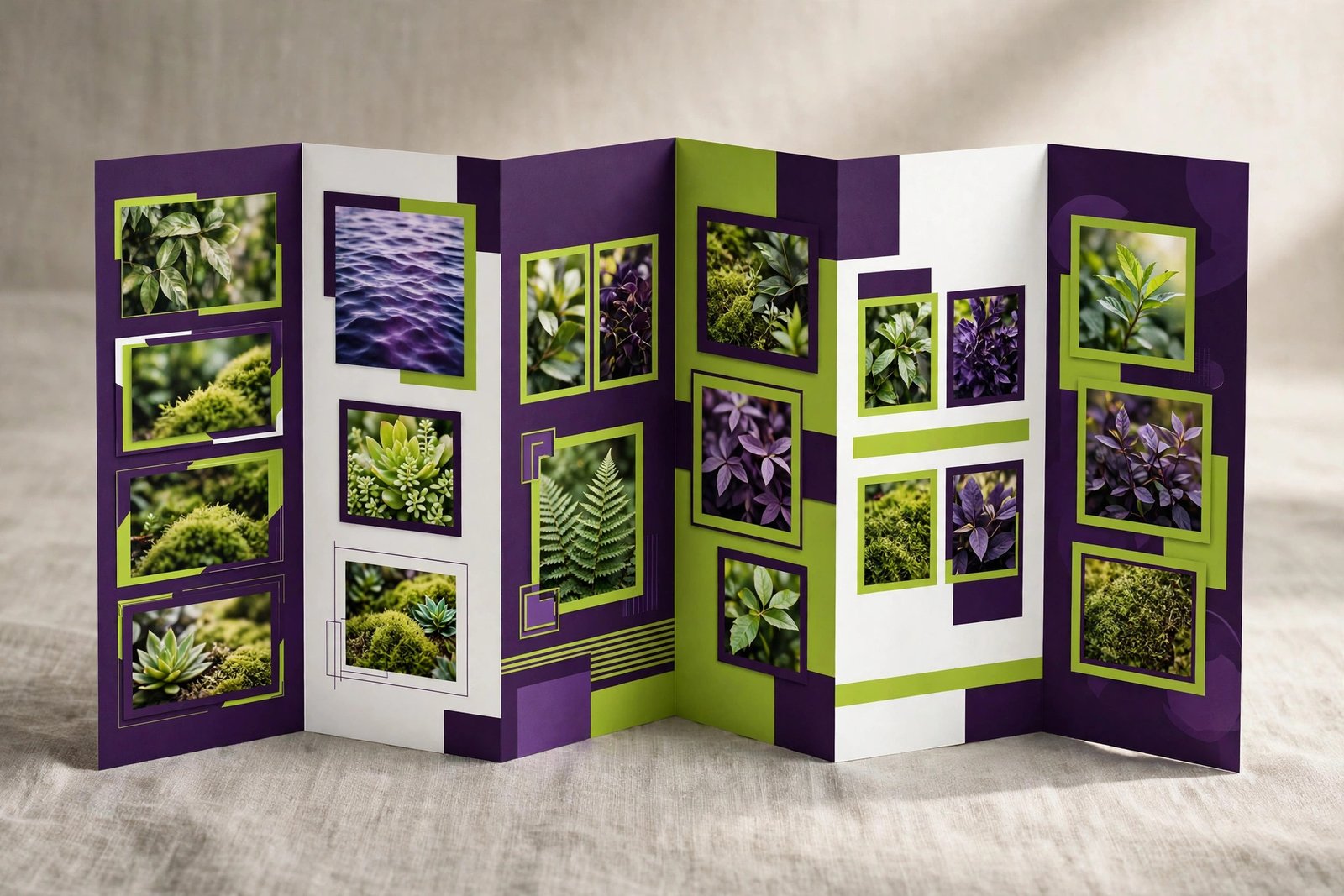
A brochure is a short, sharp sales document. Unlike a full catalogue, it does not list every product you make. It picks your best offer and presents it in a way that makes the reader want to act — call you, visit you, or place an order. In this complete guide, we explain the types of brochures, what makes one sell, how to write brochure content, what design and printing involve, what brochures cost in Sialkot, and how to distribute them for maximum effect.
Why Brochures Still Work
Some people think print is dead. It is not. A well-designed brochure still does things a social media post cannot. You can hand it to someone at a meeting and watch them read it. You can leave it at a shop counter where customers pick it up. You can put it inside every export carton so the buyer sees your other products when the box opens. A social media post disappears in a day; a brochure sits on a desk for months.
Brochures also force focus. A website has fifty pages and a catalogue has fifty products. A brochure has one job: sell one idea. That focus makes it powerful. A surgical instruments manufacturer can make a brochure just for its new dental range. A sports goods factory can make one just for its football collection. Each brochure speaks to one buyer with one clear message, without distractions.
For exporters in Sialkot, brochures are perfect for trade fairs. Visitors collect dozens of flyers at an exhibition. Most get thrown away at the hotel. A creative, well-printed brochure is the one they keep — and the one they call back about. The difference between a forgettable flyer and a kept brochure is design quality.
Brochures are also cost-effective. Designing one brochure costs far less than a full catalogue, and printing a few hundred copies is affordable for most businesses. For a new product launch, a seasonal offer, or a new service, a brochure gives you a professional sales tool without a big budget.
Finally, brochures work when the internet does not. In factory visits, market meetings, and areas with poor connectivity, a physical brochure keeps selling. It needs no battery, no signal, and no app.
Brochure vs Flyer vs Catalogue vs Company Profile
These four documents get confused constantly. Here is the simple difference, so you order the right one.
A flyer is a single flat sheet, printed on one or both sides. It announces one thing: a sale, an event, a new shop. Flyers are cheap, fast, and disposable. They grab attention but carry little detail.
A brochure is a folded document with multiple panels. It tells a short sales story: the problem, your solution, your products, and a call to action. Brochures are kept longer than flyers and carry more persuasion.
A catalogue is a multi-page document listing your products item by item, with photos, codes, and prices. It is a reference tool for ordering. Our catalogue designing guide covers it fully.
A company profile presents your business — history, factory, capabilities, certifications. It builds trust rather than selling a specific product. See our company profile guide.
The brochure sits in the sweet spot: more persuasive than a flyer, more focused than a catalogue, more sales-driven than a profile. When you need to sell one idea well, the brochure is the right tool.
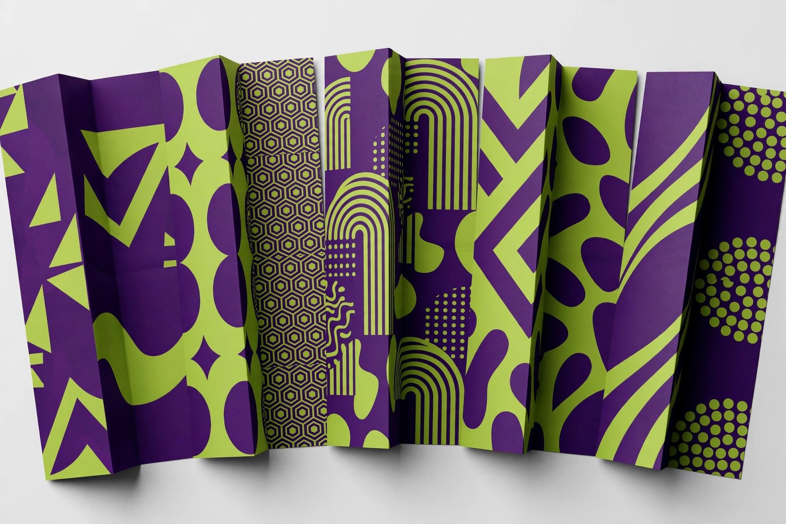
Bi-Fold Brochures: Simple and Elegant
A bi-fold brochure folds once down the middle, giving you four panels: front cover, two inner pages, and a back cover. It is the simplest folded format, and that simplicity is its strength.
Bi-folds work best when your message is straightforward. A company introduction, a single product line, a new service — anything that fits comfortably in four panels. The large inner spread (two pages side by side) is perfect for a big product photo or a bold visual statement.
Because there are only four panels, every panel must earn its place. The front cover grabs attention with a strong headline and image. The inner spread tells the story — benefits, features, photos. The back cover carries the call to action and contact details. There is no room for filler, which forces clarity.
Bi-folds also feel premium. The format is associated with high-end presentations — real estate, luxury products, corporate introductions. If your brand positions itself as premium, a well-designed bi-fold reinforces that.
From a cost view, bi-folds are economical to print. One sheet, one fold, minimal finishing. For short runs and tight budgets, they deliver strong impact per rupee.
Tri-Fold Brochures: The Popular All-Rounder
The tri-fold folds twice into six panels — the most popular brochure format in the world. It is compact (folds to a handy size), familiar (everyone knows how to open one), and versatile.
The six panels naturally divide your message into sections. A classic tri-fold structure: front panel (headline and hook), inner three panels (the story: problem, solution, details), back panel (contact and call to action), and the fold-in flap (testimonial, offer, or extra details). This structure guides the reader step by step.
Tri-folds suit content-rich messages: service lists, product ranges, price offers, step-by-step processes, and FAQs. If you have more to say than fits a bi-fold but not enough for a booklet, the tri-fold is your format.
One design tip: remember the panel order. When folded, the right inner panel is actually the first one the reader sees upon opening. Professional designers plan the reading sequence carefully so the story flows correctly. Amateur designs often put content in the wrong panels, confusing the reader.
Tri-folds are also the most cost-effective folded format to print in bulk. Standard sizes fit common paper sheets with minimal waste, keeping unit costs low for runs of 500 to 5,000 copies.
Z-Fold, Gate-Fold, and Die-Cut Brochures
Beyond the basics, specialty folds create memorable brochures for businesses that want to stand out.
Z-fold brochures fold in a zigzag, creating six panels that open like an accordion. Unlike tri-folds, z-folds can stand up on a table when partially opened — useful for counter displays. They also allow a continuous panoramic image across all inner panels, which looks stunning for visual products.
Gate-fold brochures have two outer panels that open like gates to reveal a large inner spread. The reveal creates drama — perfect for product launches, premium offers, and big announcements. The large inner area suits detailed layouts, timelines, and comparisons.
Die-cut brochures are cut into custom shapes — a football-shaped brochure for a sports brand, for example. They are unforgettable but cost more due to custom cutting dies. Use them when memorability justifies the premium: product launches, VIP invitations, and standout trade fair pieces.
Specialty formats cost more to design and print, so reserve them for high-value uses. A gate-fold for your flagship product launch makes sense; a gate-fold for a routine price update does not.
Multi-Page Booklet Brochures
When six panels are not enough, an 8 to 16 page booklet works like a mini-catalogue. Booklets suit businesses with several product lines, detailed service explanations, or stories that need room.
Booklets follow a simple structure: cover, introduction, one spread per product line or service, testimonials, and a back cover with contact details. Each spread gets breathing room, so the design feels calm and premium rather than cramped.
Many of our clients pair booklets with their full catalogue — the booklet creates interest at first contact, and the catalogue closes the sale later. The booklet is the trailer; the catalogue is the movie.
Printing booklets costs more than folded brochures, but saddle-stitching (stapled binding) keeps short booklets affordable. For runs under 1,000 copies, digital printing is economical; for larger runs, offset printing brings the unit cost down.
Digital Brochures for WhatsApp and Email
Every brochure we design comes with a digital version — and for many businesses, the digital version does most of the work.
A digital brochure is a PDF optimized for screens: compressed enough to share on WhatsApp in seconds, sharp enough to look professional on any phone. It carries the same design as the print version, adapted for digital reading.
Digital brochures can do things print cannot. Phone numbers become tap-to-call links. Email addresses become tap-to-write links. Your website address becomes a clickable link. A QR code can link to your full catalogue or a product video. These interactive touches turn a static document into a lead-generation tool.
Distribution is free and instant. Send it to inquiry responses, share it in WhatsApp groups, attach it to email quotes, post it on social media, and add a download button on your website. One design, unlimited distribution, zero printing cost.
We always prepare the digital version alongside the print file. Start with digital for speed, add print for situations where physical impact matters — trade fairs, meetings, and counter displays.
The Anatomy of a Selling Brochure, Panel by Panel
A brochure is read in a specific order, and each panel has a job. Here is how to structure the classic tri-fold for maximum selling power.
Front panel: the hook. This is what the reader sees first. It needs a bold headline, one striking image, and your logo. Its only job is to make the reader open the brochure. Do not cram details here — curiosity opens brochures, not information.
Inner panels: the story. The three inner panels (read left to right) tell your sales story in order: the problem or desire, your solution, and the proof. Panel one names the reader's need. Panel two presents your product or service as the answer, with key benefits. Panel three provides proof — features, specifications, testimonials, or guarantees. Keep text scannable: short paragraphs, bullet points, subheadings.
Back panel: the action. The back panel is seen when the brochure is flipped over — often before the inside is read. It should carry your call to action, contact details, and a reason to act now (limited offer, free consultation, easy ordering). Many readers check the back panel second, right after the front, so treat it as your second headline.
The fold-in flap: This narrow panel is perfect for a testimonial, a special offer, a QR code, or your product list at a glance. Do not waste it — it is prime real estate that many designers leave empty.
For bi-folds, the structure simplifies: front cover (hook), inner spread (the full story with room for big visuals), back cover (action and contact). The principle is the same — hook, story, action — in reading order.
Writing Headlines That Get Read
The headline decides whether your brochure gets opened or binned. Here is how to write headlines that work.
Promise a benefit. "Cut Your Stitching Costs by 30%" beats "Introducing Our New Machine." Readers care about what they gain, not what you made. Every headline should answer the reader's silent question: "what is in it for me?"
Be specific. Specific headlines outperform vague ones. "Export-Quality Footballs, 500+ Designs in Stock" beats "Quality Sports Goods." Numbers, in particular, grab attention and build credibility.
Keep it short. Aim for under ten words. Long headlines do not get read on a brochure cover. If you need more words, you need a better headline — cut until only the essential promise remains.
Speak the reader's language. A brochure for factory owners should sound different from one for retail customers. Use the words your buyers use. If your buyers say "durable," do not write "robust longevity" — write "durable."
Test it with the five-second rule. Show the front panel to someone for five seconds, then hide it and ask what the brochure is about. If they cannot answer, the headline failed. Rewrite until it passes.
Benefits Before Features: Copy That Sells
The most common brochure copywriting mistake is listing features without explaining why they matter. Features tell; benefits sell. Here is how to convert one into the other.
The translation formula: take each feature and ask "so what?" until you reach the buyer. "Double-stitched seams" — so what? "Stronger seams" — so what? "Gloves that last twice as long, halving your replacement cost." That is the benefit. Lead with it; mention the feature as proof.
More examples: "ISO 9001 certified factory" becomes "consistent quality you can rely on, order after order." "50,000 pieces monthly capacity" becomes "your large orders delivered on time, every time." "In-house design team" becomes "custom designs ready in days, not months."
Organize with subheadings. Do not write walls of text. Break copy into short sections with bold subheadings so scanners can grasp the message without reading everything. Most readers scan first and read only what interests them — subheadings are your scan-friendly skeleton.
Use bullet points for lists. Features, specifications, service inclusions — anything listable should be bulleted. Bullets are faster to read and easier to remember than sentences.
Include proof. Testimonials, client names (with permission), numbers, and guarantees turn claims into credibility. "Trusted by 200+ wholesalers across Pakistan" is stronger than "trusted by many."
End every section with momentum. Each panel should make the reader want to read the next one. End inner panels with forward-looking lines: "Here is how it works..." or "And that is not all..." Keep them turning panels until they reach your call to action.
Design Rules for Brochures That Get Kept
Good brochure design follows rules that separate professional work from amateur attempts.
One visual hierarchy. Every panel should have one dominant element — the headline or the hero image — that the eye hits first, then a clear path through supporting content. If everything shouts, nothing is heard. Size, color, and spacing create the hierarchy.
Consistent branding. Your brochure should look like it comes from the same company as your logo, website, and catalogue. Same colors, same fonts, same tone. Consistency builds recognition and trust.
Real photos, well used. One large, high-quality product photo beats four small blurry ones. Invest in good photography or quality stock images (for non-factory subjects). Every image should earn its space by supporting the message.
Readable typography. Body text should be at least 9-10pt in print — smaller strains the eyes. Use clean, professional fonts. Never use more than two font families in one brochure. And check readability in the actual folded size, not just on screen.
White space is your friend. Cramming every corner with text and images makes readers stop reading. Space around elements makes the important parts stand out. A brochure that breathes feels premium; a cramped one feels cheap.
Color with purpose. Use your brand colors as the foundation, with one accent color for calls to action and highlights. Random rainbow colors look amateur. Restrained, intentional color looks professional.
Our Brochure Design Process
We keep the process simple and transparent, so you always know what happens next.
Step 1 — Goal discussion. We start with the most important question: what should the reader do after reading this brochure? Call you? Visit your shop? Place an order? Every design decision flows from that goal.
Step 2 — Format selection. Based on your content and goal, we recommend the right format — bi-fold, tri-fold, booklet, or digital-first. We explain the trade-offs so you choose with full information.
Step 3 — Content planning. We map your message panel by panel: what goes on the front, what story the inside tells, what the back panel asks the reader to do. You provide the raw facts; we structure them into a selling flow.
Step 4 — Copywriting. We write or polish the brochure text — headlines, benefit statements, feature bullets, and the call to action. For export brochures, we write in clear international English.
Step 5 — Design. We create the full layout with your branding, photos, and content. You review a complete proof and request revisions. We refine until every panel is right.
Step 6 — Final files. You receive print-ready files (with bleeds and correct color settings), a WhatsApp-optimized digital PDF, and a high-resolution version for your website. If you want to preview the brochure realistically before printing, our mockup designing service shows it exactly as it will look folded and finished.
Brochure Pricing in Sialkot
Brochure design pricing depends on format, page count, and content work. A single tri-fold with ready content costs less than a 12-page booklet needing full copywriting and photo editing. Here is what shapes your quote.
Format and size. Bi-folds and tri-folds are the most economical — one sheet, standard folds. Booklets cost more per unit of design time because each page is a separate layout. Die-cut and specialty folds add design and production cost.
Content readiness. If you provide finished text and good photos, design is fast and affordable. If we are writing copy from scratch and cleaning up images, that professional work is reflected in the quote. Either way, you approve a fixed price before we start.
Revisions. Our quotes include revision rounds, so you can refine the design without worrying about extra charges for normal feedback. Major direction changes after approval may cost extra — we flag this upfront, never after.
Bundling. If you need a brochure plus a catalogue, a profile, or packaging in the same style, bundling saves money. One design system built once, applied across documents, costs less than separate projects.
Contact us with your format and content status, and we will give you an exact fixed quote. The design is a one-time cost — you can reprint as many copies as you want, and the digital version distributes free forever.
Paper, Finish, and Print Options Explained
The right paper and finish make a good design feel great in the hand. Here is what to know.
Paper weight. Brochures typically use 170 to 250 GSM paper — thick enough to feel substantial, thin enough to fold cleanly. Heavier stock (300 GSM) suits premium bi-folds and covers. Too thin, and the brochure feels flimsy; too thick, and folds crack.
Finish: glossy vs matte. Glossy finish makes colors pop and photos look vibrant — great for product brochures. Matte finish feels sophisticated and is easier to read — great for corporate and service brochures. You can also use matte paper with spot UV gloss on specific elements (like your logo) for a premium mixed effect.
Lamination. A thin protective layer that guards against fingerprints and wear. Matte lamination gives a soft, premium feel; gloss lamination adds shine and color depth. Lamination extends brochure life significantly — worth it for pieces that will be handled often.
Special finishes. Foil stamping (metallic gold or silver), embossing (raised texture), and spot UV (glossy highlights on matte paper) add luxury touches. Use them sparingly on key elements — your logo, the headline — for maximum effect at reasonable cost.
Print runs. For quantities under 500, digital printing is economical with no setup cost. For 1,000+, offset printing brings unit costs down substantially. We advise on the right method for your quantity and can connect you with reliable printers.
10 Common Brochure Mistakes to Avoid
1. No clear headline. A front panel with just a logo and a pretty picture gives readers no reason to open the brochure. Lead with a benefit-driven headline.
2. Trying to say everything. A brochure is not a catalogue. Pick one message and sell it well. Cramming your entire business into six panels helps nothing.
3. Walls of text. Dense paragraphs do not get read. Short paragraphs, bullets, and subheadings do. Respect the scanner.
4. Weak or missing call to action. Every brochure must tell the reader exactly what to do next — and make it easy. "Call now" with a big phone number beats a tiny email address buried in a corner.
5. Bad photos. Blurry, dark, or irrelevant images kill credibility instantly. One strong photo beats five weak ones.
6. Wrong panel order. Content placed in the wrong tri-fold panels confuses readers. Professional designers plan the reading sequence; amateurs guess.
7. No contact details on the back. The back panel is prime real estate. A brochure without clear contact info is a dead end.
8. Clashing with your brand. A brochure that looks nothing like your website or cards confuses customers. Keep all materials in one visual family.
9. Typos and errors. Nothing destroys credibility faster than a spelling mistake in print — especially in phone numbers and prices. Proofread twice, with fresh eyes.
10. Printing before proofing properly. Always review a physical proof or a careful digital proof at actual size before approving a print run. Fixing 1,000 printed brochures is expensive; fixing a PDF is free.
How to Distribute Your Brochure for Maximum Effect
A great brochure needs distribution. Here is where to put yours.
Your shop counter and reception. The simplest placement — customers waiting or browsing will pick it up. Use a simple display stand so brochures stay neat and visible.
Inside product packaging. Slip a brochure into every order or export carton. Existing customers discover your other products, and the cost per impression is nearly zero.
Trade fairs and exhibitions. Your highest-value distribution channel. Hand brochures to engaged visitors, and offer the digital version via QR code to everyone else.
Direct handouts in markets. In Sialkot's wholesale markets, a well-designed brochure handed to shop owners generates inquiries. Target the right shops — quality of distribution beats quantity.
WhatsApp and email. Send the digital version to every inquiry, include it in quotes, and share it in relevant business groups. Free, instant, unlimited.
Your website. Add a download button on relevant pages. Visitors who download your brochure are warm leads — consider asking for an email address in exchange.
Partner locations. Ask complementary (non-competing) businesses to display your brochure. A sports goods brochure in a sports academy, for example. Offer to display theirs in return.
Brochures for Exporters and Trade Fairs
Exporters use brochures differently from local businesses. Here is how to make yours work internationally.
Lead with export-relevant proof. International buyers care about capacity, certifications, and export experience. Your brochure should state these upfront: monthly capacity, countries served, certifications held. This is not bragging — it is the information buyers need to shortlist you.
Write in clear international English. Avoid local slang, complex sentences, and jargon. Your brochure may be read by buyers whose first language is not English. Simple, direct language travels best.
Include export logistics basics. MOQ, standard packing, lead times, and payment terms — even in brief form — answer the questions every importer asks. Including them moves conversations forward faster.
Design a fair-specific edition. For major trade fairs, create a focused edition: your best products for that market, fair-exclusive offers, and your stand number printed prominently. Visitors navigating a huge exhibition need to find you easily.
Follow up digitally. After the fair, email the digital brochure to every contact with a personal note referencing your conversation. The brochure refreshes their memory; the personal note restarts the relationship.
How Much Text Per Panel: A Practical Guide
One of the hardest brochure decisions is how much text each panel should carry. Too much and nobody reads; too little and the message is incomplete. Here are practical limits we follow.
Front panel: headline (under 10 words), one supporting line (under 15 words), your logo. That is all. The front panel is a door, not a room — its job is to get the reader inside.
Inner panels: each panel can hold roughly 60 to 90 words plus a headline and an image. That is about 5 to 7 short lines of text. If you need more words, you need a bigger format — do not shrink the font to cheat more text in. Small text does not get read; it gets skipped.
Back panel: call to action (one clear sentence), contact details, and optionally a short guarantee or offer line. Keep it scannable — many readers only glance at the back.
The golden rule: if you are struggling to fit the text, cut words before cutting font size. Shorter copy almost always sells better than complete copy. Say the essential thing well instead of saying everything badly.
Measuring Whether Your Brochure Works
Print makes measurement harder than digital, but not impossible. Here is how to know if your brochure earns its keep.
Use a dedicated contact point. Put a specific phone number, WhatsApp link, or QR code on the brochure that you use nowhere else. Inquiries through that channel came from the brochure. This simple trick gives you real data.
Ask new customers. Add "how did you hear about us?" to your inquiry process. You will be surprised how many say "your brochure at the trade fair" or "the brochure in the carton."
Track fair performance. After each exhibition, compare the number of brochures taken against the inquiries received in the following month. A strong ratio means the brochure did its job; a weak one means the design or message needs work.
Watch the digital version. If your PDF is hosted on your website, track downloads. If shared on WhatsApp Business, note which inquiries reference it. Digital distribution gives you the clearest feedback loop.
Refresh based on evidence. If certain products in the brochure generate no interest while others get all the questions, redesign the next edition around what the data tells you. Your brochure should evolve with your market.
Frequently Asked Questions
How much does brochure design cost in Sialkot?
It depends on the format and page count — a tri-fold with ready content costs less than a 12-page booklet needing full copywriting and photo editing. Tell us your format, page count, and whether your text and photos are ready, and we will give you an exact fixed quote before we start. The design is a one-time cost: you can reprint as many copies as you want, and the digital version distributes free forever. Bundling a brochure with other materials like a catalogue or profile in the same style also reduces the per-item cost.
Bi-fold or tri-fold — which should I choose?
Choose a bi-fold for a simple message with big, bold visuals — company introductions, single product lines, premium presentations. Choose a tri-fold when you have more to say: service lists, product ranges, step-by-step information, or FAQs. The tri-fold's six panels naturally organize richer content. If you are unsure, describe your content to us and we will recommend the right format. We will never push the more expensive option if the simpler one serves your message better.
Can you print the brochures too?
We prepare print-ready files for any professional printing press — correct bleeds, color mode, and resolution. If you need printing arranged, ask us: we work with reliable printers and can guide you on paper weight, finish (glossy vs matte), lamination, special effects like foil or spot UV, and quantities. We advise on the most economical print method for your quantity — digital printing for short runs, offset for larger ones.
Do I get a digital version for WhatsApp?
Yes, always. Every brochure comes with a WhatsApp-optimized PDF — compressed enough to share in seconds, sharp enough to look professional on any phone. Phone numbers and email addresses become tappable links. You also receive a high-resolution version for your website. The digital version is included in the design price, not charged extra.
Can you write the brochure content?
Yes. Give us your basic facts and selling points, and we write the full brochure copy: the headline, benefit statements, feature bullets, testimonials layout, and call to action. For export brochures, we write in clear international English. You review and approve every word before design is finalized. Good copy is half of a good brochure — design gets it opened, words get it acted upon.
What is the difference between a brochure and a flyer?
A flyer is a single flat sheet announcing one thing — a sale, an event, a new shop. It is cheap, fast, and disposable. A brochure is a folded multi-panel document that tells a sales story: the need, your solution, the proof, and the call to action. Brochures are kept longer, carry more persuasion, and suit considered messages. Use flyers for announcements and foot traffic; use brochures when you need to convince.
How long does brochure design take?
A standard tri-fold or bi-fold takes 4 to 6 working days once we have your content and photos. Multi-page booklets take longer — roughly a week per 8 pages. The biggest variable is content readiness on your side. If you have a trade fair or launch date, tell us in the first call and we will schedule design, proofing, and printing with enough buffer. Rush delivery is available for urgent deadlines.
What size are brochures usually?
The most common tri-fold is made from an A4 sheet folded into three panels, finishing at roughly 99 x 210 mm — a handy size that fits envelopes and brochure racks. Bi-folds are often A4 folded to A5, or A3 folded to A4 for a larger presence. We can design to any size, but sticking to standard sizes keeps printing economical by minimizing paper waste. We will recommend the best size for your content and budget.
Can you design a bilingual brochure?
Yes. We design bilingual brochures — typically English and Urdu, or English and another language for specific export markets. The layout is planned from the start to accommodate both languages cleanly, rather than squeezing translations in afterwards. Bilingual design costs more than single-language due to the extra layout work, but for businesses serving mixed audiences, one bilingual brochure is cheaper than two separate ones.
Get a Creative Brochure Designed in Sialkot
A good brochure is a salesperson that never sleeps — it sits on counters, travels in cartons, gets shared on WhatsApp, and works trade fair floors. It takes one clear message and sells it with focus that websites and catalogues cannot match. Whether you need a simple tri-fold for a new offer or a premium booklet for your flagship range, start with the right format, strong content, and professional design.
See our brochure designing service page for details, or talk to us directly. Call us today at +92 371 4200173 or visit our contact page — tell us your message, and we will design a brochure that sells it.
We do this for businesses.
Get a free consultation — we'll map the fastest path for you.