
Business Card Design in Sialkot
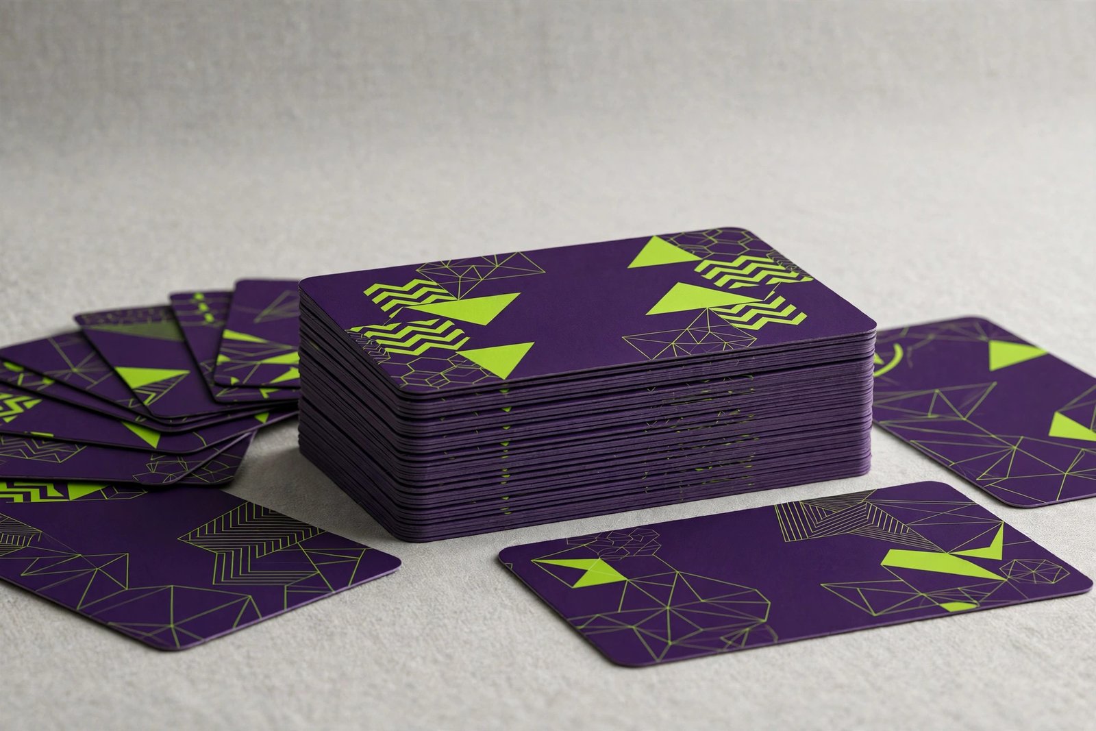
You meet someone at a meeting, a trade fair, or a market visit. The conversation goes well. Then comes the moment of truth: you hand over your business card. In those three seconds, your card tells them everything about your professionalism — before they ever call you. In this complete guide, we explain what makes a modern business card work: the design principles, the paper and finish options, what to put on the front and back, QR codes, pricing in Sialkot, common mistakes, and how to use your cards to build real business relationships.
Why Business Cards Still Matter
In a world of WhatsApp and LinkedIn, the business card refuses to die — because it does something digital cannot. It creates a physical moment. When you hand someone a well-designed card, they hold your brand in their hand. They feel the paper, see the design, and form an impression. That moment sticks in memory in a way a phone number typed into a mobile never does.
In Sialkot's business culture, cards are exchanged constantly — at the chamber of commerce, in factory visits, at exhibitions, in wholesale markets. Not having a card, or handing over a cheap-looking one, sends the wrong signal. A sharp, modern card says you take your business seriously. It says you are established, prepared, and professional.
Cards also travel. Your card sits in someone's wallet, on their desk, or pinned to their notice board. Every time they see it, they remember you. A digital contact gets buried in a phone within days. A good card stays visible for months. Many business owners tell us their best clients came from a card handed over months earlier and rediscovered at the right moment.
There is also a trust factor. In face-to-face business cultures like Pakistan's, the exchange of cards is a small ritual of mutual respect. Refusing or fumbling this ritual — "sorry, I don't have my card" — creates an awkward moment that a smooth card exchange avoids. Being prepared with professional cards shows respect for the other person and for the business relationship.
Finally, cards work without technology. No battery, no signal, no app needed. In factory visits, market meetings, and areas with poor connectivity, the card keeps working when phones do not.
The Business Card as a Brand Touchpoint
Your business card is often the first physical piece of your brand someone touches. That makes it a brand touchpoint — a moment where your brand meets the real world. Every touchpoint either builds your brand or weakens it.
Think about the last impressive card you received. You probably remember it: the weight of the paper, the clean design, the way it felt different from ordinary cards. That memory attaches to the business. Now think about a flimsy, cluttered card — you probably threw it away without a second thought, and the business went with it.
Your card should feel like your brand. A premium manufacturer should hand over a premium-feeling card. A creative agency should hand over something with design flair. A traditional trading company should hand over something solid and trustworthy. The card is a preview of what doing business with you feels like.
This is why card design cannot be separated from brand design. The card must carry your logo, your brand colors, and your visual style consistently. A card that looks nothing like your website or your company profile confuses people. Consistency across touchpoints is what turns individual impressions into a recognizable brand.
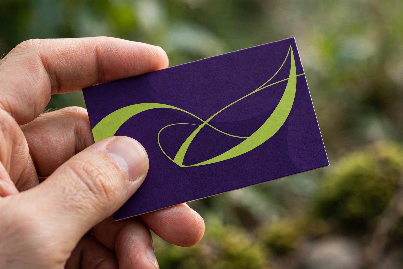
Anatomy of a Modern Card: The Front
The front of your card has one job: identify you clearly and memorably. Here is how each element should work.
Your logo should be prominent but not dominant. It anchors the design and connects the card to your brand. Place it where the eye lands first — usually top-left or centered, depending on the layout. Make sure it is high resolution; a blurry logo on a card destroys credibility instantly.
Your name should be the most readable text on the card. Use a clean, professional font at a size that is easy to read — typically the largest text element after the logo. Include the exact name people should use and remember.
Your title goes directly under your name, smaller and lighter. "Managing Director," "Sales Manager," "Founder" — the title tells the recipient your role and why you matter to their business. Keep titles honest and simple.
Contact details need a clear hierarchy. Phone and WhatsApp numbers are usually most important in Pakistani business culture — make them prominent and easy to find. Email follows. Website if you have one. Do not list every possible contact method; list the ones you actually answer.
Layout breathing room is essential. The most common amateur mistake is filling every millimeter. Professional cards use white space generously — it makes the important details stand out and makes the card feel premium. If your card feels crowded, remove something rather than shrinking everything.
The Back of the Card: Free Advertising Space
The back of your card is free advertising. Too many businesses leave it blank or print it with nothing useful. Here is how to use it strategically.
QR codes are the most popular back-panel element. A QR code linking to your WhatsApp chat, your website, your digital catalogue, or your location on Google Maps turns the card into an instant connection. One scan and the recipient is talking to you or viewing your products. We design QR codes into the layout cleanly — never as an ugly afterthought.
Your tagline or promise reinforces your brand message. "Sialkot's Trusted Surgical Manufacturer Since 2005" or "Export-Quality Sportswear, Made to Order" — a single line that tells the recipient why they should remember you.
Product or service list works for businesses with a clear, short offering. Five to seven items maximum, cleanly listed. This turns your card into a mini-brochure that reminds the recipient what you sell.
A bold brand statement — some premium cards use the back for pure branding: a large logo, a pattern, or a striking color. This suits established brands where recognition matters more than information. The bold back makes the card memorable and distinctive.
Appointment or notes space — a matte, writable back panel lets recipients jot notes ("met at Lahore expo, interested in footballs"). Cards that get written on get kept. This practical touch is underused and highly effective.
Whatever you choose, the back should feel intentional — designed, not leftover.
Typography: Fonts That Work on Cards
Typography makes or breaks a business card. The card is small, so every letter counts.
Readability first. Fancy decorative fonts may look interesting, but if the recipient cannot read your phone number at a glance, the card fails. Body text — names, numbers, addresses — should always be in clean, legible fonts. Save decorative fonts for accents only, if at all.
Size matters. Minimum readable size for contact details is typically 7-8pt in print. Your name can be 10-12pt. Anything smaller strains the eyes, especially for older recipients. When in doubt, go larger — a card with slightly less information in readable type beats a card with everything in microscopic type.
Limit font families. Never use more than two font families on a card — one for headings (your name), one for body text. More fonts look chaotic and amateur. The two fonts should complement each other: often a distinctive font for the name paired with a clean neutral font for details.
Match your brand. Your card fonts should match or complement your brand's typography — the fonts on your website, your catalogue, your signage. Consistent typography across materials is a hallmark of professional branding.
Watch the numbers. Phone numbers deserve special attention. Use clear, open numerals with good spacing. Consider grouping digits for readability (0300 1234567 reads easier than 03001234567). Double-check every digit — a wrong number on 1,000 cards is an expensive mistake.
Color and Brand Consistency
Color connects your card to your brand instantly. Here is how to use it well.
Use your brand colors. Your card should use the same colors as your logo and other materials. This consistency means someone who saw your website recognizes your card immediately, and vice versa. Brand recognition is built through repetition of the same visual elements.
Balance bold and readable. Dark text on light backgrounds remains the most readable combination. If your brand uses dark backgrounds, ensure text has enough contrast — white or light text on dark colors. Never sacrifice readability for style; a beautiful unreadable card is useless.
Consider the psychology. Blue suggests trust and professionalism. Green suggests growth and freshness. Red suggests energy and urgency. Black suggests premium quality. Choose and use colors that match the impression you want to create — and that match your industry's expectations.
Print color accuracy. Screen colors and print colors differ. Bright neon colors on screen often print duller. Professional designers work in print color modes and can advise which of your brand colors reproduce well in print. If exact color matching matters (and for brands, it does), discuss this during design.
QR Codes on Business Cards: The Smart Addition
QR codes bridge your physical card and your digital presence. Used well, they are the most functional element on a modern card.
What to link: the most effective QR code links are WhatsApp chat (tap to start a conversation — perfect for Pakistani business culture), your website, your digital catalogue, your Google Maps location, or a digital business card (vCard) that saves your contact directly to the recipient's phone. Choose the link that serves your most common next step.
Size and placement: the QR code must be large enough to scan easily — at least 2 x 2 cm on the card. Place it where it does not compete with your main contact details, usually the back panel or a card corner. Always include a short label: "Scan to chat on WhatsApp" tells people why they should scan.
Test before printing: scan the QR code with multiple phones before approving the print run. Test in different lighting. A QR code that does not scan is worse than no QR code — it promises convenience and delivers frustration.
Dynamic vs static: static QR codes link to one fixed address forever. Dynamic QR codes (managed through a service) let you change the destination later — useful if your website or catalogue link changes. For most businesses, a WhatsApp link (which rarely changes) as a static code is perfectly fine.
Paper Types Explained
Paper is half the card. The design gets the card noticed; the paper gets it kept. Here is what to know.
Standard art card (300-350 GSM) is the most common business card paper. Thick enough to feel substantial, smooth enough for sharp printing, and economical. For most businesses, this is the right choice — professional without being extravagant.
Premium thick card (400-600 GSM) feels luxurious — the kind of card people comment on. The extra thickness signals quality and permanence. Suits premium brands, executives, and anyone whose card needs to impress. Costs more, but the impression justifies it for high-value networking.
Textured papers — linen, laid, or felt textures — add tactile interest. They feel distinctive and look sophisticated under light. Popular for creative professionals, consultants, and premium service businesses. Note that heavy textures can interfere with very small text, so design accordingly.
Recycled and kraft papers suit eco-conscious brands. The natural, earthy look communicates sustainability values instantly. The brown kraft look is distinctive — your card will stand out in any stack. Best for brands where environmental values are central to the identity.
Plastic and metal cards are the extreme premium option — waterproof, nearly indestructible, and unforgettable. They cost significantly more per card, so they suit low-volume, high-impact use: executives, luxury brands, and VIP networking. A metal card is never thrown away.
Premium Finishes: Lamination, Foil, Spot UV, and More
Finishes are applied after printing to add feel, shine, and luxury. Here is what each does.
Matte lamination gives a soft, smooth, non-reflective finish. It feels premium, resists fingerprints, and is easy to write on. The most popular choice for professional cards — understated and elegant.
Gloss lamination adds shine and makes colors pop vibrantly. Great for cards with bold photography or vivid graphics. The downside: it shows fingerprints and can be hard to read under bright light.
Spot UV applies glossy coating to selected areas — typically the logo or key design elements — on a matte background. The contrast between matte and gloss creates a striking tactile and visual effect. One of the most impressive finishes for the price.
Foil stamping applies metallic foil (gold, silver, copper, holographic) to design elements. Nothing says premium like gold foil on a dark card. Suits luxury brands, and works beautifully for logos and borders. Use sparingly — foil everywhere looks gaudy; foil on key elements looks expensive.
Embossing and debossing create raised or pressed textures — your logo physically pressed into the paper. The tactile dimension adds a level of luxury that print alone cannot achieve. Often combined with foil for maximum impact.
Rounded corners and die-cutting change the card's shape — rounded corners soften the feel, while custom die-cut shapes (a football-shaped card for a sports brand) make the card unforgettable. Shape changes cost more but create instant distinction.
We design with your chosen finish in mind from the start — foil needs bolder shapes, embossing needs simpler designs, spot UV needs strategic placement. The finish and the design should be planned together, not separately.
Standard Sizes and When to Break Them
The standard business card is 3.5 x 2 inches (89 x 51 mm). This size fits every wallet, card holder, and organizer in the world. We recommend it for almost everyone.
Why standard usually wins: non-standard cards get thrown away because they do not fit. A beautiful oversized card that cannot go in a wallet ends up in the bin. The standard size is standard for a reason — it works with how people actually store cards.
When to go bigger: folded cards (tent cards) give you four panels — useful for mini-portfolios, price lists, or appointment cards. They still fold to standard size for storage. Consider these when you genuinely need more space, not just for novelty.
When to go smaller: mini cards stand out through compactness and suit creative industries. But they sacrifice readability — only consider them if your essential information fits comfortably.
The rule: break the size standard only when the benefit clearly outweighs the storage inconvenience. For 95% of businesses, standard size with exceptional design and finish beats unusual size with average design.
What to Prepare Before Ordering
Having these ready makes your card project fast and smooth.
Your details: exact name, job title, company name, phone/WhatsApp numbers, email address, office or factory address, website, and social media handles. Write them exactly as they should appear — including capitalization.
Your logo: in high resolution, preferably vector format. A blurry logo ruins the card. If your logo needs improvement, address it first with our logo designing service — the card is only as strong as the logo on it.
Your brand colors and fonts: if you have brand guidelines, share them. If not, we work from your existing materials (website, catalogue, signage) to keep everything consistent.
QR code destination: decide what your QR code should link to — WhatsApp number, website URL, catalogue link, or location. Have the exact link ready.
Quantity and finish preferences: how many cards you need, and whether you want standard or premium finishing. If unsure, we recommend based on your industry and how you network.
The Proofing Checklist: Avoiding Expensive Typos
A printed typo on 1,000 cards is an expensive mistake. Use this checklist on every proof.
Phone numbers: call every number on the proof. Seriously — dial it and confirm it rings your phone. Transposed digits are the most common and most costly card error.
Email addresses: check every character. Send a test email to the address on the proof. One wrong letter means lost inquiries.
Names and titles: confirm exact spelling and capitalization of every name and title. Ask each team member to verify their own card.
Website URLs: type the URL from the proof into a browser. Confirm it loads your site, not an error page or someone else's site.
QR codes: scan with at least two different phones. Confirm the destination is correct and loads properly.
Spelling everywhere: read every word on the card, including small text. Fresh eyes catch what familiar eyes miss — have someone else proofread too.
Design check: verify the logo is correct and current, colors match your brand, and alignment looks clean. Check the back as carefully as the front.
We send a final proof for your approval before any printing. Take proofing seriously — ten careful minutes saves the cost and embarrassment of reprinting.
Our Business Card Design Process
We keep card design quick and professional.
Step 1 — Details collection. You send us your information, logo, and preferences using our simple form. We confirm every detail — especially phone numbers — before designing.
Step 2 — Design concepts. We create card designs in your brand style: front and back layouts with your details placed professionally. You see realistic previews, not just flat files.
Step 3 — Your feedback. You review and request adjustments — layout tweaks, color refinements, information changes. We revise until the design feels right.
Step 4 — Mockup preview. Before final approval, we show you the card through our mockup service — the card in hand, from multiple angles, with your chosen finish simulated. You see exactly what you will receive.
Step 5 — Proofing and final files. You complete the proofing checklist and approve. We deliver print-ready files with proper bleeds and color settings for any professional printer.
Standard card designs are typically ready in 2 to 3 working days. Team sets (multiple people, same design) add a day or two depending on the number of cards.
Business Card Design Pricing in Sialkot
Business card design is one of the most affordable professional design services. Pricing depends on a few clear factors.
Single vs double-sided: double-sided designs (with QR code, tagline, or product list on the back) take more design time than single-sided, but the back is valuable marketing space we strongly recommend using.
Standard vs premium design: a clean, professional standard design suits most businesses. Premium designs with custom illustrations, complex layouts, or special finish planning (foil, embossing, die-cutting) cost more due to the extra design work.
Team sets: designing one master layout then producing individual cards for each team member is priced efficiently — the design work is done once, and each person's card is a variation. Per-card cost drops significantly for teams.
Printing separate: design and printing are quoted separately. Design is a one-time cost; you can reprint anytime. We guide you on paper and finish options to match your budget, from economical standard cards to luxury finishes.
Contact us for an exact quote — tell us single or double-sided, how many team members need cards, and your finish preferences. For the impression a great card creates, the design investment is minimal.
Cards for Teams: Consistent Professional Sets
When your whole team hands out cards, consistency multiplies your brand impact. Here is how we handle team orders.
One master design. We create a single approved layout for your company — the design, colors, fonts, and back panel are identical across all cards. This consistency means every team member represents the same professional brand.
Individual details. Each person's card carries their own name, title, direct phone, and email. We collect details in a simple spreadsheet — one row per person — to avoid errors. Each person verifies their own information before printing.
Role-appropriate variations. Senior management might get premium finishes while sales teams get standard cards in higher quantities. The design stays consistent; the finish matches the role's networking needs.
New joiners made easy. Once your master design exists, adding a card for a new team member is quick and inexpensive — we keep your design files organized and ready. No redesign needed, ever.
Quantity planning. Order based on real networking activity: salespeople who attend trade fairs need hundreds; office staff who rarely meet clients need dozens. We help you plan quantities per role so you neither overprint nor run out.
Networking: How to Use Your Cards Well
Great cards deserve great card etiquette. Small habits make a big difference.
Keep cards accessible. Carry them in a proper card holder — not loose in a pocket where they get bent and worn. A crisp card from a clean holder makes a better impression than a bent card fished from a wallet.
Present with intention. Hand over your card with the front facing the recipient, using both hands or your right hand. Take a moment — do not toss it across the table. The small ritual of respectful exchange sets the tone for the relationship.
Receive with attention. When someone gives you their card, look at it for a moment and acknowledge something on it — their title, their company. This small courtesy is remembered. Then put it away carefully, not in your back pocket.
Follow up fast. The card is the start, not the end. Message or email within 24-48 hours referencing your conversation. "Great meeting you at the expo" plus one relevant point turns a card exchange into a business relationship.
Keep notes. After events, jot on the back of collected cards where you met and what you discussed. When you follow up weeks later, those notes make your message personal instead of generic.
Digital Business Cards and NFC
Physical cards remain essential, but digital options are growing. Here is an honest look.
Digital business cards are mobile-friendly pages with your contact details, links, and branding — shared via link, QR code, or AirDrop. They are useful for purely digital networking and cost nothing to share. But they lack the physical moment that makes card exchanges memorable.
NFC cards are physical cards with an embedded chip — tap the card to a phone and your digital profile opens. They combine the physical ritual with digital convenience, and one card serves unlimited exchanges (no reprinting). The technology impresses tech-savvy contacts.
Our recommendation: use physical cards as your primary tool — the ritual, the tangibility, and the universal compatibility remain unmatched in Pakistani business culture. Add a QR code linking to your digital presence for the best of both worlds. Consider NFC cards as a supplement for heavy networkers, not a replacement for printed cards.
10 Common Business Card Mistakes to Avoid
1. Cluttered layout. Trying to fit your life story on a 3.5 x 2 inch card. Pick the essentials and give them room.
2. Unreadable text. Tiny fonts, fancy scripts for phone numbers, or poor contrast. If they cannot read it, they cannot call you.
3. Low-quality logo. A pixelated or stretched logo destroys the card's credibility instantly. Always use high-resolution artwork.
4. Cheap thin paper. Flimsy cards feel cheap and get discarded. Even a modest upgrade in paper weight transforms perception.
5. Outdated information. Old phone numbers, former job titles, discontinued email addresses. Review your cards yearly and reprint when details change.
6. No QR code or digital link. In 2026, a card without an easy digital connection misses the fastest path from card to conversation.
7. Inconsistent with your brand. A card that looks nothing like your website, catalogue, or packaging confuses people and weakens brand recognition.
8. DIY design that looks amateur. Your card represents your entire business in someone's hand. Amateur design suggests amateur business.
9. Skipping proofreading. Typos in print are permanent and embarrassing. Always proofread with fresh eyes — and call the phone numbers.
10. Running out at critical moments. Nothing is worse than a great conversation ending with "sorry, I'm out of cards." Keep your holder stocked, especially before events.
Business Cards for Different Professions
Different roles need different card emphases. Here is how we adapt designs.
Business owners and directors: premium feel, minimal information, emphasis on name and company. The card should feel like authority — quality paper, restrained design, confident branding.
Sales professionals: complete contact details prominent, QR code to WhatsApp, product range or territory on the back. Sales cards are working tools — every element should make buying easier.
Manufacturers and exporters: factory capabilities hinted on the back (product categories, certifications, export markets), professional industrial feel. The card should suggest scale and reliability.
Freelancers and consultants: personal brand emphasis, services listed clearly, portfolio or LinkedIn link via QR code. The card sells the person, not just the company.
Medical and professional services: clean, trustworthy design, qualifications noted, appointment contact prominent. Trust signals matter more than creativity here.
Creative professionals: the card itself demonstrates design skill — distinctive layouts, interesting finishes, memorable concepts. For designers and agencies, the card is the portfolio sample.
Frequently Asked Questions
How much does business card design cost in Sialkot?
Business card design is one of the most affordable professional design services. The price depends on whether you want single or double-sided design, standard or premium styling, and how many team members need cards. Double-sided designs cost slightly more but give you valuable marketing space on the back. Team sets are priced efficiently — the master design is created once, then adapted per person. Contact us with your requirements for an exact fixed quote. Remember: design is a one-time cost, and you can reprint your cards anytime without paying for design again.
What size should my business card be?
The standard size — 3.5 x 2 inches (89 x 51 mm) — fits every wallet, card holder, and organizer. We recommend it for almost everyone. Non-standard sizes risk being thrown away because they do not fit standard storage. The exceptions: folded tent cards (which fold to standard size) when you genuinely need more space for a mini-portfolio or price list, and mini cards for creative industries where compactness is the point. For 95% of businesses, standard size with exceptional design and finish is the winning combination.
Should I include a QR code on my card?
Yes, in most cases. A QR code linking to your WhatsApp chat, website, digital catalogue, or Google Maps location turns your card into an instant connection — one scan and the recipient is talking to you. It is especially valuable in Pakistani business culture where WhatsApp is the primary business channel. We design the QR code into the layout cleanly (usually on the back panel with a short label like "Scan to chat"), sized large enough to scan reliably. Always test-scan before printing.
Can you design cards for my whole team?
Yes. We create one master design for your company, then produce individual cards for each team member with their own name, title, direct phone, and email — all in the same professional style. You provide details in a simple spreadsheet (one row per person), and each person verifies their own information before printing. Senior staff can have premium finishes while sales teams get standard cards in higher quantities. Once your master design exists, adding cards for new joiners later is quick and inexpensive.
Do you arrange printing too?
We deliver print-ready files with proper bleeds and color settings for any professional printer. If you need printing arranged, ask us — we guide you on paper options (standard art card, premium thick stock, textured, or specialty papers), finishes (matte or gloss lamination, spot UV, foil stamping, embossing), and quantities. We recommend the most economical approach for your needs: standard quality for high-volume sales teams, premium finishes for executives and key networkers. We can also review printer proofs before your full run.
What information should go on a business card?
The essentials: your name, job title, company name, phone/WhatsApp number, email address, and website. Add your office or factory address if clients visit you. Keep it to what recipients actually need — a cluttered card with every possible contact method helps no one. In Pakistani business culture, phone and WhatsApp numbers are usually the most important elements, so make them prominent and easy to find. Use the back panel for extras: QR code, tagline, product list, or certifications.
Matte or glossy finish — which is better?
It depends on your brand and use. Matte lamination feels premium and understated, resists fingerprints, and can be written on — ideal for professional and corporate cards. Gloss lamination makes colors pop vibrantly — ideal for cards with bold photography or vivid graphics, but it shows fingerprints and can glare under bright light. A popular premium option is matte lamination with spot UV gloss on selected elements (like your logo) — the contrast looks and feels impressive. We recommend based on your design and industry.
How long does business card design take?
Standard card designs are typically ready in 2 to 3 working days once we have your details and logo. Team sets take a day or two longer depending on the number of people. The timeline assumes your information is complete and correct — gathering details (especially verifying phone numbers) is usually what takes time on the client's side. If you need cards for an upcoming event or trade fair, tell us the date and we will schedule design and printing with enough buffer. Rush delivery is available for urgent needs.
Can you redesign my existing business card?
Yes. Card redesigns are common — usually because the current card looks dated, does not match the company's updated branding, wastes the back panel, or simply does not reflect the business's quality. We evaluate your existing card against your current brand materials and goals, then redesign it for modern impact while keeping the information structure that works. If your logo itself is dated, we may recommend updating it first through our logo designing service — the card can only be as strong as the brand it carries.
Get Your Business Cards Designed in Sialkot
A business card is often the first physical piece of your brand someone touches. In three seconds, it tells them whether you are professional, established, and worth calling. Make those three seconds count with a card designed properly — clean layout, strong branding, readable details, quality paper, and a smart finish.
Get in touch with Advert Solutions today for modern, professional card design. Call us at +92 371 4200173 or visit our contact page — send us your details and logo, and we will design a card you will be proud to hand out at every meeting, market visit, and trade fair.
We do this for businesses.
Get a free consultation — we'll map the fastest path for you.